Graf von Faber Castell Walden Woods Fountain Pen Review

(Susan M. Pigott is a fountain pen collector, pen and paperholic, photographer, and professor. You can find more from Susan on her blog Scribalishess.)

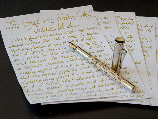
I don't typically order super expensive, limited edition pens that come in boxes that are fancier than the pens they house. But Chatterly Luxuries had a good price on the Walden Woods pen, and because I'm working on an MA in English in Creative Writing (I totally need another "practical" degree), this pen appealed to me. I love the fact that the barrel has Thoreau's handwriting etched on it. I appreciate that the ash wood used for the pen is reclaimed from naturally-fallen trees at Walden Pond. I am pleased that my purchase of this pen means a new tree will be planted at Walden Pond by the American Forests organization. All these factors combined with the great price led me to purchase the pen. I bought it for $395 (retail $750), which is still quite expensive.

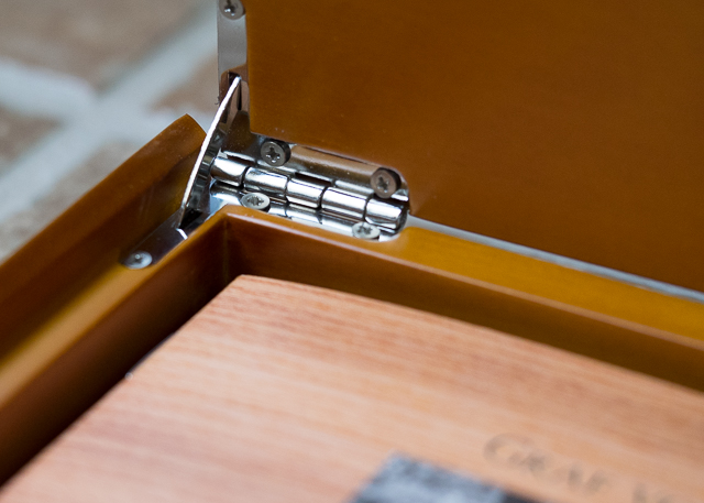
I waited to open this pen until I turned in my grades for Summer II. It was my reward for surviving the term (and it was a doozy). The packaging was impeccable. A thick, outer cardboard box protected the beautiful wooden box within. The lid of the wooden box is unadorned except for a small logo and the Graf von Faber Castell name.

The box opens smoothly and silently–I mean look at that hinge mechanism! And this is just the box!

A cream-colored, molded insert houses the pen and information about it. A well-designed booklet gives a brief history of Henry David Thoreau's two-year experiment at Walden Pond which became the basis for his book, Walden, or A Life in the Woods. The Walden Woods Project, which formed in 1990 to protect Walden Pond from development, is also discussed, as well as the partnership with the American Forests organization. A card with warranty information is enclosed and there's a small cloth for cleaning. The insert that houses the pen and information comes out, so with a pen tray cut to size, the wooden box can be repurposed for pen storage.

The Walden Woods pen is a limited edition of 2006 pens, each individually numbered. Mine is number 1268.

Unlike Graf von Faber Castell's yearly limited edition pens, which can be quite ornate (and cost thousands of dollars), the Walden Pen is understated. It has a beautiful platinum-plated cap with a spring-loaded clip that is easy to operate.

The finial is concave and unadorned other than grooves etched around the edge.

The Faber Castell logo appears just above the top of the clip.

"Graf von Faber Castell Germany" is imprinted around the bottom of the cap, and just above that, in tiny letters, is a credit for the quote used on the pen.

The grip is made of the same platinum-plated metal, and so is the bottom of the barrel which is convex and sports the grooves around its base.

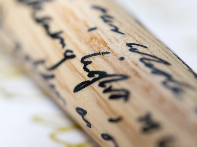
The ash-wood barrel feels smooth to the hand. It's hard to tell whether Thoreau's quote is actually etched into the wood or just painted on (the descriptions I've read use the word "etched," but the words don't look or feel like they are carved into the wood). The quote is written in black and stands out nicely against the light color of the wood.

The quote chosen for the pen is beautiful:

"So we saunter toward the Holy land; till one day the sun shall shine more brightly than ever he has done, shall perhance shine into our minds and hearts, and light up our whole lives with a great awakening light, so warm and serene and golden as on a bank-side in Autumn."

~Henry David Thoreau, Walking

The nib is a two-toned, 18K gold medium. It started up immediately after I inked the pen, and I've had no problems with skipping, hard starts, or scratchiness. I inked it with Iroshizuku Ina-Ho because I thought the golden color of that ink matched the ash wood nicely. The nib is smooth, but firm without any springiness.

Because the grip is metal, it becomes slippery under my sweaty fingers. It is small in diameter (I don't have a caliper, but it's less than 10mm at the thinnest point), and my hand cramps up while writing. I may eventually have the nib ground to an oblique italic so that I can rotate the pen into a more comfortable position. Plus, the medium nib lacks personality in my opinion.

The pen is a cartridge/converter filler, but no cartridges were supplied, an oversight for such an expensive pen. I use the converter anyway, but I think cartridges should have been included for those who don't use the converter. The converter works smoothly and draws up ink without any difficulty.

At 135mm (5.31 inches) capped, 130mm (5.11 inches) uncapped, this is a medium length pen, just a little longer than a Pelikan M600 capped. The pen is fairly heavy due to the metal construction. I could not find a specific weight in any of the literature or online. In spite of this, it feels balanced in the hand unposted. Posted it is 173mm (6.8 inches) in length and is unwieldy. The cap is simply too heavy and throws the balance off.

I am interested to see how the wooden barrel reacts with the natural oils in my hand. I don't know if the ash will darken over time, or if the wood has been coated to prevent that. My main concern about the light ash wood is what will happen if I accidentally get ink on it. Will the ink wipe off or will it stain the barrel? I am unwilling to test this, even for the sake of a Pen Addict review, sorry.

This is my first Graf von Faber Castell pen. I like many things about it, and it is definitely unique. But, it's not the most comfortable pen I've written with. My hand grew fatigued fairly quickly due to the small grip combined with the weight of the pen.

Nevertheless, I can't wait to take this pen to my English classes. I hope Thoreau's spirit channels itself through the pen to make my poetry better. I can always hope, but so far no poems have magically emerged from my Walden pen.

Pros

  • Simple design with understated elegance
  • Fans of Henry David Thoreau would probably love this pen
  • The Walden Pond ash wood and Thoreau's writing on the barrel make this pen unique
  • The nib is beautiful and well-made (though I don't like the medium point and will probably send it to a nibmeister)
  • For every purchase of this pen a tree will be planted at Walden Pond
  • The beautiful wooden box that houses the pen can be used as a pen box with the addition of a tray (but, honestly, I'd rather just have a simple cardboard box and a lower price)

Cons

  • Expensive, even on sale
  • Fairly heavy pen
  • The grip is metal and narrow in diameter which may make it difficult for some people to write comfortably
  • Cartridge/Converter filler, which can be a plus or minus depending on your perspective, but no cartridges are supplied with the pen which seems an odd oversight
  • The pen is no longer being manufactured, and remaining units are limited
Posted on August 21, 2015 and filed under Faber-Castell, Fountain Pens, Pen Reviews.

Dip Nib Primer

(This is a guest post by Nick Folz. You can find more of Nick and his work on Twitter, Instagram, and Tumblr.)

I have friends that will go on endlessly about the quality of vinyl records. They lambast me for using a streaming service as my main mode for music. Records are slightly inconvenient, they are large and delicate, but they like the ritual. I tend to lean on the convenience factor and they lean on the quality angle, but in the end we agree, music is good.

I like to think of dip nibs vs. fountain pens the same way. Yes, there is a large difference, but what it boils down to is convenience and variety.

Dip nibs are traditionally more flexible, cheaper, come in a wider variety of styles and you can change ink dip to dip if you feel like it (with a quick dip in water and a wipe with a paper towel, of course). The flip side is that you don't have to break out an inkwell and a handful of paper towels every time you use a fountain pen. Yes, they are similar, but they are also two very different beasts.

NibPhoto1.jpg

A Quick Intro:

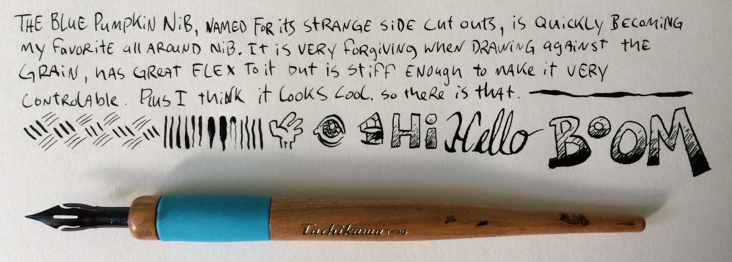
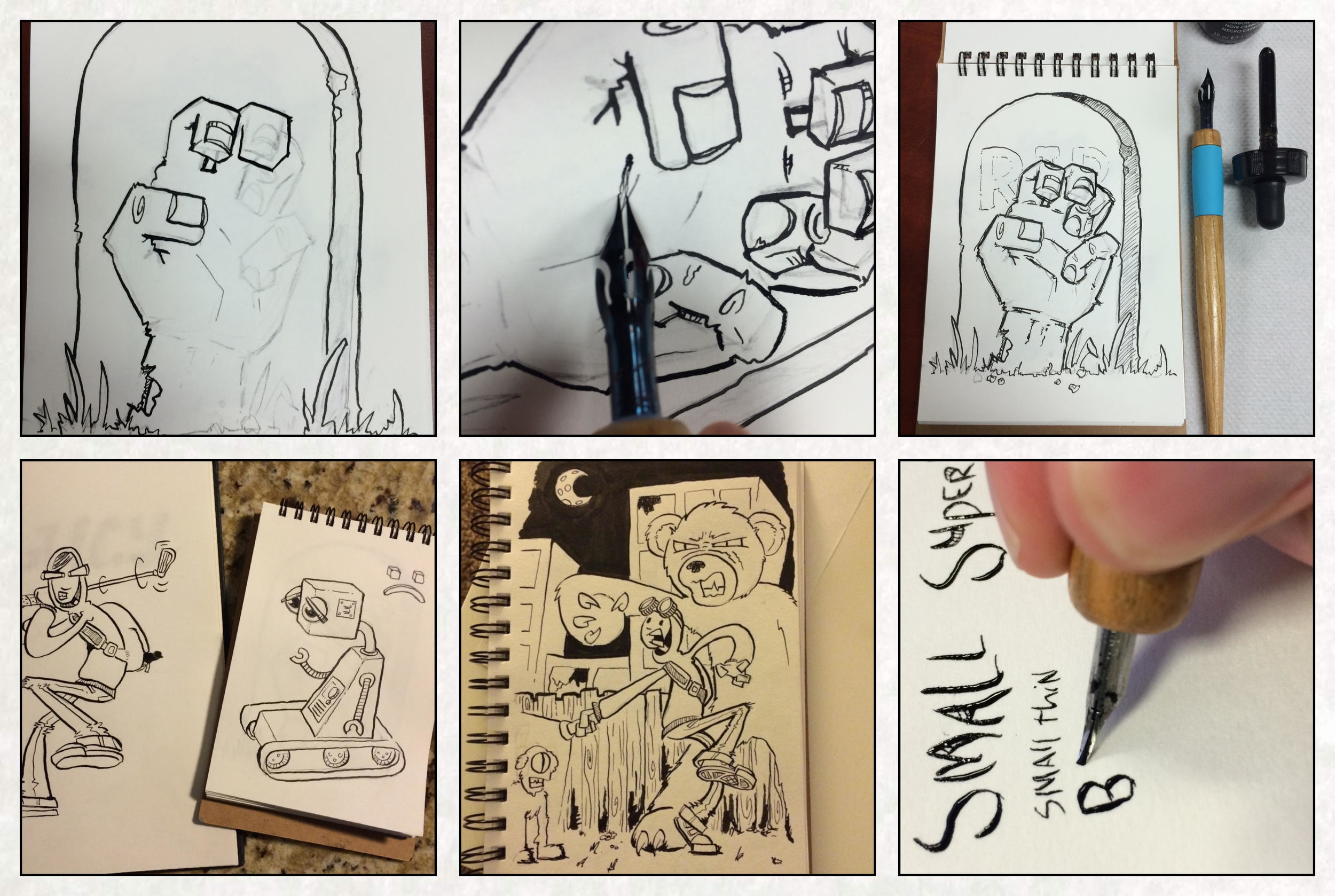
Let’s start with the holder. In case you are totally new to the concept, this is the part you hold. They are the handles that you stick the nib in, some are made for only one type of nib and others fit a wide variety of them. You could really use a stick from the yard with a slit cut into it if you wanted to, but let’s take some convenience where we can. I am using the Tachikawa nib holder, which is built to accommodate several different types of nibs by having several different sized plastic circular recesses in its tip. Plus, the Tachikawa has a cap that can fit over the nib, which is nice! You push the non-pen tip of the nib into the tip and it grips it (tight enough not to drop it but loose enough to pull it free). When first buying equipment, make sure your holder works with your nib. Nothing takes the wind out of your sails like getting incompatible equipment.

Next up is to choose your nibs. These are the metal parts you dip in ink. Nibs come from the incredibly fine and stiff, to the very flexible and inky. Some come with "reservoirs" to help hold more ink per dip, some are cylindrical, some are spoon shaped, some are flat and some are unconventionally shaped. The good news is they are all pretty cheap (a bunch of nibs are sold in packs for 3 for $4, so go crazy and pick a variety). Read reviews and see what people say, but it is going to come down to personal preference. Your first nib might be too stiff and eat paper like a shredder or it might be too sharp to draw against the grain without snagging. Pitfalls are many, but don't despair! It is worth it once you find that perfect fit.

My current favorite is the Brause Blue Pumpkin Nib. It hits the sweet spot for me: Good line variation, not too rough against the grain, can do fine hatching and can drop a nice thick line. It doesn't hold a ton of ink, but you can get a reservoir for it.

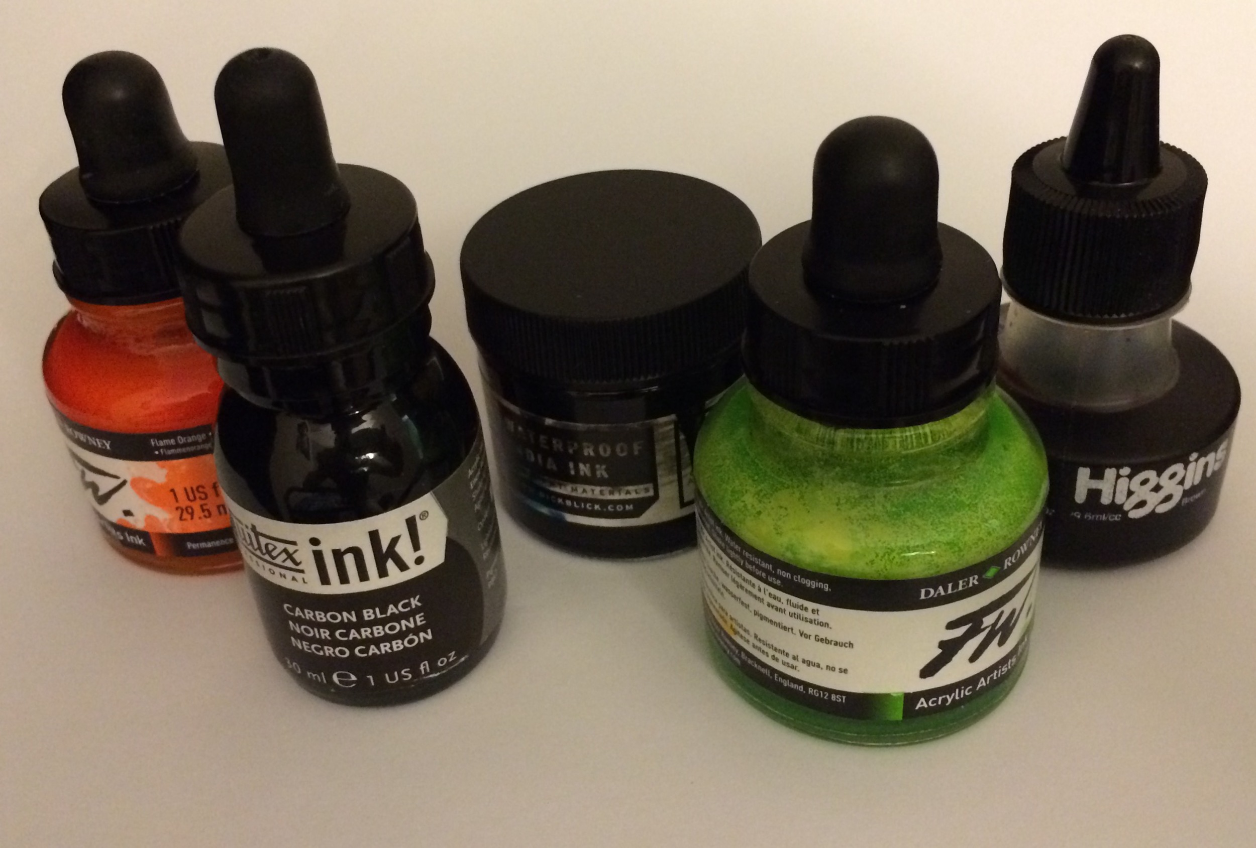
Now time for ink. For you fountain pen ink fanatics, this will be a lot of fun. The doors are blown open and you can try any sort of ink you like. That dreaded India Ink that would clog your priceless pen into a worthless stick in less than an hour? Yup, pick up a bottle. This is a safe space. I tend to prefer the India Inks with shellac because they dry quicker, have virtually no bleed and are waterproof (if you are going to ink wash over them). The things that would make a terrible fountain pen ink are what make it perfect when using a dip nib. I like brands that have a dropper built into the lid and a large enough opening to see my nib when dipping. Most are made of glass, so treat them with kindness and respect. Lots of colors are available but I would start with a simple black.

Lastly, paper. I lean towards a higher weight paper with a bit of tooth. Bristol Vellum is my favorite but any 80 lb weight sheet is going to be fine. Nibs can be much more finicky about grabbing paper, and if you are starting with standard cheap copy paper you are going to be eating through the sheet and digging fibers out of your nibs with inky fingertips. If you plan on ink washing, go for a heavier stock, even the highest paper weights want to buckle a bit when water is applied. You can get a board and tape the sides down with some painters or masking tape, but I would recommend just trying out some basic nib strokes before we go whole hog into a wash. (See illustration.)

Down To Business:

Hooray! Time to draw (or write)! Grab a bunch of paper towels, your ink, nib, holder and paper. Dip your nib in the ink and make a few simple lines, pulling the pen towards you, testing the tines. Do a few swirls and dip the nip in the ink differently each time you dip. Dip a just a bit and see how fine you can write. Dunk the whole nib in and see how much you can write with a full load of ink. Now press your luck till you make a few mistakes, better to know how far you can push each nib until it dumps too much ink. Switch nibs a few times. Make a mess.

Take a moment and enjoy the ritual of it. Ink is, by its un-erasable nature, unforgiving. It is also its own best teacher; it will punish your mistakes. If you are an artist struggling to hold a solid line or going for a less sketchy look, ink is going to force you into working more methodically with carefully laid lines. I usually ink over a loose pencil sketch and if you are drawing I would recommend the same.

I feel like I should say that I am not a dip pen aficionado, nor a world renowned artist. So please grant me a grain of salt when reading some tips and tricks I have discovered over the years when inking with nibs, and please comment with tips of your own:

  • Give yourself plenty of room and place things accordingly, make sure your inkwell is close enough to dip but out of the way when drawing.
  • If you are right handed, start at the top left corner of the page and work diagonally down to the lower right, lefties, start at the upper right and work to the lower left. This keeps you from placing your hand over the fresh ink.
  • Don't be afraid to break the above rule and rotate the page. Nibs work best when drawing towards yourself and while they will still work when going left to right or away from you, you won't get the flex or variation you are using the nib for. Even worse, a nib tine might snag the paper, ripping it or unloading all of the ink in one spot. So spin the page when needed, just watch out for wet ink.
  • When laying down ink I tend to make longer, smoother strokes with the bare minimum lines. It leaves a cleaner impression on the finished art.
  • Let the ink dry before you go back to add details, even a stray pinkie finger can wreak untold havoc with not-quite-dry ink.
  • If your nib dumps too much ink in one spot and leaves a tiny pooled up line, rip a piece of paper towel and gentle touch the tip of the towel to the ink. It will suck up much of the excess and possibly save a drawing.
  • Dip early, dip often. Don't overload the nib and beware the dry line. You can keep an eye on the vent hole, once you see the ink thin or disappear in the vent hole, you had best finish your line or lift from the page early.
  • Paper towels are your best friends, seriously. Keep at least two around, grab the roll if you are clumsy. (I grab the roll.)
  • Keep a shot glass of water so when you are finished inking, or when you switch nibs, you can drop them in it to rinse. Or you can drip a few drops of ink in the water to use as a wash.
  • Wet your nibs down in water to clean the ink off of them when done. Dry your nibs before you store them, they are not immune to rust.
  • Find an old jewelry case, altoids tin or other small container to keep your nibs. They are mindblowingly easy to lose.

If you are interested in Dip Nips I would highly recommend you check out this handy guide from JetPens. It features a nib holder chart and does a basic overview of nibs.

Final Points:

Dip pens biggest down fall is one of the things I like most about them. They are unruly, inconvenient and impractical for travel. It forces you to stop doing everything else, focus on one thing and lower the volume on life. Sit and listen to nothing but the near silent "skrit" of nib on the paper as it tells the outside world the secrets of the inside of your mind. I won't argue that a supremely well-made fountain pen can do what a decent nib can do (usually better), but I am going to bet that it will cost you more. You will always win convenience with a fountain pen, but lose a touch of ritual. In the end, I think, putting ink to paper is good, don't you agree?

(Disclaimer: Some, not all, of the products were provided for me free of cost but I am not otherwise being compensated for this review. The opinions contained are my own.)

Posted on August 20, 2015 and filed under Dip Nib, Tachikawa, Brause.

Paper-oh! Yuko-ori A6 Metallic Grey Notebook Review

(Jeff Abbott is a regular contributor at The Pen Addict. You can find more from Jeff online at Draft Evolution and Twitter.)

The quest for the perfect notebook is never over, but like I'm sure I've said many times, you can sometimes find the perfect notebook for the specific use case. And this is why most of us continue picking up new notebooks even though we have plenty in our stash at home.

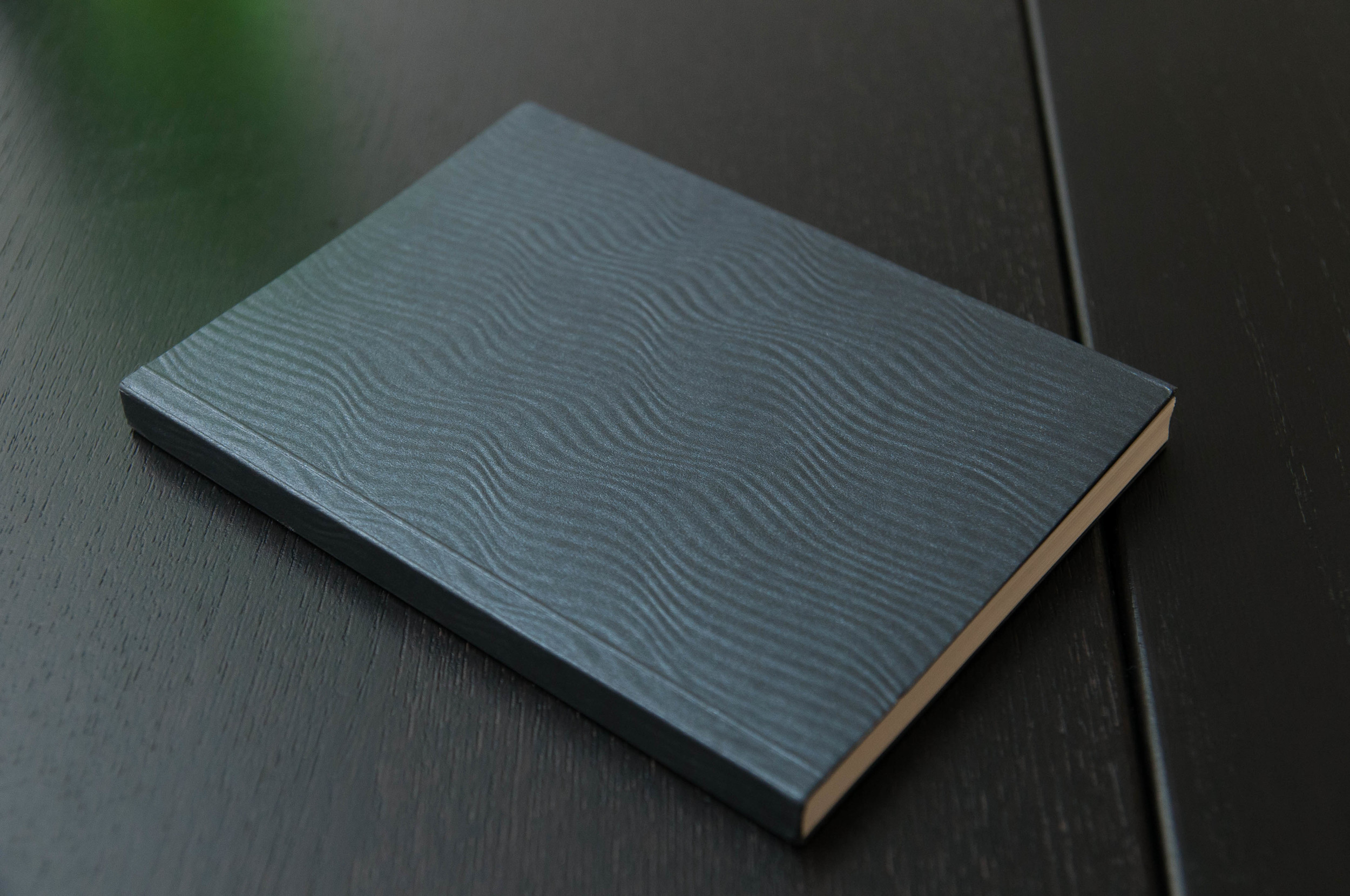
And that's exactly how the Paper-Oh! Yuko-Ori notebook got into my collection. I mean, look at that cover! Apart from the beautiful cover, this is a decent notebook that uses recycled, acid-free paper, but there are a couple draw-backs that you might need to consider.

Look & feel

First off, this notebook has a gorgeous cover. It reminds of calm deep water. It's a dark grey with hints of blue and a few glimmers here and there. It really is beautiful. According to the product description, the covers are inspired by the origami artwork of Yuko Nishimura. Very nice work indeed.

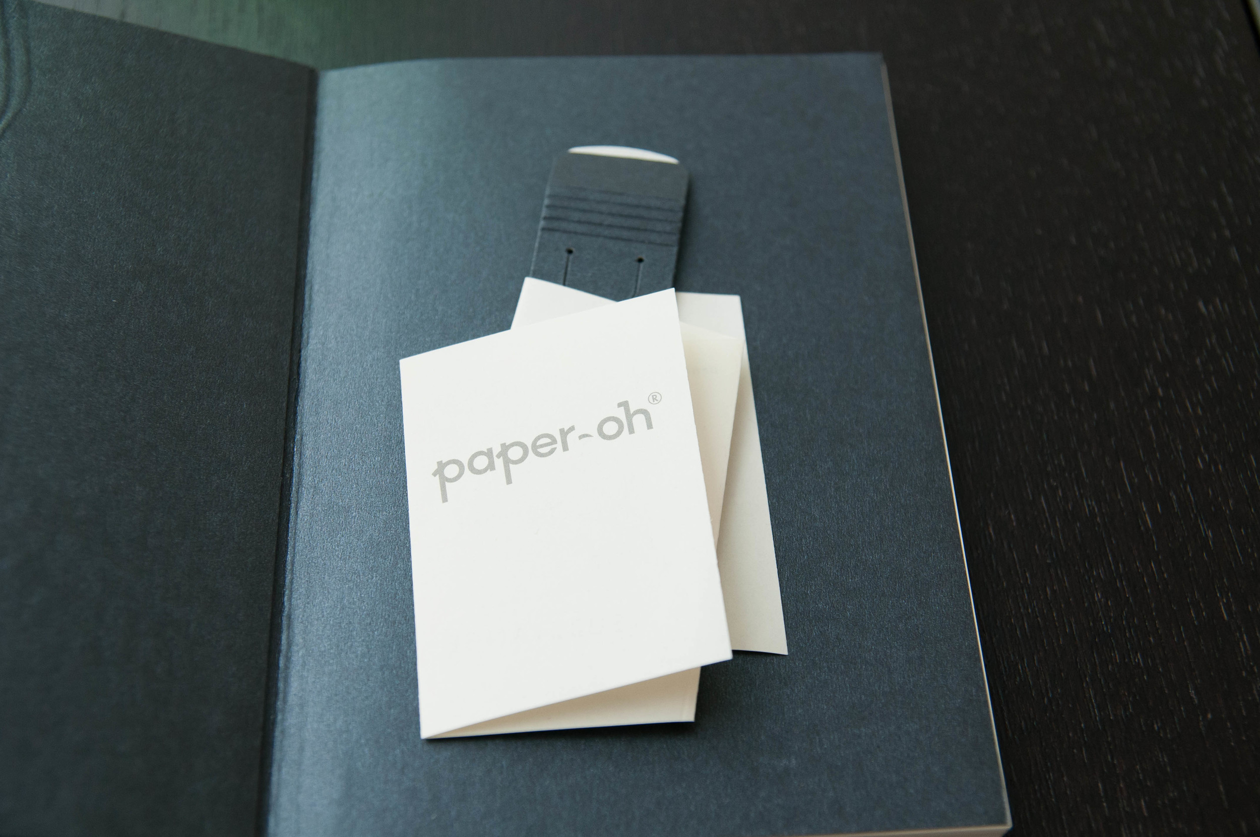
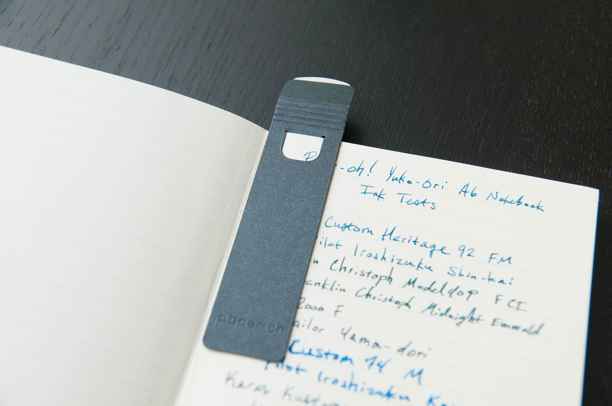
Speaking of the origami artwork, a small bookmark and info insert are included in the front cover of the notebook. Usually, I briefly glance at these things on the way to the recycling, but this caught my eye because of the way the insert was folded. After reading about the orgami artwork inspiration, it makes sense now. The non-orthodox folding method is really interesting — enough to convince me to keep it in the notebook for artistic value. Really nice touch.

The bookmark is also interesting. You can choose to use it as a standard bookmark that has a small tab to attach to a page, or you can use the adhesive patch to attach the bookmark to an inside page and fold it over the rest of the book (pictures are worth a thousand words here). Either way, it's unique and I like it.

Moving on to the paper, it's smooth to the touch and about the thickness of a Rhodia sheet of paper. The version I have is lined, and I'm not sure if you can get these notebooks in other formats. The line is a subtle light-gray that works well with the cover.

The binding leaves a little to be desired, but it gets the job done. I'm not 100% confident that this notebook would stay intact through its entire life, but it would probably make it through anyway. It opens very easily, but to a point where I wonder if certain sections will begin to fall out at some point. Only time will tell.

Overall, it's a beautiful notebook, a great pocket size, and a good thickness at 112 pages.

Writing performance

For the most part, the pen and ink tests are average. What does that mean? Well, gel-ink, rollerball, ballpoint, and pencil perform with flying colors. Fountain pen inks are a bit hit-and-miss depending on the ink. For example, Sailor Yama-dori performed extremely well, while Pilot Kon-peki and Franklin Christoph Midnight Emerald bled quite a bit and produced significant show-through on the page. If you pick the right pen/ink combo for this book, you'll be very happy.

The writing experience with all the pens I tried was very smooth. This is a good paper despite the tendency to bleed/feather with certain inks. It's a nice paper to write on, and it's also acid-free to ensure your marks will stick around a while.

Overall

This is a fun notebook that is both fun to look at and write in. Finding them for sale isn't as easy as other notebooks, but check them out if you're interested. The one I reviewed here is an A6 size, but there are several other sizes and colors available.

(This product was sent to The Pen Addict by Paper-Oh at no charge for review purposes.)

Posted on August 19, 2015 and filed under Notebook Reviews, Paper-Oh.