Each week in Refill, the Pen Addict Members newsletter, I publish Ink Links as part of the additional content you receive for being a member. And each week, after 10 to 15 links, plus my added commentary on each, I'm left with many great items I want to share. Enter Misfill. Here are this weeks links:
Read:
— Quickie: Kokuyo Thin Paper for Fountain Penning (Cheryl Lindo Jones)
— Review-ish: Arrtx 24 color full pan Watercolor set (Comfortable Shoes Studio)
— Ink Review: Three Sailor Studio Inks (341, 343, 564) (The Well-Appointed Desk)
— My current mechanical pencils (José Naranja)
— If I Could Only Keep Ten Fountain Pens.... (The Gentleman Stationer)
— There’s Nothing Like It: Tricky’s Favourite Songs (The Quietus)
— Three tools sketch (Writing at Large)
— Let Janice Chan’s photographs of a Chinese kite festival blow you away (It’s Nice That)
— DeFF's Diminutive Premium Pen (Core77)
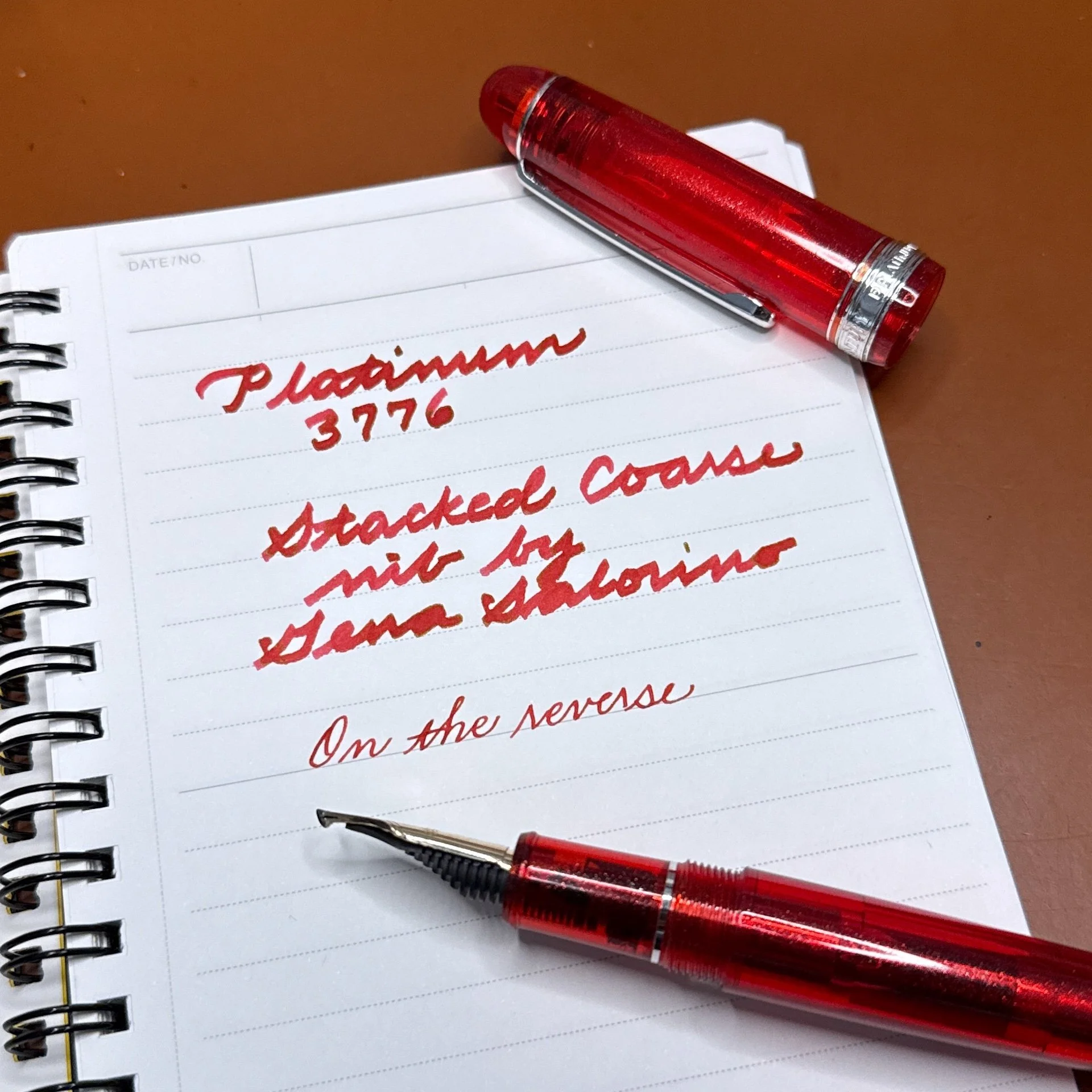
— Nahvalur Horizon Nebula (Penquisition)
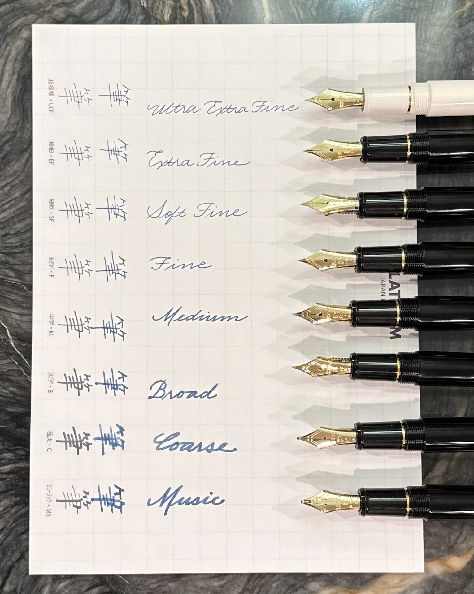
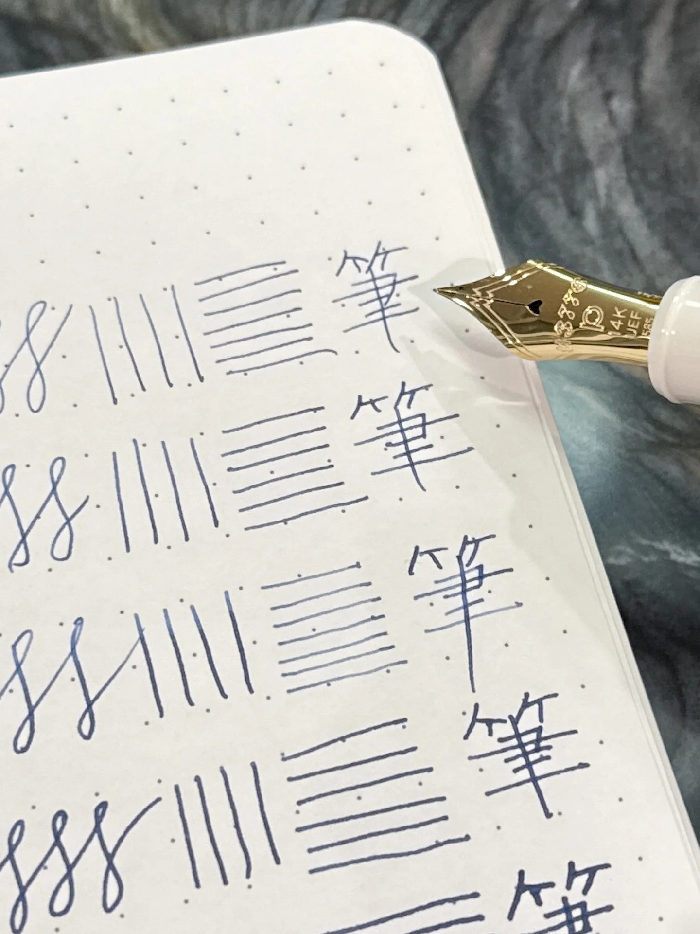
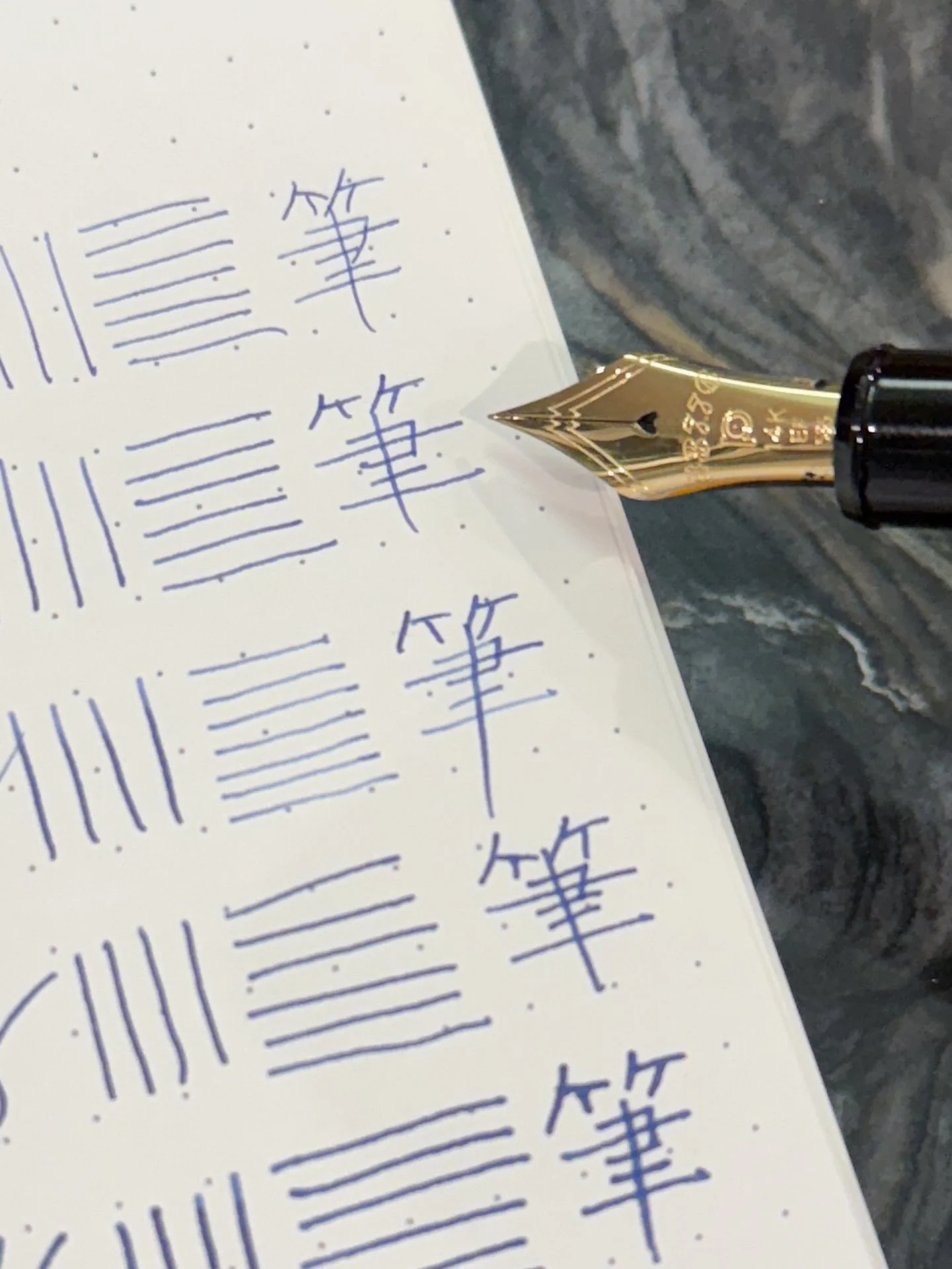
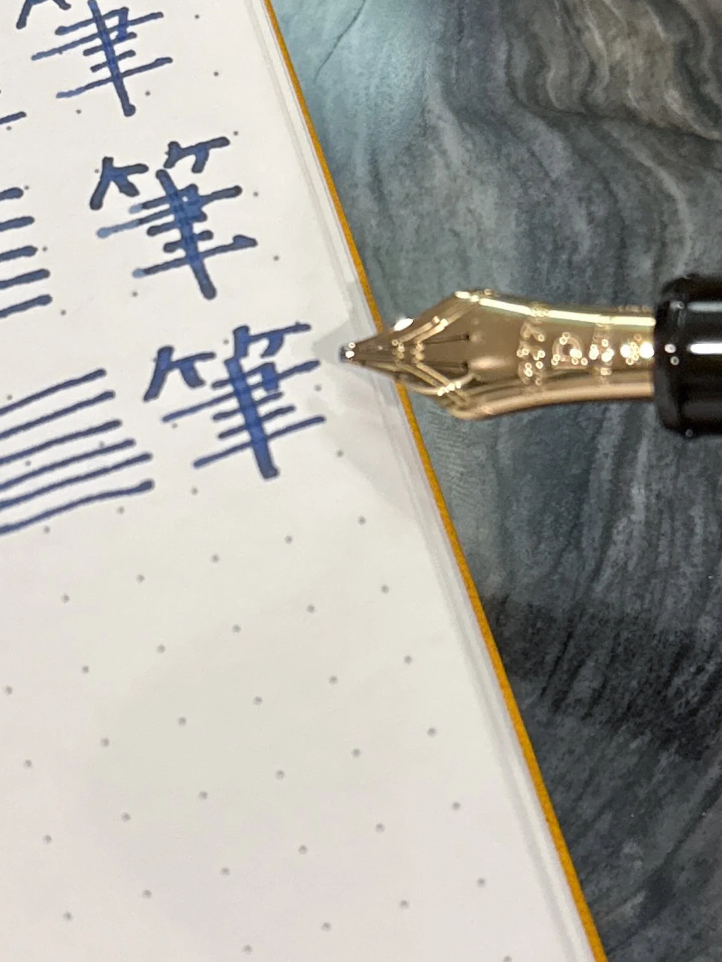
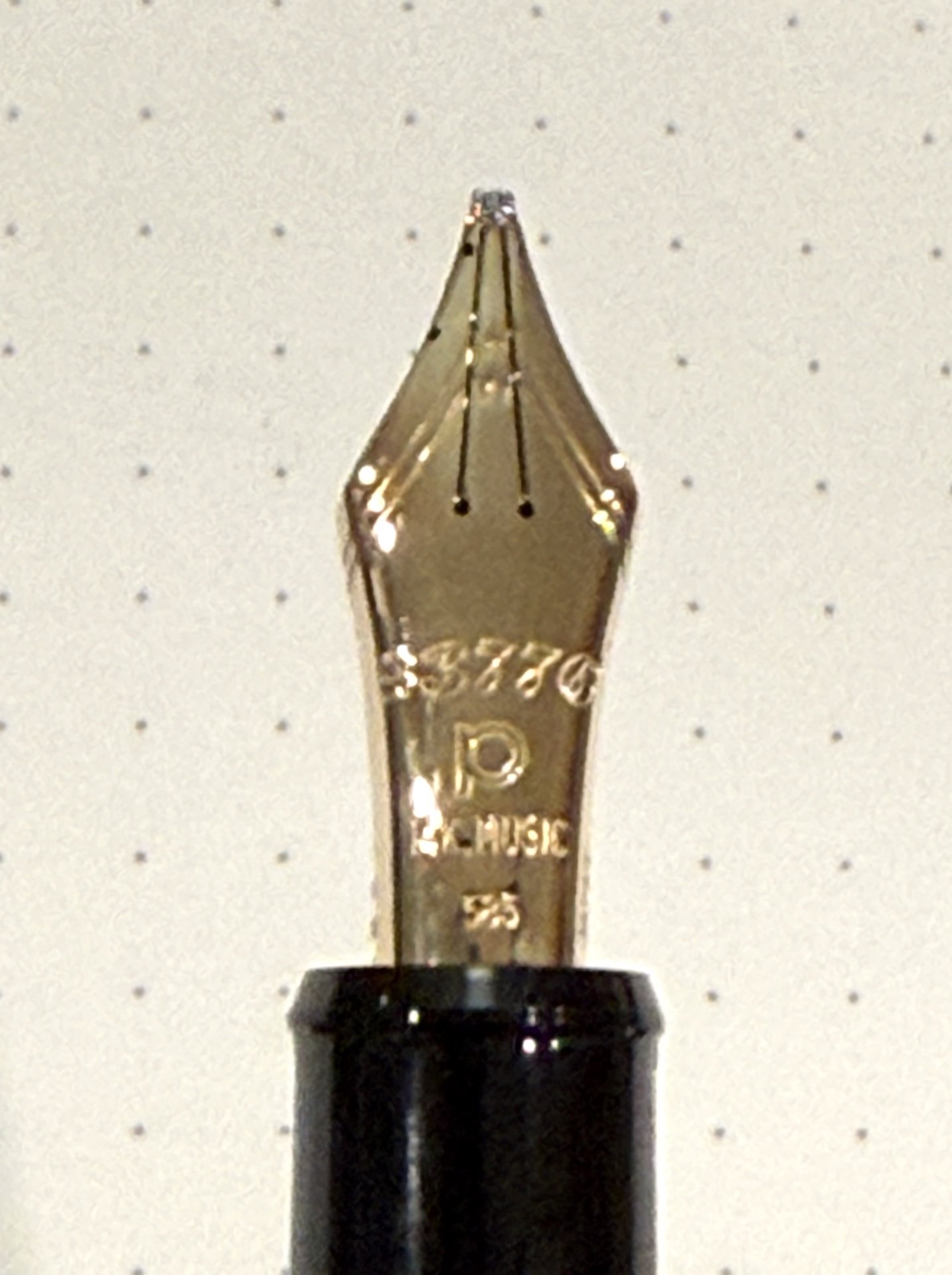
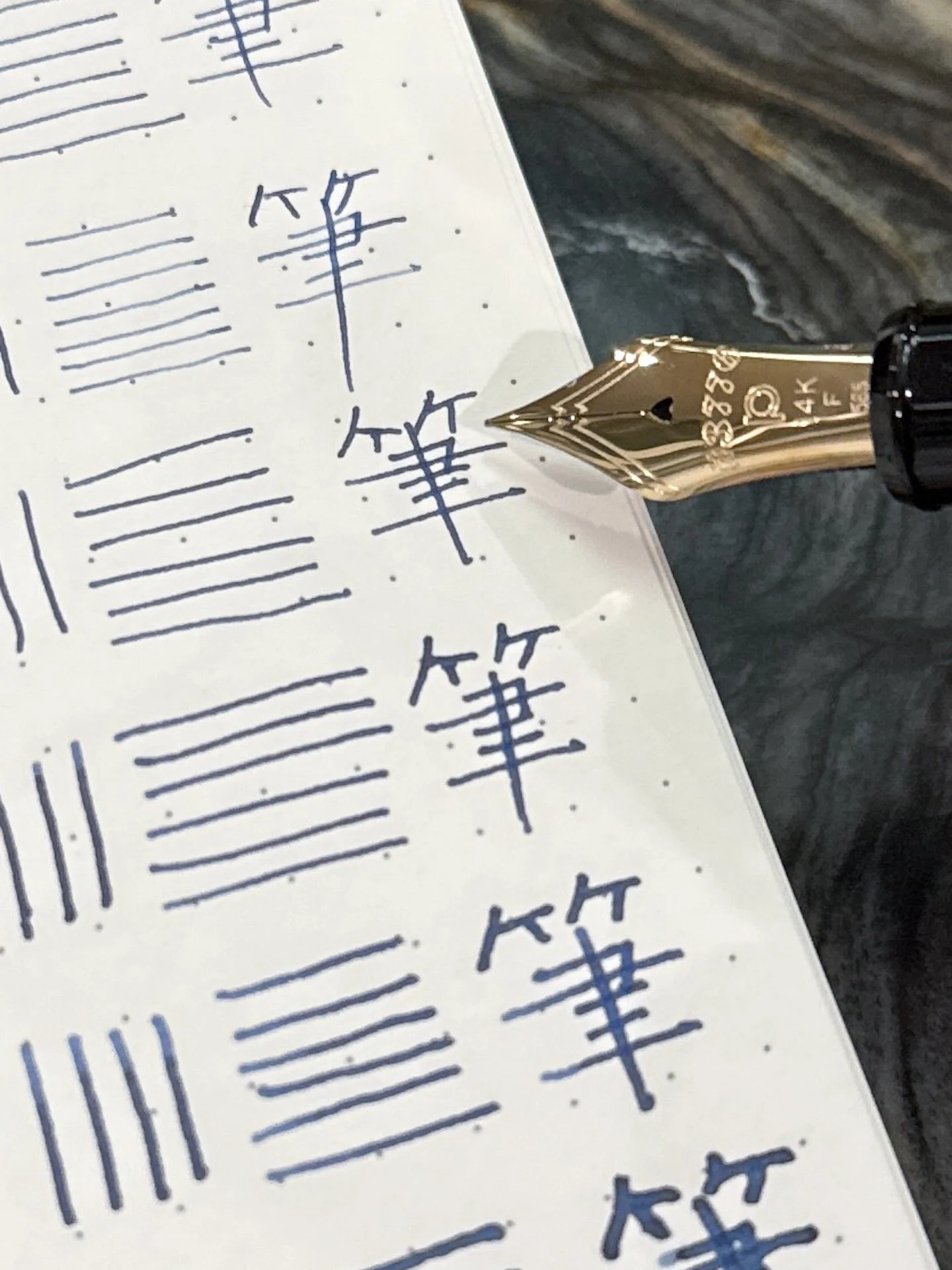
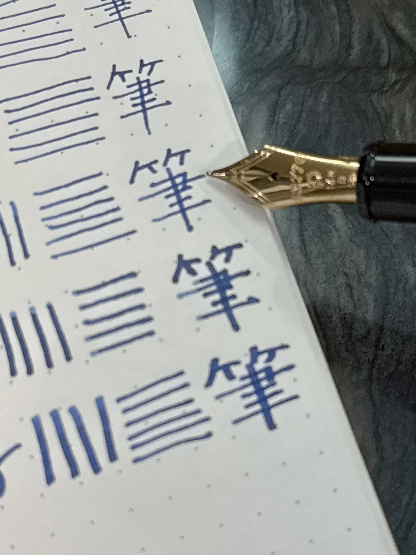
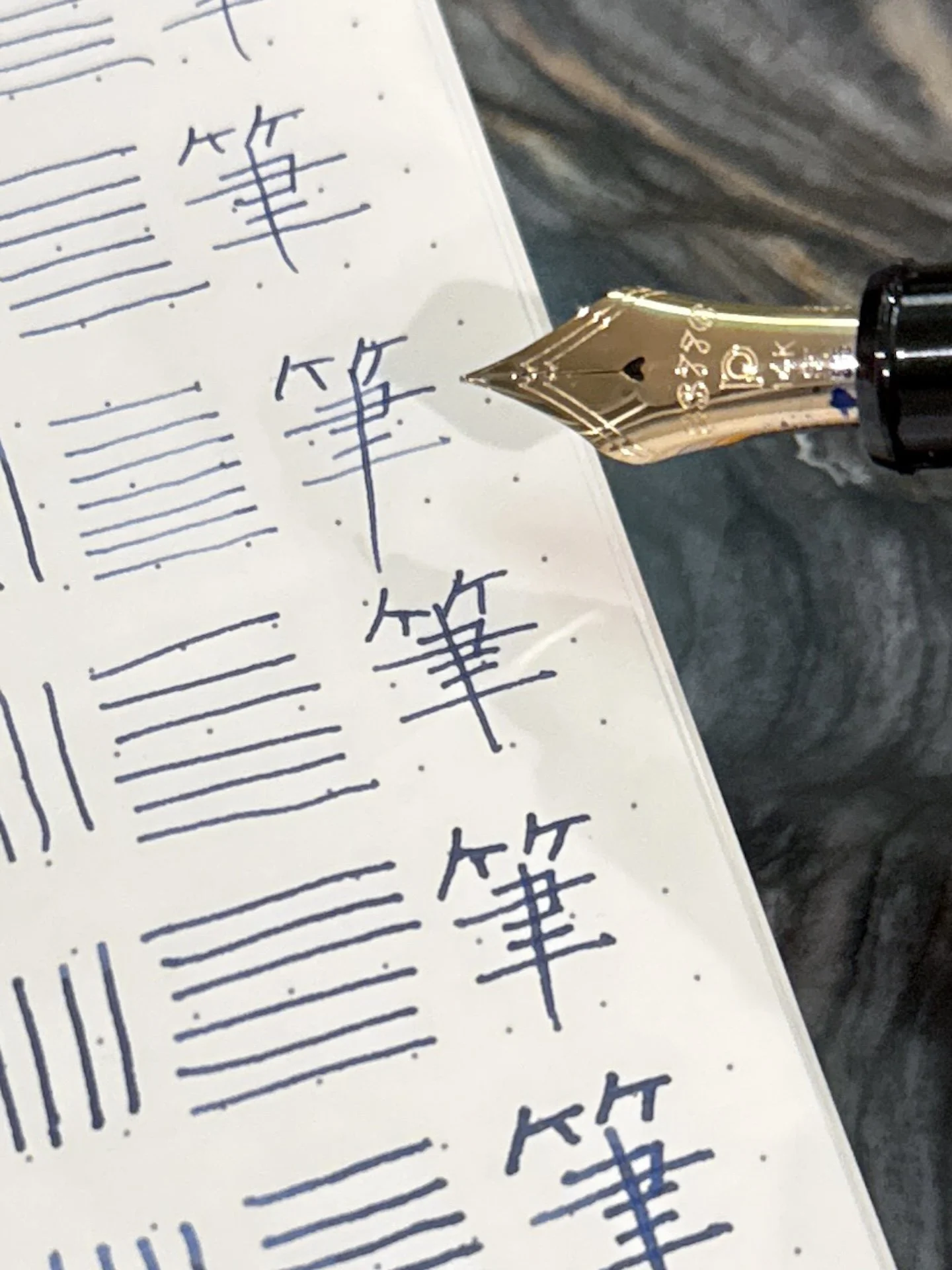
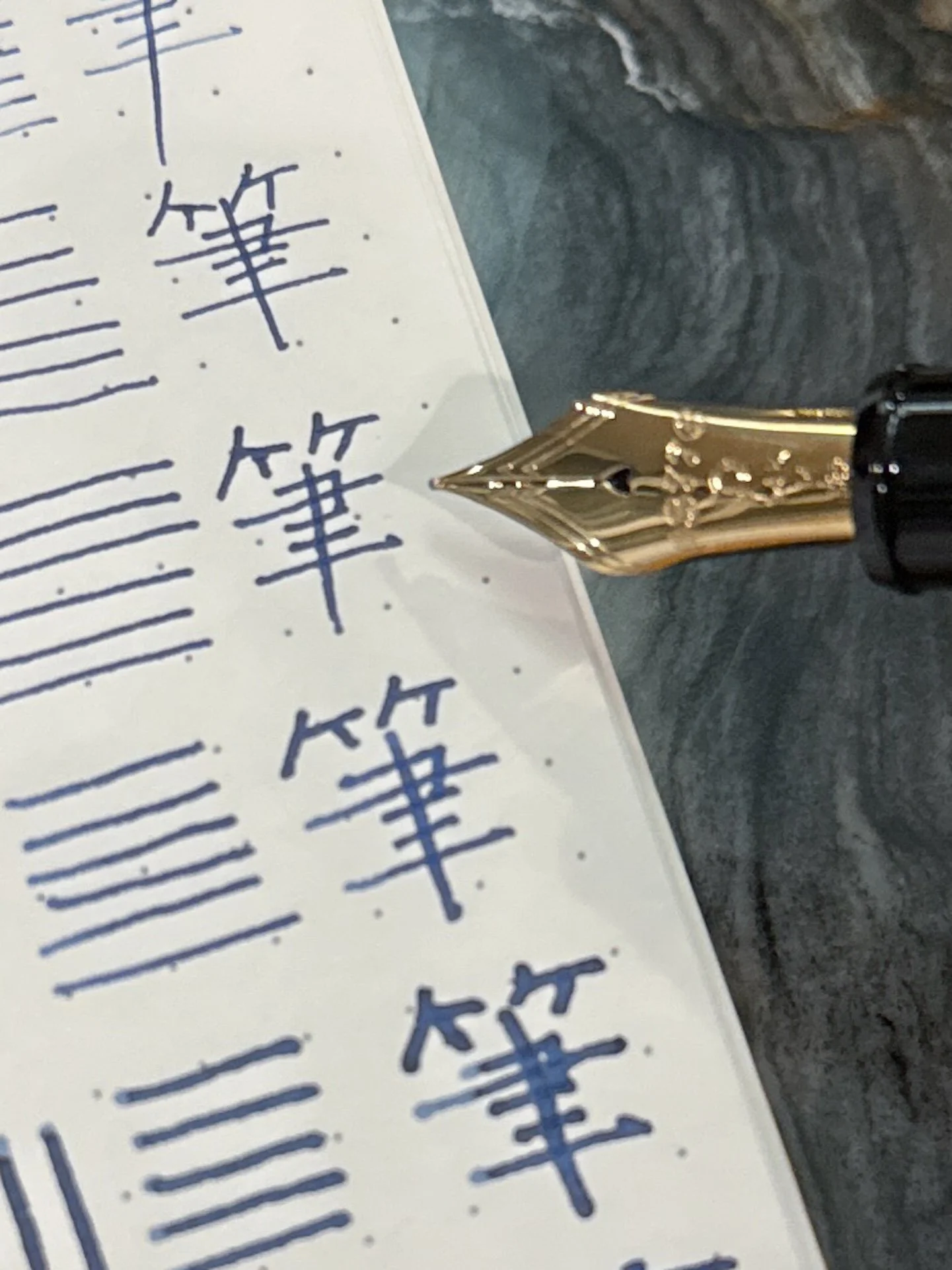
— 3+3+3+1 (Line Variation)
Watch:
— MD Event at Wonder Pens (Gourmet Pens)
— The Perfect Every Day Writer? Aurora Optima Fountain Pen Review (The Offstage Me)
— The Planner Bridge I Didn't Know I Needed (Mark Your Pages)
— I’m happy in my midori hibino… but what if I wasn’t? - YouTube (Little Coco Studio)
— Unboxing the Onoto Magna Ceramic Prototype And Filling It With New Amarillo Stationery Ink (DWRDNET)
— Sheaffer Legacy (Figboot on Pens)
— An Awesome & Mysterious Green is Lurking In My Collection: Anderillium Moray Eel (Inkdependence)
Want to catch the rest, plus extra articles, reviews, commentary, discounts, and more? Try out a Pen Addict Membership for only $5 per month!