(Kimberly (she/her) took the express train down the fountain pen/stationery rabbit hole and doesn't want to be rescued. She can be found on Instagram @allthehobbies because there really are many, many hobbies!.)
One of the (many) things I bought at the 2025 SF Pen Show was the Yamamoto Bullet Jotter and I couldn’t wait to try it out.
The Bullet Jotter comes from Yamamoto Paper, the folks who brought us the Yamamoto Paper Fountain Pen Friendly Paper, Washi Paper Tasting (among other paper tasting packs) Ro-Biki notebooks, and so much more. Taizo Yamamoto, the paper genius behind Yamamoto Paper, has come out with a new creation, this time it’s not paper, but something to hold your notes. Enter, the Bullet Jotter, named in part for the bullet/dot mark at the beginning of lists or bullet points along with the verb “jot” (to take a quick note) and “jotter”, one who jots.
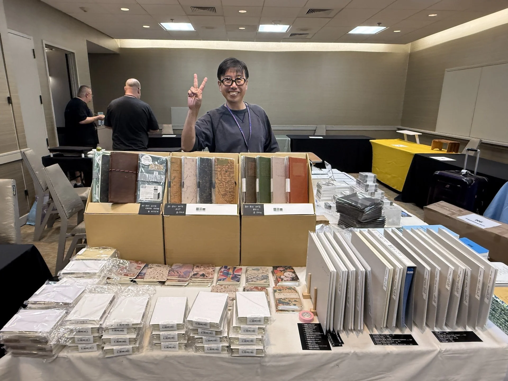
Taizo Yamamoto at the 2025 SF Pen Show.
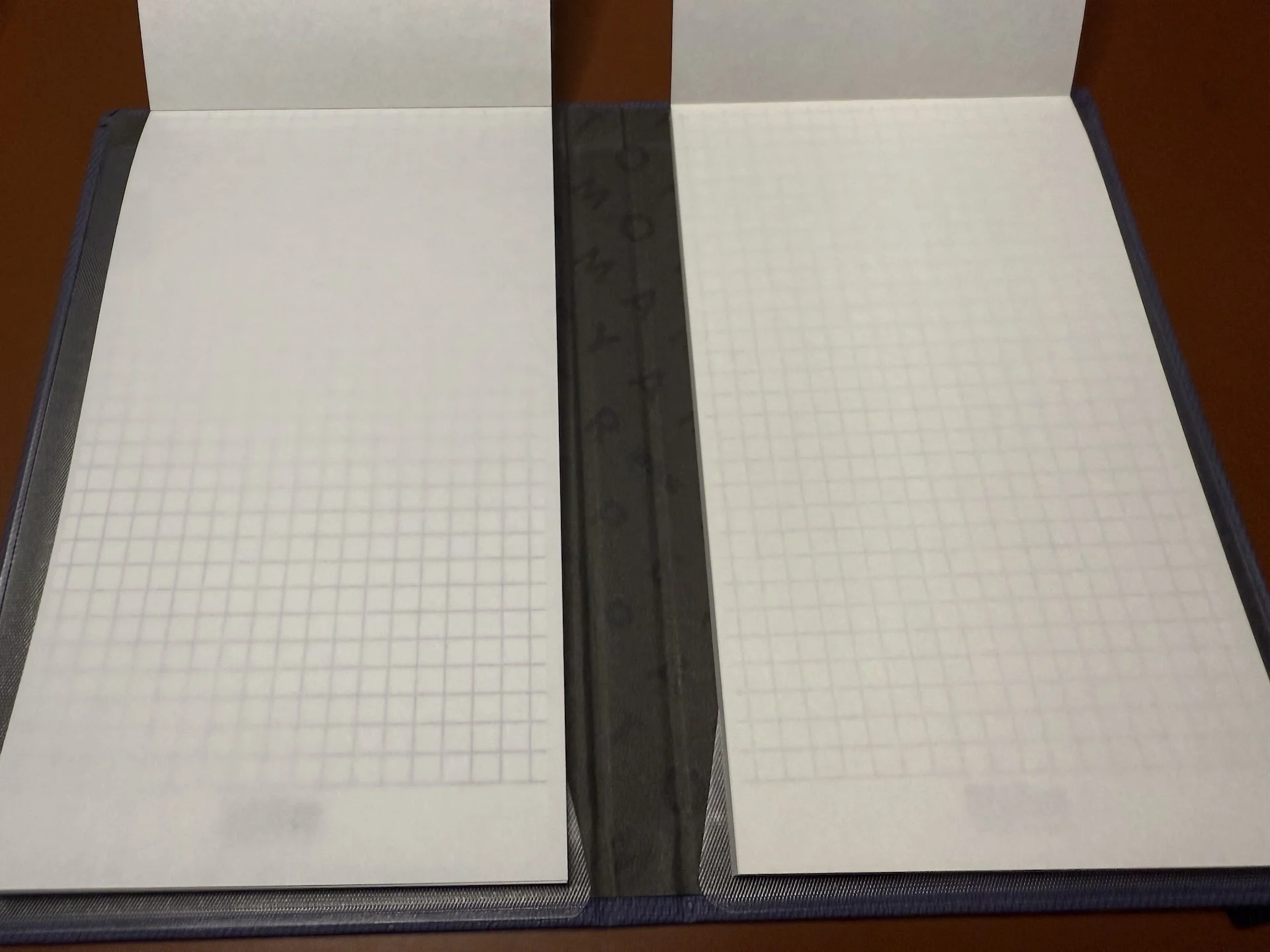
The Bullet Jotter has a textured cover that feels almost like a combination of fabric and paper. The cover is stiff and flexible - kind of like cardboard or pliable plastic. It measures 4.5" × 7.2" × 0.6” (115 mm x 183mm x 15mm). Inside, there are two plastic slots which hold your Bullet Paper pads, one on each side. The cover lays flat when open, and isn’t meant to be folded backwards (I could sorta bend it backwards a bit but I didn’t want to damage it).
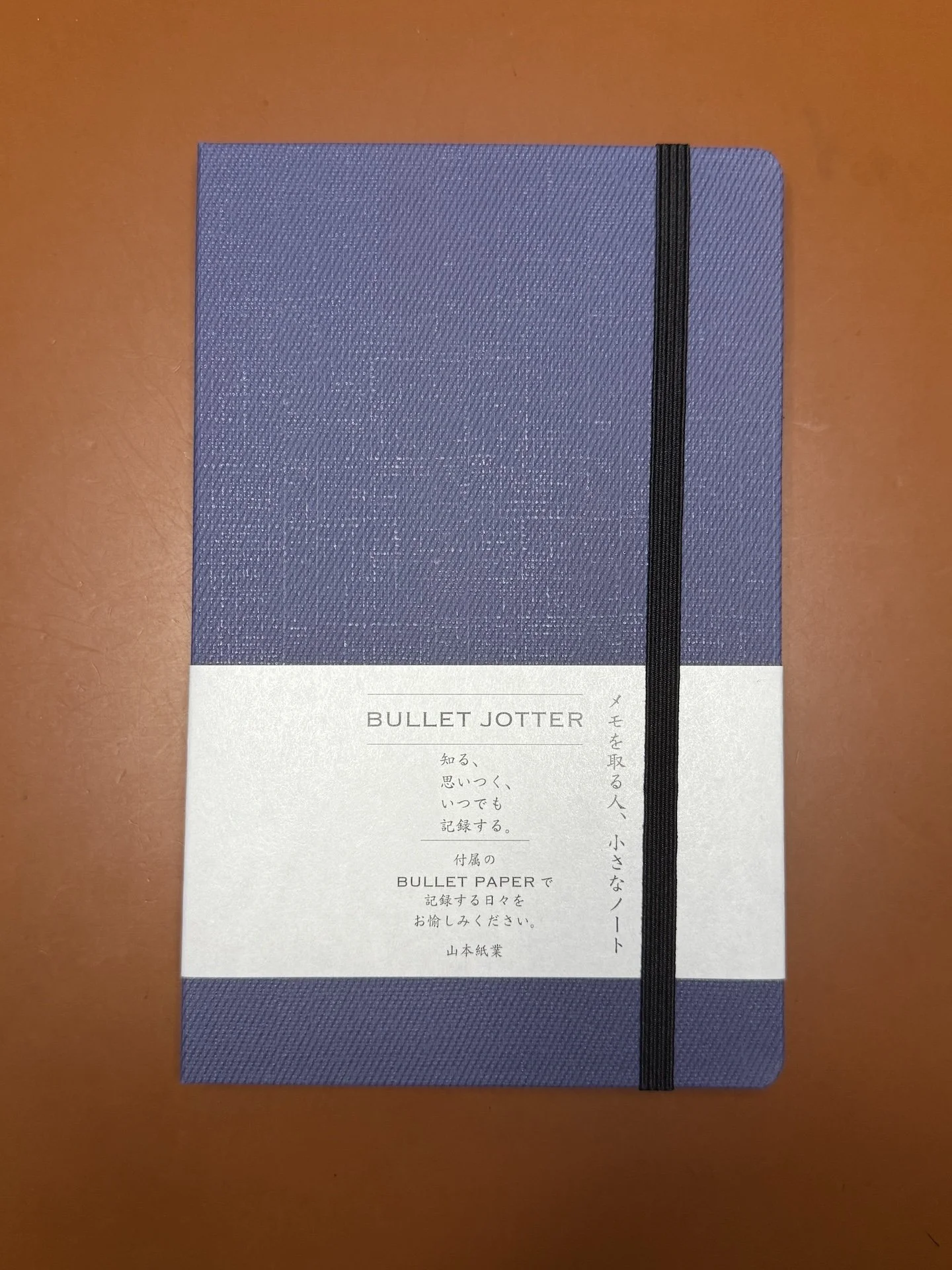
The Bullet Jotter in Gabardine Royal Blue. It is also available in Gray and Black. The elastic holds the Bullet Jotter closed when not in use.
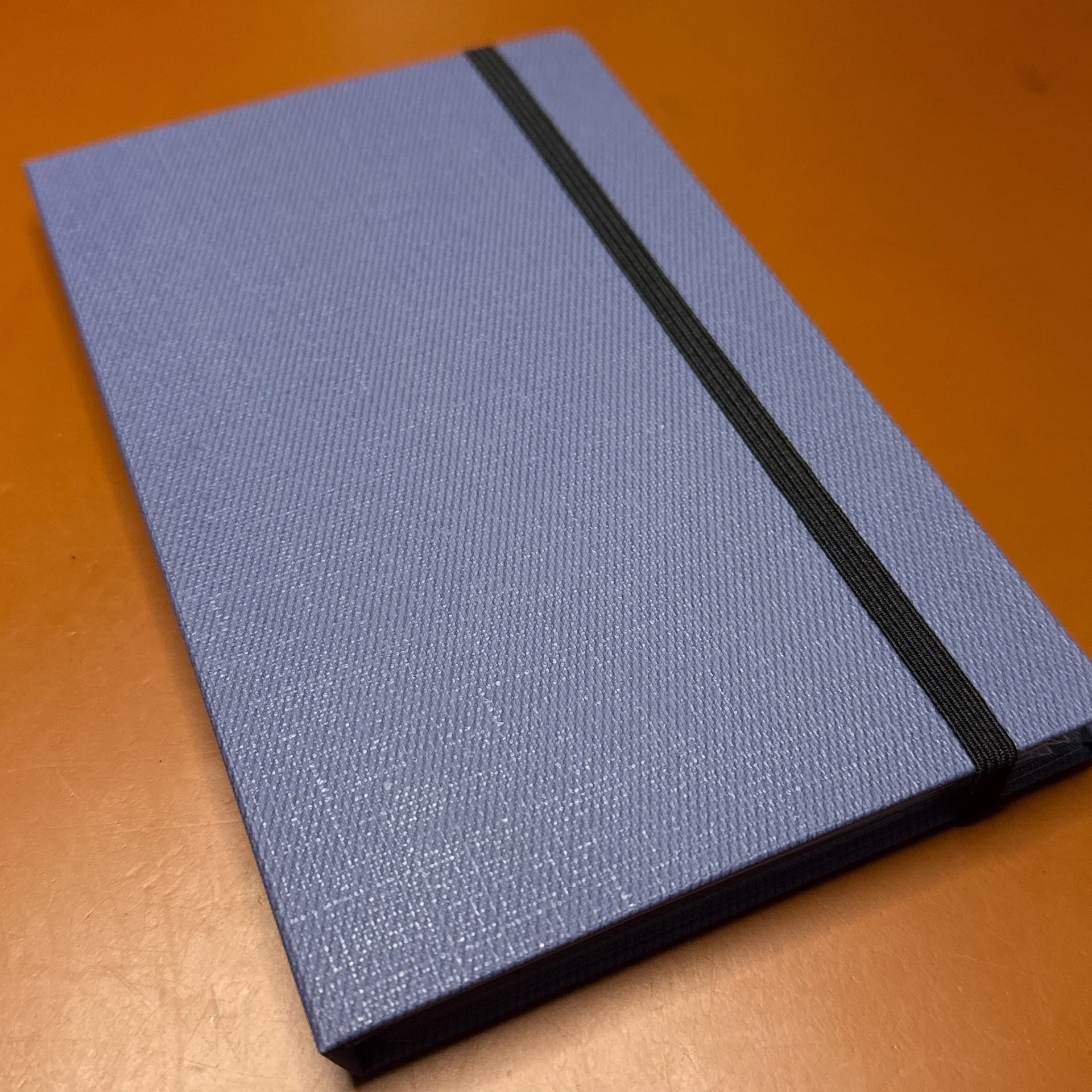
When viewed at an angle, you can see the texture of the Bullet Jotter.
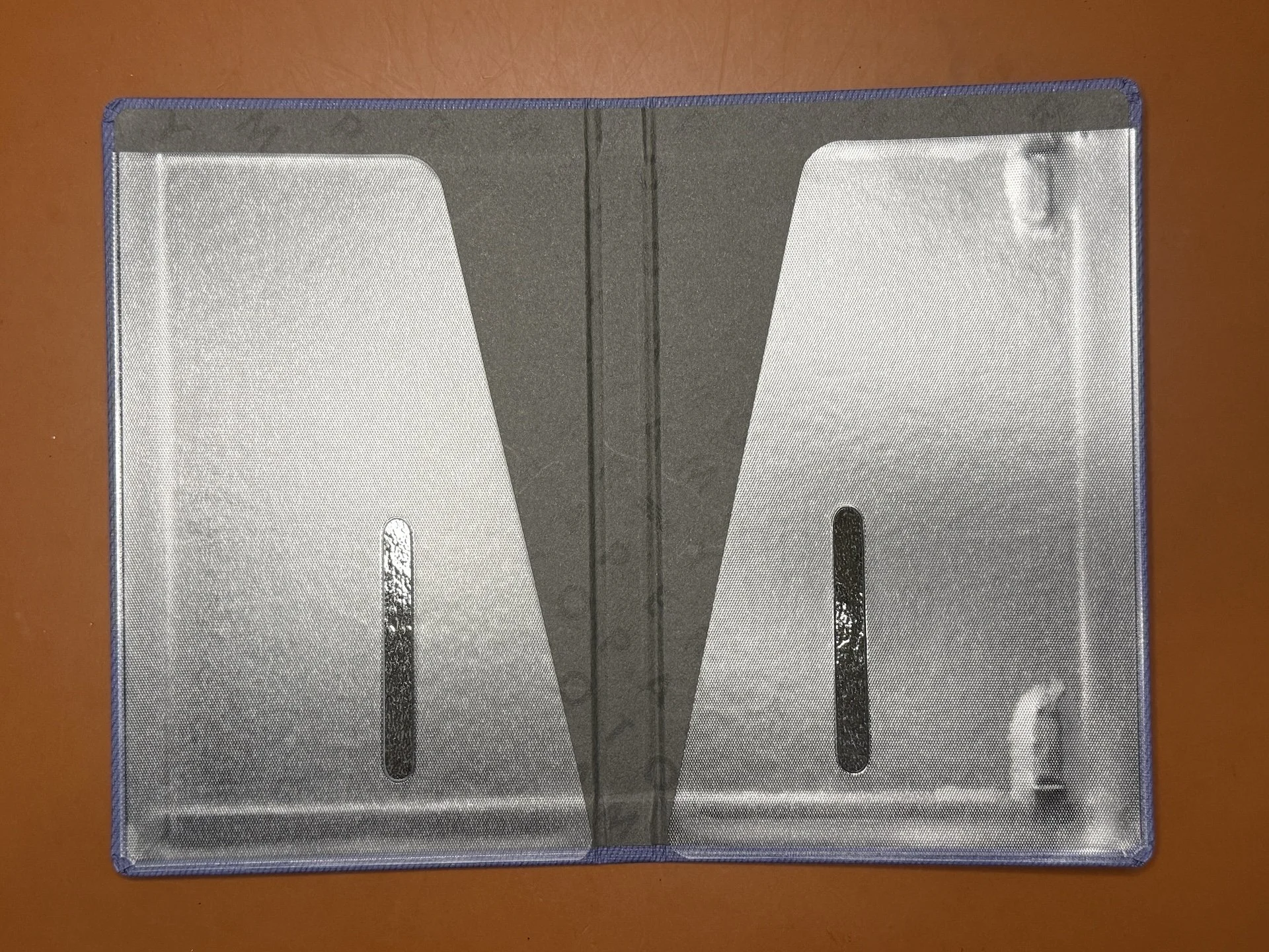
The interior flaps/slots hold the Bullet Paper pads. Because each flap isn’t secured on both sides, there is some wiggle room for the pads to move around a bit. You can also use a pad on one side, and store loose pages on the other.
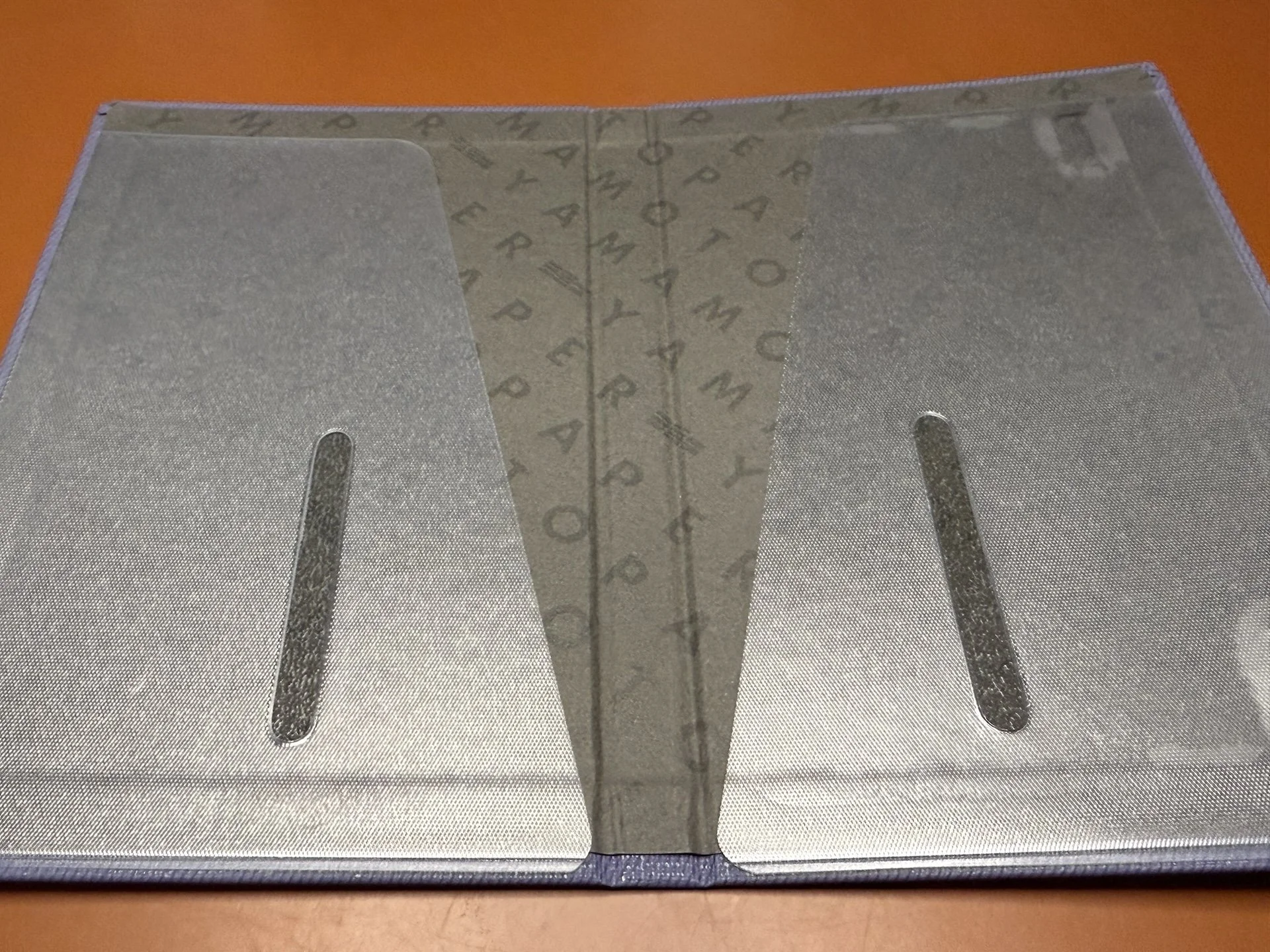
The black interior has a subtle Yamamoto Paper watermark.
The Bullet Paper pads are approximately 3.75” x 6.75” (95 x 170mm), more commonly known as personal or Bible size. There are 6 different paper options for the Bullet Paper pads, all of which are blank:
- Sanzen Tomoe River S, 52gsm, 50 sheets
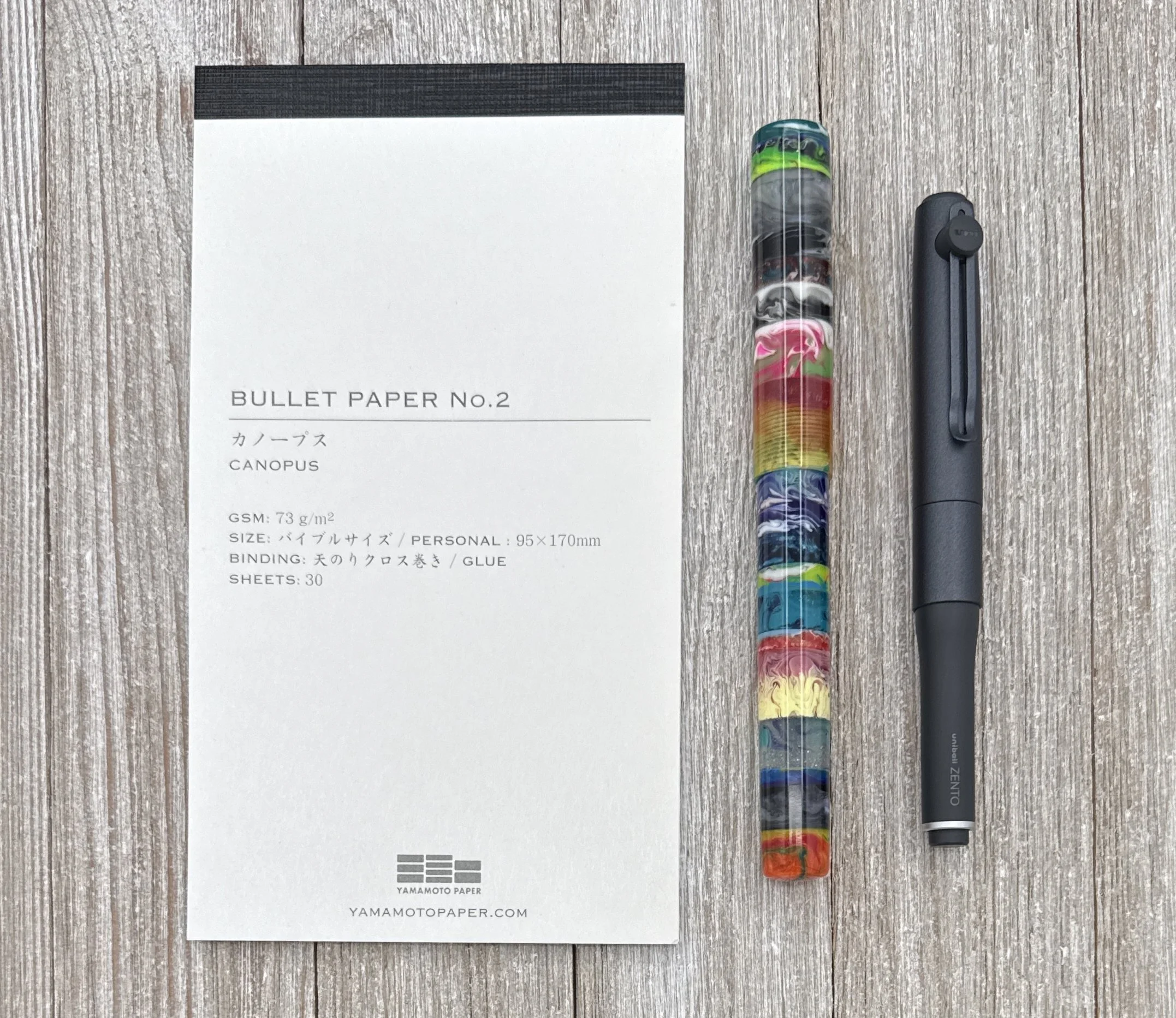
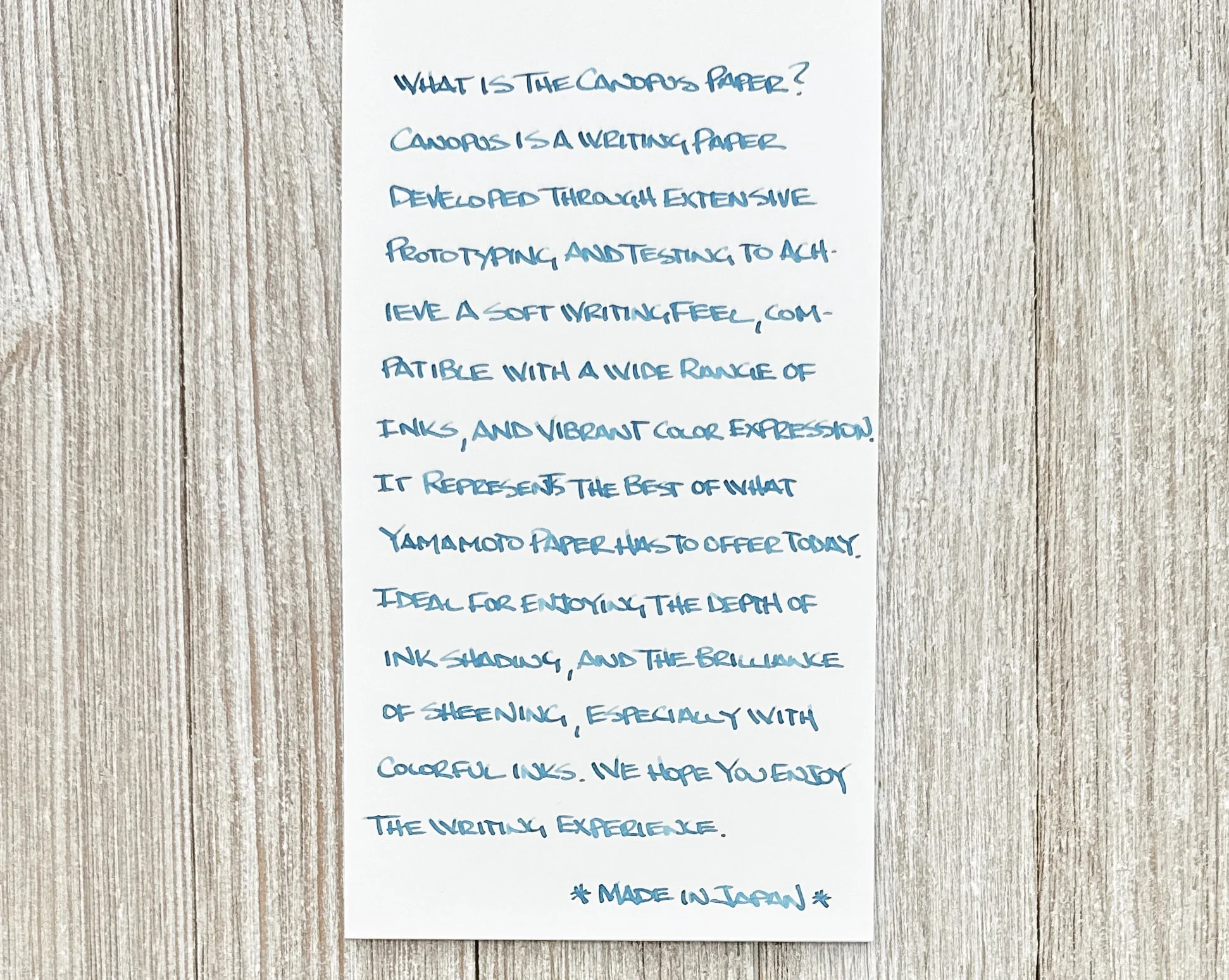
- Canopus, 73 gsm, 30 sheets
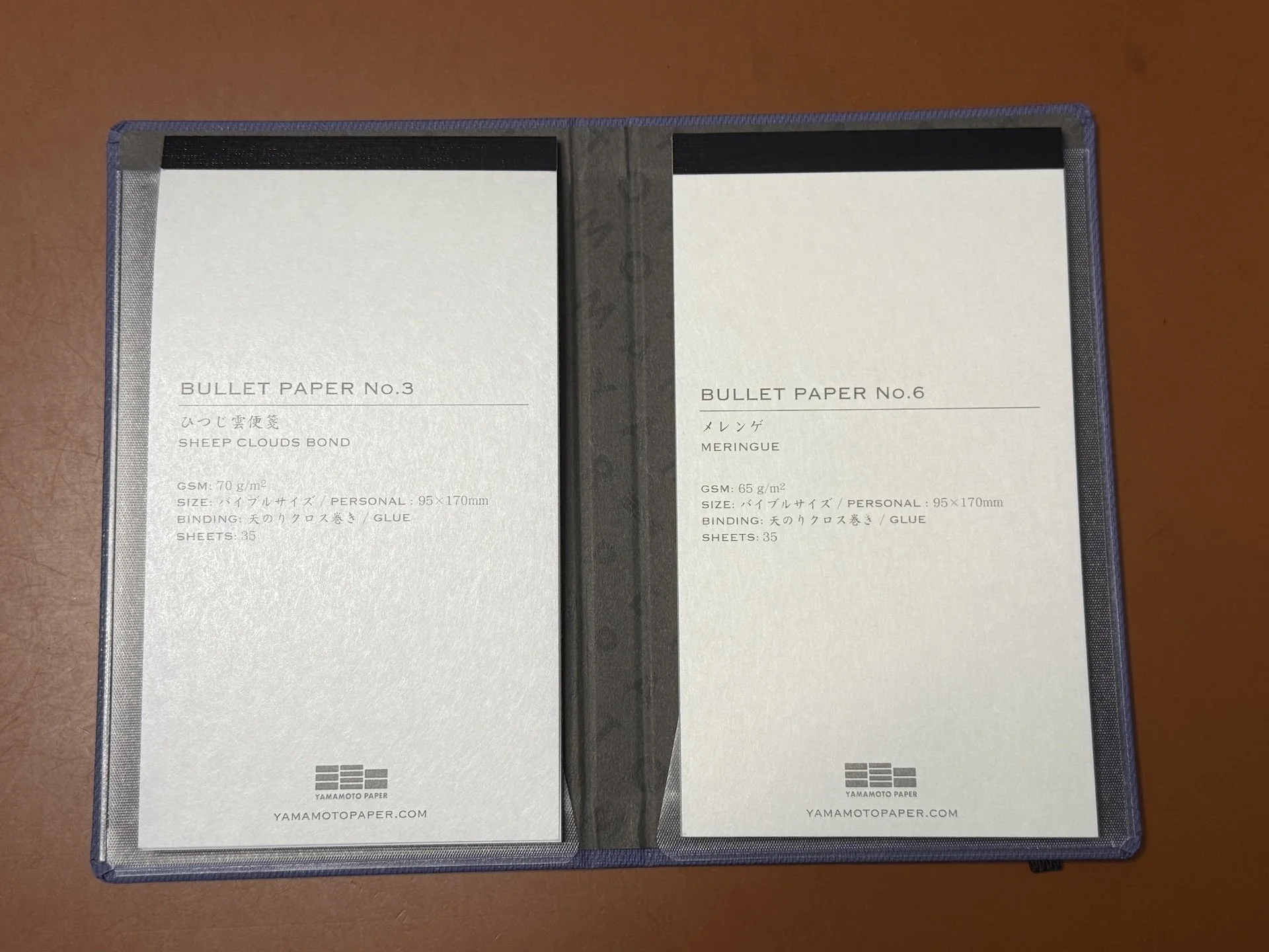
- Sheep Clouds Bond, 70 gsm, 35 sheets
- Soliste, 65 gsm, 35 sheets
- Slight White, 81.4 gsm, 30 sheets
- Meringue, 65 gsm, 35 sheets
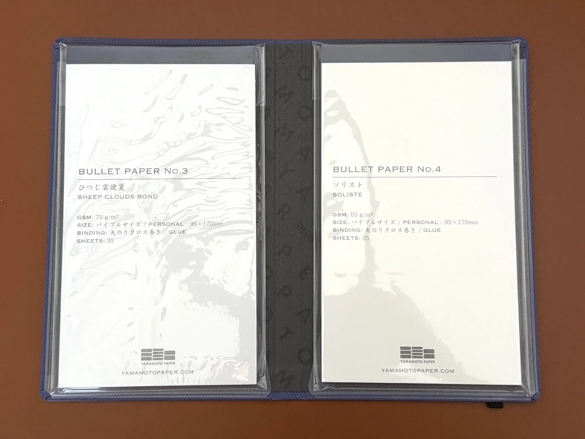
The Bullet Jotter comes with Bullet Paper pads #3 and 4.
In addition to the ones included with the Bullet Jotter, I bought all of the other ones, except for Slight White, which I didn’t love as much when I reviewed it. Since the Bossman already did a review of Canopus, I decided to test the Sheep Clouds Bond and Meringue papers, both of which are new to me.
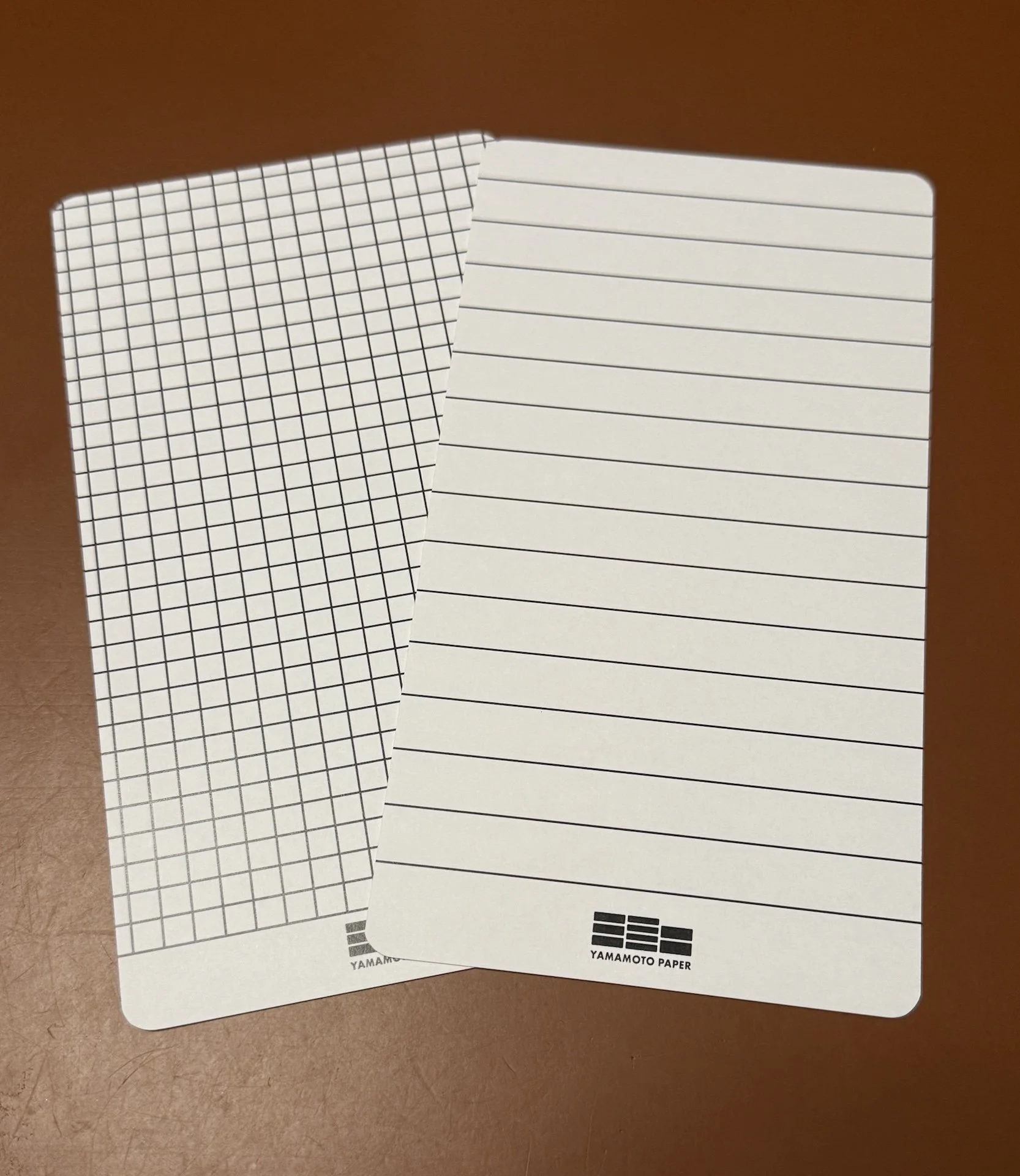
Each pad of paper comes with a double-sided guide sheet (5mm grid & 10 mm lined).
Sheep Clouds Bond (left) and Meringue (right).
Even though Sheep Clouds Bond is 70 gsm, a bit heavier than Meringue’s 65 gsm, you can see the guide sheet more clearly under it than Meringue. I was still able to see both guide sheets easily.
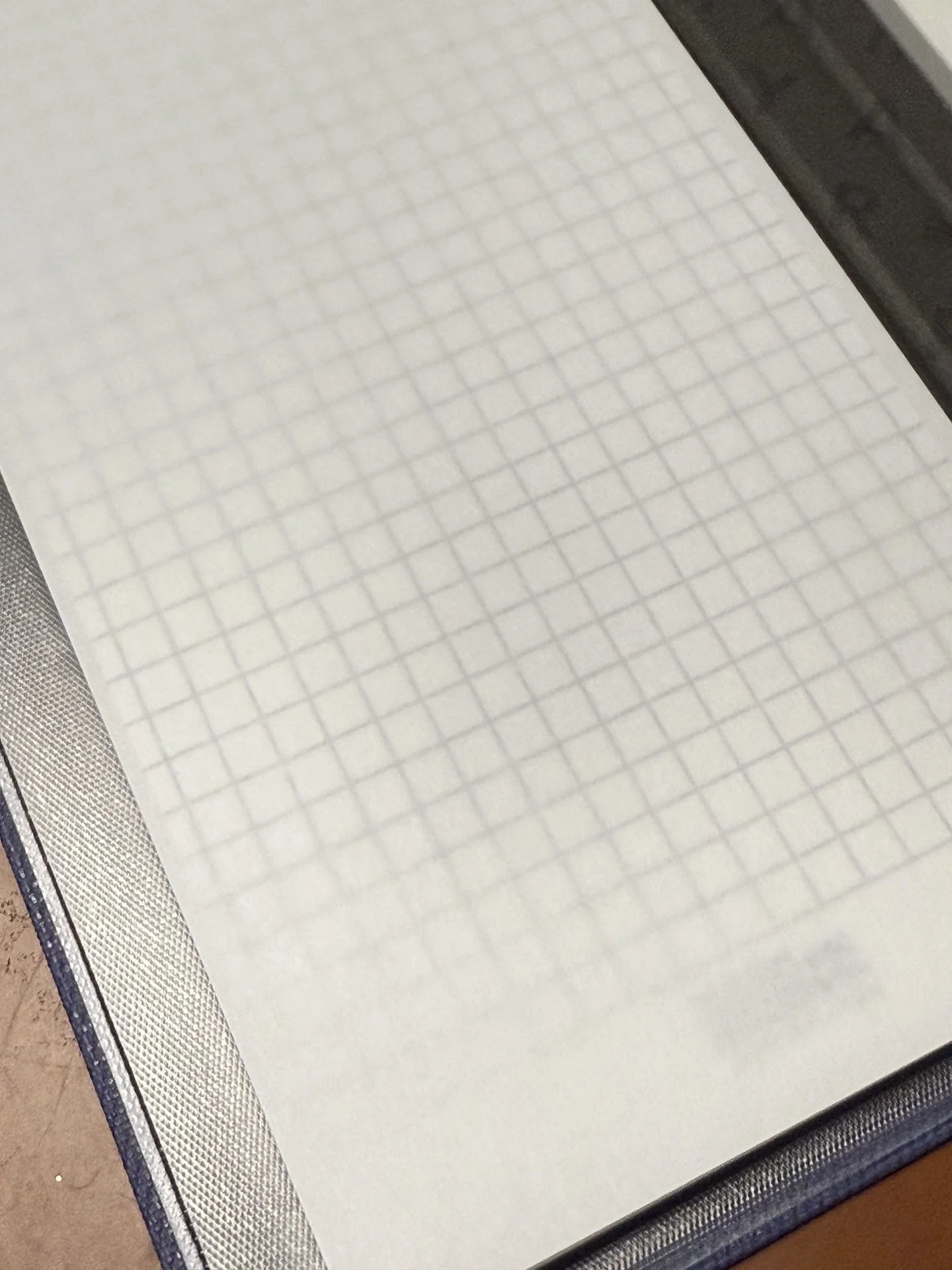
Closeup of the guide sheet under Sheep Clouds Bond.
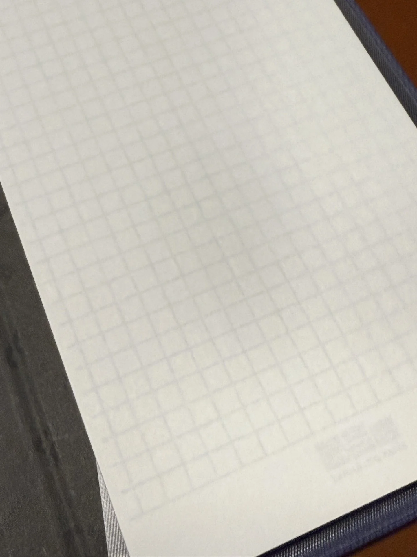
Closeup of the guide sheet under Meringue.

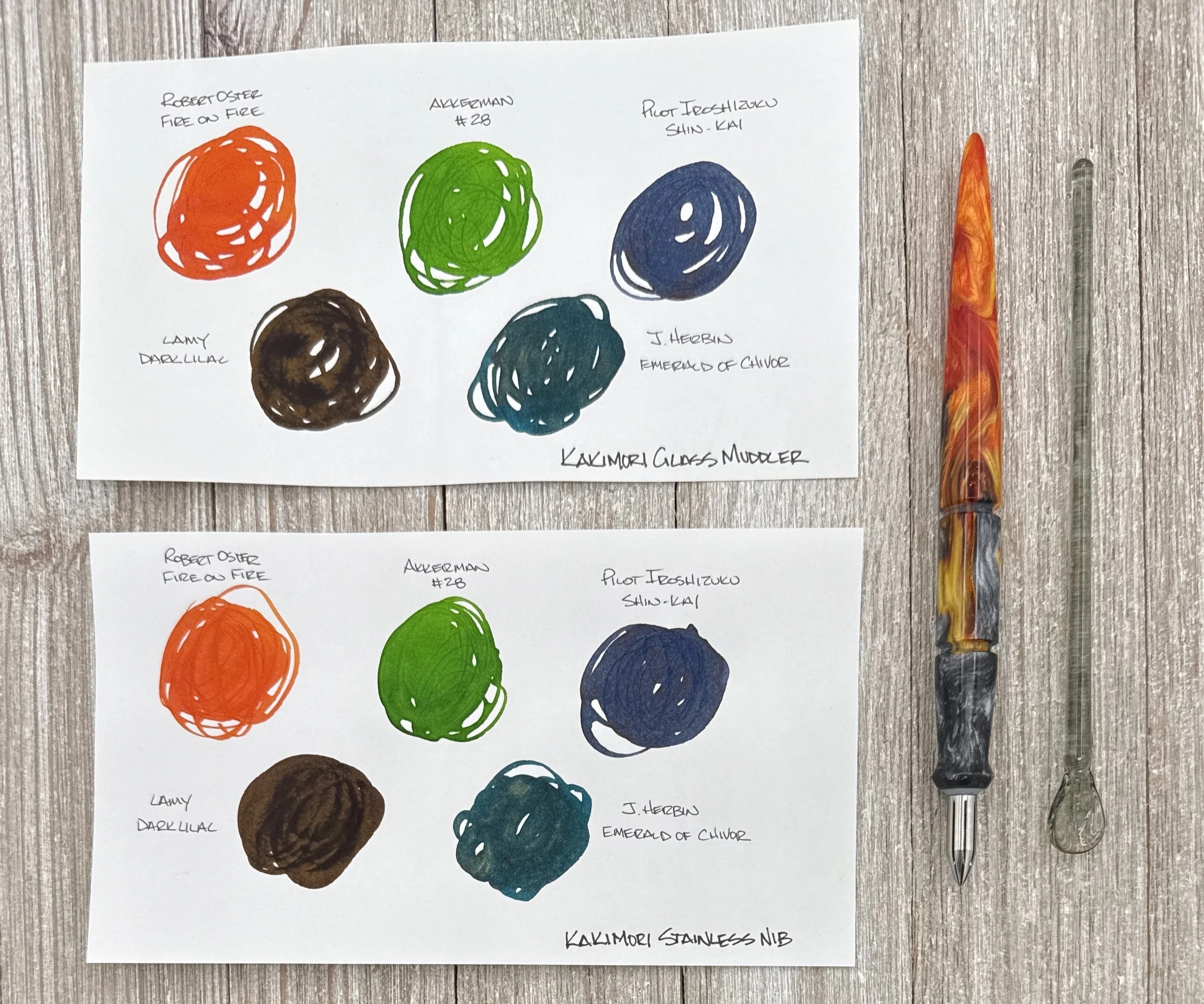
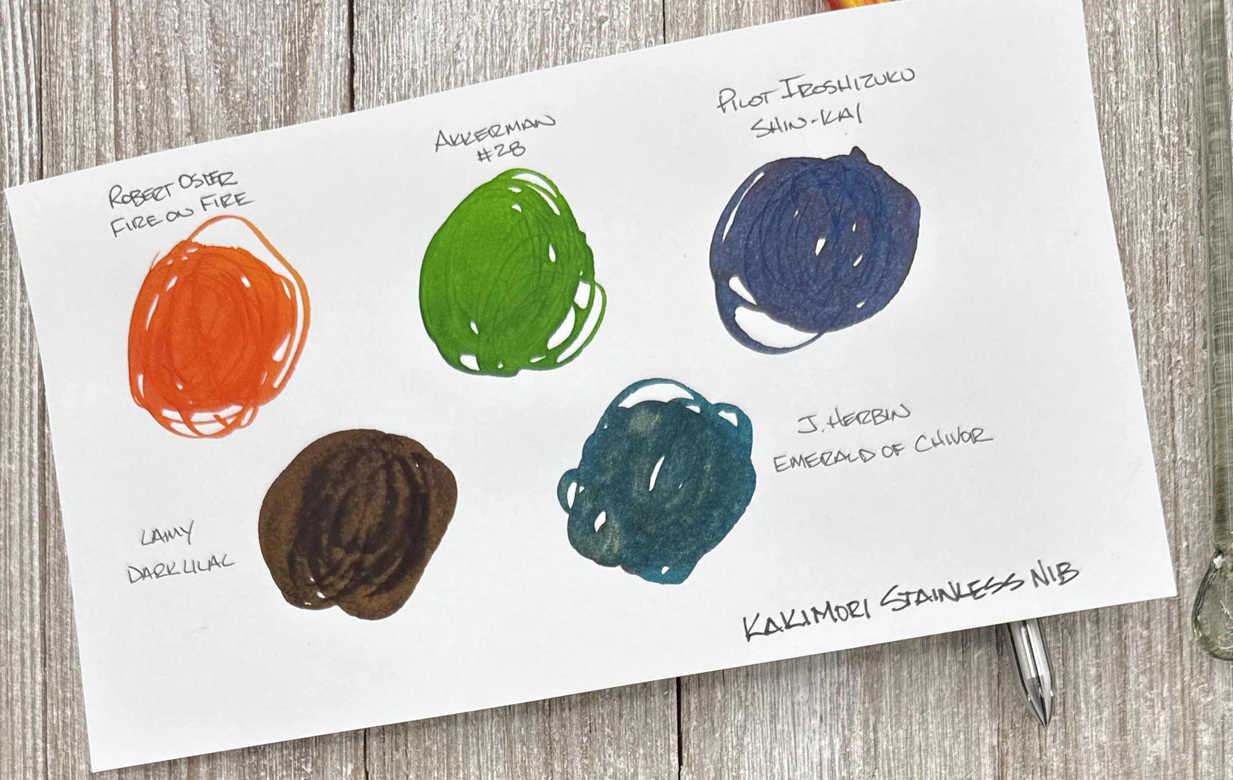
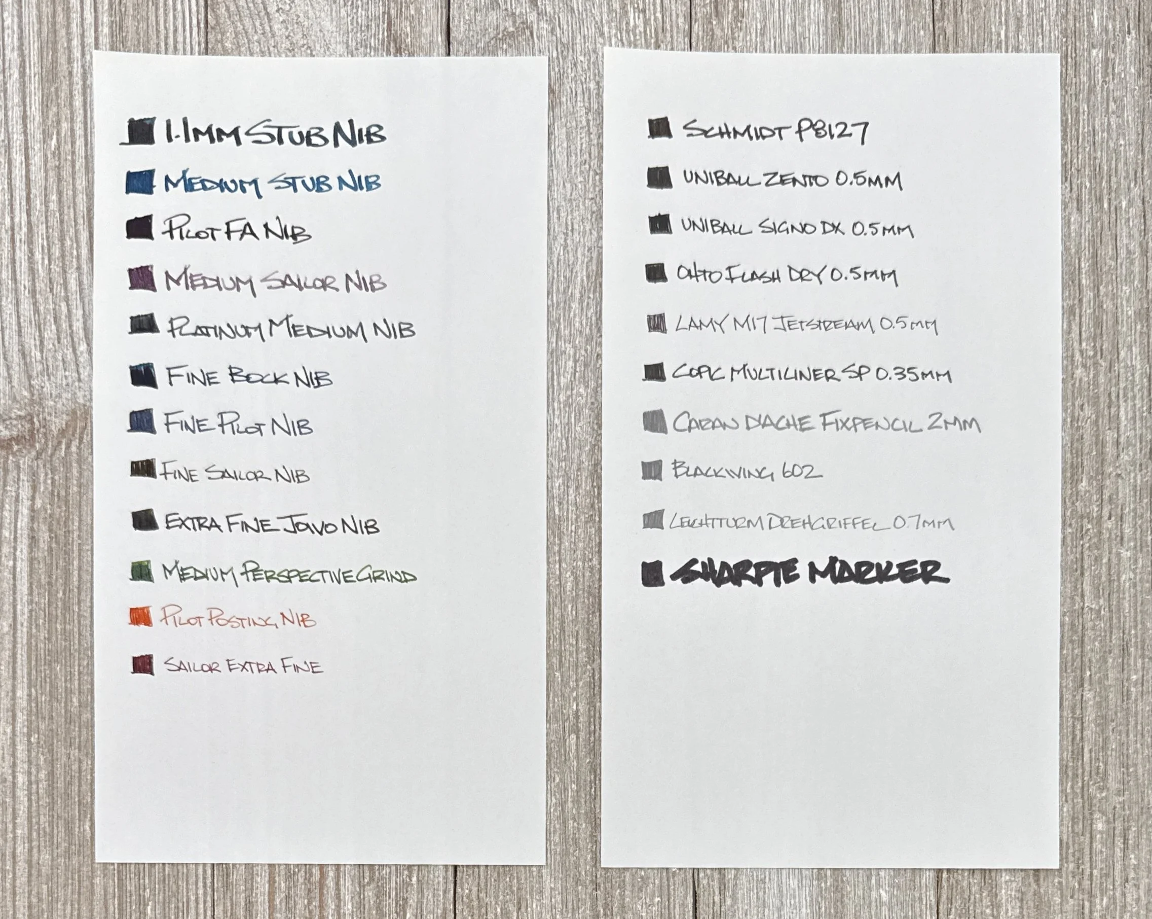
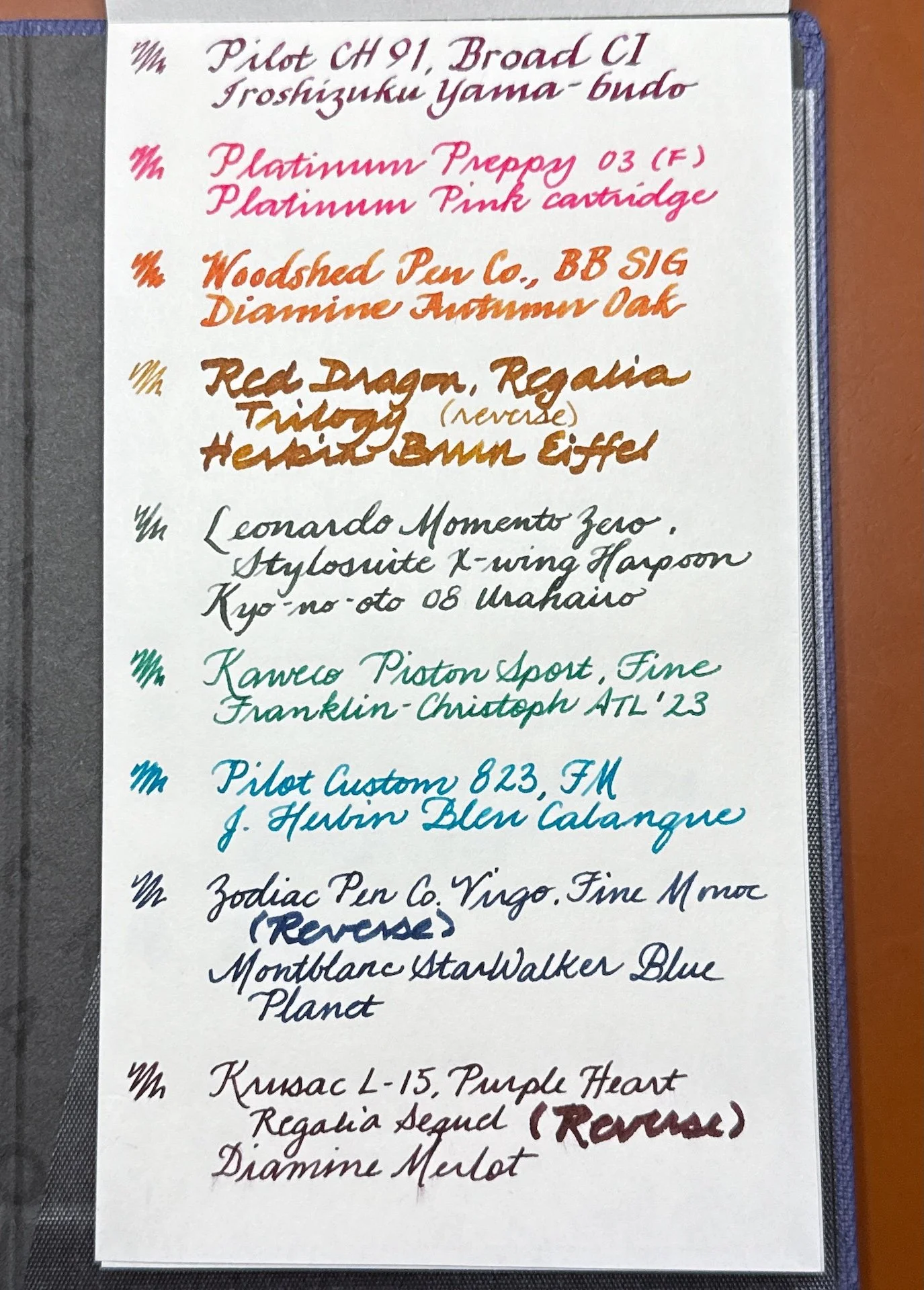
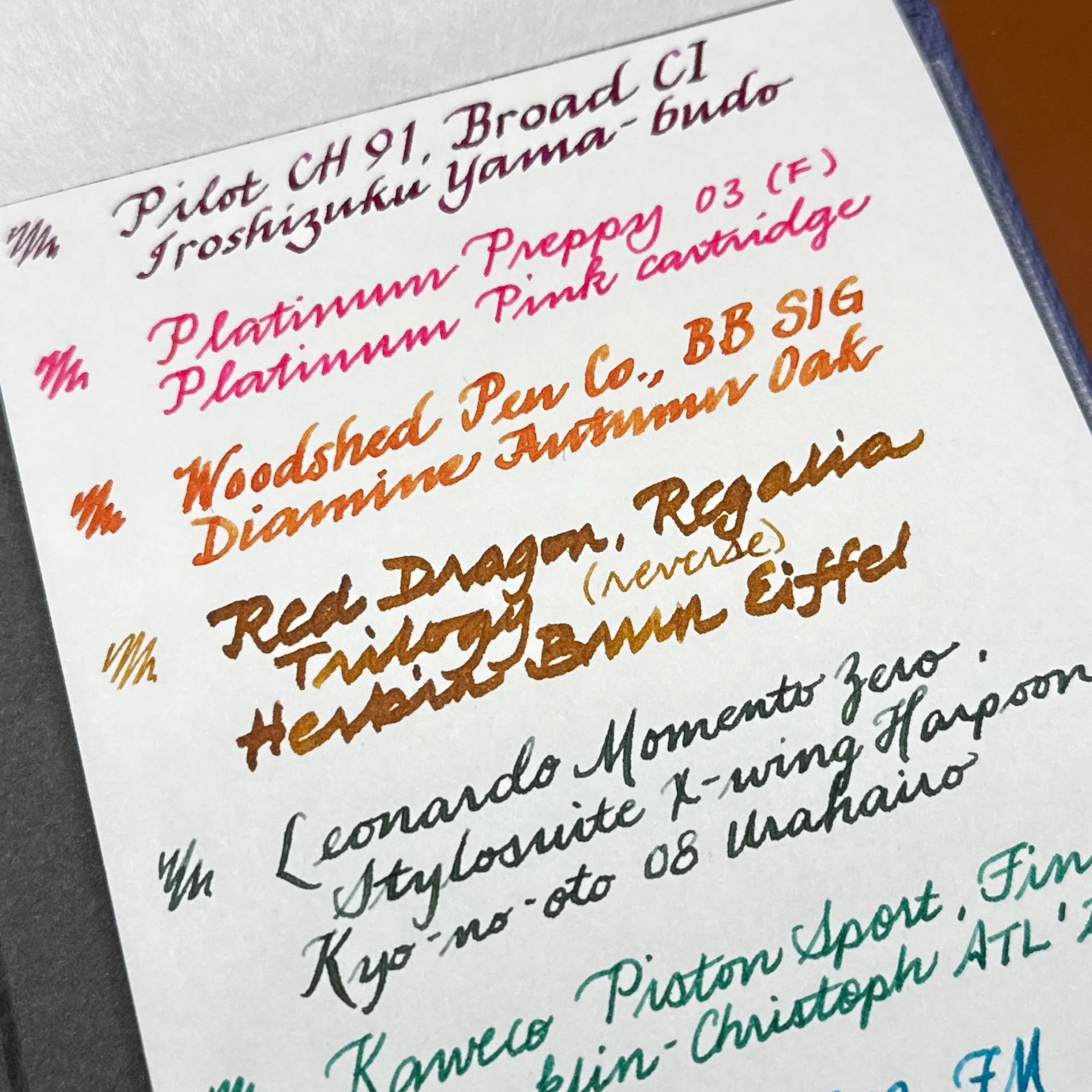
Pens & inks used for writing samples: Pilot Custom Heritage 91, Broad Cursive Italic, Iroshizuku Yama-budo; Platinum Plaisir, 03 (Fine) (ignore that I later wrote Preppy by mistake), Platinum Pink cartridge; Woodshed Pen Co, BB SIG, Diamine Autumn Oak, Red Dragon Pen Co with Regalia Trilogy, J Herbin Brun Eiffel; Leonardo Momento Zero, Stylosuite X-wing Harpoon, Kyo-no-oto 08 Urahairo; Kaweco Piston Sport, Fine, Franklin-Christoph ATL ‘23; Pilot Custom 823 FM, J Herbin Bleu Calanque; Zodiac Pen Co Virgo, Fine Monoc, Montblanc StarWalker Blue Planet, Krusac L-15 Purple Heart, Regalia Sequel, Diamine Merlot.

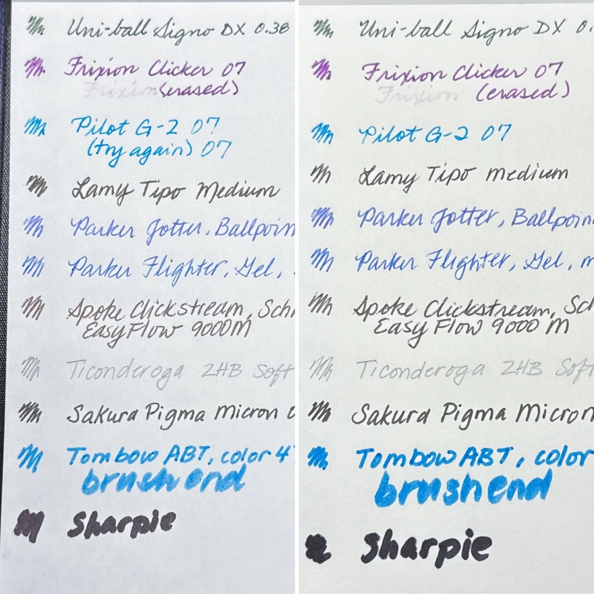
Uni-ball Signo DX, 0.38, Frixion Clicker 07, Pilot G-2 07, Lamy Tipo Medium, Parker Jotter, Ballpoint, Medium, Parker Flighter, Gel, Medium, Spoke Clickstream, Schmidt EasyFlow 9000 M, Ticonderoga 2HB Soft, Sakura Pigma Micron 05, Tombow ABT, color 476, Sharpie.
The Sheep Clouds Bond paper is a white paper that feels similar to Midori (not Cotton). It has a hint of texture while still feeling smooth, but not as slick as Clairefontaine either. For the most part, the Sheep Clouds Bond paper worked well with fountain pens and showed both shading and subtle sheen. It felt fine writing on the paper but occasionally, it felt a little like writing on tracing paper - I noticed this the most with very wet and/or broad nibs.

Fountain pen writing samples on Sheep Clouds Bond.
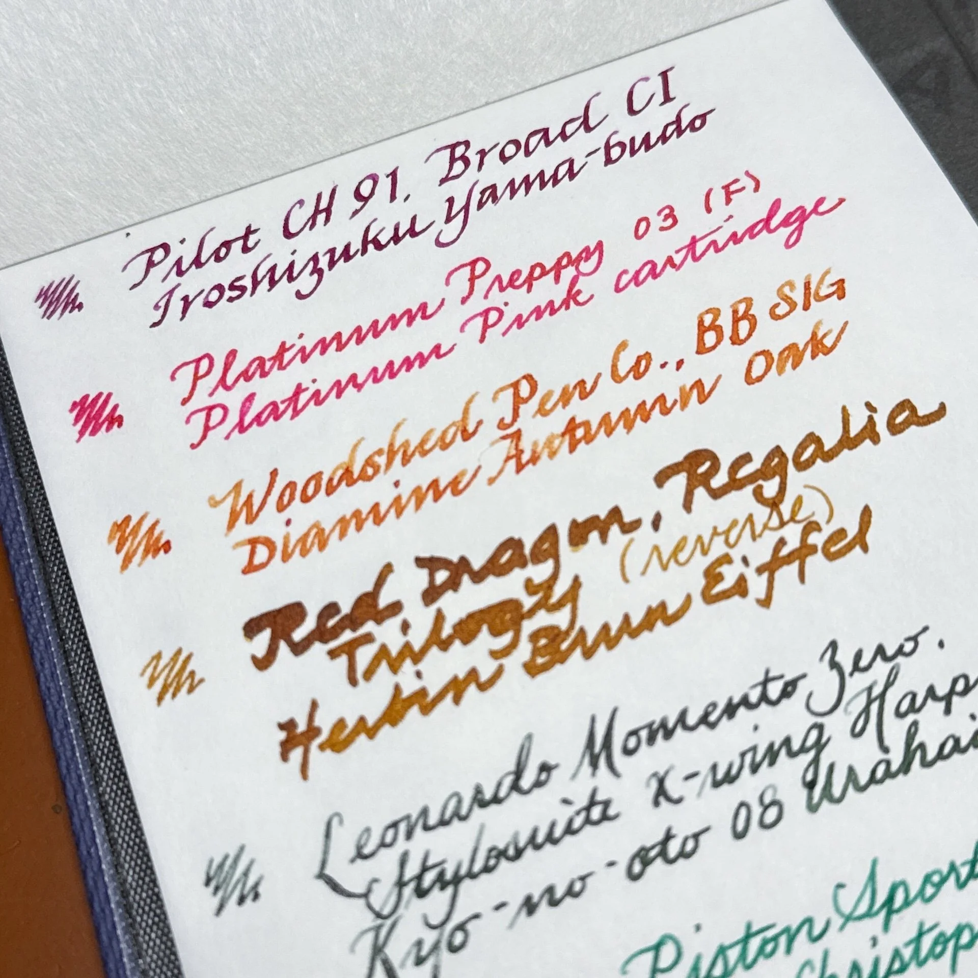
Impossible to photograph but there was a wee bit of sheen with Iroshizuku Yama-budo and Platinum Pink that isn’t visible from my iPhone camera. Love the shading from Autumn Oak. It can handle the dump of ink from the Regalia Trilogy nib but the lines aren’t always crisp (look at the “ogy” of Triology) - almost marker-like.
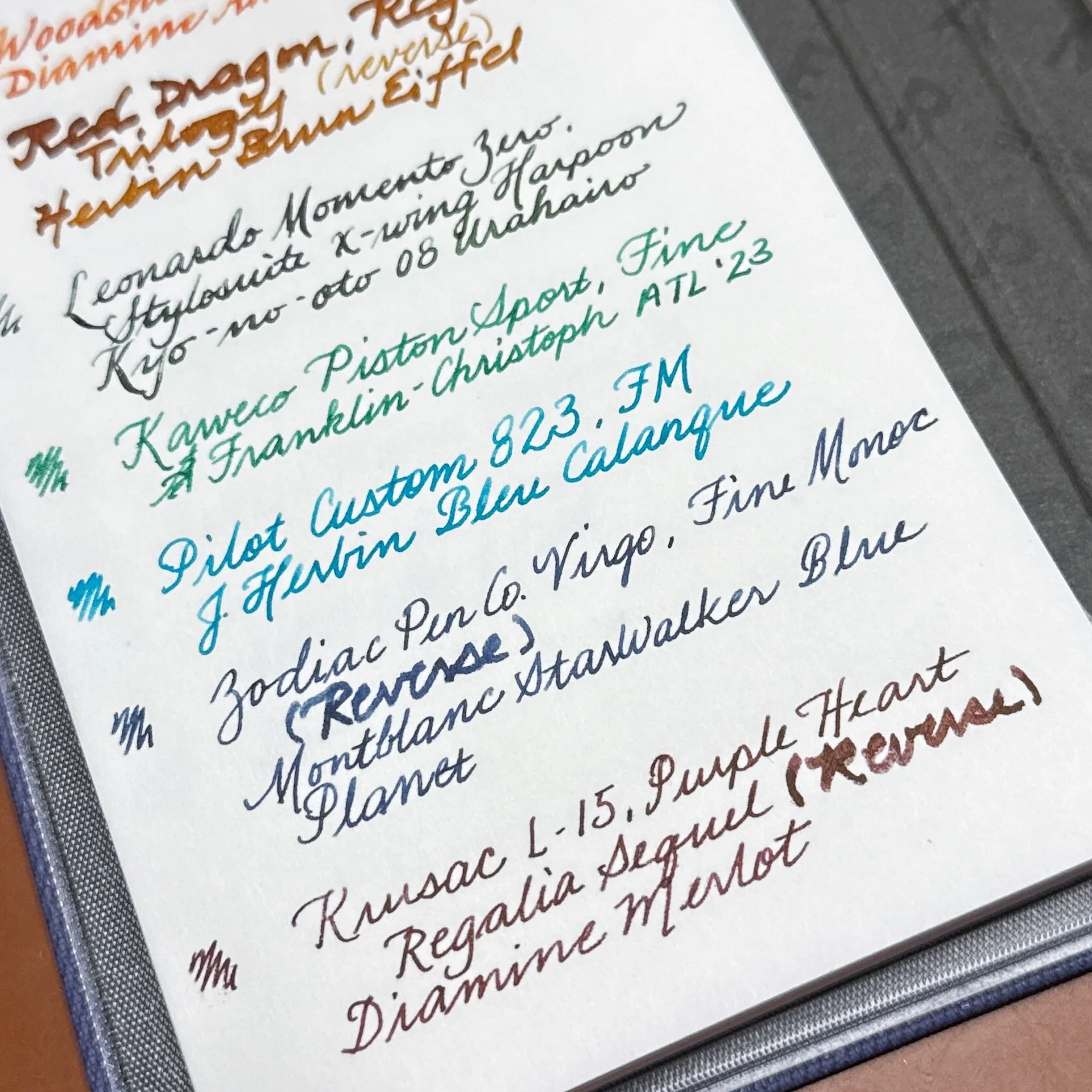
The flex nib on the Leonardo had no problems putting ink down, but you can see a few spots where the paper didn’t want to absorb it. The remainder of the pens were fine but again, both of the wetter reverse sides of the Monoc Regalia Sequel felt a bit draggy on the paper, and the lines weren’t as clear as with their regular sides.
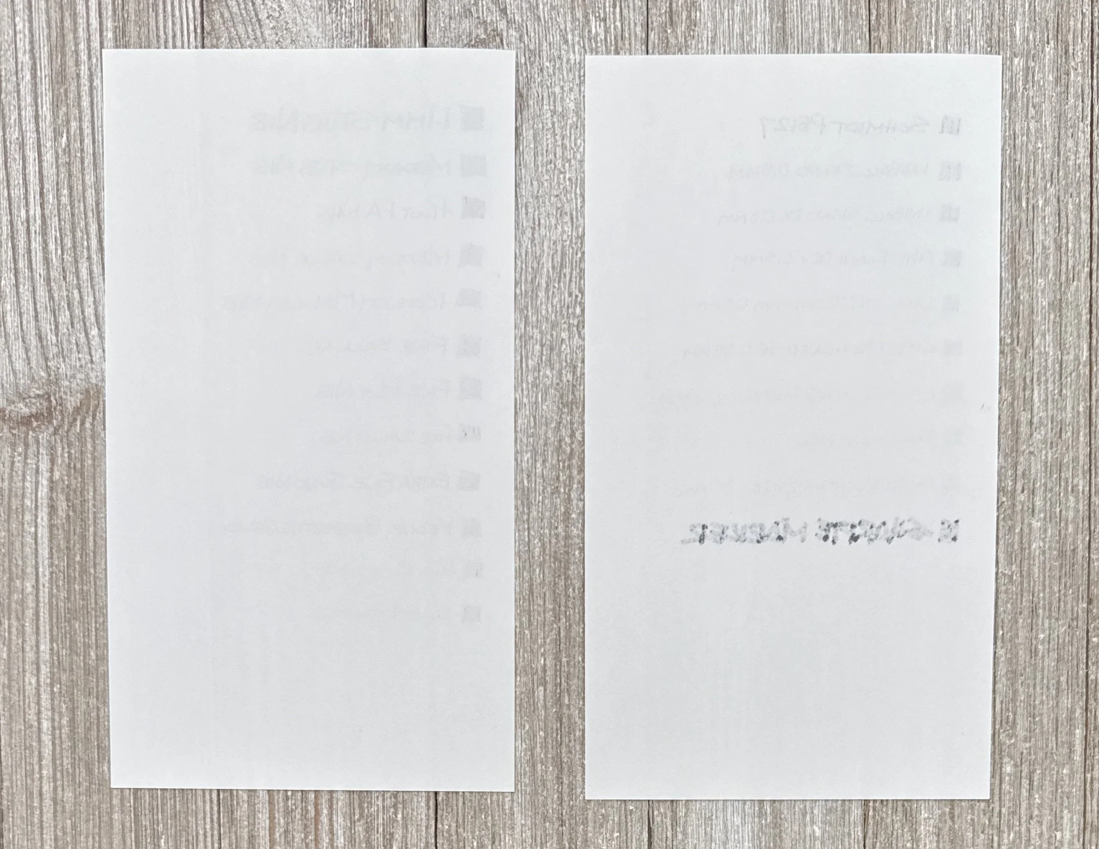
There is ghosting but you could certainly write on the back if you wanted. The form factor of the Jotter doesn’t make it easy to write on the back unless you tore off the sheet.
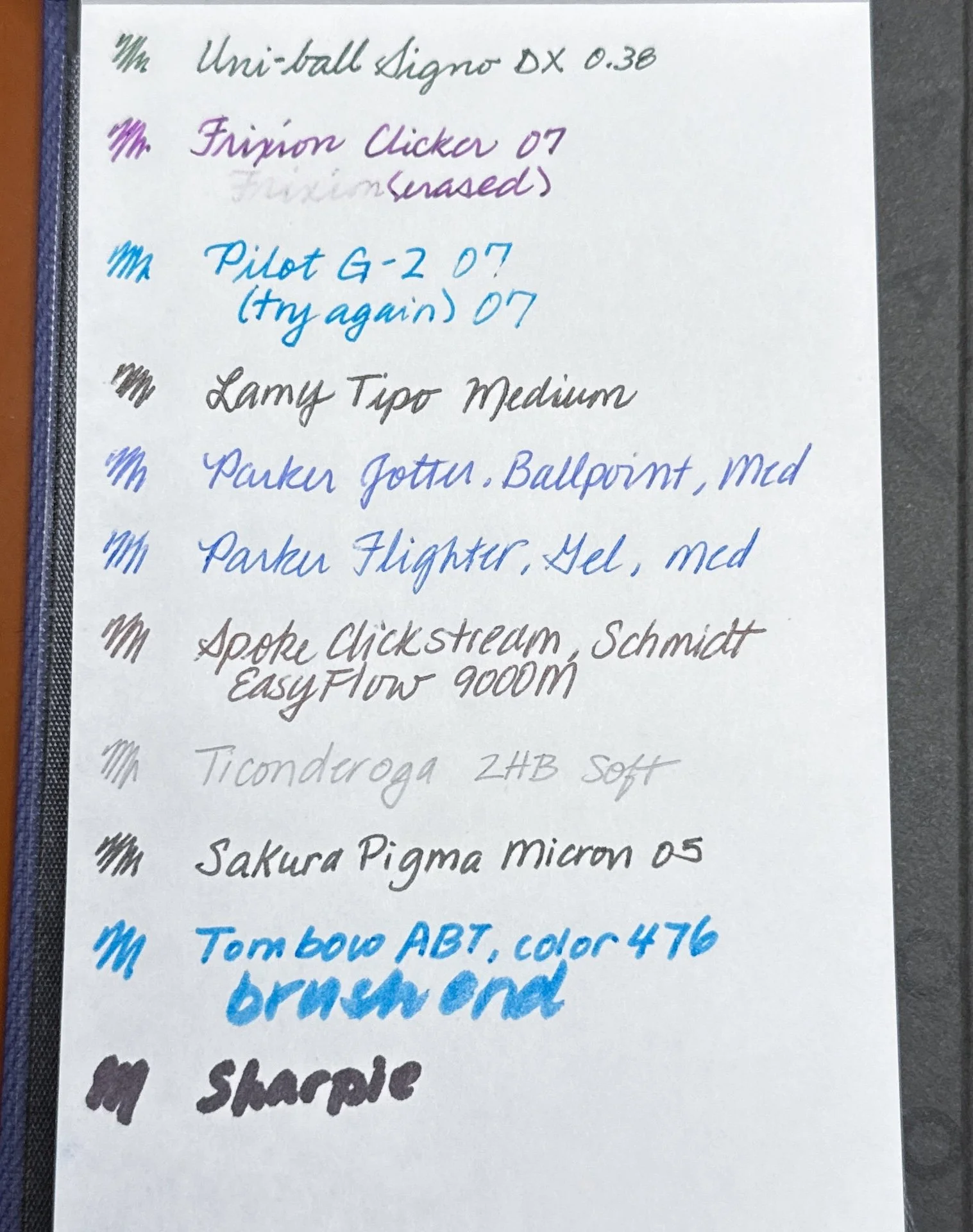
Standard pens and pencil on Sheep Clouds Bond. The Frixion erased fairly easily. I had a little problem with the first “7” from the Pilot G-2, but it was fine the second time. Also, I don’t know why my handwriting is crap with a standard pen or pencil.
Similar amount of ghosting on the Sheep Clouds Bond. Bleedthrough from the Sharpie - is anyone ever surprised?
The Meringue paper is a white paper that is 65 gsm (5 fewer gsm than Sheep Clouds Bond) but it feels thicker. The guidesheet didn’t show through as much as with the Sheep Clouds Bond either. It is neither cottony nor slick, but it felt like it had a little heft (not just in weight but in density). The Meringue paper worked well with fountain pens but it seemed to absorb the ink more quickly. As such, the lines were a bit broader than Sheep Clouds Bond, shading was diminished, and ink colors were more saturated and a touch darker as a result.
Fountain pen writing samples on Meringue.
There is less dramatic shading from Autumn Oak. The Leonardo’s lines are darker too.

Less shading from the 823, and the lines are broader. It handled the wetter nibs better than the Sheep Clouds Bond - less “marker” effect.

There is ghosting but less than Sheep Clouds Bond. You could definitely write on the back if you wanted, unless you used a Sharpie.
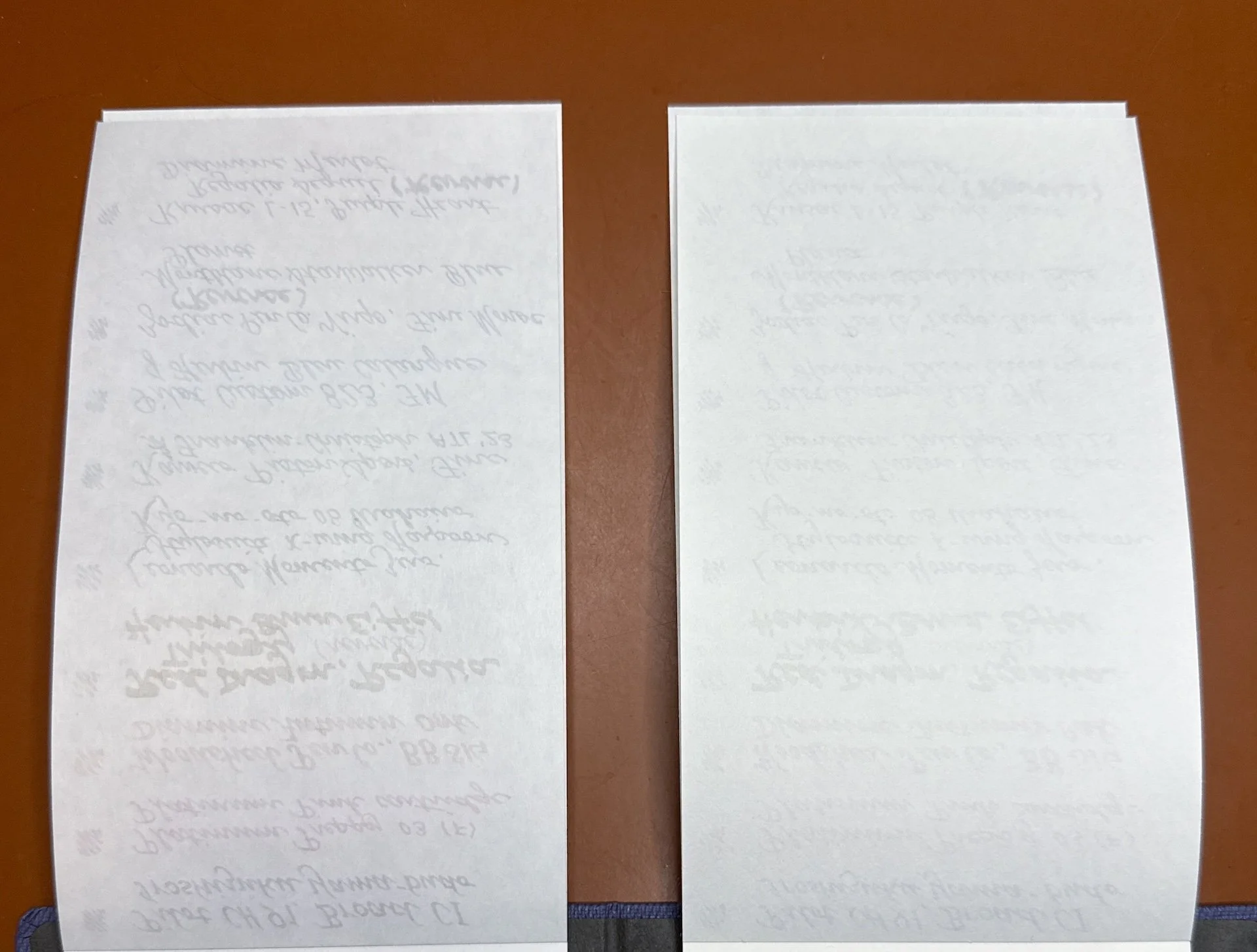
Comparison of the back side of Sheep Clouds Bond (left) and Meringue.

Standard pens and pencil on Meringe. The Frixion was a little bit easier to erase. As with the fountain pens, the lines were a wee bit darker and broader than on Sheep Clouds Bond.

Can’t see much back here except from the Sharpie.
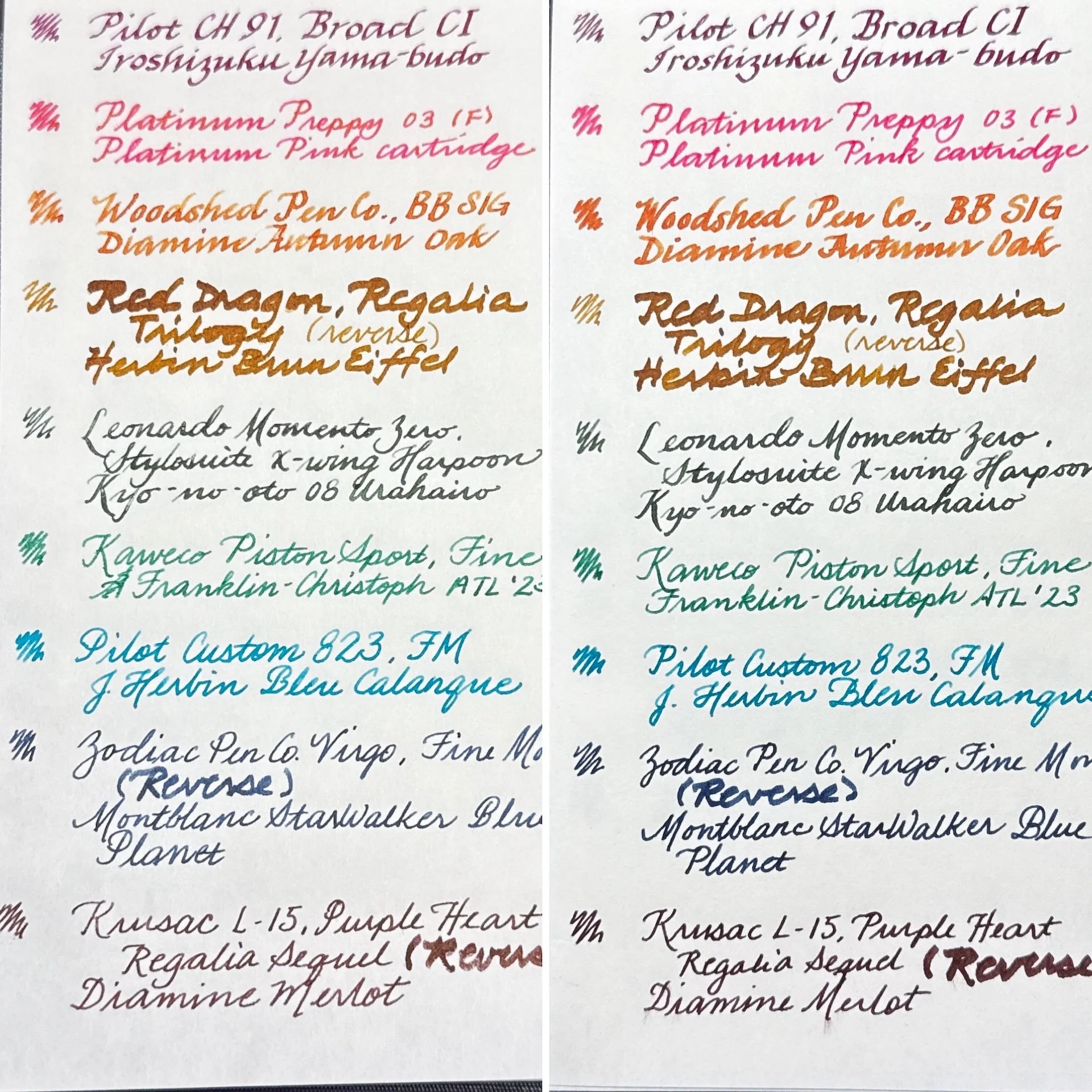
Here are the fountain pen writing samples side by side - Sheep Clouds Bond (left) and Meringue (right).
Here are the standard pen/pencil writing samples side by side - Sheep Clouds Bond (left) and Meringue.
Once punched with a 6-hole punch, the Bullet Paper sheets fit in the PLOTTER Bible or the Filofax Personal (and other similarly sized 6-hole binders).
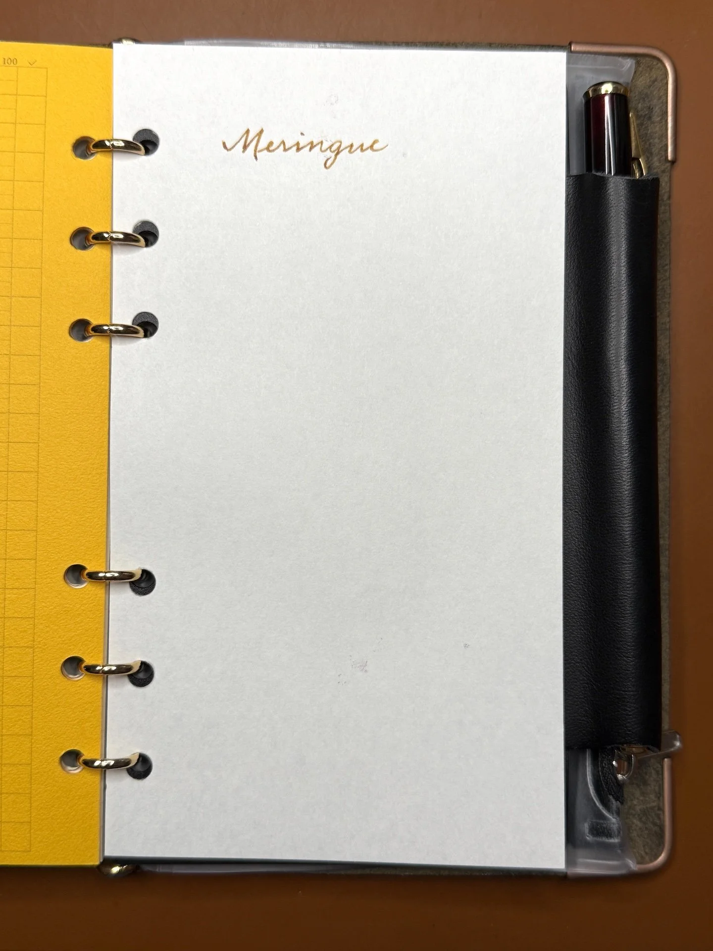
A sheet of Meringue in my PLOTTER.
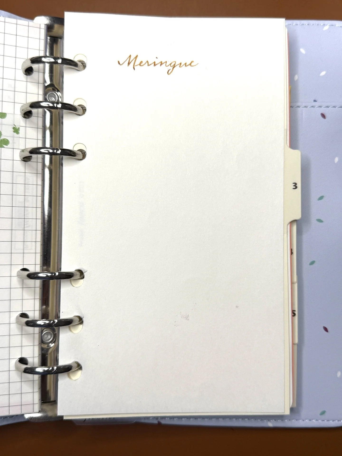
And in my Filofax.
I would have liked a pen/pencil loop to make it even easier for quick jots, but that is a minor critique, especially since we all know I rarely travel with fewer than a binder full of pens 😀 You could attach a pen loop like the ones from Leuchtturm if you want a pen handy. Even though the cover is stiff, I do worry about its longevity when traveling, so I will most likely keep this on my desk or in my purse/backpack when I go to meetups.
The Yamamoto Bullet Jotter costs $28 and includes Sheep Clouds Bond and Soliste paper pads. Additional pads cost $5.50 for 30-50 sheets depending on paper type. Both products are available from The Gentleman Stationer; you can also purchase them from Yamamoto’s Etsy store (this isn’t available on their Shopify store).
(Disclaimer: I purchased all of the Yamamoto items at regular price at the SF Pen Show. All comparison items are my own.)
Enjoy reading The Pen Addict? Then consider becoming a member to receive additional weekly content, giveaways, and discounts in The Pen Addict shop. Plus, you support me and the site directly, for which I am very grateful.
Membership starts at just $5/month, with a discounted annual option available. To find out more about membership click here and join us!