Posts filed under De Atrementis

De Atramentis Florence Nightingale Apricot Ink: A Review

(Susan M. Pigott is a fountain pen collector, pen and paperholic, photographer, and professor. You can find more from Susan on her blog Scribalishess.)

I don’t have much experience with De Atramentis inks. I recall receiving a sample of their scented inks a long while back. I took a whiff, and threw them away. I am not a scented-ink lover.

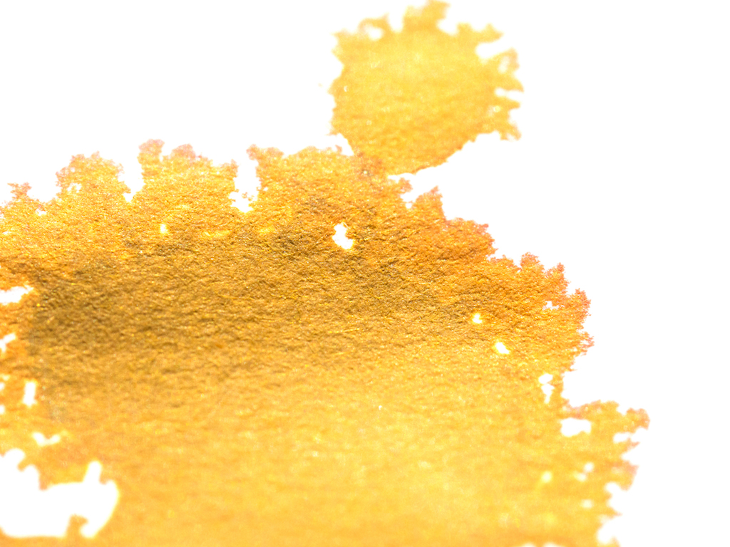
But Vanness Pens sent The Pen Addict several bottles of De Atramentis, and I received two of them (Florence Nightingale and Louis XIV of France) for review. I’ll be honest. When I first opened my bottle of Florence Nightingale and saw the color, my first thought was “baby diarrhea.” I know this is terrible. But, as it turns out, I fell in love with this ink after working with it. It’s actually an apricot color (not a hideous brown as I first thought). But it’s not like any apricot ink I’ve ever used—it has some surprises. Unfortunately, my photos make the ink look much more yellow-brown than apricot.

After making my swab card of Florence Nightingale, it looked like a rather flat apricot color. It doesn’t exhibit any sheen and I didn’t see much shading.

I did my testing page using a Pilot Heritage 912 with an FA nib. Again, the ink looks rather flat with very little shading and no sheen. It is quite wet (at least in the FA nib) and it is not waterproof.

But this is where I got my first surprise. When I squirted water on the ink to test its water resistance, it turned a fluorescent green. “That’s weird,” I thought. I didn’t see any green in this ink with my naked eye. But when I squirted some ink into a glass of water it also turned fluorescent green:

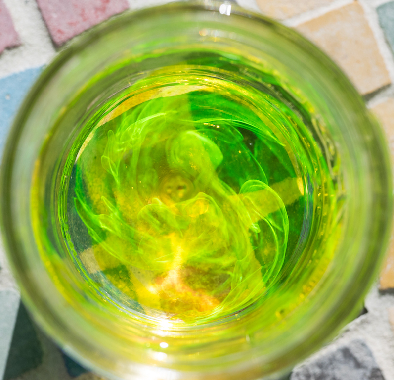
I don’t have any explanation for this, but I thought it was very cool. The chromatography test shows a range of yellow and orange, but before it dried the fluorescent green was there as well.

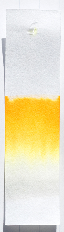
The more I write with this ink, the more I like it. It’s a beautiful gentle apricot color and it flows quite well in my FA nib.

In large nibs, the ink shows much more color variation, with splatters looking slightly more brownish. Again, there’s no discernable sheen, but there is some shading, especially where the ink pools.

What makes this ink unique, though, is how it fluoresces with water. Unfortunately, that vivid green dies down to a soft yellow once it dries. It’s still a beautiful effect.

I always love it when an ink surprises me, and Florence Nightingale Apricot most certainly did. You can purchase De Atramentis ink from Vanness Pens. A bottle of Florence Nightingale Apricot (35ml) is $13.00.

(Vanness Pens provided this product at no charge to The Pen Addict for review purposes.)


Enjoy reading The Pen Addict? Then consider becoming a member to receive additional weekly content, giveaways, and discounts in The Pen Addict shop. Plus, you support me and the site directly, for which I am very grateful.

Membership starts at just $5/month, with a discounted annual option available. To find out more about membership click here and join us!

Posted on January 29, 2018 and filed under De Atrementis, Ink Review.

De Atramentis Alexander Hamilton Ink Review

(Sarah Read is an author, editor, yarn artist, and pen/paper/ink addict. You can find more about her at her website and on Twitter.)

De Atramentis has taken their standard Aubergine color and put a dashing Alexander Hamilton on the label--giving an already popular ink a new wave of energy. I'm not usually into the relabeling of old products, but the De Atramentis themes are always a fun take.

This rich purple ink is nicely lubricated. I had no flow issues with it at all--and though it behaves like a very wet ink, the dry time isn't too unreasonable. It took about 22 seconds to dry completely on Rhodia paper, but it's relatively dry a bit quicker than that.

It's a very saturated color that doesn't show much shading. There is a little bit, but it's not a key feature with this ink. Chromatography shows that it's a bright pink and grey mix, and the dark tones of it do result in a higher rate of show-through on thin paper. I did not experience any bleeding on the papers I tried. When it pools, it has a subtle brassy sheen to it that is extremely lovely. I didn't see much of this sheen in regular writing, though--only in places where I deliberately tested for it.

One of my favorite features of this ink is its water resistance. It isn't advertised as having any resistance, but both my drop test and my wash test showed that this ink will survive a leaky water bottle or spilled cup of tea. While the pink tone washed away, the darker grey tone stayed put and the text was still easily readable.

While the color is the same as the Aubergine ink from De Atramentis, the shade itself is different from the other purples in my swatch collection. It has a magenta undertone that makes it a little more zippy than the more common dusty purples.

The popularity of Hamilton as an historical--and more recently, musical--figure has led to some scarcity of this ink. If you love the color, Aubergine is still more easily available. But the fun themed labels are worth the wait--and they make great gifts for fans and enthusiasts.

(Vanness Pens provided this product at no charge to The Pen Addict for review purposes.)


Enjoy reading The Pen Addict? Then consider becoming a member to receive additional weekly content, giveaways, and discounts in The Pen Addict shop. Plus, you support me and the site directly, for which I am very grateful.

Membership starts at just $5/month, with a discounted annual option available. To find out more about membership click here and join us!

Posted on January 11, 2018 and filed under De Atrementis, Ink Reviews.

De Atramentis Pearlescent Brillant Violet Silver Ink Review

(Sarah Read is an author, editor, yarn artist, and pen/paper/ink addict. You can find more about her at her website and on Twitter.)

So, more sparkle inks, yes? I have to say that I feel like my sparkle ink needs are already met, but that feeling is in direct opposition to my "more ink, please" philosophy. So, sure--more sparkle ink. This time it's De Atramentis bringing the glimmer to your pages, with their Pearlescent line, which includes a wide variety of colors with either silver or gold sparkle. One thing that this line offers that the others don't is your choice of either gold or silver in each color. So if you fall in love with a base color, you can go with either the cool or warm shine to it.

This ink is very shiny. At the right angle, it is almost mirror-bright in sunlight. And the shimmer shows nicely even in a Pilot Metro fine point nib. With a stub, it's a total party ink. It might even be a bit too much for everyday use, at least for me. I'd reserve something this blingy for holiday cards and special occasions. Or for sending really alarming news.

The color of this Brilliant Violet lives up to its name. It's a very saturated color with lots of zip. The dry time is fairly slow on Rhodia paper. It was noticeably faster on cheaper paper, where it still showed a good sparkle and very little feathering. There's almost no shading to be seen on any paper. It survived a light sprinkle of water with the lines still visible, but when really soaked it all disappeared. It does, however, stain skin and remain firmly in place for days. I also noticed that, when dry, the sparkle rubs off the paper a bit. So if you're passing your hand over dry writing, you may end up looking like Tinkerbell. There is no extra charge for this service.

The chromatography showed some lovely blue undertones, but overall it's not a terribly complex color. It is brighter than the other purples in my collection, but that's likely because I prefer my purples more muted. The silver sparkle does cool the color down a bit--the gold sparkle version of the same color looks quite different. It's really interesting to see how the different sparkles change the colors throughout the collection.

The ink flowed well in my TWSBI with a stub nib, even after sitting for several days. And I had no trouble with it in the fine point Pilot Metro, either. I did have some flow issues with the TWSBI when I swapped in the medium nib, even after forcing some ink into the feed--but the difference was drastic enough that I'd attribute the issue to the nib rather than the ink.

If you're looking to add some serious zing to your writing or artwork, these inks should do the trick. And with ten different colors, each with the two sparkle options, there's almost certainly one that inspires you. The Heliogen Green with gold sparkle is calling to me. My pen pals can anticipate Tinkerbell letters in the near future (happy thoughts included).

(JetPens provided this product at no charge to The Pen Addict for review purposes.)


Enjoy reading The Pen Addict? Then consider becoming a member to receive additional weekly content, giveaways, and discounts in The Pen Addict shop. Plus, you support me and the site directly, which I am very grateful for.

Membership starts at just $5/month, with a discounted annual option available. To find out more about membership click here and join us!

Posted on July 27, 2017 and filed under De Atrementis, Ink Reviews.