(Kimberly (she/her) took the express train down the fountain pen/stationery rabbit hole and doesn't want to be rescued. She can be found on Instagram @allthehobbies because there really are many, many hobbies!.)
I was excited to pick up the Piper Trading Company inks at the Philly Pen Show earlier this year and I’m finally getting around to reviewing them. Thank you to Scott Franklin of Franklin-Christoph and Piper Trading Company for providing these inks for review.
Piper Trading Company (PTC) is a wholly-owned subsidiary of Franklin-Christoph and had its first show debut at the St. Louis show last year. Full disclosure: I have worked behind the Franklin-Christoph tables for many years and also for PTC’s first show last year and will again be doing so at this year’s St. Louis show. As with all of my reviews, my views are my own and I was not compensated by F-C or PTC for this review.
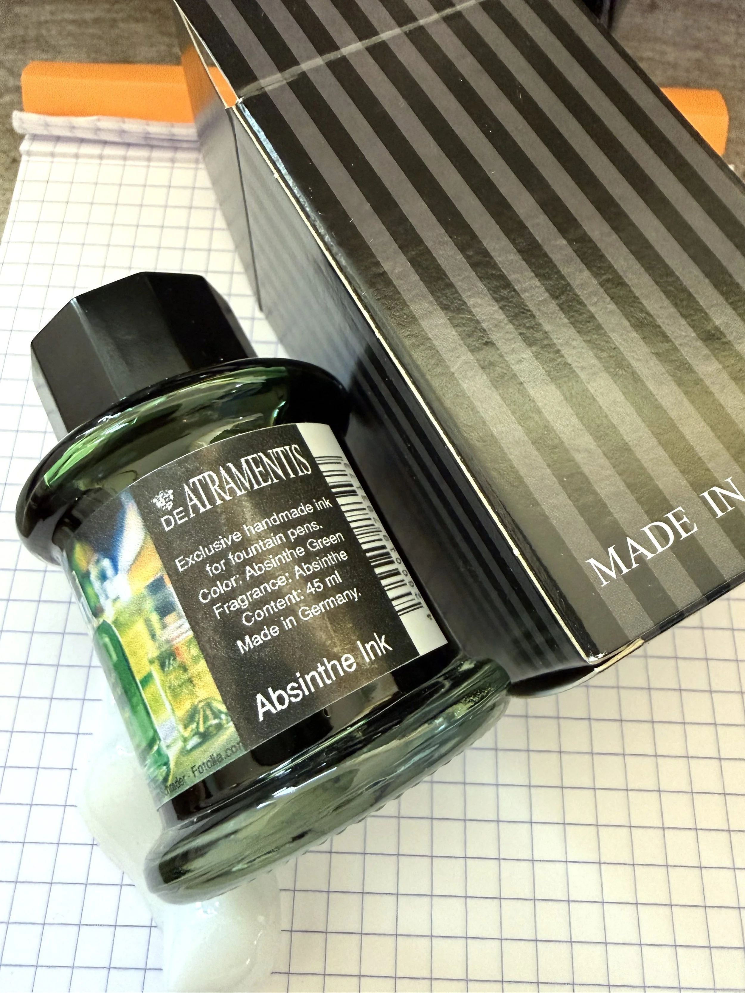
This is PTC’s first foray into inks; there are 4 inks so far: Fickle Pickle, Firefox, Kissin’ Cousin, Mysteria Wisteria. They are sold in 30ml/1ounce bottles and cost $10 per bottle. The four bottle set is currently unavailable.
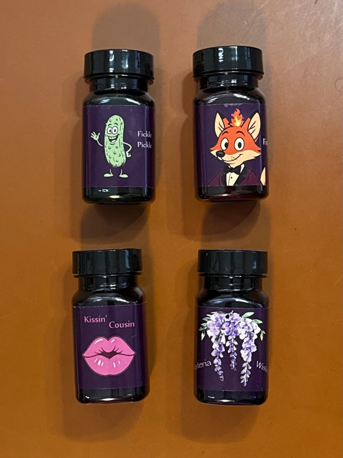
Piper Trading Co Inks: Fickle Pickle, Firefox, Kissin’ Cousin, and Mysteria Wisteria.
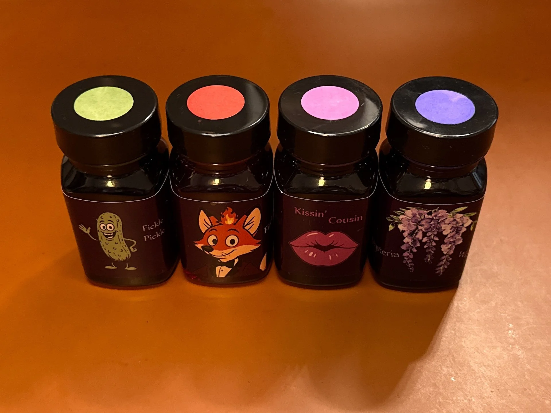
I like to do a label swatch on the top so I know what color it is in my ink drawer without pulling out the bottle.
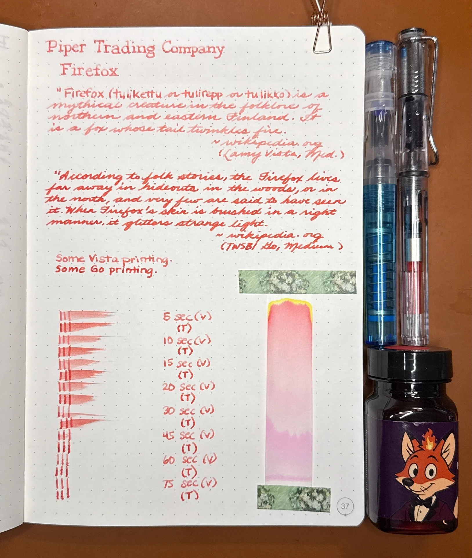
As usual, all swatches were done on Col-O-Ring and Wearingeul Instant Film Color swatch cards using a Kakimori steel dip nib and writing samples were done primarily with a Lamy Vista with a steel Medium nib and a TWSBI Go with a Medium nib. The notebooks used for writing samples are from an Endless Recorder and Odyssey Notebooks, both with 68 gsm Tomoe River paper. Dry times for the Vista are shown with “(V)” and the Go will be shown below that with a “(T)”. Dry times may be a bit slower on 52gsm TR or wetter nibs or faster on more absorbent papers like Rhodia, copy paper, Cosmo Air Light, or with drier or finer nibs.
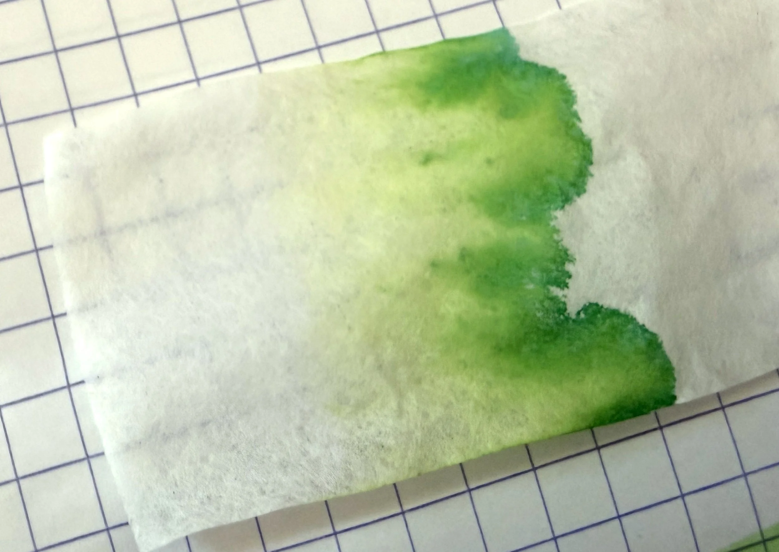
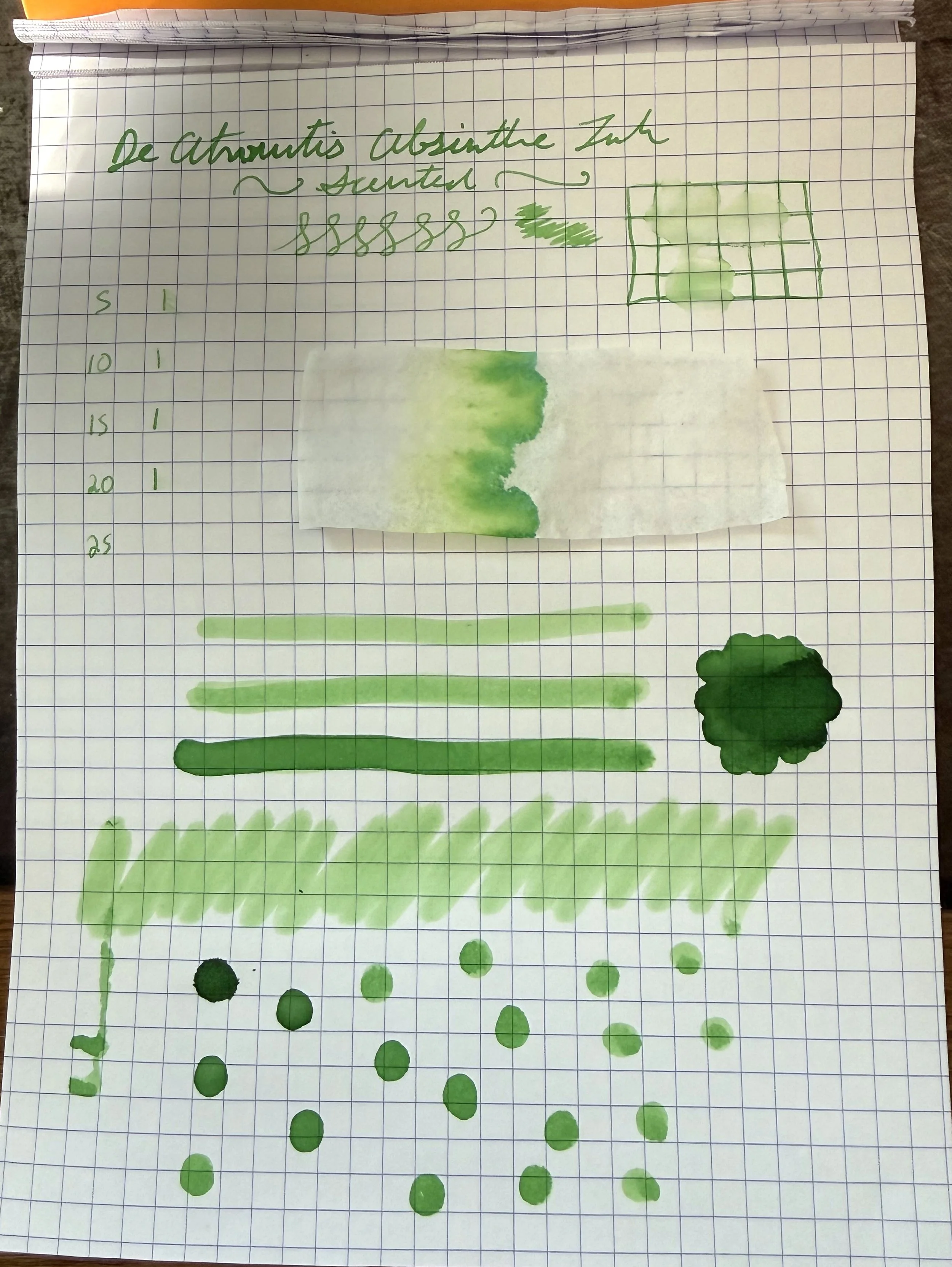
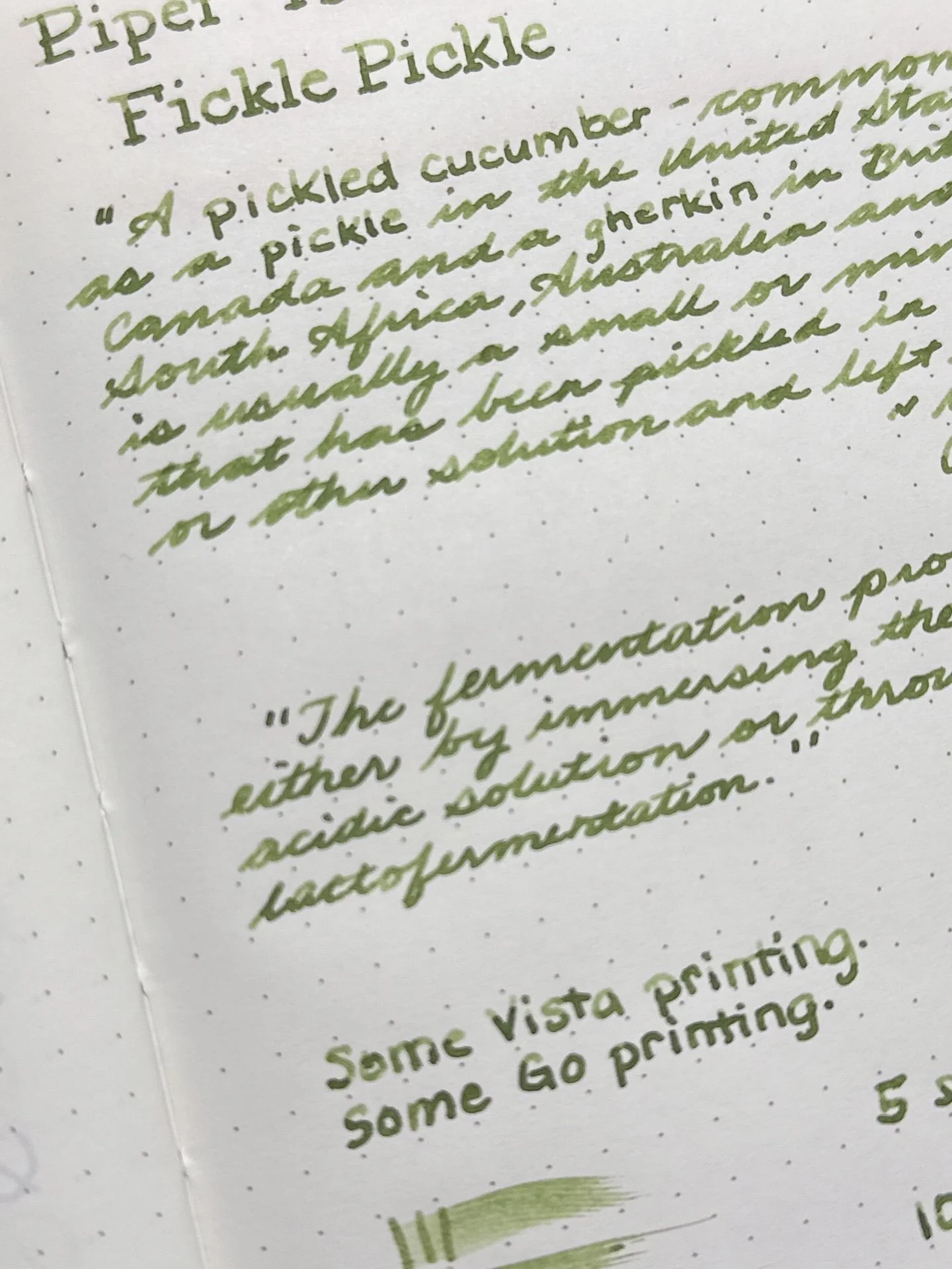
Fickle Pickle is a medium olive green that is neither too light, nor too dark. It is a nice shading ink that is almost a chromashader with hints of brown in heavier swatches. Flow was average.
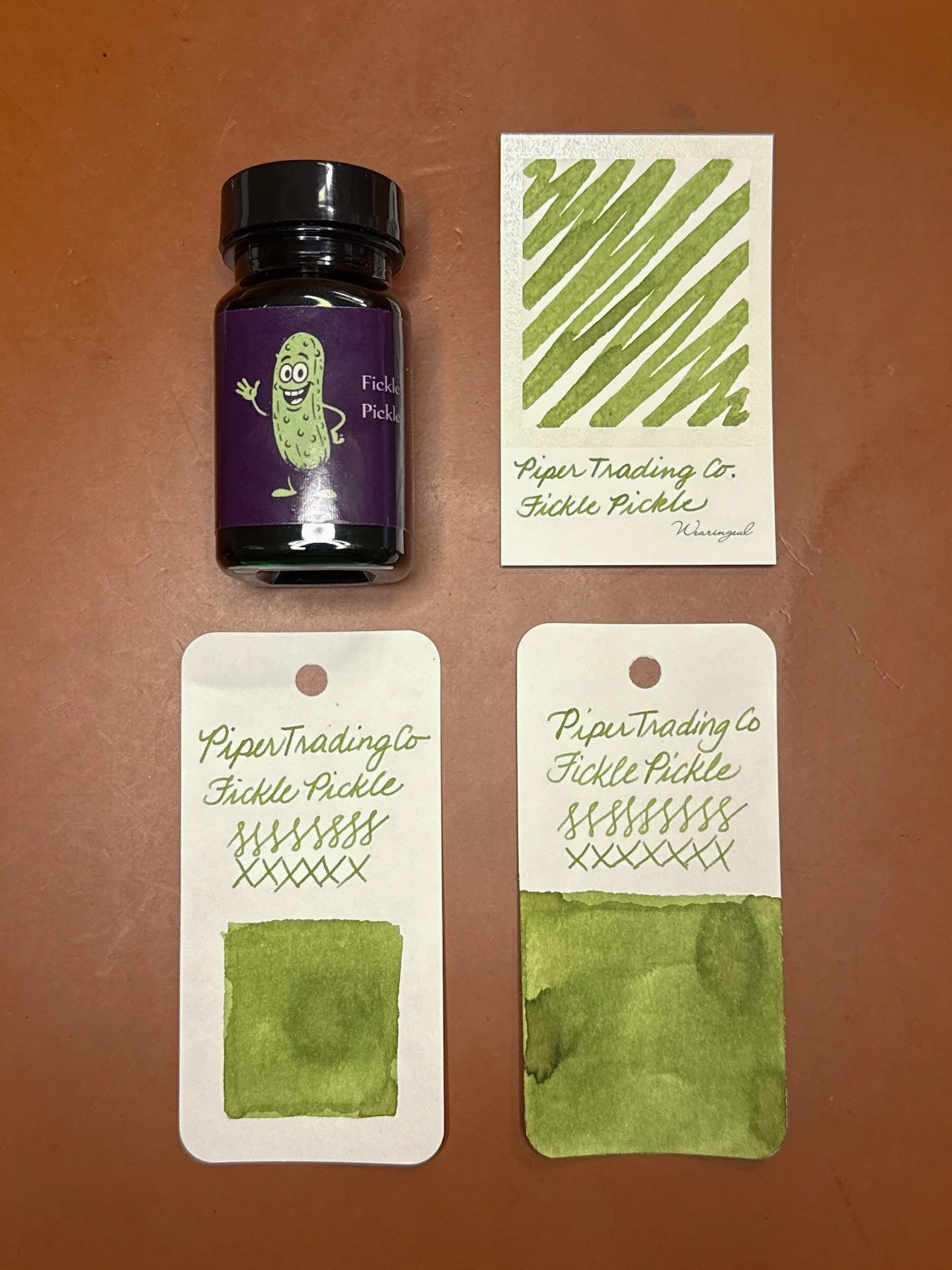
Fickle Pickle on Wearingeul (top) and Col-O-Ring cards.
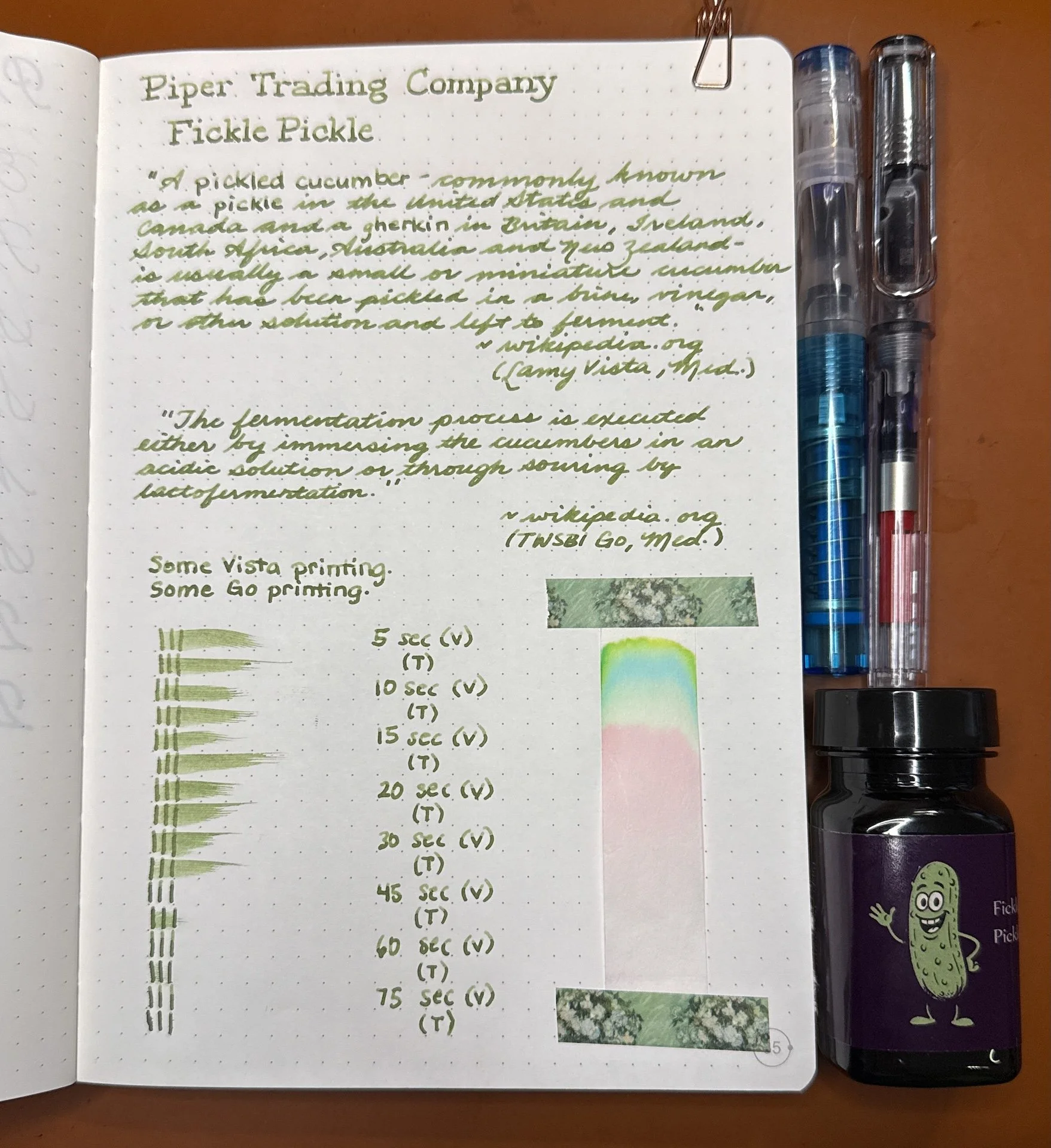
Fickle Pickle writing sample.
The shading is more prominent from the Vista (top), while the Go is a bit more saturated. I think it is more noticeable in the cursive writing samples.
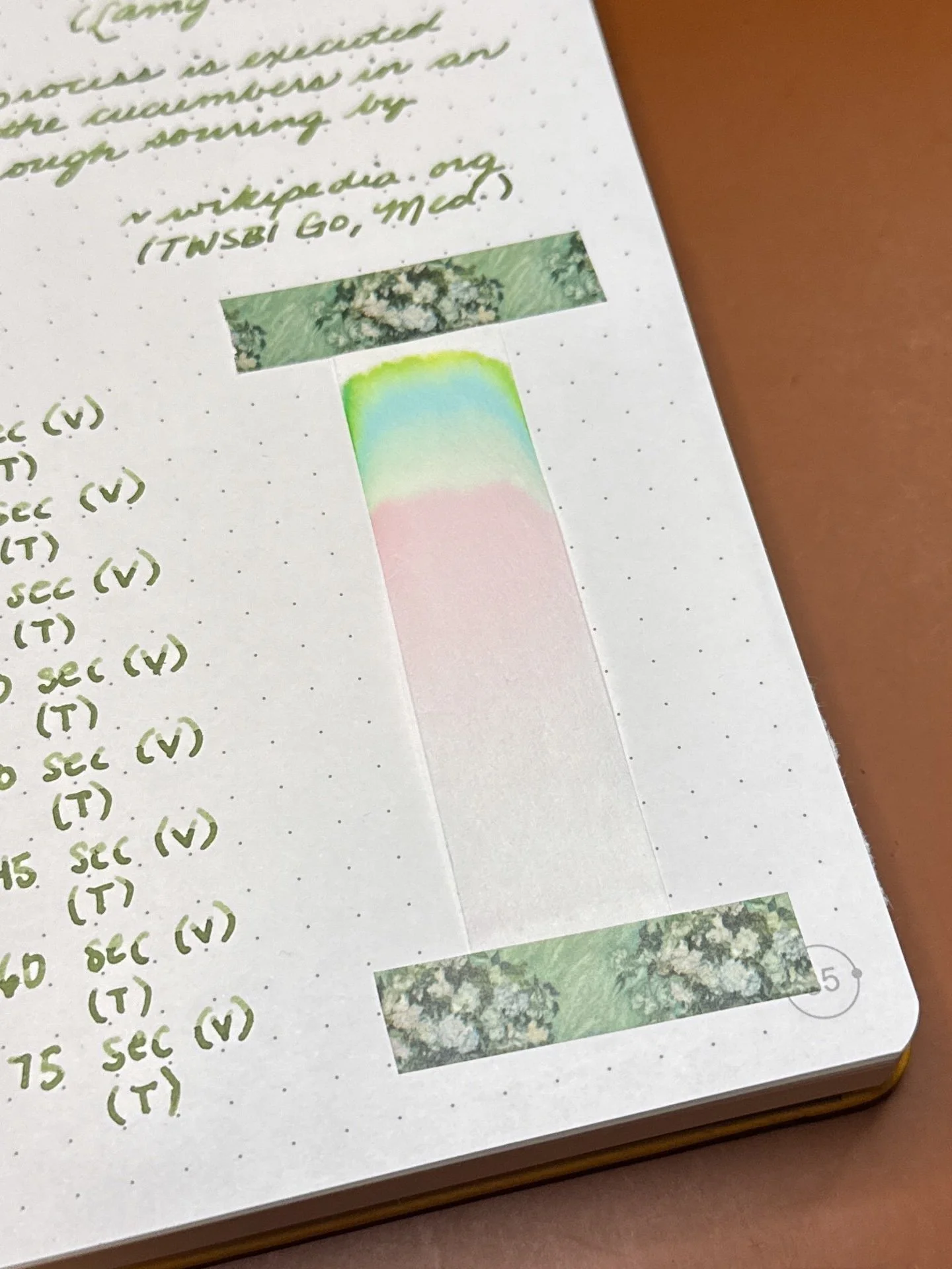
Look at that neon green pop of color atop the turquoise and pinks below!
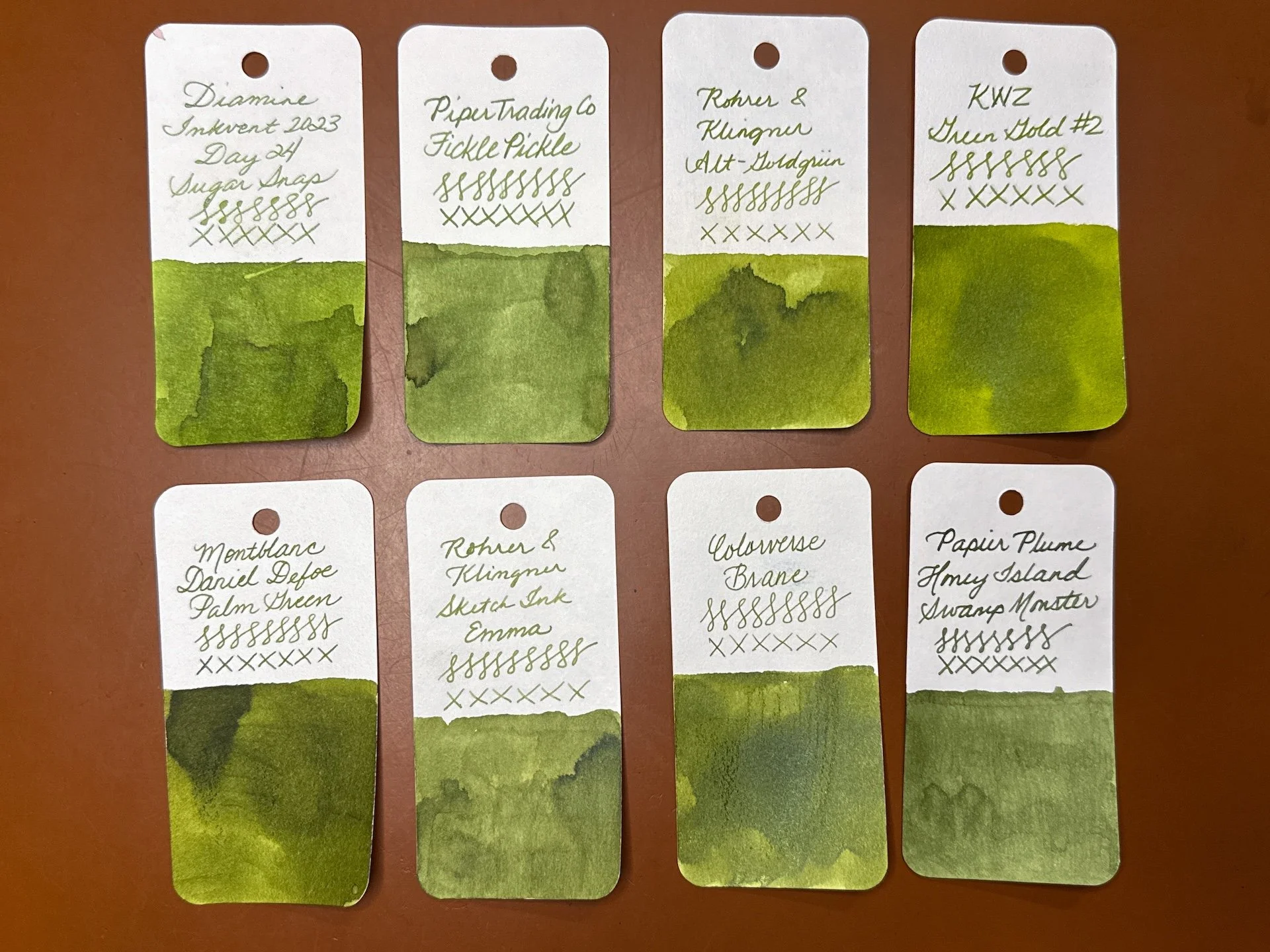
Inks similar to Fickle Pickle - Diamine Sugar Snap, Rohrer & Klingner Alt-Goldgrun (a bit too yellow), KWZ Green Gold #2, Montblanc Daniel Defoe Palm Green (too dark and yellow), Rohrer & Klingner Emma (the closest match), Colorverse Brane (too yellow), and Papier Plume Honey Island Swamp Monster (slightly too dark).
Firefox is a slightly orange-leaning red that can show up as an almost pastel coral pink with drier nibs. Flow felt slightly dry in the Vista but not in the Go.
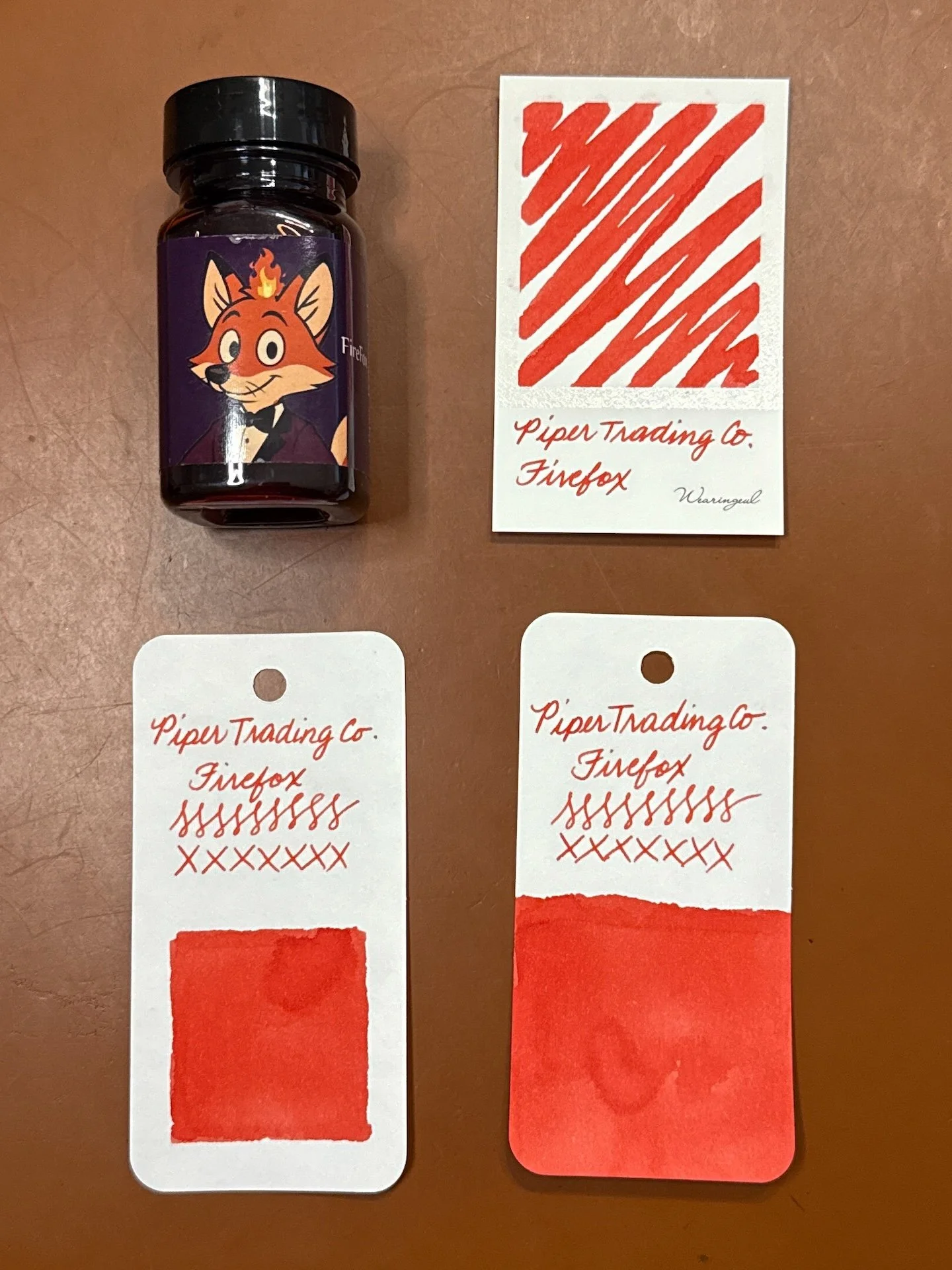
Firefox swatches as a red with a hint of orange.
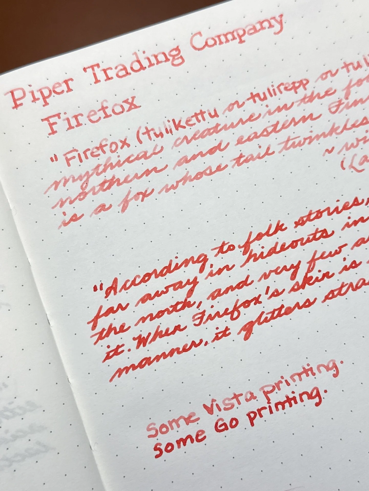
Firefox writing sample.
I was surprised at how light the ink was from the Vista (top). I even dipped the nib and scribbled on some scratch paper and it was still this light. Compare that to the Go’s writing sample (bottom) which more closely matches the swatches.
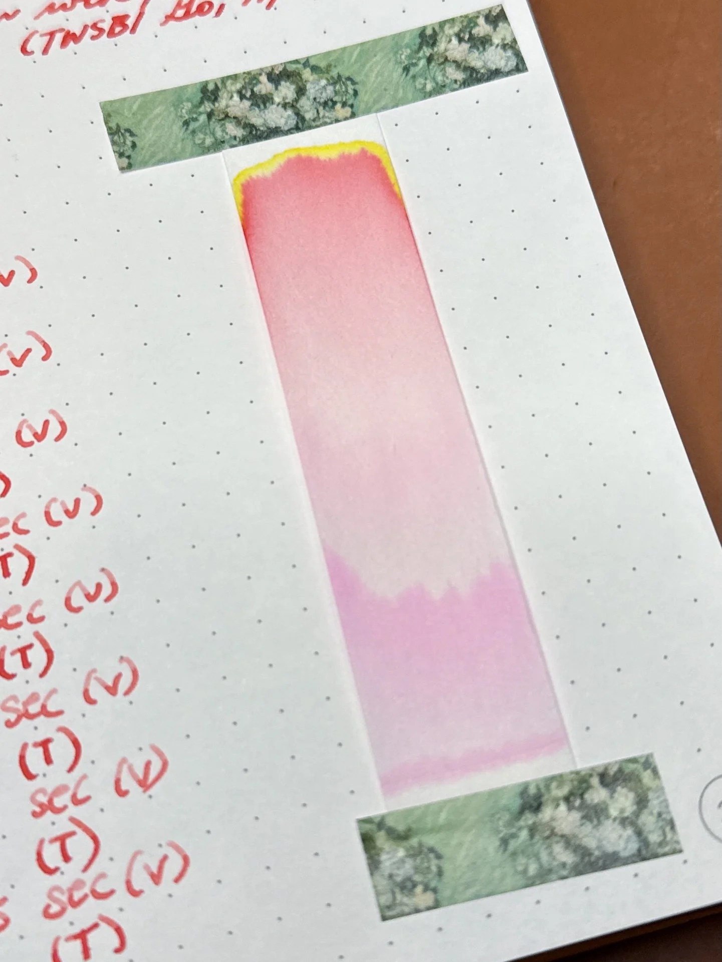
Firefox’s chroma has an electric pop of yellow at the very top which gives this that hint of orange. The rest of the chroma is red, pink, and some magenta near the bottom.
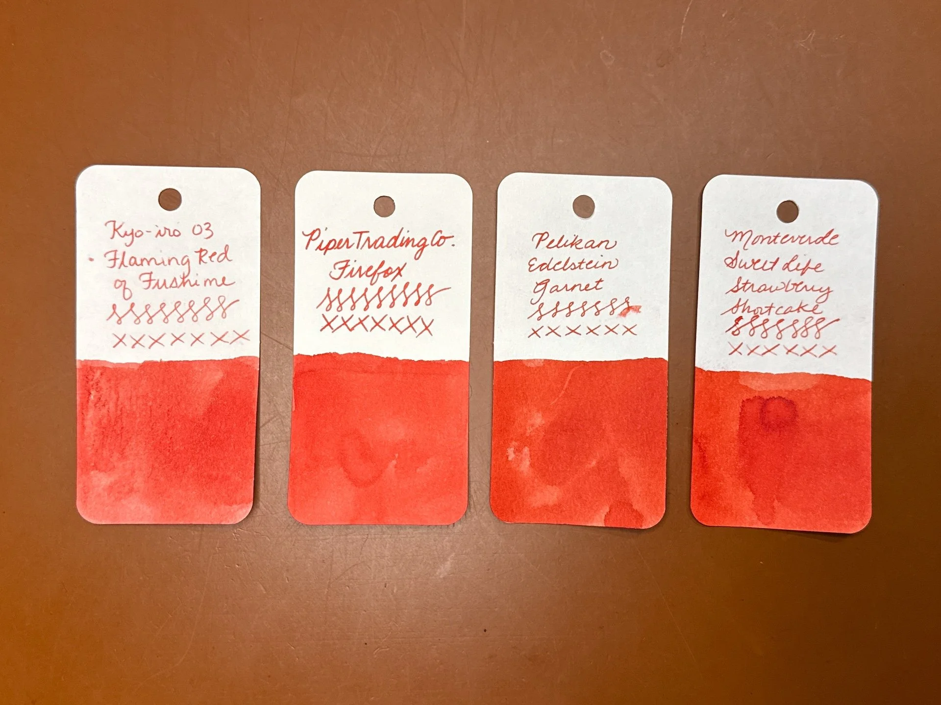
Inks similar to Firefox: Kyo-iro 03 Flamin Red of Fushime (closest match), Pelikan Edelstein Garnet and Monteverde Sweet Life Strawberry Shortcake (both a bit too dark). I thought I’d have more ink matches but my inks are either much darker, more red, or more orange.
Kissin’ Cousin is a bright magenta that also has a bit of lightness/softness to it. It had average flow despite it being a shader (which can sometimes feel dry). Dry time was pretty fast too.

Kissin’ Cousin swatches are almost hot pink, but not quite.
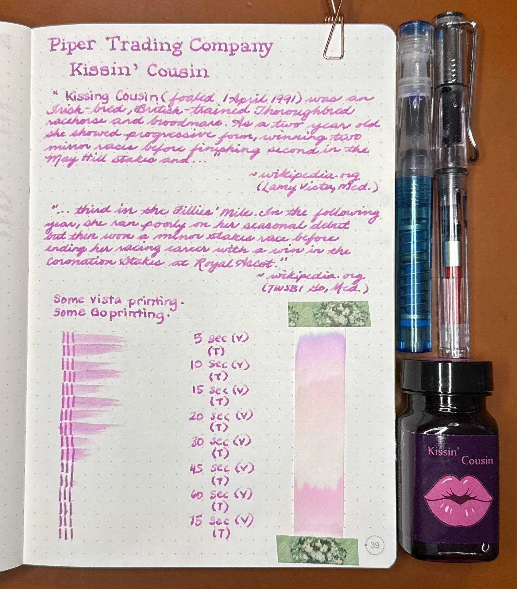
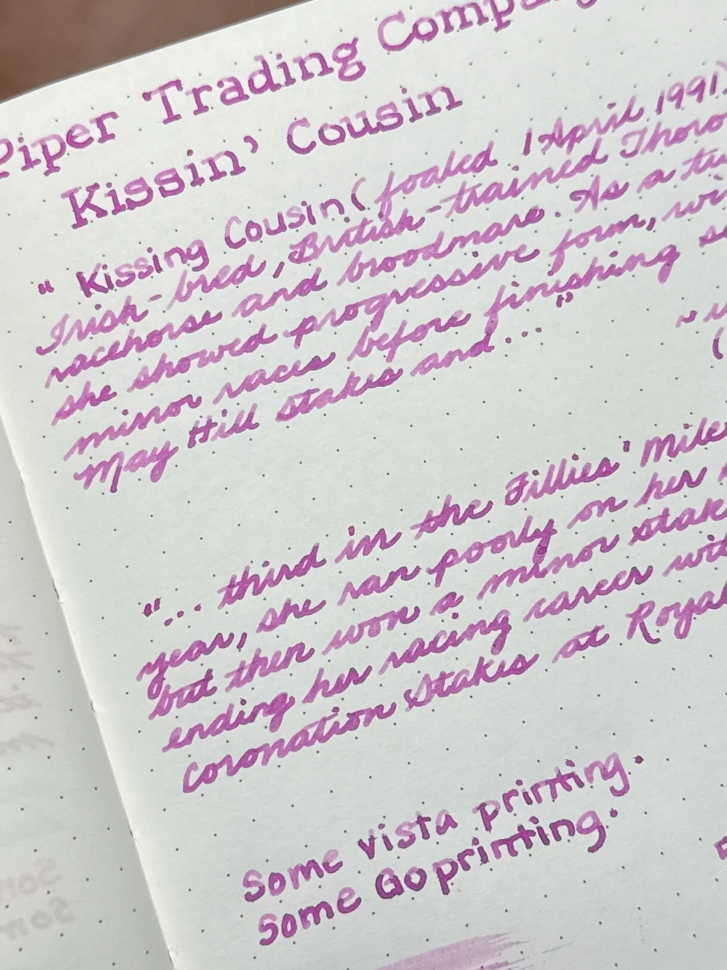
Kissin’ Cousin writing sample.
While both pens show off shading, it is more prominent from the Vista (top) and moreso with print than cursive (which is usually the case with shaders).
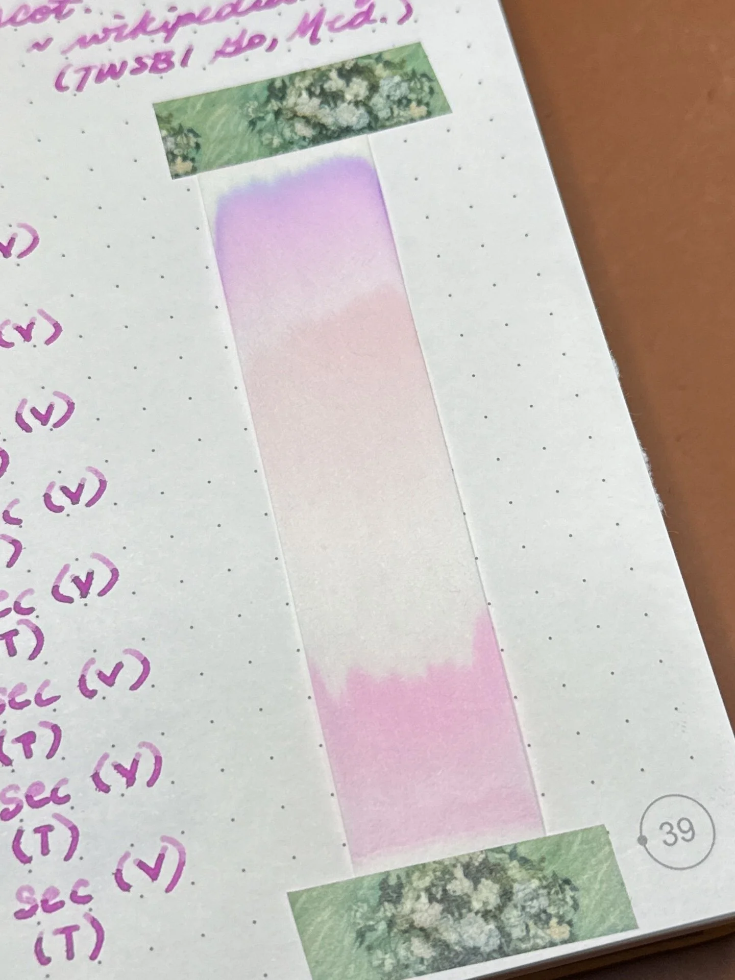
Kissin’ Cousin’s chromatography starts off at the bottom with magenta, then separates into a peachy pink, lavender, and finally purple.
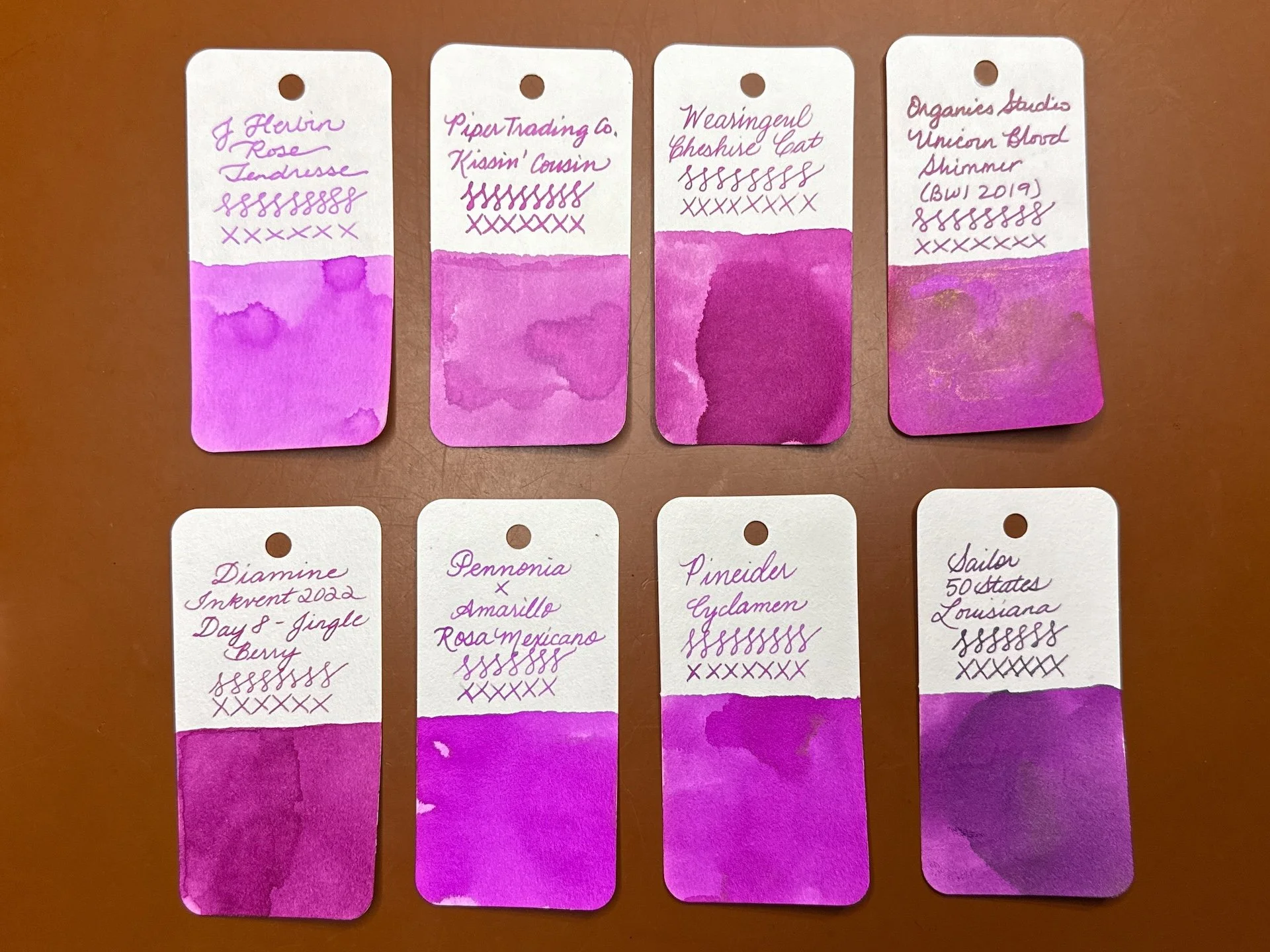
Inks similar to Kissin’ Cousin: J Herbin Rose Tendresse (too bright, too purple), Wearingeul Cheshire Cat (closest match), Organics Studio Unicorn Blood Shimmer (too dark), Diamine Jingle Berry (too dark, too red), Pennonia x Amarillo Stationery Rosa Mexicano and Pineider Cyclamen (both too bright), and Sailor 50 States Louisiana (too dark, too purple).
Mysteria Wisteria is a vivid blue-purple with good flow and very fast dry times.
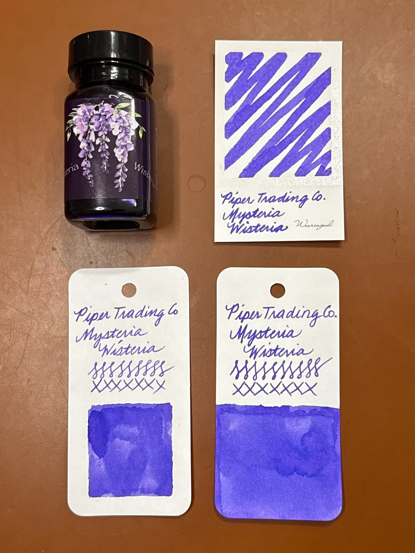
Mysteria Wisteria swatches.

Mysteria Wisteria writing sample.
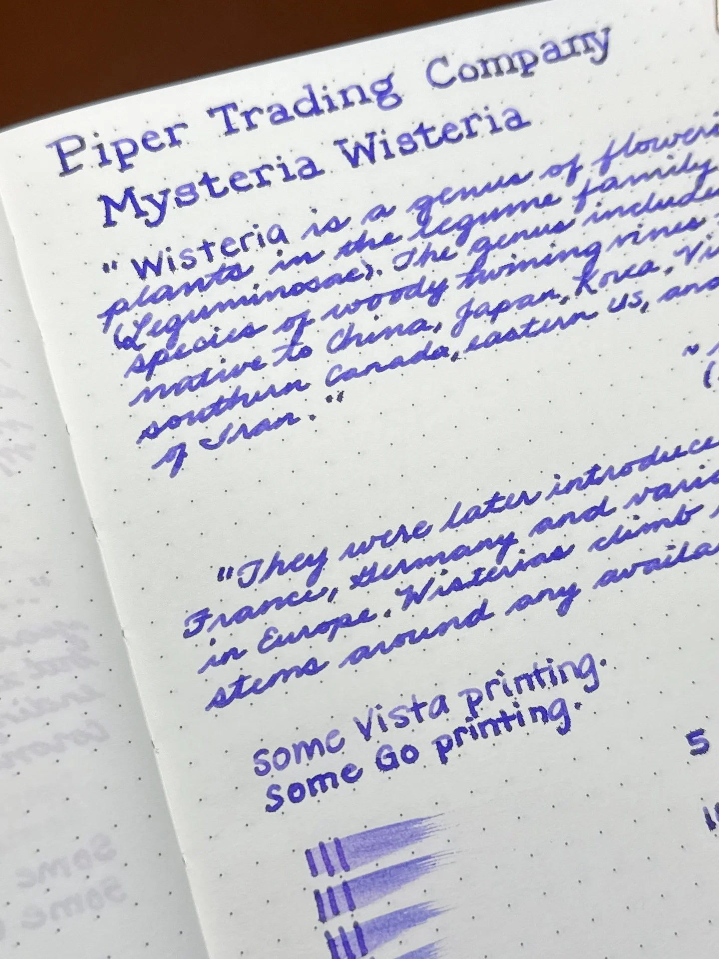
It’s very subtle but there is a wee bit more shading in the Vista (top) than the go, but as usual, it’s more noticeable with print than cursive.
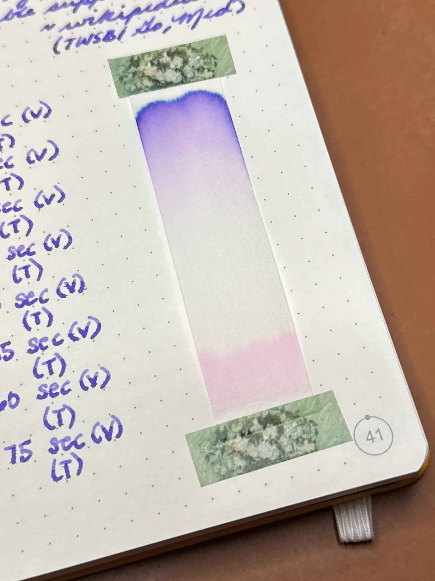
Mysteria Wisteria’s chromatography starts pink, then separates out before showing off its lavender to bright purple colors.
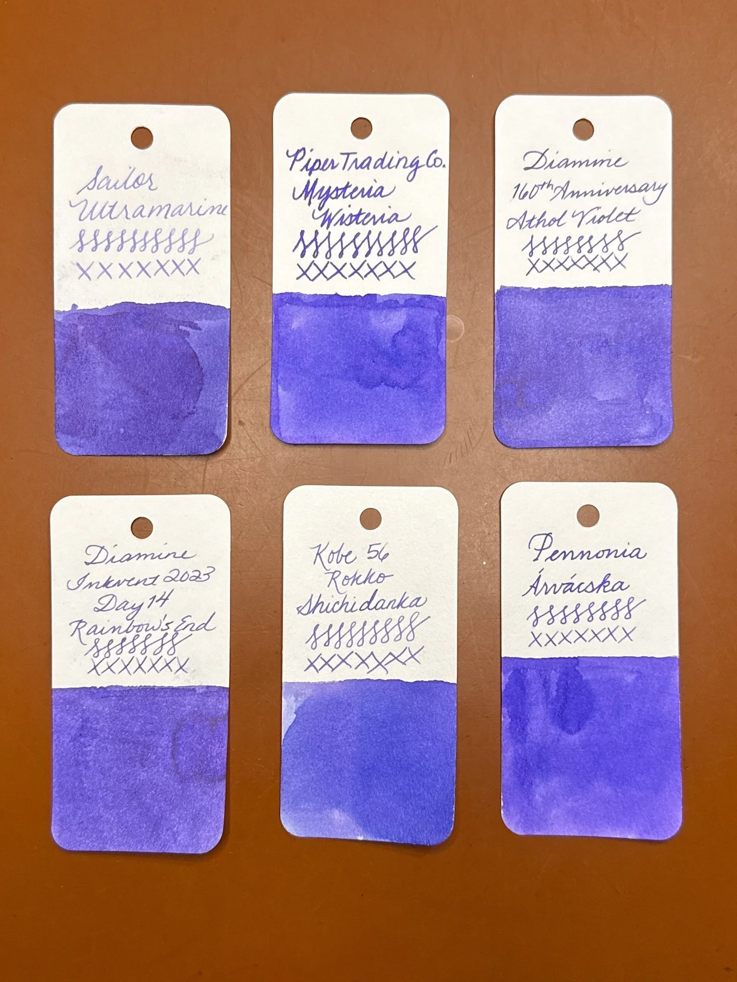
Inks similar to Mysteria Wisteria: Sailor Ultramarine (touch too purple), Diamine 160th Athol Violet and Diamine Rainbow’s End (both are a bit too muted and purple), Kobe 56 Rokko Shichidanka and Pennonia Arvacska are both good matches (the Kobe is a touch too dusty).
All of the inks had average flow, with the exception of Firefox in the Vista, which I’m going to chalk up to the pen, since it was fine in the Go. Can’t decide between Fickle Pickle and Mysteria Wisteria as my favorites of the bunch. At $10 for a 30ml bottle, they are a good value especially if you don’t already have similar colors. You can buy Piper Trading Company inks online or at the St Louis Pen Show next weekend. Please stop by and say hi if you’re going to the show!
(Disclaimer: Thank you to Scott Franklin for providing these inks for review. All other products are my own.)
Enjoy reading The Pen Addict? Then consider becoming a member to receive additional weekly content, giveaways, and discounts in The Pen Addict shop. Plus, you support me and the site directly, for which I am very grateful.
Membership starts at just $5/month, with a discounted annual option available. To find out more about membership click here and join us!