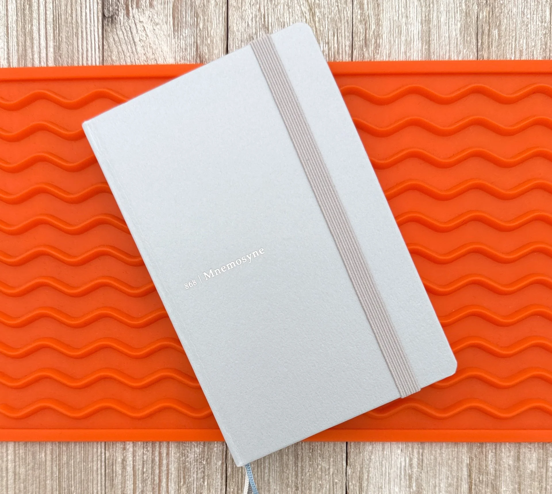
The paper in Maruman notebooks and notepads is some of the best in the business, and over the past few years, they have expanded their traditional spiral-bound options into hardbound formats. I’ve been a little slow in reviewing any of their Maruman Mnemosyne Journal offerings, but that changes today with the A6 Slim Notebook.
Pilot FriXion for scale.
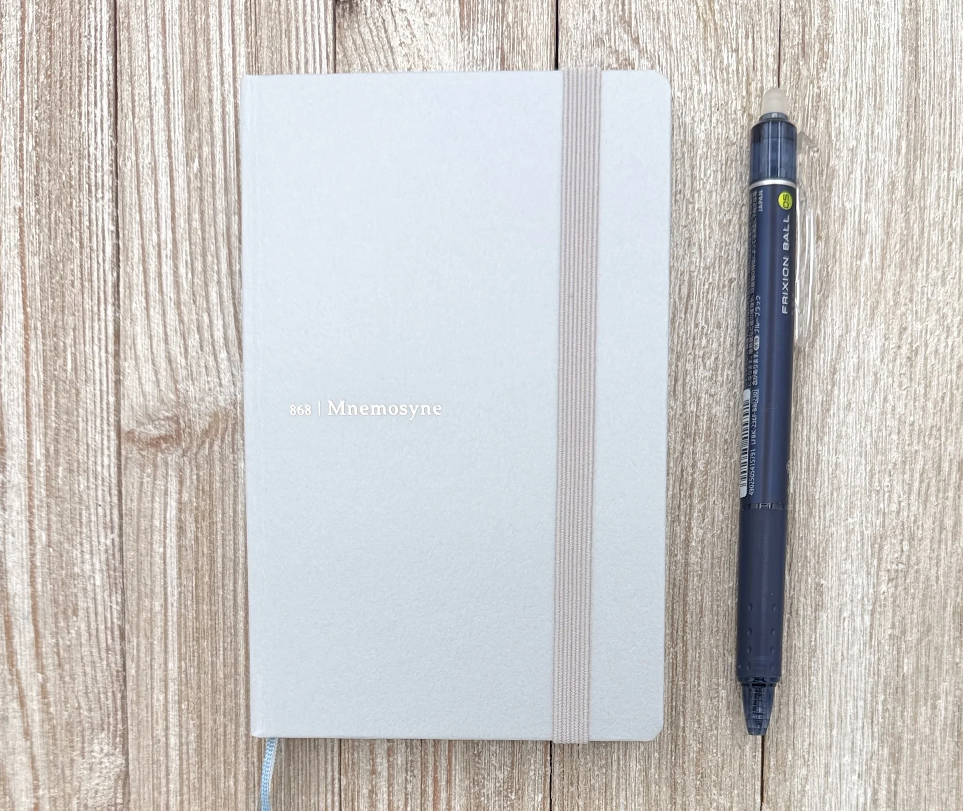
For starters, this notebook is an amazing object. I purposefully bought the small size to test, and it feels great in the hand, and even better when using it. There are some issues with the smaller size you might need to work around, such as finding a comfortable writing position with a 5.7 inch x 3.7 inch, 160 page notebook, but simply as a product it is fantastic.

The are tons of markings around the edges of the page it you want to break down your layout even further.
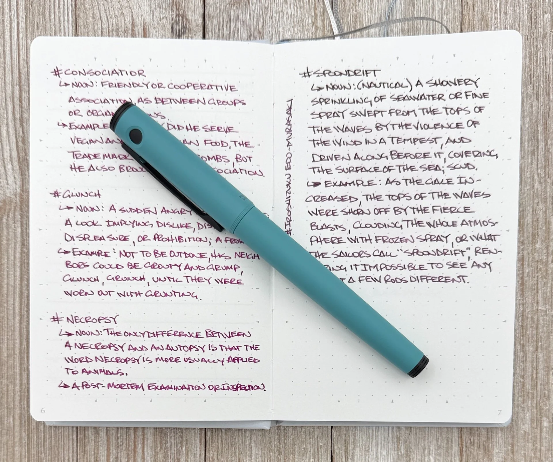
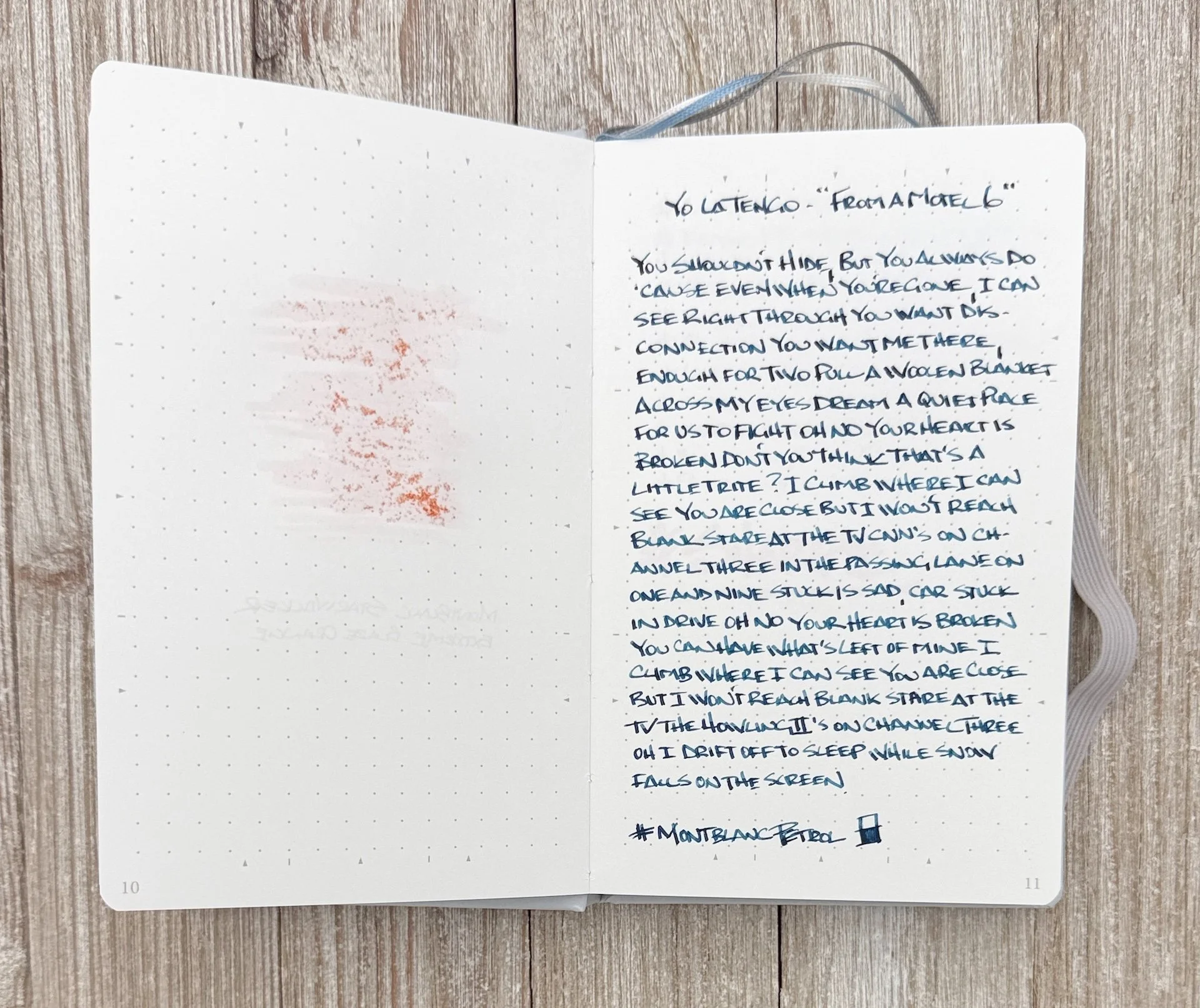
If you are familiar with Maruman’s paper performance, then you will be very happy with what’s contained within these covers. At 90 gsm, it’s a slightly thicker page than what is used in the 70 gsm Spiral Note Basic, and the 80 gsm Mnemosyne Spiral lineup, but the feel and performance is generally the same. It handles every type of ink well, including fountain pen ink. The lines are clean, and the white page shows off color and shading nicely.
Great performance from the Fine Steel Pilot Explorer Nib (left side.)
The only thing I wouldn’t use this notebook for is heavy ink swatching. My swatch didn’t bleed through to the next page, but the paper absorbed a lot of the ink, as opposed to the ink sitting on top of the page to dry. I’ve never had an issue when writing with a fountain pen nib, but dumping ink on the page isn’t the play.

The color is great, but the page is too absorbent for heavy swatches.
None of the ink on the left transferred to the page behind it, which is nice.
Feel wise, I do find it a little dry when writing, which may be the lack of sizing or coating on the page. This may show up more in the finer fountain pen nibs I use, but honestly, it’s not much of an issue, more of a preference. This paper feel also means it’s nice for standard pens like gel, ballpoint, and especially rollerball. This is one of the papers where I see little to no ghosting from the Schmidt P8127 Rollerball refill, which is impressive, and may differentiate this notebook for some.
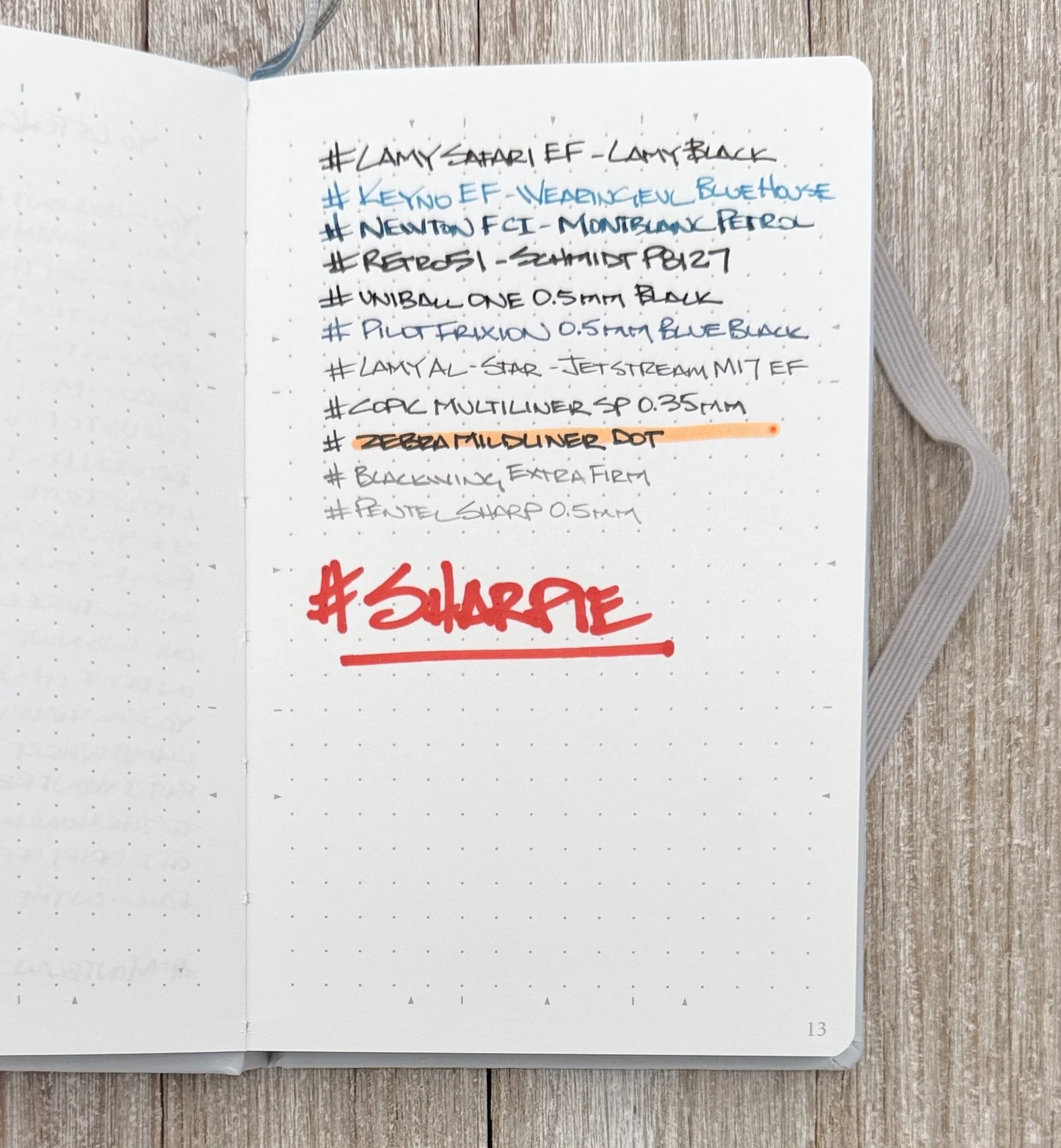
Quality performance for every ink and graphite.
While the format and performance are nearly perfect, the cost of the A6 Slim will play a big role in whether this notebook is for you. At $25, this is well into the premium category, and I’d argue a bit too much for this size. The full A5 variety is $36, and while expensive in its own right, makes a bit more sense as a purchase.
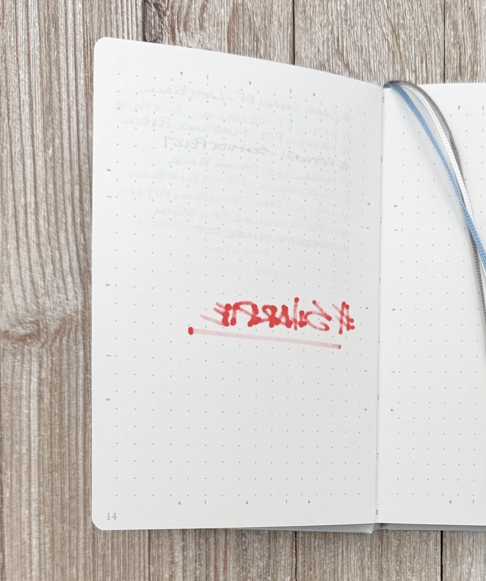
Sharpie lol.
The Maruman Mnemosyne Journal A6 Slim Notebook does fulfill a need as a portable, durable, and quality notebook, so give it a look if it meets your specifics. Anyone would be happy with how it performs, but not everyone needs it in their writing arsenal.
(JetPens provided this product at no charge to The Pen Addict for review purposes.)
Enjoy reading The Pen Addict? Then consider becoming a member to receive additional weekly content, giveaways, and discounts in The Pen Addict shop. Plus, you support me and the site directly, for which I am very grateful.
Membership starts at just $5/month, with a discounted annual option available. To find out more about membership click here and join us!