Posts filed under Platinum

Platinum Classic Lavender Black Ink Review

Platinum Classic Lavender Black Ink Review

(Sarah Read is an author, editor, yarn artist, and pen/paper/ink addict. You can find more about her at her website and on Bluesky. And her latest book, The Atropine Tree, is now available!)

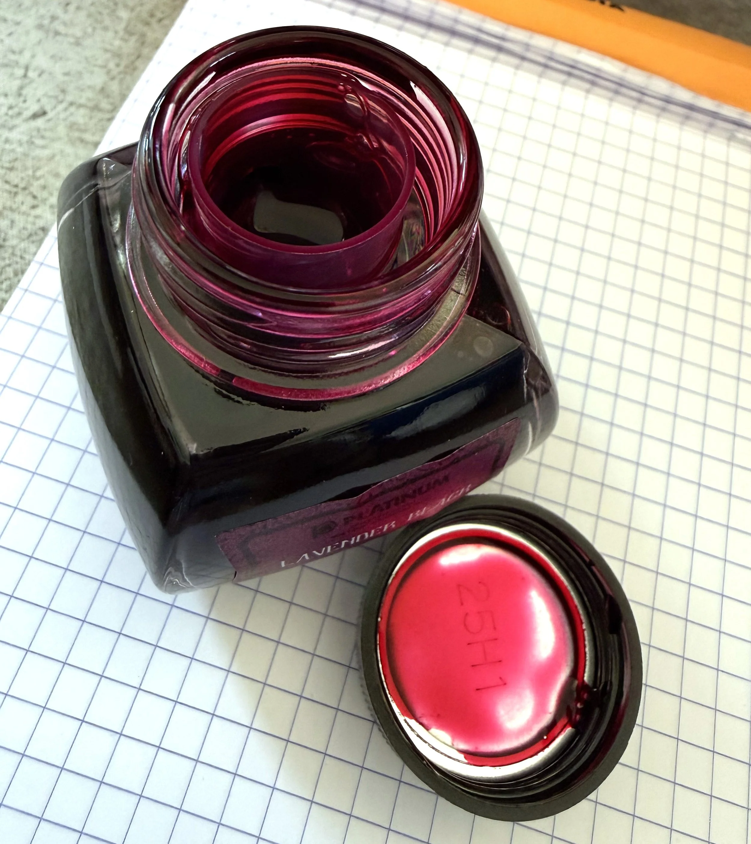
Platinum Classic Lavender Black Ink is like writing with black cherry juice. It goes down bright magenta, dries to a rich purple, and it has some permanence to it. It's a gorgeous ink and it's a pleasure to write with.

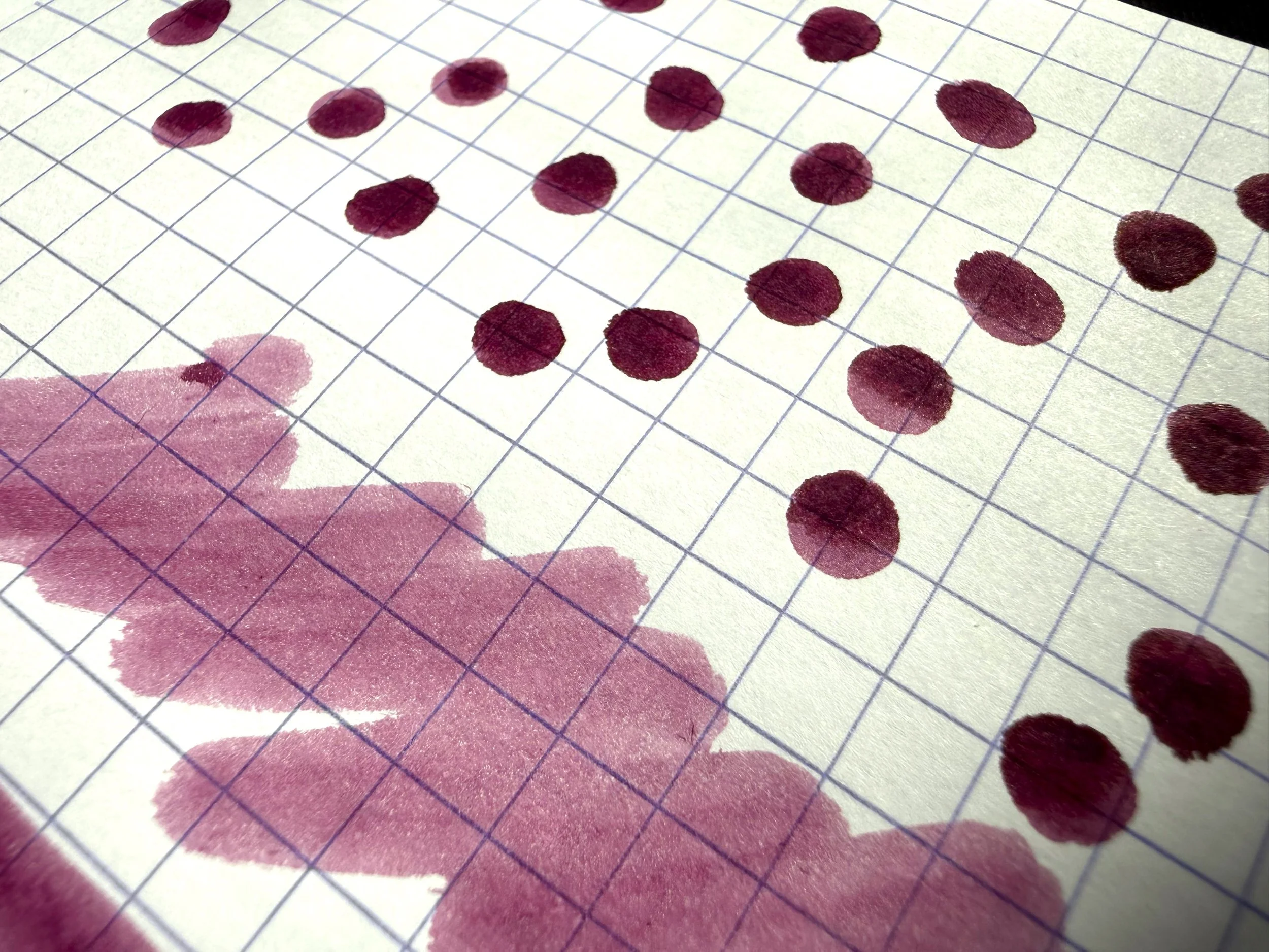
The black base of this ink is a water-resistant modern form of iron gall ink, so it remains when the magenta-lavender dye washes away. You can see the base color stay put in chromatography, and where I dropped water on the grid and wiped it away. While the pigment washes off, the ink's base stays visible. I love that quality in an ink, as I'm always a little worried about my notebook surviving a sweating water bottle, sudden rain, or tippy cup of tea. Often, permanent inks are dull colors, so I was very excited to try this bright one. It does not disappoint.

Platinum Classic Lavender Black Ink Swatch

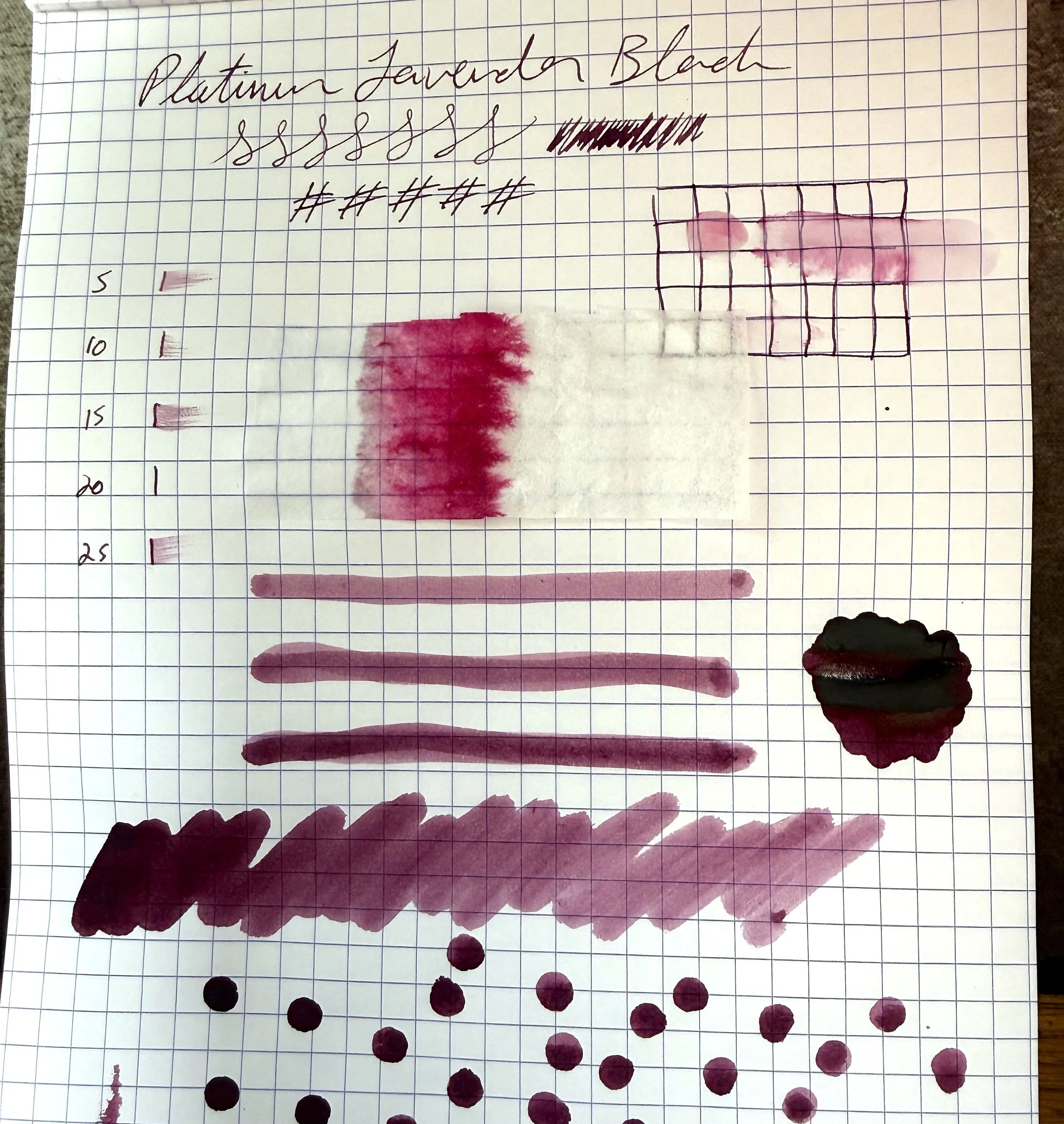
It's common for inks to only have one rad feature: sheen or shimmer or shading or permanence, etc. But this ink has two--permanence and shading. The pale earthy pink to deep cherry color is gorgeous, and watching the ink dry into its ombre shades is hypnotic. Sometimes I forget to keep writing because I'm watching the ink dry. It's also a good color for readability and would pass the professional test, I think. It has some whimsy and character, but looks serious enough.

Platinum Classic Lavender Black Ink

This ink does have a longer dry time, which surprised me, because it's a fairly dry-feeling ink. It isn't scratchy, but it doesn't feel slick. It does take between 20 and thirty seconds to dry, depending on how much ink is laid down.

Platinum Classic Lavender Black Ink Bottle

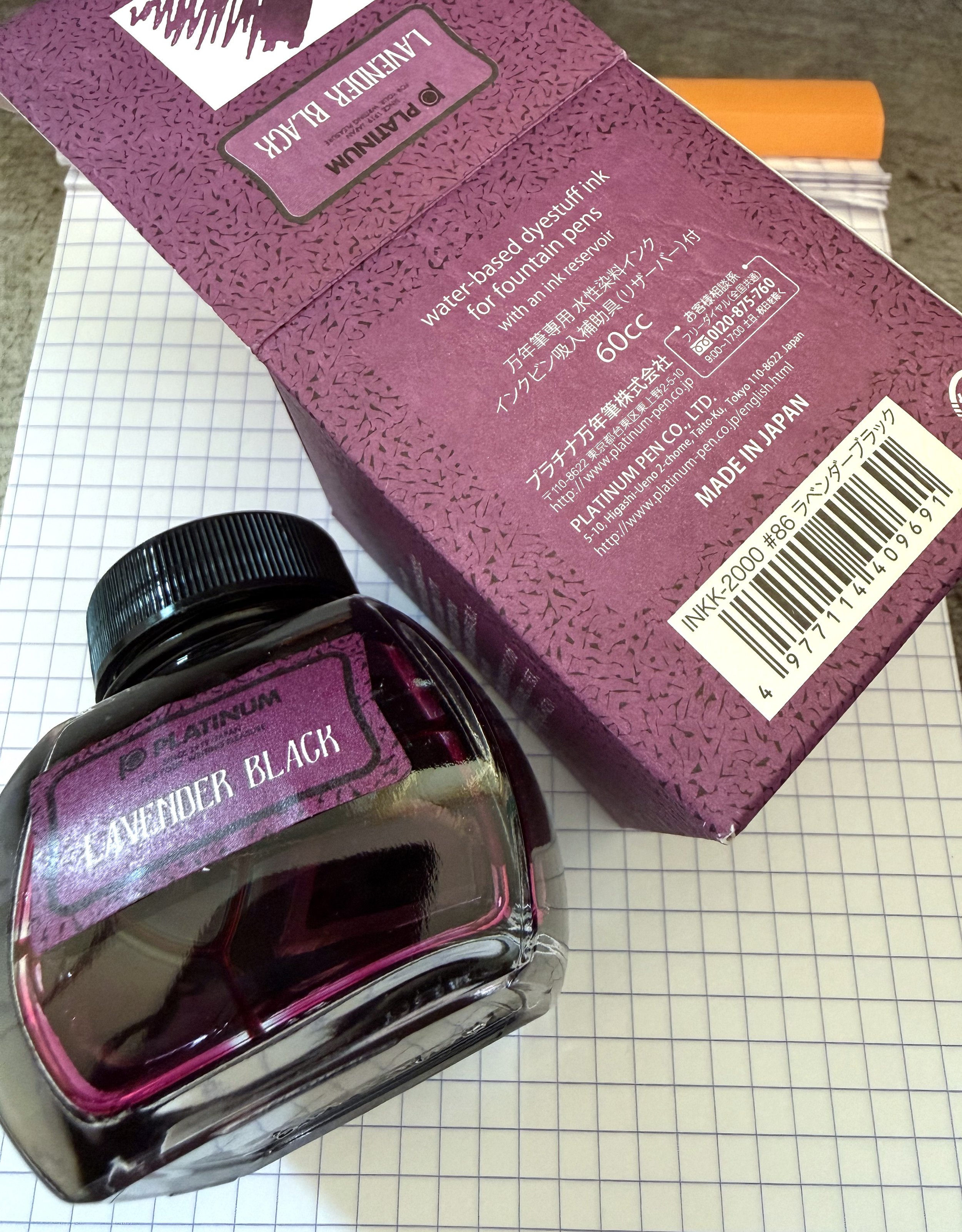
The ink comes in a sturdy blown glass bottle with a black plastic lid. The bottle is a rounded, smooshed cube shape, so there's no danger of tipping. And though the squat shape isn't ideal for filling, it comes with an inkwell insert that provides the perfect nib-shaped well to fill from. The bottle is 60 ml, and it sells for $32 at Vanness Pen Shop, which is a good deal. That much ink will last a long time, which is great, because I can see myself using this one often.

(Vanness Pens provided this product at a discount to The Pen Addict for review purposes.)


Enjoy reading The Pen Addict? Then consider becoming a member to receive additional weekly content, giveaways, and discounts in The Pen Addict shop. Plus, you support me and the site directly, for which I am very grateful.

Membership starts at just $5/month, with a discounted annual option available. To find out more about membership click here and join us!

Posted on May 14, 2026 and filed under Platinum, Ink Reviews.

Platinum Pro-Use 171 Drafting Pencil Limited Edition Review

Platinum Pro-Use 171 Drafting Pencil Limited Edition Review

Platinum not only makes some of the best fountain pens on the market, they have done a great job in the mechanical pencil space for decades as well. The Platinum Pro-Use 171 Drafting Pencil is their top of the line model, with a feature list to match the price tag. Is it worth it? Let’s find out.

Platinum Pro-Use 171 Drafting Pencil

The Pro-Use 171 has two main selling points outside of the standard setup: an adjustable length lead sleeve, and a toggleable spring mechanism to help prevent breakage. Let’s tackle those first, and then we will get into the traditional features.

On the front end of the pencil, the nose cone is twistable to extend and retract the lead sleeve. This extension ranges from 0 mm when completely retracted, to 4.5 mm when fully exposed. As a fan of an extended lead pipe, 4.5 mm is a bit too long even for my tastes, but that is the good news - you can customize it to fit your exact needs. It is a bit of a visual trick when doing this, as it’s the nose cone itself moving up and down. The shorter the sleeve appears, the bigger the gap between the nose cone and barrel. I’m not a fan of the aesthetics of this feature, but it’s usable in my normal writing position.

What I can get behind is the spring mechanism to help with lead breakage. Twisting the grip section to the proper station activates or deactivates the mechanism. I’ve kept it “on” for the most part, other than testing if I could feel any difference. If I push it hard I can notice some give with it activated, but my writing pressure is light enough that it’s hardly noticeable in either stage.

Platinum Pro-Use 171 Drafting Pencil Spring

The two stages are marked on the barrel, with a short twist to engage/disengage the spring.

The standout feature of the Pro-Use 171 is the knurled metal grip section, and the balance it prides to the overall writing experience. The knurling is light-to-moderate so it won’t sandpaper your skin during long sessions, and the entire section is heavy, especially when placed against the lightweight plastic barrel. That’s how engineering and drafting pencils should be designed, but I can’t help but wonder if a lightweight aluminum barrel would better fit the price tag of this pencil.

Platinum Pro-Use 171 Drafting Pencil Comparison

The Pro-Use is a good pencil, but it has a long list of competitors that I would choose before it. Top to bottom: Spoke Design Model 4, uniball Kuru Toga Wood, Pro-Use, Rotring 600.

Price is the kicker for the Pro-Use 171. It’s $43 for this Limited Edition color (the all-Black standard model is $38,) and I’m not sure there is enough there to justify it for my own use. The lead sleeve adjustment is a set it and forget it situation, as is the spring mechanism to assist with breakage. With a few exceptions, I guess you could say I’m a fan of fixed pencils.

Do you have any use cases where the features of the Pro-Use 171 come into play? I’d love to hear them if so.

(JetPens provided this product at no charge to The Pen Addict for review purposes.)


Platinum Pro-Use 171 Drafting Pencil writing
Posted on January 12, 2026 and filed under Platinum, Mechanical Pencil, Pencil Reviews.

Reflections on Some Currently Inked Pens

(Kimberly (she/her) took the express train down the fountain pen/stationery rabbit hole and doesn't want to be rescued. She can be found on Instagram @allthehobbies because there really are many, many hobbies!.)

Despite being in this rabbit hole for 6.5 years, I continue to learn not just about pens, inks and all that, but about my preferences and habits. There isn’t a right or wrong way to be in this hobby and what works for someone may or may not work for you. For some reason during the past few weeks, a few of my currently inked pens were good reminders of lessons I’ve learned along the way.

On the surface, there isn’t much that is similar among these pens, other than they all happen to be blue! (Bottom to top: Pelikan M215 Blue Stripe, TWSBI Classic Blue, Visconti Van Gogh, Platinum Curidas, Pilot Falcon/Elabo.)

Pelikan M215 Blue Stripe

Hard to tell from this picture but there are silver colored stripes on the barrel of this pen.

  • Patience (and research), Grasshopper - I have wanted this pen for 3-4 years (maybe longer) and have seen it on eBay for very high/ambitious prices. And I am definitely not one for patience. But I also don’t want to overspend. Doing research ahead of time, including reaching out to folks who have better pulses on the Pelikan secondary market, made it easier for me to pounce on a listing that was finally in the right price range.
  • Inks & pen combinations matter - As I mentioned in recent ink reviews, inks behave differently in different pens (and also on different papers too). This M215 is currently inked up with Pelikan Edelstein Tanzanite, which is a lovely blue-black ink. Is it a shocker that this is a good matchup? No, not really, but I haven’t used this ink since I first tried it, gulp, way back in 2017, in a Lamy Safari. I absolutely hated the combination because it felt like writing with sand and I wondered if I should dump the ink out of the pen and get rid of the sample. What I didn’t know then, was that Lamy pens can be on the drier side and that Pelikan inks are also on the drier side (to compensate for their wetter nibs), so that combination was doomed from the start. What’s sad is that I was hesitant to try the ink again, even though I learned more about pens and inks since 2017. I’m glad I decided to try the ink in this pen, because it flows just perfectly from this pen, and it’s a great match colorwise, too. I’ve also since learned that it’s ok to empty out a pen if the ink just isn’t doing it for you. Life’s too short to write with a bad combination.

TWSBI Classic, Blue

  • Oldie but goodie - One of my first TWSBIs is the Classic, in Turquoise. I love the non-demonstrator look but I don’t really think about them as much because I usually want a demonstrator when I want to ink up a TWSBI. I needed to ink up a blue pen so I decided on the blue Classic. It had a Fine nib and even though Mediums are my usual jam, I just shrugged and inked it up anyway. Then I wrote with it and was shocked at how much I liked the Classic AND the fine nib. It is so easy to ink up the latest acquisitions and forget about the older pens (and inks). I try to balance that urge by having a mix of old and new pens in the “to-be-inked-next” tray. I do this with inks too. It’s like discovering a lost treasure.

Visconti Van Gogh, Starry Night

  • It’s ok if looks are important - As a Van Gogh fan, and more specifically of Starry Night, I love this pen. Not because it is an amazing writer (I mean, it writes fine) but because looking at it makes me happy. It makes me think about my favorite piece of art and that makes me happy. People place different levels of importance on the nib vs the appearance and that’s one of the many wonderful things about this rabbit hole. My personal pen preference emphasizes looks over writing (probably 65:35 as long as the nib doesn’t write poorly). In the end, as long as you’re happy, whether it’s with the looks, the nib (or both), it’s a win in my book.
  • Oldie but goodie, this time with ink - I inked this up with an ink that I once loved but sorta put by the wayside (shame on me) - Iroshizuku Tsuki-yo. When everyone was raving about Shin-kai (cough cough, Bossman), I instead fell in love with Tsuki-yo. With all the deluge of inks that currently exist and continue to be released, it’s easy to get caught up in the latest “must-have ink”. I had forgotten how much I liked that ink and I’m glad I decided to use it again.

Platinum Curidas, Matte Blue

  • It is not a popularity contest - Not gonna lie, the Platinum Curidas is probably one of the more polarizing pens when it comes to looks, nock length, design, etc. And yet, I still love it. I have the original demonstrator finishes but I love this Matte Blue with black trim. The Medium steel nib gives me the perfect line width. Do I love it more than the Vanishing Points or Decimos? Probably not, but I still love it, even if it’s not for everyone, and that’s what matters.
  • Don’t judge an ink before using it - I bought a sample of Taccia Ukiyo-e Hiroshige-Ruri and after swatching it, I thought “yet another dark blue ink” and was glad that I hadn’t bought a bottle. After pairing it up with the Curidas though, I’m loving the richness of this blue ink, along with its subtle sheen that can even been seen on Rhodia, and am now adding it to my “bottles to buy” list. It’s another reminder that I shouldn’t judge an ink too quickly!

Pilot Falcon/Elabo, Metal Blue

  • They can’t all be winners - The Pilot Falcon (or Elabo in other markets) is a pen that has a fun, bouncy nib that can give some line variation, which I generally love, but there’s something about this one that isn’t doing it for me. I really like the plastic version of this pen with a Soft Fine nib, but I don’t think it’s the minimally- added weight. The Akkerman Delfts Blauw ink is flowing just fine so it’s not that. Maybe it’s the Soft Medium nib which feels blobby and almost squeaky. I really want to love it, but I don’t, so I think it’s better to part ways, than to have it stay in the collection untouched and unloved.
  • It’s hard saying goodbye - Despite everything I just wrote about the pen not being a good fit, it’s still really hard for me to decide to sell a pen. I just have to remember that someone else will enjoy it more than I do and that I can use the proceeds to get something else, like that bottle of Taccia Hiroshige-ruri :-)

None of these things are earth-shattering or new in any way, but I don’t usually have these revelations when I’m writing with my pens. So when they do pop up, it’s worth taking a moment to pay attention to what they’re trying to teach me.

Posted on November 17, 2023 and filed under Fountain Pens, Pilot, Pelikan, TWSBI, Visconti, Platinum.