Posts filed under Guest Post

Pen Show Nib Grinds: Oblique Italic By All In The Nib

(This is a guest Post from Sam Alpert. Sam is a geologist, gamer, and general lover of all things with good, clean design that will last a lifetime.)

I was fortunate enough to be able to attend my first pen show ever this year at the Baltimore Washington International Pen Show, or BWIPS for short! One of my biggest objectives was to take advantage of the presence of nib grinders to get at least one of my pens ground. This wouldn’t be my first time having this done, previously I was able to get an architect grind from JJ Lax when he was doing an in-store event for Fountain Pen Day 2023. I loved the experience, and was keen to continue finding ways to customize my writing.

I was only going to be able to attend the show on Friday, so I looked online and was able to book in advance with JC at The Nib Tailor. But Sam, you say quickly, this article refers to All in the Nib, surely that was a typo. Unfortunately, Thursday night, disaster struck, when JC fell ill and canceled all his Friday appointments. This was pretty rough, since I’d only booked to be at the event the one day. I immediately reached out for advice, and Brad was quick to recommend Damien. With no availability to book appointments online I made sure I was there early Friday to go straight to his table when the doors opened and take the first slot that I could find. With my name on for 3:30 I was happy to spend the rest of my morning accomplishing other goals (Schon DSGN presents clear and present danger to your wallet, just saying.)

Damien looking like a wizard while grinding my nib. When I asked if I could take a photo he said, “please do, I don’t have that many of myself working” which I thought was sarcastic at first, but turns out he really is just too focused to get photos!

When I sat down with Damien the first thing he did was to ask what kind of grinds I had, and what I did or didn’t like about them. I told him my preferences, M SIG for life, and he walked me through a couple of choices that he thought I might like. It was very helpful that he had a tester pen on his table for each grind he offers, allowing me to effectively preview how they would actually feel in practice. This seems somewhat common for nib grinders and I would say it was essential as basically a first-timer. For example, I would normally never have asked for an oblique grind, but while talking about what I didn’t like about the tester he had, Damien explained that there were things he could change (namely the angle of the oblique) that would better suit my writing angle. With that in mind, we settled on the oblique italic. Honestly, a lot of his grinds appealed to me, but I wanted to try something out of my comfort zone, and so put myself in Damien’s extremely competent hands.

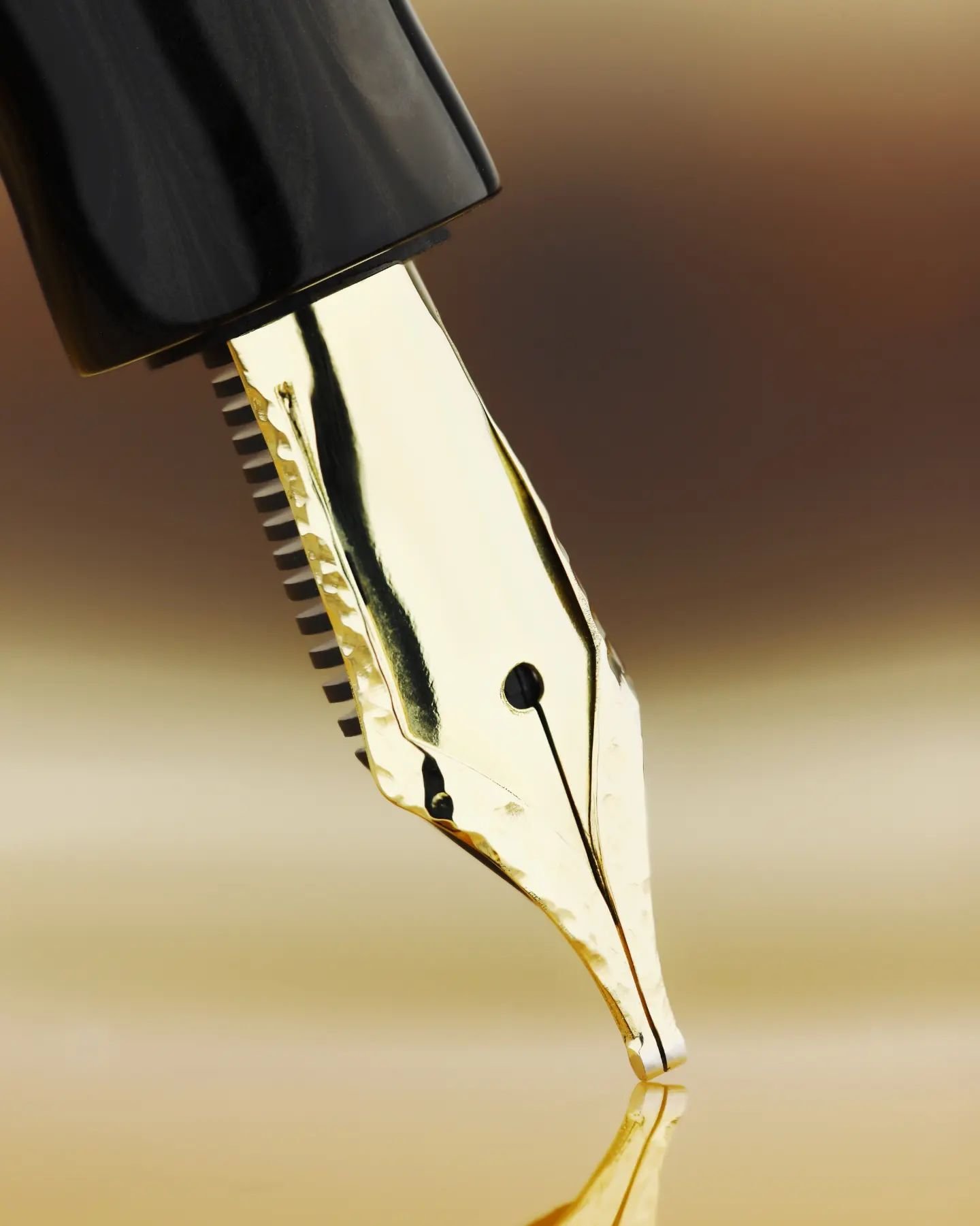
I’d brought a B 21k Sailor nib that just hadn’t been doing it for me. Damien encouraged me to talk him through what I did and didn’t like about the nib as-was, and used that as a starting point for the grind. The first thing he did was to open up the nib slightly, allowing for a wetter writing experience, he then set to work grinding the oblique italic, keeping just a hint of the feedback that Sailor is known for.

The finished grind is super smooth, and fits my writing style perfectly. I get good variation in my strokes, and don't feel any need to adjust how I hold the pen. Damien was patient with me testing the grind a few times, and making tweaks according to my feedback. All in all it was a fantastic experience and I'm very glad to have met him. He is professional, but also clever, making smalltalk all while focusing on making the grind. I would absolutely recommend Damien to anyone looking for a fantastic grind at a very fair rate. And for those of you worried about grinding your expensive nibs, I encourage you to stop by a table at a pen show and try the tester pens, you may be surprised what cool things you’ll find!


Enjoy reading The Pen Addict? Then consider becoming a member to receive additional weekly content, giveaways, and discounts in The Pen Addict shop. Plus, you support me and the site directly, for which I am very grateful.

Membership starts at just $5/month, with a discounted annual option available. To find out more about membership click here and join us!

Posted on May 6, 2024 and filed under Nib Grind, Pen Shows, Guest Post.

In the Footsteps of the Pen Addict - Choosing a Spoke Icon

(Note from Brad: Since I wouldn’t review this pen myself, my friend Diane asked if she could step in and tackle a product I had a direct hand in making. This is her review below. Thank you Diane!)

In early 2021, Spoke Design introduced not one but 3 fountain pens - the Icon, Axle and Axle S. All 3 designs are available in a variety of mix and match color combinations.

Right away I wanted to get at least one of these pens, but. which? I loved all 3, and it took time to narrow down the choices. Despite its cuteness, I managed to eliminate the tiny Axle S because of its cartridge-only filling system. While the Axle’s tool-like aesthetic was appealing and I liked the threaded posting, I found the Icon the most intriguing with its open 6-slotted barrel revealing a contrasting inner sleeve. Soon after the release, alternative grips including a knurled version were added for the Icon only.

For a while I held out for a pen show where I could evaluate the models in person, but over a year passed with no pen shows attended by Spoke.

I had decided that I wanted the knurled grip and sleeve in the same color, with a surprise color contrast to the cap and barrel. Of all the knurled grip colors, I liked the cyan best. That just left the choice of cap and barrel color.

I found the gunmetal or silver combination with cyan too conservative; the purple and cyan, on the other hand, seemed too gaudy.

Time passed, and the unfinished business of choosing an Icon remained. Meanwhile the colors slowly sold out and my choice was made - cobalt blue and cyan.

First impressions

The pen arrived securely packed in foam-line tin within a Spoke Design logo box,. In the website photos, the Icon looks like a chunky, heavy pen. In fact it’s smaller than I expected and also at 23.6g capped, it weighs about the same as a Lamy Safari, substantially less than most of the pens I use daily. There are benefits to lighter weight and benefits to substance. The option of brass grip and insert may allow the pen to be customized to be heavier if that’s preferred.

Spoke Icon Comparison

From the top: Rotring 600 pencil; Rotring Newton; Lamy Al-Star; Spoke Icon; Diplomat Aero; Levenger L-Tech.

Fitting a new pen into my life When taking handwritten notes in meetings, I like a pen with an efficient, geometric, logical appearance; unconventional but not flamboyant. I also have a dread of a pen drying up while uncapped, so I like to use either a snap cap or a retractable. My go-tos are Rotring Newton, Diplomat Aero, Pilot Vanishing Point and Platinum Curidas, all with EF nibs. My heptagonal, F nibbed Levenger L-Tech could be a runner up here as it channels the Rotring design aesthetic; although it’s not a snap cap, it can be uncapped in less than a full turn.

For daily ephemeral work notes and sketches, I use my notetaking pen du jour, something else from rotation, plus a stub or architect with a different colored ink for accents and separators.

When flying, I value pens that don’t dry out if left unused for a while as I believe this makes them more resistant to air pressure changes and leaking. Kaweco Al-Sport, Schon DSGN pocket 6, Esterbrook Estie and Platinum 3776 have served well here; the retractables stay at home.

For home note-taking and journaling, abalone and crazy resins are welcome as well as modern flex nibs, stubs and italics.

Viewed through this lens, the Spoke Icon has the logical, geometric aesthetic that I like for the office. It wrote instantly and did not leak after 2 flights with 2 weeks of non-use over the holidays. In the months since obtaining the Icon, it has been a daily driver for work and home.

Usability

Unlike its Axle siblings, the Icon is not designed to post. At first glance the cutouts look like they are there to provide roll stop behavior. They don’t - the pen rolls easily and when placed on a desk, defensive measures are necessary.

The Icon’s barrel has an o-ring that prevents it from unscrewing on its own, and attempts to unscrew the cap don’t cause the barrel to come undone. The cap thread does not make contact with fingers while in use. One downside is that the cap has a single thread and takes over 3 full rotations to undo. While this provides for a moment of quiet meditation when uncapping the pen, it makes it a less than ideal choice for meeting notes.

Grip choices

There’s a special fatigue caused by writing with a slippery pen. The mental energy required to keep control of the pen is not available for the thought processes involved in writing. The first time I picked up a pen with a knurled grip, I experienced an unexpected peace and increased focus.

Until the Icon, I only had two knurled grip writing instruments - a Rotring 600 pencil and the Rotring-inspired Levenger L-Tech fountain pen. I received all 3 available grip variants with my Icon and rated each on the following factors:

Grip Comfort - 1 minimum, 5 maximum, higher is better.

Slip vs grip - 1 slippery, 5 grippy, higher is better.

The Icon’s concave grip scored 5; it is one of the most comfortable grips I have ever used. However, it scored 2 on the slip versus grip scale, being slippery both longitudinally and rotationally.

The Icon’s groove grip scored 3 for comfort and 4 for slip vs grip; longitudinal slip is gone but rotational slip remains.

The Icon’s knurled grip scored 4 for comfort, dropping a point relative to the concave, and a perfect 5 for grip.

While the Levenger L-Tech also scored 4 + 5 due to its knurled grip, both the Rotring Newton and Diplomat Aero have unforgiving straight slippery grips, scoring 2+2 = 4 each.

Retractables have their own grip comfort challenges, which I see as a necessary compromise for retractable functionality, so I won’t rate them here.

The knurled grips are clear winners in this highly subjective evaluation. The surprise is just how badly I rate two of my go-to pens in comparison.

Spoke Icon Concave Grip

Spoke Icon Concave Grip.

Spoke Icon Groove Grip

Spoke Icon Groove Grip.

Filling

The Icon uses standard cartridge / converter filling and with the barrel sleeve in place, there’s no ink window. The sleeve can be removed with the available tool in order to replace it with a different color. Removing the sleeve completely gives a view of the ink level in the converter, at the expense of the flash of contrasting color from the sleeve. It’s worth noting that the sleeve is open ended, so if the cartridge or converter were dislodged, ink could escape from the barrel. This is also a consideration for the Lamy Safari and Al-Star; I have never had it happen with either. The main downside of the knurled grip is that when filling from an ink bottle, ink may get into the knurled texture and is then hard to remove. Even when it seems to be gone, tiny amounts of ink remain and transfer to fingers when writing. There are many ways to avoid this - rinsing the grip after filling, syringe-filling the converter, filling the converter from the bottle or from a TSWBI inkwell - and I’m happy to use these methods in return for the knurled grip.

Nib Heaven

The nib is always the most important part of any pen and yet in this case, also the least important. Since the Icon takes a standard Jowo #6 nib unit, any other Jowo #6 will fit, giving access to needlepoint, stub, fine cursive italic, modern semi-flex, architect and more from a variety of sources.

The Spoke Icon is available with a standard Jowo #6 nib unit in EF, F, M and B, all engraved with the Spoke logo. I selected the Jowo #6 EF somewhat reluctantly as I already have several in other pens. I have come to think of the Jowo #6 EF as Heaven - every time I come back to it, I marvel at its precise, clean line, reliability and ease of use. But it’s Heaven by the Talking Heads - the ennui of perfection.

Conclusion

The Spoke Icon is everything I hoped it would be. Its clean but unconventional design suits me both at work and at home. It sparks joy when its cyan accents flash through the barrel cutouts or appear when the cap is removed. Its knurled grip allows me to focus on writing. Its nib is perfect and also easily replaced. And I can live with the 3 turns to remove the cap.

As I made arrangements to get the Icon’s nib tailored to UEF and obtain a reverse architect / engineering nib, I reflected on one of my all-time favorites - the gold fine cursive italic in the Lamy Dialog, purchased from the Pen Addict during a previous herd-thinning event.

For me, this is all that’s missing from the Spoke Icon - it would be great to be able to order a Spoke pen pre-sprinkled with Pen Addict nib magic.

(I received the Spoke Icon at no charge in return for this unbiased review.)

Posted on March 2, 2023 and filed under Spoke Design, Fountain Pens, Pen Reviews, Guest Post.

Behold, Something New! The Harmonic Nib, from Opus Cineris

Opus Cineris Harmonic Nib

The Harmonic Nib. Image via Opus Cineris.

(This is a guest post by Andrew Coon. You can find more of Andrew’s fountain pen favorites on Instagram.)

Whenever a pen of note arrives, something interesting, I hand it to my wife. I play with pens, she knits. I appreciate the yarn she finds, and she appreciates the pens that show up. Over the years, many such pens have arrived and we have found a pattern.

She takes the pen, and writes the following:

Writing

A Harmonic BB nib, with Diamine Aurora Borealis on a Nock a5 Cahier.

And then she asks what makes it special. I have handed her a Pilot Emperor, a Pilot Custom Urushi, Jowo 6's, Bock 8's, King of Pens, stacked nibs of all different types, and many more.

This time, she said "this could be my favorite."

My wife has good taste.

What she wrote with is already one of my favorites - both for who made it as well as for what it is.

Anabelle Hiller, first being trained as a musician, then made the jump to metal working. A trained jeweler, she has focused on a particular piece of metal that anyone reading this holds dear - the nib of a fountain pen. After creating her own nib for her masterpiece she experimented with a batch of silver nibs. After a few truly lucky people tested them out at length, she moved on to make a batch of ten nibs in 14k gold.

I was lucky enough to obtain one of these, and I would like to tell you about it because there will be more of her creations. They will be worth finding and cherishing.

Opus Cineris Harmonic Silver

The Harmonic Nib, in Silver. Image via Opus Cineris.

What is immediately striking about this nib is the double layer of metal that frames the entire nib. I don't know how this is done - but I can see what it makes possible. On these, this edge has a hammered finish that is very striking. On Anabelle's second set of nibs, a set of 8 made in silver, this edge was engraved in a leaf border, complementing the scrolls down the center of the nib.

Matched with an ebonite feed from FPnibs.com, these nibs can be customized with any grind. What I have is a round BB, tuned for showing off the sheening and shading properties of any ink. And, it is perfect. Responsive and well behaved, I can only wish that all my nibs wrote like this one. I have used multiple brands of ink with it, multiple types of paper, and the performance has been consistent and superb.

Harmonic Nib Giants Pens

The Harmonic Nib, with Giants' Pens ebonite barrel. Image via Opus Cineris.

The pen this nib came in was made by Teun and Joep of Giants' Pens, and is elegant and clean. The material is a black and grey ebonite, that is almost impossible to photograph. The tolerances are tight - and the quickest way to tell is with the threading. This threading is smooth and exact. Matched with the immaculate polish, the pen is a stunner. Its shape is that of a Nakaya Naka-ai, and that is what it reminded me of. Light, nimble, a pen that I reach for multiple times a day.

It is not often that something truly new comes along in the pen community. This is one of those moments.

Anabelle makes nibs sing upon request, for any pens purchased from Appelboom. In addition to employing her, Appelboom also allowed Anabelle to use their website for the sale. This is very cool - It is always good to see those who are well established in the field support those who are starting.

I look forward to following along with what happens next. Engraving, gem setting, overlays? I don't know. But it will be great.

I invite you to join me in following Anabelle at Opus Cineris and on Instagram @opuscineris

(This nib was purchased by Andrew Coon at the 2022 Washington DC Pen Show, directly from Anabelle Hiller. Opus Cineris images provided for this post with permission.)

Posted on September 5, 2022 and filed under Opus Cineris, Fountain Pens, Nibs, Guest Post.