As a long-time LAMY fan, not even I have tried all of their pens and pencils, but I’m getting one step closer with this review of the LAMY noto.
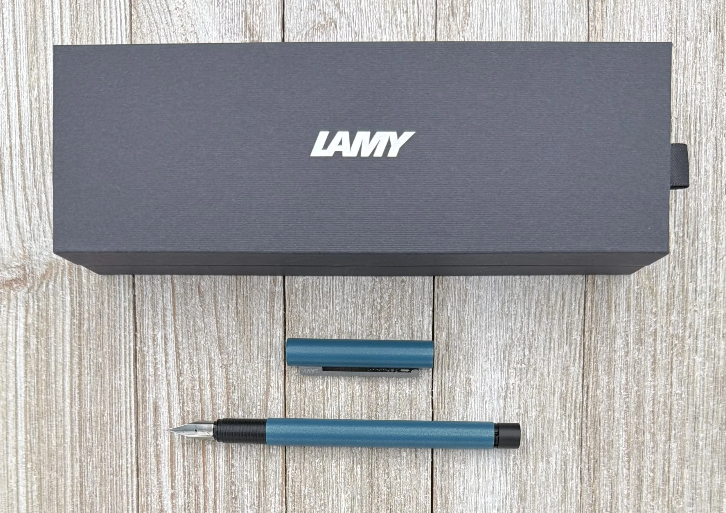
In my mind, LAMY does entry-level as well as anyone that’s not looking to dominate retail shelves with three-packs of pens, or office supply cabinets with dozen-count boxes. Entry-level in their case means a single pen made well, and for a fair price. The noto ranges from $12-16 depending on the color (this Teal model is a “Special Edition” and runs $14,) and places itself in the popular “upgrade from my first pen” category.
Is it an upgrade, though? Let’s take a look.
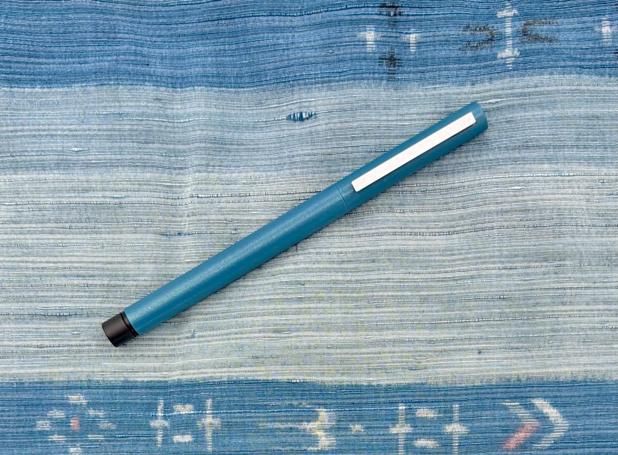
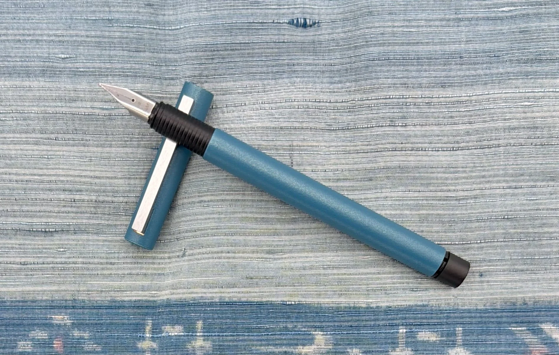
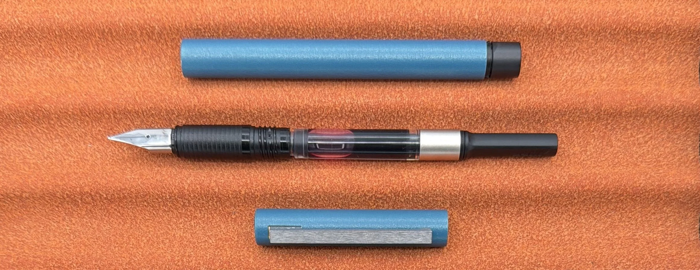
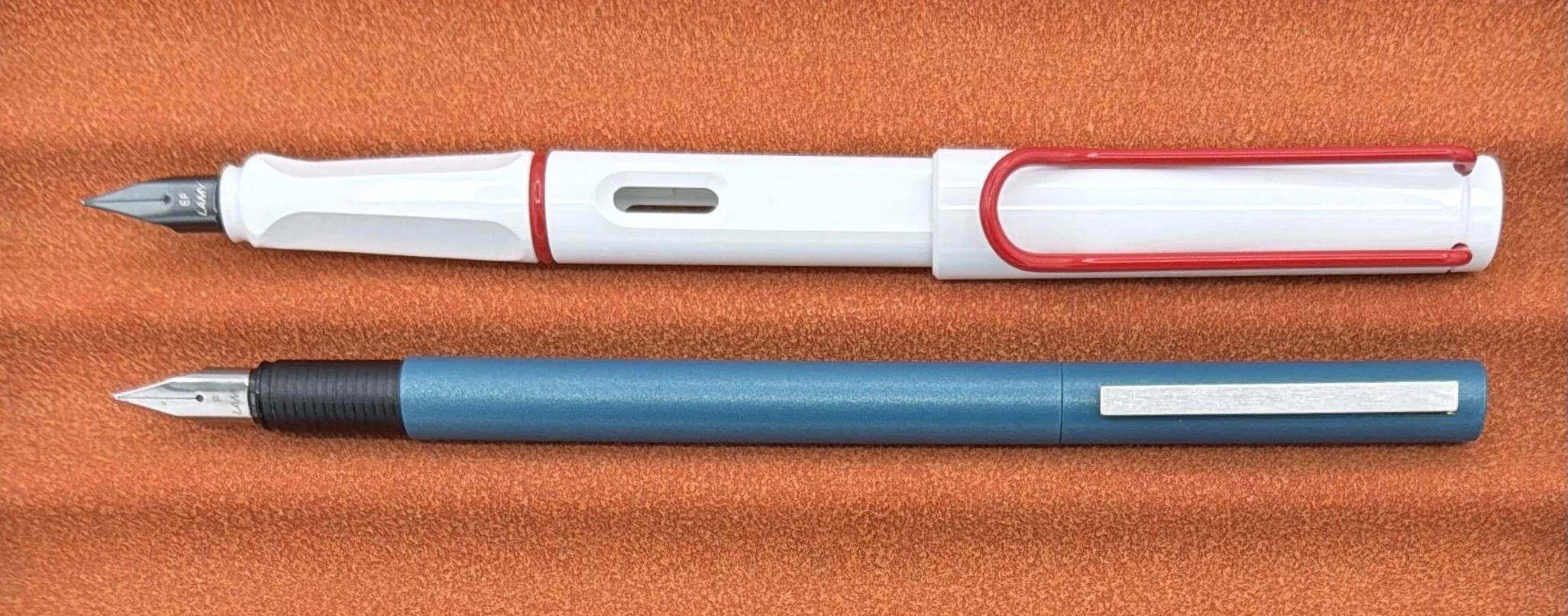
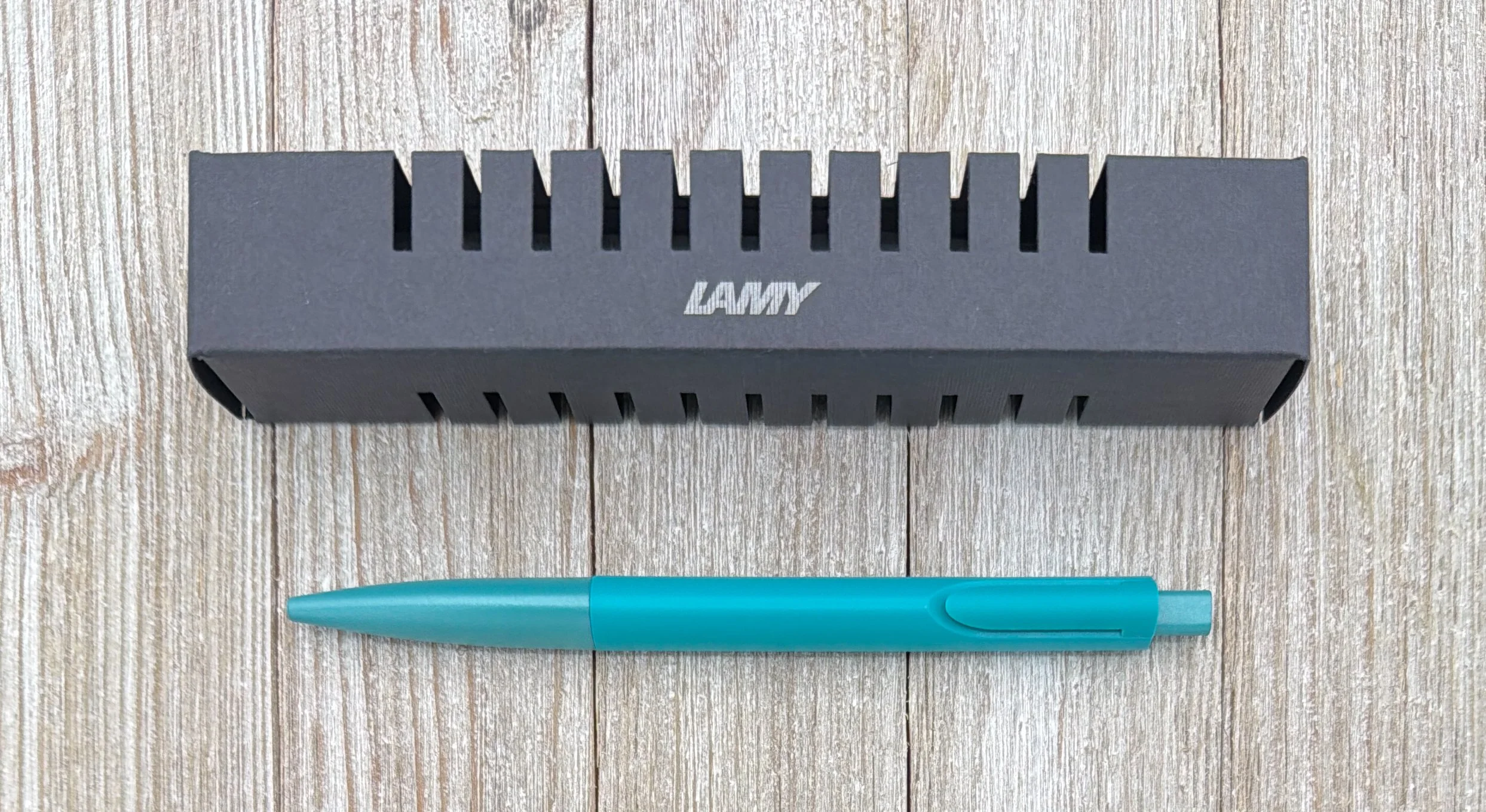
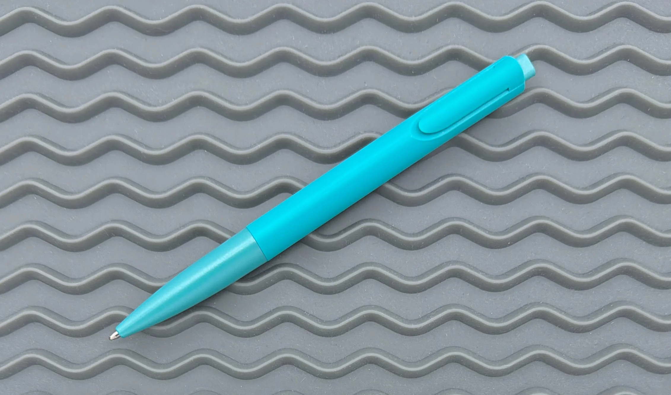
The noto (I’m having a hard time not capitalizing “noto,” but that’s how LAMY lists it,) is a plastic barrel, retractable, ballpoint pen. Designed by Naoto Fukasawa, it is the only LAMY creation by what seems to be quite a prolific designer. The noto fits the LAMY aesthetic, so I’d say they nailed the design brief.
The standout design points of the noto are the triangular grip section, and what I’m calling an inset clip that appears built in to the barrel. These features are also ones that can be divisive for anyone interested in buying the noto.
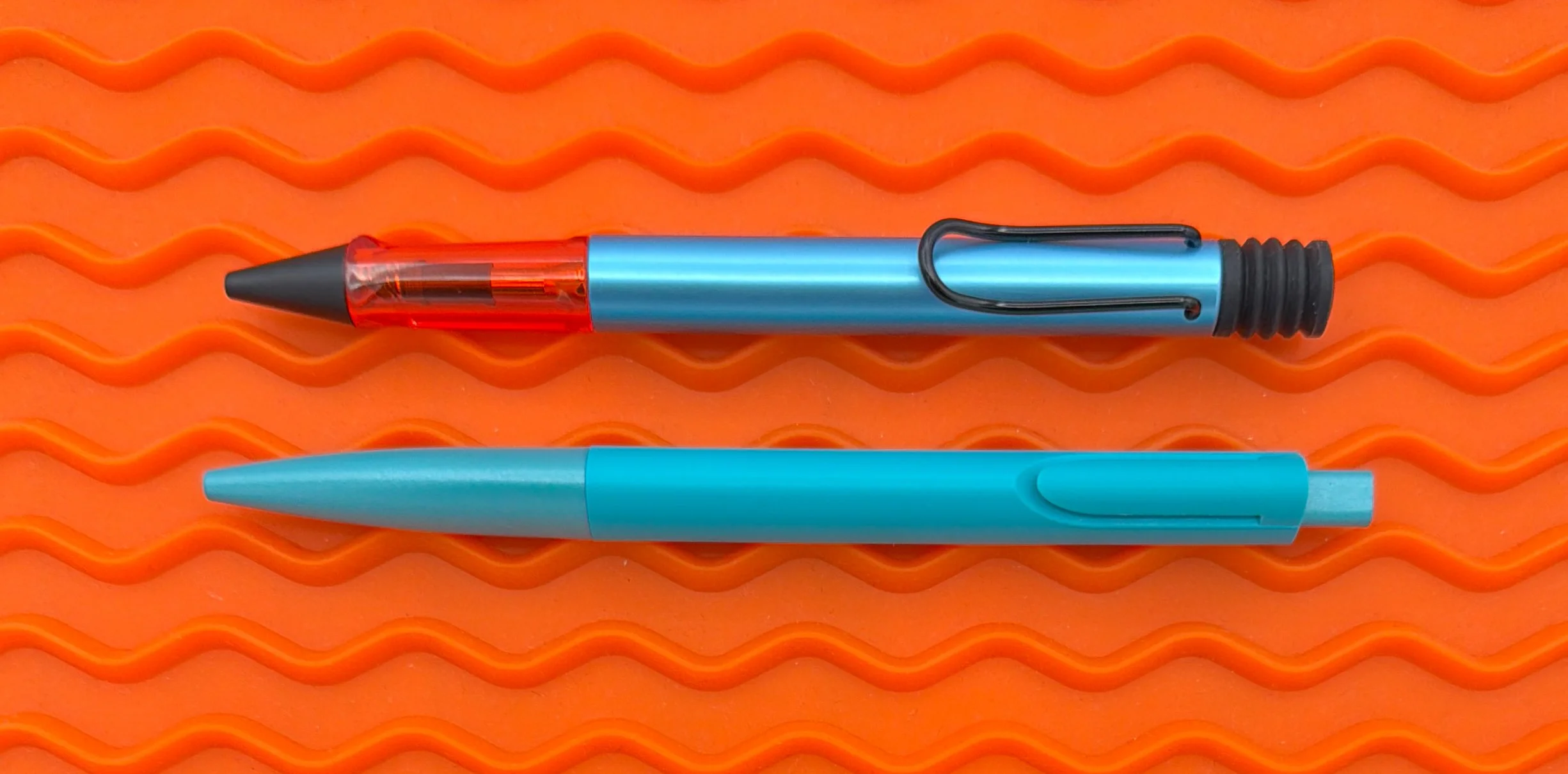
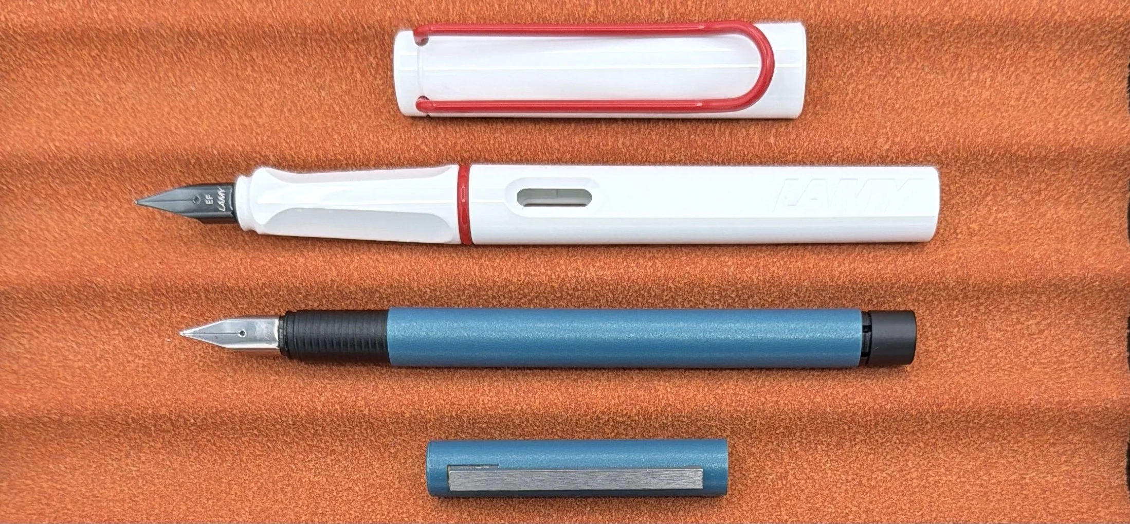
LAMY Denim AL-Star ballpoint, top.
While the triangular grip is less intrusive than the molded grip section used on their Safari and AL-Star lineups, it can still pose a problem for non-traditional grips. It’s comfortable for a standard tripod grip like mine, and I can even rotate the barrel when writing without the clip hitting my hand way due to its design. I also like the monotone matching throughout the Teal barrel.
The clip design … I just can’t get behind it from a functional perspective. It looks good, and it is unobtrusive, but it requires a little extra if you want to clip it to something. Maybe you have to tilt your paper at an angle, of maybe it takes two hands to attach. Whatever it is, it’s extra. It’s a form over function design. I like the form, and don’t use the function.
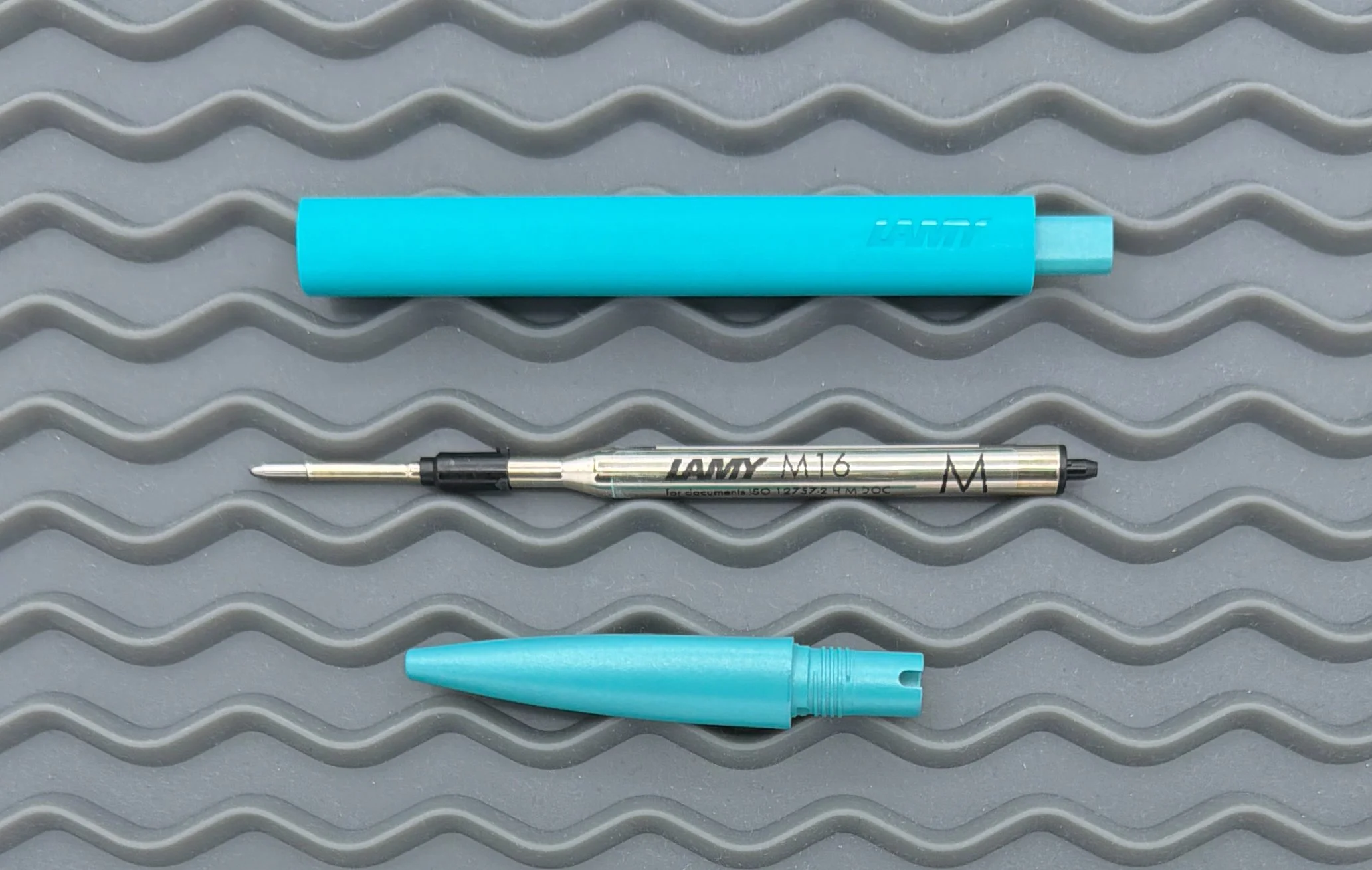
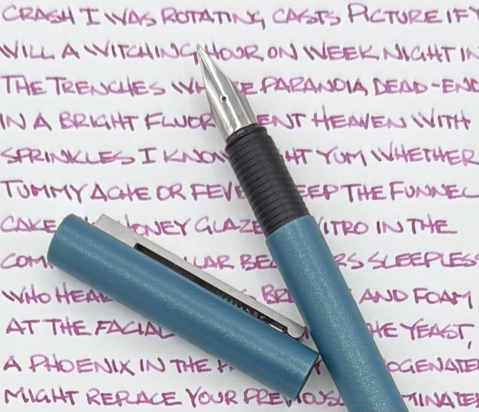
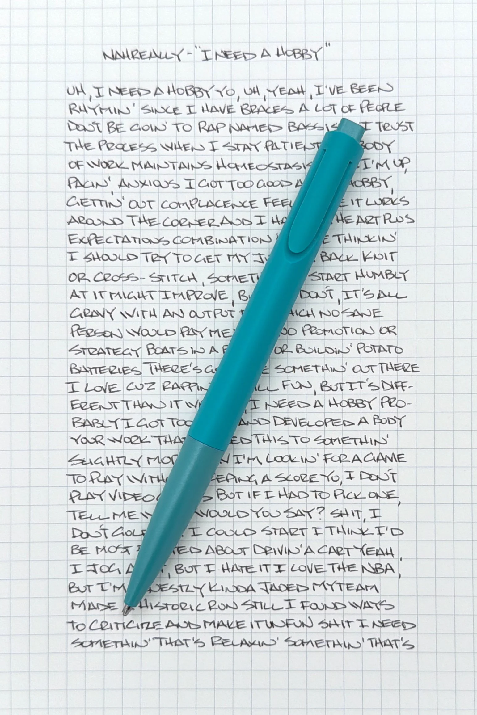
The refill used by the Noto is their classic M16 ballpoint. I must be an outlier in that I enjoy this refill, because it does get some grief. As far as standard ballpoint ink formulations go, it is up there in quality and performance. This Black Medium refill is dark and smooth, and the tip stays clean. Maybe one day LAMY will allow customers to easily upgrade to the uniball Jetstream-filled LAMY M17 refill, but today is not that day. Regardless, I think it writes great as-is.
To answer the “upgrade” question above, I’ll be direct and say that the LAMY noto - or other entry-level LAMY ballpoints like the XEVO - cannot compete on pure refill performance with any uniball Jetstream ballpoint. No ballpoint can, to be clear, so why consider the noto? It looks fantastic, feels great in the hand, writes well, and is fun to use. At $14, it makes for a good personal, portable option, and would make a good gift, especially give the range of color options.
The LAMY noto makes me smile, and that’s as good of a reason to own it as any.
(Goldspot Pens provided this product at a discount to The Pen Addict for review purposes.)
Enjoy reading The Pen Addict? Then consider becoming a member to receive additional weekly content, giveaways, and discounts in The Pen Addict shop. Plus, you support me and the site directly, for which I am very grateful.
Membership starts at just $5/month, with a discounted annual option available. To find out more about membership click here and join us!