(Sarah Read is an author, editor, yarn artist, and pen/paper/ink addict. You can find more about her at her website and on Bluesky. And her latest book, The Atropine Tree, is now available!)
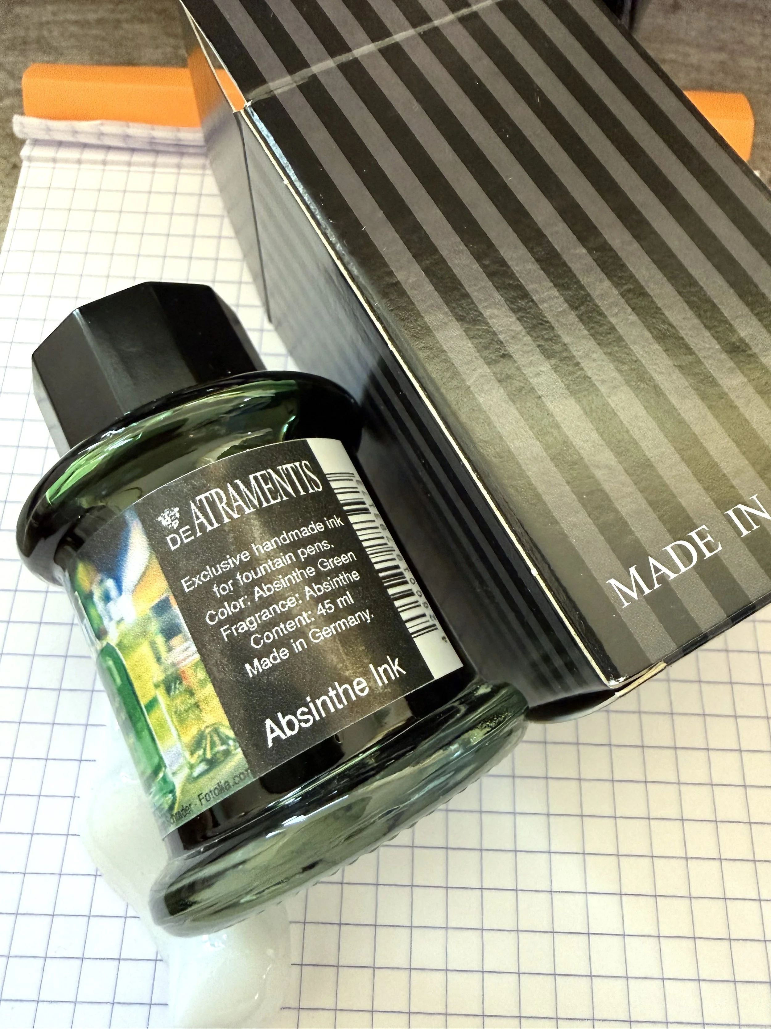
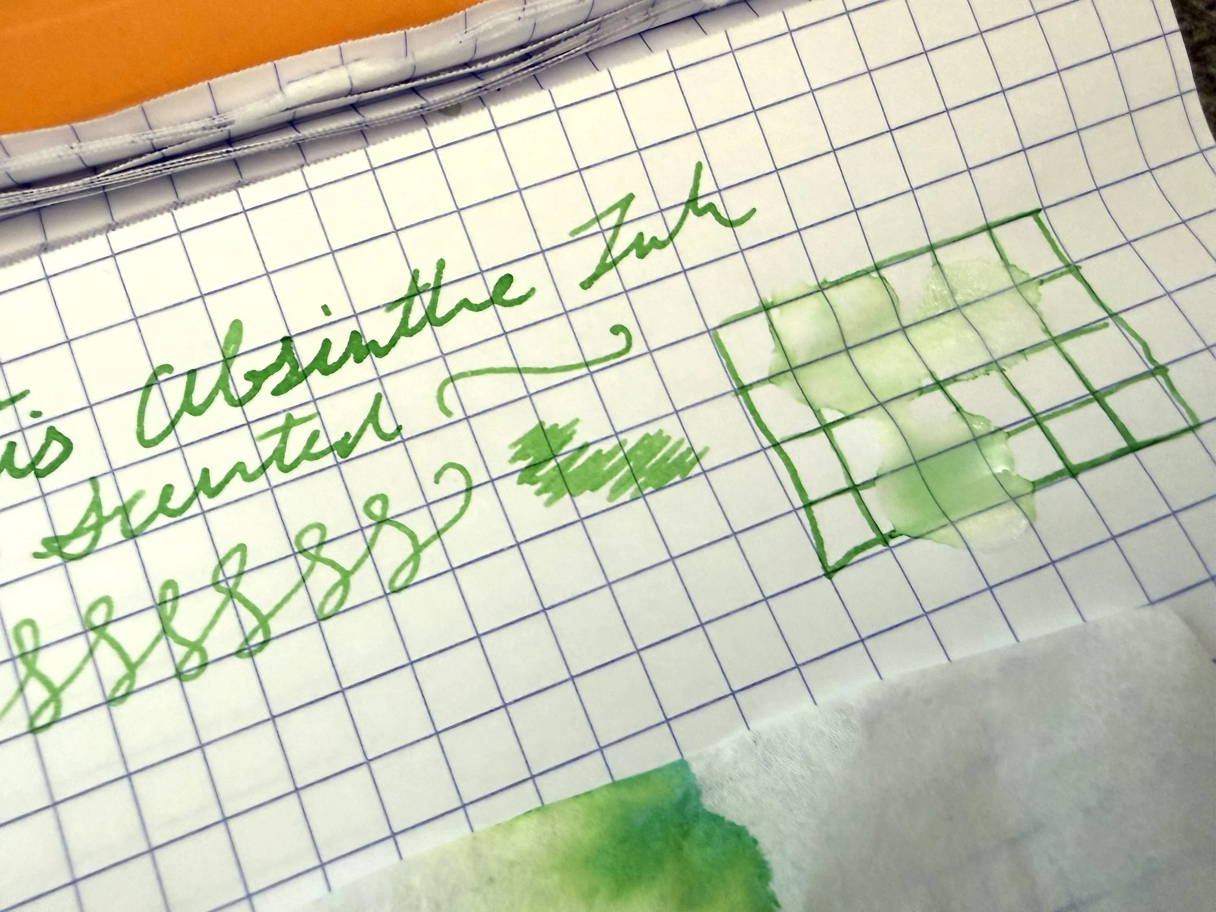
If one wants to write strange and unusual things in strange and unusual ways, one needs strange and unusual ink. That's just math. And this is chemistry--a weird form of chemistry where they make bright green ink that looks and smells like Absinthe (but you're not supposed to drink it).
DeAtramentis is delightfully experimental in their scented ink line, with fragrances ranging from the expected, such as rose and cedar, to the downright odd, like cannabis and banana. Absinthe is on the odder end of the spectrum. But I love a glass of absinthe, and I love to write in green ink, so this was a must-try for me.
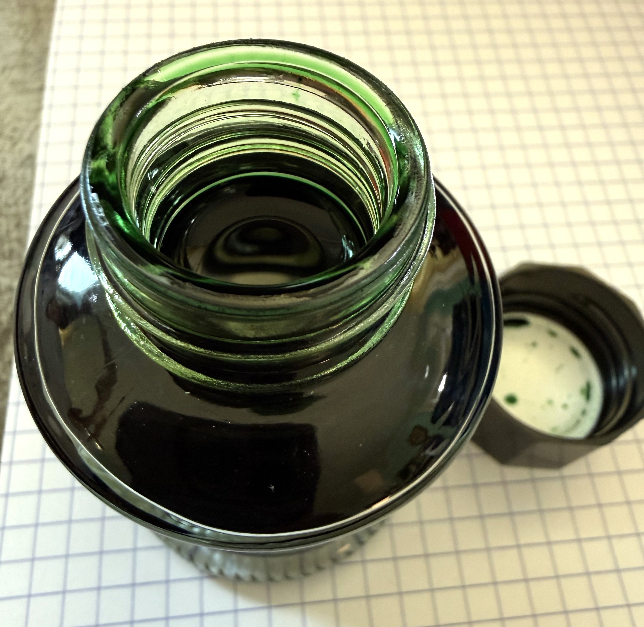
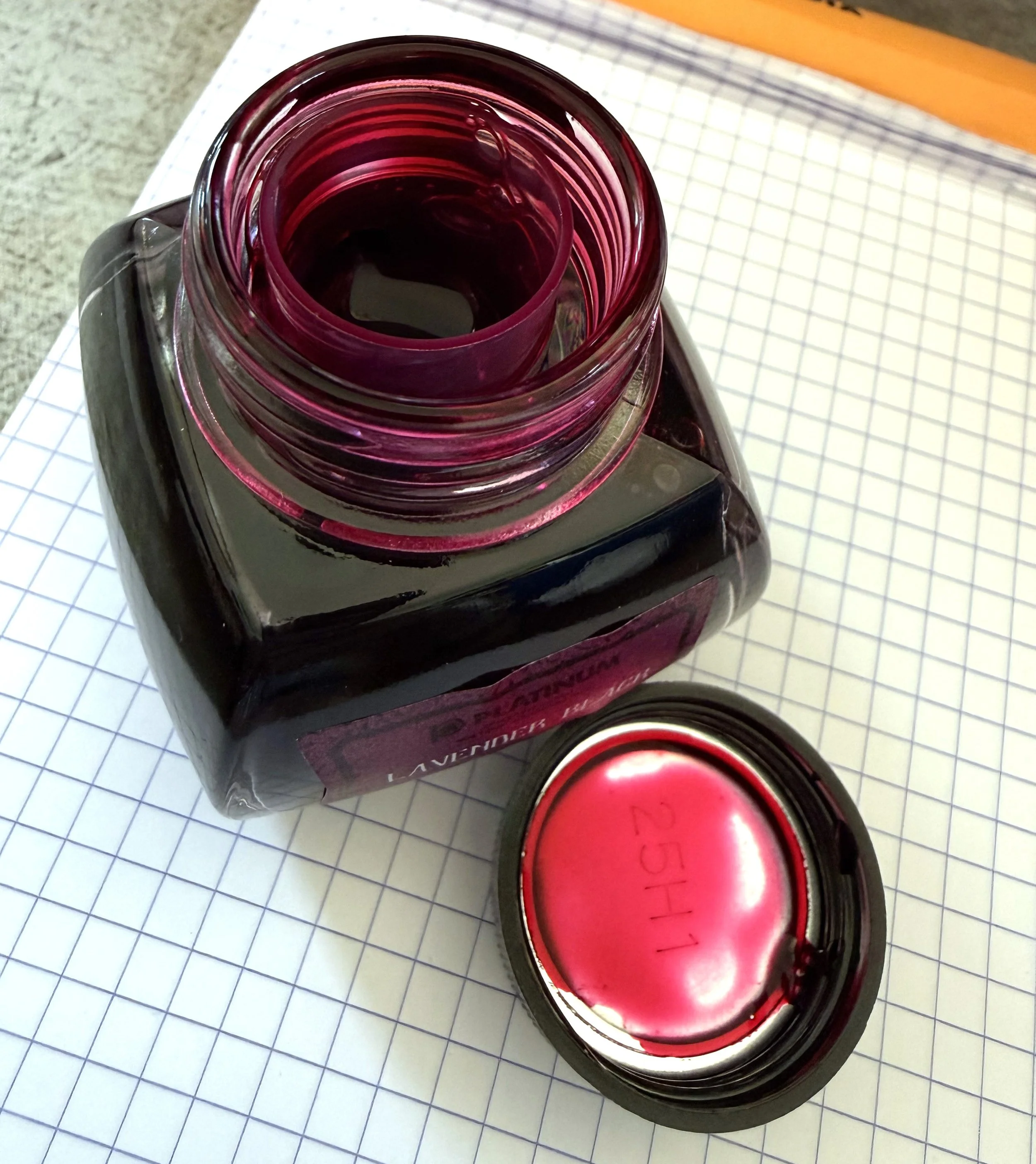
The ink comes in a glass bottle with a black plastic cap. The bottle is mostly cylindrical, with a wide base and shoulder. It's not tippy, and the deep design makes it easy to fill your pen.
You notice the fragrance as soon as you remove the cap. It's not too strong, though. It's pleasantly subtle. And while the scent doesn't linger on the page once the ink is dry, it makes for a fun writing experience.
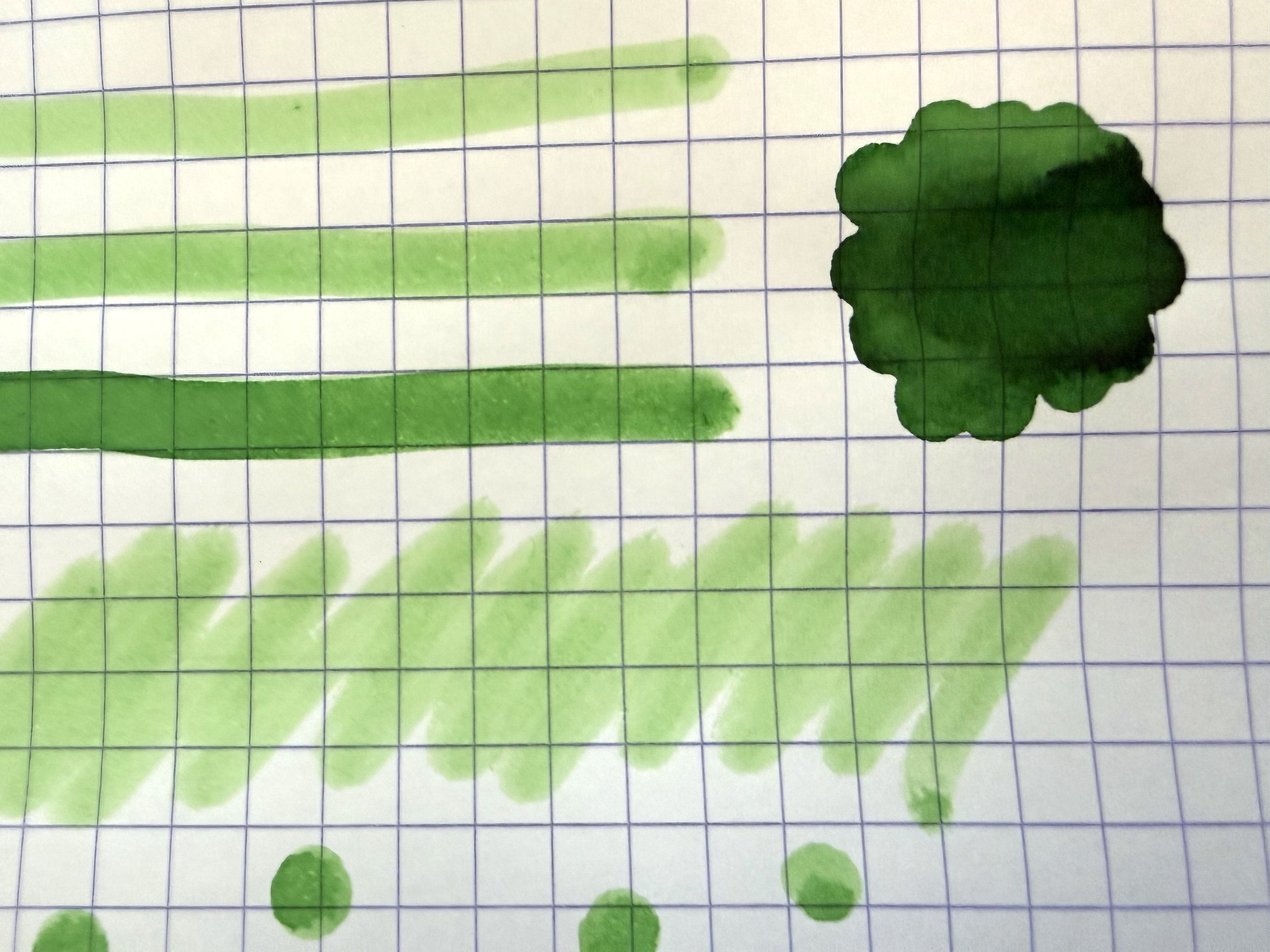
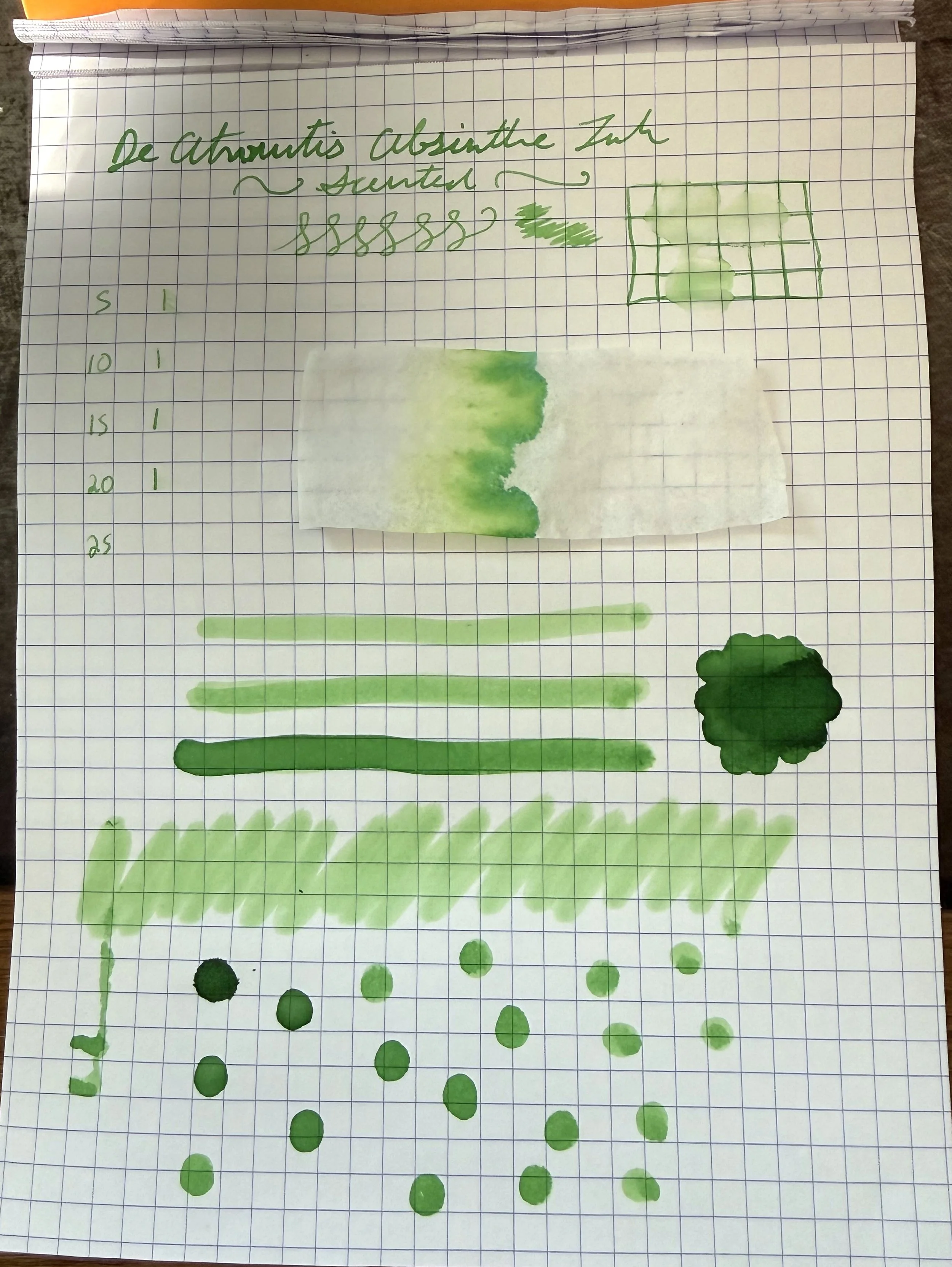
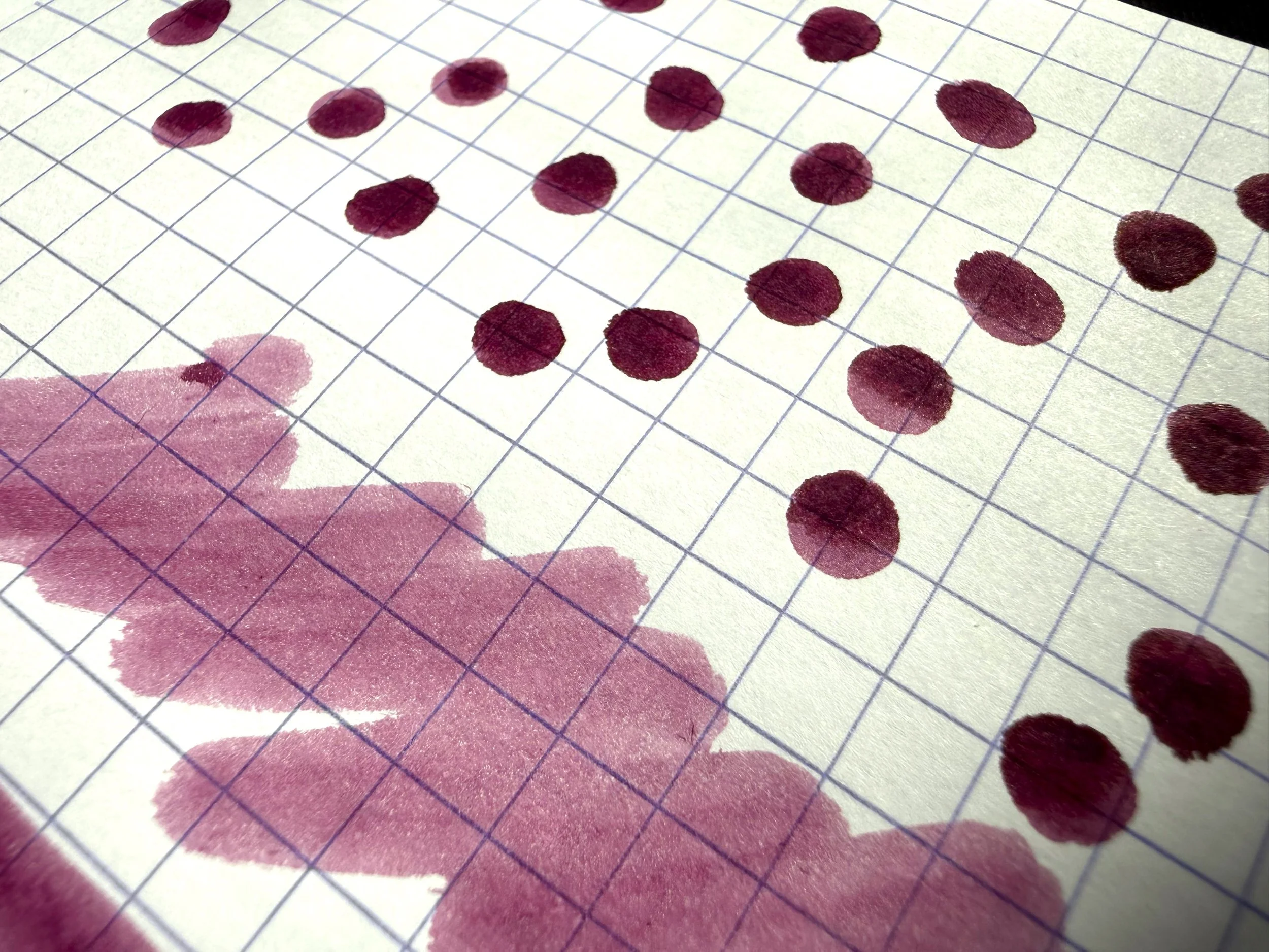
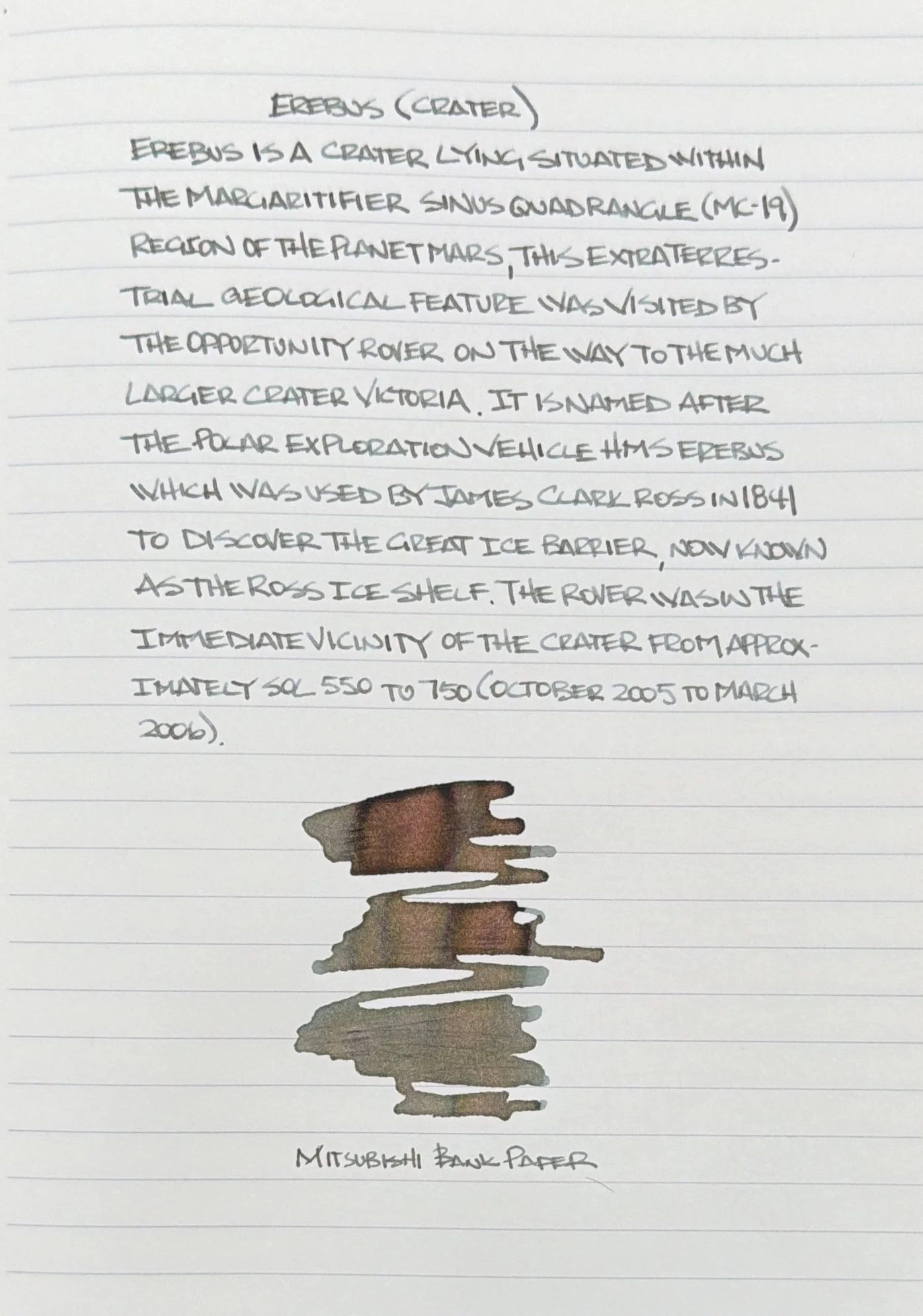
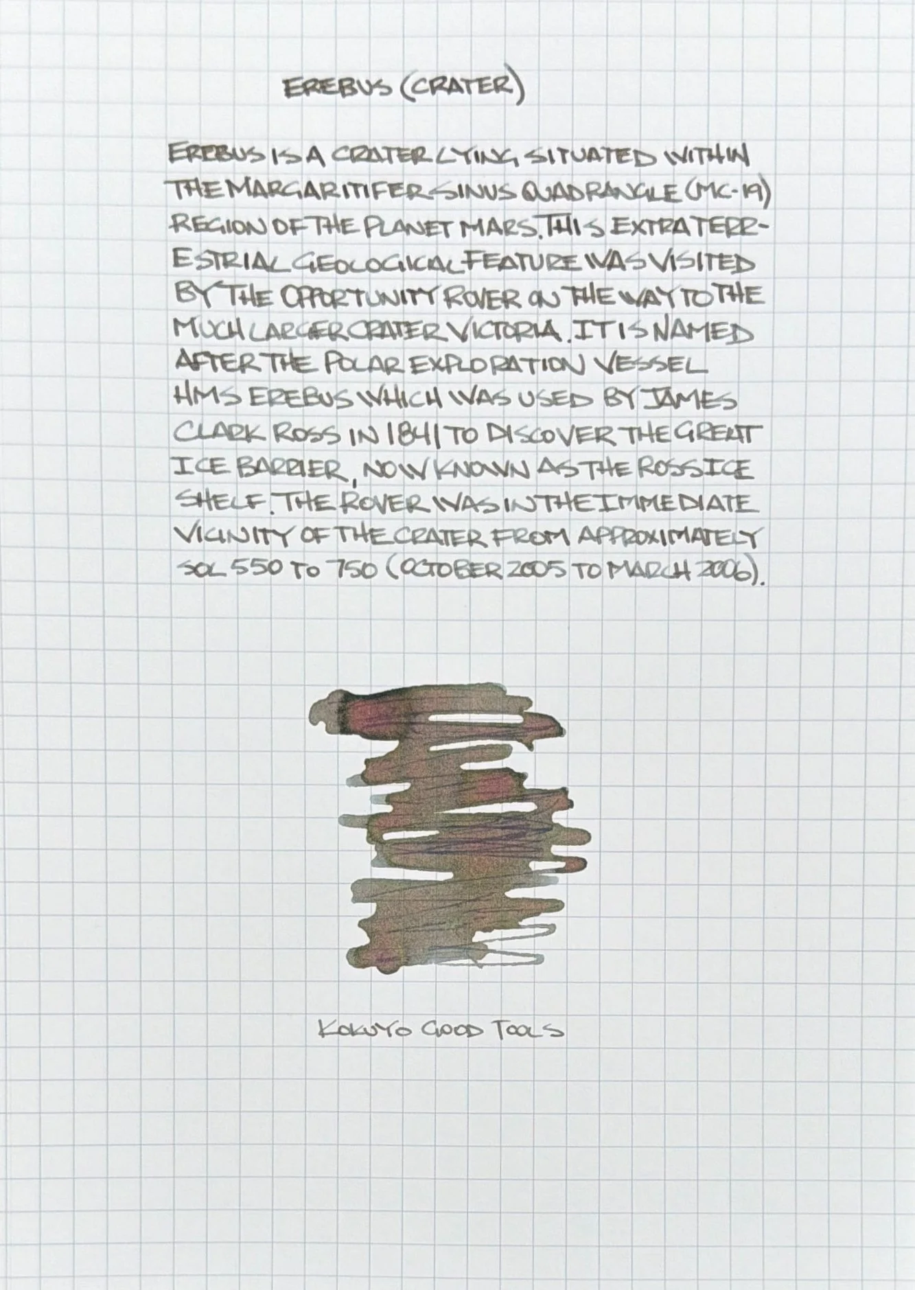
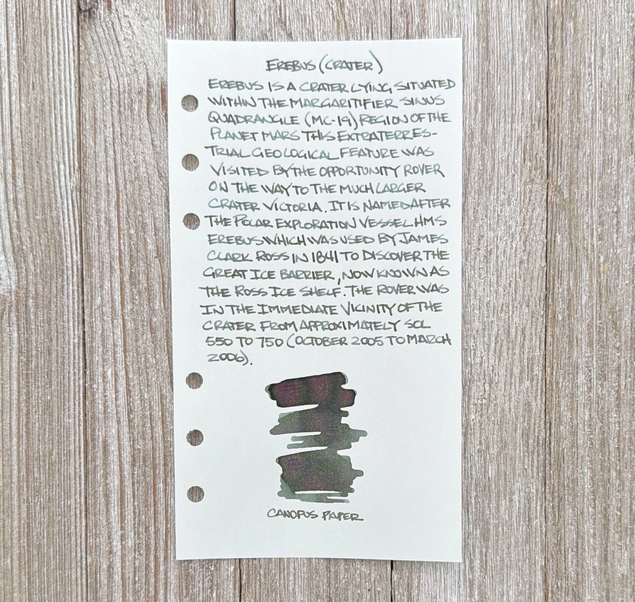
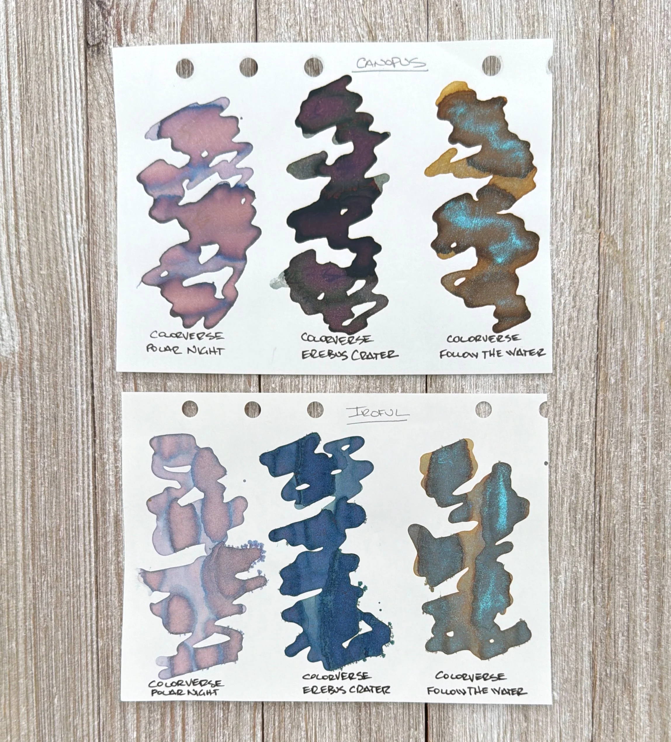
The green color of this ink is a bit pale. In a fine point, it might be difficult to read in low light. But this isn't a practical ink, and I think we knew that before we began. While it can be quite pale on the page, it does shade nicely to a deeper green that is really lovely. Chromatography shows a dominantly yellow undertone with a touch of teal.
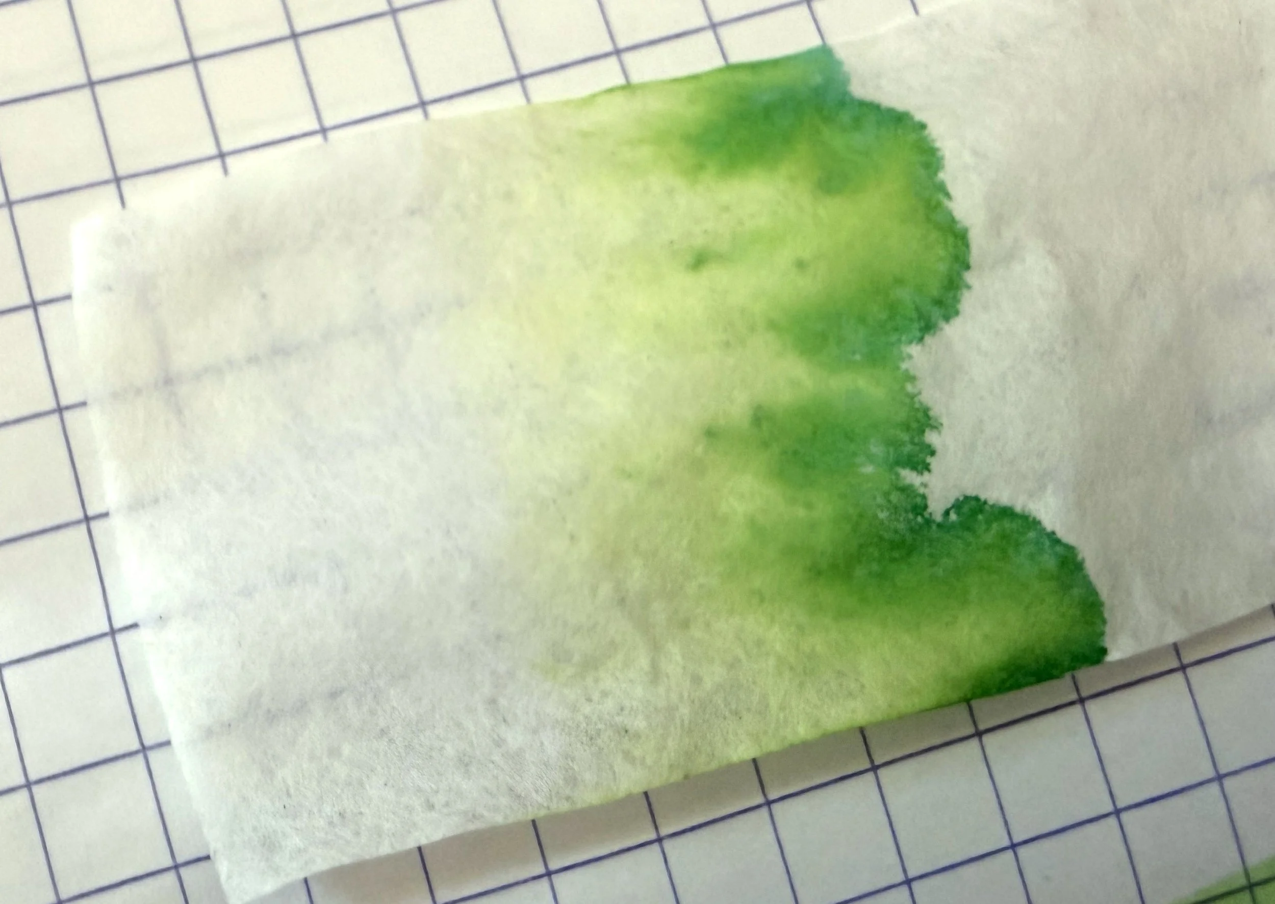
The ink dries very quickly, somewhere between 10 and 15 seconds. It has no water resistance, and because of its pale color, it almost completely vanishes in the water drop test. I did not see any sheening with this ink. Its attitude is all in its shading, which is my personal favorite ink property.
The bottle is 45ml and costs $14 at Vanness Pen Shop, which is one of the most affordable inks out there right now. While this isn't the best writing ink, due to its pale color, it's perfect for washes or art projects. I'll still write with it anyway, of course, likely with a wet broad nib, to make the most of the shading and enjoy the lightly spiced fragrance that takes me back to New Orleans.
(Vanness Pens provided this product at a discount to The Pen Addict for review purposes.)
Enjoy reading The Pen Addict? Then consider becoming a member to receive additional weekly content, giveaways, and discounts in The Pen Addict shop. Plus, you support me and the site directly, for which I am very grateful.
Membership starts at just $5/month, with a discounted annual option available. To find out more about membership click here and join us!