Posts filed under Anderillium

Anderillium Ichthyoformes Series Ink Review

(Kimberly (she/her) took the express train down the fountain pen/stationery rabbit hole and doesn't want to be rescued. She can be found on Instagram @allthehobbies because there really are many, many hobbies!.)

I have reviewed all of the Anderillium Cephalopod Inks, the Lepidopteran series, and the Avian series, so I’ve been eager to check out their Ichthyoformes series too. They were so popular that every time I saw them at a show, one or more of their inks were sold out! I managed to get most of a sample bottle set from Anderillium at the Philly Pen Show and had to get a full-size bottle from Darail PenZ to complete the set.

The 8 inks in the Ichythoformes series (named for various fish) are as follows: Anglerfish Deep (Brown), Betta Fish Purple, Lionfish Red, Moray Eel Green, Piranha Red, Sockeye Salmon, Swordfish Blue, and Whale Shark Grey. Anderillium Inks are available in 1.5 ounce (44ml) sealed glass “jam” jars, and are also sold in sets of 0.5 ounce (14.5ml) “sample” bottles.

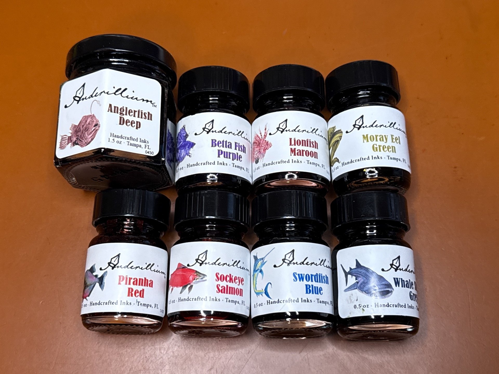
Pack of 1 full-size bottle and 7 sample bottles from the Anderillium Ichthyoformes Series.

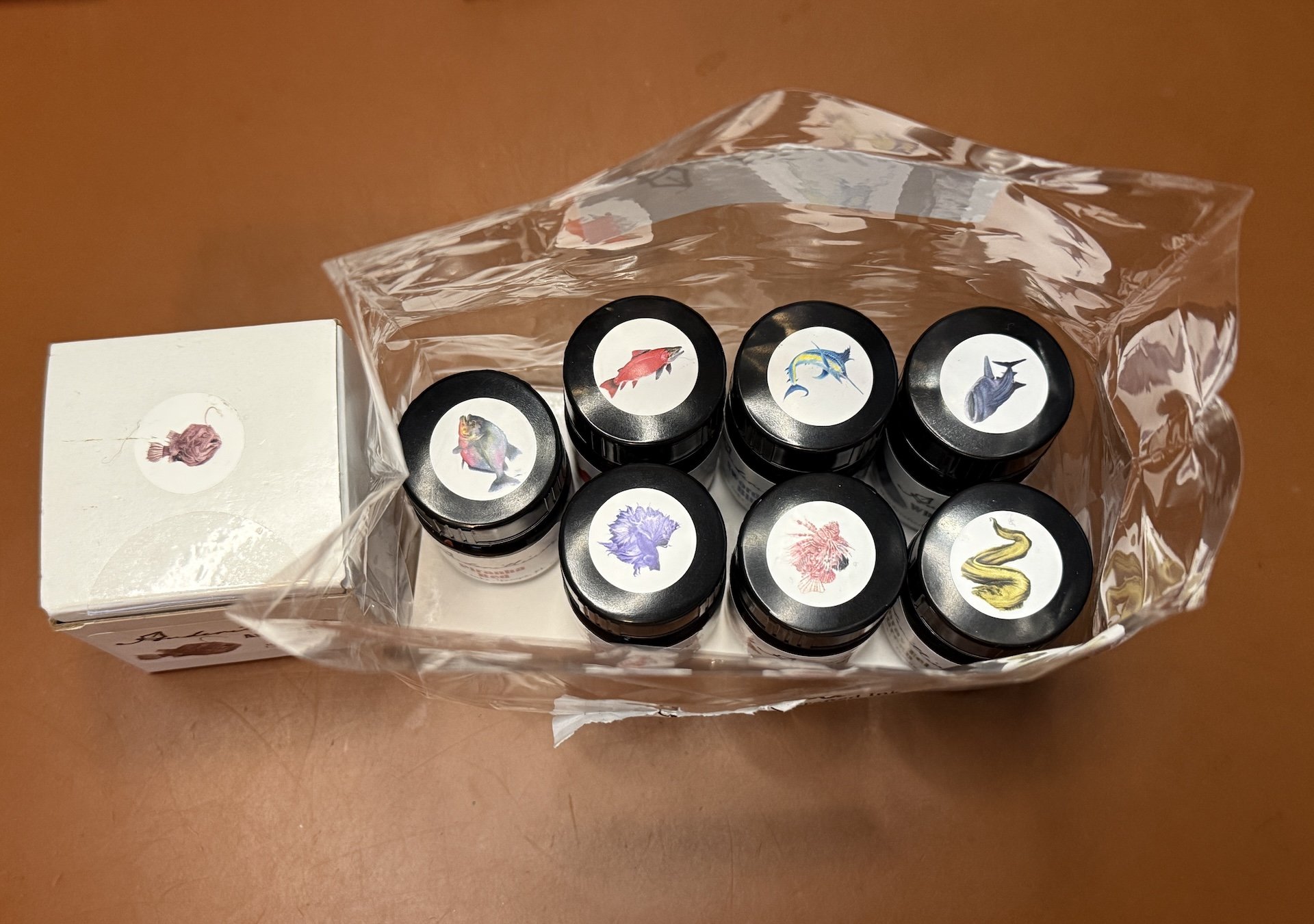
I like that there are fish stickers on top so you can tell the ink color. The regular size bottles have stickers on the boxes, but not the bottles. (I also put a white Avery circle sticker on the cap of the jam jar, then dab some ink on it.)

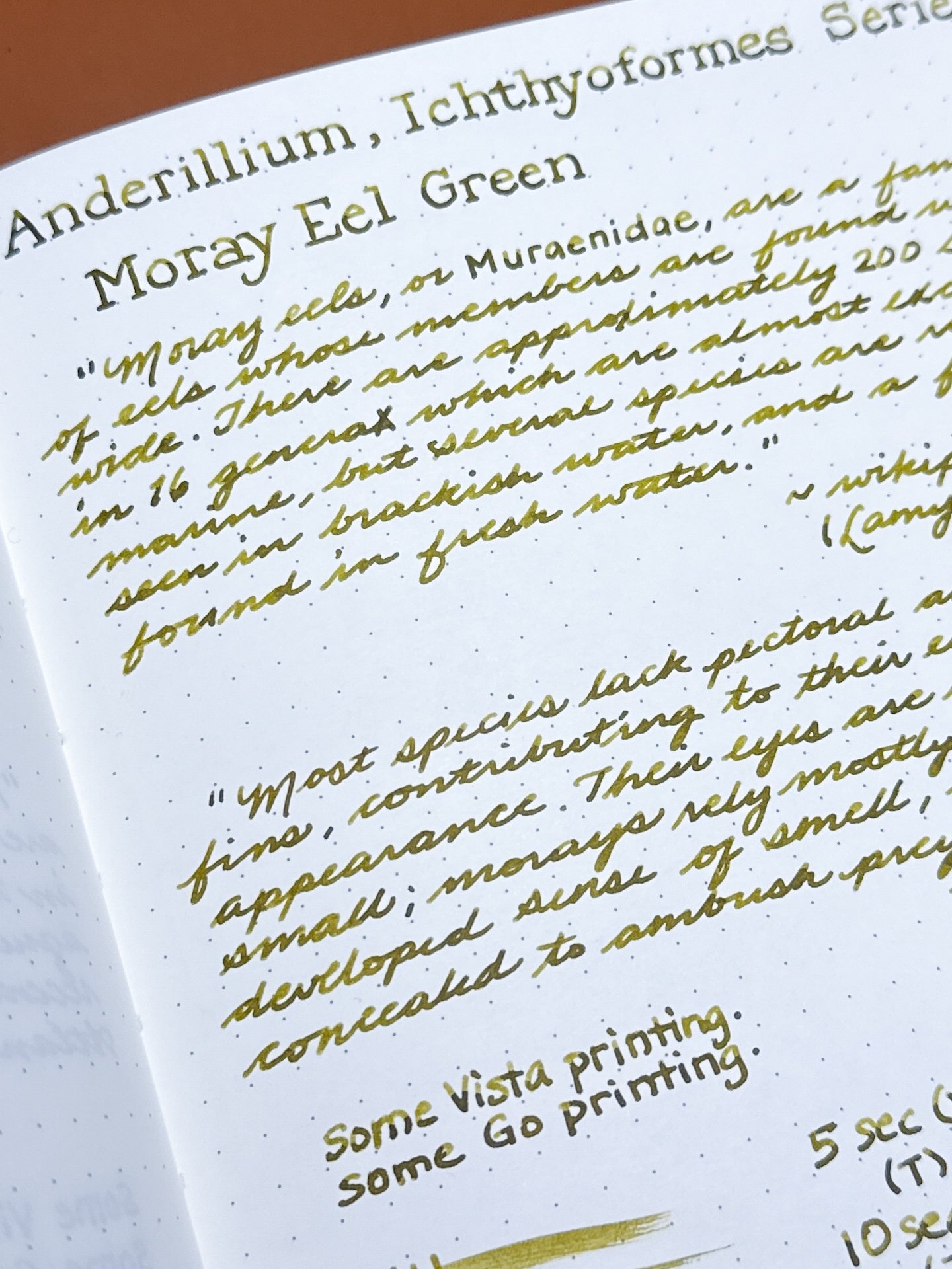
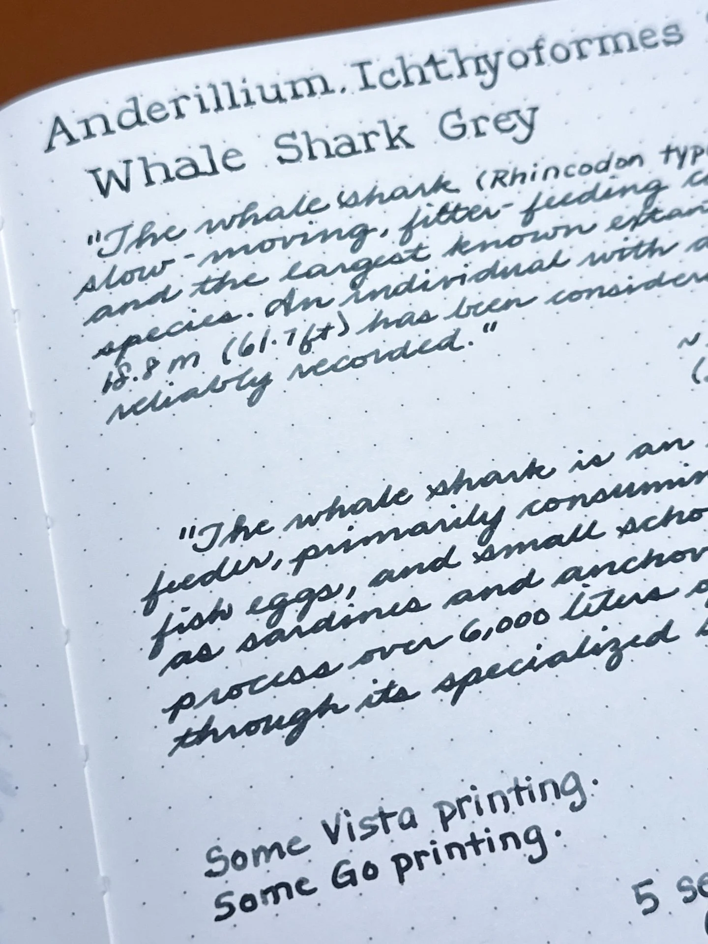
As usual, all swatches were done on Col-O-Ring and Wearingeul Instant Film Color swatch cards using a Kakimori steel dip nib and writing samples were done primarily with a Lamy Vista with a steel Medium nib and a TWSBI Go with a Medium nib. The notebooks used for writing samples are from an Endless Recorder and Odyssey Notebooks, both with 68 gsm Tomoe River paper. Dry times for the Vista are shown with “(V)” and the Go will be shown below that with a “(T)”. Dry times may be a bit slower on 52gsm TR or faster on more absorbent papers like Rhodia, copy paper, Cosmo Air Light, or with drier or finer nibs.

Anderillium ink swatches

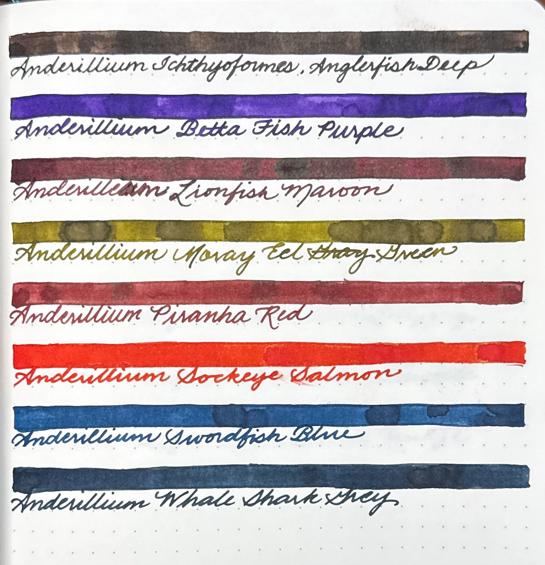
Anderillium Ichthyoformes Series on TR 68gsm paper.

Swatches from the Cephalopod series (left) with the Lepidopteran series (right).

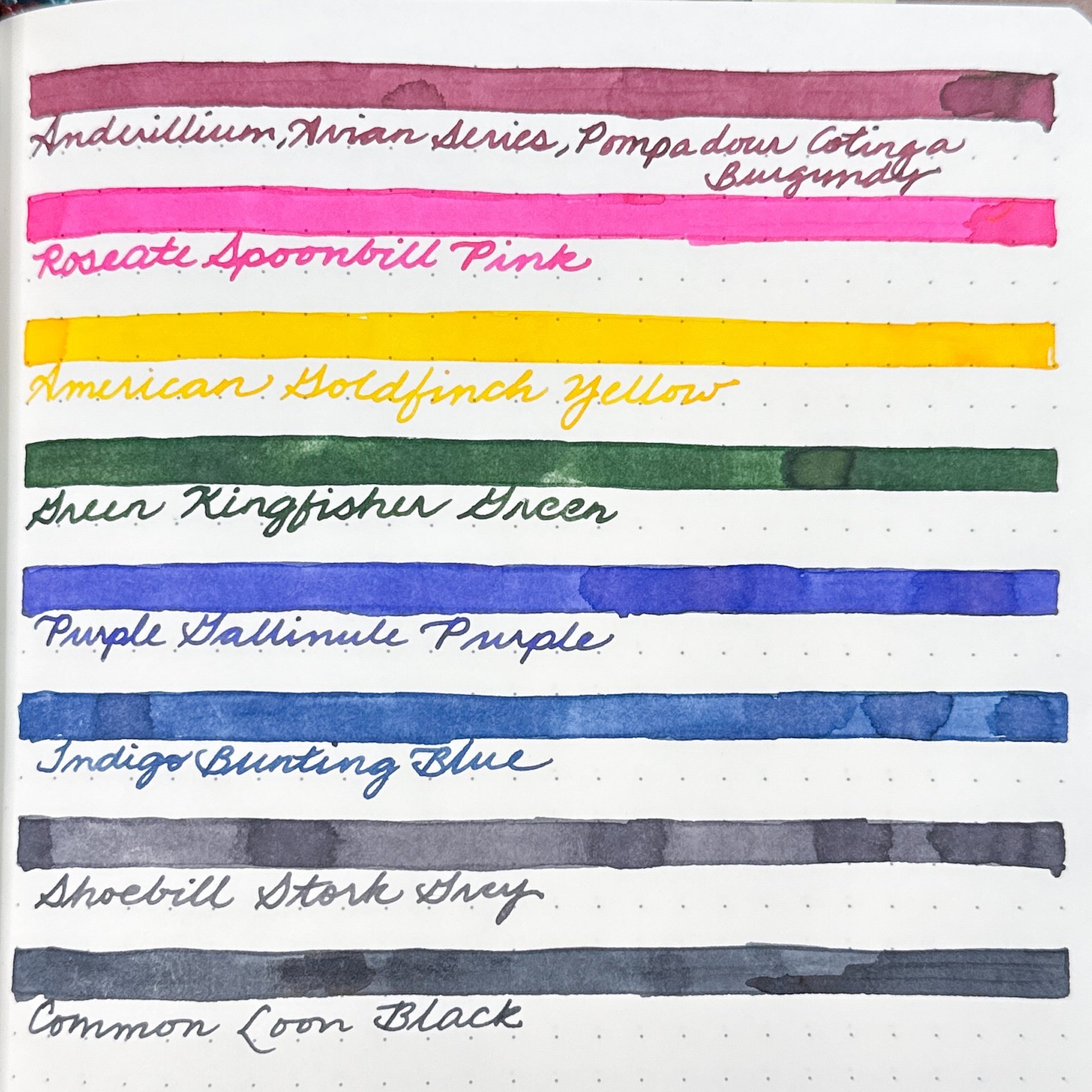
Swatches from the Avian series.

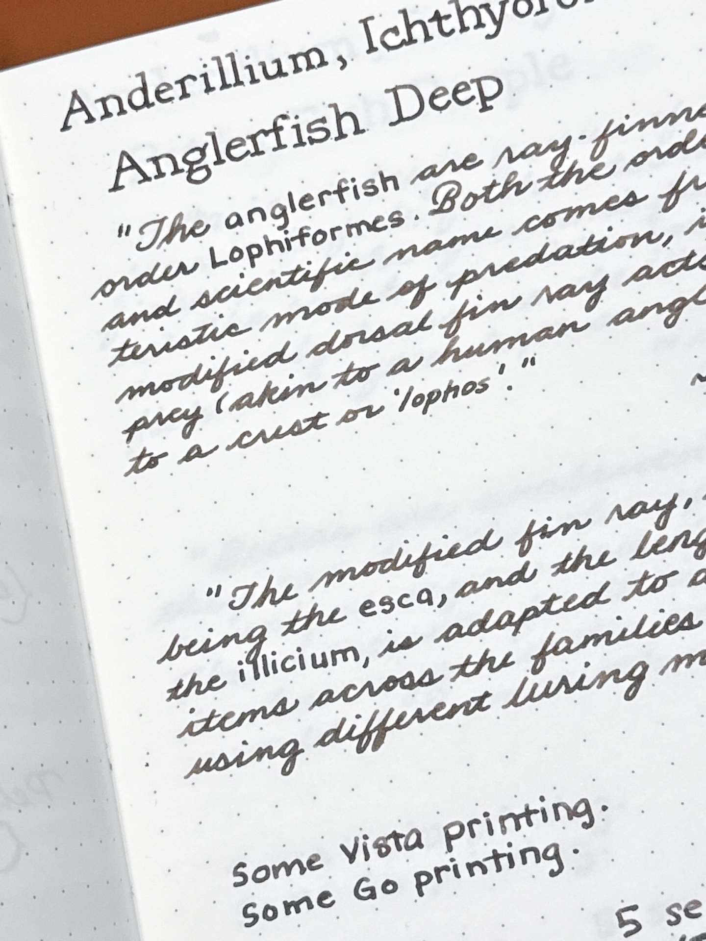
Anglerfish Deep is a dark brown ink that is fairly similar coming out of both the Vista and Go. There is some shading with cursive, less so with print, and no sheen.

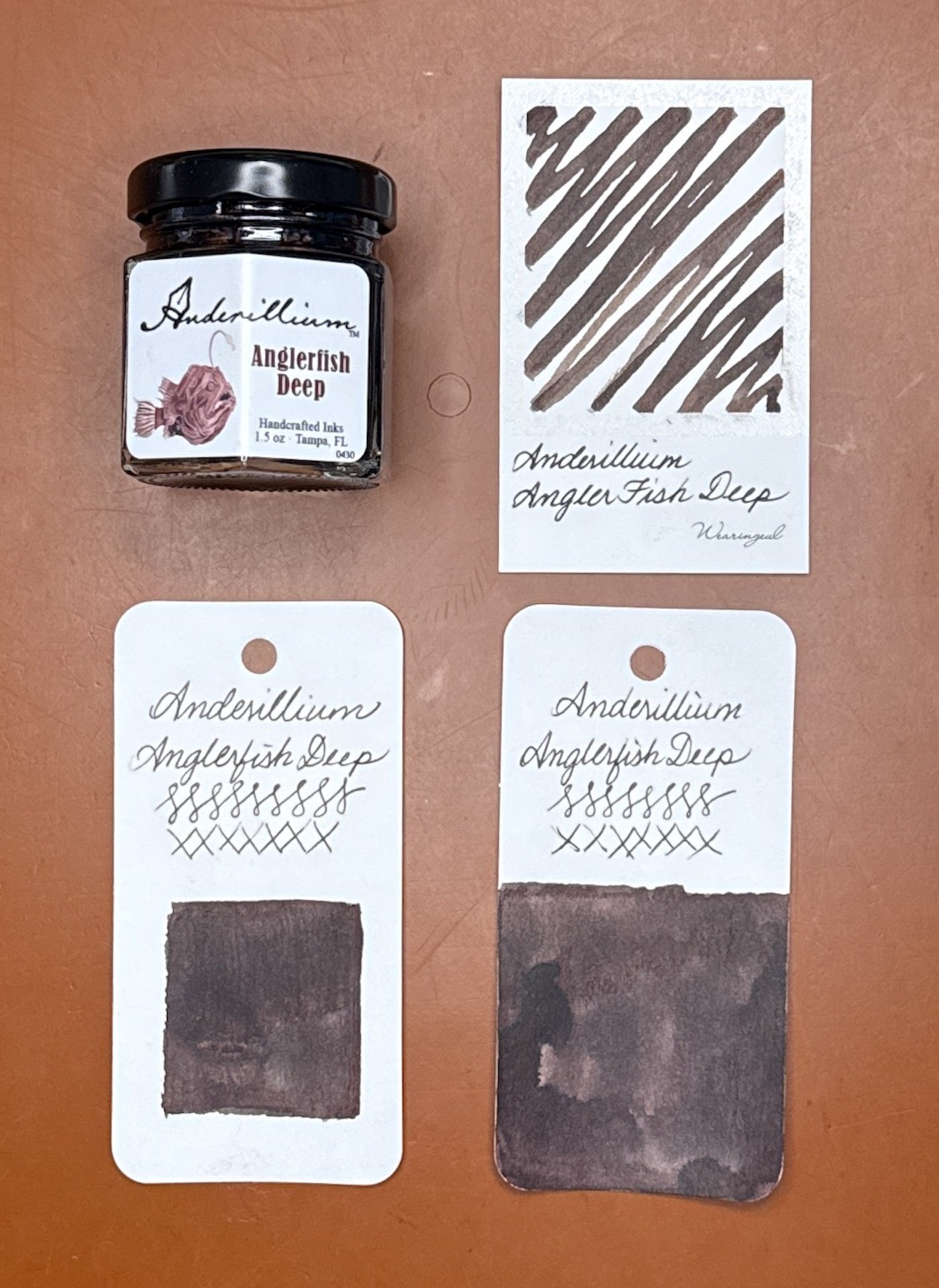
Anderillium Anglerfish Deep swatches on Wearingeul (top) and Col-O-Ring cards.

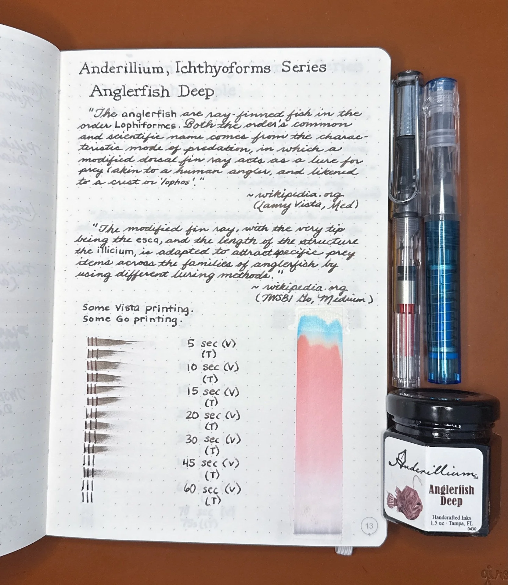
Anglerfish Deep writing sample.

Both writing samples are similar in color and saturation, with the Vista (top) showing off just a bit more shading than the Go.

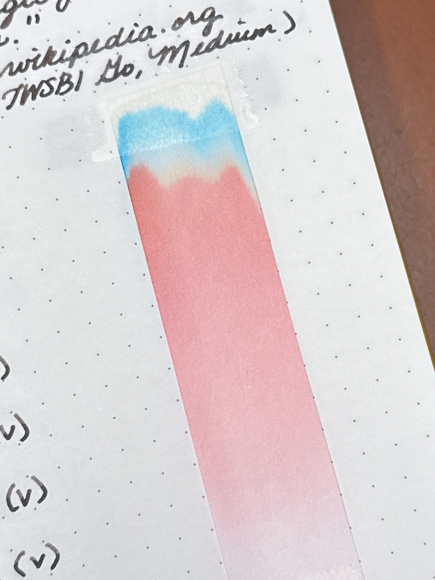
I’m always amazed at how the chromatography of a dark brown ink like Angerfish Deep, can show so much pink and even a bit of yellow and turquoise up top.

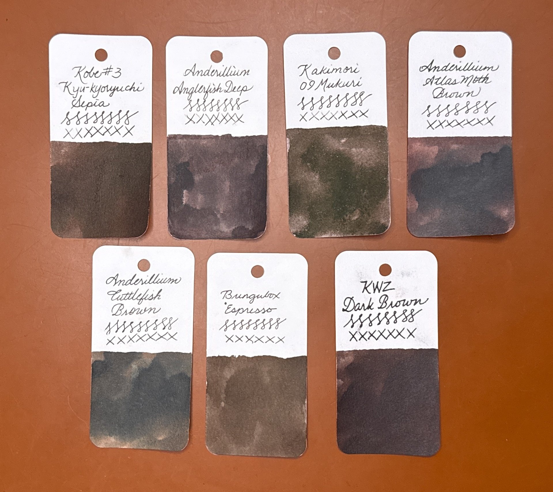
Inks similar to Anglerfish Deep: Kobe #3 Kyu-kyoryuchi Sepia and Kakimori 09 Mukuri were the most similar in person, despite the picture of Anderillium’s Atlas Moth Brown looking like a dupe. Anderillium’s Cuttlefish Brown is too dark and not warm enough, Bungubox Espresso is a bit too warm, and KWZ Dark Brown is close but a bit too dark.

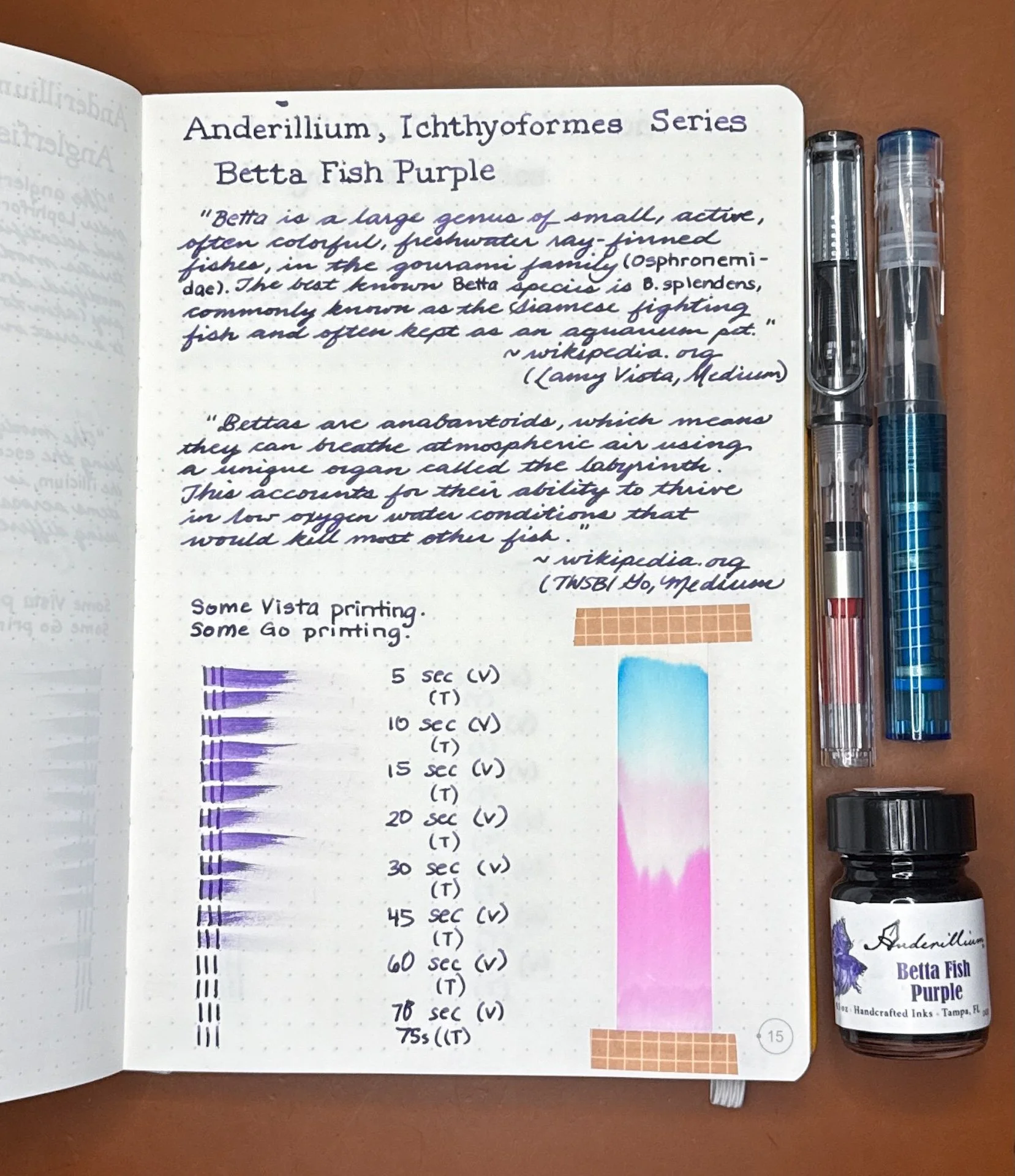
Betta Fish Purple is a beautiful royal purple ink that has some shading with drier pens and no sheen in writing samples.

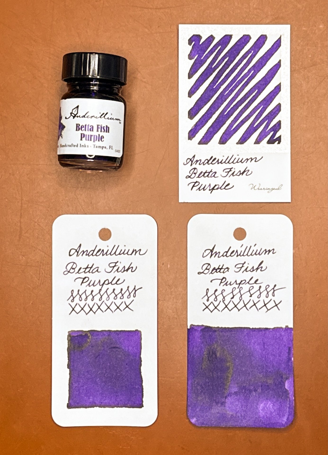
Anderillium Betta Fish Purple swatches, showing a bit of green sheen that doesn’t show up in writing.

Betta Fish Purple writing sample.

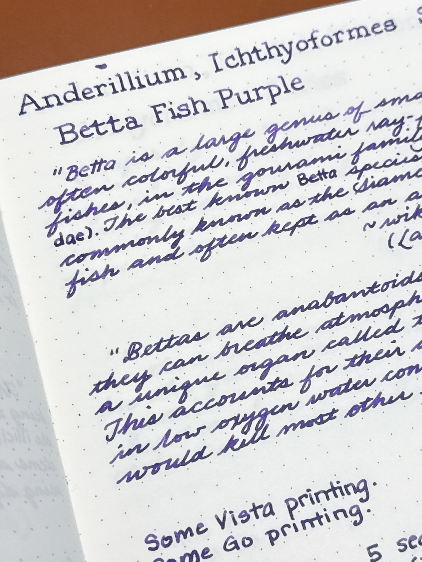
Both of the writing samples are showing up much darker than irl, where it is a royal purple (trust the swatches for the real color). It is a fairly saturated ink with some occasional shading from the Vista (top).

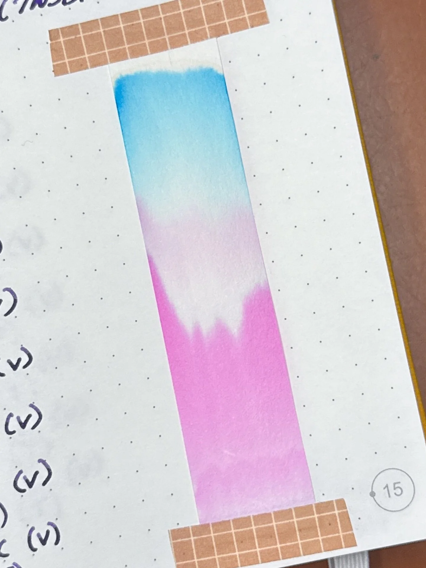
Look at Betta Fish Purple’s bright magenta chromatography topped with turquoise!

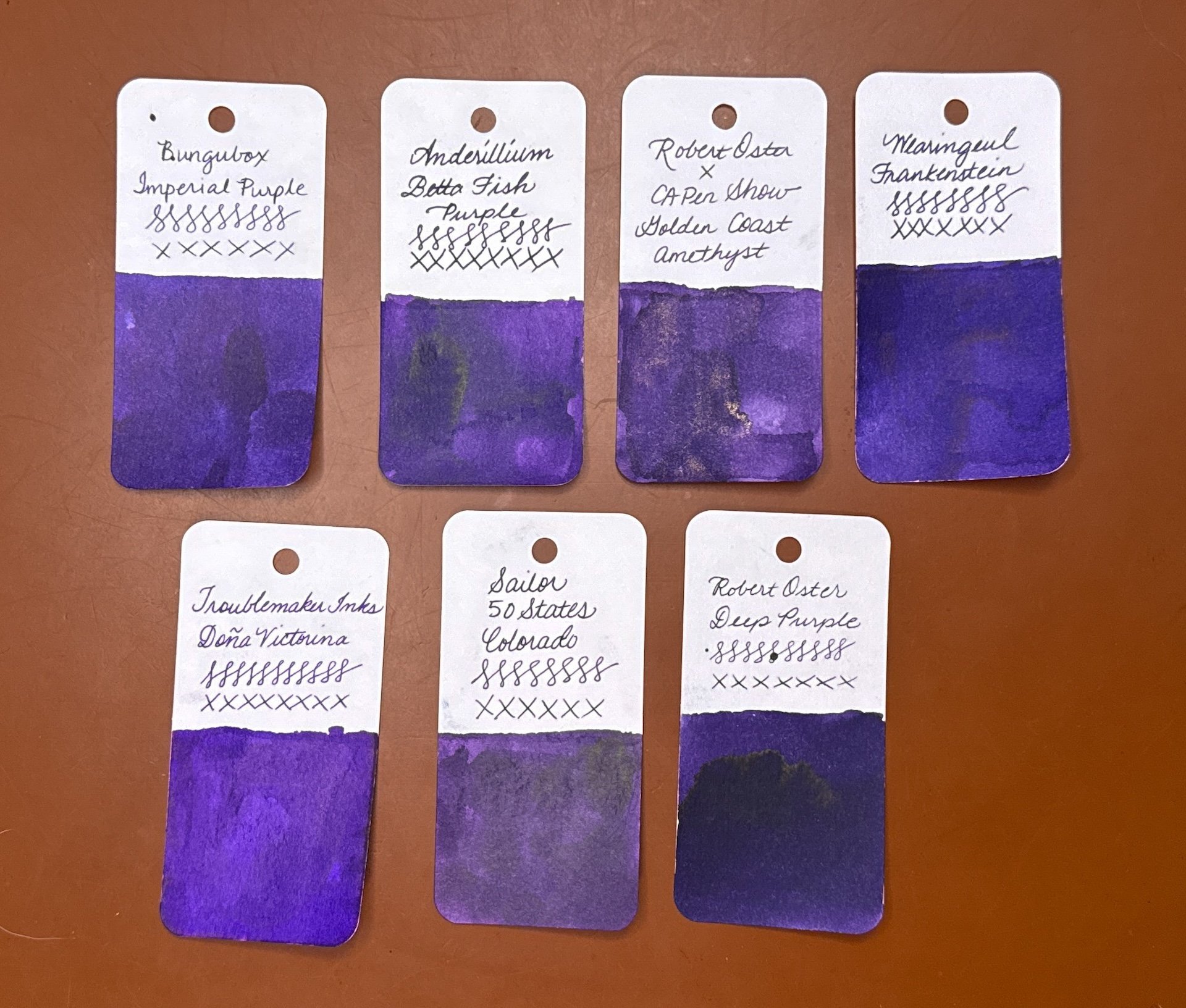
Inks similar to Betta Fish Purple: Bungubox Imperial Purple (touch too dark), Robert Oster x CA Pen Show Golden Coast Amethyst with gold shimmer (probably the closest match, followed by the Bungubox), Wearingeul Frankenstein (too blue), Troublemaker Doña Victorina (too bright, too blue, and also a stainer), Sailor 50 State Colorado (a bit too dusty), Robert Oster Deep Purple (too dark and too blue).

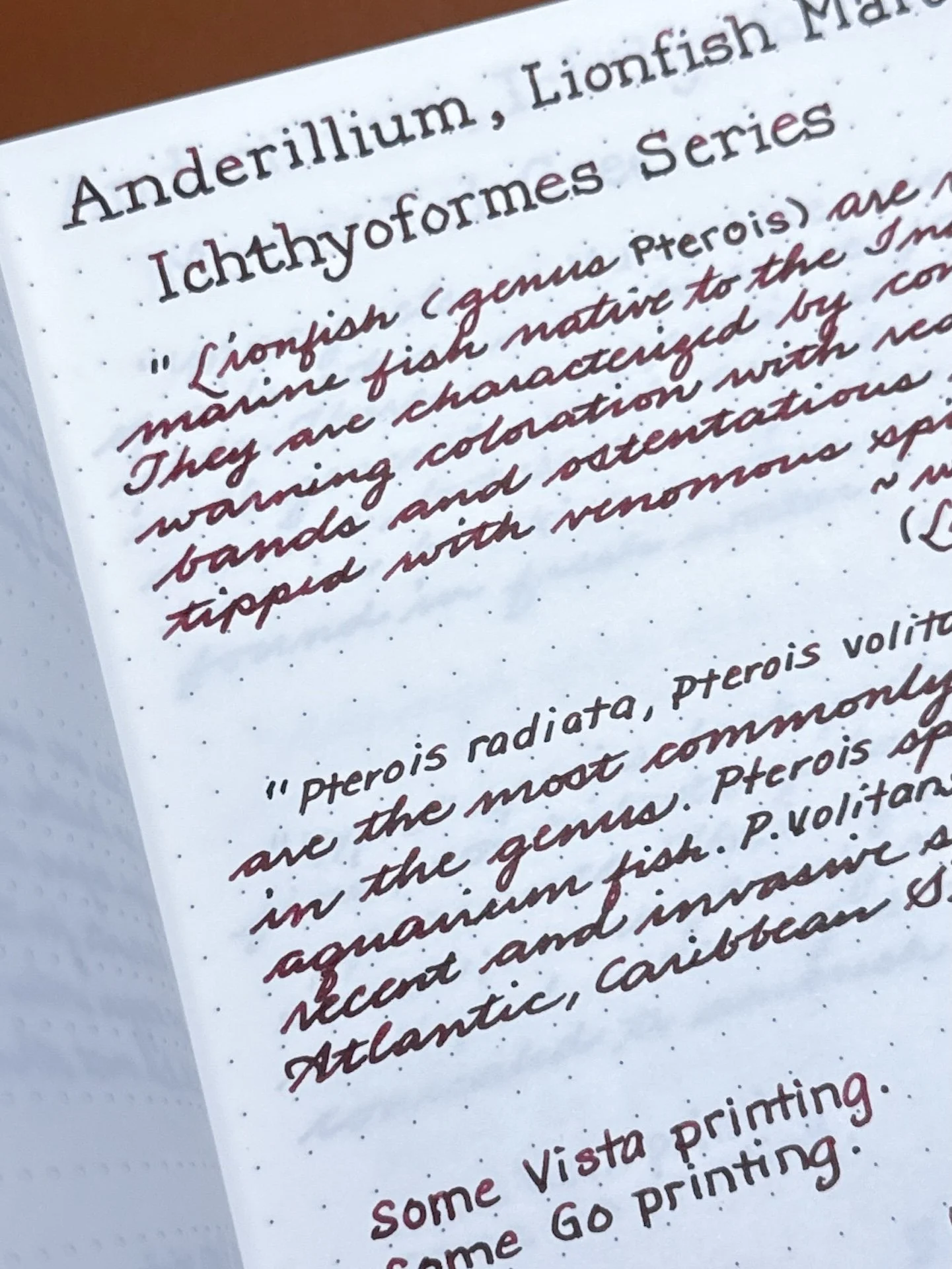
Lionfish Maroon is a rich maroon ink, which is not just dark red, but a red with brown undertones.

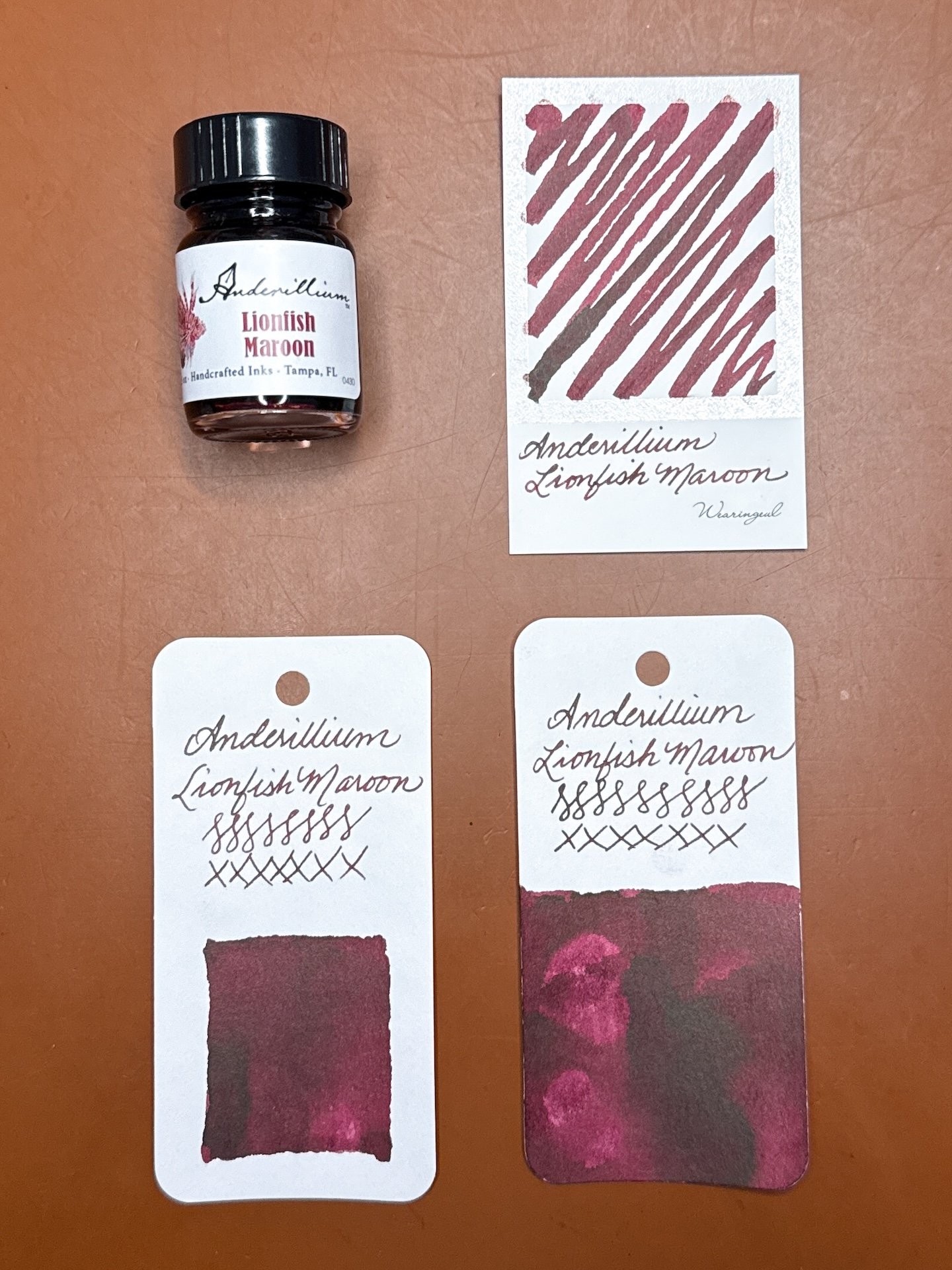
Anderillium Lionfish Maroon swatches, showing a bit of green/brown sheen that sometimes shows up in wetter writing.

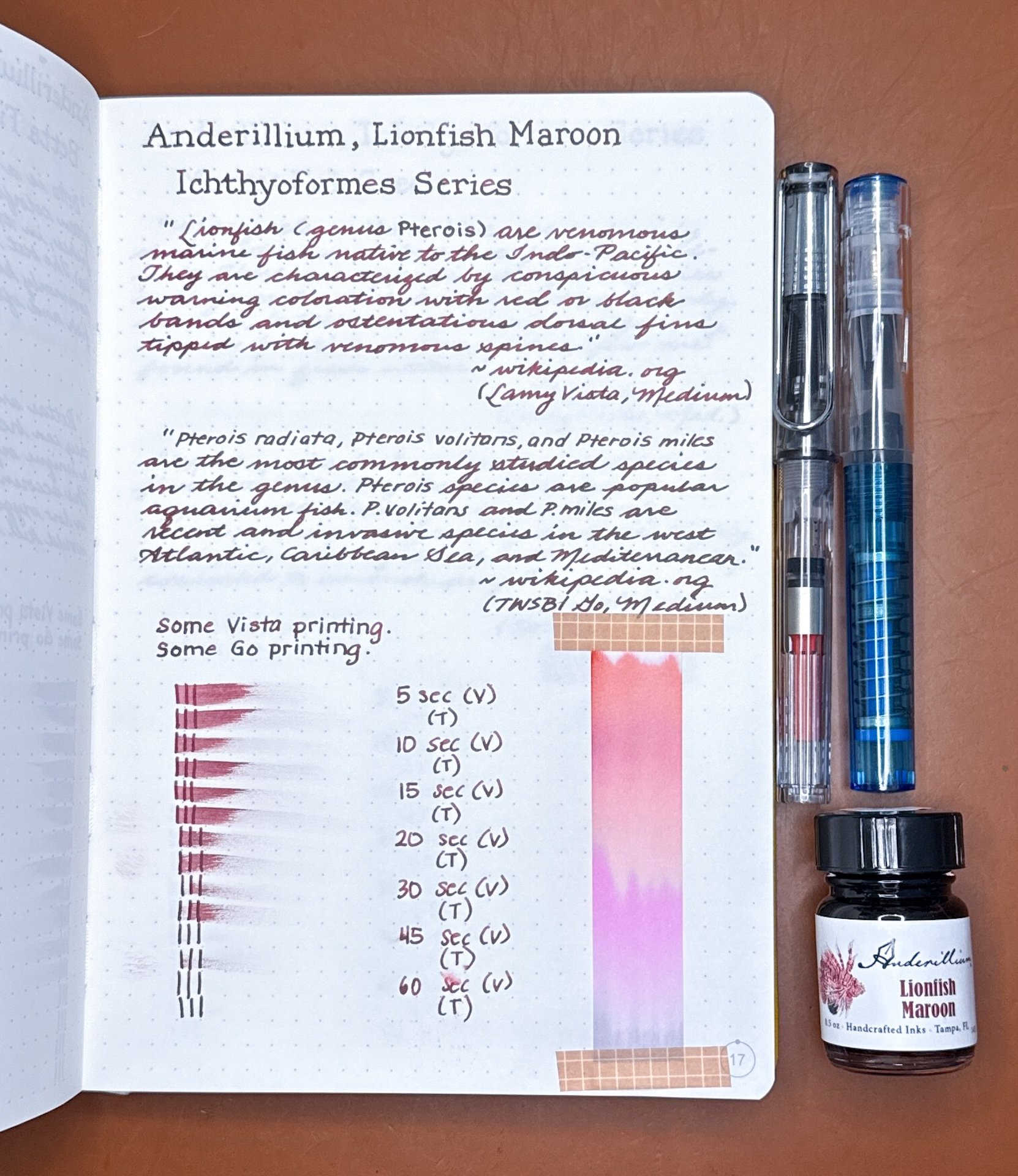
Lionfish Maroon writing sample.

While both pens showed off the dark red/maroon color, the writing from the slightly drier Vista leans more dark red, while the Go results in a darker and richer color where you can almost see a hint of brown.

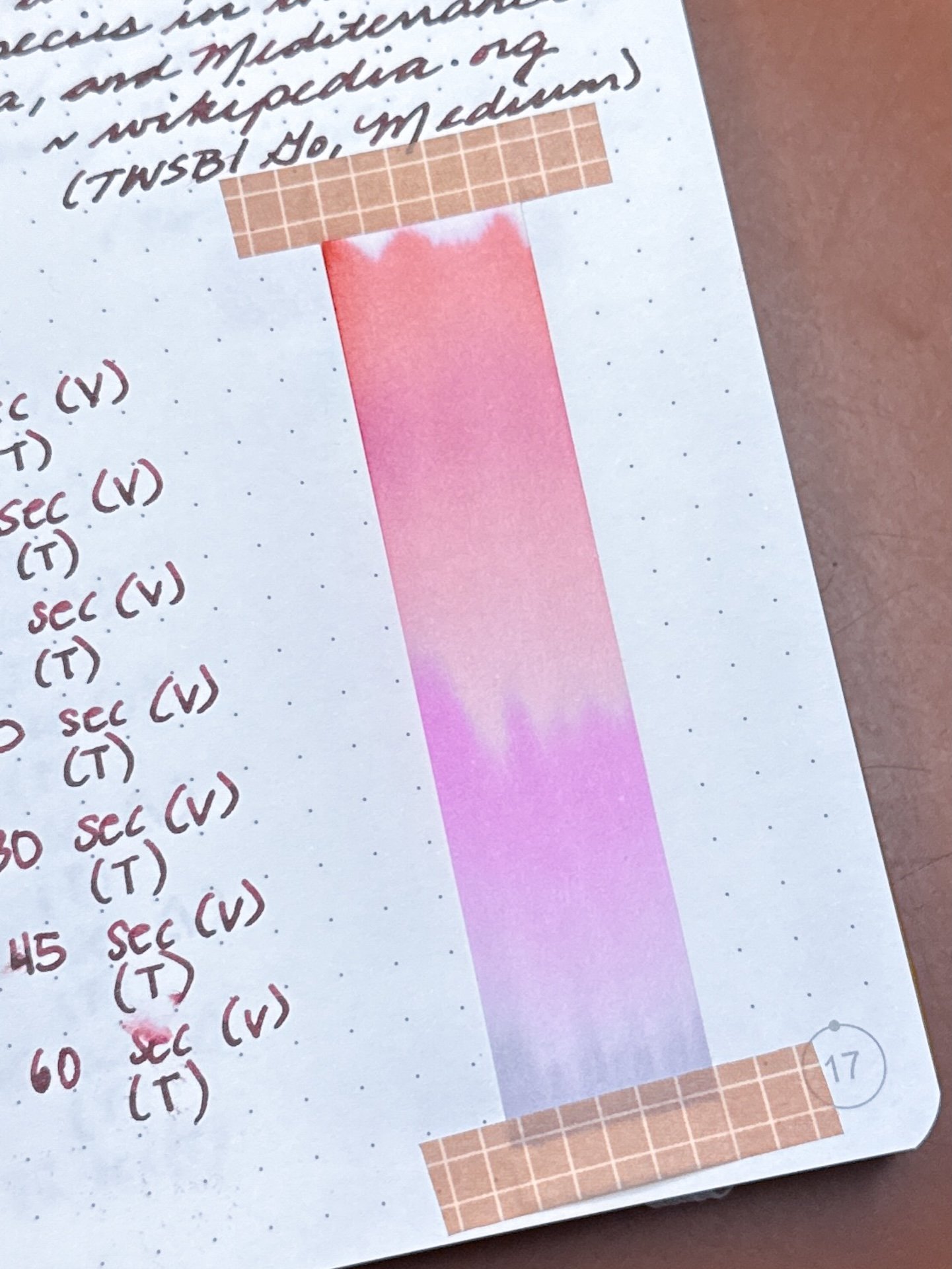
Lionfish Maroon’s chromatography starts off at the bottom with a blue grey before moving up the strip with pastel pink, magenta, and then more pink and coral tones!

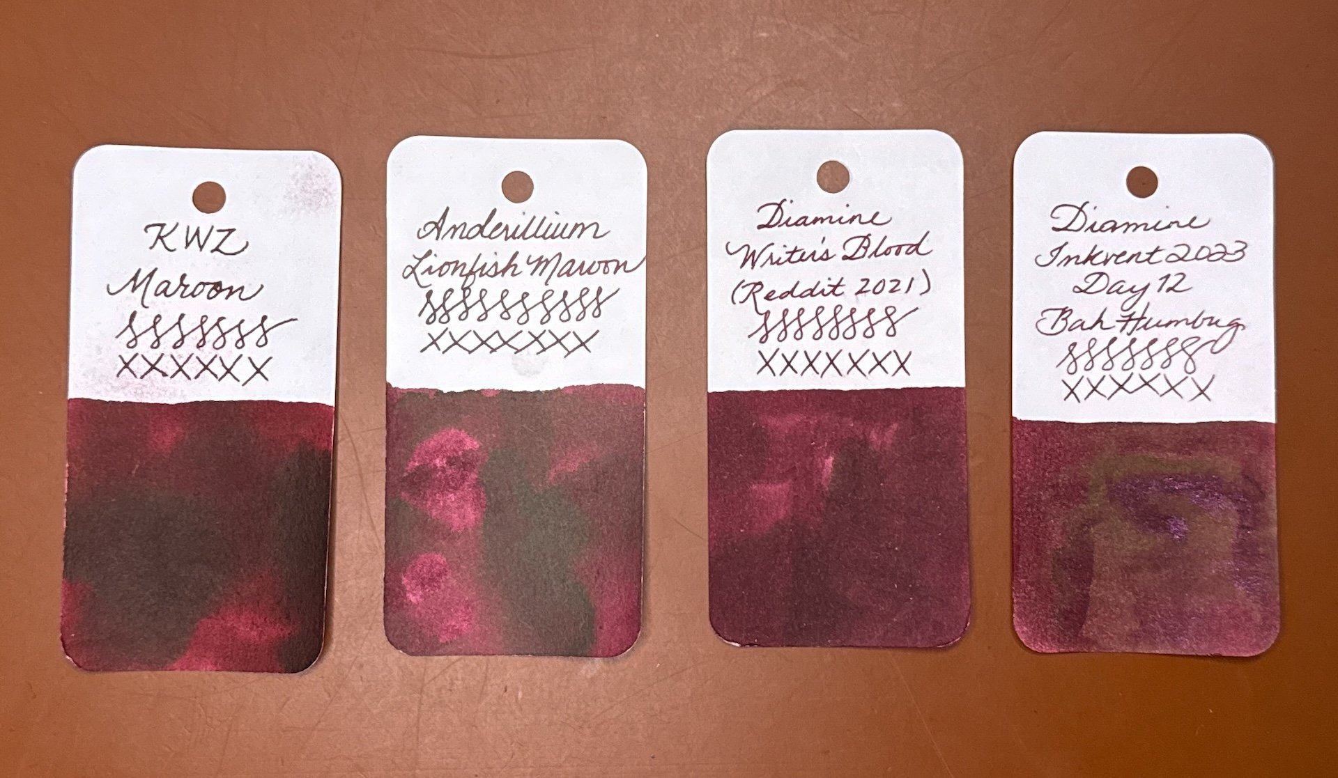
Inks similar to Lionfish Maroon: KWZ Maroon is the closest match I have, followed by Diamine Writer’s Blood and Diamine Bah Humbug. My other inks, including others with “maroon” in the name, tended to be too red, too burgundy, too purple, too wine-y, too pink, you get the picture.

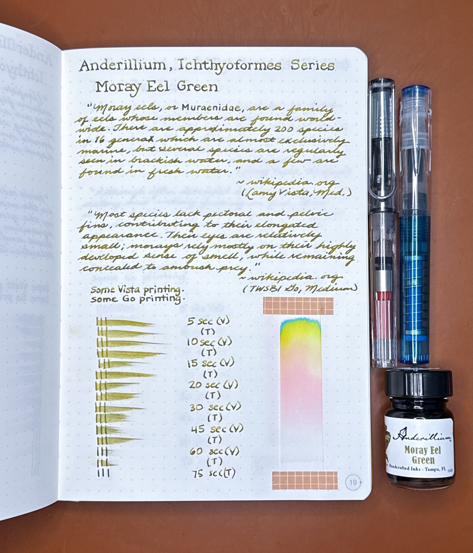
Moray Eel Green is a murky, olive-y green ink that is a lovely shader, even with wetter pens.

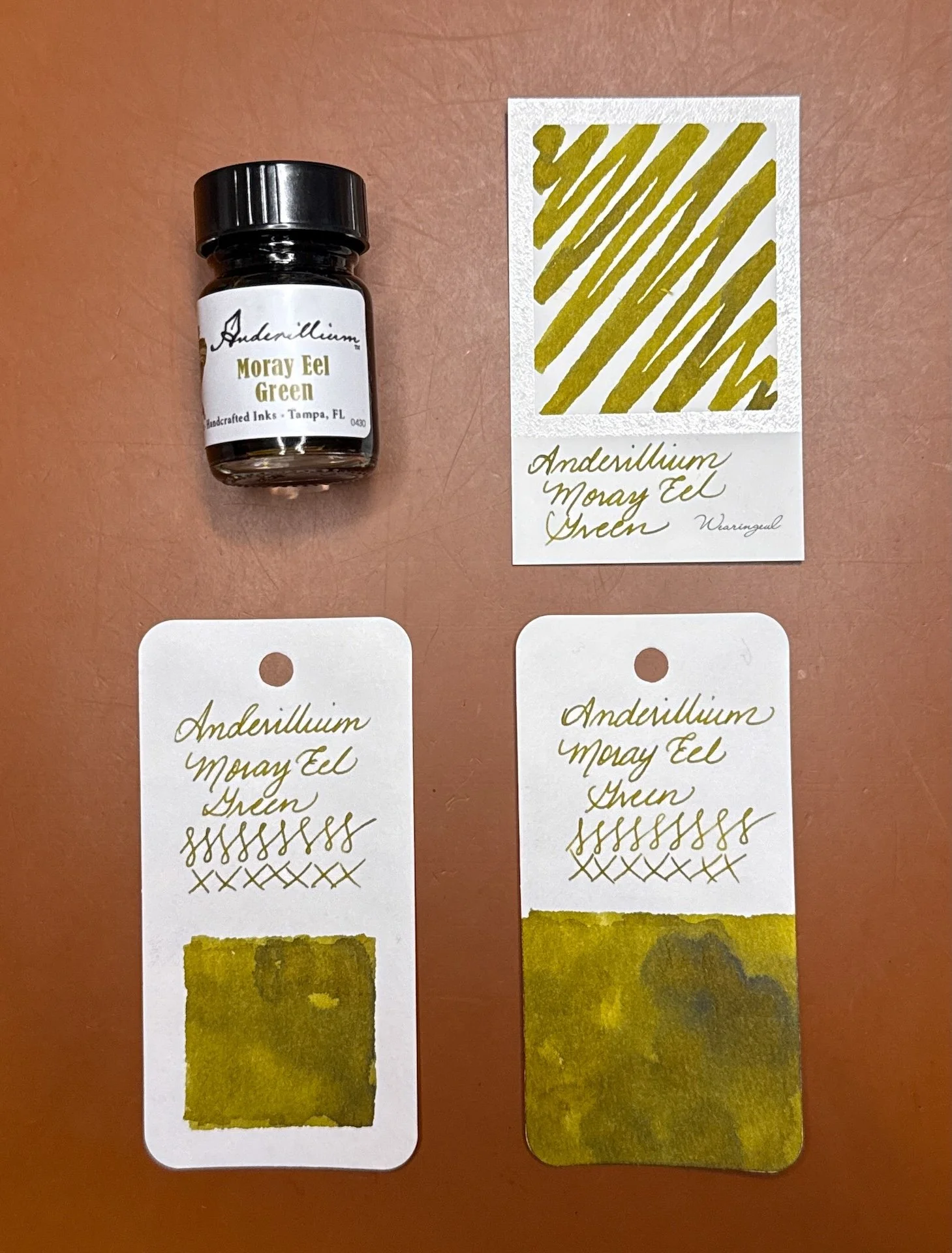
Anderillium Moray Eel Green swatches, with a bit of brown in the wetter parts of the swatch.

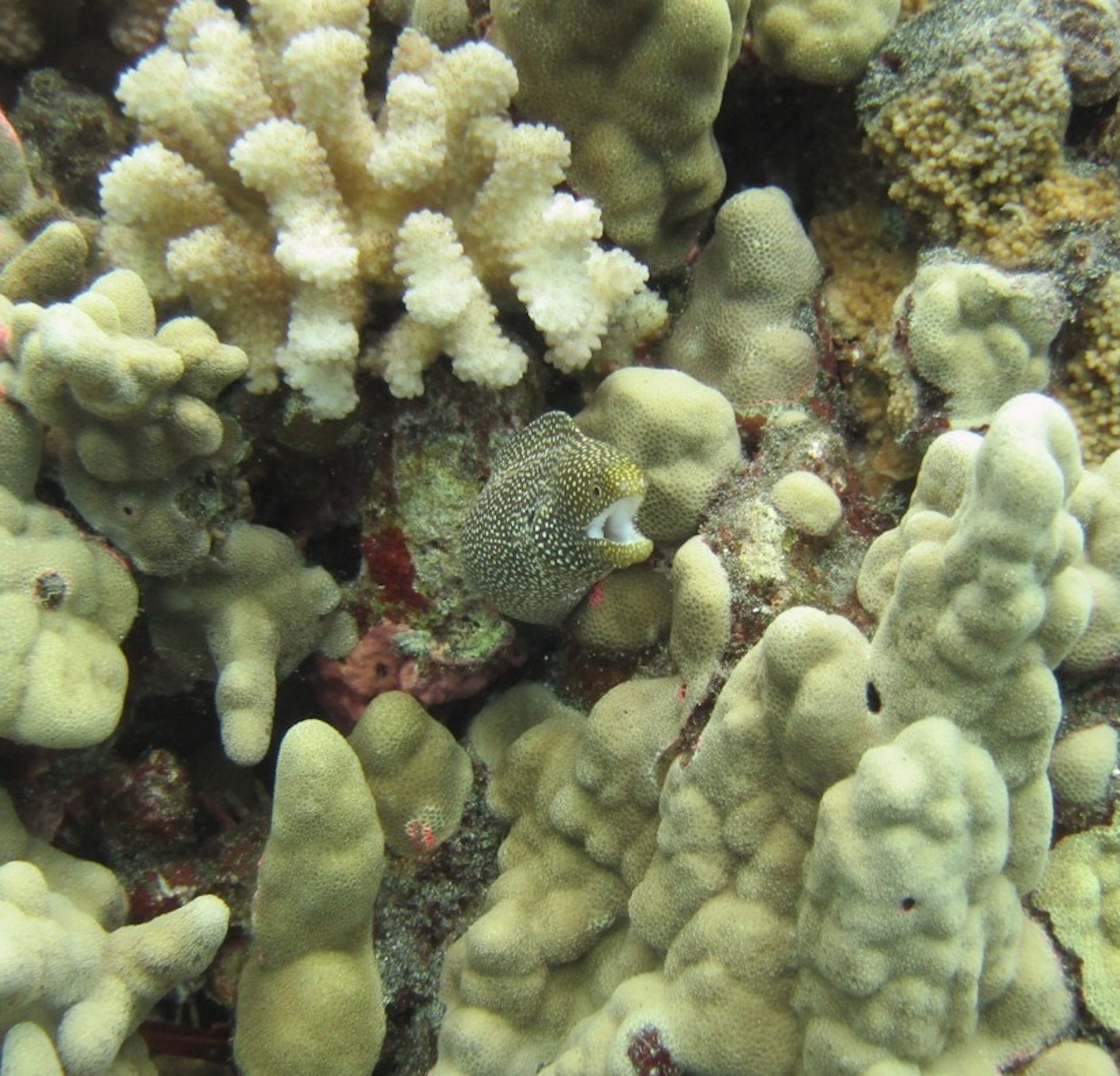
Can you spot the moray eel? (Taken during one of my scuba diving trips to Hawaii back in my triathlon days, and yes, scuba was one of the many hobbies.)

Moray Eel Green writing sample.

The writing sample from the drier Lamy Vista (top) shows off the yellow tones of this ink, while the wetter Go leans greener. Both are lovely and would look perfect in one of the Pelikan White Tortoise pens. Despite the lovely shading, they both had decent flow and average dry times.

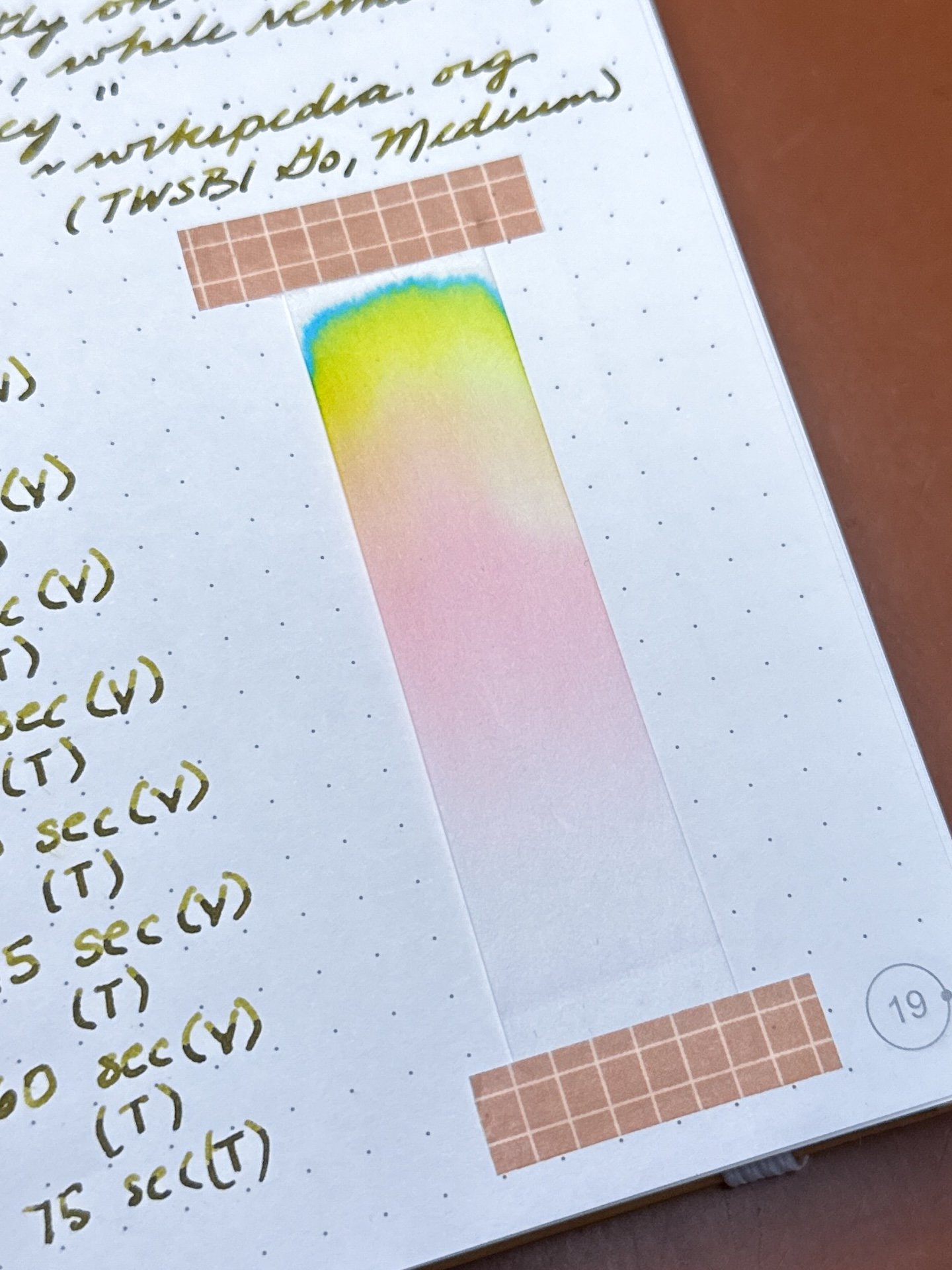
Moray Eel Green’s chromatography has all of the colors traveling way up the strip, starting with light pink, to coral/peach, yellow, and lastly, turquoise at the top.

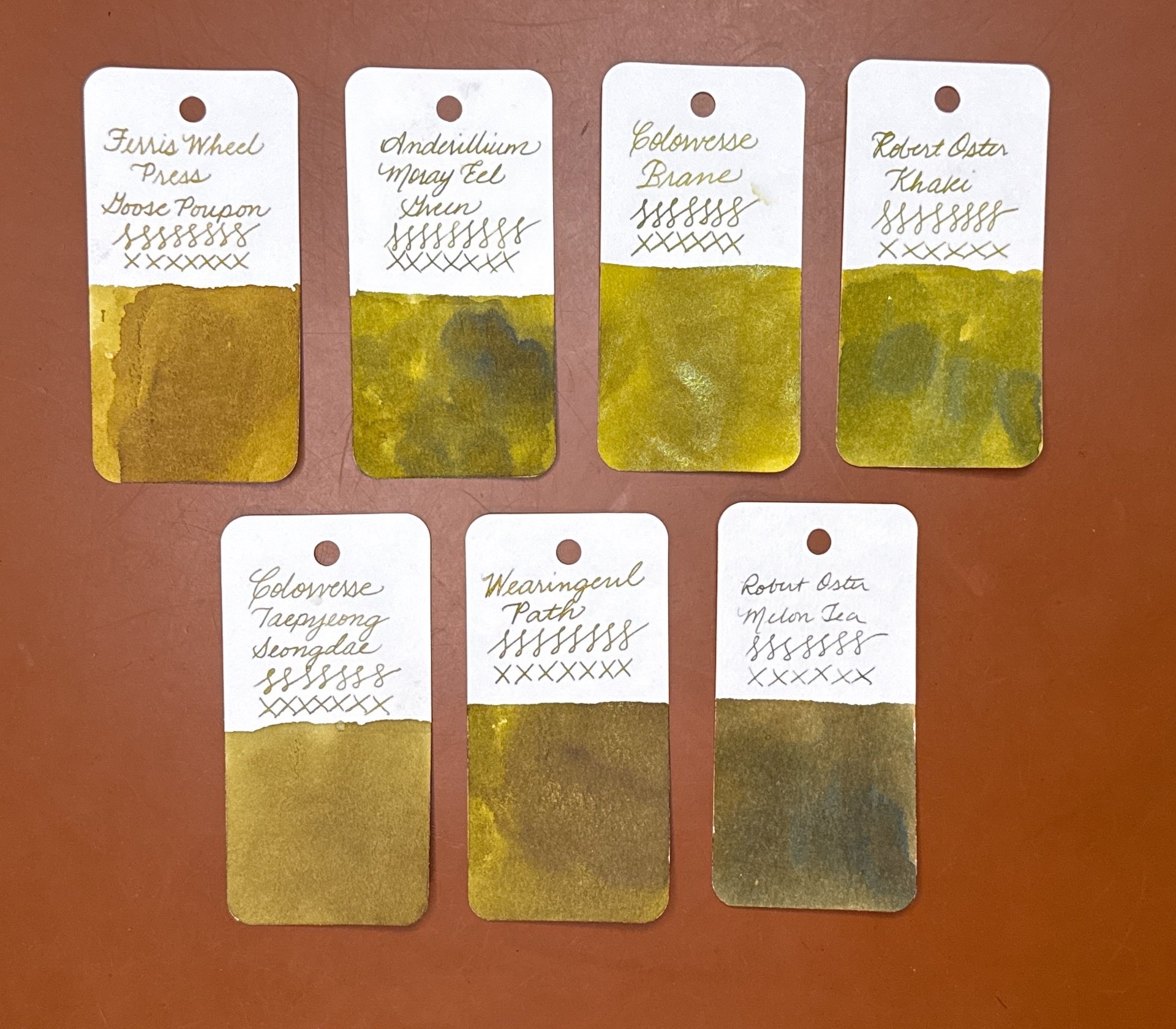
Inks similar to Moray Eel Green: Ferris Wheel Press Goose Poupon (too yellow), Colorverse Brane (slightly too light), Robert Oster Khaki, ColorverseTaepyeong Seongdae, Wearingeul Path are also good options, and Robert Oster Melon Tea if you wanted something darker and less yellow.

Piranha Red is a burgundy red that has some dusty pink and brown undertones. It has some shading and no sheen.

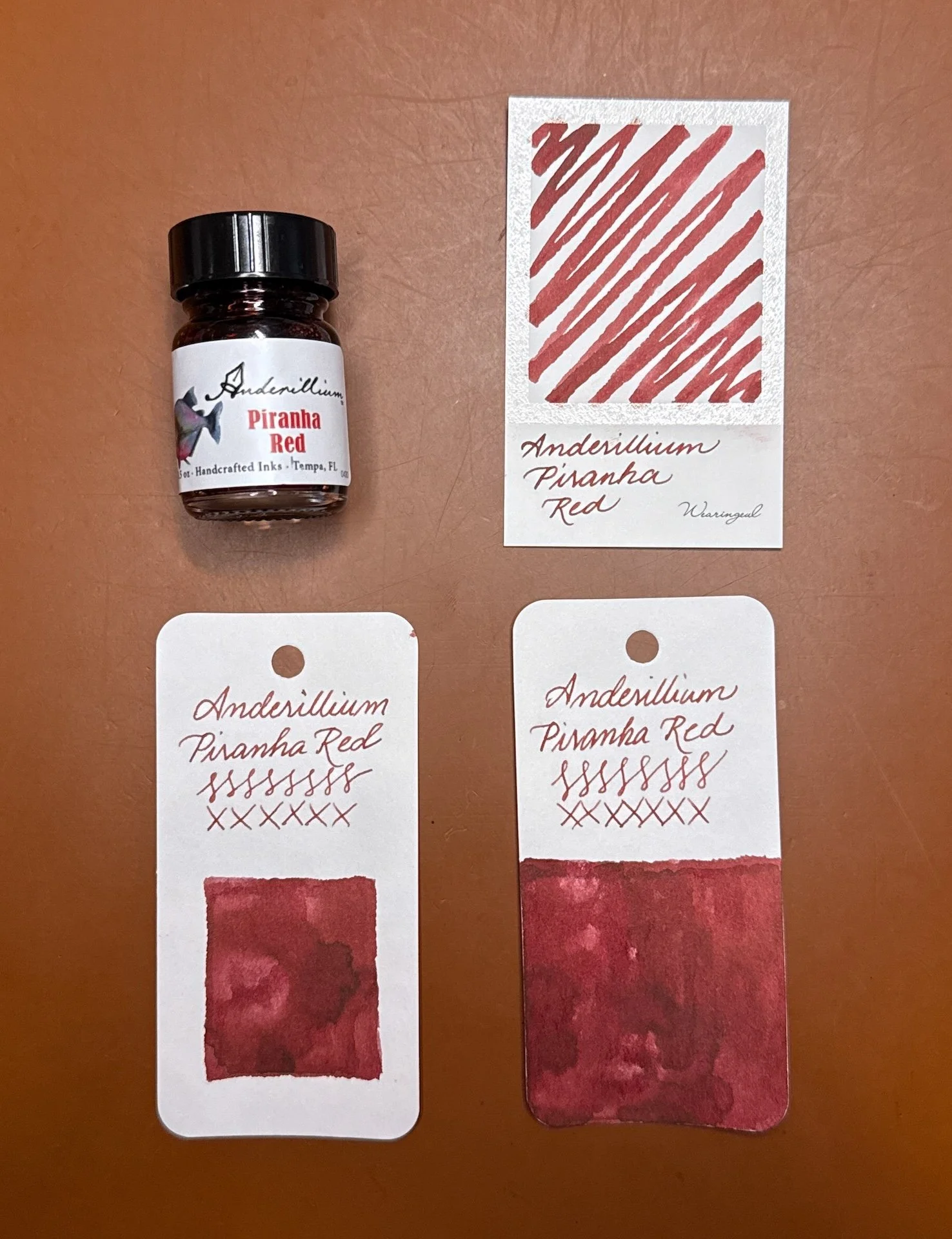
Anderillium Piranha Red swatches.

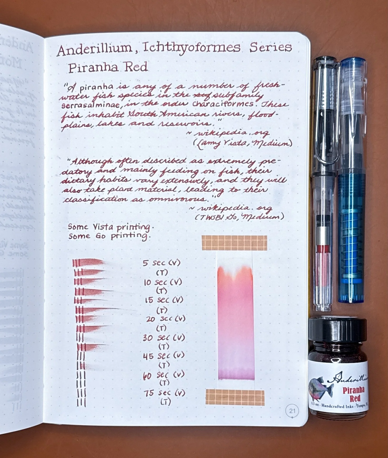
Piranha Red writing sample.

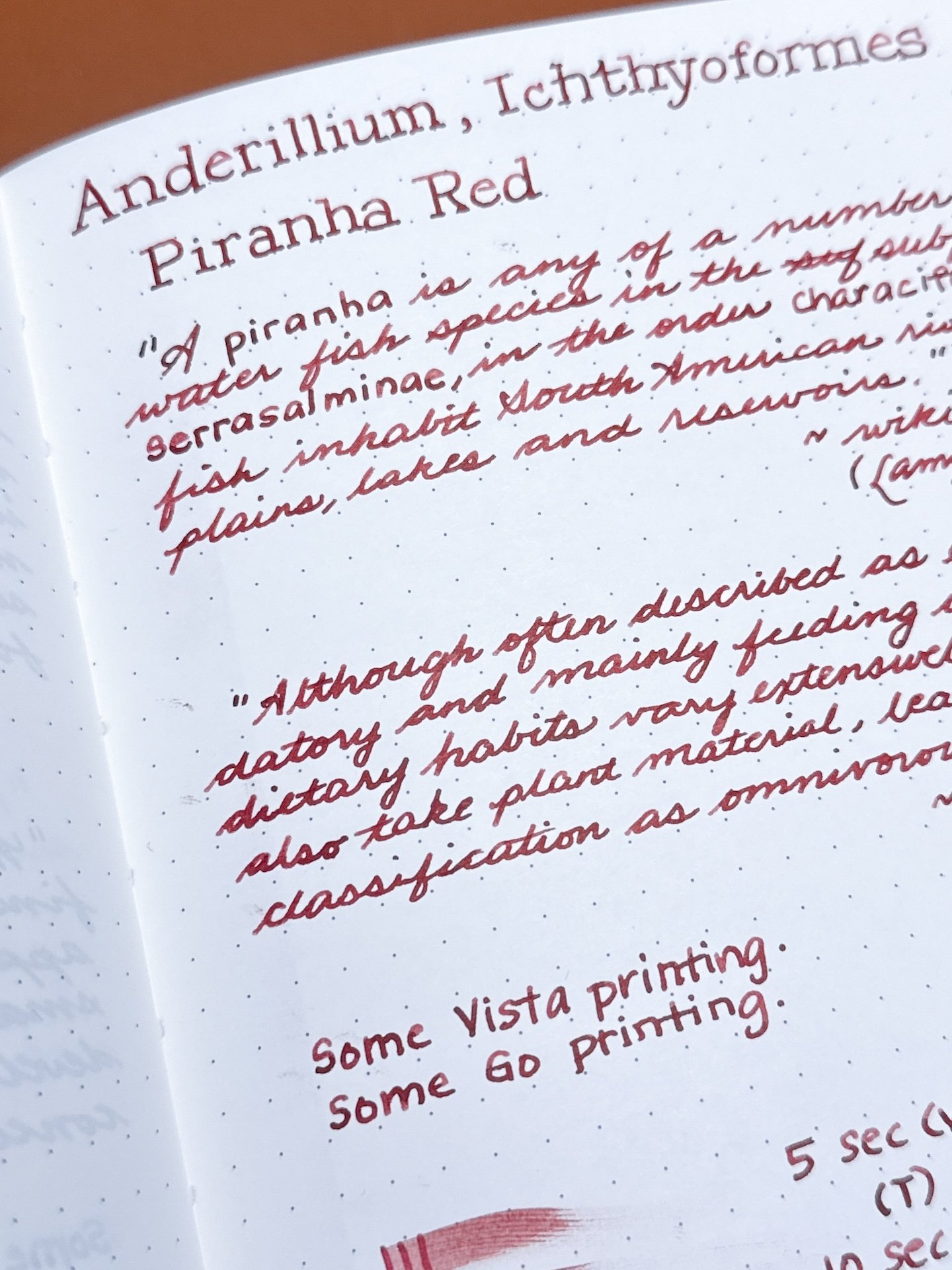
The Vista (top) writing shows a bit of shading and pinker tones, while the Go gives a more saturated line and dark burgundy tones. With the minimal shading, I expected slower dry times, but it was the opposite - dry times for both were faster than the Moray Eel Green’s shader.

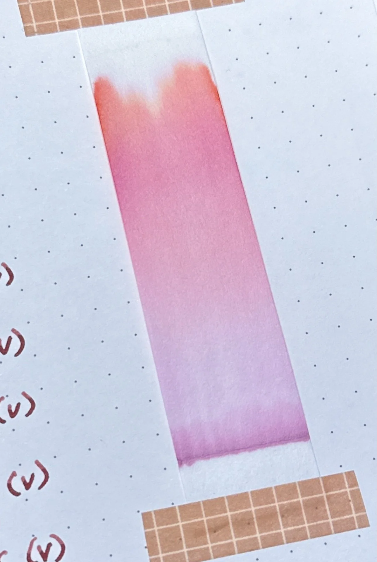
Piranha Red’s chromatography starts off with a dusty purple, moving up the pink gradient to a light brick red near the top.

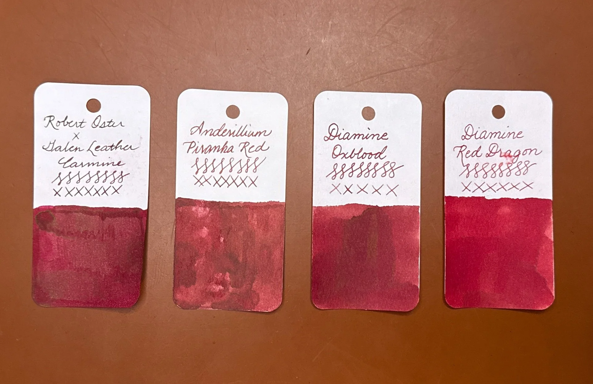
Inks similar to Piranha Red: Both Robert Oster x Galen Leather Carmine and Diamine Oxblood are close, albeit a touch too dark. Diamine Red Dragon is too “red”. All my other reds were too red, too purple, too burgundy, too pink, etc.

Sockeye Salmon is a bright orange ink with a bit of a pink/coral tinge. There is a gold sheen that is visible in swatches and in writing samples. There is little to no shading.

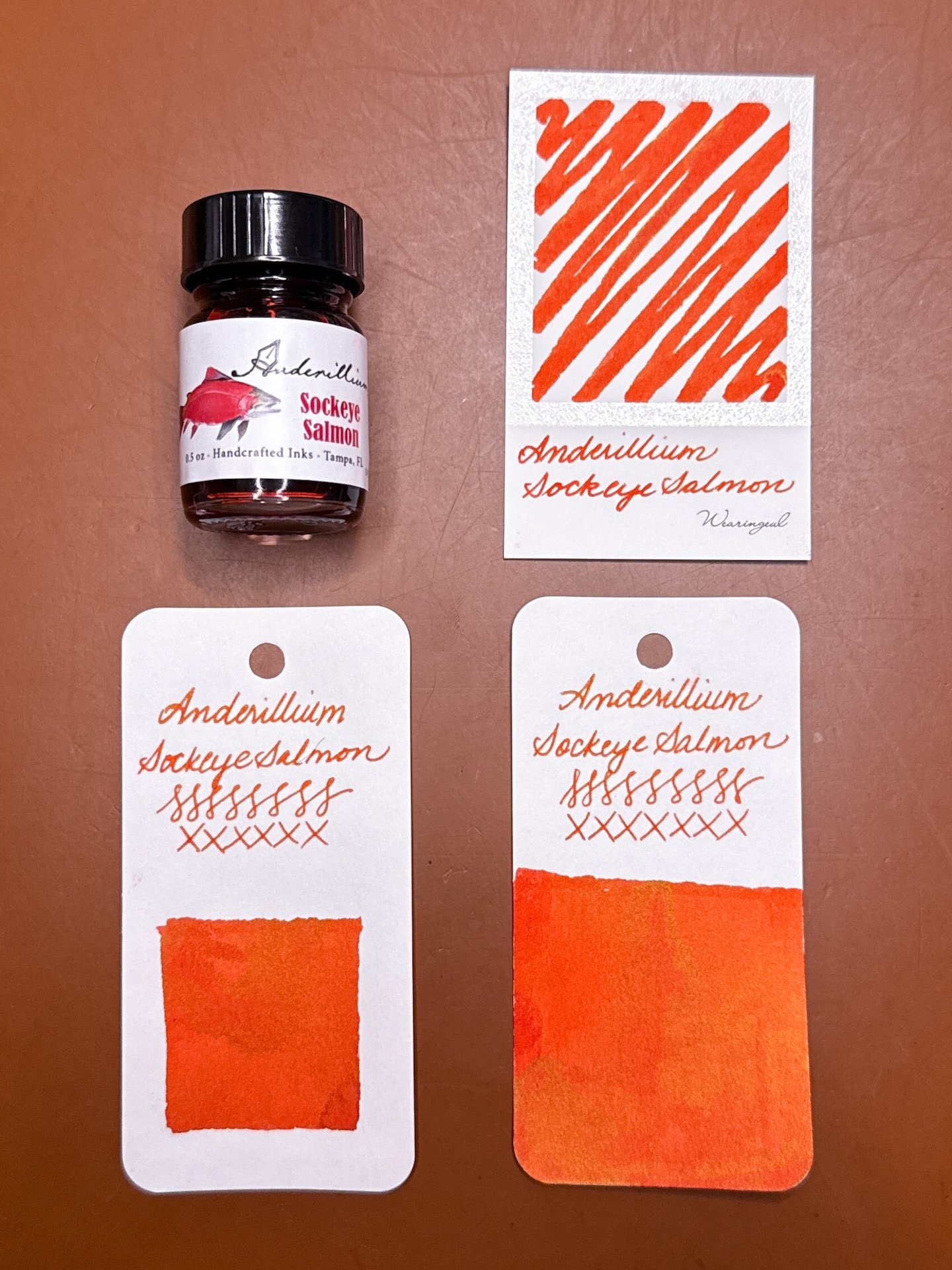
Anderillium Sockeye Salmon swatches - the sheen is more visible in the Col-O-Ring swatches (bottom) than the Wearingeul one.

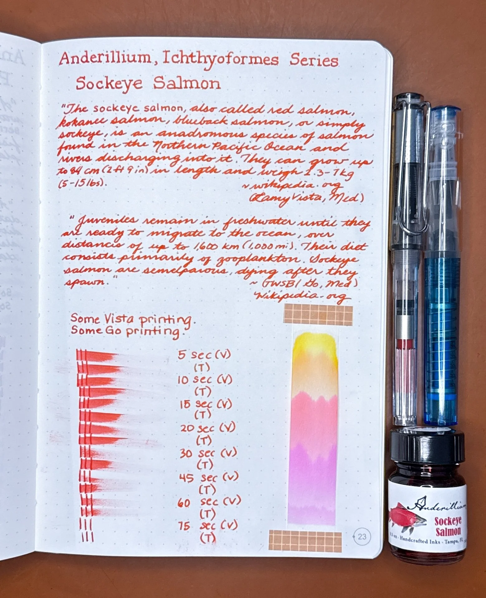
Sockeye Salmon writing sample.

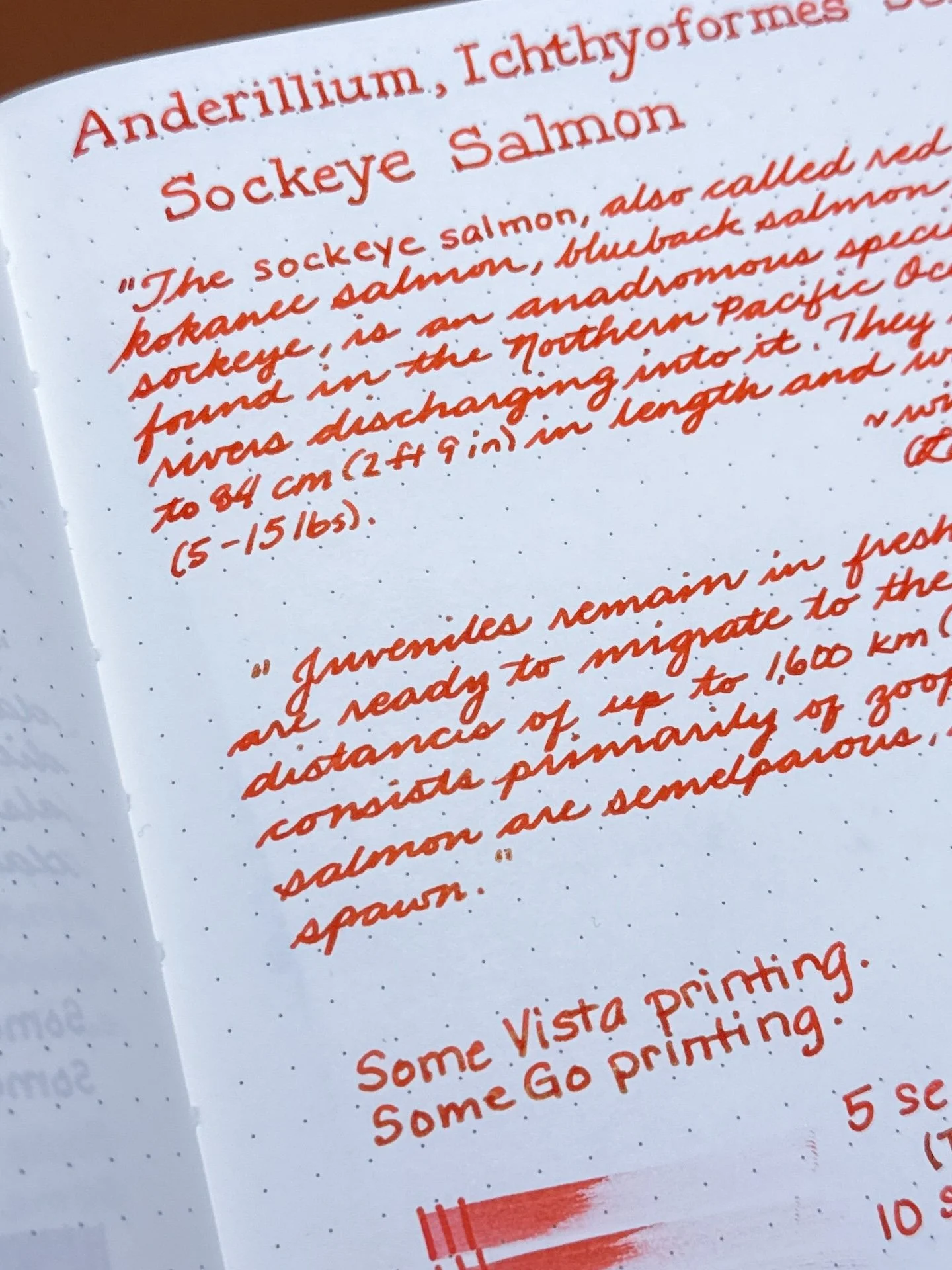
Both pens laid down bright orange lines but the Go’s writing is slightly redder. Visible in person but not in pictures is the subtle gold sheen from the wetter lines. Sockeye Salmon was one of the wetter writers, with slightly longer dry times than the others.

Oh my goodness, look at that chroma! Sockeye Salmon has gorgeous shades of magenta, pink, orange, and yellow. Made me think of a popsicle!

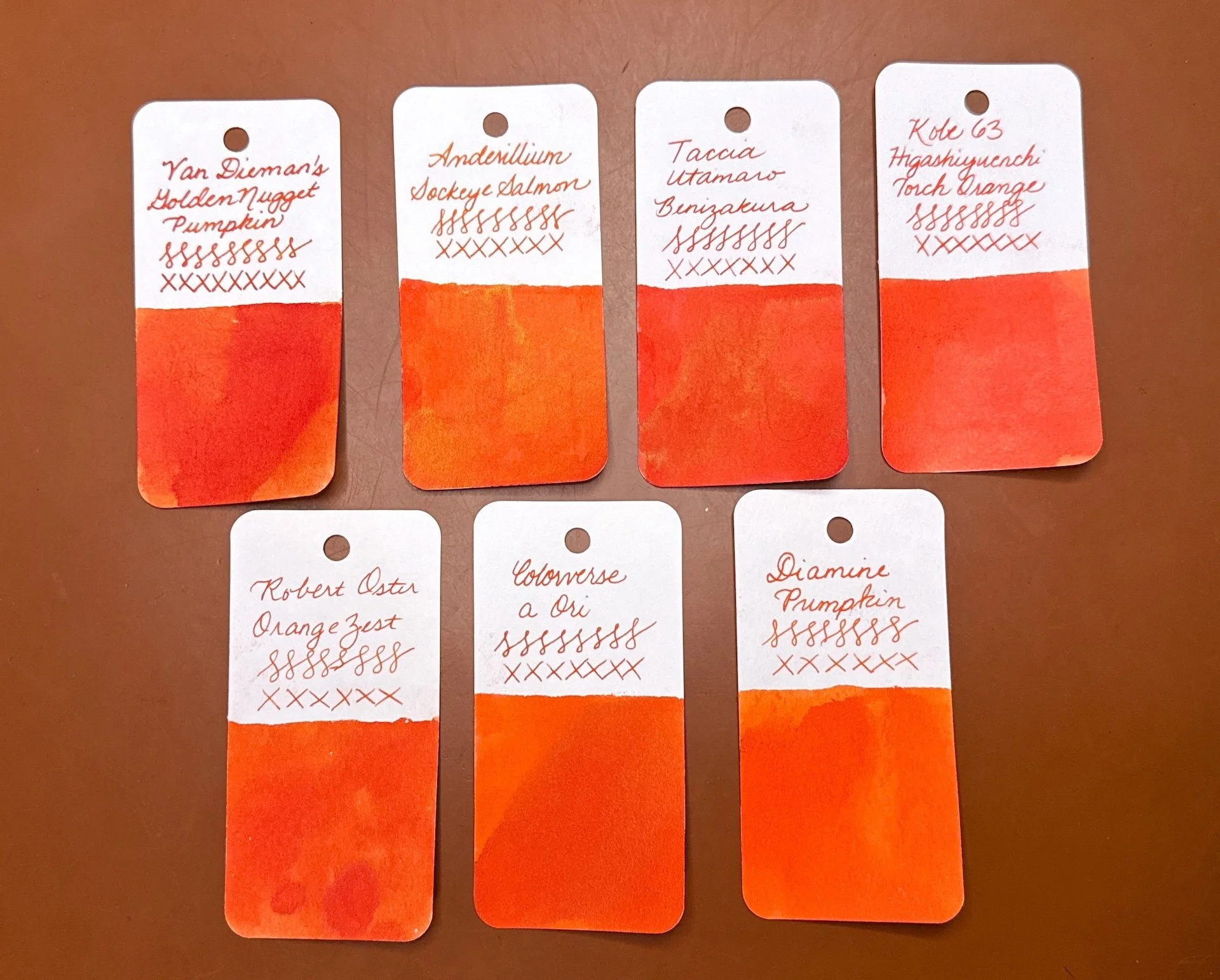
Inks similar to Sockeye Salmon: Van Dieman’s Golden Nugget Pumpkin (too red), Taccia Benizakura (a touch too red, but similar golden sheen), Kobe 63 Higashiyuenchi Torch Orange (also a bit too red), Robert Oster Orange Zest, Colorverse a Ori, and Diamine Pumpkin are also similar but without the sheen.

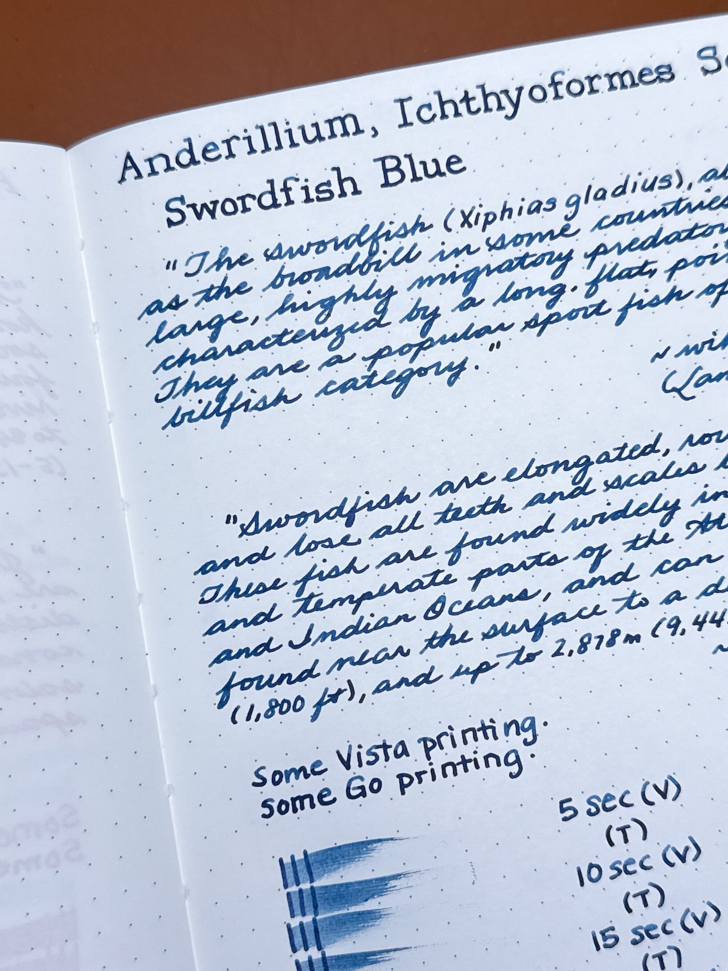
Swordfish Blue is a dark blue denim ink that isn’t navy, dark teal, or blue-black. It is a moderately saturated ink with some shading in drier pens. There is little to no sheen.

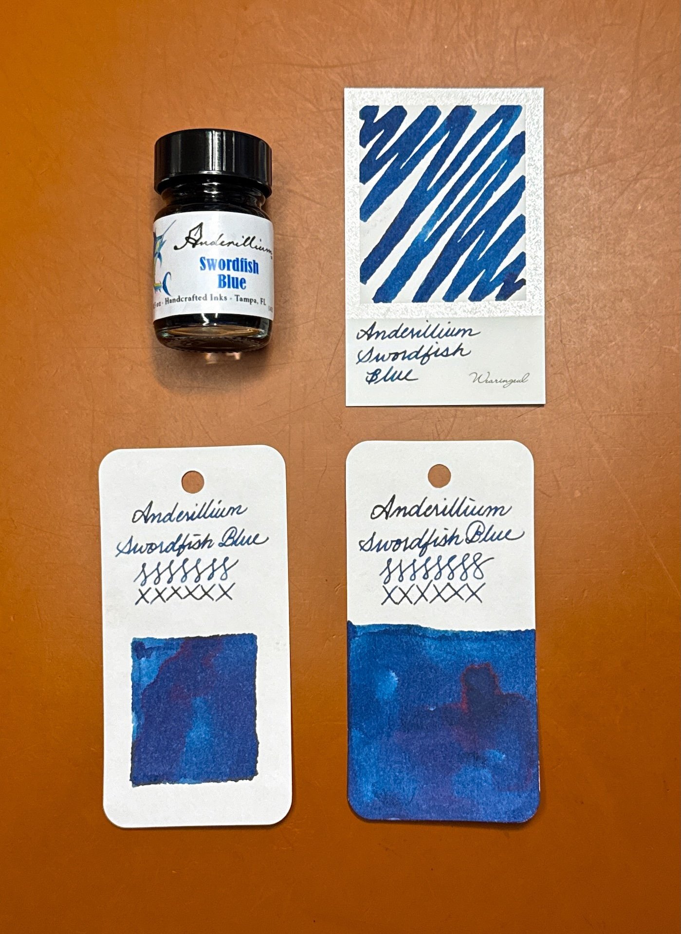
Anderillium Swordfish Blue swatches.

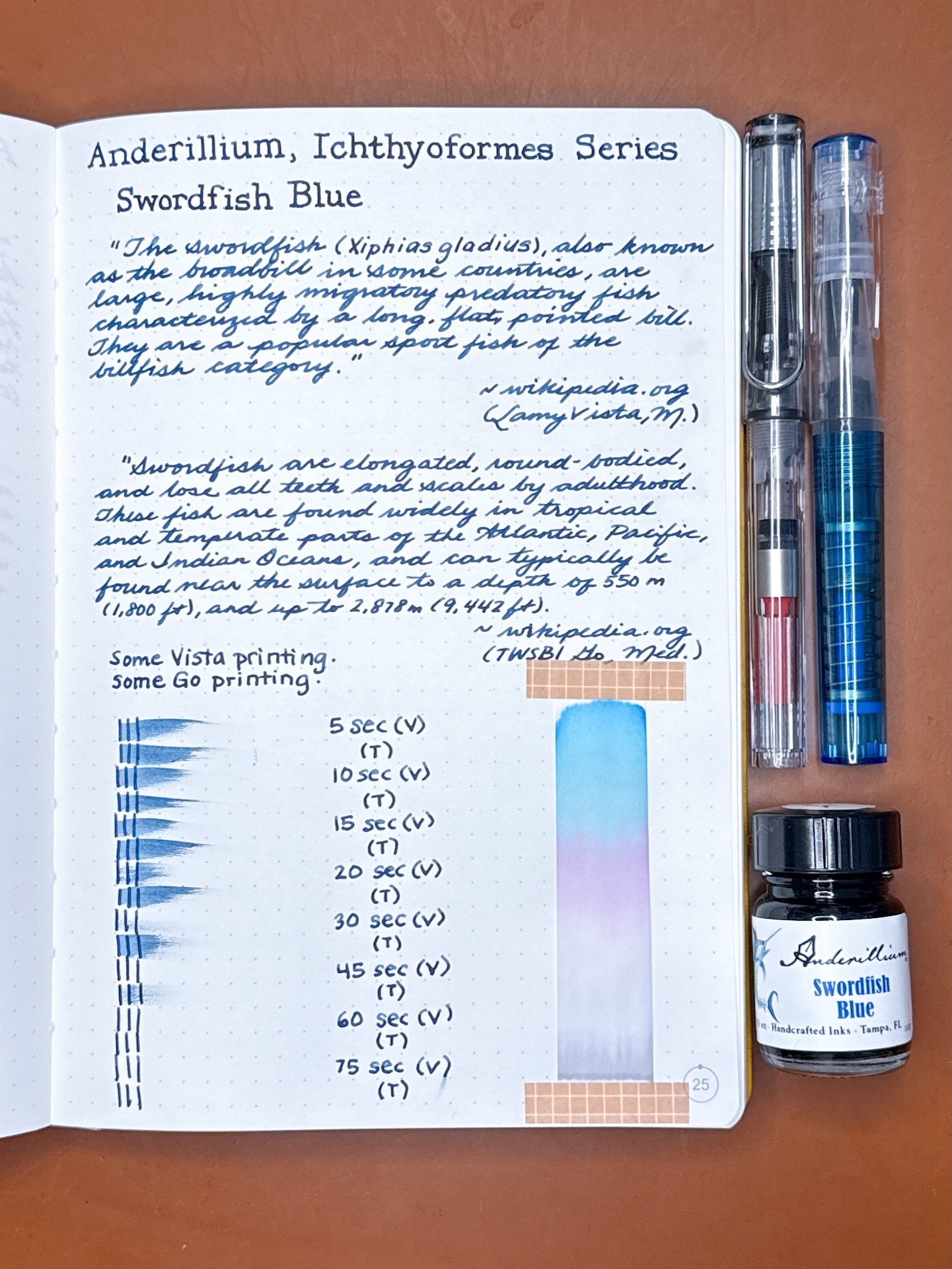
Swordfish Blue writing samples.

Both pens laid down similarly toned denim blue lines, but you can see a bit of shading from the Go (top). Despite feeling wet and saturated, the dry times were fairly fast.

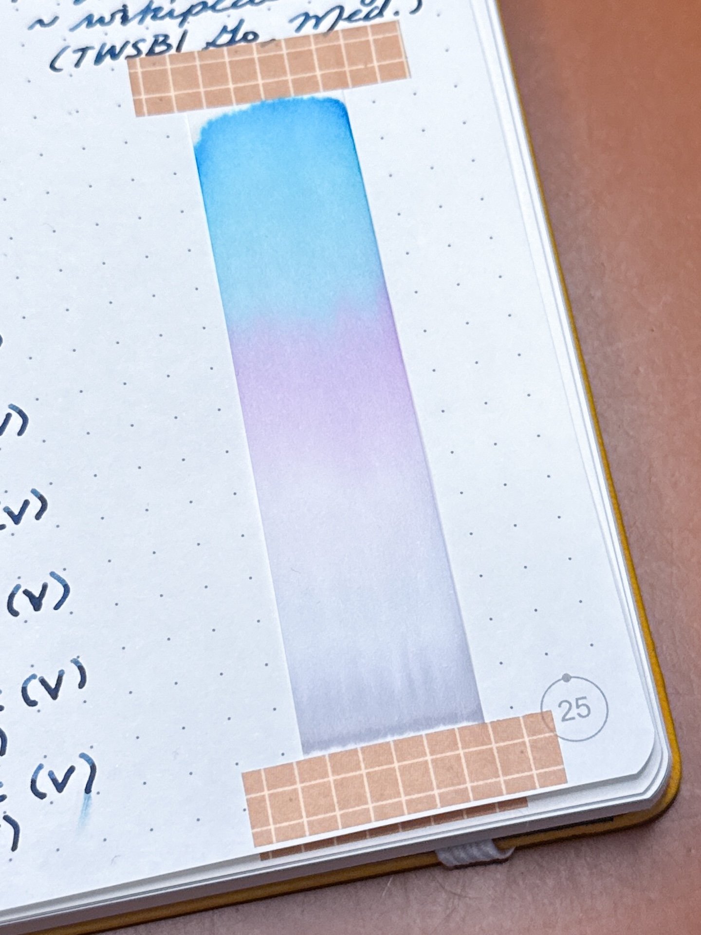
Swordfish Blue’s chromatography from grey to lavender to turquoise.

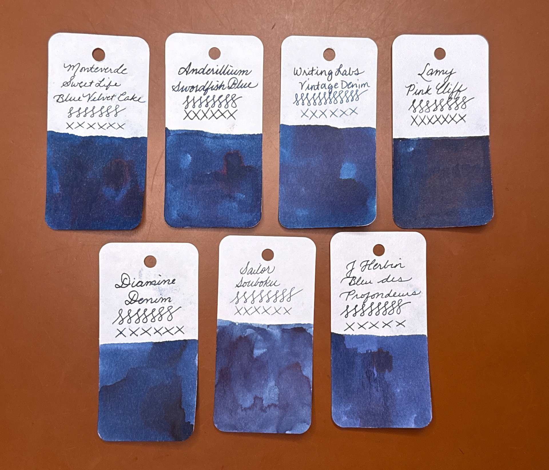
Inks similar to Swordfish Blue: Monteverde Blue Velvet Cake and Writing Labs Vintage Denim were the two closest. Lamy Pink Cliff (too dark and sheeny), Diamine Denim (too light), Sailor Souboku (too blue), and J Herbin Bleu des Profondeurs (too blue and too dark).

Whale Shark Grey is blue-leaning grey, so much so that I would almost say it’s a grey-leaning blue. It is a shading ink in drier pens, and there is little to no sheen.

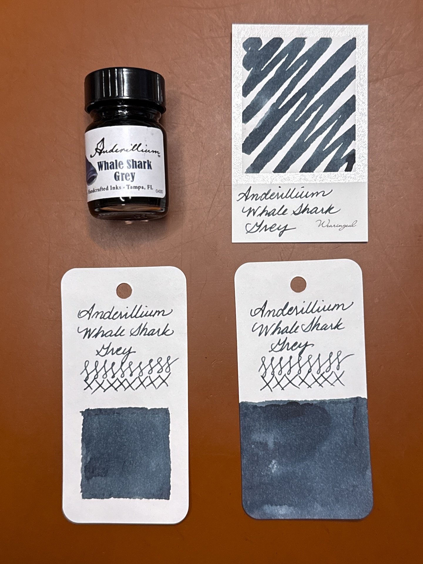
Anderillium Whale Shark Grey swatches looking bluer than grey.

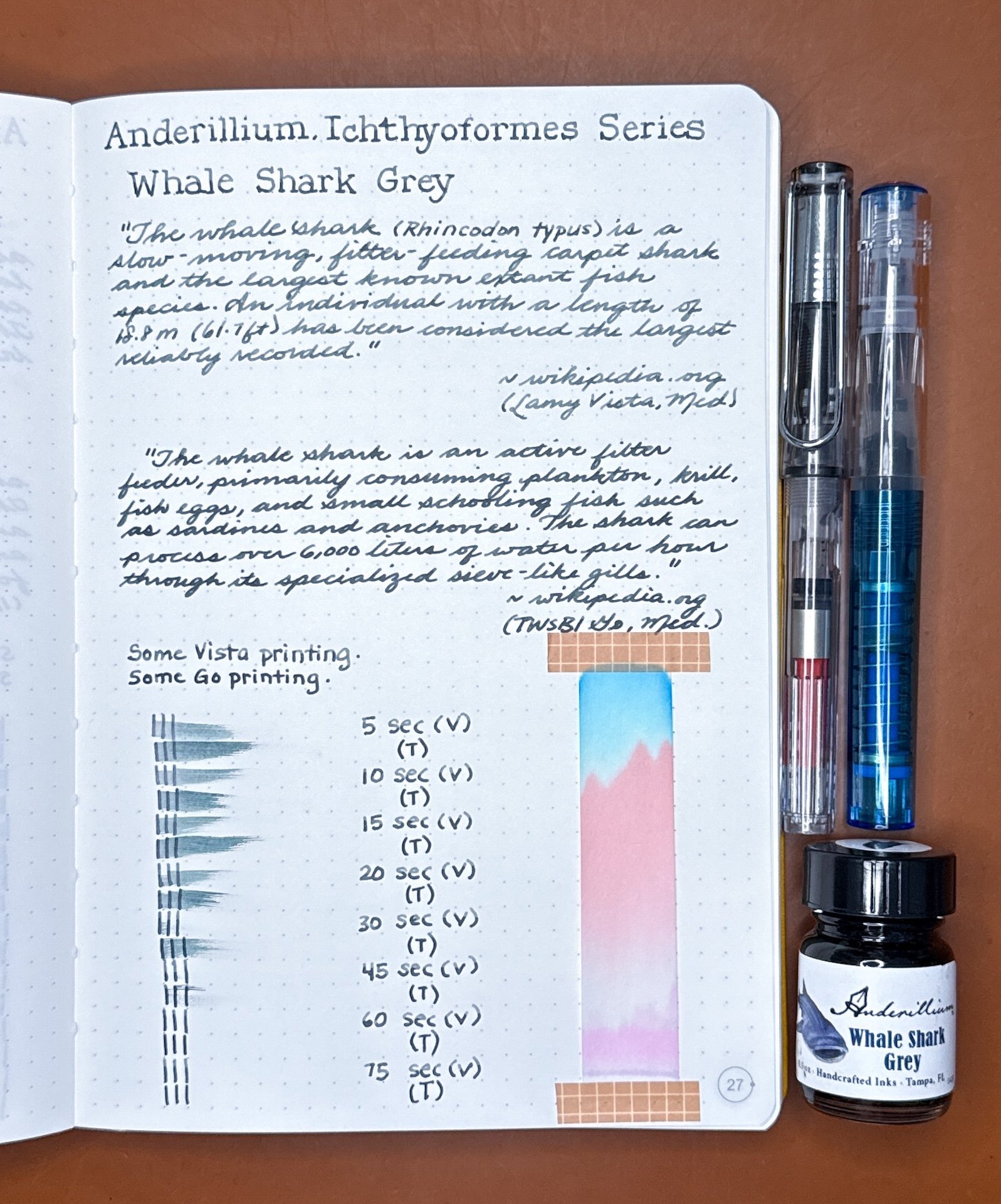
Whale Shark Grey writing samples.

Look at the shading from the drier Vista (top), which also makes the ink look greyer than the wetter Go writing which looks bluer.

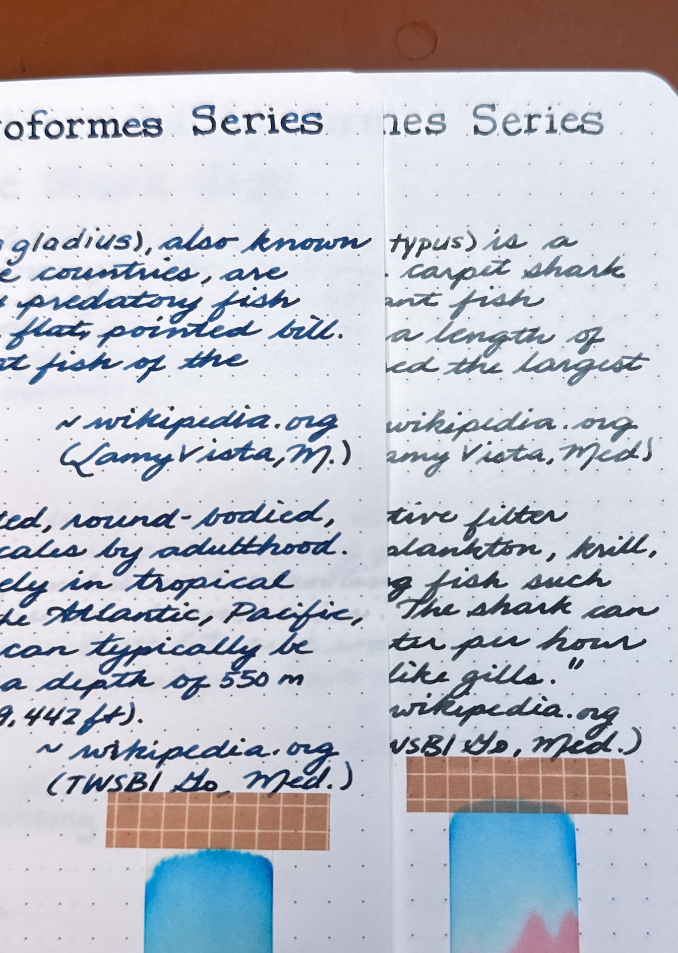
Seeing Swordfish Blue (left) and Whale Shark Grey side-by-side, I can see more of the grey tones of the latter, but I’d still call it a greyish-blue ink instead of a bluish-grey ink.

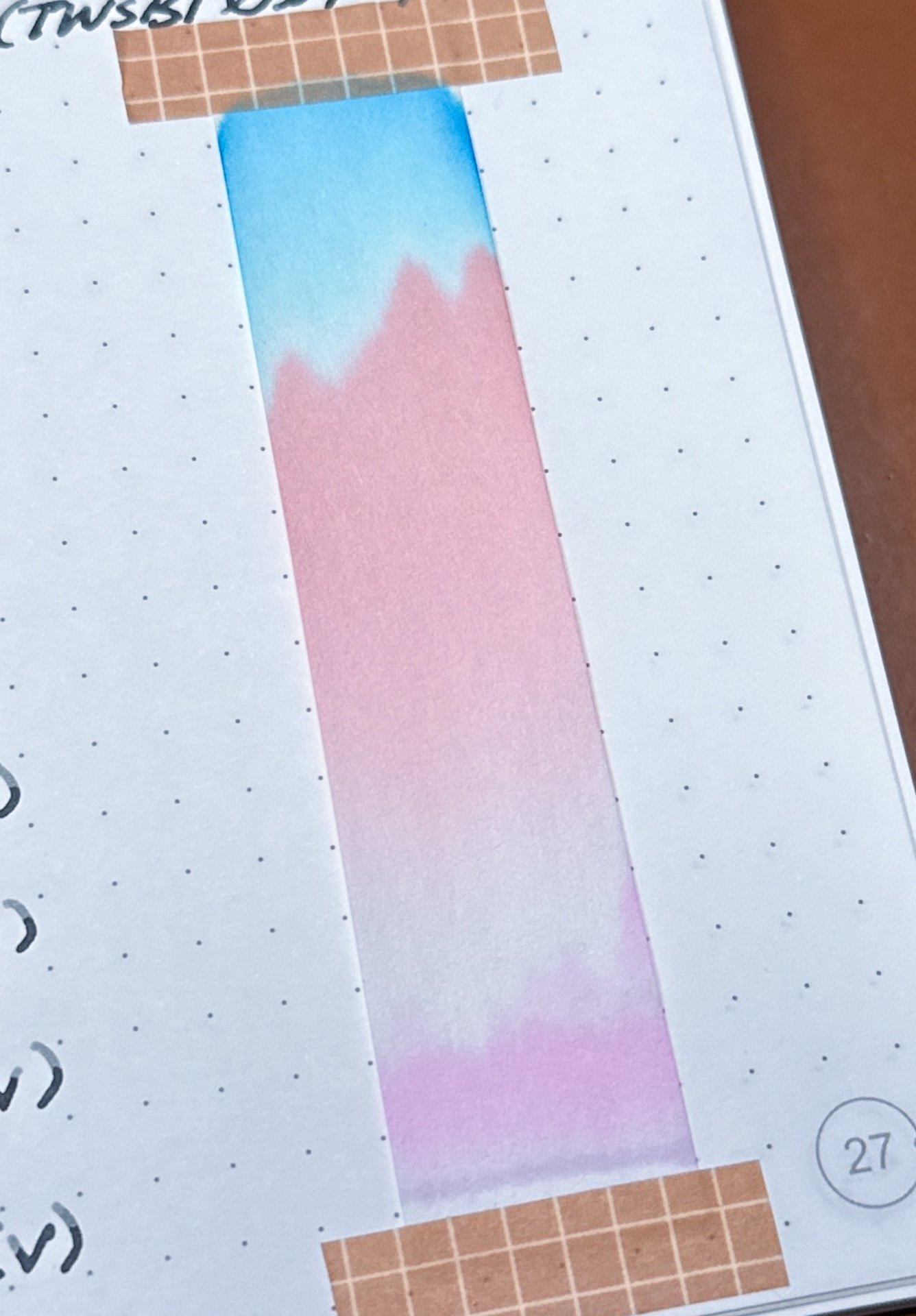
I would never guess that Whale Shark Grey’s chromatography would have so much pink with that turquoise.

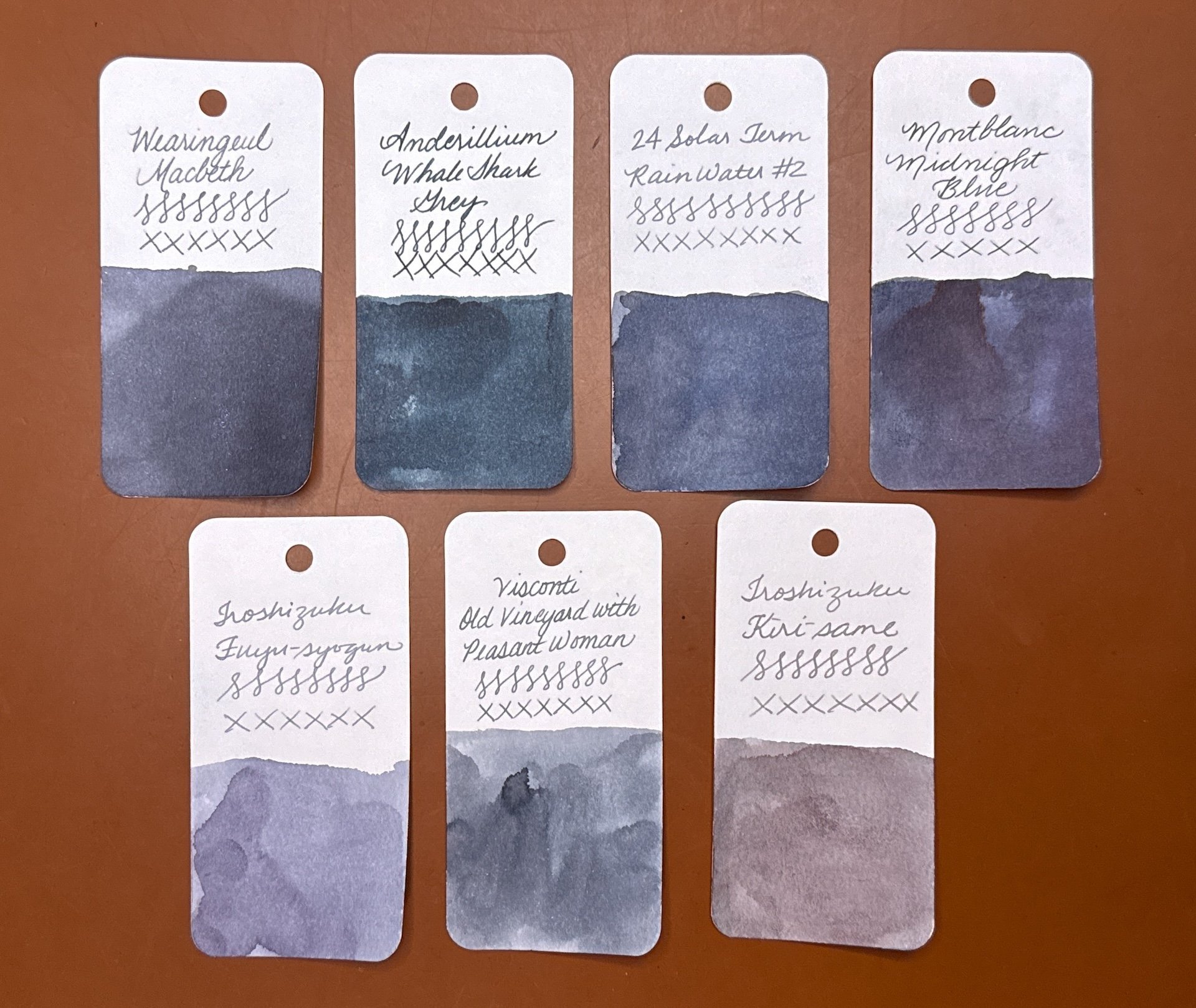
Inks similar to Whale Shark Grey: I didn’t really have any inks quite this color, but the closest were Wearingeul Macbeth and 24 Solar Term Rain Water #2, both of which were more grey. Montblanc Midnight Blue was too blue and not grey enough. I picked 3 other greys that also looked nothing like this one for comparison - Iroshizuku Fuyu-syogun, Visconti Old Vineyard with Peasant Woman, Iroshizuku Kiri-same.

As with the other series, all of the inks behaved well, were pleasant to write with, and cleaned out easily though Piranha Red took a wee bit longer to get all the ink out (I suspect it could stain a converter, so ymmv). While some inks looked fairly similar from different pens, some of them really looked different.

If I had to pick favorites in the bunch, they would be Moray Eel Green because I love this murky olive color and because it reminds me of my scuba adventures, and Whale Shark Grey because it’s unlike many of the blues and greys I own. In my review of the Avian Series, I was hoping that “maybe the upcoming Ichthyoformes series will have a purple” and I love the color of Betta Fish Purple. Overall, the colors are nice and they are worth the purchase if you don’t already have similarly colored inks. I do think the inks are fairly “straight forward”, compared to shimmer, sheening, or chromashading inks.

Anderillium inks sell for $14.50 per 1.5 ounce bottle, or $50 for 0.5 ounce sample sets of all 8 inks. They can be purchased directly from Anderillium or from authorized resellers.

(Disclaimer: Thank you to Anderillium Inks for providing these inks for review. Anglerfish Deep was purchased at regular price from Darail Penz at the Philly Pen Show.)

Posted on May 1, 2026 and filed under Anderillium, Ink Reviews.

A Trio of 2025 Chicago Pen Show Inks

(Kimberly (she/her) took the express train down the fountain pen/stationery rabbit hole and doesn't want to be rescued. She can be found on Instagram @allthehobbies because there really are many, many hobbies!.)

One of my favorite things to get at a concert, show, event, or shop, is something that reminds me of the occasion, whether it’s a t-shirt, bag, or sticker that makes me remember that event. In the case of pen shows, it’s no surprise that I am a sucker for show-exclusive inks!

At the 2025 Chicago Pen Show, I bought several bottles of ink, but 3 of them were specifically made for this show! The first one is the official show ink, Windy City Blue, made by Colorverse to celebrate the show’s 45th anniversary. The second one is Papier Plume Lake Michigan Springtime. And last, but not least, is Anderillium’s Chicago River Green.

Note: I add swatches to similar color family inks in both the Hobonichi Weeks and 68 gsm Tomoe River notebook. Unlike the Col-O-Ring swatch card comparisons, the Weeks and TR swatches might not be that close to the ink in question.

2025 Chicago Pen Show Inks

L to R: Colorverse Chicago Pen Show 45th Anniversary Windy City Blue, Papier Plume Lake Michigan Springtime, Anderillium Chicago River Green.

Despite the box and bottle’s lighter blue color, the Windy City Blue is more of a darker blue-leaning teal.

You can see a hint of red/purple sheen in wetter parts of the swatch and writing sample.

Swatch/writing sample of Windy City Blue on 2022 Hobonichi Weeks, which has slightly cream-colored paper, along with Anderillium Indigo Bunting Blue, Montblanc Leo Tolstoy, Montblanc StarWalker Blue Planet.

Swatch/writing sample on 68 gsm Tomoe River Endless Recorder notebook. Accidentally added an “s” to the ink name, oops.

Inks similar to Windy City Blue: Rohrer & Klingner Verdigris, Robert Oster Lake of Fire is the closest match, Van Dieman’s Hanging Lake, New Brew Space, and Robert Oster Great Southern Ocean are also close but a touch too blue.

I’m eager to put Windy City Blue in either the Sailor x Cult Pens Pro Gear Slim, Midnight Sky Blue or the Leonardo x Figboot on Pens Momento Zero, Carolina Midnight.

I love that Papier Plume dips their ink bottle caps in wax and then stamps the top.

My swatches of Papier Plume Lake Michigan Springtime look fairly green but I’ve seen some swatches where it has more teal to it. I double checked with some friends who agreed that theirs is also more green in real person but looks a bit more teal in photos.

First/only swatch/writing sample of Lake Michigan Springtime in the Hobonichi Weeks. This looks more teal than on the Col-O-Ring cards.

A green leaning teal on TR 68, but still fairly green.

Inks similar to Lake Michigan Springtime: Waterman Harmonious Green, Jacques Herbin Vert Metropolitain, Wearingeul Tick Tock Croc, Diamine Velvet Emerald, Iroshizuku Sui-gyoku (this and the Diamine are a touch too blue), Diplomat Deep Green (a bit too dark.)

The Kaweco x GoldSpot Pens Sport, Transparent Turquoise (which is way more of a teal than turquoise), and the greenish parts of the Aurora Optima, Azzurra are both good matches for Lake Michigan Springtime.

Anderillium Chicago River Green is a pleasantly bright, spring green ink.

Chicago River Green in the Hobonichi Weeks along with Pennonia x Inkdependence Hens & Chicks and Anderillium Green Kingfisher Green.

Inks similar to Chicago River Green: Diamine Appletini (too yellow), Papier Plume 2019 SF Pen Show Marina Green, Robert Oster Envy (both of which are close but still too yellow), Organics Studio Frog Green Shimmer, Diamine Merry & Bright (the closest), Van Dieman’s Wasabi (second closest.)

Anderillium Chicago River Green would look great in the Taccia Spotlight Forest Eye or the Kaweco x Cult Pens Apple Green.

Even though I can find similarly colored matches for all 3 inks, I still love having them as souvenirs of this year’s Chicago Pen Show. The inks cost $15-20 per bottle and are a great way to remember a fun pen show. If you didn’t get a chance to snag them, you can reach out to Roger Wooten, (show organizer) to see if they are willing to sell/ship the Colorverse ink. You can order Anderillium Chicago River Green from Atlas Stationers. Papier Plume is currently sold out of Lake Michigan Springtime but you can add it to your wishlist in case they decide to make more.

(Disclaimer: All 3 inks were purchased by me at the show at regular price.)

Posted on May 23, 2025 and filed under Anderillium, Colorverse, Papier Plume, Ink Reviews.

Anderillium Avian Series Fountain Pen Ink Review

(Kimberly (she/her) took the express train down the fountain pen/stationery rabbit hole and doesn't want to be rescued. She can be found on Instagram @allthehobbies because there really are many, many hobbies!.)

I have reviewed all of the Anderillium Cephalopod Inks and the Lepidopteran series so I told the Bossman that I might as well review the Avian series, too! The Avian Series is actually the first series from Anderillium Inks so it definitely needed to be done!

The 8 inks in the Avian series (named for various birds followed by the ink’s main color) are as follows: Pompadour Cotinga Burgundy, Roseate Spoonbill Pink, American Goldfinch Yellow, Green Kingfisher Green, Indigo Bunting Blue, Purple Gallinule Purple, Shoebill Stork Grey, and Common Loon Black. Most people have seen the inks in 1.5 ounce (44ml) sealed glass “jam” jars, but their ink sets are also available in 0.5 ounce (14.5ml) “sample” bottles.

Pack of 8 sample bottles from the Anderillium Avian Series.

I like that there are bird stickers on top so you can tell the ink color. The regular size bottles have stickers on the boxes, but not the bottles.

As usual, all swatches were done on Col-O-Ring cards using a Kakimori steel dip nib and writing samples were done primarily with a Lamy Vista with a steel Medium nib and a TWSBI Go with a Medium nib. The notebook used for writing samples is from Endless Recorder with 68 gsm Tomoe River paper. Dry times for the Vista are shown with “(V)” and the Go will be shown below that with a “(T)”. Dry times may be a bit slower on 52gsm TR or faster on more absorbent papers like Rhodia, copy paper, Cosmo Air Light, or with drier or finer nibs.

Anderillium Avian Series.

Swatches from the Cephalopod series (left) with the Lepidopteran series (right.)

Pompadour Cotinga Burgundy is a dusty pink that isn’t as dark or red as what I think burgundy should look like. I think of burgundy as a wine-colored red and this is a bit more pink. It is still a nice color but the naming does throw my brain off a bit. It was slightly dry in the Vista and had pretty fast dry times with both pens. There is some shading and no sheen.

Pompadour Cotinga Burgundy writing sample.

You can see the Pompadour’s shading from the Vista (top) versus a more saturated writing sample from the Go.

Chromatography from Pompadour Cotinga - I would have never guessed that this muted pink would have such bright bright pinks, coral, and turquoise on top!

Inks similar to Pompadour Cotinga: DeAtramentis Blackberry, Montblanc Antoine de Saint-Exupery, Rohrer & Klingner Alt-Bordeaux, Diamine Tyrian Purple (a bit too much purple), Diamine Forest Gateau (too dark.)

Roseate Spoonbill Pink is a bright, neon/hot pink that dries pretty quickly in the Vista, and flows well in both pens. There is minimal shading in the Vista and no sheen.

Roseate Spoonbill Pink writing sample.

The ink is lighter from the Vista but it isn’t much of a shader. I really liked the bright pink lines from the Go.

Not a whole lot to this chromatography - it’s straight up hot pink all the way.

Inks similar to Roseate Spoonbill Pink: Diamine Hope Pink and Bungubox Sweet Love Pink. Iroshizuku Kosomosu and other bright pinks weren’t the right shades (often too orange) or brightness.

American Goldfinch Yellow is a very yellow ink - I wish I had swatched this before recording the AskTPA episode 660 with the Bossman about ROYGBIV inks! It is almost unreadable in the drier Vista, and while readable from the Go, it’s just too bright to be read comfortably for very long. I think it’d make a great ink for art though! It had an average flow, average dry times, and not much shading.

American Goldfinch Yellow writing sample.

The Vista writing sample is actually lighter in real life than in this picture which is actually quite readable. It’s still a lot of yellow going on. I can’t imagine reading an entire page of this ink.

Yep, yellow and not much else on this chromatography strip.

Inks similar to American Goldfinch Yellow: Blackstone Golden Wattle (rip Blackstone ☹️), Colorverse Golden Leaves, Colorverse Project Series #8 Ornament Yellow, Pilot 100th Anniversary Daikokuten.

Green Kingfisher Green is what I would call an algae green. It isn’t yellow enough to be olive but it’s also not a regular green or forest green. It had average dry times of 30 seconds with a bit of shading from the Vista.

Green Kingfisher Green writing sample.

More shading from the Vista (top) than the Go, which produces not-quite forest green lines.

The Vista swipes (odd) had an almost blue hue to it, while the Go swipes (even) were more of a light forest.

I would have never guessed that Green Kingfisher Green would produce peach and turquoise colors in its chromatography! If I hadn’t done these one at a time, I would have assumed I mixed this up with a different ink!

Inks similar to Green Kingfisher Green: Diamine Oliva , Diamine Salamander, and Bungubox Dandyism were too brown, Montblanc Homage to Brothers Grimm Green is the closest, and Robert Oster Eucalyptus Leaf is close but too dark.

Indigo Bunting Blue is a nice blue that isn’t royal blue or school blue but isn’t a blue black either. It ranges from a light to dark navy depending on the pen’s flow. It dries quickly for the Go but average dry times for the Go. Some shading with the Vista but not as much with the Go, and no sheen.

NOTE: There were issues with the dyes in early bottles of Indigo Bunting Blue and Adonis Butterfly Blue (from the Lepidopteran series) such that the blue component disappeared and the color was off. While the inks were safe to use, they were just the wrong colors. Please reach out to Anderillium if you’re experiencing issues with either of those bottles and they will happily replace them.

Indigo Bunting Blue writing sample.

I liked both the lighter and darker navy colors that you can get from drier and wetter pens.

What an interesting mix of purple (bottom), pinks, and turquoise to produce this colorful chromatography.

Inks similar to Indigo Bunting Blue: J Herbin Bleu Nuit (too “royal”), Colorverse Saturn V (the closest), Diamine Shimmering Seas (also fairly close but the shimmer changes the color a bit), J Herbin Bleu des Profondeurs (a bit more blue-black but still close.)

Purple Gallinule Purple is a blue leaning lavender and purple (depending on wetness of pen). There is a hint of chromashading with the drier Vista and no sheen. It had fast to average dry times.

Purple Gallinule Purple writing sample.

The chromashading is very faint in the drier writing sample (top) but it has nice shading, especially when printing.

Kinda cool to see the purple lines while the swipes of color are blue/bluish purple.

Hot pink chromatography starting from the bottom and ending with turquoise up top.

Inks similar to Purple Gallinule Purple: DIamine Rainbows End, Robert Oster Purple Sunset were a bit too purple, while Kobe 56 Rokko Shichidanka, Bungubox Blue Purple Morning Glory, and Pennonia Arcaska are closer while still being a bit too purple.

Shoebill Stork Grey is a light to medium grey ink with some nice shading in the drier Vista. It had fast dry times and no sheen.

Shoebill Stork Grey writing sample.

Fairly neutral light and medium grey lines with shading in the Vista and less in the Go.

Some grey and a touch of blue in Shoebill’s chromatography.

Inks similar to Shoebill Stork Grey: Vinta Clouds of Grey Pagtangi (shimmer), Sheaffer Bling, Iroshizuku Kiri-same (had a bit too much “brown,”) Diamine Ghost, Visconti Old Vineyard with Peasant Woman, and Iroshizuku Fuyu-syogun was close but too “cool” in tone.

Common Loon Black is more of a grey/dark grey ink as opposed to a black ink. Even with the wetter Go, it is still more grey than black. There is shading from the Vista, but no sheen from either. Dry times were average for both pens.

Common Loon Black writing sample.

The top writing almost has a hint of blue to its grayness. Neither are particularly black.

Similar to Shoebill Stork Grey’s chroma, but more of it. More grey at the bottom and more turquoise up top.

Inks similar to Common Loon Black: Wearingeul Romeo and Colorverse Lucky Star II. It didn’t match any of the grey inks I have and it’s not black enough to match any of my black inks either.

As with the other two series, all of the inks behaved well, and cleaned out easily. I continue to enjoy seeing how different pens can produce such different results with the same ink.

If I had to pick favorites in the bunch, they would be Purple Gallinule Purple in a dry writer because of the lovely chromashading and Green Kingfisher Green because it’s unlike many of the greens I have in that range. I think the colors are nice and they are worth the purchase if you don’t already have similarly colored inks. I do think the inks are fairly “straight forward”, compared to shimmer or sheening inks. The Purple Gallinule Purple is the only purple out of the 3 sets (maybe the upcoming Ichthyoformes series will have a purple? Pretty please?)

Anderillium inks sell for $14.50 per 1.5 ounce bottle, or $50 for 0.5 ounce sample sets of all 8 inks. They can be purchased directly from Anderillium Inks or from authorized resellers.

(Disclaimer: Brad purchased all of these inks at normal price directly from Anderillium.)

Posted on May 2, 2025 and filed under Anderillium, Ink Reviews.