(Kimberly (she/her) took the express train down the fountain pen/stationery rabbit hole and doesn't want to be rescued. She can be found on Instagram @allthehobbies because there really are many, many hobbies!.)
After testing 14 of Pilot’s #15-sized 14K gold fountain pen nibs on the Pilot Custom 743 two years ago, and then 15 of the #10 sized nibs last year, I asked, no, I begged Jaclynn Burleigh (now Carpenter, congrats!) of Pilot USA if I could test their #5-sized 14k gold nibs in their Pilot Custom 74 pens and she said yes!
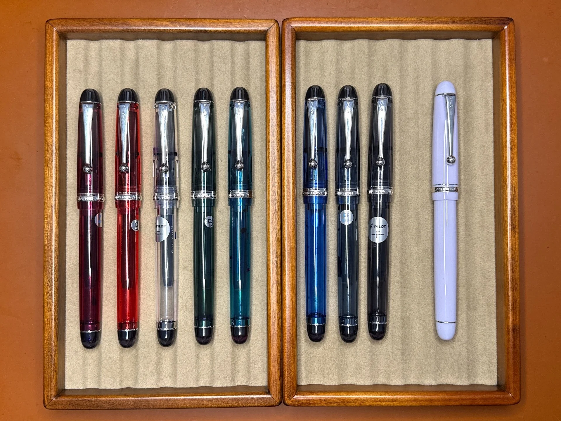
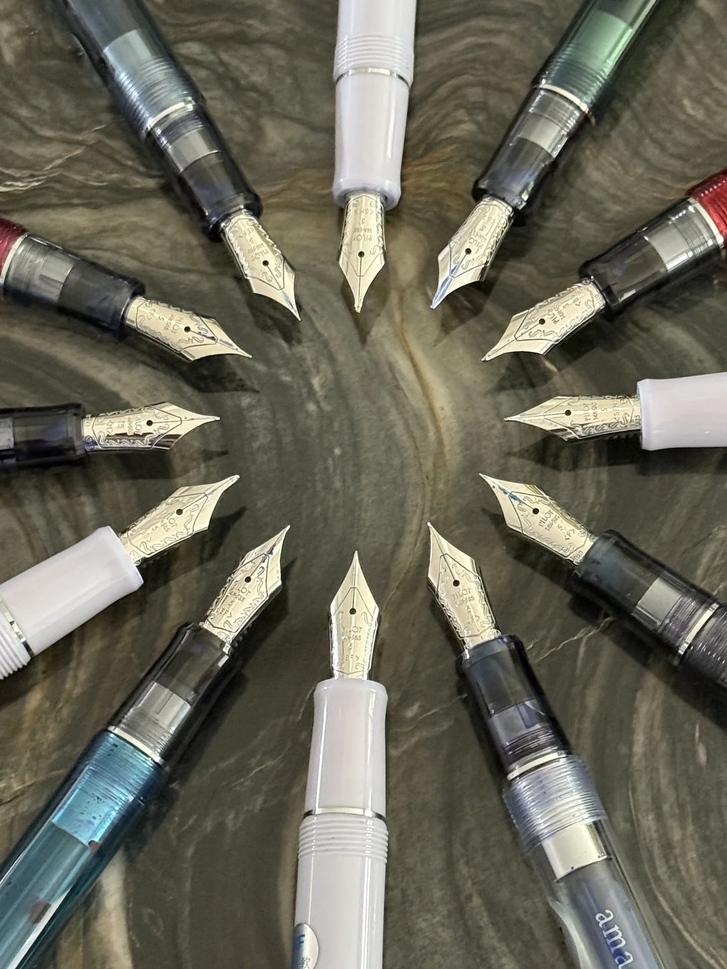
All of the currently available Custom 74 colors and nib options are represented here. Left to right: Merlot, Grenadine, Clear, Forest Green, Teal, Blue, Blue Stone, Smoke, and the US exclusive Lavender Fog.
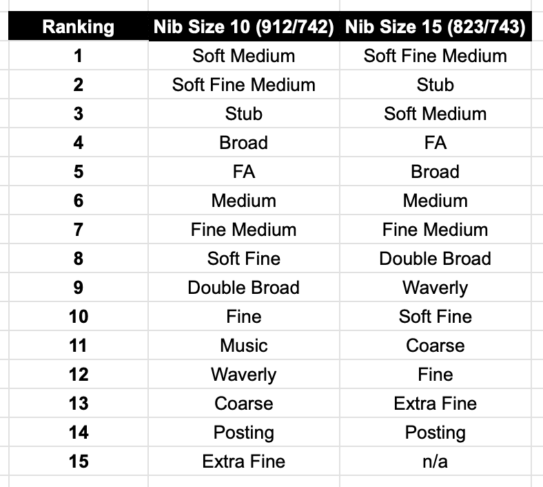
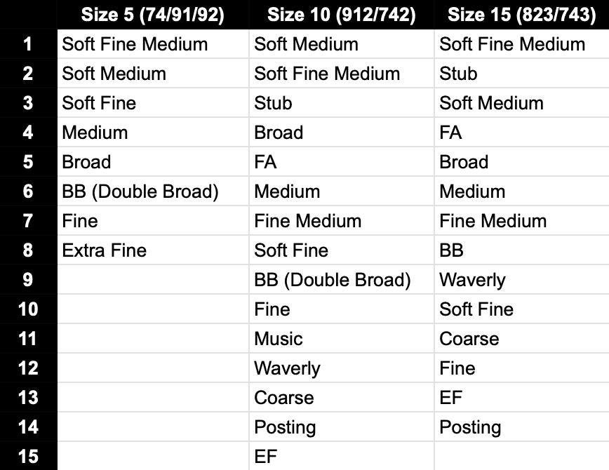
Jaclynn was kind enough to include all of the colors as well as the various nib sizes. Unlike the 912/742 and 743/823, which have 14-16 nib options (the Signature nib isn’t available on the 743), the Custom 74 has 8 nib options, which makes it a little easier for me to pick my favorites. The Soft Fine, Soft Fine Medium, Soft Medium, and Double Broad (BB) are currently only available in the Lavender Fog colorway in the Custom 74 line, so keep that in mind when making your wishlist.
I have several pens with size 5 nibs, but I don’t have them all (nor do I need to) so I wanted to see if my favorites from the 743 and 912 nib rankings would translate to the 74 nibs. I didn’t re-read my past ranking articles, so I wouldn’t be too biased. I do happen to have a 74 M, 912 SFM, 823 FM, and 743 SM in my currently inked rotation so those nibs are top of mind. I am using a similar “methodology” as the past two rankings, which were based off of the one the Bossman did in his Custom Heritage 912 writeup.
A few things to keep in mind:
- I am right-handed but have a “stupid steep” writing angle - 75 degrees isn’t uncommon for me, while most people have a 45-50 degree angle.
- I tend to write primarily in cursive, and occasionally in print (but not like the Bossman’s block print), typewriter font and calligraphy-esque styles like Copperplate and Italic. My go-to nib size from any maker/country/region is Medium. I also prefer broader nibs as well as stubs/italics. I rarely reach for Extra Fine, especially since I own very few of them.
- Pilot asked that I dip these pens instead of inking them up, which I don’t think is the best way to test the flow in the nibs, but it’s enough for short writing samples. I dipped, then dragged the tip across the ink vial so there wouldn’t be blobs of ink on the page.
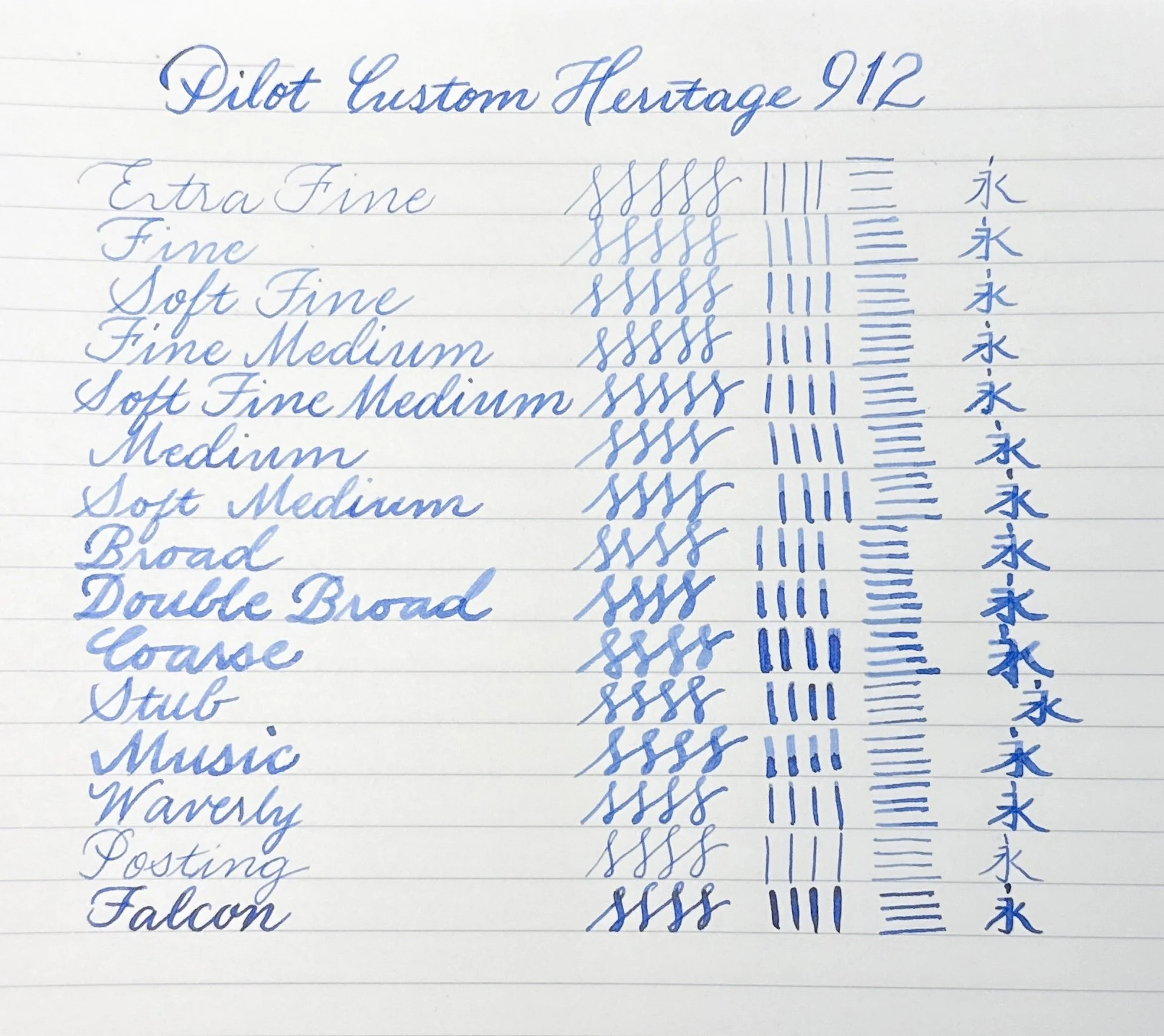
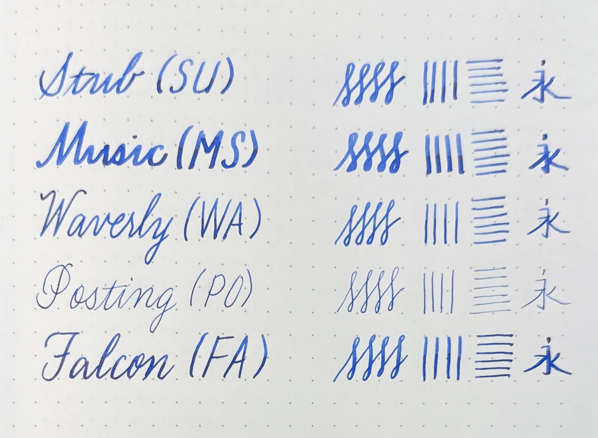
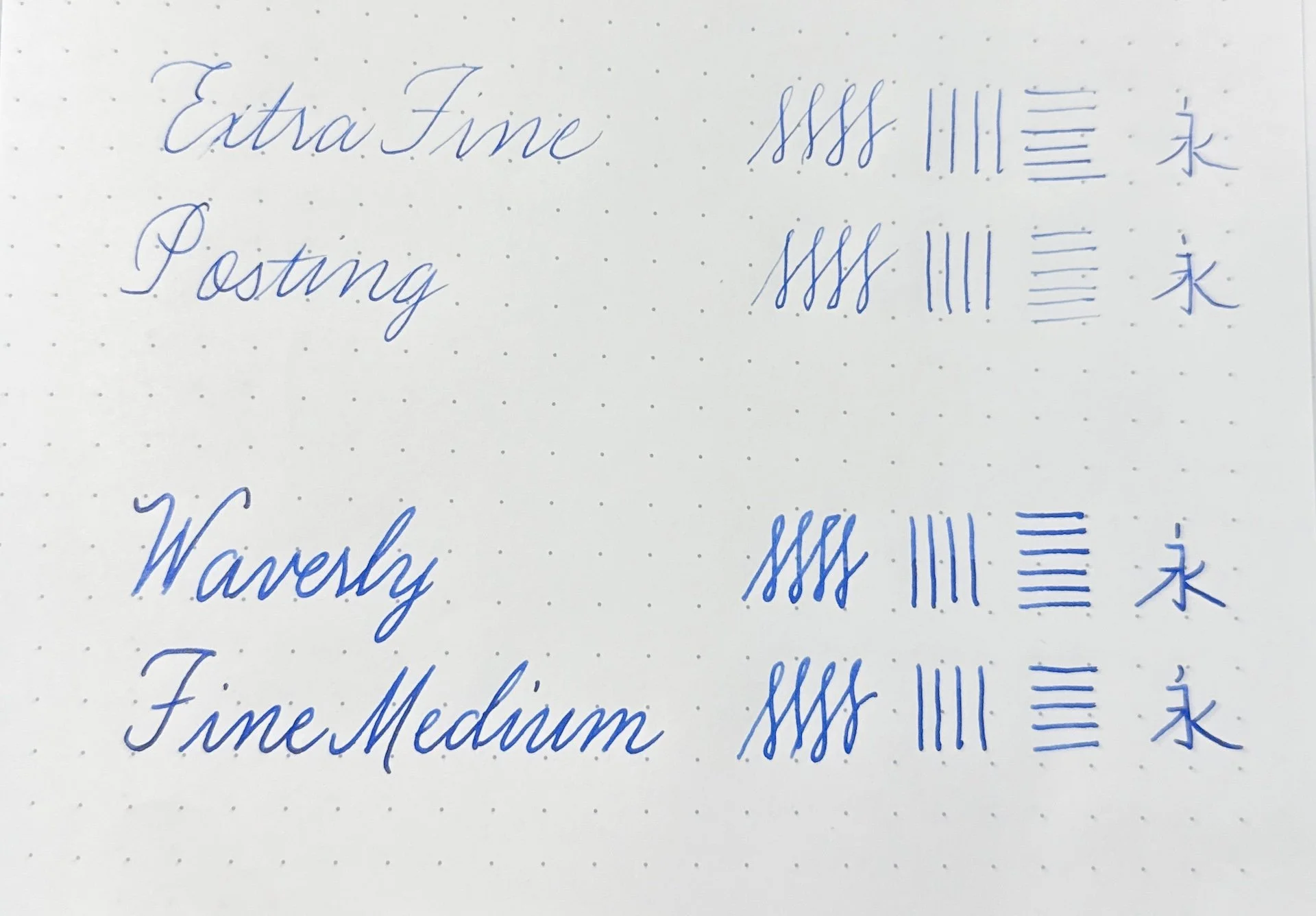
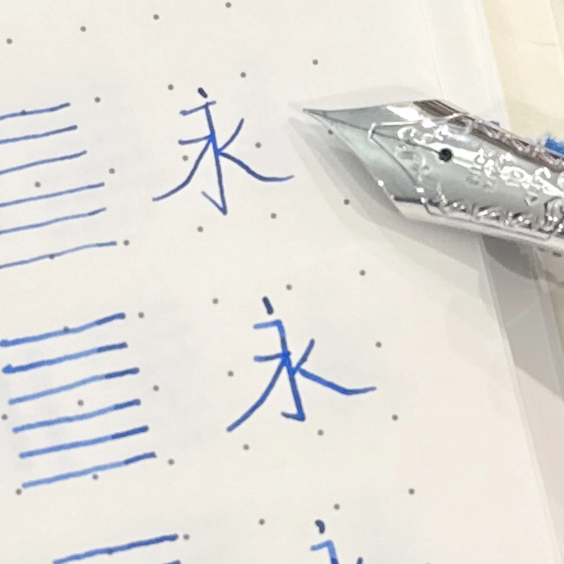
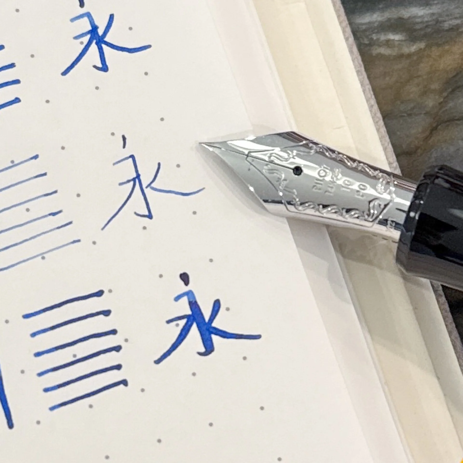
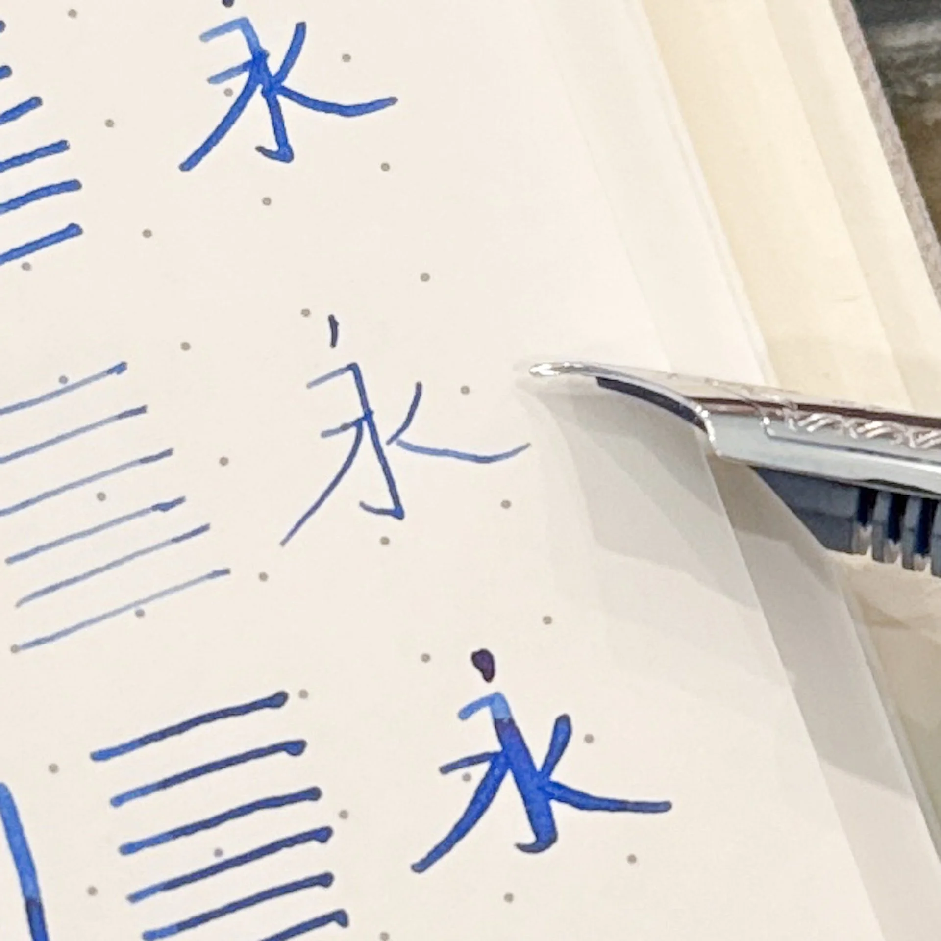
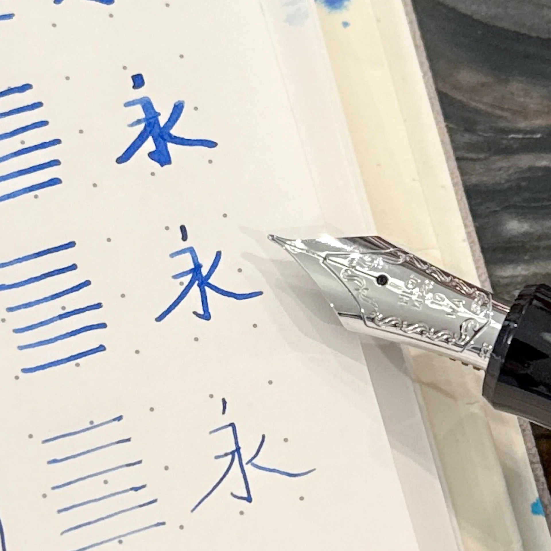
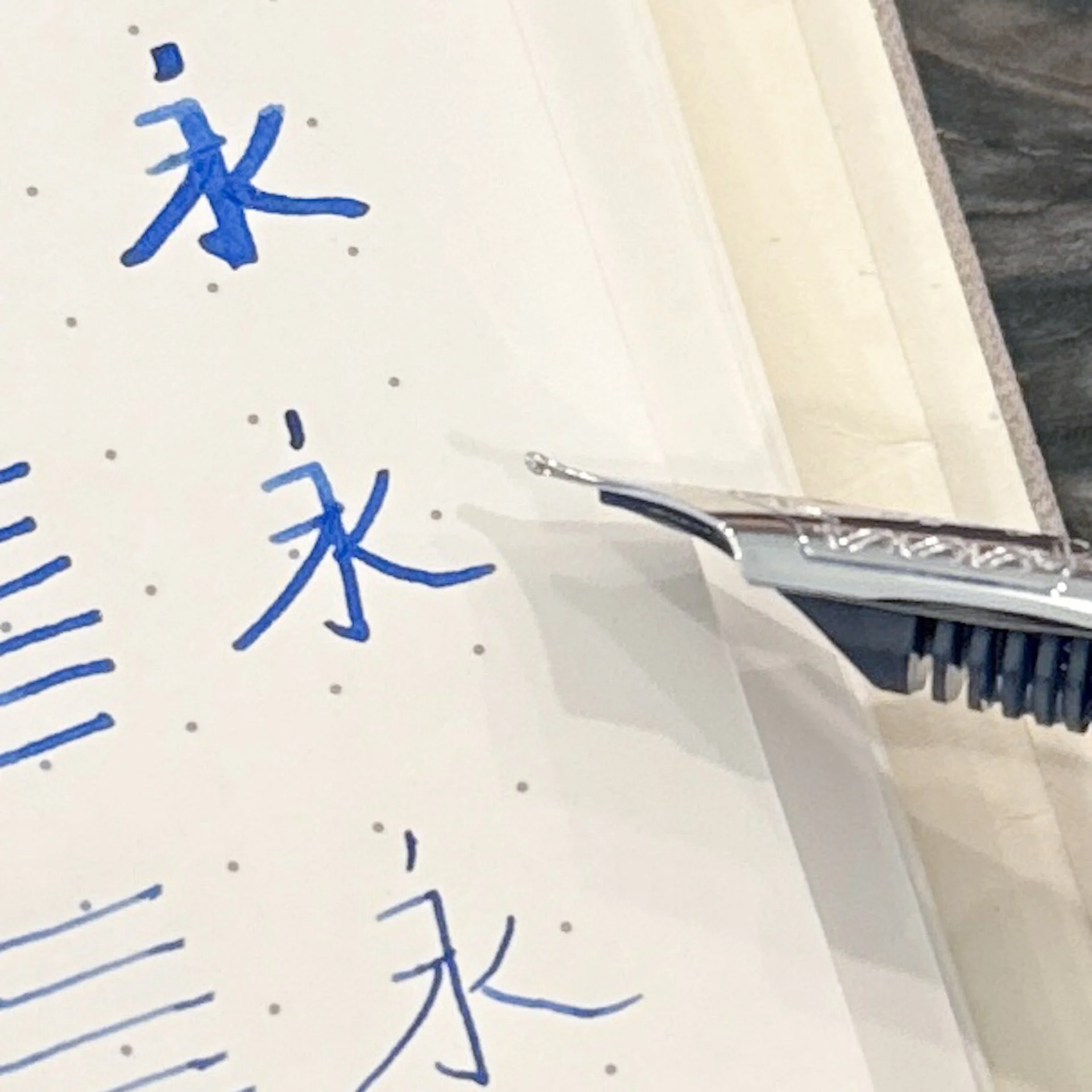
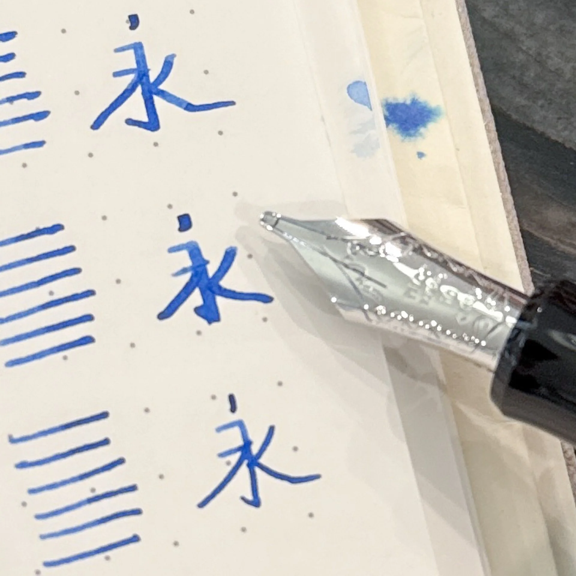
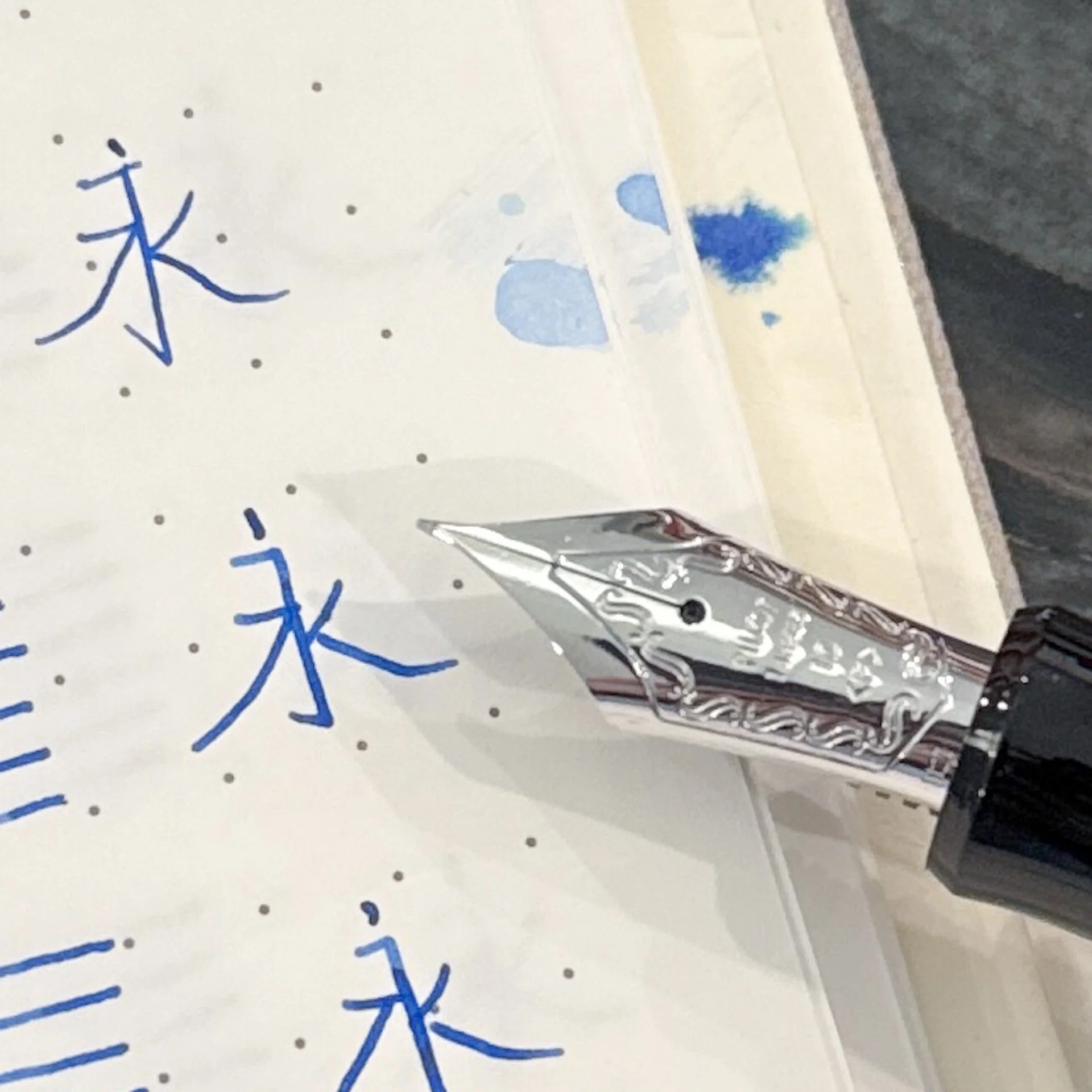
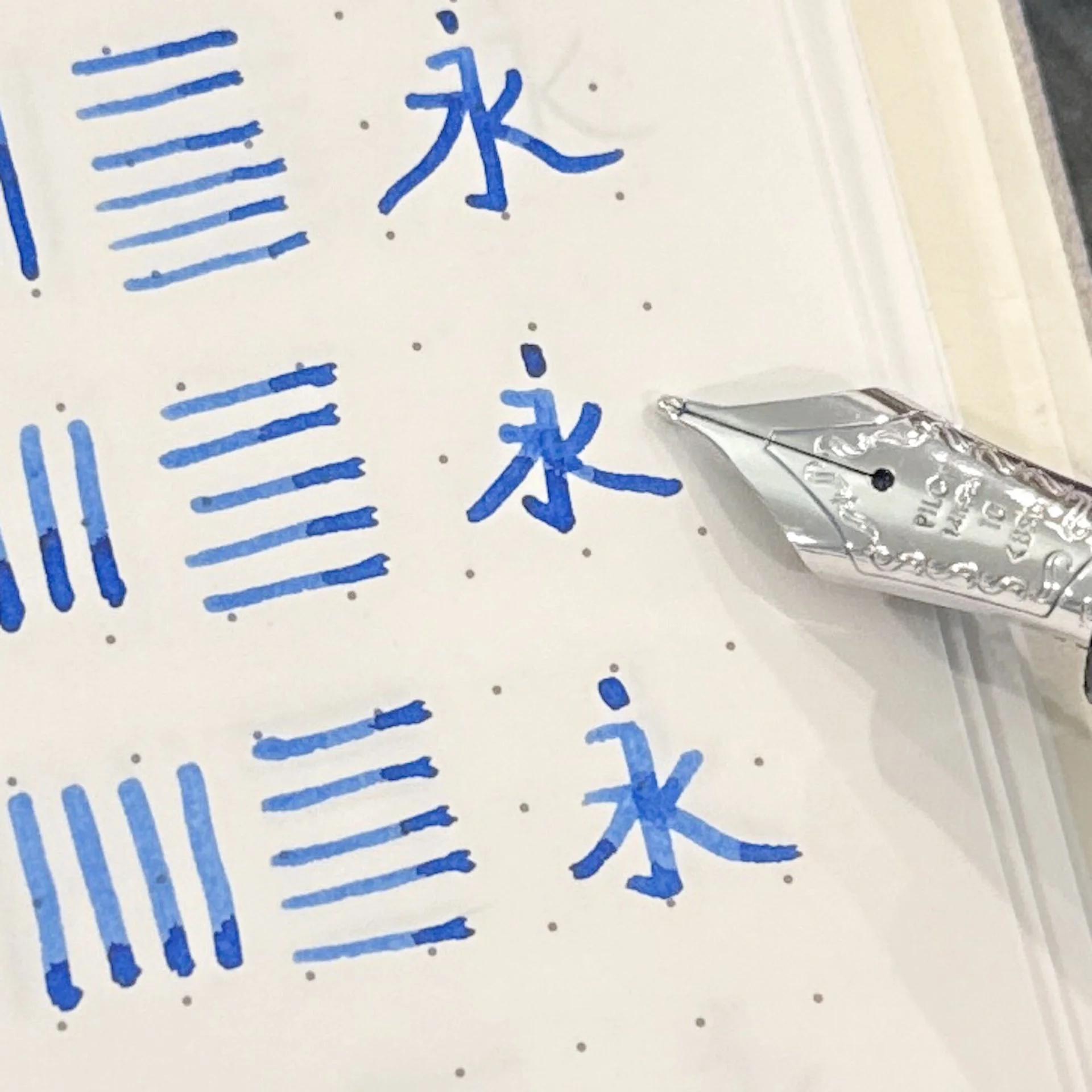
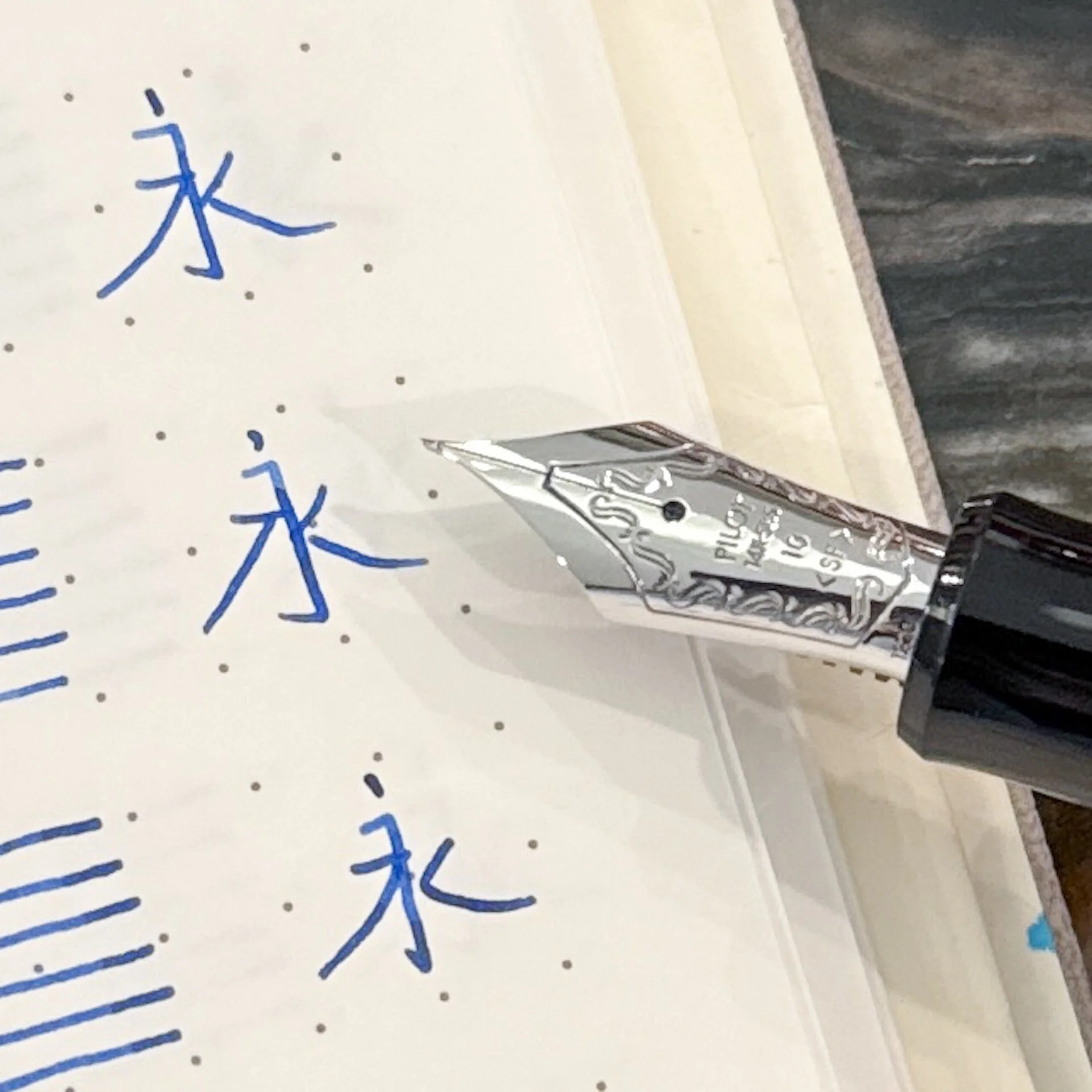
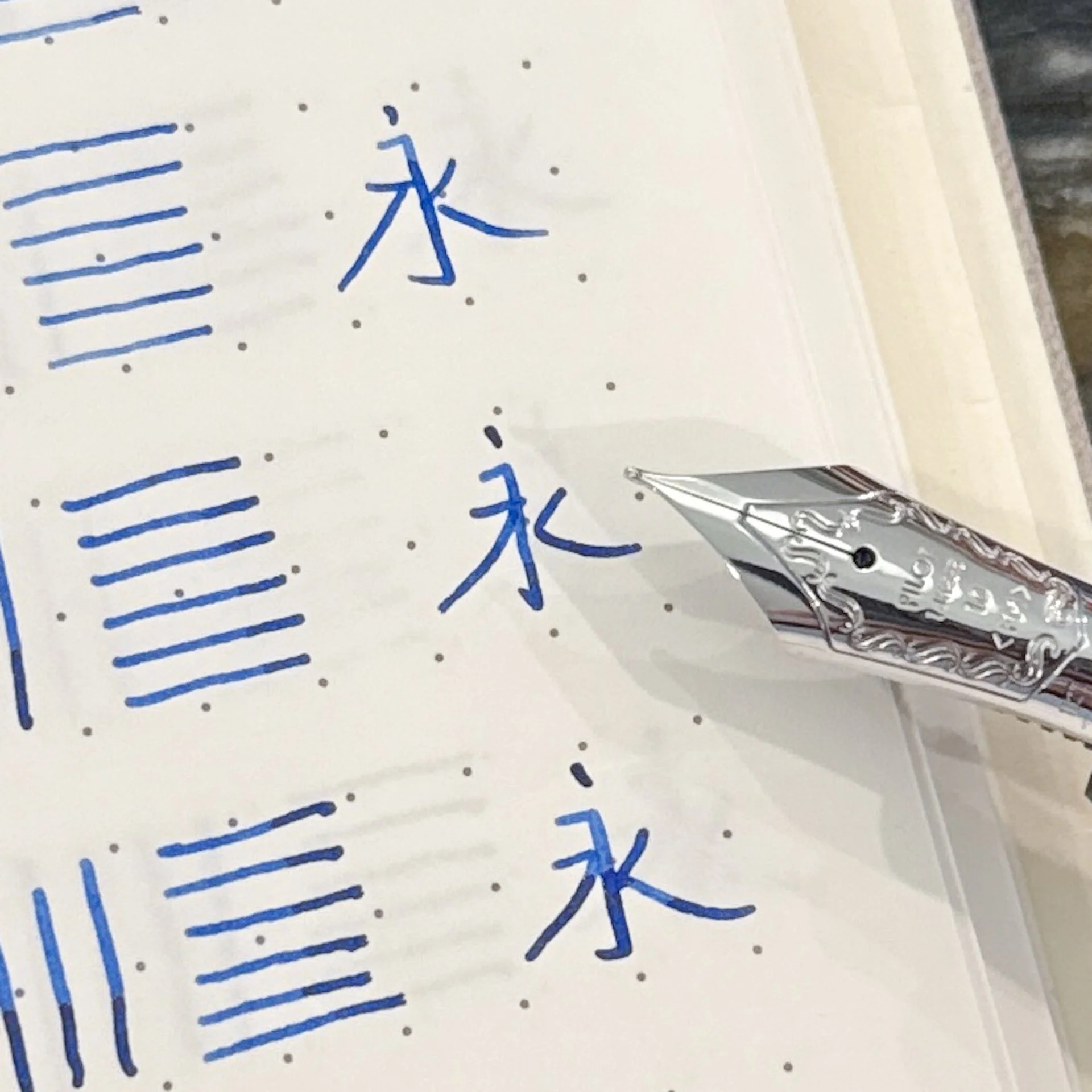
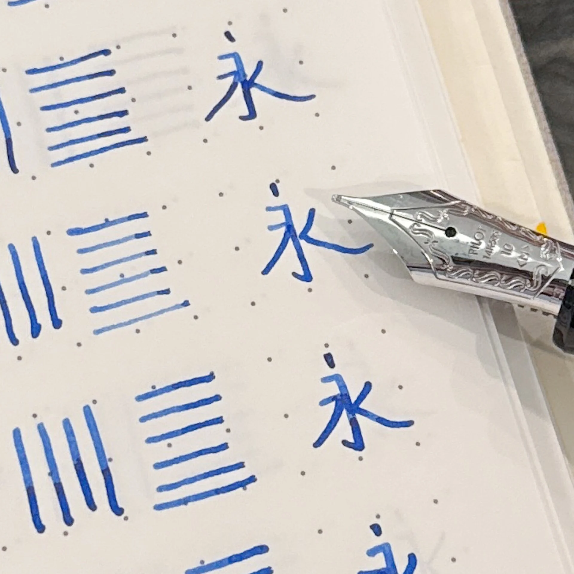
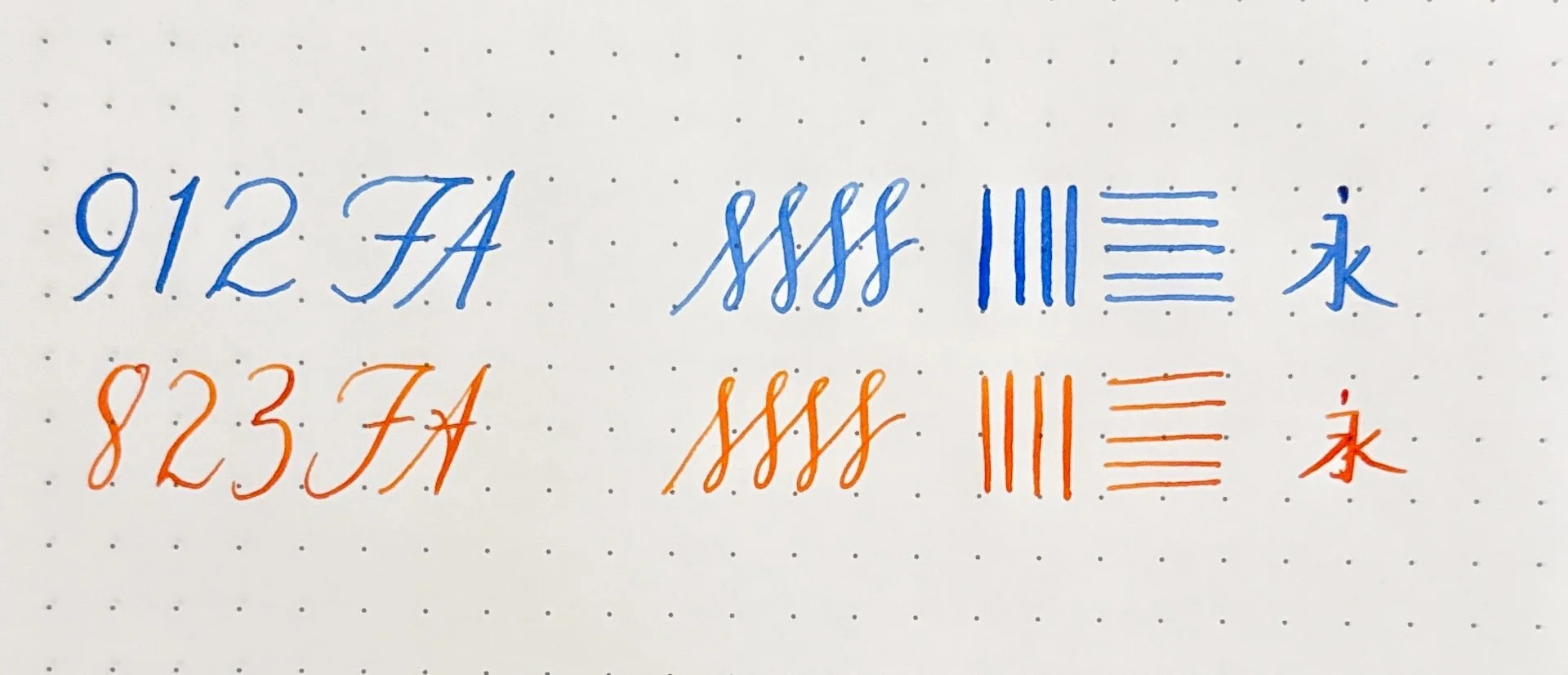
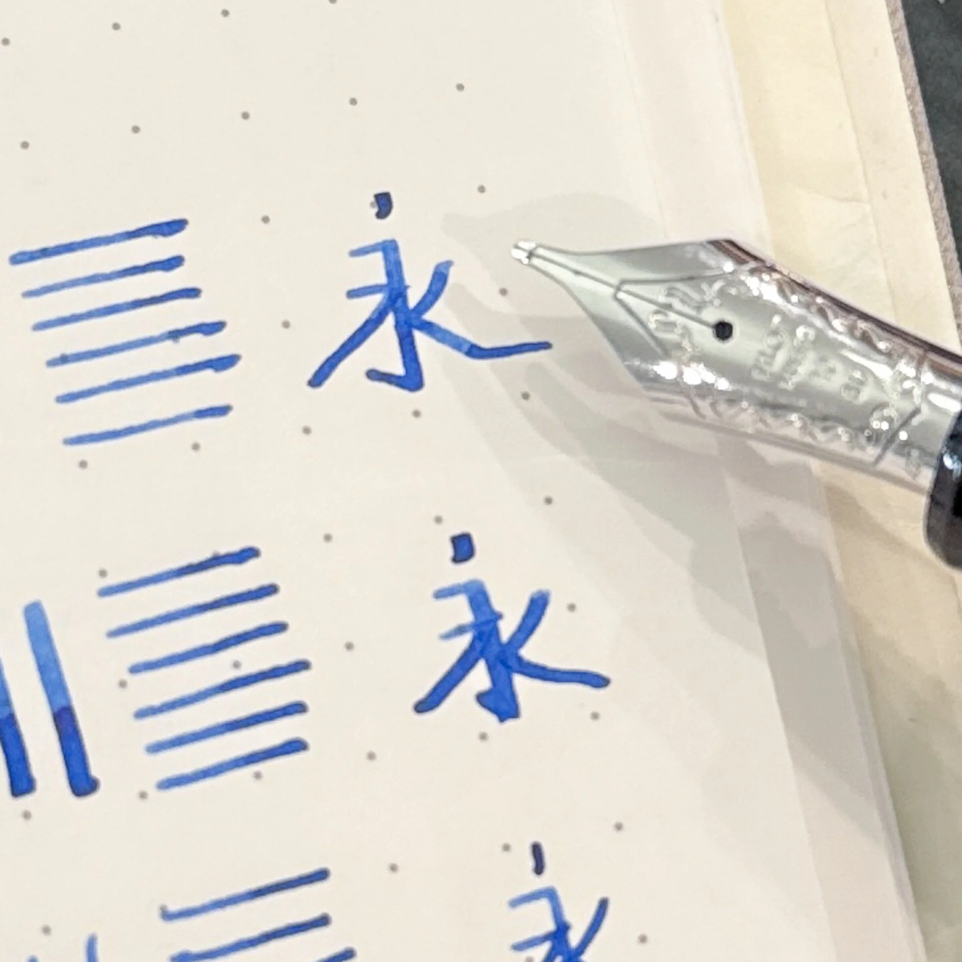
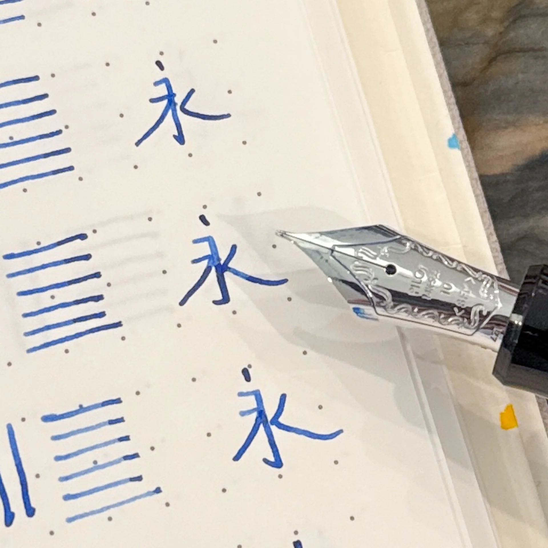
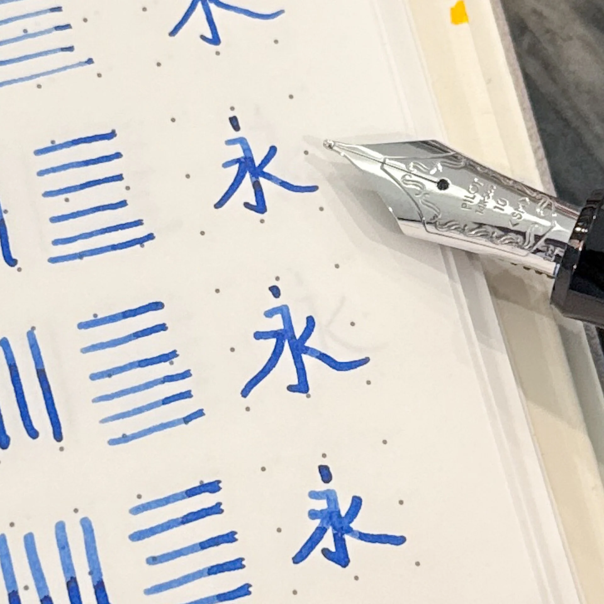
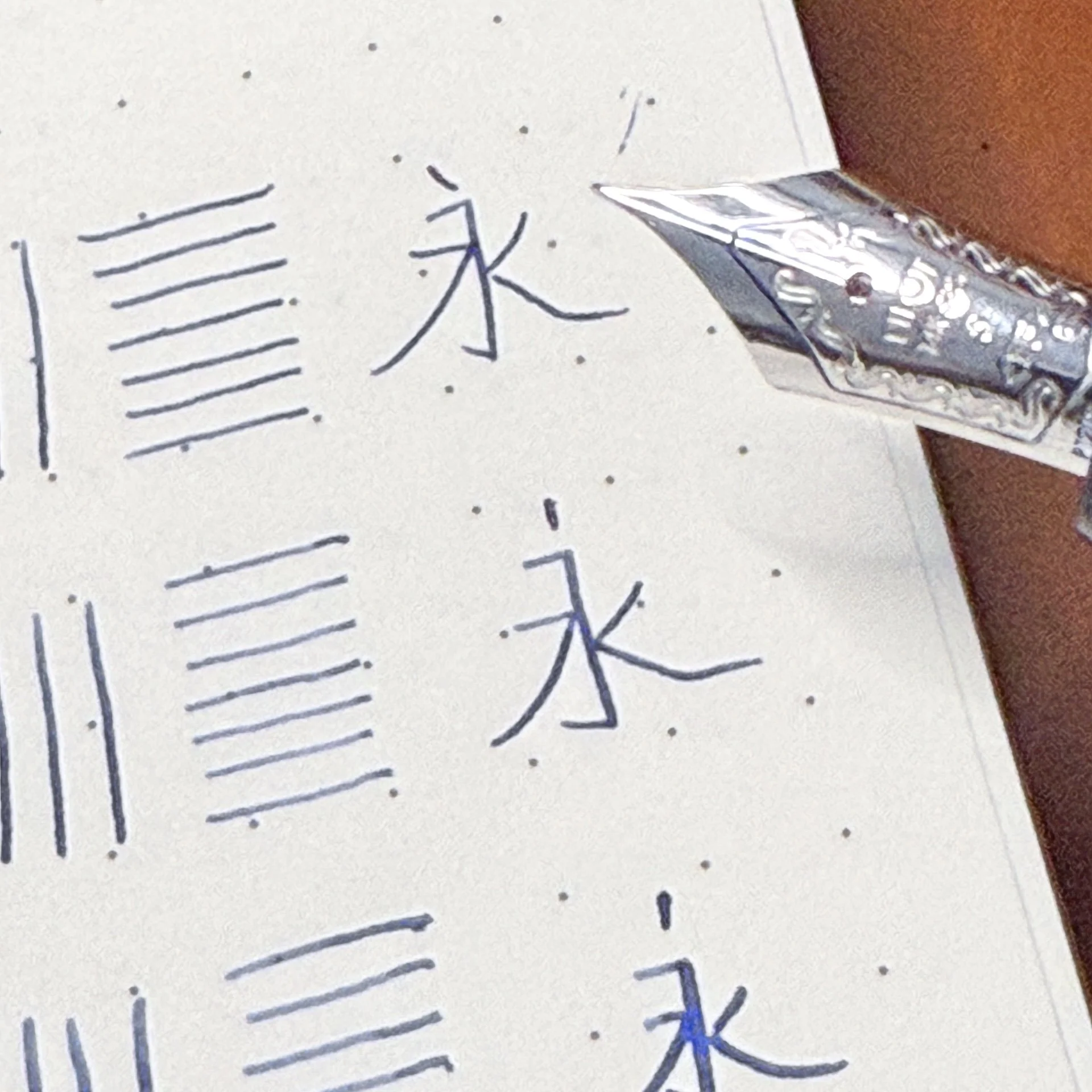
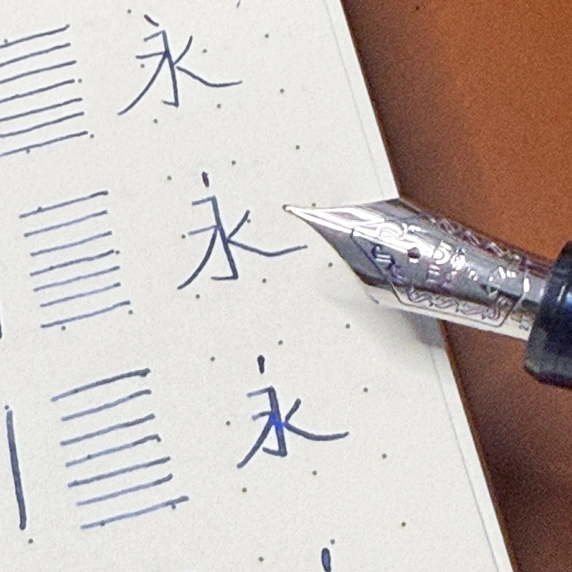
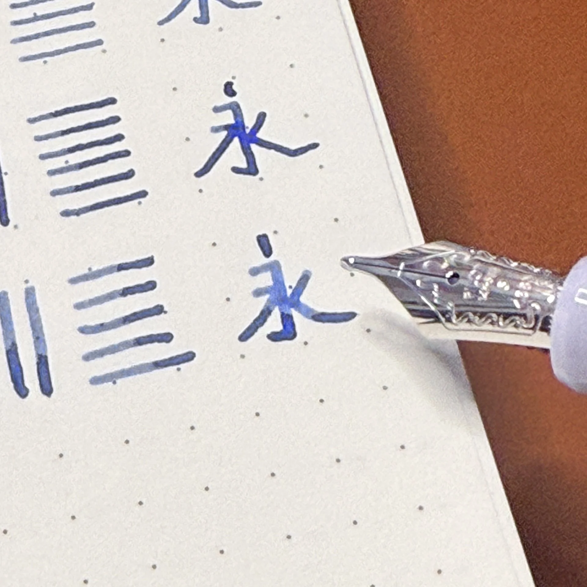
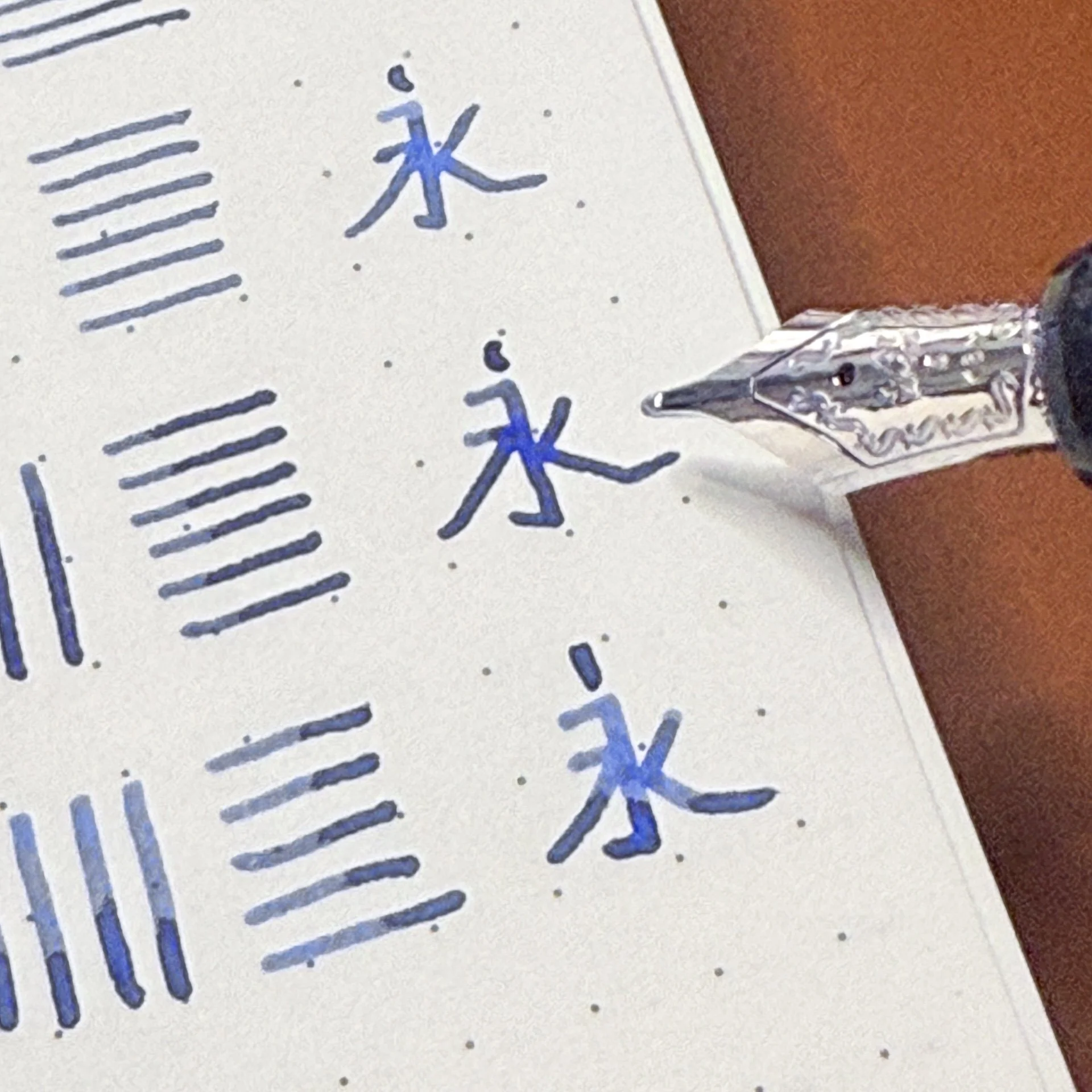
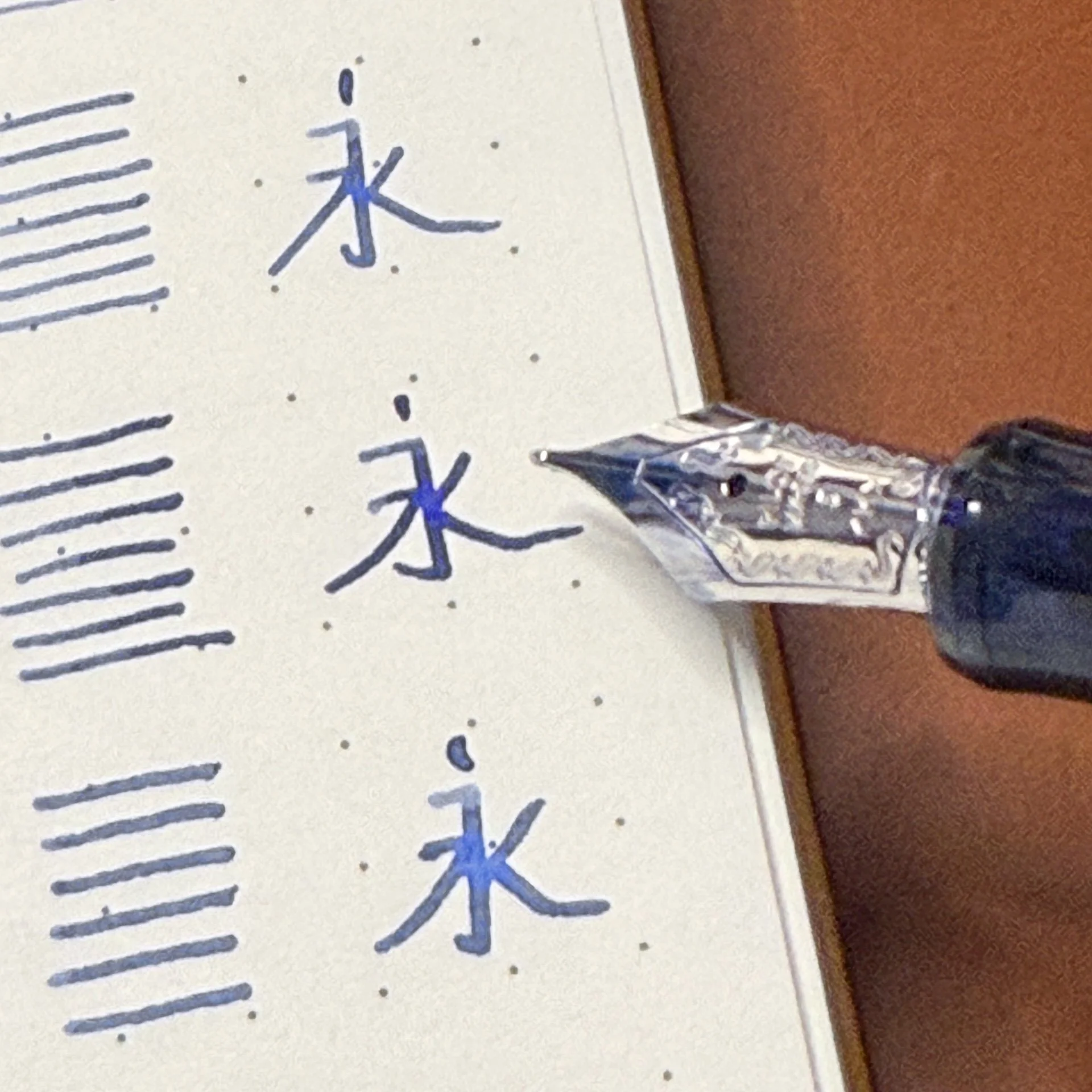
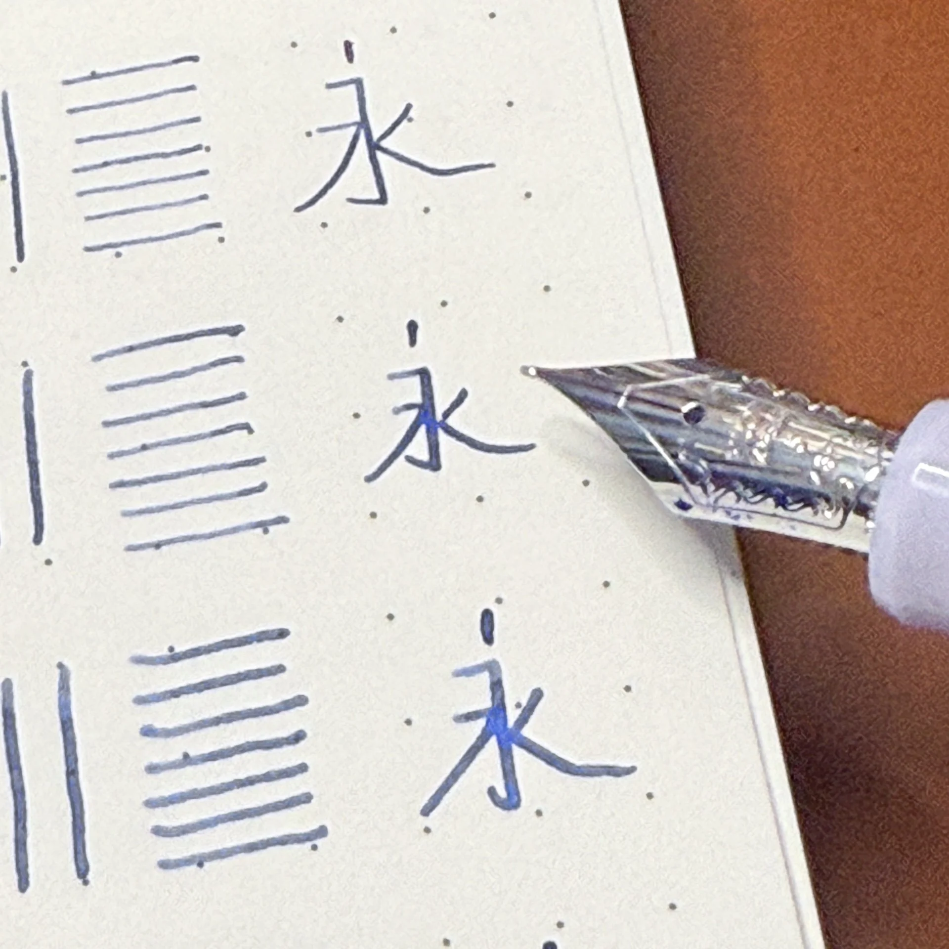
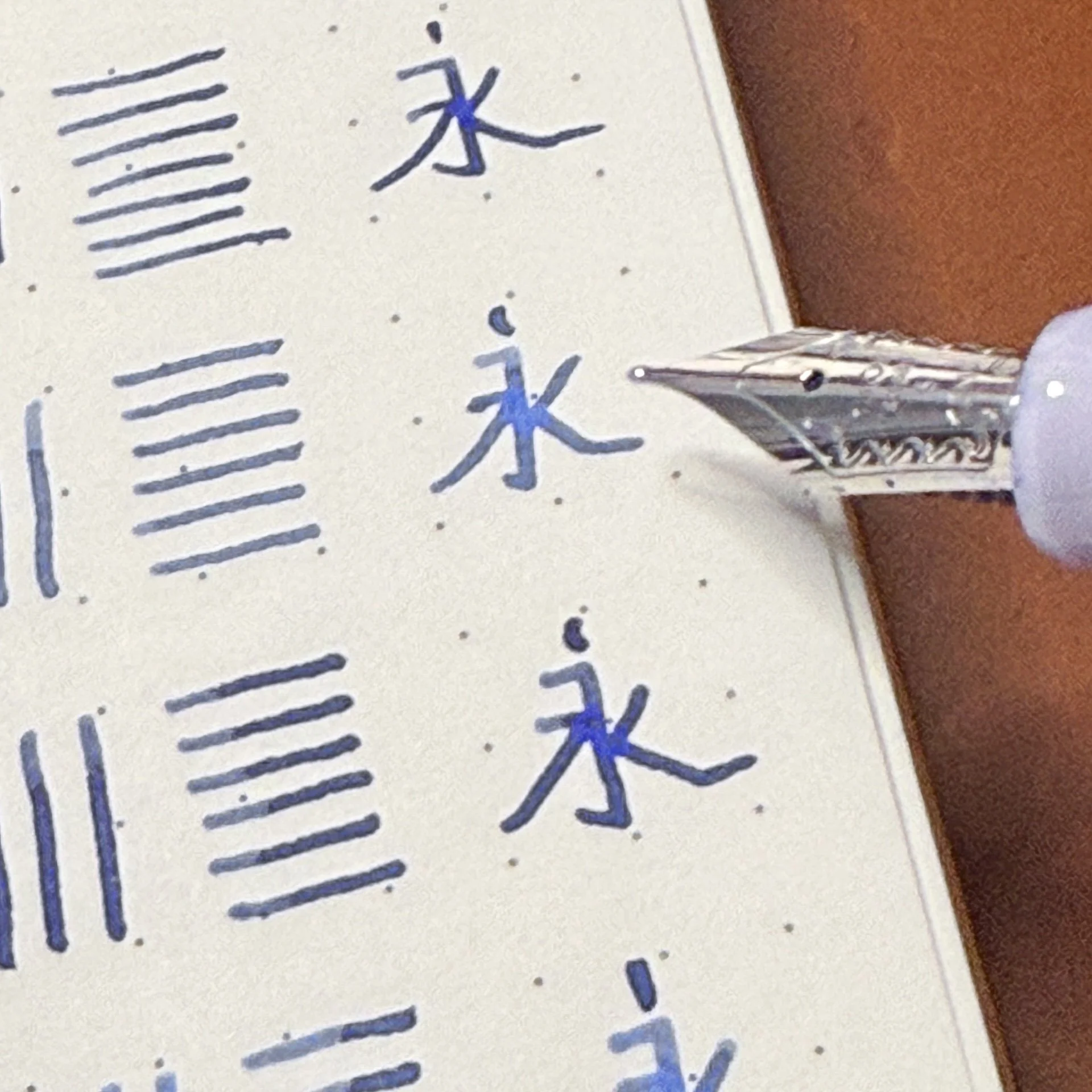
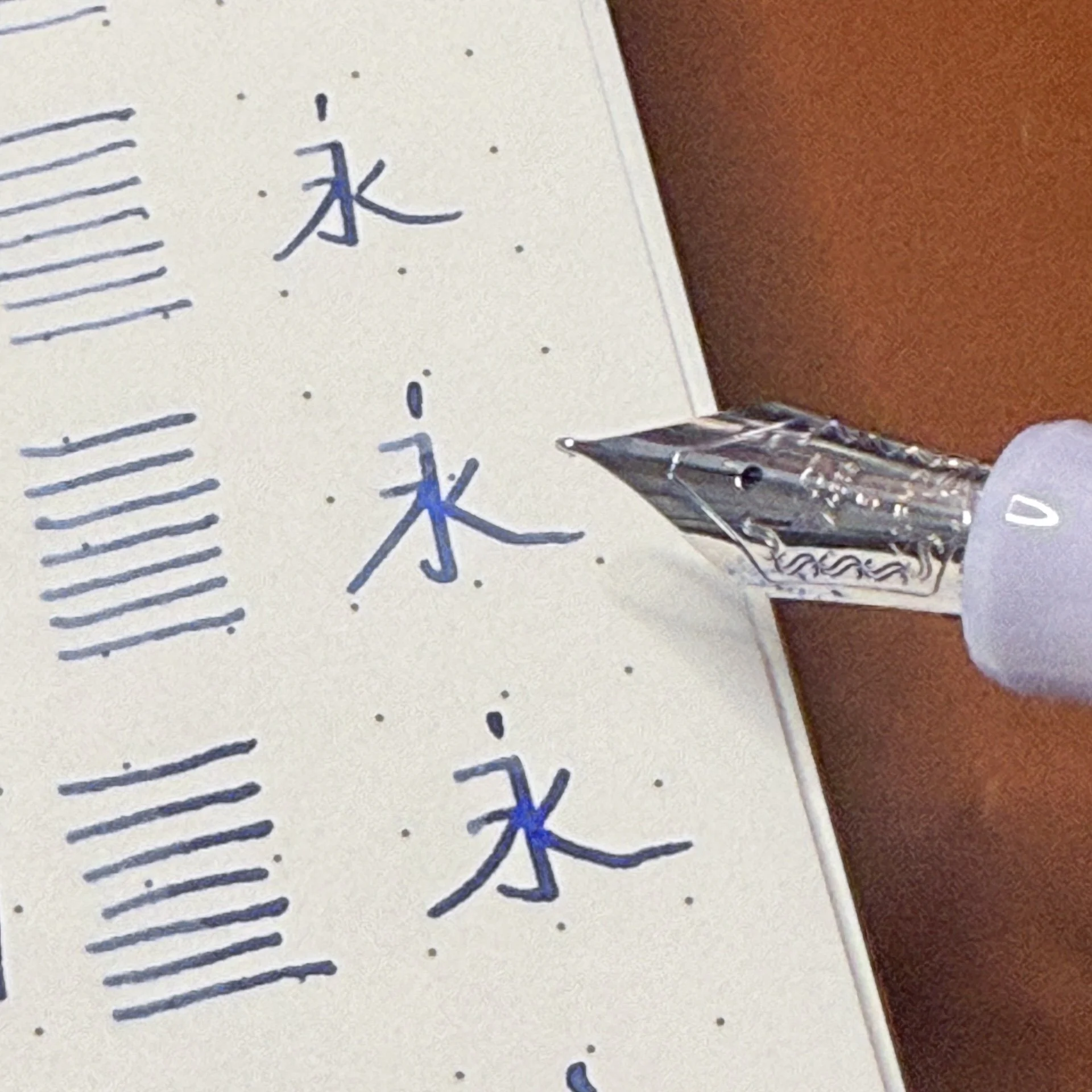
- The writing sample with all the nibs was done in an Odyssey A5 Notebook with 68 gsm Tomoe River paper. I used Iroshizuku Asa-gao ink.
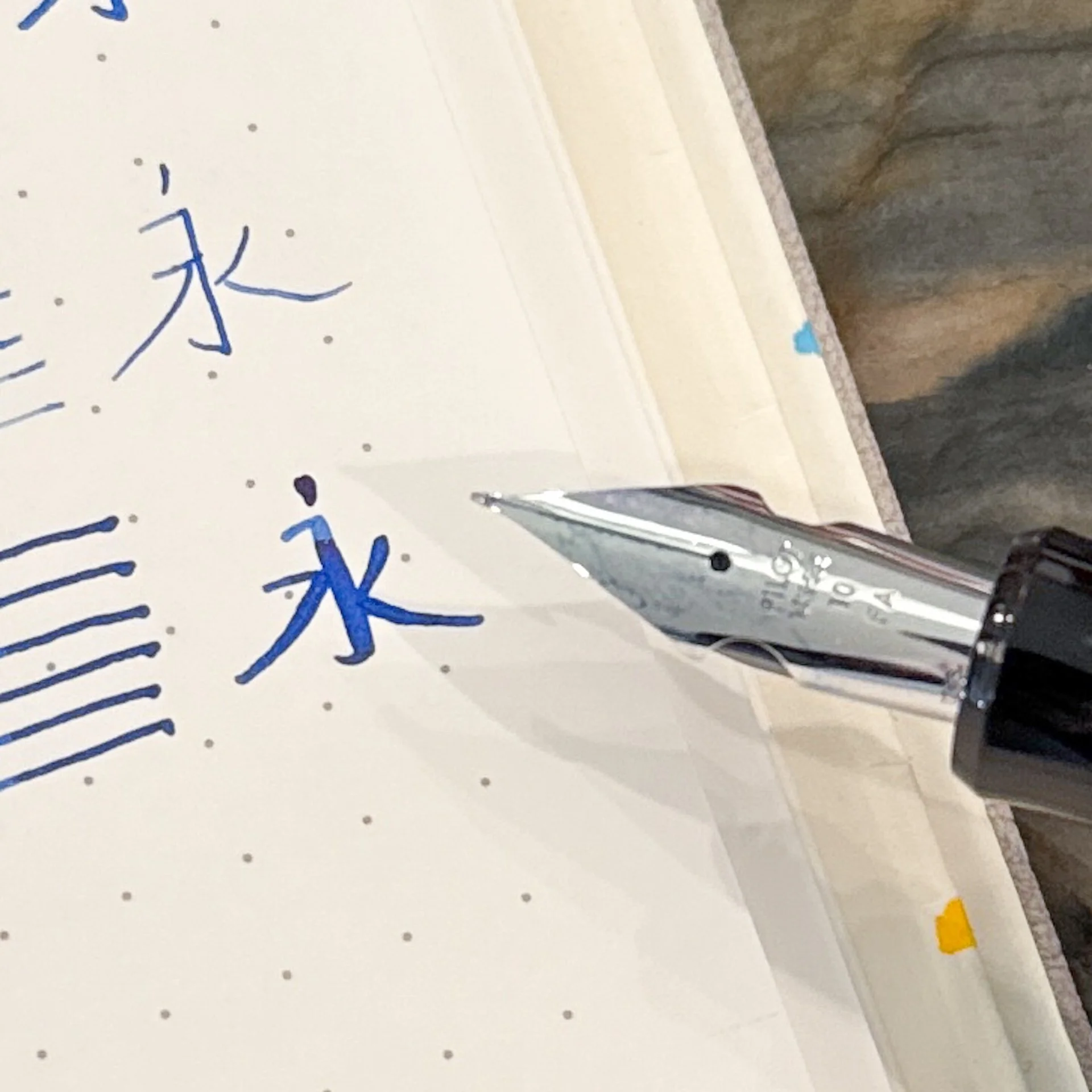
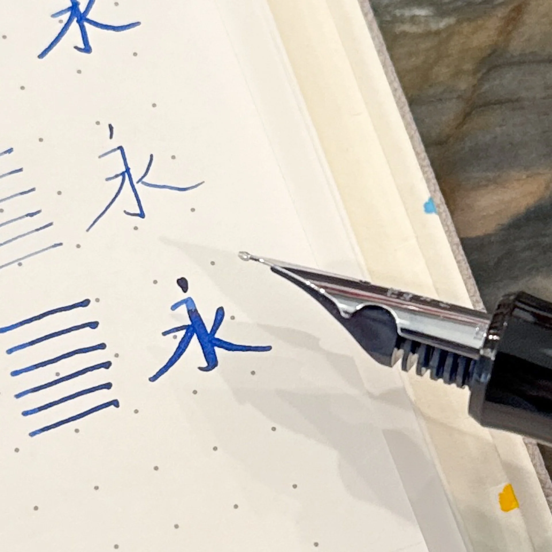
- My Chinese teachers from high school would be shuddering, but hey, it’s accurate, just not beautiful. The character means “always” or “forever”.
- Thank you Pilot USA for sending these 74s so I could do a nib showdown!
- Last but not least, I mostly followed Brad’s formatting but I did not read his ranking (nor mine from the past two rankings) so I wouldn’t be biased.
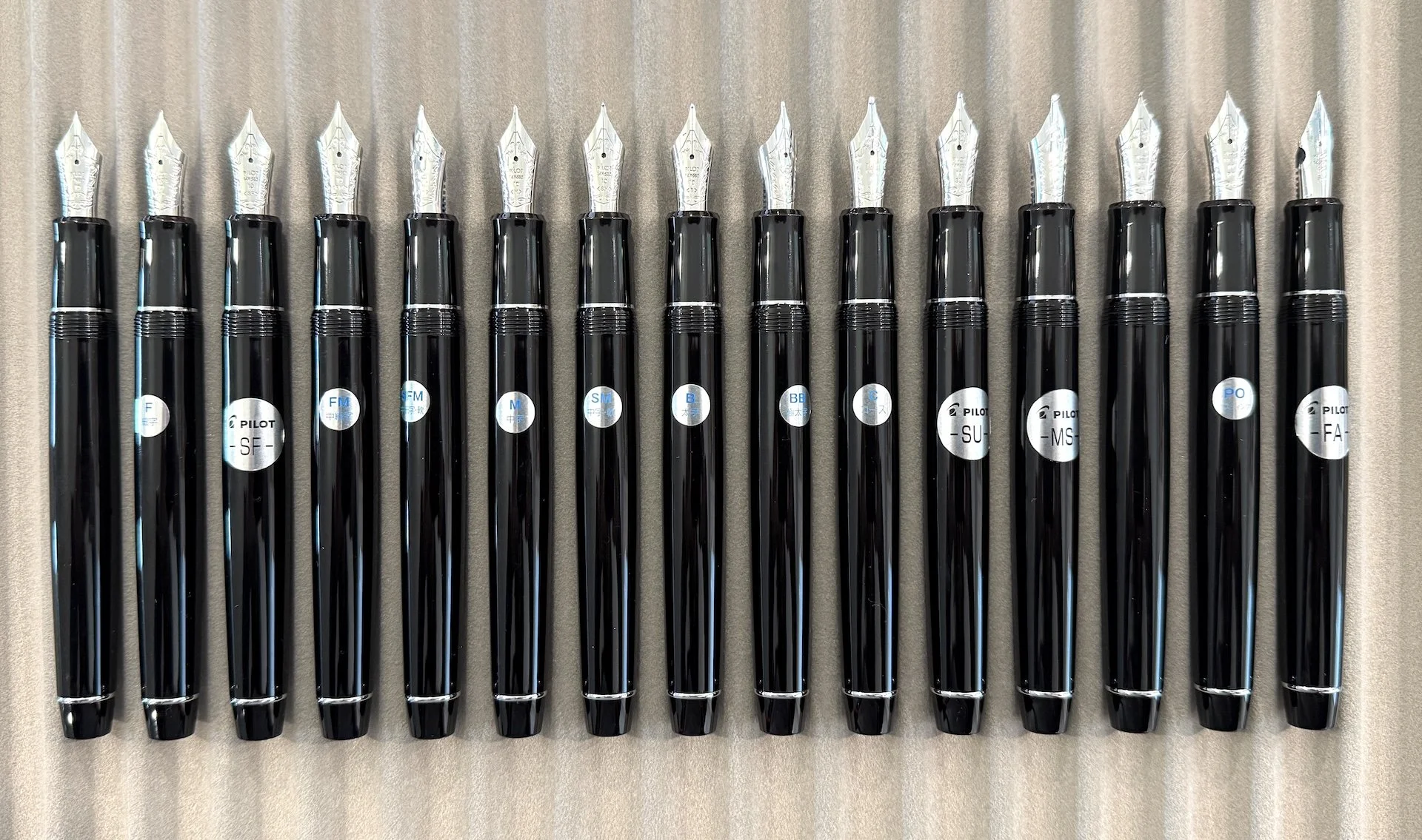
As with the other pens, the biggest difference is the size of the nib (not the tipping, but the actual length and width of the nib and feed). The 743 & 823 are equipped with the size #15 nib, the 912 & 742 takes size #10, and the 74 (and 92 and 91) have size #5 nibs.
Pilot size #3 (Pilot Stargazer/Stella), #5 (74/91/92), #10 (742/912), #15 (743/823).
The pens came to me directly from the Chicago Pen Show, so they were inked up with various Iroshizuku ink cartridges. I decided to use them all for writing samples since it shows that (1) the same nib sizes can vary slightly from pen to pen and (2) inks matter. The darker Iroshizuku Asa-gao can make writing look broader than a lighter/brighter ink like Ama-iro.
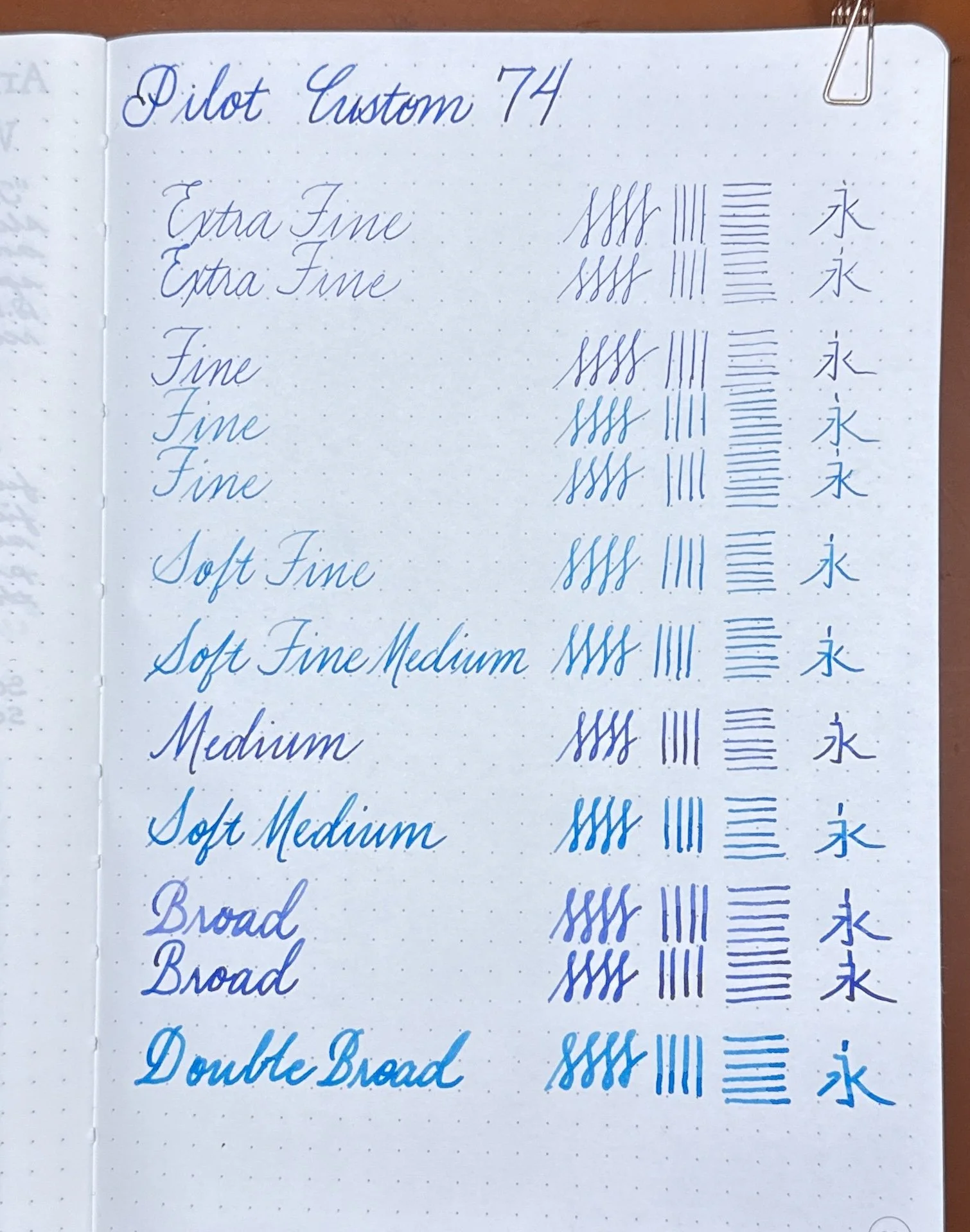
All the pens on Tomoe River 68 gsm.
After writing the above, I cleaned out the non-Asa-gao pens and dipped them with Asa-gao for the remaining writing samples.
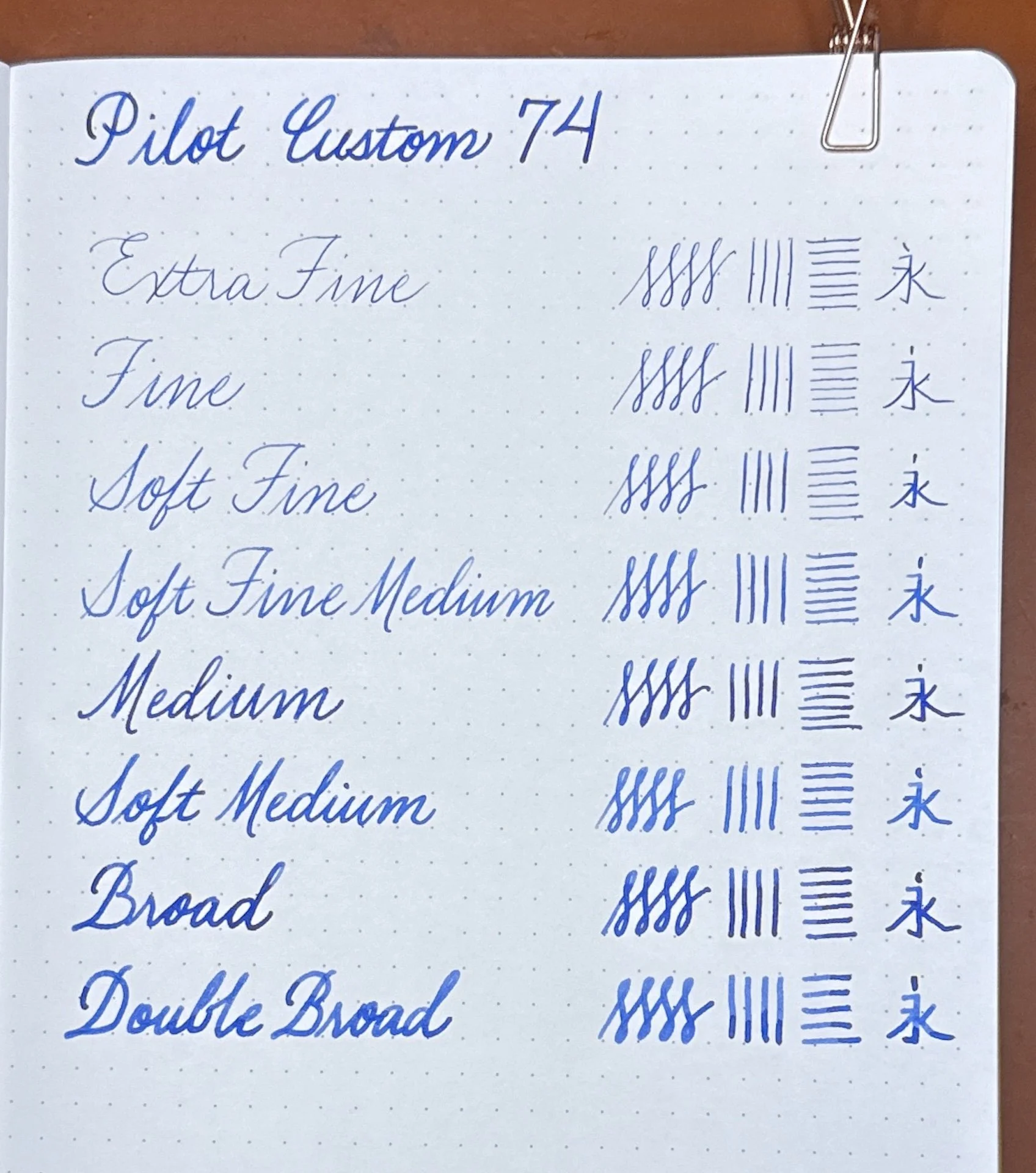
This time, I removed the duplicates and only used Asa-gao so you can better compare the nib sizes.
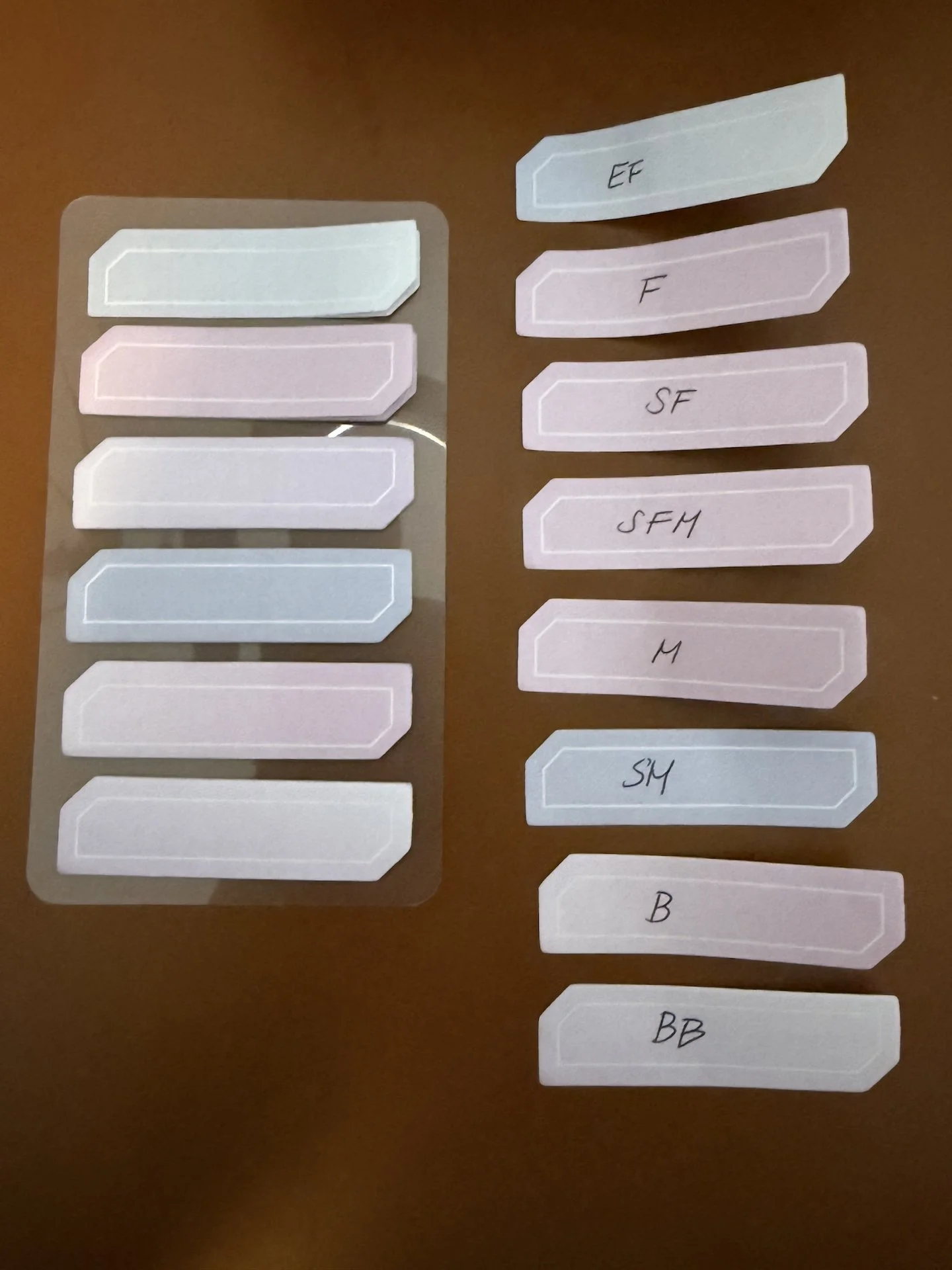
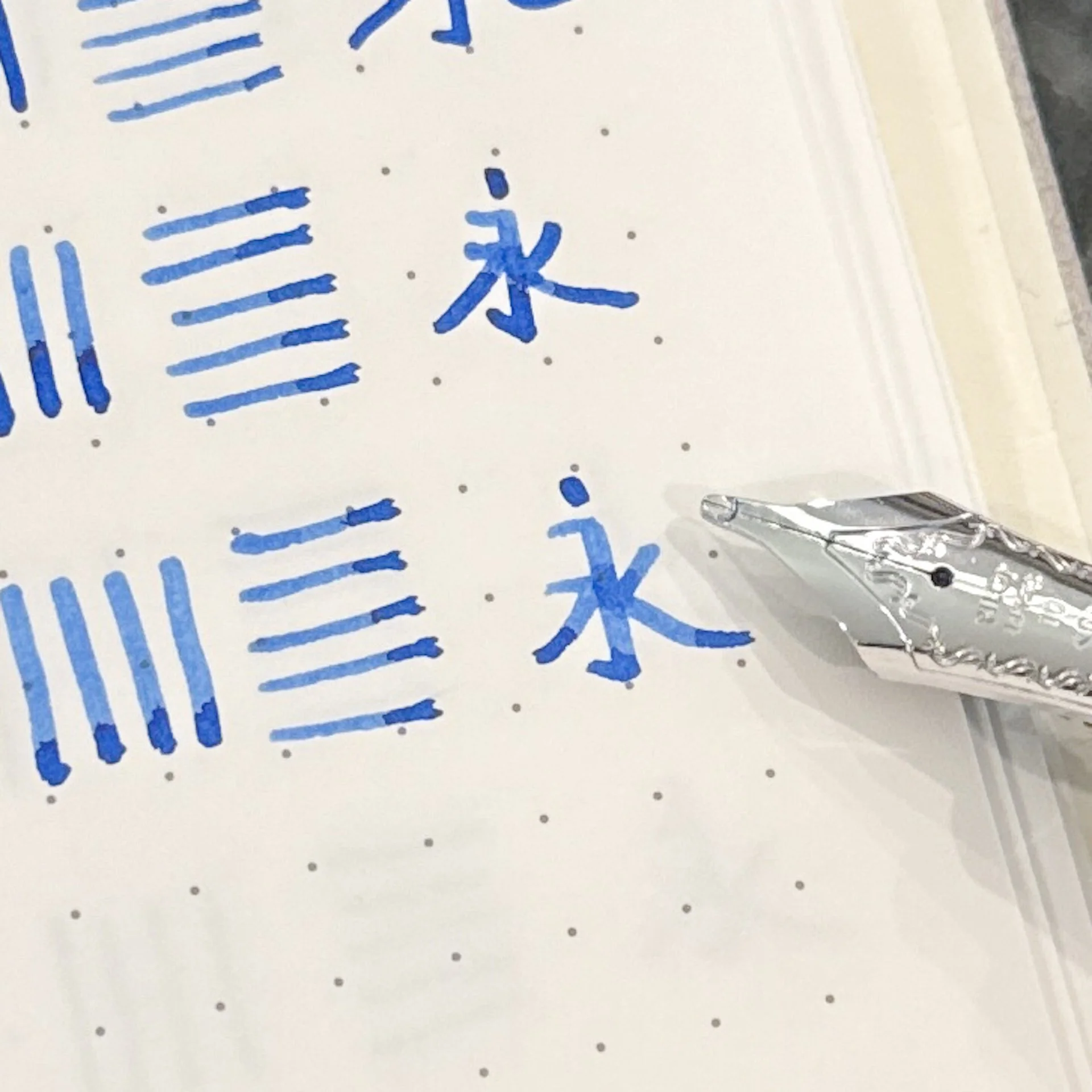
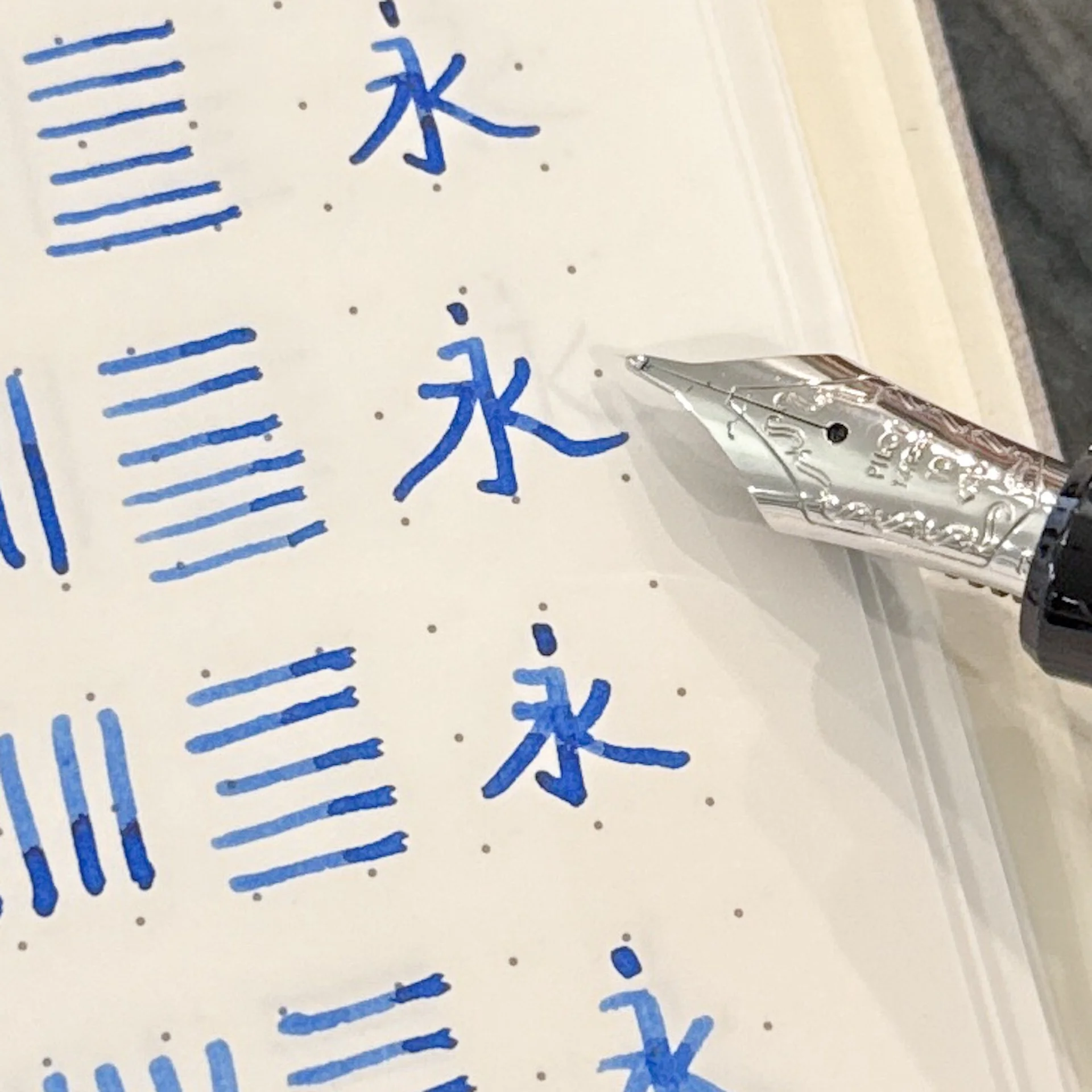
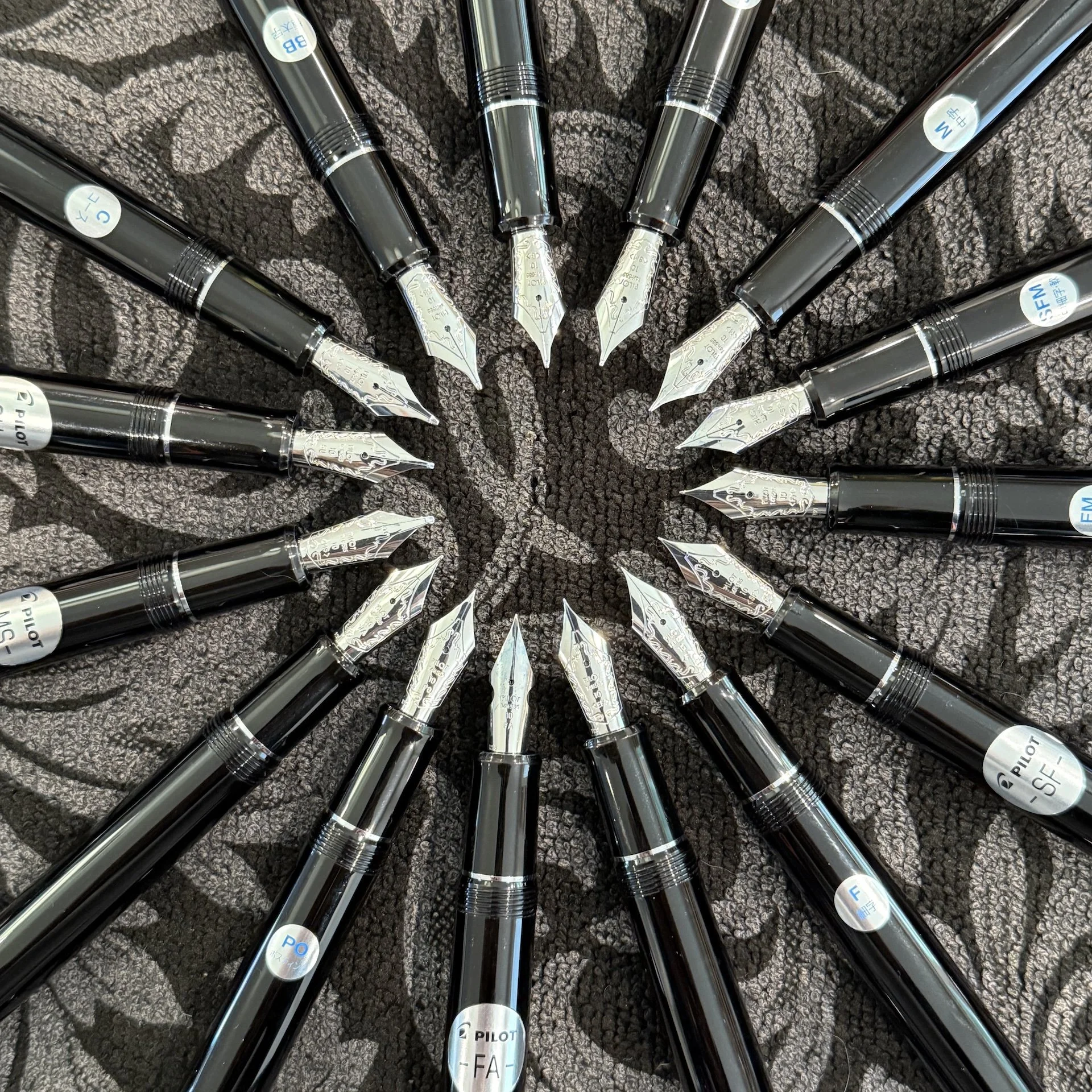
Using some sticky tabs from Daiso, I wrote out the different nib sizes so I could sort them according to my preferences.
8 - Extra Fine
Is anyone surprised by this? This should come as no surprise since I don’t really prefer EF nibs from any brand. But if I had to pick an EF to use, this would definitely be a contender!
7 - Fine
Pilot’s Fine nibs are fine for me. It writes well and I do enjoy it because it’s still a smooth writing experience, BUT I’d rather lay down some more ink, so sorry, Fine, you’re second to last for me.
6 - BB / Double Broad
And on the complete opposite of the spectrum, I picked the Double Broad. I know I said I love laying down more ink but it’s too thick for the size of my everyday writing. The letters look more bunched up than I’d like and this is already writing larger than I normally do. That said, if I wanted to get a nib ground to something like an Architect or Naginata Togi/Kodachi, this would be a great starting point. As with other BB’s in the Pilot lineup, this one is just not practical for me, but I still ranked it higher because I could get a fun grind for it. BUT, if I couldn’t get it ground, I’d probably pick the Fine over the BB.
I like big nibs and I cannot lie, but this might be too big. 🙂
5 - Broad
Ok, this one was a tough choice. Like the BB, I wouldn’t normally pick this one for an everyday writer but I would love to get an Architect if I had a B nib. I am shocked that I still don’t have any Broad nibs in either the 10 or 15 size, though I do have it in a VP nib and I love it. This would be a great ink layer-downer nib without having an overly broad line and as such would be a great addition.
Maybe I don’t like big nibs and I cannot lie? I do like the Broad, it’s still a touch too broad for me.

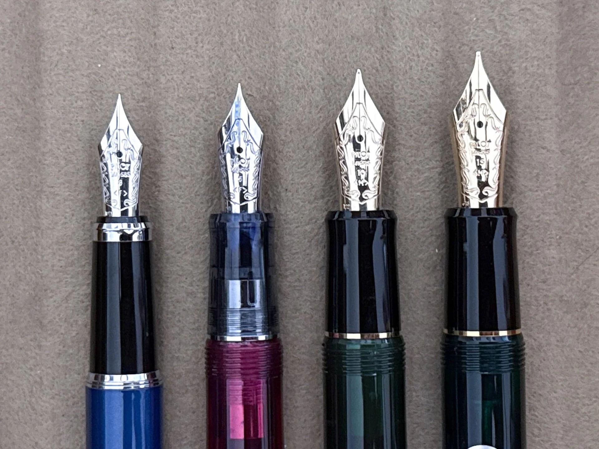
Look at the tipping on the Broad (top) vs the Double Broad (BB) on the bottom. Lots of potential for a nib grind!
Now it really gets tough - now we’re at the top half of the list…
4 - Medium
Once again, Medium, my go-to nib size barely made the top half of this list! It is such a nice and smooth writer that it’s one of my favorites, but I have enough Mediums so it barely made the top half of this list.
Medium, I still love you, you’re still a fave, but I’d rather get one of the top 3 because I already have lots of M nibs in your size!
3 - Soft Fine
My steep angle makes it a little difficult to really appreciate the slight bounce from the softer nib, which also gives it a slightly wider line and a touch of line variation (no way is this a flex nib). The ever-so-slight increase in line width is what made it top 3 instead of near 7th place. It’s also a nib I don’t have (I’m sensing a theme here).
Soft Fine, you’re finally number nine! (it was #10 last year)
2 - Soft Medium
Believe it or not, Soft Medium and Medium could’ve easily swapped places. I think the reason it’s 2nd for me is because I don’t have this nib in this size and I kinda want to, lol. I love the slight bounce that this gives over the Medium, but it also makes the line a touch wider too.
1 - Soft Fine Medium
I ranked the Size 15 SFM as #1, and the Size 10 SFM as #2, so it’s no surprise that this one would be at or near the top. It combines the perfect FM nib size for me with the soft bounce and slightly wider line width without approaching the Medium’s line.
Soft Fine Medium, atop the leaderboards again!
How did the size 5 nibs do compared to the size 15 nibs?
Ranking:
It’s hard to compare across the other two sizes because there are only 8 nib options versus 14-16 with the others. What still holds true is that I don’t love the Extra Fine or Fine nearly as much as the other nibs. It’s not because they’re bad or write poorly, but because I prefer wider nibs. I think the broader nibs felt too blobby to write with, maybe because it’s coming from a physically smaller nib, so I didn’t like them as much as in the larger sizes. My top 3 nib sizes are only available with the Lavender Fog, which isn’t quite my jam, so I’m hoping I’ll see them in other colorways someday! Fingers crossed!
And there you have it, my ranking of the size 10 nibs from the Pilot Custom 74 line! We already know that the Bossman and I don’t agree on most nibs and that’s ok (though why he loves EFs is beyond me, lol)! The beauty of this rabbit hole is that we all like different things and there’s plenty of pens and nibs to enjoy for all of us!
It’s the circle of life, I mean, nibs!
PS: August sees the two of the largest US pen shows (DC and San Francisco), so you should take advantage of the opportunity to try all the nibs for yourself at the Pilot USA tables and let me know which ones are your favorites!
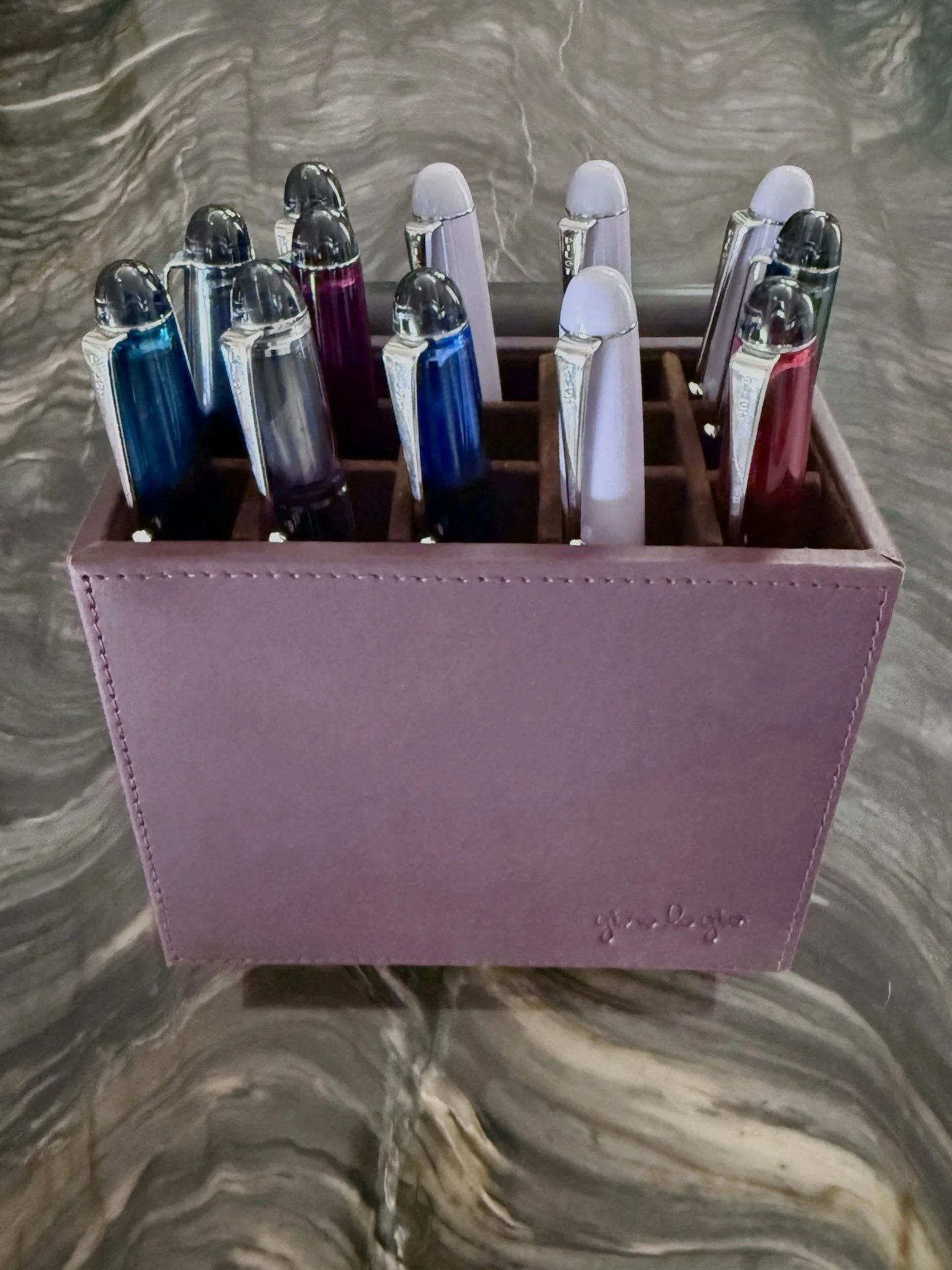
PPS: This is my first time using the Girologio Pen Suite and It was so convenient to keep the pens in order during testing and photography without sliding them in/out of my binder. I plan on using it for multi-pen projects (like Hamilton or currently inked spreads).
Enjoy reading The Pen Addict? Then consider becoming a member to receive additional weekly content, giveaways, and discounts in The Pen Addict shop. Plus, you support me and the site directly, for which I am very grateful.
Membership starts at just $5/month, with a discounted annual option available. To find out more about membership click here and join us!