(This is a guest post by Dwayne Lively, pen addict, knife collector and writer for DwayneLively.com. You can follow him at: @DwayneLively on Twitter and @blatherama on Instagram.)
I don't understand why the Sailor G-Free needs to exist. It seems more like a proof-of-concept than a product people might be clamoring for.
It’s 300 yen (which as of this writing is around US $2.50 or 1.6 Pounds Sterling). This makes it expensive for a ballpoint, even in Japan.
My first impressions of this expensive pen, though, were not particularly good because it’s ugly.
It has a big Sarasa-style clip and a chunky rubber grip that makes it look like a stretched hourglass. The monster clip, unfortunately, serves as the nock release, meaning you can’t just snap it off and go clipless.
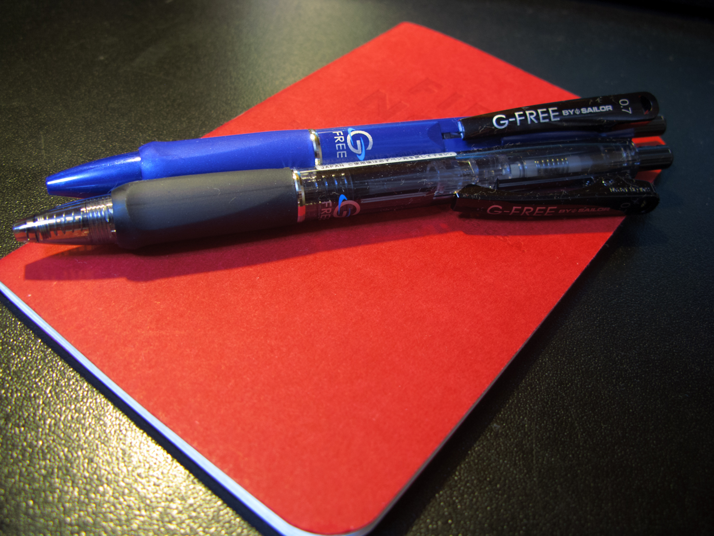
Two versions of the G-Free by Sailor on a Field Notes Red Blooded.
Sailor claims the pen has two special features that make it worth the extra money: hard/soft adjustment and a special low-friction ink.
First, by twisting the nock, the user can adjust a spring that changes how springy the pen feels. For example, if you're writing on a blotter, the hardest setting is fine, but if you switch to a hard surface, you can adjust the pen to make it feel better as you write. This is kind of interesting, but it’s not something I’ve ever wished a pen could do.
On the softest setting, you can almost push the nib back into the pen; on the hardest setting it barely moves. However, there’s not enough difference that it’s worth more money than my Pilot G2 or the 130 yen a UNI Jetstream would cost me. I’m also not sure the G-Free needs seven different levels of adjustment. The difference between 7 (hard), 4 (medium), and 1 (soft) is noticeable, but there’s not much change felt by switching from setting 2 to 3.
Details of the ugly clip and the hard-soft spring.
Second, Sailor claims its ink — which as near as I can tell is a gel ink — is specially formulated to have less friction, making for easier and faster writing. They even claim specific percentages for how much more efficient your writing will be.
Although it is smooth, I haven't noticed anything special about the ink except that it only comes in black and there isn't much of it. The black version of the pen is translucent and you can see the refill stops halfway up the pen to allow space for the hard/soft mechanism. The eight different barrel colors available are just for fashion, although each version has the ugly black clip.
You can see the where the ink stops right in the center of the picture.
After using both pens for a few days on different types of paper, including Field Notes, Moleskine, Tomoe River and copy paper, I haven’t noticed much difference in the writing experience than I’d get from a standard gel ink pen. The chunky rubber grip section is triangle shaped and I found it awkward to hold at first despite the fact I’ve used a Pilot Vanishing Point for almost 20 years. I eventually twisted the grip around and that made it feel more comfortable.
Although I don’t expect line variation from a ballpoint pen, I was disappointed there was no effect at all on the size of the line by adjusting the hard/soft settings. The line was always the same thickness. That said, I was surprised that although the G-Free is only offered in a 0.7 size, the line from both pens was thin. They actually felt like 0.38 pens.
One final pet peeve is that the nib has a black circle around it, even on the blue version. This has no effect other than to constantly make me think that ink residue was building up on the nib.
The ugly black ring on the nib and some ugly handwriting.
As of this writing the pen is apparently only available in one physical store (Tokyu Hands in Ikebukuro), the Sailor online store, and at Amazon Japan where you have to buy an 8-pack. In the end, all I have are questions about this pen: Does the Sailor G-Free need seven different adjustment levels especially when there’s no visible change in the line? Is a slight difference in springiness enough to justify the price and the ugly?
The answers, I’m afraid, are “No” and “Not for me”.
Some examples of bad handwriting at three of the seven settings. This was written on a soft surface.


