I’m always skeptical when a company known for its fountain pen inks decides to make the jump into fountain pens, but credit to Dominant Industry, who I think has done a nice job with their Keyno Stay.tionery Fountain Pen series.
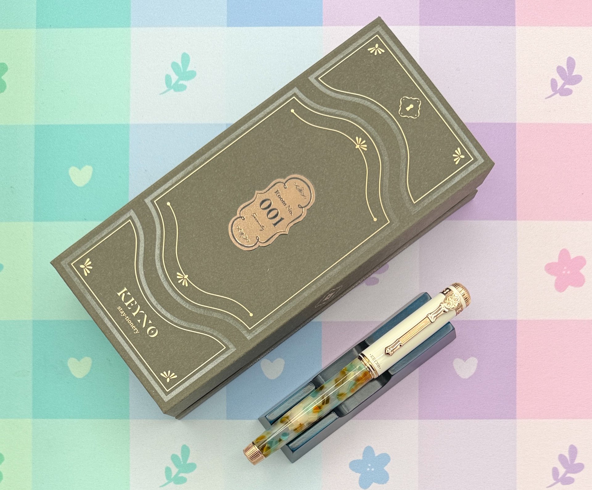
Launched earlier this year, there have been two Keyno Stay.tionery releases so far, the first being No. 014 Cherishment, and the second named No. 001 Serenity, which is the model I am reviewing. Dominant Industry is looking to expand their storytelling beyond their inks, paper, and accessories with these pens. What story, exactly? From their marketing:
“Born from Dominant Industry in 2026, this fountain pen brand aspires to create writing instruments in harmony with beautiful inks. Their story starts at Hotel Keyno, a secluded retreat perched in the mountains of a faraway peaceful island. Each release is created with a a hotel visit in mind through each "key number" assigned to a pen. With a refined touch and balanced weight, each piece delivers an indulgent writing experience. Their pens are fitted with an ebonite feed for a rich and seamless ink flow. Rooted in story-driven design and detail, their fountain pens aim to inspire and nurture creativity.”
I’m the first to roll my eyes at marketing out of thin air like this, and even held off on the Cherishment release despite finding the pen nice looking. I just didn’t feel the overly Instagrammable style of the pen was something I would use regularly.

The second release, aptly named 001, hooked me for two reasons. One, the barrel color landed a bit better for me personally, and two, the short timeframe from when the second pen released in relation to the first. Why does that second detail matter to me? It told me that this pen concept wasn’t going away soon, so I may as well test it out and share my thoughts. Best case, I have a fun pen to add to the rotation. Worst case, I give it away to one of you tomorrow.
Spoiler: This is not tomorrow’s giveaway.

Let’s get aesthetics out of the way first, because I think that will be the biggest contention with Keyno Stay.tionery products. I love fun, pretty, colorful, and stylish products, all of which I think are good descriptors for this fountain pen. There is a balance, though, and the 001 Serenity gets right up to that edge for me. On one hand, this pen is on the same style family tree as Pelikan’s popular color editions. You know, the ones with the White caps, Gold trim, and colorful barrels? You can find them in various Pelikan sizes, and I do see a little bit of that in Serenity.

Upon closer look, Dominant Industry turned that classic style into something more. The details on the clip, clip band, both finials, cap ring, and nib etching show that they wanted to maximize the style of this pen to fit in with their storytelling vision. Keys and key holes everywhere! Overall, it is themed well, but is not for everyone.

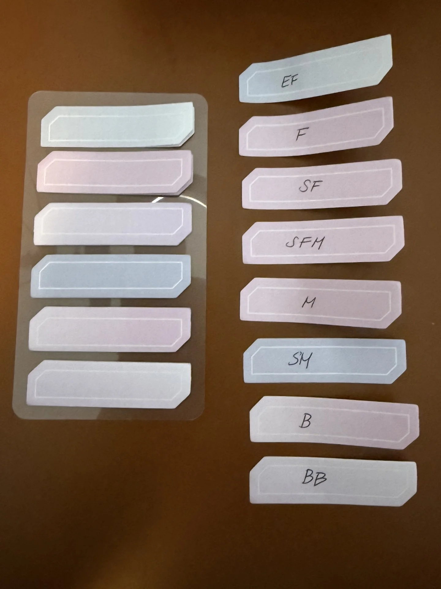
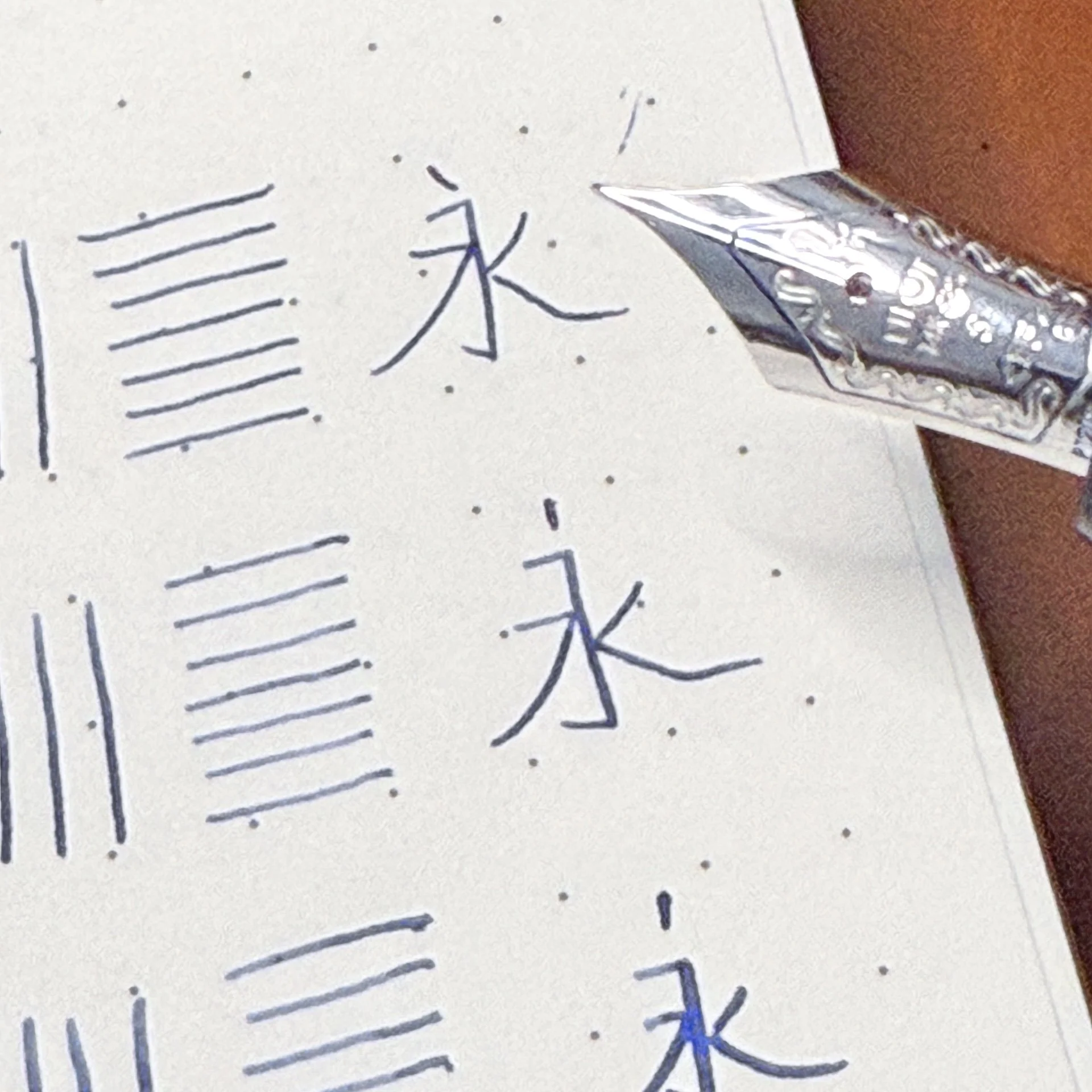
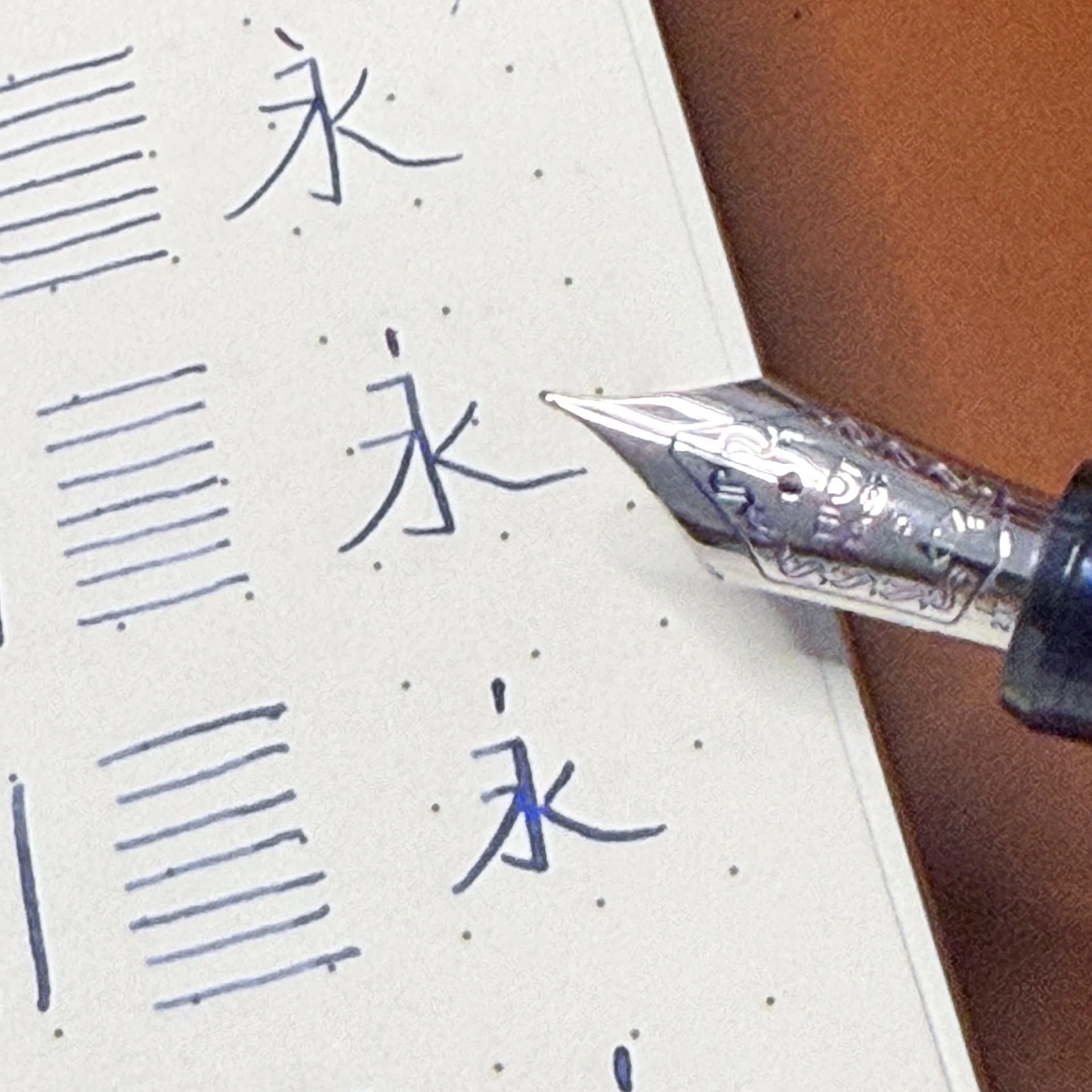
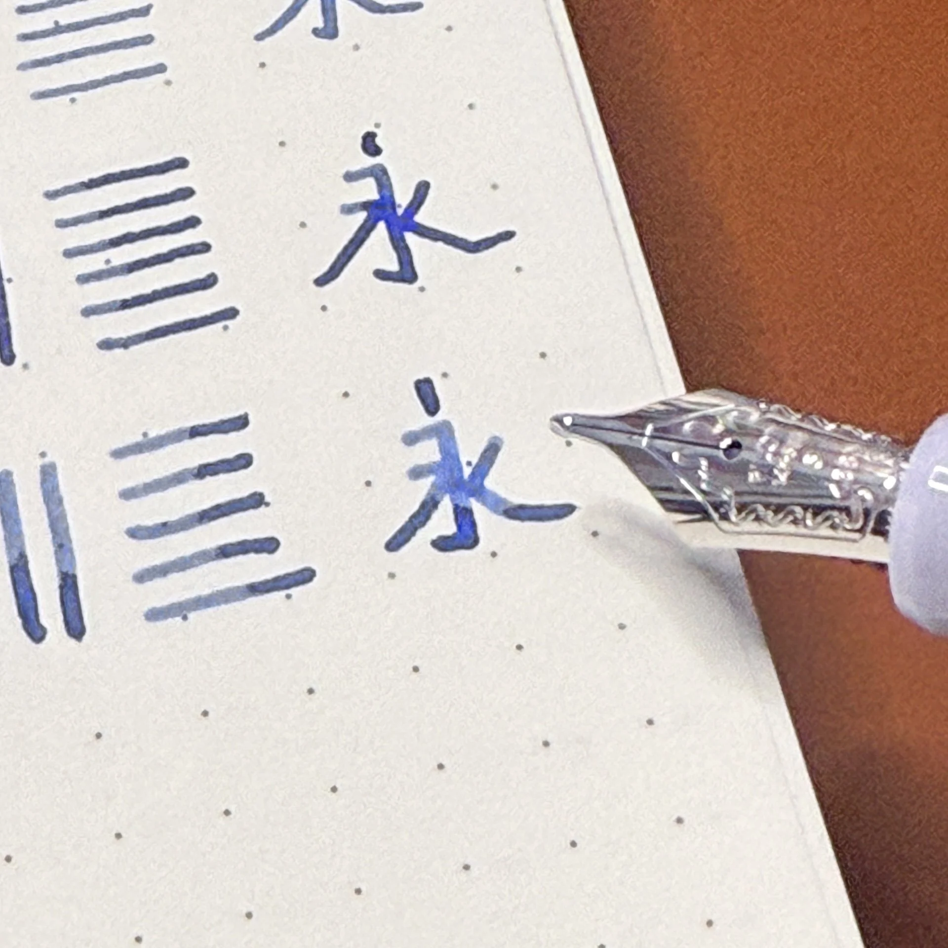
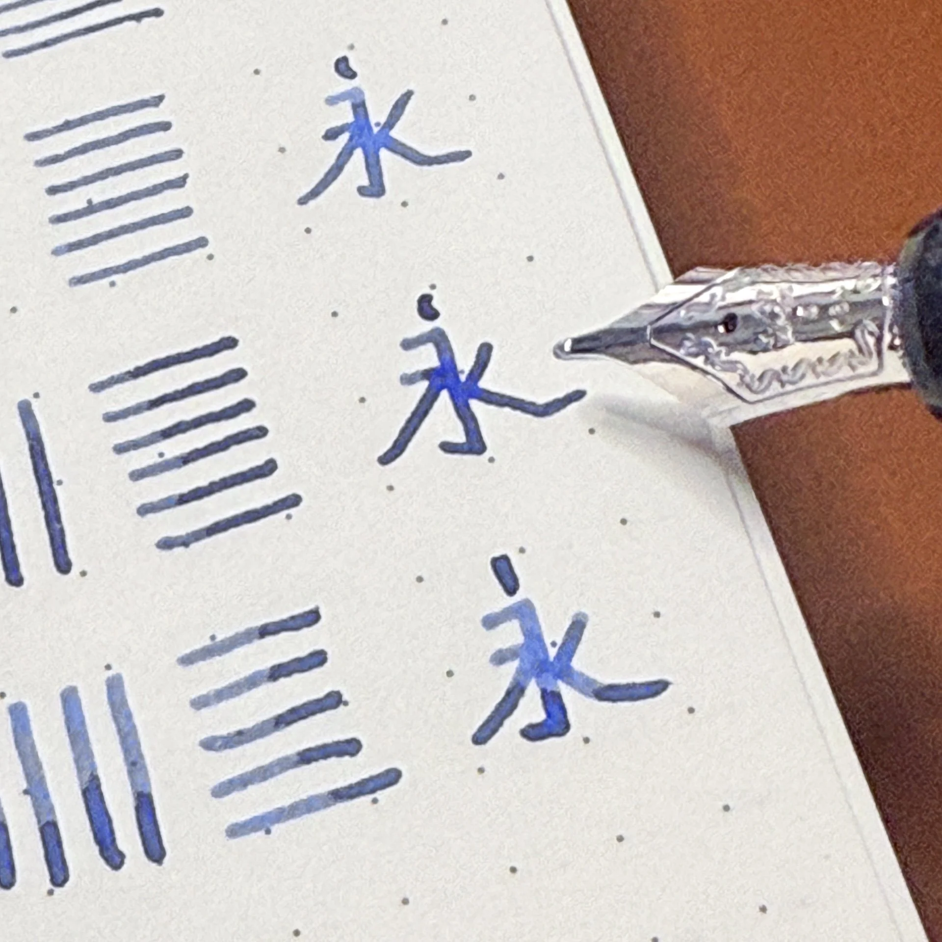
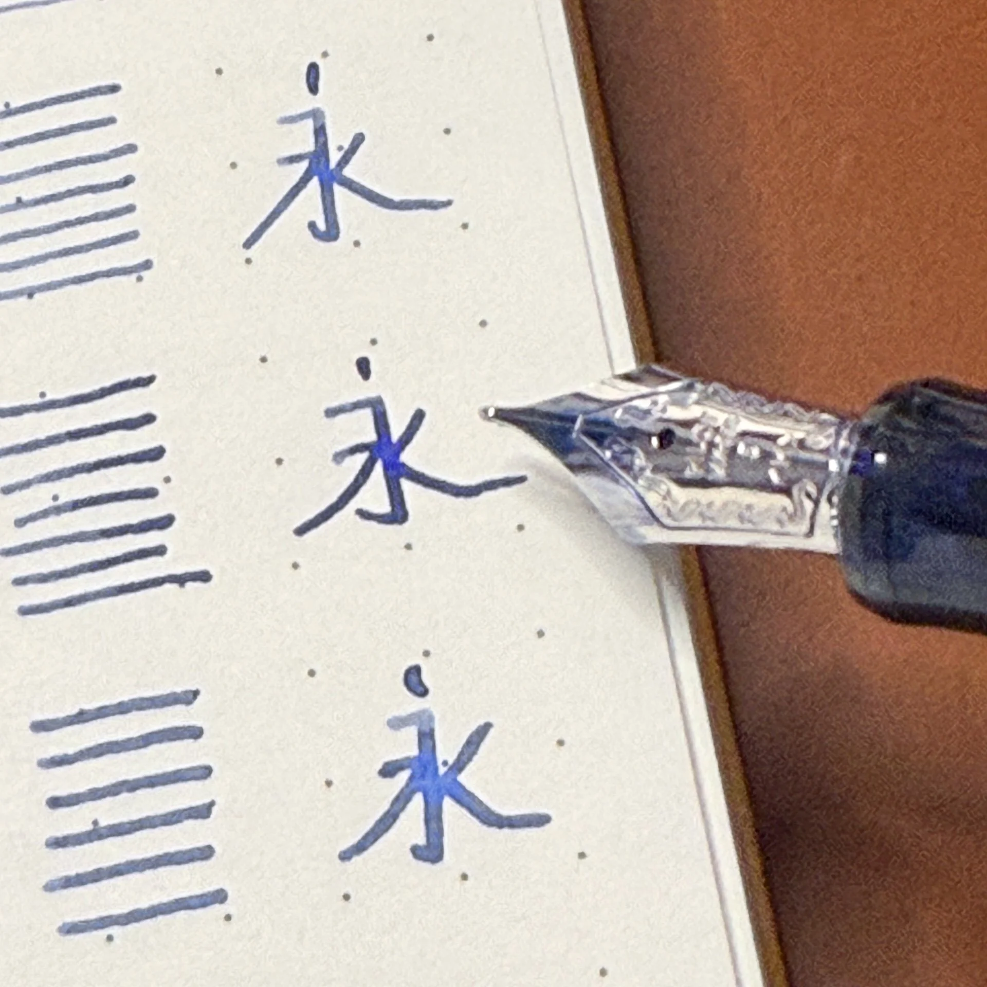
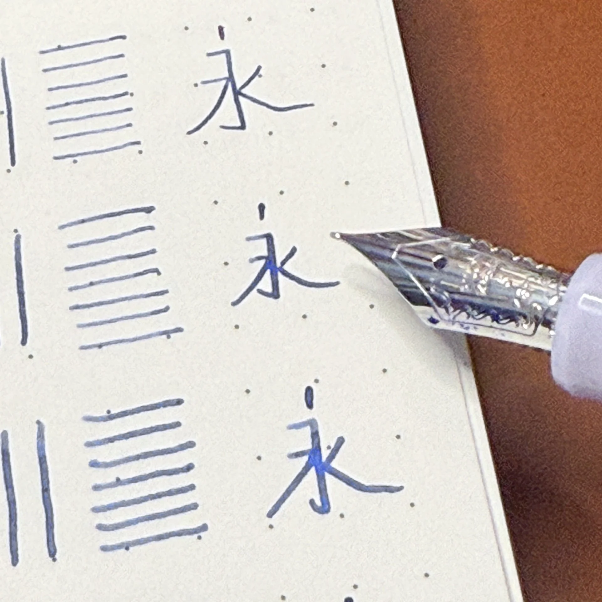
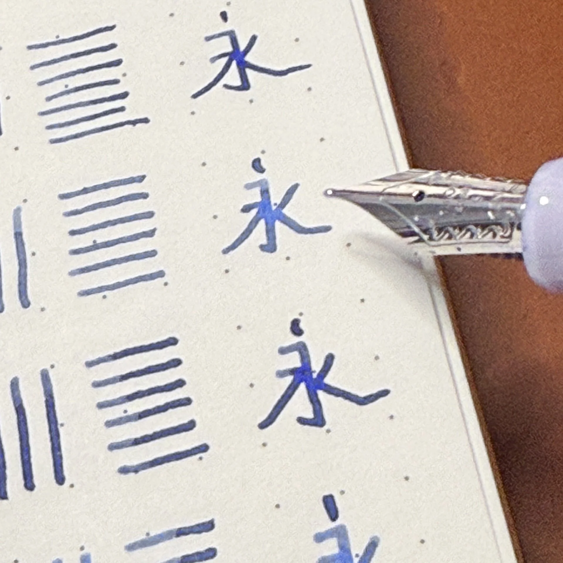
What might be for everyone with this pen is the nib. I say might, because I ordered mine with an Extra Fine nib (Fine and Medium are the other options, all Steel,) and haven’t tried the others. Visually speaking there is not a lot of tipping on this nib, which got me excited for fine lines. It delivered.

This nib is so good, and was from the first touch on the page. I inked it up with Wearingeul The Blue Castle, and have used it across many paper types. It has been solid, smooth, and controllable. For a “who knows who makes this,” nib, it is perfect. Bonus, it has an ebonite feed, which helps with ink flow and consistency. It hasn’t skipped a beat from first inking.

So, who is the Keyno Stay.tionery No. 001 Serenity for? You have to love the aesthetic that Dominant Industry is going for here to even consider it. It’s $115, which seems fair, especially given the performance I’m getting from the nib. The more I use it, the more I like it. Will I need the entire series of Keyno Stay.tionery fountain pens? No, but I do have a hotel room key that needs investigating, so who knows where this will lead.
(This product was purchased from Dromgoole’s at a discounted price.)
Enjoy reading The Pen Addict? Then consider becoming a member to receive additional weekly content, giveaways, and discounts in The Pen Addict shop. Plus, you support me and the site directly, for which I am very grateful.
Membership starts at just $5/month, with a discounted annual option available. To find out more about membership click here and join us!