Posts filed under Colorverse

Colorverse Apollo 11 50th Anniversary First Moon Landing Limited Edition Ink Set Review, Part 2

(Sarah Read is an author, editor, yarn artist, and pen/paper/ink addict. You can find more about her at her website and on Twitter. And check out her first novel, The Bone Weaver’s Orchard, now available where books are sold!)

In my last review, I covered the lovely contents of the Colorverse Apollo 11 limited edition ink set. It's a very droolworthy, if pricey, gift set of inks that has won my heart but not my wallet. This week, I'll talk more about the individual inks included with the set.

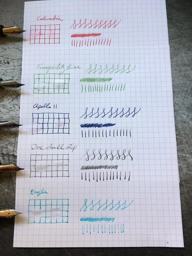
Apollo 11, the large bottle of blue-black ink is the primary feature of the set. It goes down very dark and dries to a slate-navy color. It's decently lubricated and shows lovely shading even with a fine nib. In a water test, the blue color washed away but the grey tone remained behind, both when the water was wiped away and left to soak, so it may have a little bit of water resistance. This is a great workhorse ink. It's formal enough to be professional, but has enough character that it's still a joy to write with.

One Small Step is the mysterious grey that splits into orange, pink, and teal in chromatography. A touch of that character shows on the page, where I honestly can't tell if it's a warm color or a cool color. This one feels drier, but shows phenomenal shading. Its lighter color appears like a graphite line, and it pools to almost black. With a stub nib, the effect is almost ghostly and I adore it so much.

Columbia is the pinky-red ink of the set. It has a fantastic tone, though it doesn't show much character on the page. There's a small bit of shading, but it's mostly a flat color. It washes away completely in water. Do you remember the wee red hot candy hearts at Valentine's Day? This ink looks like those taste. Spicy and sweet at the same time.

Eagle is a pale sky teal. It's the driest ink of the batch, with a tendency to dry out in the feed. It's also a bit pale, so it might be tricky to read at times. It doesn't show much shading, but there is some. It washes away completely in water. The color itself is beautiful, but it's probably the one I'll use least from the set. I think it's perfect for highlighting something or for decorative notes, but it isn't a staple color.

The last color of the bunch is Tranquility Base, a beautiful grey-green that has a soft matcha tone to it. It is nicely wet, shows a lot of shading, and the grey notes remain behind when water is applied. Like Eagle, it's a bit pale for everyday use, but its darker tones are grass-green and easier to read. It's more of a Spring green than a Winter green, and it makes me think of light teas and Easter grass.

I think what appeals to me most about this selection of colors is that it perfectly suits the way I write. It has everything I need, all in one box. I'll be drafting in Apollo 11, interjecting thoughts or questions to myself in Eagle, making proof marks in Columbia, adding research notes in Tranquility Base, and inserting new text with One Small Step. I already write this way, to keep my manuscripts color-coded as I draft and re-draft. I just never expected to be handed a kit that anticipates my needs so well. Admittedly, I could have assembled a similar kit myself just from what's on my ink shelf already--which is why I'd likely not shell out the cost of this one--but I really do like the individual characteristics of these inks. I think One Small Step is easily the best grey in my collection, and I have a feeling I'll be lamenting the tiny size of this bottle before long.

My final thoughts are: if you love this, grab it. You won't regret it at all. And if you find it at a good deal, it's definitely worth picking up. For any shade of ambivalence, it's not worth the price. Though... it does come with stickers, if that sways you.

(JetPens provided this product at no charge to The Pen Addict for review purposes.)


Enjoy reading The Pen Addict? Then consider becoming a member to receive additional weekly content, giveaways, and discounts in The Pen Addict shop. Plus, you support me and the site directly, for which I am very grateful.

Membership starts at just $5/month, with a discounted annual option available. To find out more about membership click here and join us!

Posted on October 10, 2019 and filed under Colorverse, Ink Reviews.

Colorverse Apollo 11 50th Anniversary First Moon Landing Limited Edition Ink Set Review

(Sarah Read is an author, editor, yarn artist, and pen/paper/ink addict. You can find more about her at her website and on Twitter. And check out her first novel, The Bone Weaver’s Orchard, now available where books are sold!)

There have been so many fun moon landing anniversary editions in the stationery world this year, and the Colorverse Apollo 11 Ink Set is certainly no exception. It's a fun theme, a great celebration, and this is probably the most drool-worthy ink set I've encountered.

The first thing you can't help but notice about this set is the amazing packaging. The spacey looking grey box unfolds to fun facts and illustrations about NASA's mission and the spacecraft. Then there's a layer of wee cute ink bottles nestled in formed foam. The cardstock has more fun facts. Beneath that is another layer of ink bottles and yet more educational nuggets. The set comes with napkins and info cards and stickers. It's clear a lot of thought went into what would be inside this box besides the fun inks themselves.

I love the color choices for this set. It's the essentials--every color you really need is here, yet they're all still wonderfully within the theme. And somehow they've used common colors and still made them unique. Of all my sample cards, I could not find any that looked like a clear duplicate of any of these five colors.

Best of all, I love the tones. The blue-black, called Apollo 11, has a lovely smoky blue shade that pools to a deep navy. The grey, called One Small Step, is a perfect moon dust color. It seems cool in its lighter tones, and warm where it's darker. The teal, called Eagle, is fresh and bright but still readable. The green, Tranquility Base, is a lovely, earthy, matcha green. And the red, Columbia, is sometimes pink, sometimes orange, and sometimes deep red with a gold-green sheen.

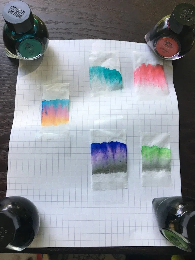
The chromatography tests for these inks blew me away. The teal and red were fairly straightforward, through it did bring out the pinks in the red. The green left a lovely smoky line behind as the brighter neon green crept away. The blue-black had some lovely hidden pinks and purples that I hadn't been expecting. But that grey? Holy cats! Bright orange, pink, and teal. There's clearly some sort of alchemy afoot at the Colorverse laboratory. As I watched the colors climb the paper, I felt like I was watching some sort of spell unravel. And it also explains that dual warm/cold look to the ink itself.

I'll do a part two of this review where I talk about all of their behaviors in actual pens. But for now, I can easily say that this is the most fun I've had with inks in a long time. The only downside to this set? The price. The $100 cost is a bit high, even for all this magical fun. While I think the packaging is unbeatable as far as coolness goes, I wonder how much it has driven up the cost of this set. There are only 125ml of ink here. And while there's a good color variety, and the bottles are adorable, I'm not sure I'd have splurged on this. I think the audience for this package requires a very specific overlap in the Venn diagram of ink buyers: People who are drawn to practical colors, who are space fanatics, and collectors of limited editions. I'm sure there are plenty of pen addicts who fit into those categories, and I do hope that this limited run will all find good homes. I can't help but love it, myself. More fun with these inks to come next week!

(JetPens provided this product at no charge to The Pen Addict for review purposes.)


Enjoy reading The Pen Addict? Then consider becoming a member to receive additional weekly content, giveaways, and discounts in The Pen Addict shop. Plus, you support me and the site directly, for which I am very grateful.

Membership starts at just $5/month, with a discounted annual option available. To find out more about membership click here and join us!
Posted on September 26, 2019 and filed under Colorverse, Ink Reviews.

Colorverse Extra Dimension & Warped Passages Ink Review

(Jeff Abbott is a regular contributor at The Pen Addict. You can find more from Jeff online at Draft Evolution and Twitter.)

It seems like it's only been a couple of years since the Colorverse ink brand exploded onto the stationery scene, along with their break-neck pace for releasing gorgeous space-themed inks. I've always wanted to collect all the various ink colors they sell for all the reasons Colorverse make them: They're beautiful colors and they are all based on real scientific concepts and space exploration. It's a dream come true.

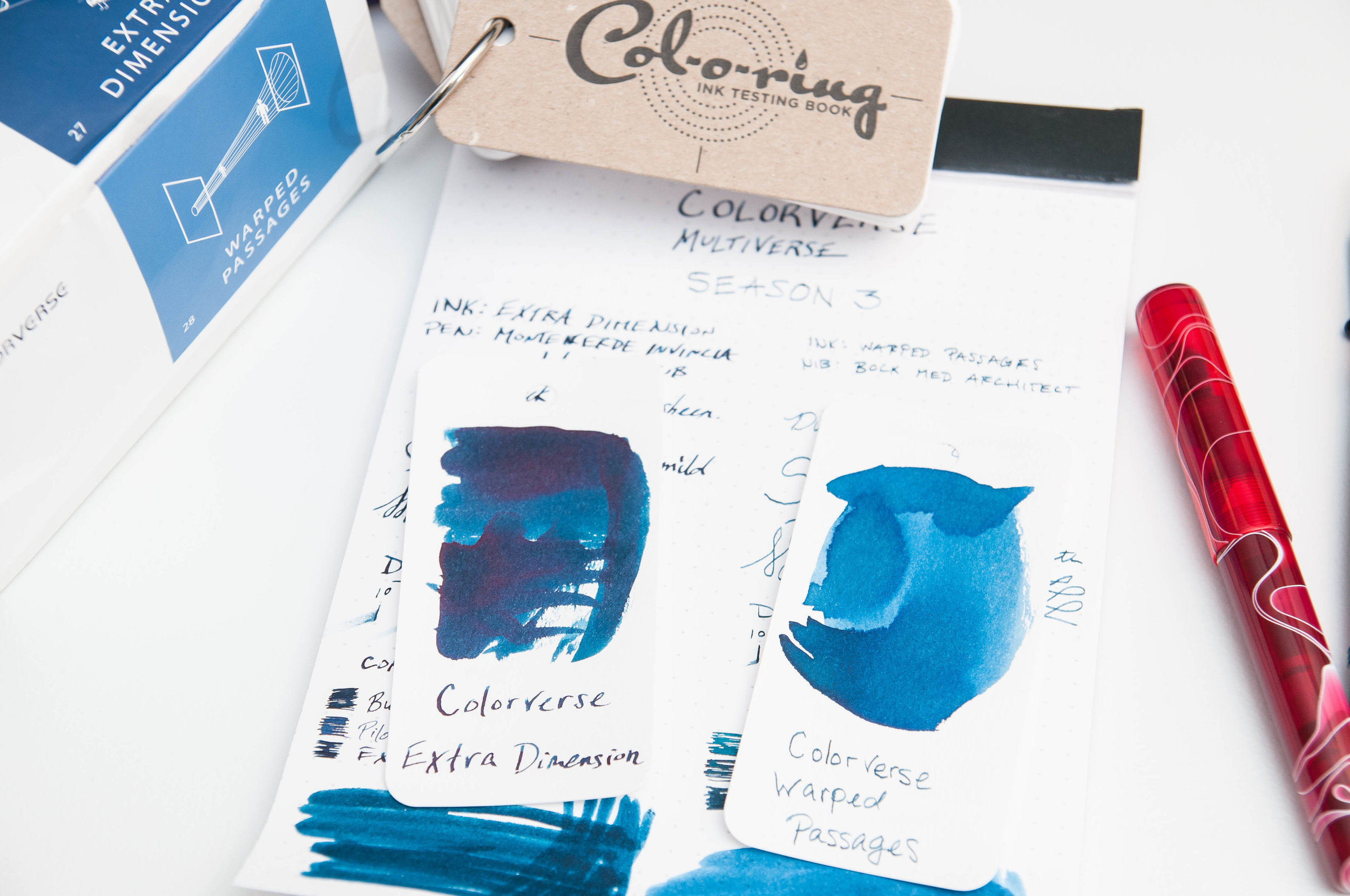
Alas, there are far too many inks in the line to purchase them all. But one of the latest batches I've tried out is the Extra Dimension & Warped Passages set. This set contains a large bottle (65 ml) of Extra Dimension and a small bottle (15 ml) of Warped Passages. These colors are both beautiful blues at different ends of the spectrum. Extra Dimension is a dark, almost black, blue, while Warped Passages is a light, dusty denim. The multiverse series are based on concepts of harmony and symmetry, so it only makes sense that these two colors compliment each other so well.

Before going into the behavior and individual characteristics of these inks, I'll start by saying that they both behave very well. The flow is just right, I haven't had any issues with nibs drying out or flow problems after a while of non-use. Cleaning out pens is easy, and I haven't noticed any adverse effects. Like Colorverse claim, these inks are gentle on your pens, and I can attest to that fact.

Starting with Extra Dimension, there are depths to this color that unfold with the right nib. It's largely a blue-black ink with a fair amount of shading, but you can also detect some red sheen in certain light if you put down enough ink. I absolutely love red sheen in blue inks, and the subtle change in color is splendid after the ink dries.

Along with the blue-black qualities, you can also pick out some green/teal if the ink is spread out enough. Personally, I wish more of this hue was visible under normal writing conditions. You can really only see it clearly when swapping lots of ink. Perhaps with the right nib, this color would shine.

Dry time is a bit lengthy with this ink, but it isn't excessive. Somewhere between 18 and 24 seconds seems to be the magic time. Don't let the dry time deter you from picking up this ink unless that's a hard requirement for you.

Warped Passages is a color that made me unsure for the first few minutes of use. It's pale, dusty, and unassuming. But when you really look at the depth of the color and (especially) compare it alongside Extra Dimension, this color takes on a whole new quality. Under normal writing circumstances, this feels like a medium blue with great shading qualities. In the bits of shade, you can pick out hints of green, just like the Extra Dimension ink. These hints of green in both inks really delight me, and I'm not sure I'll ever use one of these inks without the other. They beg to be used together.

While this dusty blue is lighter than its larger sibling, it's still a medium blue that suits office environments well. It shades nicely, giving it a lot of visual interest on the page. I see this ink easily becoming one of my favorites. It's just a shame the bottle is so small!

These, again, are two different inks. Extra Dimension is the larger of the two, coming in at 65 ml. Warped Passages is only 15 ml, which is similar to a few sample vials. Unfortunately, you can't purchase these inks individually. They're meant to be a complimentary set, and I can't agree more. I just wish the two bottles were the same size!

(JetPens provided this product at no charge to The Pen Addict for review purposes.)


Enjoy reading The Pen Addict? Then consider becoming a member to receive additional weekly content, giveaways, and discounts in The Pen Addict shop. Plus, you support me and the site directly, for which I am very grateful.

Membership starts at just $5/month, with a discounted annual option available. To find out more about membership click here and join us!

Posted on January 30, 2019 and filed under Colorverse, Ink Reviews.