Posts filed under Fountain Pens

Sailor Maki-e Fountain Pen Identification Help!

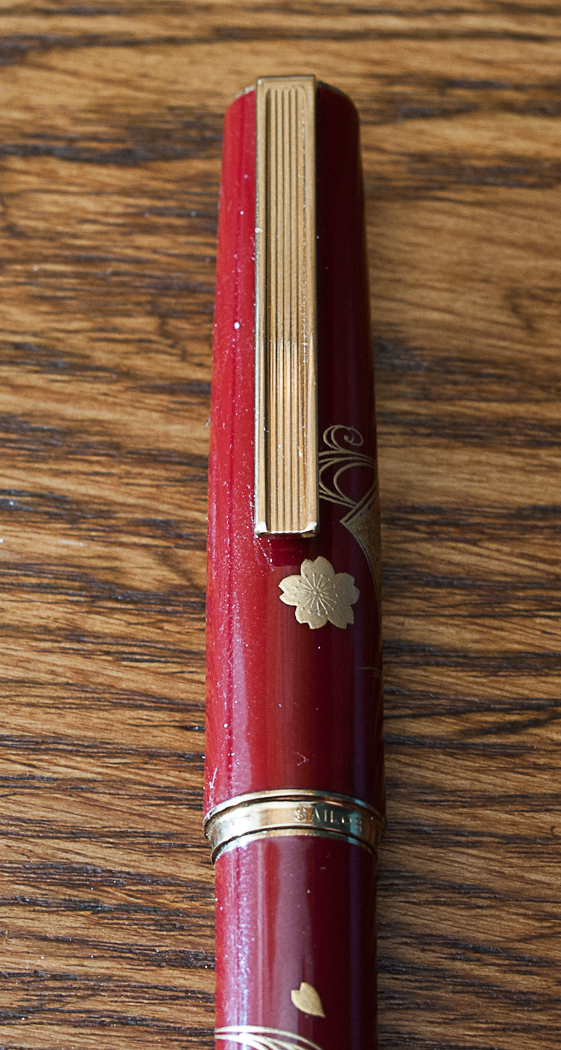
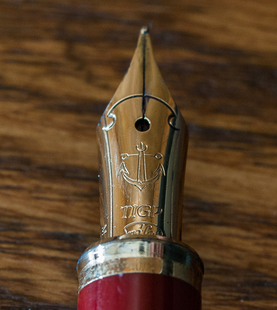
A reader sent me these pictures of a Sailor Maki-e fountain pen he received from a Japanese businessman over 20 years ago. He would love to know more about this particular model, and I am unable to come up with a match to the artwork and barrel color. As best as I can tell, it is a Sailor Young Profit (or Somiko in some markets) with a titanium gold plated nib (TIGP), but that's all I have.

If anyone can help nail down the remaining specs of this pen let me know.

pen.jpg
pen ~ characters.jpg
pen ~ clip.jpg
pen ~ nib.jpg
Posted on February 4, 2014 and filed under Fountain Pens, Sailor.

J. Herbin Eclat de Saphir Ink Review

If Iroshizuku Kon-peki is my favorite blue ink, then J. Herbin Éclat de Saphir is my close second.

Éclat de Saphir is a gorgeous, vibrant blue ink with lots of character and depth. I love how it pops off the page when I’m writing and even after it’s dried. I'm very pleased when inks retain the same level of saturation when they dry as when the ink is wet, and this ink is no exception.

Before I dive into the detailed notes, I do have some general comments about this ink. I love the color and shading qualities of this ink, but you really need to try it in a fine or larger nib (or medium and larger for Japanese nibs) to get the full effect. After playing with this ink for a while, I really want a stub nib. Secondly, many reviews I've seen on this ink praise its fast-drying property, as well as many other J. Herbin inks. This has not been the case for me with this ink. I don't know if I'm doing something wrong or if I'm just using wet nibs on heavy paper, but I would not say it's fast to dry. In my tests, it took about 20 seconds to dry to a point where it would not smudge when I brushed my finger across it. With that being said, it's still an excellent ink that I highly recommend.

J. Herbin Eclat de Saphir 3.jpg

This is one of the most well-behaved and easy to maintain inks I've tried. I currently only have cartridges, but will buy a bottle very soon so as to use it in even more pens. It's extremely easy to clean out of pens and washes off my fingers easily.

My favorite quality of this ink is the color. It's a medium to dark blue, very similar to what I think of as "royal" blue. It's nice and saturated, which is something I long for in inks. It has good lubrication and excellent flow in the handful of pens I've used so far.

On nice paper, this ink does not feather or show through the page. Sure, it does feather on cheap paper, but what ink doesn't?

The shading properties are fantastic. Again, I see a stub nib in my near future just so I can play with this beautiful ink some more.

Overall, this is one of my favorite inks and I can't wait to introduce it to more of my pens. Aside from my quibble with the drying time, it's close to a perfect ink for me. I'd like to hear from you if you have some information about the drying time or have advice on performing ink drying tests. Next time you're looking for a nice blue ink to try, grab some Éclat de Saphir.

J. Herbin Eclat de Saphir 1.jpg

(You can find more from Jeff online at Draft Evolution, Twitter, and App.net.)

Posted on January 31, 2014 and filed under Fountain Pens, J. Herbin, Ink Reviews.

Retro 51 Tornado Black Acrylic Fountain Pen Review

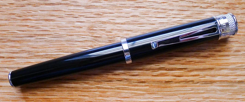
Retro 51 fountain pens have been on the market for a while now and I finally got my hands on one from JetPens. I went with the Black Acrylic - Fine Nib model and while it is beautiful and has a fantastic nib, there are a couple of issues keeping this pen from being a daily writer.

First off, the grip section is exceedingly poor for a pen of this quality. It is a cheap, slick plastic that does not fit in with the overall design of the pen. I'm assuming Retro 51 made this choice for a good reason, but for the life of me I don't know what it could be. Awkward looks aside, it is a bad gripping surface. My fingers slide constantly when writing.

Secondly, the balance is wrong in both posted and unposted writing modes. Unposted, the pen is too short, too light, and uncomfortable to write with. It is very close to an unposted Pilot Prera. I don't like writing with the Prera unposted either, but the difference is the Prera is perfectly weighted and balanced when posted. The Retro 51 is not. The sexy cap bling and knurling make the pen too top heavy.

The Schmidt nib, on the other hand, is good. As in really, really good. I chose a fine nib and it is smooth, consistent, and a true joy to write with. The barrel design outstanding as well, as we all have come to expect from this popular pen maker.

In the end, the problem with this pen is there is no middle ground. The nib and design are 10's, the section and balance are 1's. I expect a more functional pen than this from Retro 51.

(JetPens is an advertiser on The Pen Addict and I received this product at no charge.)

Posted on January 22, 2014 and filed under Fountain Pens, Pen Reviews, Retro 51.