Posts filed under Fountain Pens

TWSBI Micarta Review

I'm feeling guilty about this review for many reasons.

One, this pen was loaned to me by the wonderful Ionsomnia many a moon ago. This is his pen in the review, we discussed it and the additional nibs he sent with it several times, and I sent it back in a timely fashion. But I never posted the review, because...

Two, the TWSBI Micarta was discontinued. Version 1 only came with a gold plated nib and clip, plus it had some feed problems that TWSBI wanted to correct. Version 2 corrected the feed issues and added a clipless version to go along with the gold furniture model. Now we are talking.

Three, I bought the clipless model, swapped in a silver steel crispy bold cursive italic nib, and fell in love. And you can't get one now, at least not easily through direct channels.

But this is a great pen and it deserves to be talked about, so here we go.

What the heck is Micarta? That is probably the most often question asked about this pen if I had to guess. I had no idea either, but learned from Wikipedia that it is "a brand name for composites of linen, canvas, paper, fiberglass, carbon fiber or other fabric in a thermosetting plastic". To me, that sounds like scrap repurposed to make a new material, and that is kind of neat.

You can see some of the material and texture in the Micarta pen body, and it has a feel that is warmer than that other acrylic pens. I found myself just holding it on more than one occasion because it felt so great. That is also partially because the barrel shape is fantastic, fitting my hand as good as any pen I own.

These partially natural materials do have some downside though, primarily the ability to be stained by ink. Kind of a problem in a pen, huh? Ionsomnia found that out by dipping the pen in an ink bottle to fill it. I found out by having a bad feed in mine. As you can see below, a crack caused the ink to spread, soaking the inside section threads and the front exterior edge of the grip section.

TWSBI replaced the feed for me, which works fine now, and I didn't ask them to replace the pen. Why? Wabi-sabi. Old me would have had a conniption and would have wanted a new, pristine pen as a replacement. New me has found the beauty in acceptance of imperfection. That acceptance is why I was finally able to purchase my first Nakaya and not worry if it might get dinged or scratched. It's my pen, and things happen, and it's ok because the pleasure of using a pen far outweighs being afraid to take it out of the pen case.

So my Micarta is not perfect, but it is mine, and I love it. That's why I'm guilty about this post, because I think a lot of you would love this pen too. Maybe TWSBI will surprise with a Version 3 one day.

Posted on December 15, 2014 and filed under Fountain Pens, Pen Reviews, TWSBI.

Sailor Fasciner Fountain Pen Review

(Jeff Abbott is a regular contributor at The Pen Addict. You can find more from Jeff online at Draft Evolution and Twitter.)

Sailor is one of the brands that I'm a huge fan of without even owning many of their pens. Every time I've bought or tried a Sailor fountain pen, I've been very impressed – even (especially) with their budget-friendly offerings.

The Fasciner is no exception. It's a great all-around pen, and looks gorgeous to boot. At just over $100, it's not an impulse buy, but it's definitely worth every penny.

Aesthetics

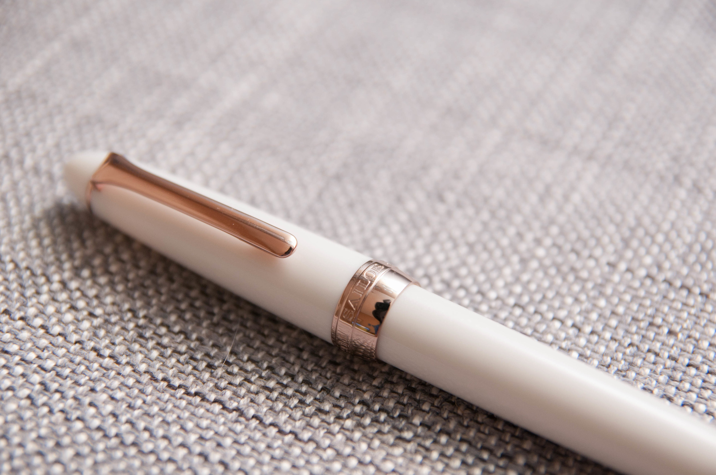
The Fasciner has the same body shape as a Sailor 1911 pen, but with a white body and gold trim. Handling the pen, you can tell immediately that it's solidly built. It might not be one of Sailor's premium pens, but it definitely isn't cheap, either. The quality can be felt when handling the pen and also when writing.

The section is made of metal and has a small rubber o-ring that snugs up to the body when the section is screwed on, which makes for a tight seal in case of any accidental ink leakage inside the body. Internal bleeding might not be the best phrase, but you get what I mean.

The clip is a great strength – not too tight or loose. I haven't really clipped it to anything besides the inside of a case because the body feels too nice to risk getting scratched or scuffed. Although, it's done pretty well against any accidental blemishes on my part. As a desk pen, you don't have to worry about being careful with it. In a bag or pocket with other objects, it might not fare so well.

The cap is a screw fit, and it feels great coming on and off the pen. When screwing the cap on, instead of hitting a sudden stop at the end of the threads, you reach a soft, gentle end of the threads. It's a small detail, but it makes me smile every time. It just feels great.

The nib is "pink gold" color, but I can't detect any of the pink. I was assuming it might be something like the TWSBI rose gold color, but I just can't see any of the pink. Despite that, it looks great. I'm not a big fan of gold trim, but it works really well on this creamy white pen. It gives it a highly classy look, and I like it for that. The trim on the cap is done very well. None of it looks or feels like cheap decoration flourishes – they're solid components of the pen.

The cap posts on the back of the pen, but you have to place it firmly on the end to make it stay. Otherwise it will wobble a bit when writing.

Writing

As every Sailor pen I've tried before it, it writes beautifully and effortlessly. It's a fine nib (no other options available here), and it runs finer than other Japanese nibs, like Pilot or Platinum. It's almost too fine for my taste, but it isn't an issue because it writes so smoothly.

This wasn't always the case, however. When I got the pen, it was a really dry writer. It wasn't unusable, and some might even prefer how it wrote out of the box, but I lean toward wetter nibs all around. A couple of gentle pulls on the tines to bring them away from the feed a bit fixed the problem for the most part. At some point I might like to have it worked on by a professional, but it writes great now.

It's the kind of fountain pen nib that I'm 100% confident about. Know what I mean? It's had zero issues with starting, skipping, drying, or any of these problems that sometimes plague or briefly affect pens. Some of my pens have 95% of my confidence, because every now and then they might skip or have a hard time starting, and they always respond to the same fixes. They write well, but sometimes have a small little issue. Not this one. It's a great writer.

It also feels great in the hand, as you might expect from Sailor. It's well balanced in the hand when writing and feels like an extension of your hand instead of a separate object.

Overall

If you're a fan of Sailor's pens, the Fasciner is a great piece to add to the collection. If your'e new to Sailor, it's a nice middle-of-the-road place to try them out. It's hard to beat the High-Ace Neo in terms of value, but you get a lot of extra class and finesse with the Fasciner.

As you might expect, it works with Sailor's cartridges, or you can purchase a converter to use with bottled inks.

Posted on December 2, 2014 and filed under Fountain Pens, Pen Reviews, Sailor.

Regal 82 William Fountain Pen Review

(Jeff Abbott is a regular contributor at The Pen Addict. You can find more from Jeff online at Draft Evolution and Twitter.)

The Regal 82 William fountain pen caught my eye when it landed on JetPens for two reasons: it has a brass body and a metal grip section. I typically love pens with a heavy body and metal grips, so I dove on it immediately. Not knowing anything about the brand, I made a mental note to look into them later on. After some brief research, it appears that Regal is a large wholesaler of their own line of pens with a presence in several large US cities, as well as India. I don't know for sure, but word on the street is that the pens are made in Taiwan. Not bad, right? So, how does this new player stack up against the other competitors? It puts up a good fight, but I think a lot of it will come down to personal aesthetic preference.

Aesthetics

The pen comes in 5 different colors: black, white, French rose, lavender pink, and hot pink. Is it just me, or is that a lot of pink? White and black are standard, and pink is also a popular color, but I can't help but think that some other choices would be advantageous here. Purple? Green? Blue? You get my point, right?

The pen has a great heft to it. It's a fairly slim body, so the weight can be a bit unexpected when you first pick it up. Being slim, it still feels very good in hand. I really enjoy writing with it and haven't experienced any cramps or fatigue while using it. This is always a good sign of proper balance and sizing for pens that I use.

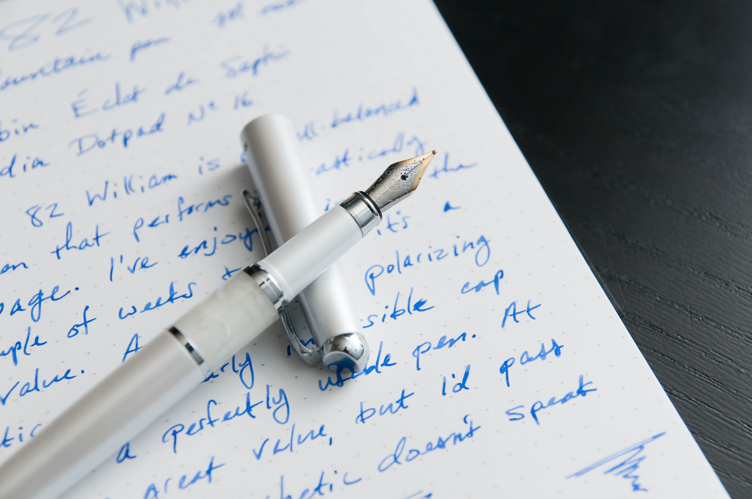
There's a marble-like band above the grip section of the barrel, and I'm not a huge fan of it for two reasons: it looks fake and it seems misplaced on the pen. Other than that, I really like the white color of the model I chose. It's pearly and has a nice glimmer to it. The chrome furniture is also a great touch.

The decorative thing at the top of the pen cap is...confusing. I'm not sure what it is or what it represents, but it just doesn't speak to me in any way. I want to replace it with something flat and subtle.

The clip is strong, but not annoyingly so. The cap, on the other hand, has been a major problem for me. This cap is snug when it's on the pen. It takes two hands (firmly gripped) to remove the cap from the pen. I'm worried that I might damage the nib at some point from trying too hard to remove the cap. I'm hoping this will get easier with some wear, but I also think it's unacceptable for a new pen. The cap can post on the pen, but it's awkward. It makes the pen extremely long and put it off balance. I've been using it without the cap posted, and that seems to work best.

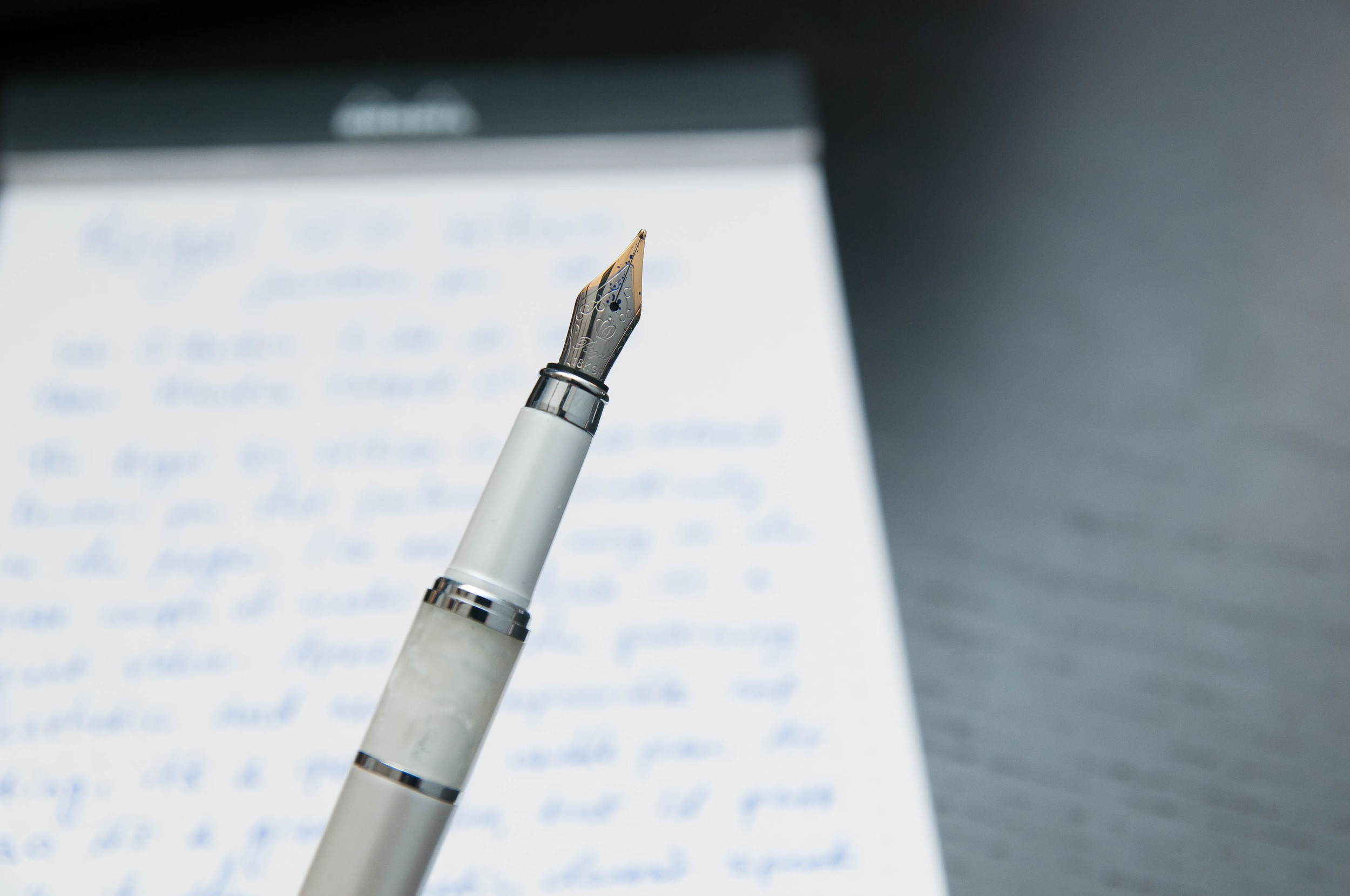
The grip is metal and feels very nice. It's smooth and is mostly the same shape, which is a big win in my book. The nib is small and two-toned, which isn't a problem, but the fact that it says "18K GP" bothers me. I think this is meant to be decorative, and it might very well have some small amount of gold-plating, but it gives the wrong impression.

Overall, the pen feels good in the hand, and that's the most important part of the aesthetics, right?

Writing

The 82 William only accepts international short catridges, or that's what it claims. I'm sure that you could use a converter if it was slim enough. The cavity in the pen body is deep enough to hold a converter. The Monteverde converter comes to mind.

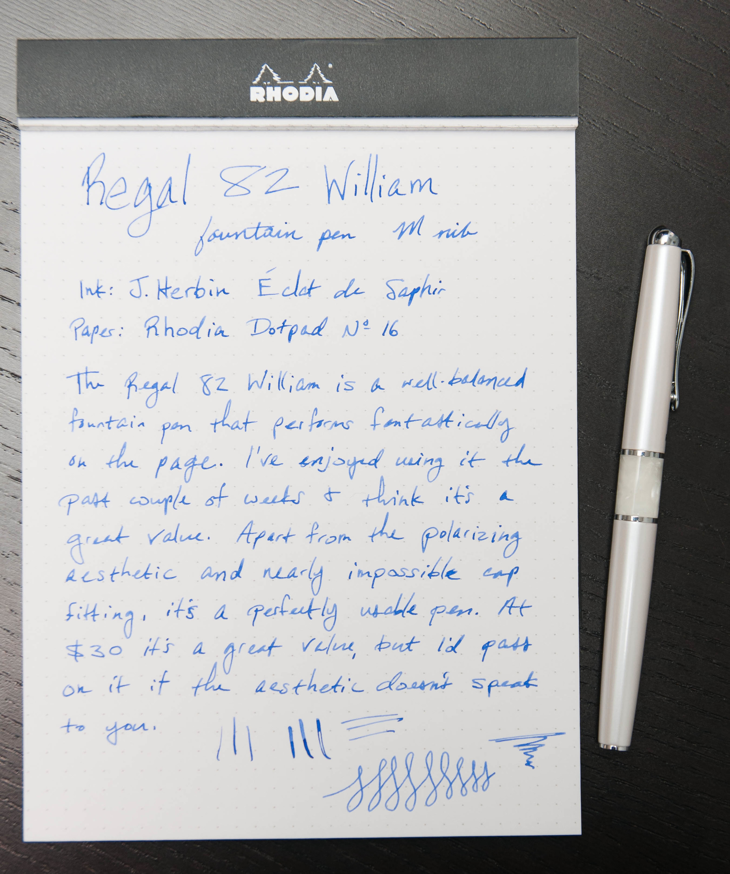
I loaded the pen with J. Herbin Éclat de Saphir instead of the black cartridge that came with the pen. This ink does really well in the medium nib on the pen, and I've been completely happy with the way it writes.

The line is consistent and tad on the wet side, which is what I prefer in a medium or bold nib. So far, it's been very good about not drying out in between uses — there haven't been any problems with starting or skipping, and it can even write after a few minutes of being uncapped and unused.

Overall, it writes really well and feels great in the hand. For that reason, it's a really good pen, and at the $30 price point, it's a fairly good value. Like I said earlier, I think the major factor to consider here is aesthetics. Do you like the way this pen looks? If so, then I'm pretty confident that you'll enjoy using it as it's a great writer. If you don't like the look of the pen, I'd recommend passing it.

After using this pen from Regal, I'd be interested in trying others from the company.

Posted on November 26, 2014 and filed under Fountain Pens, Pen Reviews, Regal.