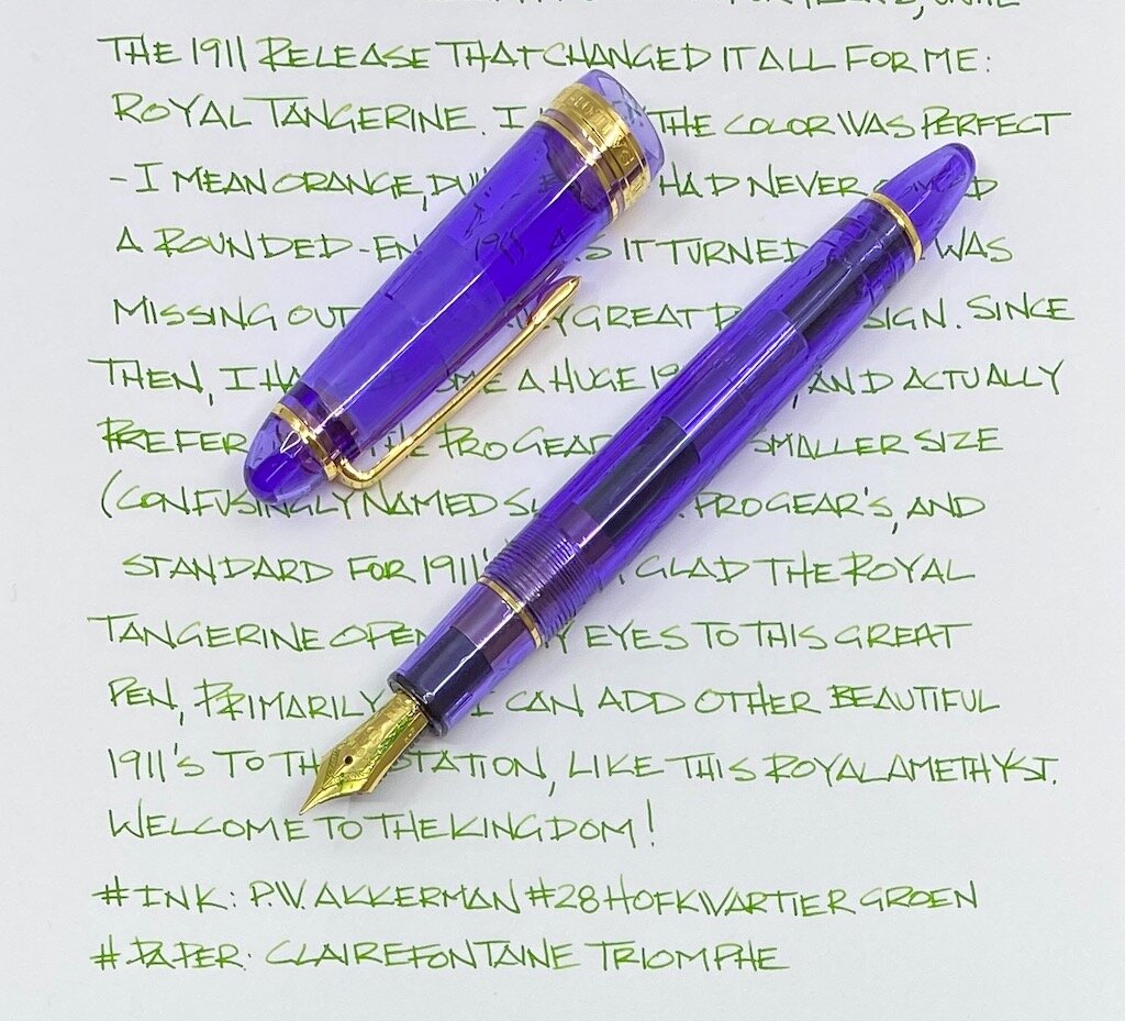
(Sarah Read is an author, editor, yarn artist, and pen/paper/ink addict. You can find more about her at her website and on Twitter. And check out her latest book, Out of Water, now available where books are sold!)
I hadn't heard of or seen a Narwhal fountain pen till I watched Brad unbox his on his Twitch stream. Even after seeing the video, I kept my expectations low. With its price tag of $45, I assumed it was more likely to be cheaply made and slightly overpriced than well-made and underpriced. When the pen arrived, I was pleasantly surprised. Maybe even shocked. Possibly flabbergasted.

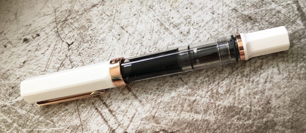
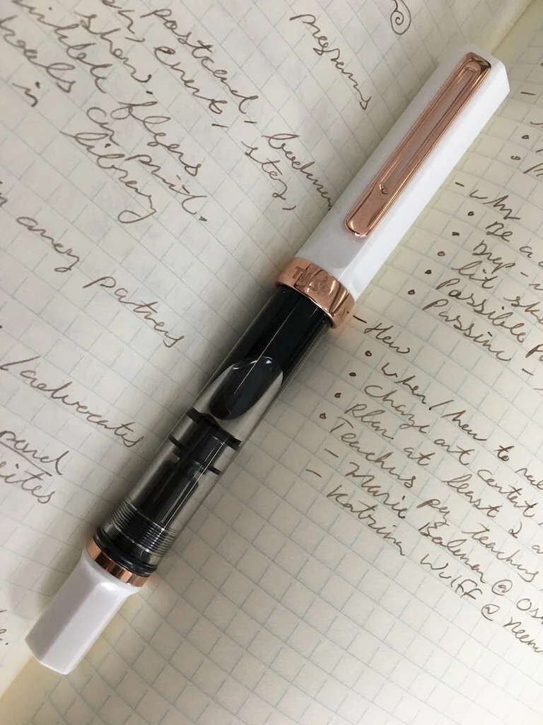
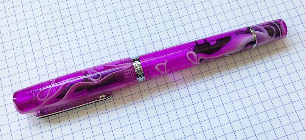
The first thing I noticed about the pen is how substantial it feels. It's very solid. A bit heavy, but in a reassuring way. It doesn't feel like the plastic is fragile or cheap, the way some economically priced acrylic pens sometimes do. In the hand, it does not feel like a cheap pen at all. The joins and corners are all smooth and seamless. The threads are precise, both for the cap and for the piston. Because, yes, this is a piston filler! The mechanism resembles the one in a TWSBI ECO, and it holds a comparable amount of ink. As in, a lot of ink.

The piston is operated by twisting the end cap. The cap, end cap, body, and grip section are all in the same pretty, swirly acrylic. The ribbons of color have a great depth to them and it's a lovely effect. The grip tapers smoothly and is very comfortable to hold. The threads at the top of the grip section are so smooth that you can hardly feel them. There is a silver clip that has the perfect amount of grip and spring, and a silver cap band that says "Narwhal." The clip design even looks like a fountain pen! There is also a silver ring at the join for the end cap. Every fitting is absolutely seamless. I don't think I've ever seen this level of precision on a pen under a hundred dollars. Heck, I have some that cost over that that are less well fitted.
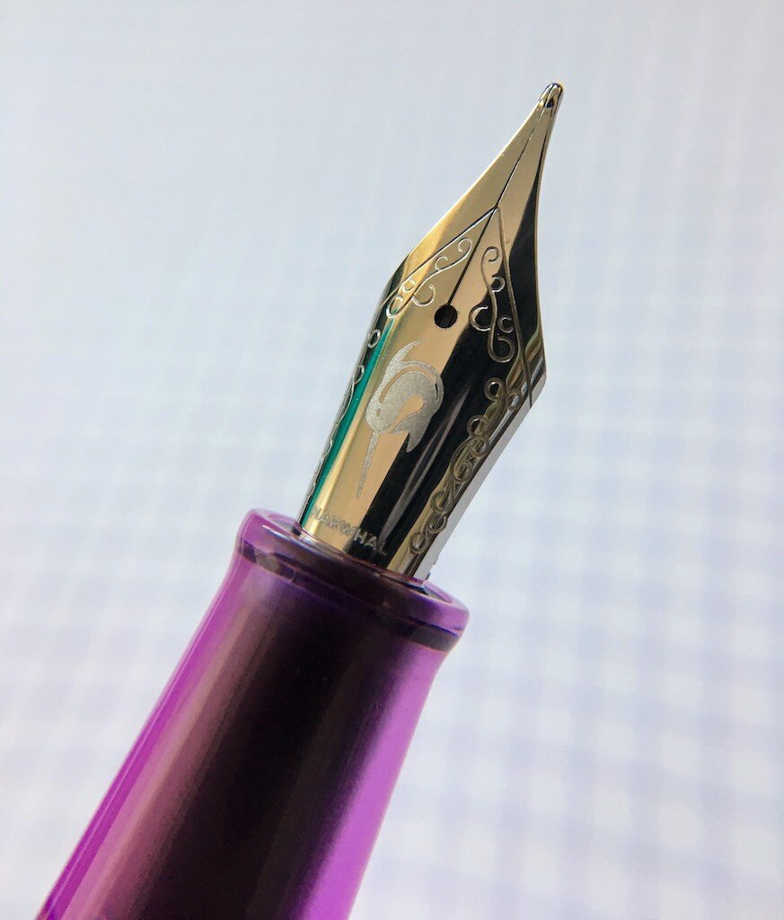
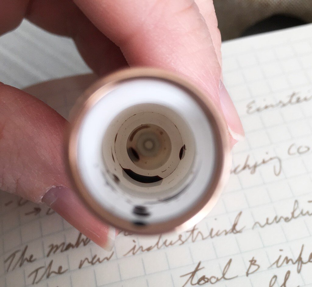
Narwhal also make their own nibs, which sounds bold, even foolhardy, but--again--they've exceeded my expectations. This is a good nib. Perfectly wet with no skipping. There's a bit more feedback than I personally prefer, but it doesn't feel too scratchy, and it doesn't feel dry. It also has one of the coolest engravings I've seen on a nib--a leaping narwhal (their company logo). The nib only comes in Fine, but it's not a true fine, in my opinion. It's closer to a western medium, or even a Japanese broad.

When uncapped, it's perfectly balanced. With the cap on, it's very cap-heavy, as there's a chunk of metal at the finial. The only negative I can name so far is that it does not post. I know that can be a dealbreaker for some folks. If it did post, though, that metal in the cap would be a problem. It's a large enough pen that it does not need to be posted, and would even be a bit unwieldly if it was. It's slightly longer than a TWSBI ECO.
I highly recommend this pen if you're looking to try a piston filling pen and want great quality for your money. I can't quite fathom (haha, get it?) how they've kept the cost so low while offering such high level of finish. They could easily be charging quite a bit more for these pens. I'm really looking forward to seeing what Narwhal comes out with next. I'll definitely be keeping my eye on this new brand.
(Goldspot provided this product at no charge to The Pen Addict for review purposes.)
Enjoy reading The Pen Addict? Then consider becoming a member to receive additional weekly content, giveaways, and discounts in The Pen Addict shop. Plus, you support me and the site directly, for which I am very grateful.
Membership starts at just $5/month, with a discounted annual option available. To find out more about membership click here and join us!