Posts filed under Franklin-Christoph

Franklin-Christoph 03 Iterum in Coco and Créme with an EF SIG Nib: A Review

(Susan M. Pigott is a fountain pen collector, pen and paperholic, photographer, and professor. You can find more from Susan on her blog Scribalishess.)

The Franklin-Christoph Iterum is a medium-sized fountain pen in acrylic with a screw-on cap. The pen comes packaged in a Franklin-Christoph cardboard box and a zippered leather pen envelope.

The Iterum’s body and cap are cylindrical with a flat finial and barrel bottom. The grip tapers down from the barrel and the cap threads are near the nib—out of the way but also providing a lip to prevent your fingers from slipping.

The Coco and Créme acrylic is a deep brown with shimmery swirls of cream. It’s a subtle pen, and I love the colors which remind me of hot chocolate or a well-brewed cappuccino.

The cream-colored finial is embedded into the cap and is engraved with the Franklin-Christoph logo. One reason I chose the Iterum model is because I liked the complementary colored finial.

The clip is rhodium-plated with four F-C diamonds engraved. It is a fairly stiff clip, so it will keep the pen secure on a shirt pocket or a thin tablet.

The only other adornment is “Franklin-Christoph 03” lightly engraved near the base of the cap.

The pen is a size I think most writers will find comfortable. Unposted, it is 5.01 inches in length, 6.91 inches posted, and 5.5 inches capped. The pen is quite light (25.79 grams), so posting shouldn’t present a weight problem. But because the cap doesn’t post deeply, the pen feels unwieldy posted.

Like many Franklin-Christoph models, the Iterum can be filled via cartridge, converter, or eyedropper. If you choose to eyedropper this pen, it will hold a lot of ink. I eyedroppered one of my other Franklin-Christoph pens, but I found it messy and inconvenient (plus it can stain lighter acrylics). So, I use the provided converter. Yes, I have to refill the pen more often, but I like that there’s less mess.

The nib I chose for this F-C pen is an EF steel SIG nib. SIG stands for “stub italic gradient.” Essentially it’s an extra-fine italic with the corners smoothed so that it is in between a cursive italic and a stub nib.

The EF SIG nib obviously doesn’t show as much line variation as a broader nib would, but I like that it offers a little more character than a regular EF nib would. Unfortunately, this particular nib is a little scratchy compared to my other F-C nibs, but I think that’s because it’s an EF. I’m accustomed to F-C medium italics.

The Iterum is no longer available in the Coco-Créme color. I got one of the last ones before the color was retired. You still have several color options, though: black and maroon, emerald and white, smoke and maroon, or ghost and smoke. Prices for this pen depend on what nib you choose. If you purchase the Iterum with a basic steel nib, you’ll pay $175. For one like mine with a SIG nib, you’ll pay $185. 14k nib options start at $265 for regular nibs and $285 for Masuyama nibs. See the Franklin-Christoph Iterum page for all the options.

I now own three Franklin-Christoph pens: the Marietta (model 20), the Stabilis (model 66), and the Iterum (model 03), and I love them all. I like the Iterum’s size, shape, and styling.

Pros

  • The Iterum is a pen style that I think most people will like. It’s a medium-sized pen with a comfortable grip.
  • The Iterum comes in a variety of acrylic colors with complementary finials.
  • I think one of the great benefits of buying Franklin-Christoph pens is the wide variety of nib options. I really like the SIG nib grind because formal italics can be too sharp and stubs can be too rounded. The SIG is nicely in between. Plus, those of us who can’t get to pen shows to have Mike Masuyama grind nibs for us, can still experience his workmanship via Franklin-Christoph. Note that you can’t purchase Masuyama nibs separately; you have to order a Masuyama nib along with a pen. All the other nibs are available for purchase separately.
  • Another advantage of Franklin-Christoph pens is the three different filling options.

Cons

  • Honestly, the only possible negative I can think of with Franklin-Christoph pens is how light they are. I personally prefer pens with some heft to them, but I find the Iterum incredibly comfortable to write with. I’d much prefer a pen to be light rather than so heavy it’s uncomfortable.

Enjoy reading The Pen Addict? Then consider becoming a member to receive additional weekly content, giveaways, and discounts in The Pen Addict shop. Plus, you support me and the site directly, for which I am very grateful.

Membership starts at just $5/month, with a discounted annual option available. To find out more about membership click here and join us!

Posted on November 17, 2017 and filed under Franklin-Christoph, Fountain Pens, Pen Reviews.

Franklin Christoph Pocket Notebook and Cover Review

(Jeff Abbott is a regular contributor at The Pen Addict. You can find more from Jeff online at Draft Evolution and Twitter.)

As my collection of pocket notebooks continues to grow, I try to be more selective in what I keep around and purchase. Still, it's hard to pass up a new entry to the popular size. Franklin Christoph have been making paper products for quite a while, but this is my first time trying them out. Whenever you purchase paper products from a fountain pen maker, you can usually assume that the paper will work well with fountain pens. Fortunately, this is the case with the Franklin Christoph Pocket notebooks, and they also have a unique flair to set them apart from the pack.

To start things off, let's look at the size of these notebooks. They are the standard 3.5" by 5.5" that we've come to expect from this genre. Each book contains 32 sheets (64 pages), and features some really great bamboo paper. The paper can be either lined, blank, graph, or dot grid. The version I have is lined, and it features a 6mm line spacing. This is the typical spacing size with most Japanese notebooks, and close to "college rule" here in the states. For a pocket notebook, this is a great line spacing. If you like, you can order a 4-pack medley (about $12) that contains one of each format. The normal pricing ($10) is per 3-pack of one kind of paper format.

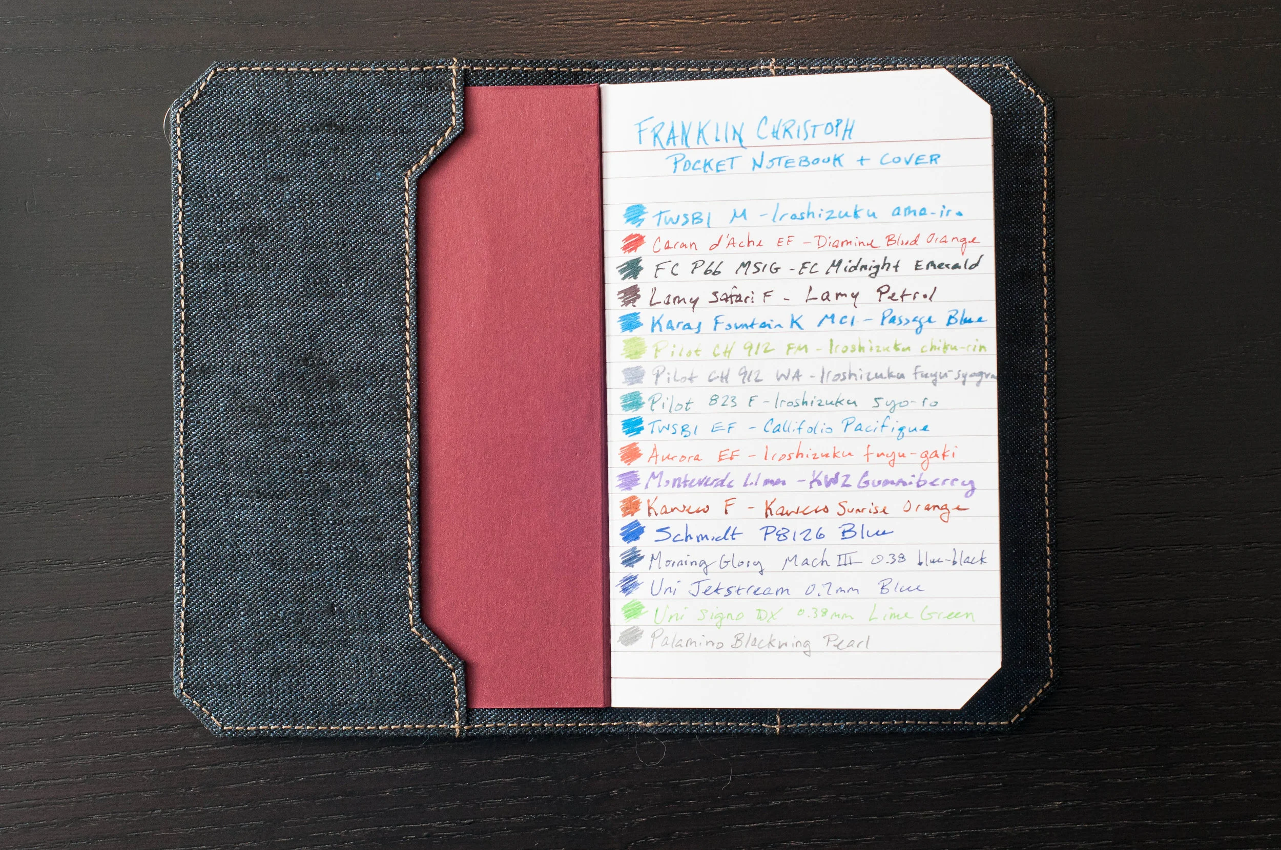
One unique feature that sets this notebook apart is the corner trimming. Most notebook opt for some sort of chamfered, rounded corner to make sure the corners don't snag and become tattered. Franklin Christoph went with a straight chamfer, which gives the notebook a unique look. It doesn't affect the usability of the notebook, so it's fine by me. I'm not sure I prefer this look, but it certainly doesn't detract from the experience.

One minor nitpick I have regarding the paper is the darkness of the lines in the lined version I have. It's a bit too dark for my tastes, which distracts me from my own writing or doodling. I prefer a lighter line weight so it can easily disappear into the background when convenient.

The cover material is a bit thin, but no different than comparable pocket notebooks. The binding is a tight binding that looks to be high quality, and I've been pretty happy with how it's held up. The pages open easily and don't have much trouble staying open. The same is true when the notebook is closed. It doesn't have an issue staying closed. Depending on the paper format, the cover will be a different color. For the lined version, the cover is a deep red color.

There is branding on the front and back of the cover, but it's minimal. The inside covers feature no writing/branding at all.

Finally: the paper. Made from bamboo, this paper handles different inks pretty well. I've noticed a little bit of bleeding and feathering with some inks, but it's minimal. Same thing goes for show-through. Depending on the ink/nib, you'll notice a fair amount of show-through on the back of the page. For me, my results varied. For pen/ink combos that resulted in lots of show-through, I wasn't able to comfortably use the back page. In general, the paper is fountain-pen friendly, smooth, and a nice off-white color.

In general, the Franklin Christoph pocket notebook is a great option in the pocket notebook space. I'd recommend trying one out with your next order or pen show visit.

As a bonus, I've also been using a fabric notebook cover from Franklin Christoph. There are several options available, both fabric and leather, and they're priced competitively. And, since the notebooks are a standard size, these covers will also fit other pocket notebooks (like Field Notes, etc.) as long as they adhere to the same size and trimmed corners standard.

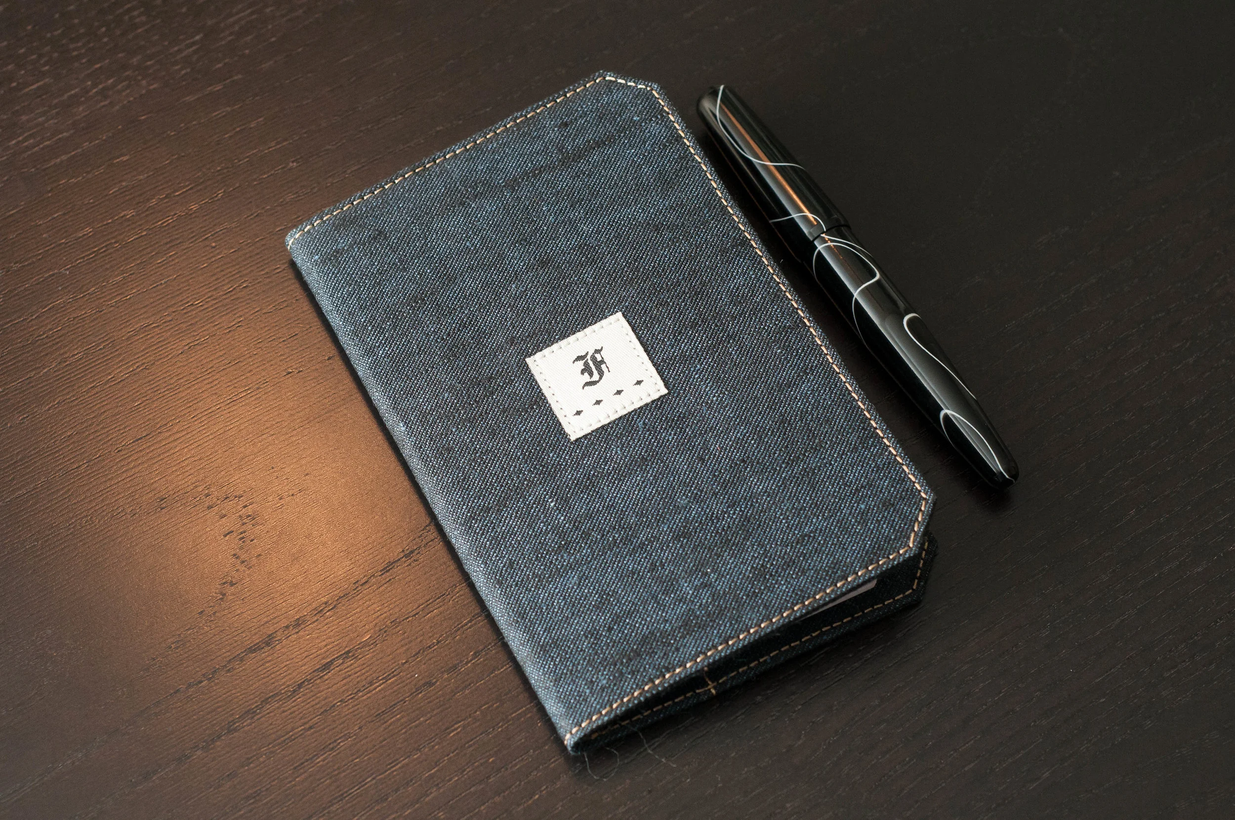
The cover I have is the Linen Blue fabric. It has a nice denim look and features a tasteful Franklin Christoph logo centered on the front of the cover, as well as a smaller logo on the back. The logos are also made of fabric and are sewn into the cover.

In the fabric covers, you have the option of Linen Blue, Linen Brown, Suite Gray, and Suite Blue. They all cost $20 each, which is a pretty good deal.

They also offer these covers in leather. The FxCel Black and FxCel Brown covers are only $25, which is also a great price.

The covers feature pockets in the front and back with which to hold the notebook covers. I'm using mine with only one notebook, and it's pretty snug and secure. Although, you can fit two notebooks into one cover. This presents a nice option if you'd like to carry more than one notebook in a convenient cover.

The size of the cover is large enough to protect the notebooks, and it seems to be made pretty well. I can't see any wear so far, but I'm sure the fabric will fade a bit as it is used more. The tan stitching around the edges is a nice touch to the overall aesthetic. If you purchase a notebook cover, it comes stocked with one ruled notebook.

Overall, I've been enjoying the Franklin Christoph cover as a compliment to the notebook. It adds a degree of protection and also convenience if you want to easily carry two notebooks as one. The fabric is a nice departure from the standard leather fare, but you also have a couple of leather options if that's your preference. Again, check them out next time you're at a pen show, or throw one into your cart with your next order!

(Franklin-Christoph provided this product at no charge to The Pen Addict for review purposes.)


Enjoy reading The Pen Addict? Then consider becoming a member to receive additional weekly content, giveaways, and discounts in The Pen Addict shop. Plus, you support me and the site directly, which I am very grateful for.

Membership starts at just $5/month, with a discounted annual option available. To find out more about membership click here and join us!

Posted on September 13, 2017 and filed under Franklin-Christoph, Notebook Reviews.

Franklin-Christoph S.I.G. Flex Nib Review

I’ve had my Franklin-Christoph S.I.G. Flex Nib in regular use for a couple of months now, and I find two statements to be true about it’s performance:

  • It is an awesome feeling nib.
  • There is little line variation.

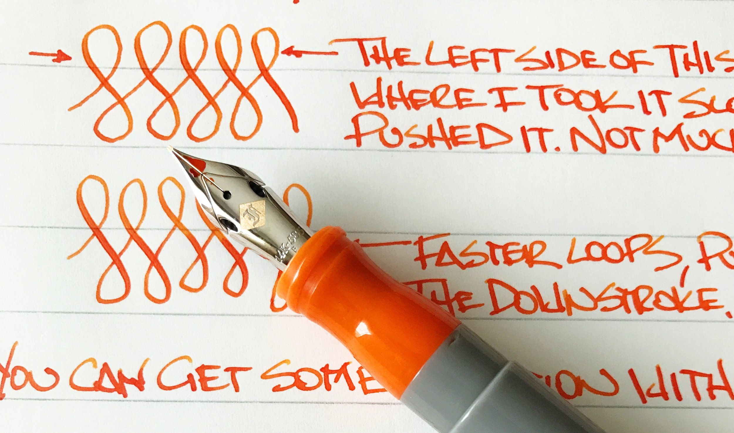
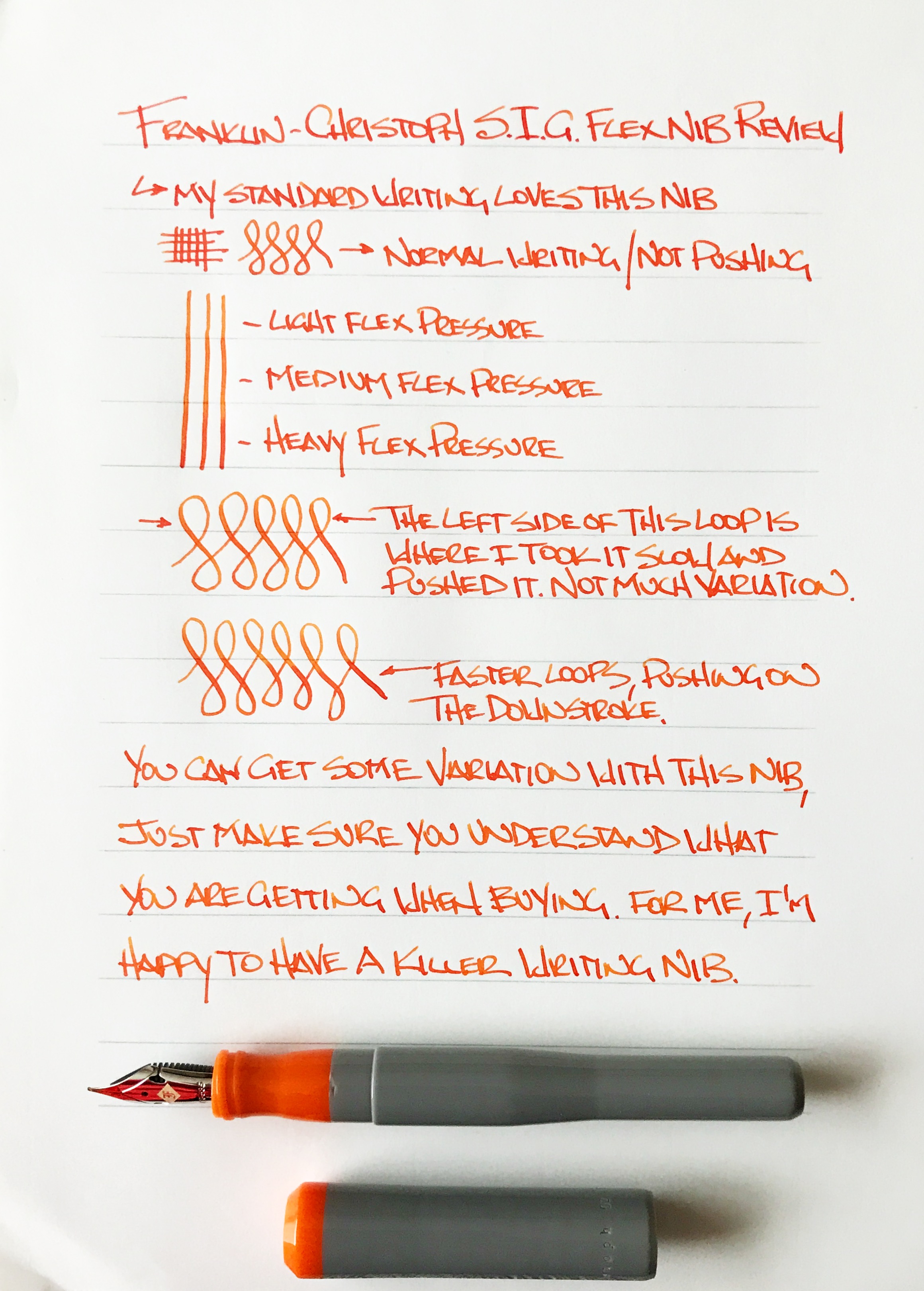
When I have talked about this nib in other places I keep saying it is not a flex nib. That’s not exactly true. It does flex in the literal sense, as in the tines spread and the nib bends, but it does not provide what I consider to be flex nib output, meaning noticeable line variation when pushed. Not with light pressure, not with heavy pressure. But that doesn’t keep this nib from being great in my book.

What this nib provides is bounce, not flex. You can push the nib and watch the tines spread. It is a fantastic feel, and a great writing experience. Just don’t expect much line variation. My fine S.I.G. grind goes from a medium width line to a mediumer line. And I’m ok with that because my line looks great and the nib feels great.

S.I.G. stands for Stub Italic Gradient, which is a nib grind done by F-C’s in house nib meister Jim Rouse. It is perfect for someone like me who enjoys a cursive italic grind but without the sharp edges is often comes with. This grind smooths those edges out while keeping the horizontal and vertical line variation that I enjoy so much.

To achieve flex in this nib, Jowo (the nib manufacturer) added cutouts above the shoulders of the nib. In theory, this allows the tip to be pushed when writing for added flex. The output just isn’t as impressive as the look. Nib meisters have added cutouts and slits to nibs for years to provide added flex. Jowo, and other nib manufacturers, are now adding this feature as a stock offering, which is a good sign that they are listening to us consumers. Just don’t be confused about what you are actually purchasing.

If you are looking for line variation as found with a traditional flex nib, this is not the nib for you. If you are looking for a wonderful writing nib with a ton of character and fun, then check out the S.I.G. flex nib. I’m completely enamored with mine and enjoy using it. I may even add a second one to the lineup one day.

(This nib was purchased at full price with my own funds.)


Enjoy reading The Pen Addict? Then consider becoming a member to receive additional weekly content, giveaways, and discounts in The Pen Addict shop. Plus, you support me and the site directly, which I am very grateful for.

Membership starts at just $5/month, with a discounted annual option available. To find out more about membership click here and join us!

Posted on September 11, 2017 and filed under Franklin-Christoph, Fountain Pens, Nibs, Pen Reviews.