(Jeff Abbott is a regular contributor at The Pen Addict. You can find more from Jeff online at Draft Evolution and Twitter.)
In Australia, Robert Oster has been producing some unique, beautiful inks that I'm sure we've all heard of. One of the more famous ones is Fire and Ice, which has a lovely blue shade and gobs of red sheen. Be careful looking at the collection of Robert Oster inks — you'll want to pick up a surprising number of delicious inks to try.
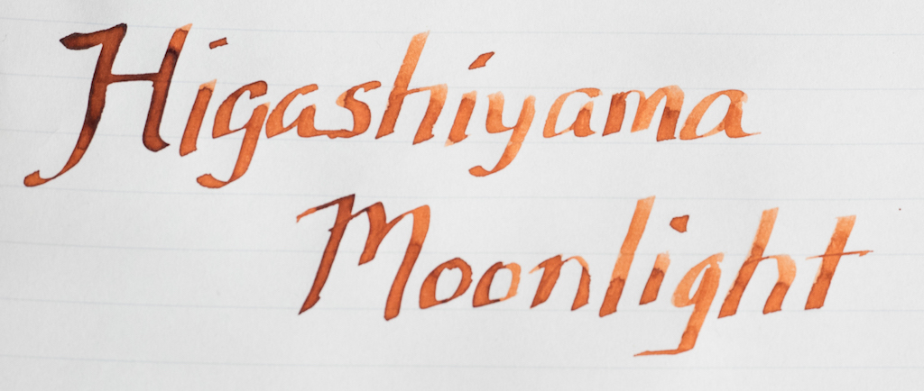
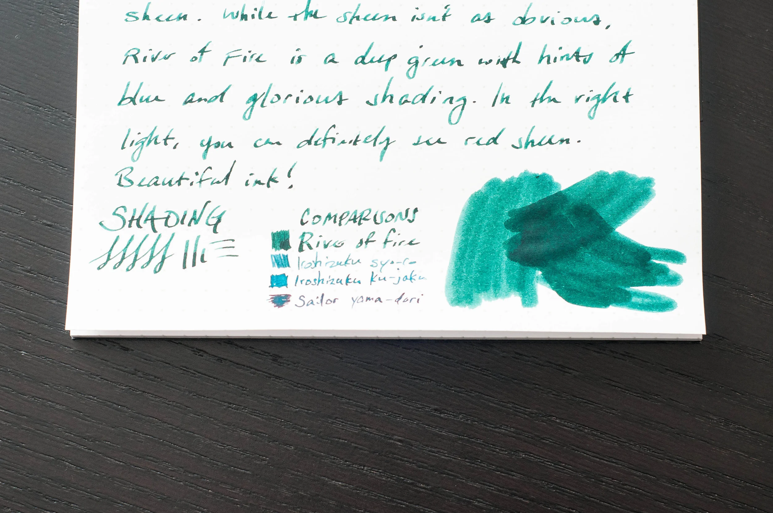
One of the new inks for 2017 is River of Fire — a gorgeous dark green with hints of blue and subtle red sheen. It's a beautiful ink that performs admirably at a decent price.
From JetPens, here's a short description of Robert Oster and his inks:
Inspired by the rich scenery and culture of Australia, Robert Oster inks are available in a stunning selection of vibrant and contemplative colors. Made with a commitment to environmental friendliness, all Robert Oster inks are non-toxic, 100% made in Australia, and bottled in PET plastic bottles from the country's first carbon-neutral plastics plant.
The environmental-friendly aspect is pleasing enough, but throw in the lovely colors and you've got a real winner.
River of Fire is a lovely green with hints of deep blue. It reminds me of a glimmering river, shifting from dark green, light green, and blue as it flows. It's a beautiful shade, and there's plenty of it. The saturation is phenomenal, and you never feel like it's not dialed up enough to let those gorgeous colors shine through. This is an ink that deserves a fat, wet nib to showcase its beauty and hidden attributes.

While the main color for River of Fire is medium to dark green, it has a lovely amount of shading between the greens. It shades easily and often, regardless of nib. There are blue undertones, and those come out more when using a wetter nib, so keep that in mind.
Like its cousin, Fire and Ice, there's a bit of red sheen at times. It isn't as prominent as the sheen in Fire and Ice, but it's there if you have the right light. To my eye, it's mostly red sheen, but I pick up blue/green sheen as well. It's a real delight when you see these characteristics pop up when you aren't expecting them. What looks like a normal, nicely shaded green ink has some sheeny tricks. To get the best results for sheen, use a really wet nib and Tomoe River paper.
The bleed and feathering factor of this ink is incredible. Even when using wide, wet nibs, this ink keeps its cool. I've tried it on all the paper types I own, and I haven't seen any bleeding, feathering, or show-through. It's really incredible. That green goodness stays where it's supposed to.
Another surprising attribute of River of Fire is the dry time. The dry time ranges from 5-20 seconds depending on the nib and paper, but I was shocked to get consistent 8-10 second dry times using a 1.1mm stub (broad side) on Clairefontaine. That's incredible. On other papers, the dry time is more consistent with other inks, coming in around 15-20 seconds in the darker, pooled areas. For most writing conditions, 10-12 seconds seems to be the average.
The flow and lubrication of this ink is also top-notch. It starts consistently, has no issues with skipping or stuttering, keeps well when uncapped for a couple of minutes, and lubricates the nib well. This really helps out when using a wide nib, because the ink flow has no problem keeping up with the amount of ink required in such a large nib.
I'm still only dipping my toe in the Robert Oster well, but I know I'll certainly be trying out others. If there was a "one of each" sampler pack of Oster inks, I'd be all over it. It's a slippery slope, but one worth sliding down if you enjoy unique, well-behaved, nuanced inks that pack a punch.
JetPens has a huge range of Robert Oster inks available, and at $17 for a 50ml bottle they are an excellent value.
(JetPens provided this product at no charge to The Pen Addict for review purposes.)
Enjoy reading The Pen Addict? Then consider becoming a member to receive additional weekly content, giveaways, and discounts in The Pen Addict shop. Plus, you support me and the site directly, which I am very grateful for.
Membership starts at just $5/month, with a discounted annual option available. To find out more about membership click here and join us!