Posts filed under Ink Reviews

PENBBS No. 85 Fountain Pen Ink Review

I never cease to be amazed at how much I miss after so many years attending pen shows and following pen-related news. Inevitably, there's always a product or even an entire company that has floated below my radar for a significant amount of time. In some ways, it's really exciting to discover something that other people have been enjoying for years, but it's also a bit embarrassing!

This is exactly the case with the ink company PENBBS. Based in China since 2005, this is an ink company that has a very simple naming process for their inks — they're all numbered. This makes it easy for stock and inventory, but it can be a bit taxing to keep track of the actual color-to-name mapping.

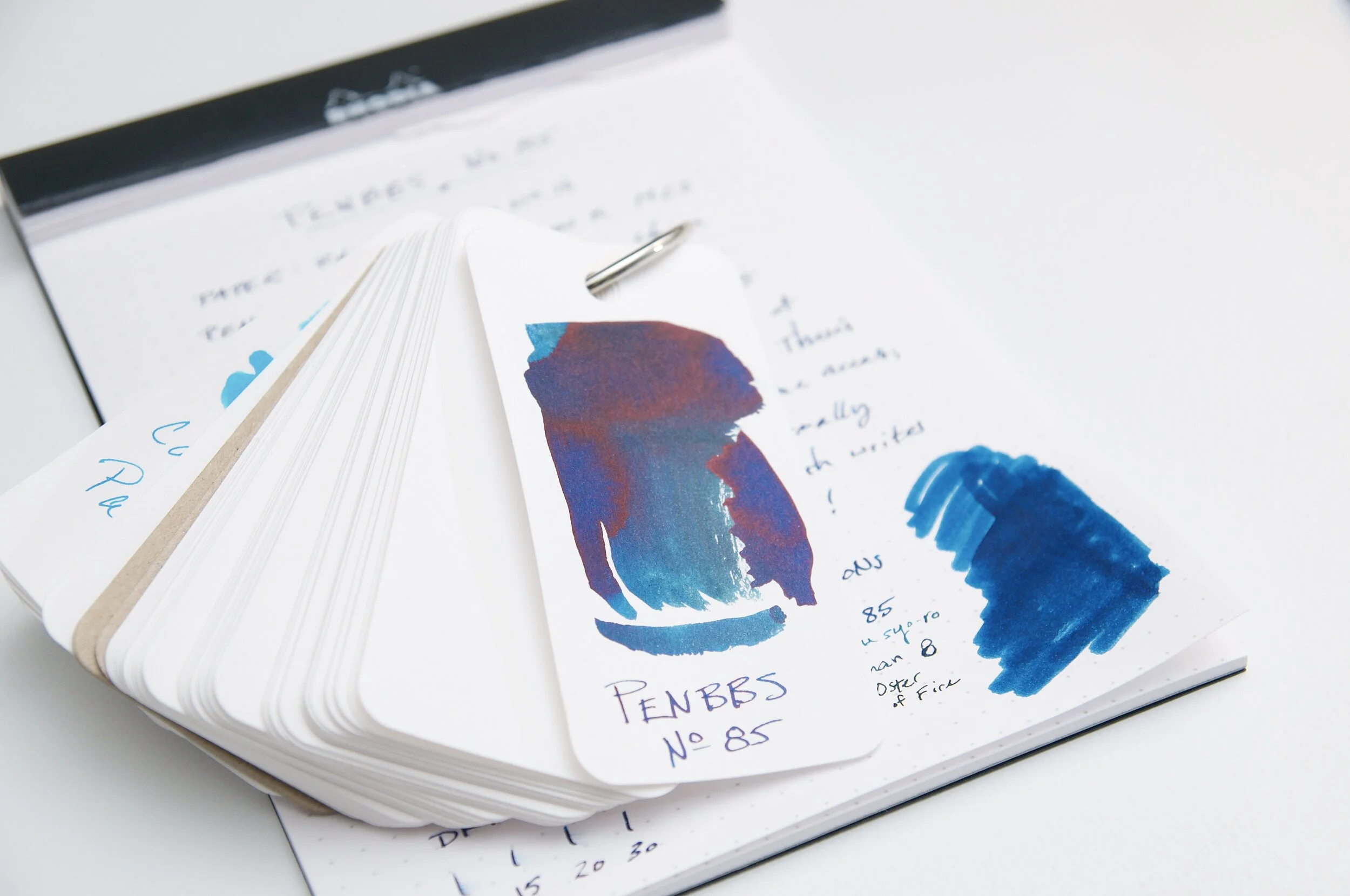
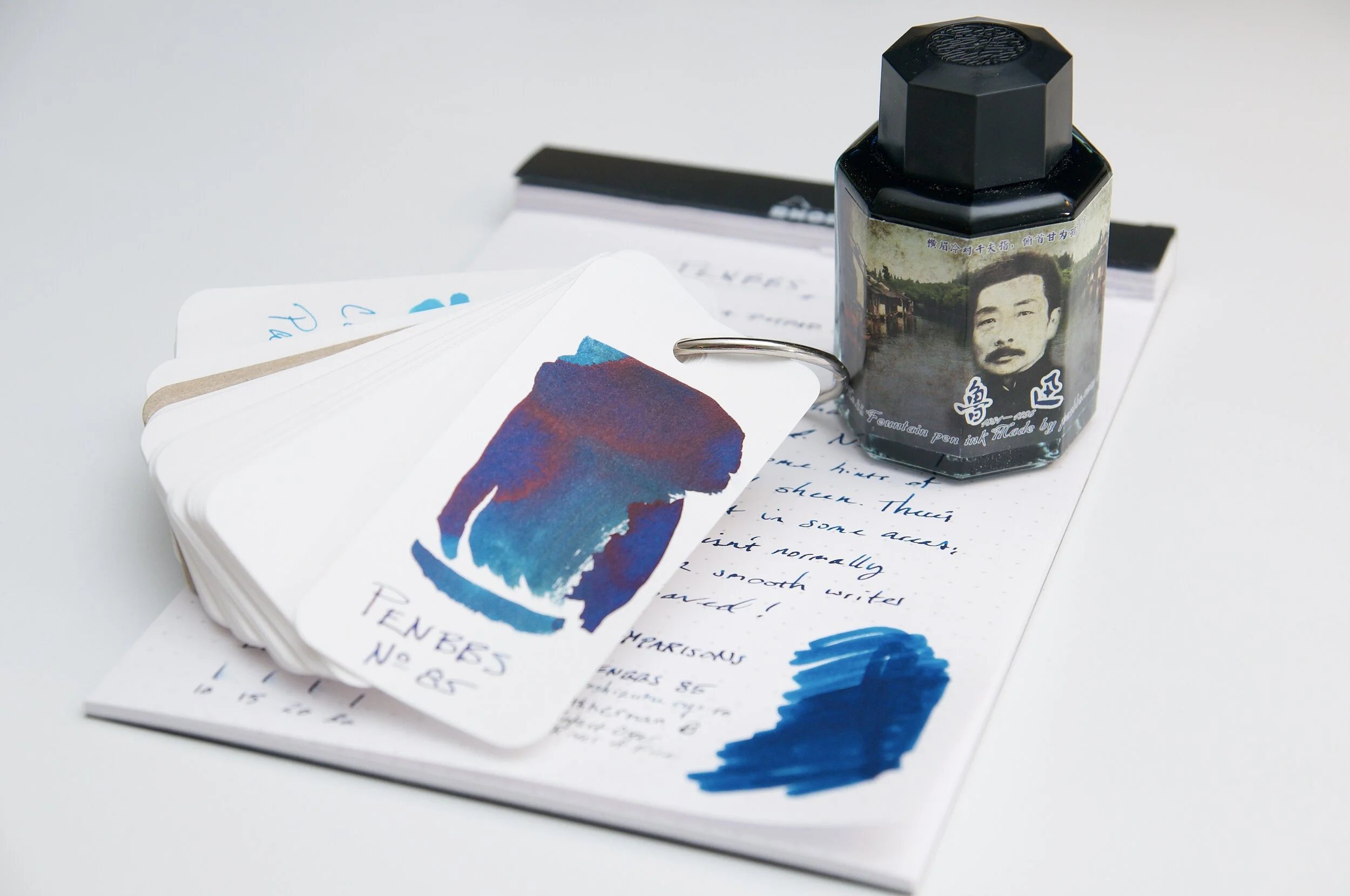
Number 85 is the one that I have the privilege of reviewing today, and it's one that will remain in my regular rotation. Since the name doesn't offer any indication of the color, I feel it's important to start out with a quick description of this ink's color. 85 is a dark blue with slight green hints in certain light, but it also features an amazing red sheen that isn't difficult to tease out.

I've really enjoyed using this ink in my medium cursive italic nib (ground by Mark Bacas), and I feel like it really shows off the possibility of shading this ink offers. If you're using a nib that's any smaller or drier than this, you really won't notice much shading at all. This is expected out of a dark ink, but just something to mention if high levels of shading are important to you.

The sheening factor is what really draws me to this ink. Sure, you also have to use a fairly wet or broad nib to see this feature, but it really is worth it. The red sheen that dries on top of this ink is fantastic. It's really prominent in ink swabs, but it also shows up in ordinary strokes as you're writing. It's a delightful little surprise when the light catches the page just right. If you're a fan of red sheen, this ink does not disappoint.

Writing with this ink has been a joy. Like any italic nib, the one I used to photograph this sample can get a bit scratchy if you hold it a bit off its center stance. With this ink, I could tell that the scratchiness wasn't as prominent when I was holding it a bit off the right angle. This is a huge testament to any ink; the lubrication and flow really are wonderful and can do wonders for a dry nib or slow feed.

In my testing, I didn't experience any bleed or feathering on my Rhodia, Leuchtturm, or Apica papers, but I did notice some feathering when I used this ink/nib comination in a Baron Fig notebook. Now, the Baron Fig paper is very different from the Japanese/German fountain pen papers in that it is also meant to handle some light sketching. The paper is really absorbant and has a lovely tactile feedback that I love. But, it also displays feathering and bleeding more often than other notebooks I use. That being said, I don't think this ink exhibits an unusual amount of feathering or bleed for a dark blue ink on this paper. On the typical papers I use, there were zero issues, but you should take this into consideration if you primarily write on absorbent paper.

Dry time for this ink isn't amazing, but it also isn't horrible. At around 15 to 20 seconds, it's typical for most fountain pen inks that don't already advertise an unusually quick drying time. It's quick enough to mostly dry before slapping your notebook shut, but you should be careful of the previous sentence or so while writing.

This ink doesn't advertise any type of water resistance at all, so I wasn't expecting much. As you might expect, it bleeds like crazy when exposed to water, but the main line doesn't wash away. It's not permanent by any means, but it can withstand an accidental spill or rain torrent if you can prevent the paper from getting smeared.

I really like how this ink performs in the pen and nib, but the cleaning process is equally important for your fountain pens. The PENBBS 85 ink is extremely well-behaved. It is incredibly easy to wash out and doesn't leave behind any residue or stains in the converter. I have no worries about leaving this in my pen for months on end!

PENBBS 85 is available at Vanness Pens in a couple of different options. If you want to go all in, the 60ml bottle will cost you just $16. This is a great deal for the volume of ink you receive. But, if you're not ready to commit just yet, you can also pick up a 4ml sample vial for a couple bucks.

85 is a lovely dark blue with a hint of green and a lot of red sheen. I've become a really big fan of this ink in the few short weeks I've been using it, and I'm excited to see what else this ink maker has to offer.

(Vanness Pens provided this product at no charge to The Pen Addict for review purposes.)


Posted on November 20, 2019 and filed under PenBBS, Ink Reviews.

Vinta Pink Sands Shimmer Santa Cruz 1983 Ink: A Review

(Susan M. Pigott is a fountain pen collector, pen and paperholic, photographer, and professor. You can find more from Susan on her blog Scribalishess.)

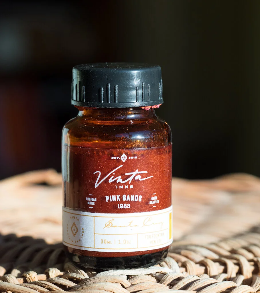
Vinta Ink is made in the Philippines, with Pink Sands named for the coraline sands that line the beaches of the Great Santa Cruz Island in the southern part of the Philippines.

The ink comes in a box labeled “Santa Cruz” with a tiny swatch of the color. Although the box looks nice, I found the lettering really hard to read, and assumed that the ink color was called Santa Cruz. That’s not a big deal, because the bottle itself has “Pink Sands” written clearly on it (if you’re smart enough to look closely, which admittedly I wasn’t, which is why all my writing samples call the ink “Santa Cruz.” I need bifocals.

Although the ink name is Pink Sands, the color is definitely more of a bright peach. This is explained in the ink’s description, which says the color is supposed to evoke the pink beach at sunset. The shimmer in the ink is both pink and rose gold.

When I opened the bottle, I was surprised to discover what looked like sandy growths on the bottle threads. This “ink crud” seems to plague orange inks, but, in this case, the shimmer definitely contributed to the crusty deposit.

I’ve had the ink in my TWSBI Eco for over a week and the crud didn’t collect on my nib. This is likely because, being a ding dong, I didn’t realize this was a shimmer ink. I didn’t shake the bottle before inking my pen, thus, no shimmer was drawn in. I suspect, had I shaken the bottle and inked the pen properly, sandy formations would’ve appeared on the nib.

Vinta Pink Sands is a bright peach color with yellow and pink gold shimmer. The color is fairly uniform on the Col-o-dex card swab and offers little shading (but lots of shimmer) when writing with a Brause Blue Pumpkin nib. The ink splats are interesting because they actually dry with tangible edges to them.

I tested the ink on Rhodia dot pad paper. Again, you can see that the ink is uniform in the swab and on the ink bottle print. The color is bright and quite readable. It is a slow-drying ink and it is not waterproof.

Chromatography reveals only slight variations of color in this ink. It contains some pink but peach predominates.

Big ol’ Texas-sized nibs really show this ink off. I used my Handwritmic nib on MD Cotton paper, and . . . just wow! There’s gorgeous shading, pooling, and sheen.

Overall, I’m not a fan of this particular color. It’s a little too bright for my tastes (I prefer darker oranges with lots of shading). And, I’m not too keen on shimmer inks. I always worry about the shimmer gunking up my nib and clogging the converter or piston mechanism.

I plan to try other Vinta inks, first because they’ve created some really interesting colors. Second, I appreciate that the company donates 25 Philippine pesos to Teach for the Philippines, Inc., an organization that advocates for quality education for all Filipino children.

You can purchase Vinta Pink Sands Shimmer Santa Cruz 1983 from Vanness Pens for $13.99 (30ml) or $3.00 for a 4ml sample.

(Vanness Pens provided this product at no charge to The Pen Addict for review purposes.)

Enjoy reading The Pen Addict? Then consider becoming a member to receive additional weekly content, giveaways, and discounts in The Pen Addict shop. Plus, you support me and the site directly, for which I am very grateful.

Membership starts at just $5/month, with a discounted annual option available. To find out more about membership click here and join us!

Posted on November 15, 2019 and filed under Vinta, Ink Reviews.

Sailor Ink Studio 941 Review

Sailor Ink Studio fountain pen inks have been all the rage since the first pictures of the 100 inks in this collection hit the internet. The premise of this collection is to feature the 100 favorite inks from Sailor’s in-shop Ink Studio events, where customers were allowed to mix their own colors. According to Sailor, this final group was narrowed down from over 20,000 (!) creations.

Image via Sailor Japan.

And you think you have an ink problem?

I had been wanting to try out these inks myself, but aside from a few samples I had been given, I didn’t put in the effort to track them down. There was nothing I saw that felt must-have, but seeing that Sailor is my favorite ink brand, I knew I would dive in head first when the opportunity presented itself.

Opportunity to all in the US market came this summer, as these inks made their way into retailers hands. But there was a catch to ordering: You could not buy them online. Why the silly restriction? Your guess is as good as mine. So, you had to buy them in person at a shop or pen show, or call a retailer to place an order over the phone.

Fortunately, that restriction has been recently lifted, as you can now order Sailor Ink Studio inks online.

I bought mine in person on my recent visit to Dromgoole’s, where I went in with a list based on samples provided by Macchiato Man and Mountain of Ink, each of who swabbed all 100 colors. Pictures on a screen may never do inks justice, but I figured this was as good of a starting point as any.

My eyes trained on five colors:

450 - A dark/dusty purple.

731 - A hot pink with sheen.

767 - A yellowish green.

773 - A bright orange.

941 - A blue black with a slight teal undertone.

4 of the 5 came home with me, with 731 the only not available during my visit. All of these color choices are within my realm of likes, with no real outliers, like the hugely popular Sailor Ink Studio 123.

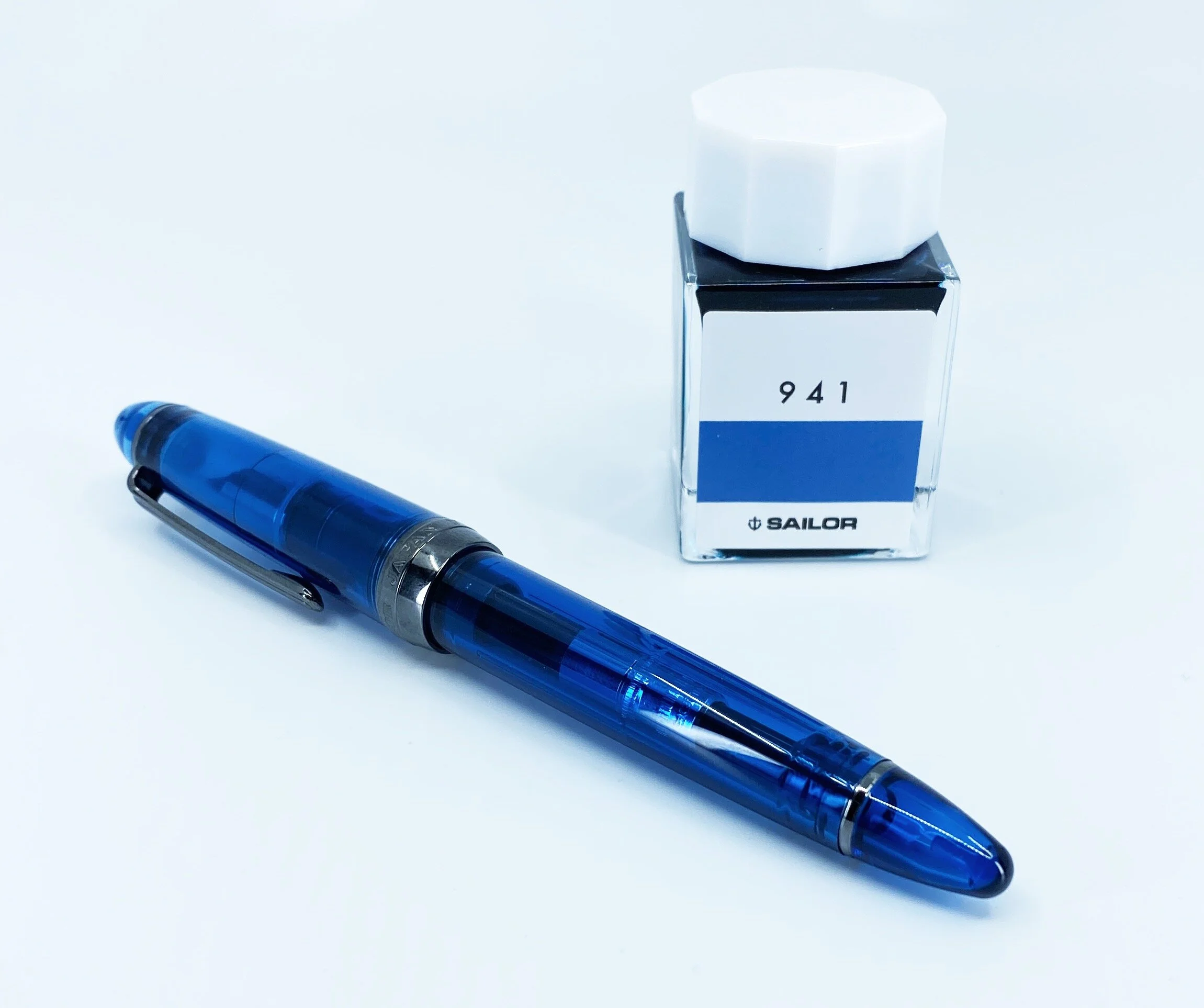
I plan on testing all of these inks out eventually, but 941 was the easy first choice. Not only is it part of one of my favorite color groups, it is a very close match to the Sailor 1911 4 a.m. fountain pen I purchased on the same trip. Matchy matchy!

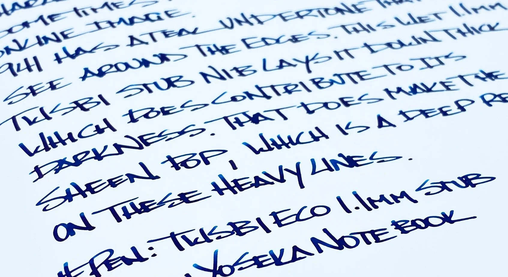
After a couple of weeks of use, I am very happy with the color and the performance. It’s a bit darker than I thought prior to seeing it in person, but not too dark to where you can’t tell the character of the ink. Lighter, brighter hues pop out on thinner lines, and it has a nice, dark red, sheen when dry. For a blue black ink, I find it quite fun.

Not that I would expect anything different, but standard Sailor ink properties apply, with good flow, lubrication, saturation, and a moderate dry time. They are also expensive, checking in at $18 for a 20 ml bottle. That may sound cheap, but it’s not, considering you can get 50 ml of the equally as great Pilot Iroshizuku for $20.

I went simple and straightforward with my initial choices, and while I am happy with them, I think next time I will experiment more and try some of the outlier inks that have made the Sailor Ink Studio lineup so popular.

(I bought this ink at a discount from Dromgoole's.)


Enjoy reading The Pen Addict? Then consider becoming a member to receive additional weekly content, giveaways, and discounts in The Pen Addict shop. Plus, you support me and the site directly, for which I am very grateful.

Membership starts at just $5/month, with a discounted annual option available. To find out more about membership click here and join us!

Posted on November 11, 2019 and filed under Sailor, Ink Reviews.