Posts filed under Ink Reviews

Sailor Ink Studio 773 Review

(Sarah Read is an author, editor, yarn artist, and pen/paper/ink addict. You can find more about her at her website and on Twitter. And check out her latest book, Out of Water, now available where books are sold!)

Sailor inks are some of my favorites, but the new Ink Studio line that has released over the last year has really captured a lot of hearts. There are a few standout colors in the line, and I was so enchanted by those that I didn't notice number 773 at first. Now that I've had a chance to use it, I find it every bit as enchanting as those ultra-popular colors, and now I wonder if the entire rest of the Ink Studio line is just as amazing.

I thought this was an orange ink, when I first saw the bottle, and I wondered if it would be too similar to a dozen other orange inks. I love orange inks, but it's a color that I really don't need more than two of, as fun as they are. However, I've decided that this is really a coral ink, and therefore it bypasses any arbitrary color rules I may have set for my collection.

773 shows its nuanced character immediately on the page. It looks complex, even when drawn with a fine nib. The chromatography is bright and wild, with a bubblegum pink fading into saffron yellow--but it wasn't a surprising color split to see. The pinks and yellows come through in the coral color itself. The very saturated swab even shows a hint of gold sheen where the ink pooled. I haven't seen it in my writing yet, but the capability is there, given the right nib/paper combination. It shows wonderful shading, even in a fine nib, that looks like a soft guava color in the lighter areas, and a bolder coral where it pools.

It isn't very similar to any of the inks in my collection. It's much to orangey for comparing to the pinks, and too rosy for the oranges. I haven't, personally, tried any comparable colors.

The ink writes smoothly and doesn't feel dry, but it has a fast dry time compared to a lot of inks. It went from fairly lubricated at ten seconds to almost completely dry at 15, like there's a magical off-switch in its chemistry.

It has almost no water resistance, disappearing quite completely even when it's gently patted dry.

The Ink Studio line comes in small, 20ml glass bottles. They're sturdy and not difficult to fill from--much nicer than the squat, round bottles they sometimes use. But also much smaller, and 20ml retails for around $18, making this quite a pricey ink. It's an expensive line, but one with a number of colors that I don't think can be easily matched to another, less expensive brand. They're also not the easiest inks to obtain, as they're only sold through stores with a brick-and-mortar presence.

Many of the Ink Studio colors are captivating enough that people are tracking them down and happily paying the higher cost. I think 773 is one of those worth-it colors. I'm nervous, now, to meet any more of the Ink Studio line. If they're all this subtly lovely, we could be in real trouble.

(Dromgooles provided this product at a discount to The Pen Addict for review purposes.)


Enjoy reading The Pen Addict? Then consider becoming a member to receive additional weekly content, giveaways, and discounts in The Pen Addict shop. Plus, you support me and the site directly, for which I am very grateful.

Membership starts at just $5/month, with a discounted annual option available. To find out more about membership click here and join us!

Posted on January 30, 2020 and filed under Sailor, Ink Reviews.

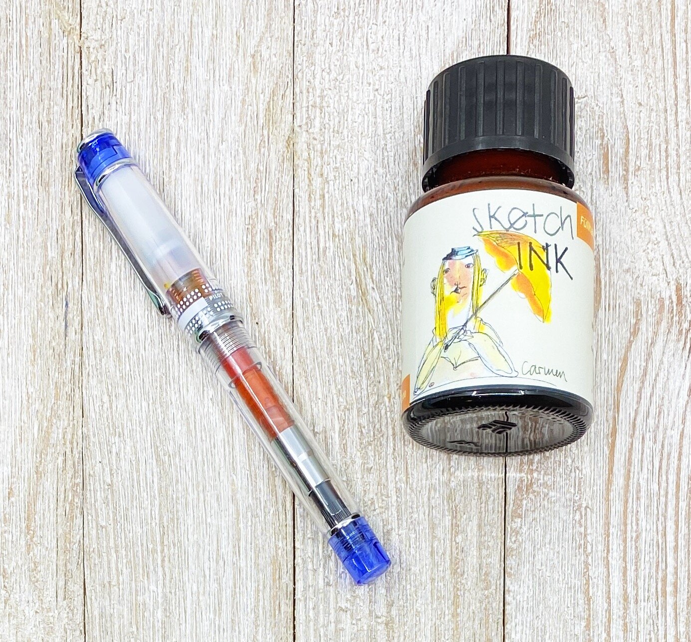
Rohrer & Klingner sketchINK Carmen Fountain Pen Ink Review

Let’s get one thing cleared up real quick: Choosing a demonstrator barrel fountain pen may not have been the choice for this review. As you will soon find out, Rohrer & Klingner sketchINK Carmen is a pretty darn good ink, but I must admit that “Liquid Rust” or “Damp Tang” are suitable monikers for how it appears in this pen.

The odd color is actually there for a reason. Rohrer & Klingner sketchINKs are pigmented inks, and they tend to have a more cloudy appearance than their standard fountain pen ink friends. That’s a feature if you are looking for a waterproof, lightfast, and quick dry ink for general writing, journaling, and artwork.

I skipped over these when they first launched, thinking why do I need an ink with all of these additional features that I traditionally don’t care about? Well, I still don’t need to draw with ink pens over a layer of sketchINK, or wash over them with a watercolor brush, but others do, and maybe they would like to explore a little.

And, as it turns out, sketchINKs are pretty good general writing inks, too.

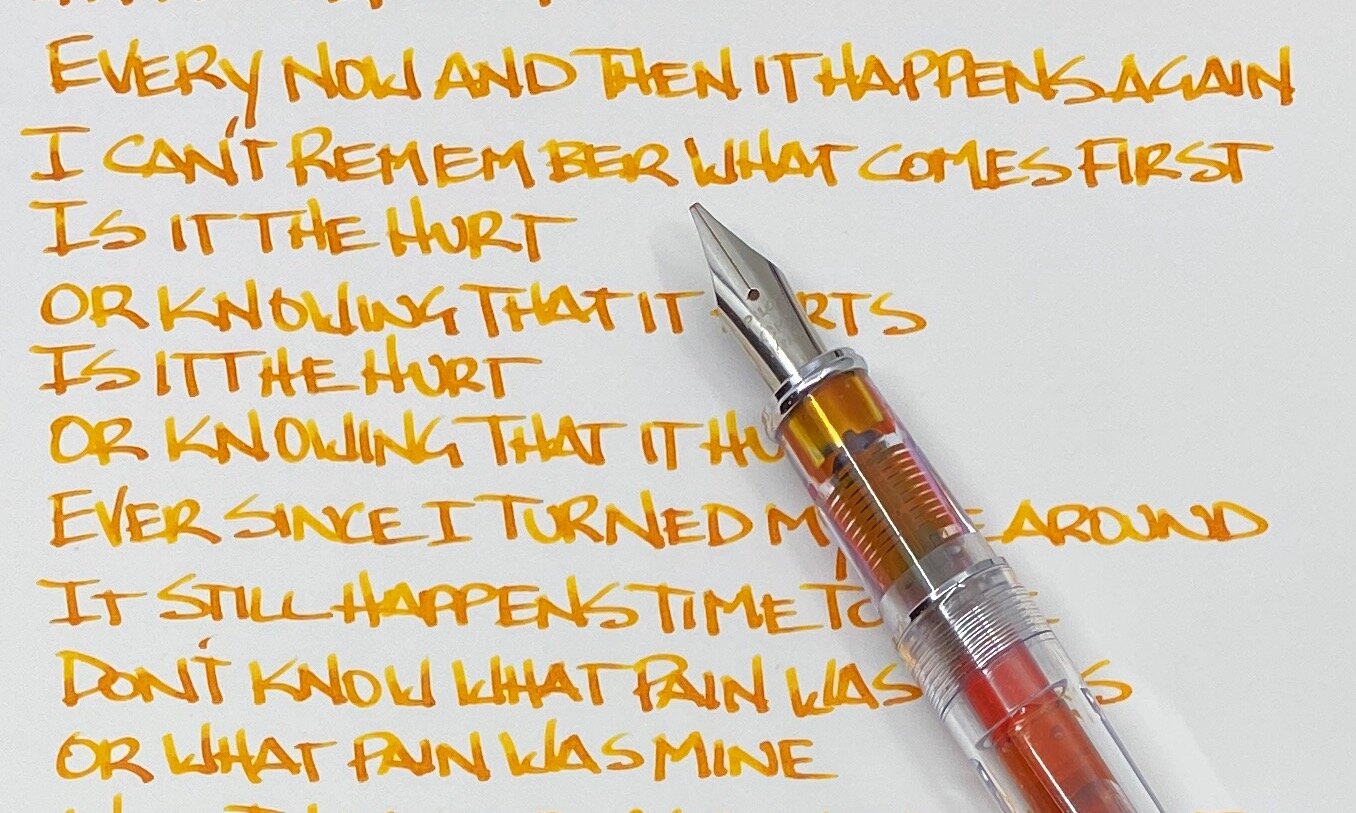
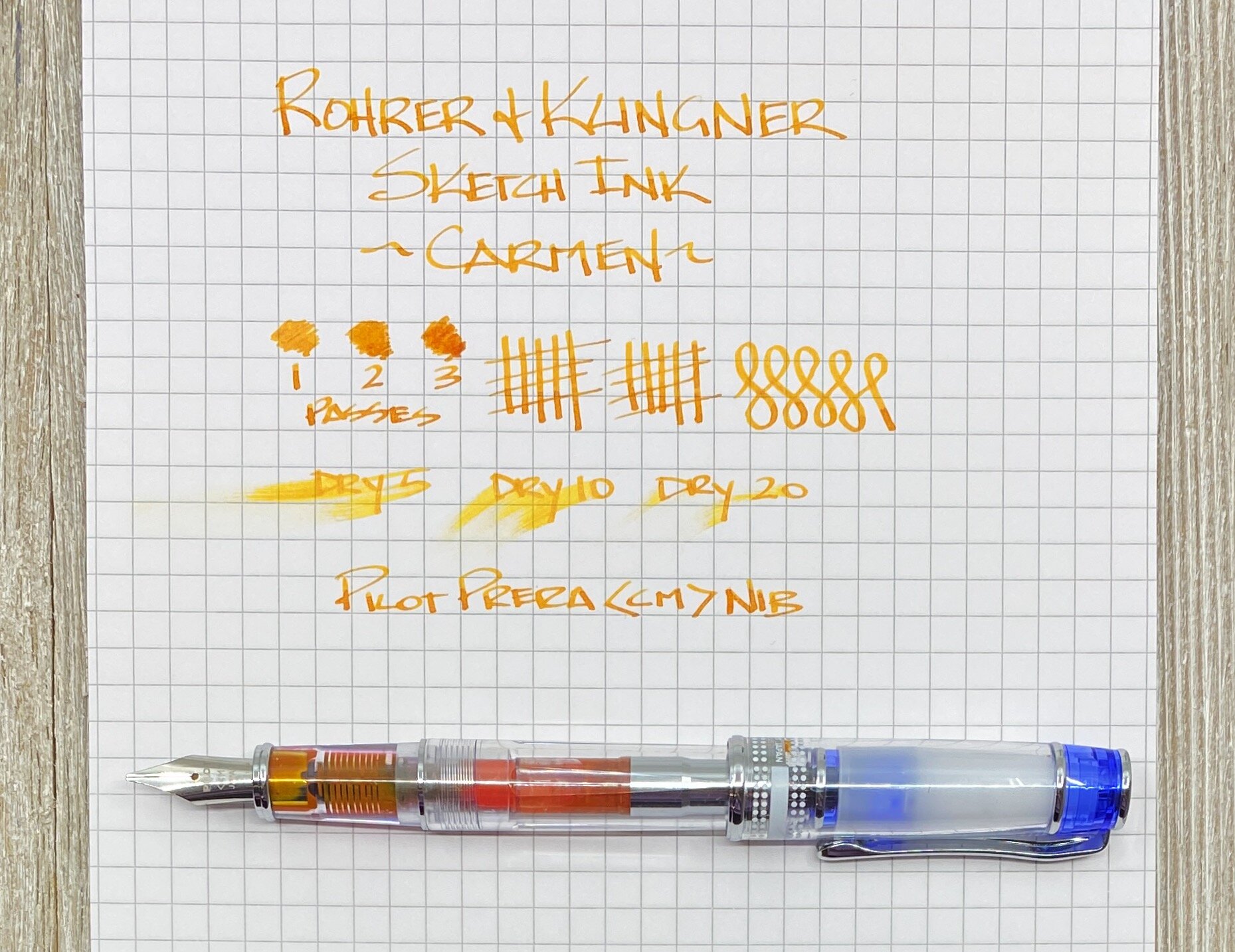
I chose a Pilot Prera with a CM (Calligraphy Medium) nib for this review, which is Pilot’s cursive/stub hybrid nib that checks in around 1.0 mm wide. While Carmen, and other sketchINKs are designed to work well with any nib width due to their ink flow, I wanted to see what character was in this shade.

The orange-yellow color is bright, and exhibits a decent amount of shading that I was surprised to get. The ink flow is fantastic, as advertised, and the dry time is average to above-average on Rhodia paper. I also did a quick test on Field Notes stock paper to see how it would perform, and it wasn’t good at all. Bleeding and feathering galore, which is the expectation from a pigment ink on this paper. Other lighter, thinner, absorbent papers will perform similarly.

The only downside to pigment inks are that you need to ramp up your pen cleaning program. JetPens recommends cleaning your pigment inked pens every four to six weeks, or if you don’t plan on using them for more than a week. They tend to clog up when not being used, but the actually cleaning part is easy and normal if you keep up with it.

Rohrer & Klingner sketchINK comes in 10 different shades, and I have picked up Frieda to test out as well, but with an extra fine nib. At $12 for a 50 ml bottle that decision was simple. For more on how sketchINKs work in more artistic situations, take a look at this great review from Parka Blogs.

(JetPens provided this product at no charge to The Pen Addict for review purposes.)


Enjoy reading The Pen Addict? Then consider becoming a member to receive additional weekly content, giveaways, and discounts in The Pen Addict shop. Plus, you support me and the site directly, for which I am very grateful.

Membership starts at just $5/month, with a discounted annual option available. To find out more about membership click here and join us!

Posted on January 6, 2020 and filed under Rohrer & Klingner, sketchINK, Ink Reviews.

Diamine Inkvent Calendar Day 25

Merry Christmas everyone!!! As usual, I spent Christmas Eve waking up every hour until the kids came in at 6:00 a.m. to open presents. Yes, they’re in college, but it’s tradition!

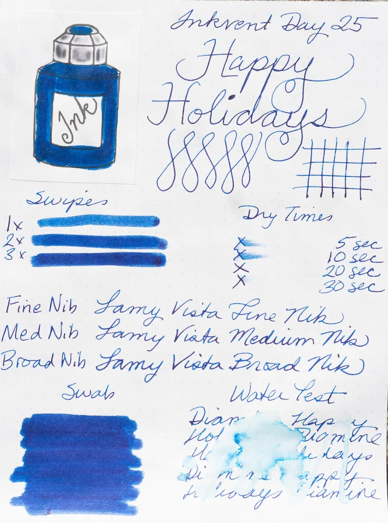
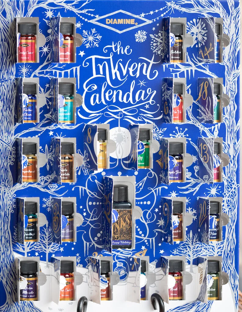
The ink for Christmas Day is called Happy Holidays. It’s a shimmer and sheen ink, and it comes in a 30ml bottle.

Happy Holidays is a blue/purple ink (primarily blue but with purple/magenta sheen), and I believe the shimmer is silver (in close up pictures it looks light blue).

I love, love, love blue inks, so I’m happy that the December 25th ink is blue. And it’s a pretty spectacular blue at that. The cobalt color shows up well in any size nib and that magenta sheen is fantastic. As always, if you want the shimmer to show up, it’s best to use wide nibs.

So, we’ve come to the end of the Diamine Inkvent Calendar. Now all twenty-five doors are open and all the inks are revealed.

I did an inventory of the twenty five inks in terms of color distribution. There were

  • Six blue inks: Blue Peppermint, Polar Glow, Jack Frost, Festive Cheer, Midnight Hour, and Happy Holidays
  • Five red inks: Candy Cane, Ho Ho Ho, Noel, Mulled Wine, and Poinsettia
  • Four brown inks: Triple Chocolaté, Nutcracker, Gingerbread, and Roasted Chestnut
  • Four green inks: Mistletoe, Elf, Season’s Greetings (teal), and Holly
  • Two purple inks: Winter Miracle and Purple Bow
  • One yellow/gold ink: Gold Star
  • One orange ink: The Embers
  • One grey/silver ink: Snow Storm
  • One grey/black ink: Winter Solstice

Of these, my favorites are: all the blue inks, Noel, Mistletoe, Winter Miracle, and Winter Solstice. What are your favorites? Let us know in the comments.

I hope you’ve enjoyed these posts. I tried to do more than just ink reviews. I incorporated some of my favorite Christmas memories--memories evoked by the various inks in the Inkvent Calendar. I’ve enjoyed opening each door with you for the past twenty-five days.

I hope you all have a very Merry Christmas and a Happy New Year!

(Cult Pens provided the Diamine Inkvent Calendar to Pen Addict free of charge for review purposes.)


Enjoy reading The Pen Addict? Then consider becoming a member to receive additional weekly content, giveaways, and discounts in The Pen Addict shop. Plus, you support me and the site directly, for which I am very grateful.

Membership starts at just $5/month, with a discounted annual option available. To find out more about membership click here and join us!

Posted on December 25, 2019 and filed under Diamine, Inkvent, Ink Reviews.