Posts filed under Ink Reviews

Colorverse Joy in the Ordinary Coffee Break Ink Review

(Sarah Read is an author, editor, yarn artist, and pen/paper/ink addict. You can find more about her at her website and on Twitter. And check out her latest book, Out of Water, now available where books are sold!)

The Joy in the Ordinary series from Colorverse is truly delightful, as a theme. What would astronauts miss when in space? Lots of lovely earth things, like hot coffee--the inspiration for Colorverse Coffee Break. I love a good warm brown ink, and this one is well up in the ranks with some of my favorites.

The packaging, as with any Colorverse ink, is so charming that you're inevitably smiling before you even set eyes on the ink itself. The box is fully decorated with delightful illustrations. When all the different colors are lined up, the illustrations on the outside of the boxes form one continuous scene. I don't know any other company that puts this much thought into their presentation, and I totally love it.

The ink bottle itself is an egg-shaped blown glass 30ml jar. The front is flattened where the label goes. It's a cute bottle, as all Colorverse bottles I've seen to date are. It's a practical shape, too, allowing for easy pen filling, even when the ink starts to run low. The smaller size bottle helps to keep the cost down, as well. This bottle retails for $13.75, which seems just right.

The ink itself is a nice warm brown. It leans a bit yellow, I think. This isn't a black coffee, or a creamy latte coffee. This is more like the weak coffee you get in a hotel lobby at 3am. But I dig it. Chromatography shows a lovely split between an almost purple-mauve, fading into pink, to coral, to bright yellow. It's easy to see where all that warmth is coming from. And Colorverse remains the most surprising brand when it comes to chromatography tests.

It has quite a lot of shading, ranging from a dry grass color to a rich chocolate. It's well balanced between wet and dry. It doesn't feel like a wet ink, but doesn't have the drag of dry ink, either. The dry time on it is decent, between 20 and 25 seconds. There is almost no water resistance to this ink at all. The slightest splash washes it clear away. A bit ironic, since the thing that most people seem to spill on their writing is coffee.

As far as comparisons go, I can't say that this ink is unique. There are a lot of similar colors out there. The closest in my swab collection is J. Herbin Lie de The--a funny naming convention coincidence. The J. Herbin is a little bit cheaper than this Colorverse, but I strongly prefer the Colorverse bottle.

I really like this new series from Colorverse. Their previous offerings are all excellent, but the larger sets they come in often exceed my ink budget. These smaller singles at affordable prices are just what I needed from this line. And while the colors so far aren't anything wild, they perfectly capture their theme of joy in the ordinary.

(JetPens provided this product at no charge to The Pen Addict for review purposes.)


Enjoy reading The Pen Addict? Then consider becoming a member to receive additional weekly content, giveaways, and discounts in The Pen Addict shop. Plus, you support me and the site directly, for which I am very grateful.

Membership starts at just $5/month, with a discounted annual option available. To find out more about membership click here and join us!

Posted on February 6, 2020 and filed under Colorverse, Ink Reviews.

Sailor Ink Studio 960 Review

(Jeff Abbott is a regular contributor at The Pen Addict. You can find more from Jeff online at Draft Evolution and Twitter.)

Out of the many inks I own, there aren't any true greens. I've always enjoyed green, but never fallen for any green inks that I find while at pen shows or perusing online shops. Sailor Ink Studio #960 is about as true a green that I could ever want. While the color might not match exactly what "true green" is, it certainly comes close enough by my personal definition.

Sailor Ink Studio is a fascinating project and line of inks produced by Sailor's own Osamu Ishimaru, a professional blender of inks. The Ink Studio line is comprised of over 100 unique inks chosen from Mr. Ishimaru's thousands of ink creations. I can't imagine coming up with a handful of unique ink colors that span the color wheel, let alone coming up with thousands. This is truly fascinating to consider and makes the 960 on my desk even more special for that reason.

Aside from the clever concept and interesting branding behind the Ink Studio line, it's still a Sailor ink at heart, which means I was excited to try it out. 960 is a deep green that looks more like jade in lighter areas. It's not dark enough to qualify as forest green or British racing green, but it comes close to those shades when the ink pools up on the page. Let's just say this ink will not come into question on St. Patrick's Day.

This is a fairly saturated ink, which helps it pop from the page despite the dark-ish color. I've been using this ink in a 1.1mm stub nib mostly, and that's purely because I love to see the character of the ink come out more with a wider nib. There's some really beautiful and subtle shading that comes out with a broader nib. When using this ink in a fine nib, I barely noticed any shading at all and almost wrote the ink off as a dark green with very little character. I'm glad I was wrong.

Like all Sailor inks I've come across, this one is extremely well-behaved. The ink is smooth on the page, works great in the feed and nib system (meaning it starts quickly and doesn't skip or sputter), and dries really quickly on the page. In my unscientific tests, the ink is normally dry in under 15 seconds. And, as with all well-behaved inks, it's also easy to clean out of pens when it's time to swap in for something else.

The dark, subdued shade of this delicious green is something that makes me happy when I see it drying on the page. It's not a flashy ink, but it has a lot of hidden character that you can coax out with the right nib. It's dark enough to be appropriate in many business settings, but fun enough to use on a daily basis.

At $18 for a 20ml bottle, Sailor Ink Studio #960 is a bit on the pricey end of inks, but it does have a very unique story and some additional info on all 100 colors in the Color Studio line, as well as some blank cartridge converter labels so you can always remember what ink you have in a given pen. If this particular color doesn't strike your fancy, take a look at the other 99!

(Dromgoole's provided this product at no charge to The Pen Addict for review purposes.)


Enjoy reading The Pen Addict? Then consider becoming a member to receive additional weekly content, giveaways, and discounts in The Pen Addict shop. Plus, you support me and the site directly, for which I am very grateful.

Membership starts at just $5/month, with a discounted annual option available. To find out more about membership click here and join us!

Posted on February 5, 2020 and filed under Sailor, Ink Reviews.

TWSBI Blue Black Fountain Pen Ink Review

Like many of you, I love to express myself through fountain pen ink. There are dozens, if not hundreds, of outrageous colors on the market that make me smile, and make the letters on the page look amazing. As cool as those inks are, there is always a need for classic colors, and TWSBI Blue Black is the latest and greatest.

I appreciate how TWSBI launched their new ink lineup. They dropped a six-pack of bright colors in quality packaging, allowing customers to sample one, or all of them, in smaller 18 ml bottle sizes. Following that release, TWSBI expanded the lineup with core colors - Black, Blue, Red, and Blue Black - that form the baseline for what is expected from a pen manufacturer that is producing their own inks.

While stock colors aren’t designed to set Instagram on fire, they are expected from any company bringing out their own ink to use with their full pen lineup. And TWSBI did it correctly in my book, with large, 70 ml bottles, and for a reasonable price of $18.

As a verified blue black ink aficionado, you know this was going to be the first one I tested out. I’m sure I’ll get more questions about the black - everyone needs a great black - but blue black is more my style when I’m picking out a standard color ink. In fact, it is the ink color that made me want to use fountain pen inks in the first place.

What makes a classic blue black ink in my opinion? Equal blue and black representation, and no hints of any other color except grey.

That combination is what I expect from the basic blue black ink in any fountain pen lineup. Now, there are variants of blue black that have a red sheen, a wider color range, and different undertones (all things I prefer in my most used blue blacks,) but for this ink, none of that is necessary.

TWSBI, ya basic. And I mean that in the best way possible.

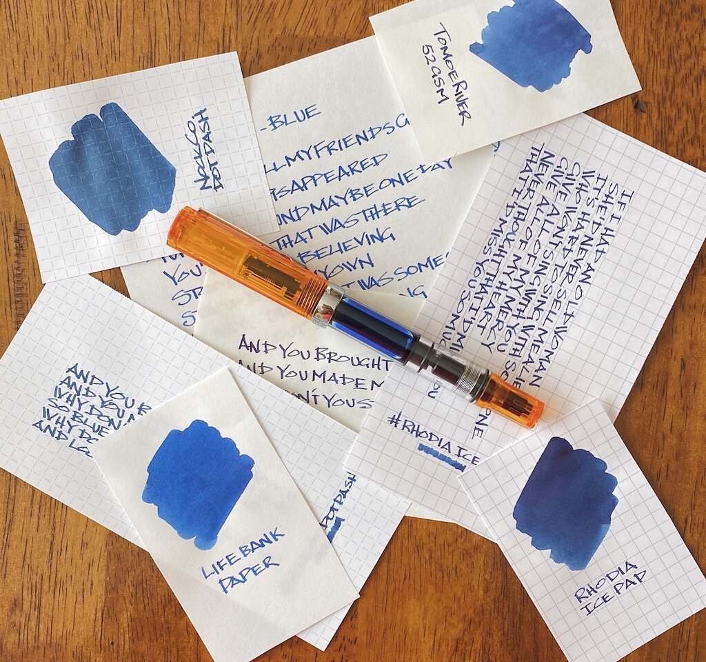
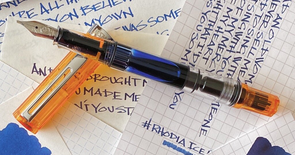
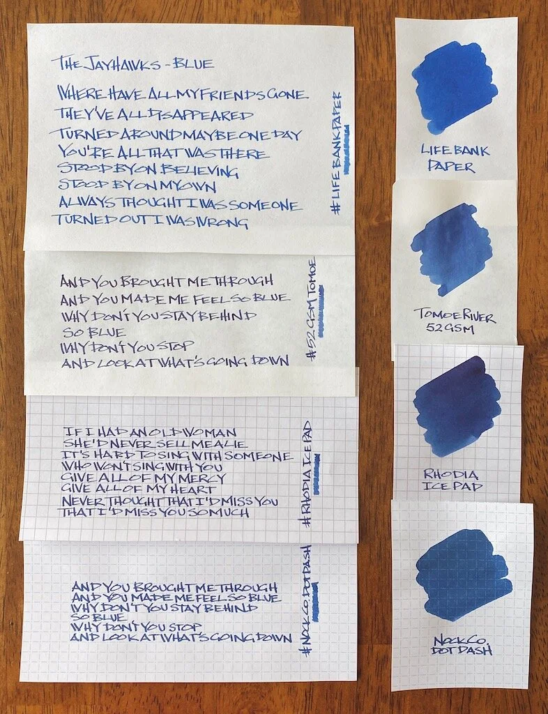
I tested this ink on several types of fountain pen friendly paper, all with different characteristics. You can see how much your choice of paper makes a difference in the color the ink appears.

My handwriting on the Life Bank Paper showed the most accurate color representation, although a heavy swab of ink on the same paper made the ink appear the bluest. Tomoe River paper showed off a darker tone, primarily because the ink stays on the surface of the page more. There is very little sheen on Tomoe River, and less shading than I expected.

The darkness really popped on Rhodia - maybe too dark for what I want from this ink. And on the big swab it tried to sheen, but there is really nothing there in that category. The drier paper of the Nock Co. DotDash showed a mid-range color, closer to the Bank Paper than the other two, which makes sense.

Out of the entire batch, TWSBI Blue Black looks the best to my eye on the Life Bank Paper, although it is pretty great anywhere I’ve used it so far.

And that’s what I expect more than anything from a house ink such as this one. Sure, you can get the premium Botanist gin for your G&T, but some days, maybe those heavier writing days, call for the house brand. TWSBI has made a pretty good one that is worth inking up any day of the week.

(JetPens provided this product at no charge to The Pen Addict for review purposes.)


Enjoy reading The Pen Addict? Then consider becoming a member to receive additional weekly content, giveaways, and discounts in The Pen Addict shop. Plus, you support me and the site directly, for which I am very grateful.

Membership starts at just $5/month, with a discounted annual option available. To find out more about membership click here and join us!

Posted on February 3, 2020 and filed under TWSBI, Ink Reviews.