Posts filed under Ink Reviews

Colorverse Maryland Blue Crab Ink Review

Colorverse Maryland Blue Crab Ink Review

Let’s be clear about something: I’m easily enabled. There are tiers of enabling, though. For example, “Hey Brad, LAMY has a new release, have you seen it?” Whether I answer that question with a yes or a no, I’m already on my way to buy whatever it is to get a look at it.

A much lower tier would be something like Blue ink. I have a Blue ink infestation on my ink shelf as it stands right now, with many shades represented. So when someone says, “Hey Brad, you should check out Colorverse Maryland Blue Crab, it’s an interesting Blue ink,” I have no business even considering adding yet another Blue to the collection.

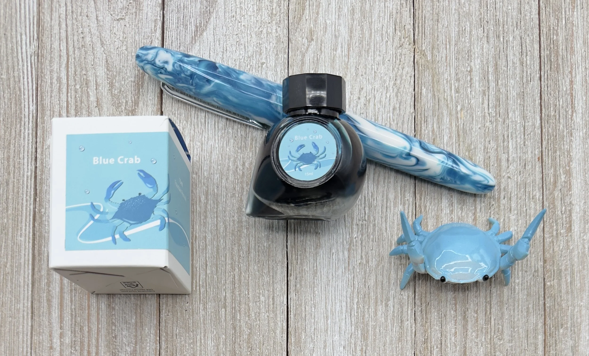
Colorverse Maryland Blue Crab Ink

But we wouldn’t be here now if I didn’t buy it, would we?

Once I looked at the swatch of Blue Crab, I did think it looked interesting, so I added it to my cart. Once it arrived and I inked it up, it looked better than I expected on the page. The best part about it is that I can’t exactly explain why.

Colorverse Blue Crab

Blue Crab was created by Colorverse to represent Maryland, as part of their USA 50 States series. These large sets are always fun to play around with, seeing what they come up with to represent - in this case - States. And Blue Crab for Maryland? How perfect is that. What did you think they would choose, Natty Boh?

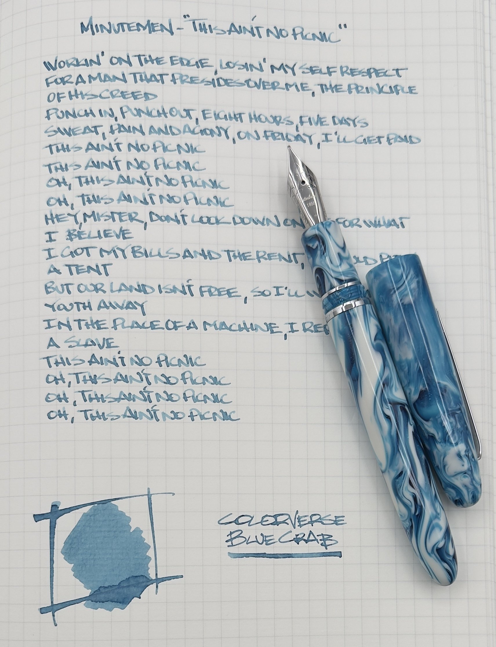
The description of this ink is listed as “pale sky blue ink with medium shading,” and while I agree with the shading description (which I love, btw,) I’m not sure I would call the color pale. Dusty maybe? Is there a difference between pale and dusty even? I’m not sure, but my point with Blue Crab, and the challenge I’m having, is how to describe it.

Colorverse Blue Crab Writing

There are many ink descriptors we like to use - bright, saturated, light, dark, moody, etc. - and I’ve yet to be able to nail down this one. It’s weird and normal, odd and fun. It makes me like it more that I can’t define it specifically.

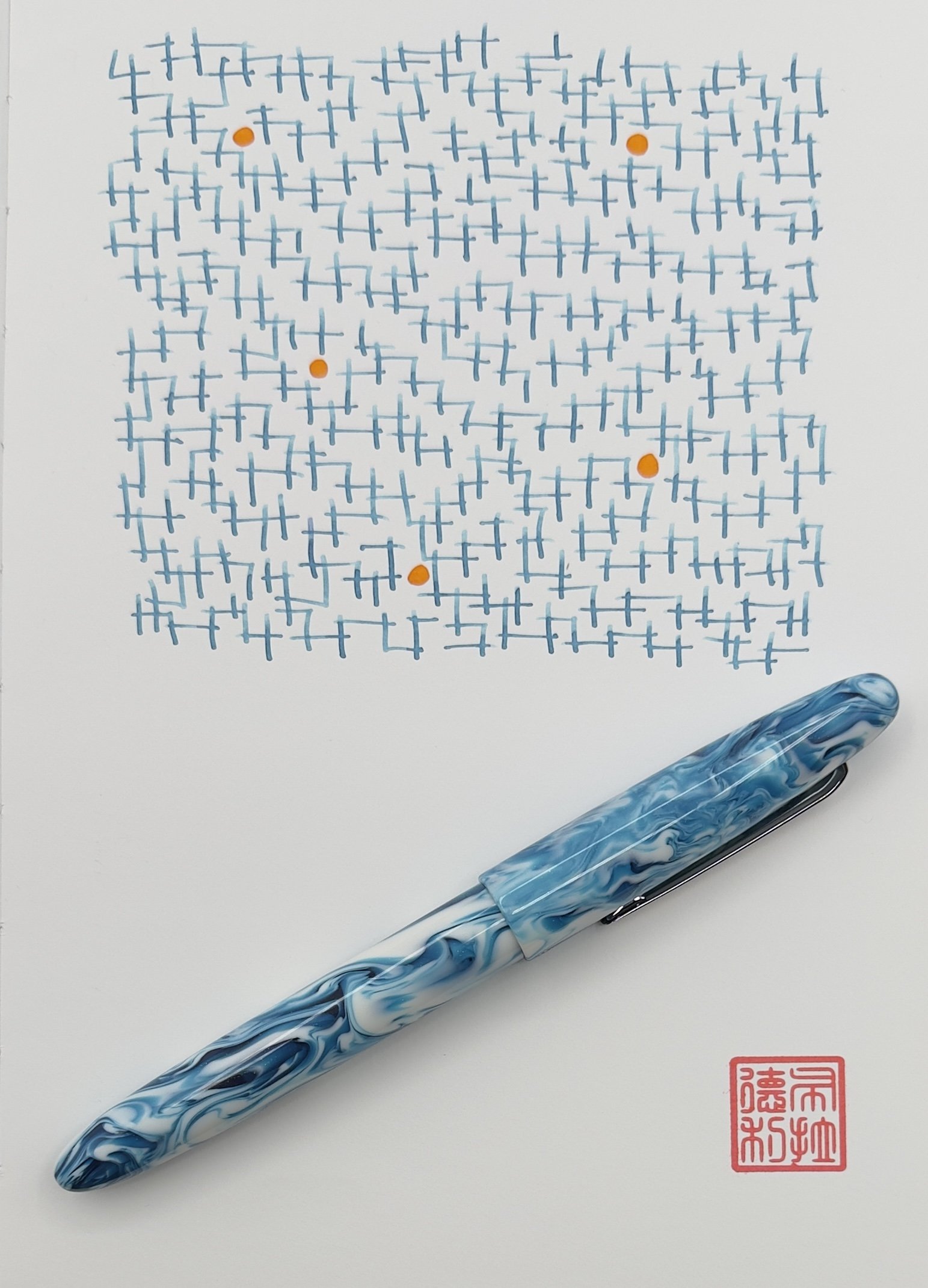
I used a prototype Esterbrook (sorry!) with a Journaler nib grind with Blue Crab, and I love the pairing. My letters look so good, mainly because of the shading the ink has. The grind, similar to a Stub nib, helps pull and pool the ink within my letters, from top to bottom, giving them that cool two-tone look we call shading. It’s my favorite aspect of this ink, and has me wanting to write more and more with it.

Colorverse Maryland Blue Crab

There are no performance or color downsides to Colorverse Blue Crab, but the bottle leaves a lot to be desired. I don’t mind 15 ml ink bottles, but the opening is so small that you are only getting a converter or syringe inside of it to fill your pen. I can deal with that, but if you aren’t prepared, that could be annoying. Also, at $13.50, it’s not exactly cheap per milliliter. There are many better values on the market.

In the case of Colorverse Maryland Blue Crab, I wasn’t going for value. I was going for CRABS! And I got them, in the form of a color I look forward to using frequently. Nicely done.

(Vanness Pens provided this product at a discount to The Pen Addict for review purposes.)


Enjoy reading The Pen Addict? Then consider becoming a member to receive additional weekly content, giveaways, and discounts in The Pen Addict shop. Plus, you support me and the site directly, for which I am very grateful.

Membership starts at just $5/month, with a discounted annual option available. To find out more about membership click here and join us!

Colorverse Blue Crab Lines
Posted on May 5, 2025 and filed under Colorverse, Ink Reviews.

Anderillium Avian Series Fountain Pen Ink Review

(Kimberly (she/her) took the express train down the fountain pen/stationery rabbit hole and doesn't want to be rescued. She can be found on Instagram @allthehobbies because there really are many, many hobbies!.)

I have reviewed all of the Anderillium Cephalopod Inks and the Lepidopteran series so I told the Bossman that I might as well review the Avian series, too! The Avian Series is actually the first series from Anderillium Inks so it definitely needed to be done!

The 8 inks in the Avian series (named for various birds followed by the ink’s main color) are as follows: Pompadour Cotinga Burgundy, Roseate Spoonbill Pink, American Goldfinch Yellow, Green Kingfisher Green, Indigo Bunting Blue, Purple Gallinule Purple, Shoebill Stork Grey, and Common Loon Black. Most people have seen the inks in 1.5 ounce (44ml) sealed glass “jam” jars, but their ink sets are also available in 0.5 ounce (14.5ml) “sample” bottles.

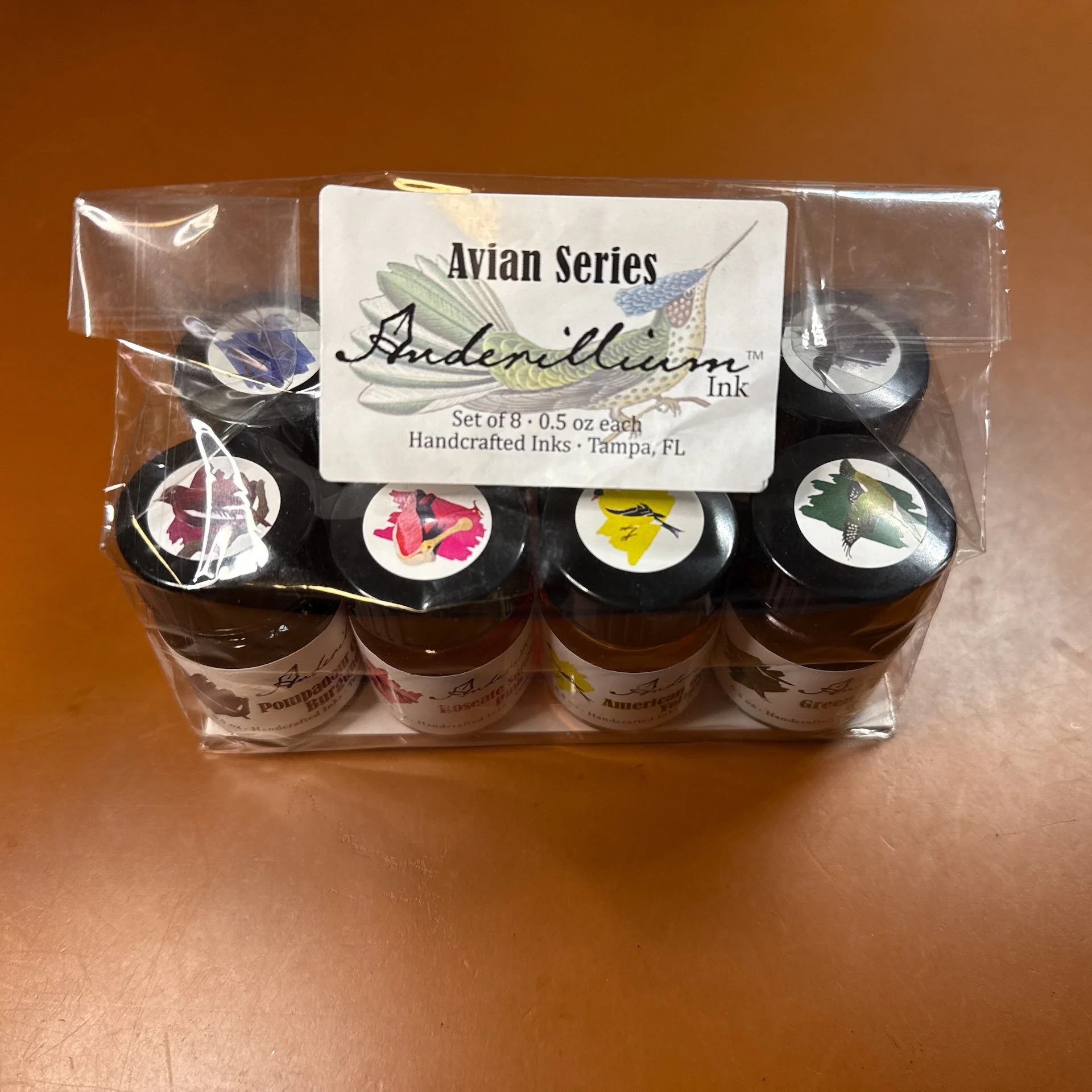
Pack of 8 sample bottles from the Anderillium Avian Series.

I like that there are bird stickers on top so you can tell the ink color. The regular size bottles have stickers on the boxes, but not the bottles.

As usual, all swatches were done on Col-O-Ring cards using a Kakimori steel dip nib and writing samples were done primarily with a Lamy Vista with a steel Medium nib and a TWSBI Go with a Medium nib. The notebook used for writing samples is from Endless Recorder with 68 gsm Tomoe River paper. Dry times for the Vista are shown with “(V)” and the Go will be shown below that with a “(T)”. Dry times may be a bit slower on 52gsm TR or faster on more absorbent papers like Rhodia, copy paper, Cosmo Air Light, or with drier or finer nibs.

Anderillium Avian Series.

Swatches from the Cephalopod series (left) with the Lepidopteran series (right.)

Pompadour Cotinga Burgundy is a dusty pink that isn’t as dark or red as what I think burgundy should look like. I think of burgundy as a wine-colored red and this is a bit more pink. It is still a nice color but the naming does throw my brain off a bit. It was slightly dry in the Vista and had pretty fast dry times with both pens. There is some shading and no sheen.

Pompadour Cotinga Burgundy writing sample.

You can see the Pompadour’s shading from the Vista (top) versus a more saturated writing sample from the Go.

Chromatography from Pompadour Cotinga - I would have never guessed that this muted pink would have such bright bright pinks, coral, and turquoise on top!

Inks similar to Pompadour Cotinga: DeAtramentis Blackberry, Montblanc Antoine de Saint-Exupery, Rohrer & Klingner Alt-Bordeaux, Diamine Tyrian Purple (a bit too much purple), Diamine Forest Gateau (too dark.)

Roseate Spoonbill Pink is a bright, neon/hot pink that dries pretty quickly in the Vista, and flows well in both pens. There is minimal shading in the Vista and no sheen.

Roseate Spoonbill Pink writing sample.

The ink is lighter from the Vista but it isn’t much of a shader. I really liked the bright pink lines from the Go.

Not a whole lot to this chromatography - it’s straight up hot pink all the way.

Inks similar to Roseate Spoonbill Pink: Diamine Hope Pink and Bungubox Sweet Love Pink. Iroshizuku Kosomosu and other bright pinks weren’t the right shades (often too orange) or brightness.

American Goldfinch Yellow is a very yellow ink - I wish I had swatched this before recording the AskTPA episode 660 with the Bossman about ROYGBIV inks! It is almost unreadable in the drier Vista, and while readable from the Go, it’s just too bright to be read comfortably for very long. I think it’d make a great ink for art though! It had an average flow, average dry times, and not much shading.

American Goldfinch Yellow writing sample.

The Vista writing sample is actually lighter in real life than in this picture which is actually quite readable. It’s still a lot of yellow going on. I can’t imagine reading an entire page of this ink.

Yep, yellow and not much else on this chromatography strip.

Inks similar to American Goldfinch Yellow: Blackstone Golden Wattle (rip Blackstone ☹️), Colorverse Golden Leaves, Colorverse Project Series #8 Ornament Yellow, Pilot 100th Anniversary Daikokuten.

Green Kingfisher Green is what I would call an algae green. It isn’t yellow enough to be olive but it’s also not a regular green or forest green. It had average dry times of 30 seconds with a bit of shading from the Vista.

Green Kingfisher Green writing sample.

More shading from the Vista (top) than the Go, which produces not-quite forest green lines.

The Vista swipes (odd) had an almost blue hue to it, while the Go swipes (even) were more of a light forest.

I would have never guessed that Green Kingfisher Green would produce peach and turquoise colors in its chromatography! If I hadn’t done these one at a time, I would have assumed I mixed this up with a different ink!

Inks similar to Green Kingfisher Green: Diamine Oliva , Diamine Salamander, and Bungubox Dandyism were too brown, Montblanc Homage to Brothers Grimm Green is the closest, and Robert Oster Eucalyptus Leaf is close but too dark.

Indigo Bunting Blue is a nice blue that isn’t royal blue or school blue but isn’t a blue black either. It ranges from a light to dark navy depending on the pen’s flow. It dries quickly for the Go but average dry times for the Go. Some shading with the Vista but not as much with the Go, and no sheen.

NOTE: There were issues with the dyes in early bottles of Indigo Bunting Blue and Adonis Butterfly Blue (from the Lepidopteran series) such that the blue component disappeared and the color was off. While the inks were safe to use, they were just the wrong colors. Please reach out to Anderillium if you’re experiencing issues with either of those bottles and they will happily replace them.

Indigo Bunting Blue writing sample.

I liked both the lighter and darker navy colors that you can get from drier and wetter pens.

What an interesting mix of purple (bottom), pinks, and turquoise to produce this colorful chromatography.

Inks similar to Indigo Bunting Blue: J Herbin Bleu Nuit (too “royal”), Colorverse Saturn V (the closest), Diamine Shimmering Seas (also fairly close but the shimmer changes the color a bit), J Herbin Bleu des Profondeurs (a bit more blue-black but still close.)

Purple Gallinule Purple is a blue leaning lavender and purple (depending on wetness of pen). There is a hint of chromashading with the drier Vista and no sheen. It had fast to average dry times.

Purple Gallinule Purple writing sample.

The chromashading is very faint in the drier writing sample (top) but it has nice shading, especially when printing.

Kinda cool to see the purple lines while the swipes of color are blue/bluish purple.

Hot pink chromatography starting from the bottom and ending with turquoise up top.

Inks similar to Purple Gallinule Purple: DIamine Rainbows End, Robert Oster Purple Sunset were a bit too purple, while Kobe 56 Rokko Shichidanka, Bungubox Blue Purple Morning Glory, and Pennonia Arcaska are closer while still being a bit too purple.

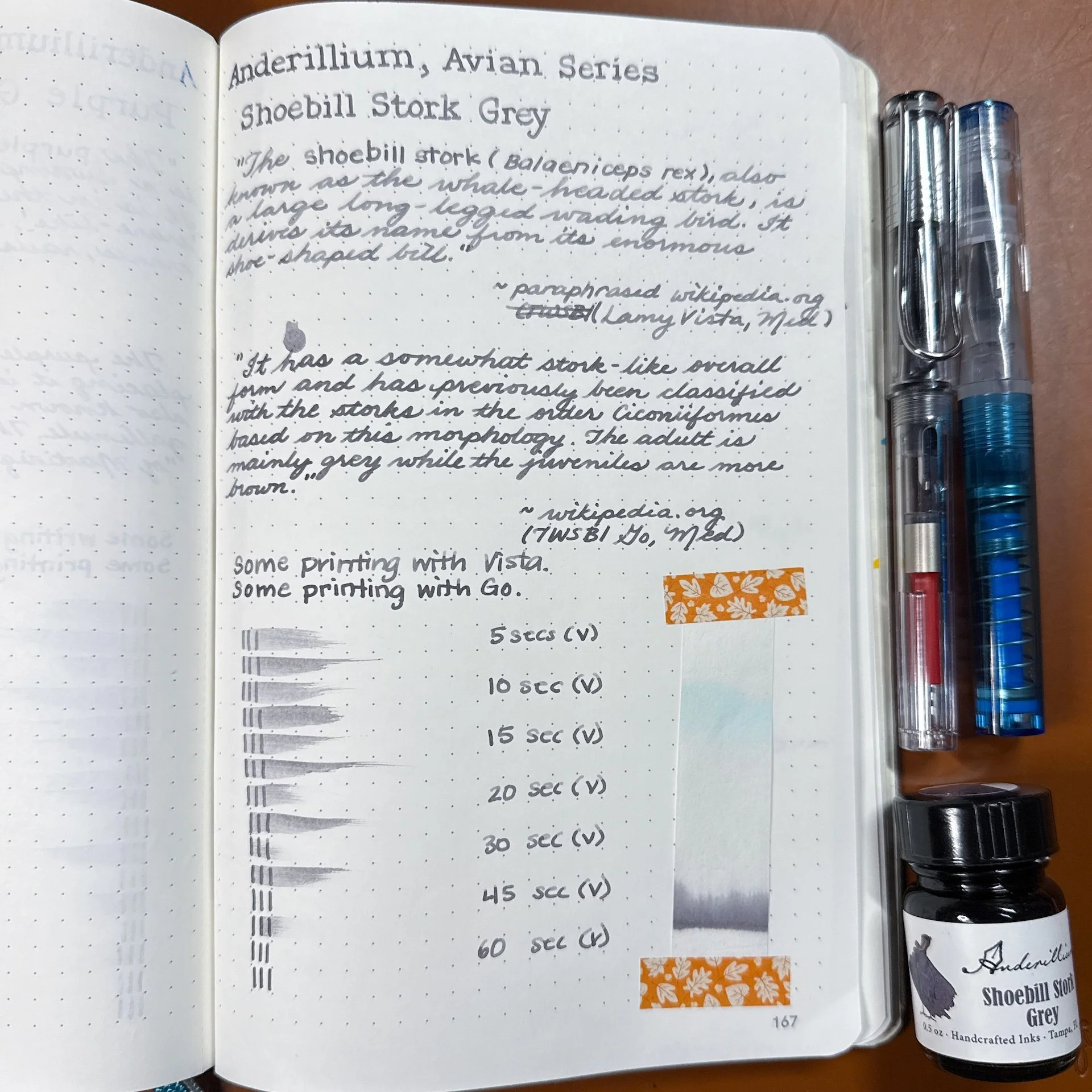
Shoebill Stork Grey is a light to medium grey ink with some nice shading in the drier Vista. It had fast dry times and no sheen.

Shoebill Stork Grey writing sample.

Fairly neutral light and medium grey lines with shading in the Vista and less in the Go.

Some grey and a touch of blue in Shoebill’s chromatography.

Inks similar to Shoebill Stork Grey: Vinta Clouds of Grey Pagtangi (shimmer), Sheaffer Bling, Iroshizuku Kiri-same (had a bit too much “brown,”) Diamine Ghost, Visconti Old Vineyard with Peasant Woman, and Iroshizuku Fuyu-syogun was close but too “cool” in tone.

Common Loon Black is more of a grey/dark grey ink as opposed to a black ink. Even with the wetter Go, it is still more grey than black. There is shading from the Vista, but no sheen from either. Dry times were average for both pens.

Common Loon Black writing sample.

The top writing almost has a hint of blue to its grayness. Neither are particularly black.

Similar to Shoebill Stork Grey’s chroma, but more of it. More grey at the bottom and more turquoise up top.

Inks similar to Common Loon Black: Wearingeul Romeo and Colorverse Lucky Star II. It didn’t match any of the grey inks I have and it’s not black enough to match any of my black inks either.

As with the other two series, all of the inks behaved well, and cleaned out easily. I continue to enjoy seeing how different pens can produce such different results with the same ink.

If I had to pick favorites in the bunch, they would be Purple Gallinule Purple in a dry writer because of the lovely chromashading and Green Kingfisher Green because it’s unlike many of the greens I have in that range. I think the colors are nice and they are worth the purchase if you don’t already have similarly colored inks. I do think the inks are fairly “straight forward”, compared to shimmer or sheening inks. The Purple Gallinule Purple is the only purple out of the 3 sets (maybe the upcoming Ichthyoformes series will have a purple? Pretty please?)

Anderillium inks sell for $14.50 per 1.5 ounce bottle, or $50 for 0.5 ounce sample sets of all 8 inks. They can be purchased directly from Anderillium Inks or from authorized resellers.

(Disclaimer: Brad purchased all of these inks at normal price directly from Anderillium.)

Posted on May 2, 2025 and filed under Anderillium, Ink Reviews.

Wearingeul The Old Man and the Sea Ink Review

Wearingeul The Old Man and the Sea Ink Review

(Jeff Abbott is a regular contributor at The Pen Addict. You can find more from Jeff online at Draft Evolution and Twitter.)

One of the inks I've been using recently takes inspiration from a work of literature that I'm sure many are familiar with. For me, it was required reading for 9th grade English in school. The Old Man and the Sea by Ernest Hemingway was my first exposure to his work, and it's also the inspiration for Wearingeul's ink of the same name. While the source material is about an epic struggle of human versus beast and nature, the ink focuses on the serene but unknown beauty of the sea.

The Old Man and the Sea is a deep teal ink with lots of shading and a heavy dose of red shimmer to mimic the sparkly reflection of the sun off the ocean's surface. I've used many Wearingeul inks at this point, and I've come to expect great performance. This ink is no exception.

Wearingeul The Old Man and the Sea Ink

I've really enjoyed the color of this ink. The dark teal is a pretty shade and there's enough shading to produce a good amount of color variation in even small nibs. Comparing this ink swatch to others in my collection, I was surprised by how similar it is to Sailor's Yama-dori. The main difference is that the Wearingeul ink has an additional red shimmer component.

While I'm not a huge fan of shimmering inks, it's really well-done with this ink. The ratio of glitter particles to ink is on the lower side to ensure it never overwhelms the beautiful teal color, and the choice of using red glitter is a fantastic complimentary color. There are many blue/green inks that use a red sheen for the same reason — they just go well together.

Wearingeul The Old Man and the Sea Ink Shimmer

Writing with this ink is a joy. It feels smooth on the nibs and papers I've tried, and it flows well. Since this is a shimmering ink, you need to remember to shake the bottle well and ink your pen immediately to get a good sampling of red glitter. If you forget to shake the bottle, you will barely notice the red shimmer when you start writing.

Wearingeul The Old Man and the Sea Ink Shading

The ink also dries in what I'd call an average amount of time. It's not setting any records (on either end of the spectrum), but it falls right in the middle at around 20-30 seconds to become smudge-proof. Not an ideal candidate for anyone that wants a fast-drying ink. That said, I think the color and shimmer is worth the extra hassle of waiting for the ink to properly dry if you know you won't be in a hurry. For left-handed writers, it will be challenging to keep your hand from smudging this ink as you write — even if you're using a really small nib.

Wearingeul The Old Man and the Sea Ink Comparison

It's been so long since I read The Old Man and the Sea, but I'm pretty confident that I can say that I've enjoyed using this ink for the past several week more than I enjoyed reading and writing about the novella. To each their own, right? Wearingeul really did a great job at designing an ink that pays homage to the source material, while also making it a fantastic ink on its own rite.

The Old Man and the Sea is $22 for a 30ml bottle, or you can pick up a small sample vial to try out first for a few bucks. Regardless of what you think about the book or the author, this ink is a great color that looks great on paper. If you like how it looks, you'll really enjoy using it.

(Vanness Pens provided this product at a discount to The Pen Addict for review purposes.)


Enjoy reading The Pen Addict? Then consider becoming a member to receive additional weekly content, giveaways, and discounts in The Pen Addict shop. Plus, you support me and the site directly, for which I am very grateful.

Membership starts at just $5/month, with a discounted annual option available. To find out more about membership click here and join us!

Wearingeul The Old Man and the Sea Ink Writing
Posted on April 9, 2025 and filed under Wearingeul, Ink Reviews.