Posts filed under Ink Reviews

iPaper Nantou Tree Frog Ink Review

iPaper Nantou Tree Frog Ink Review

(Sarah Read is an author, editor, yarn artist, and pen/paper/ink addict. You can find more about her at her website and on Twitter. And check out her latest book, Out of Water, now available where books are sold!)

I keep telling myself to stop falling for pale inks, because my aging eyes struggle to see them written on the page. I'm not listening, though, because look at this green! iPaper Nantou Tree Frog Ink is the brightest, prettiest, baby leaf green in my ink family. Can I read what I wrote with it? No. Do I have two pens inked with it anyway? Yes. Sometimes this hobby is more about passion than practicality.

iPaper Nantou Tree Frog Ink

Okay, first stop is that wee frog's face. That expression is just daring us to be bold. The Nantou Tree Frog ink is part of the “Natural Wonders of Taiwan” series, and it's plain to see why this wee charmer was honored with his own color in the lineup, which currently has six total inks. I want them all. The ink comes in a slightly pyramid-shaped 30ml glass bottle (pro tip: open the box from the bottom).

iPaper Nantou Tree Frog Ink Writing

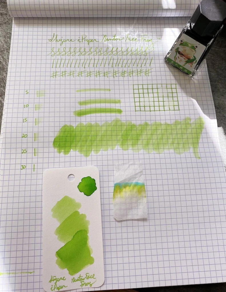
This is a very wet ink with excellent flow, which helps show off the shading properties. It's difficult to see the shading in photos, because the ink is so pale. But there is nice shading, which takes it from new grass to highlighter green. In fact, this ink in a wide stub would make an excellent highlighter. It isn't ideal for everyday writing, but it is gorgeous and fun to play with. It isn't similar to any inks I own, despite my love of green ink.

iPaper Nantou Tree Frog Ink Swatch

All trace of this ink is fully annihilated by the lightest touch of water. Don't even sneeze on your notebook. Even when I quickly dabbed away a drop of water, it had washed away the line, and where it sat for a few seconds, there is no color left.

This is one of the longer dry times I've seen in a while. It takes a full 30 seconds to stop smearing, and the 5-second test almost completely wiped away the ink.

iPaper Nantou Tree Frog Ink Chromatography

Color-wise, this ink split into the expected yellow with a trace of blue. Even though it's a pale color, it has good depth to it.

This line of inks retails for about $22, which is a little on the pricey side for 30ml. It's in line with other high-end limited-edition inks, but it does mean I can't have them all. It's the first iPaper ink that I've used, though, and I'm impressed. It definitely won't be the last, even if the rest don't have cute frogs on them.

(The Pen Addict purchased this ink from Shigure Inks at full retail price.)


Enjoy reading The Pen Addict? Then consider becoming a member to receive additional weekly content, giveaways, and discounts in The Pen Addict shop. Plus, you support me and the site directly, for which I am very grateful.

Membership starts at just $5/month, with a discounted annual option available. To find out more about membership click here and join us!

iPaper Nantou Tree Frog Ink Dry Time
Posted on June 18, 2020 and filed under iPaper, Ink Reviews.

Sailor Ink Studio 735: A Review

Sailor Ink Studio 735 Review

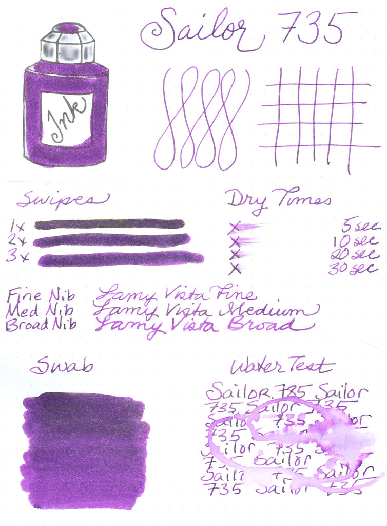
Sailor Ink Studio is a collection of one hundred inks (out of 20,000 created!) that were blended by inkmeisters at Ink Studio events. Each number represents a unique blending code (source: Sakura Fountain Pen Gallery). Sailor 735 is the second ink from the Ink Studio collection that I’ve gotten to try (the first was Sailor 123, review here). I discovered that the higher the number of an Ink Studio ink, the more shading and sheen it offers, and 735 definitely rocks the sheen.

Sailor Ink Studio 735 Bottle

As always, my ink testing begins with Rhodia Dot Pad paper. Although I like this paper for ink testing because it’s a true white and it’s fountain pen friendly, it tends not to show sheen very well. You can see a little bit of sheen in my first swipe, but otherwise it’s not apparent. Sailor 735 is a beautiful deep purple ink with lots of pink undertones. The ink is quite wet and takes over 30 seconds to dry. If you lay it on really thick, you’ll want to give it even more time. It’s not waterproof.

Sailor Ink Studio 735 Ink Testing

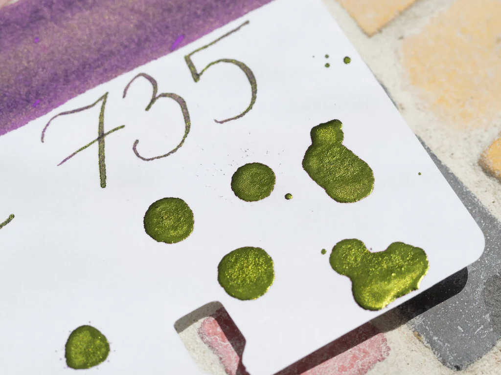
The sheen in this ink comes through nicely on my Col-o-dex card. It’s a gorgeous shiny green. There’s just something wonderful about the combination of purple and green. In fact, I have an entire section of my Animal Crossing island (Villanelle) planted with purple and green mums . . . but, like Isabelle, I digress. Sorry! Both the swirls and the ink splats show off the green sheen as do the swab and writing.

Sailor Ink Studio 735 Col-o-dex
Sailor Ink Studio 735 Ink Splats

Chromatography demonstrates that Sailor 735 is a complex ink, with blue, lavender, magenta, pink, and purple hues.

Sailor Ink Studio 735 Chromatography

Even more glorious sheen is exhibited when you use a ruling pen for big, fat, juicy lines. It’s almost as though the letters are gilded with green-gold leaf!

Sailor Ink Studio 735 Lettering

I used my Franklin-Christoph EF steel flex nib on Midori MD paper and was pleased at how beautifully the ink flowed. Even with such a fine nib sheen is evident.

Sailor Ink Studio 735 Writing
Sailor Ink Studio 735 Letters
Sailor Ink Studio 735 Writing Close Up

I am absolutely smitten with Sailor 735. It is a wonderful purple ink, but what makes it extra special is that green sheen. Fortunately, Sailor Ink Studio inks are now much more readily available than they were when I wrote my first review last July. You can purchase a 20ml bottle of Sailor 735 from Dromgooles for $18.00.

(The Pen Addict purchased this ink from Dromgooles at a discount.)


Enjoy reading The Pen Addict? Then consider becoming a member to receive additional weekly content, giveaways, and discounts in The Pen Addict shop. Plus, you support me and the site directly, for which I am very grateful.

Membership starts at just $5/month, with a discounted annual option available. To find out more about membership click here and join us!
Sailor Ink Studio 735
Posted on June 5, 2020 and filed under Sailor, Ink Reviews.

Kala Tribute to Neon “Boogie” Fountain Pen Ink Review

Kala Tribute to Neon “Boogie” Fountain Pen Ink Review

Eleven-year-old me is so happy right now. Boogie is the color theme for the 90s. This is Lisa Frank riding a unicorn on roller skates, zooming around the rink to Salt-n-Pepa. It's great. This is the first Kala Ink that I've tried, but I'll definitely be taking a look at their other offerings. Maybe even a few more of these neon colors.

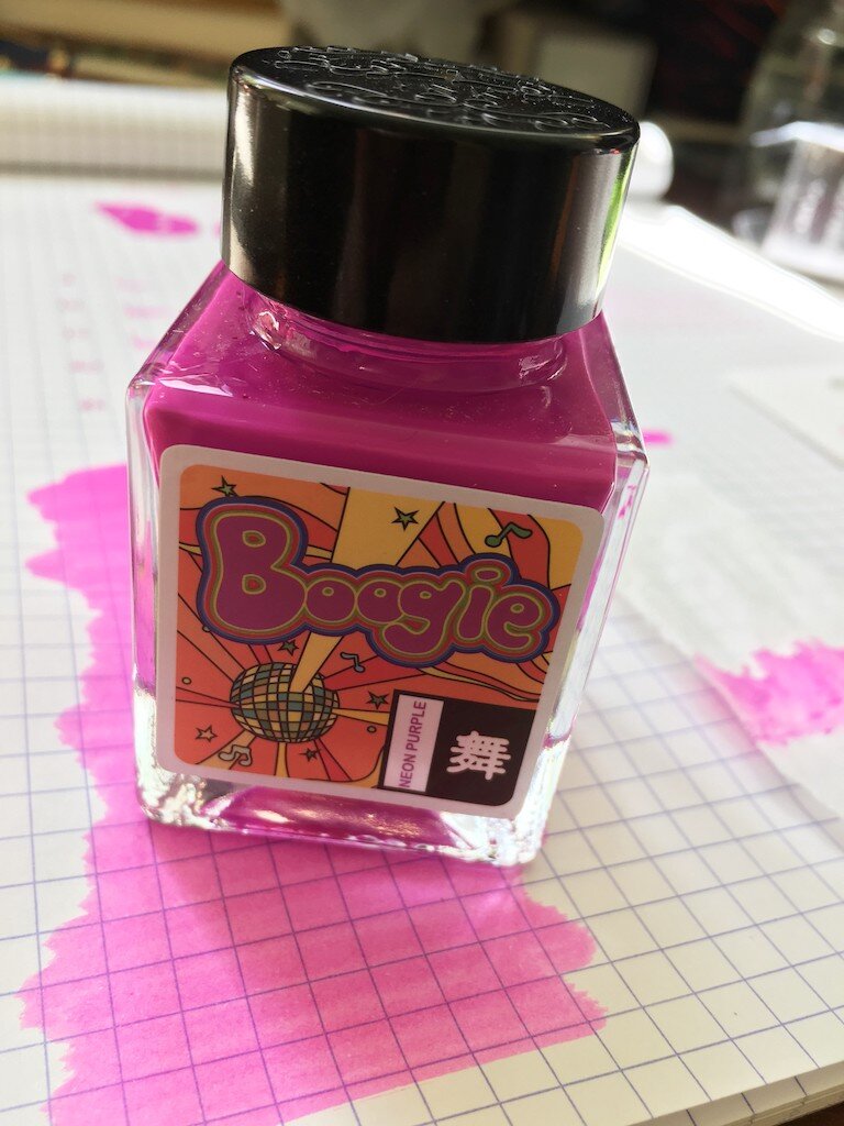
Color-wise, this isn't as eye-searingly neon as I was expecting it to be. It's definitely a bright color, and a rich one, but it isn't glowing like a highlighter would. And while it would have been much cooler if it was highlighter neon, it's much more practical and useable as it is. It retains the attitude of neon, even if it doesn't quite possess the properties of it. I think a lot of that richness comes from the intense pigment saturation of this ink. It's a pigment-based ink, and doesn't look, at first glance, like something that would be safe to put in your pen.

Kala Neon Boogie Ink Review

The ink is fully opaque in the bottle. It looks more like nail polish than ink, and that might make any pen user nervous. And while I have it on good authority that it is safe to use in pens, it has a few characteristics that you might want to keep in mind when using it.

I get the sense that this ink is highly lubricated to make up for its natural thickness. I could see an almost separation of layers as I watched a puddle of it dry on my swab card. It would have to be lubricated in order to flow through a pen properly. That lubrication lends itself to a longer dry time. It remained fully wet until about the 25-second mark, when it suddenly became immovable.

Kala Neon Boogie Ink Waterproof

This ink is entirely waterproof! No amount of water dripping, rubbing, or soaking lifted it from the page. I couldn't even get it to do a proper chromatography test, because water didn't force it to travel through the paper unless I caught it before it dried.

It also tends to dry out on the nib a bit, leading to some difficulty getting it flowing at first. The first line or stroke after any amount of time (as short as ten seconds or so) would not lay down any ink. Once it was flowing, though, it flowed nicely.

Kala Neon Boogie Ink Swab

The ink shows lovely shading, but doesn't sheen. It does have a shiny coating to it, though. It dries as a layer on top of the page, rather than soaking in at all, so when the light hits it, you can see it shining off of this coating. It's less noticeable than on a calligraphy ink, and seems to occur mostly where the ink has pooled or concentrated. I can also feel the texture of this coating on the page when I run my fingers over it.

As far as pigment-based permanent inks go, this one is the most fun that I've tried. So many of them are sepia, blue, or black--which is great, too--but sometimes life needs a pop of color. This would make a great ink to use for sketches under color washes, for example. There are lots of uses for it beyond just writing a page of lovely, bright text (though I've been doing just that!).

Kala Neon Boogie Ink Bottle

Given its properties, though, I'd add a note of caution about putting it in fancy pens that are difficult to clean. Its texture is a bit more viscous than a typical water-based ink, and even more than other pigment inks I've used. So I'd expect some additional challenges in cleaning, especially if the ink has sat in the pen for a while. Time may show it to be just fine, but maybe don't use your prized pen as the guinea pig.

My only real criticism of this ink is that it makes me wish I was better at drawing unicorns.

(The Pen Addict purchased this ink from Shigure Inks at full retail price.)

Kala Neon Boogie Ink Writing
Posted on June 4, 2020 and filed under Kala, Ink Reviews.