Posts filed under Ink Reviews

Van Dieman's Midnight Series: Howl At The Moon Ink Review

Van Dieman's Midnight Series: Howl At The Moon Ink Review

(Jeff Abbott is a regular contributor at The Pen Addict. You can find more from Jeff online at Draft Evolution and Twitter.)

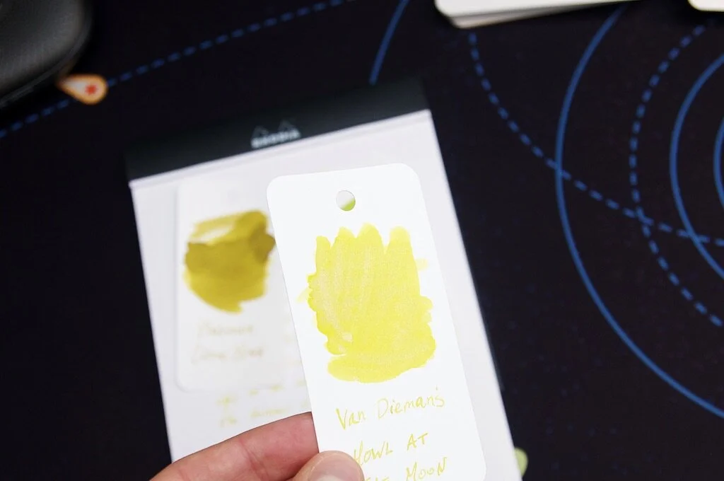
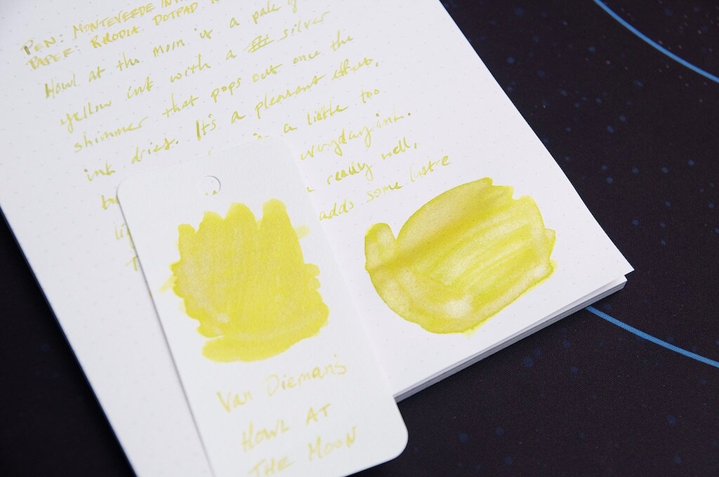
It's been quite a while since I've tried any shimmering inks, so the decision to try Van Dieman's Howl at the Moon is seriously overdue. All of the shimmering inks I've tried previously were of a darker variety, which creates a fairly obvious contrast between the ink color and the bright shimmery bits. Howl at the Moon is different because it's a pale yellow ink paired with a silver shimmer that sits on top. It's a subtle effect, but I've really been enjoying it.

I really enjoy the imagery that the marketing copy calls up to describe this ink:

Howl At The Moon is a silver shimmered dark yellow ink, inspired by the iconic image of a full yellow moon illuminating the night sky, silhouetting a lone alpha wolf, and uplifting the moods of everyone beneath.

I don't know if I'd agree with the dark yellow description, but I love the image of the moon and the wolf complementing each other in an idyllic midnight scene.

Van Dieman's Howl At The Moon

To my eye, Howl at the Moon is a pale, dusty yellow that inches toward a darker hue only when the ink pools up in certain strokes. It's certainly difficult to read on white paper, and I wouldn't mind if it was just a bit darker to improve the legibility. That said, I think it's a really pretty color. It's not one that I would write with routinely, but it's certainly an enjoyable change of pace and one that always makes me smile when I see it.

There's also a fair bit of shading that occurs if you're using a nib that's large and wet enough. In this somewhat dry 1.5mm stub nib from Monteverde, I get plenty of color variation between the thick, slow strokes compared to the quick, light strokes of different letters. The shading doesn't present as prominently when swabbing, so that shows it only has a limited capacity for color variation. The small amount of variation it does exhibit, however, is quite nice.

Van Dieman's Howl At The Moon Swab

A lovely ink is made better by the hidden mysteries is possesses. In this case, the silvery shimmer that surfaces under certain light. It's a tricky thing to catch — sometimes it only looks like a place where the ink ran thin, leaving only a hint of color behind. Change your angle of perspective just a bit, and the dusty yellow rushes back in. The silver shimmer creates such a dazzling effect in areas where the ink has pooled, and it creates a glittering starlight effect in normal handwriting. It reminds me of Moon runes in The Hobbit:

“Moon-letters are rune-letters, but you cannot see them,” said Elrond, “not when you look straight at them. They can only be seen when the moon shines behind them..." — The Hobbit by J.R.R. Tolkien

While the ink is completely legible regardless of whether moonlight is present, this subtle glimmer is such a delight in our mundane real world.

Van Dieman's Howl At The Moon Comparison

Aside from the color and shimmer, this ink is fairly standard in terms of how it behaves in the pen. It's easy to clean out, but I clumsily forgot that shimmer inks require a good shaking before inking up your pen! My initial impressions were along the lines of, "what shimmer??" But that's easy to fix by remembering to prepare the ink before drawing it into the pen. Without some gentle shaking, all the shimmery silver bits stay at the bottom of the container!

At $14.95 for a 30ml bottle, Van Dieman's Howl at the Moon is an excellent value. And, if you're not sure (or just don't want much), you can always opt for a small sample for a few bucks. It's not in stock at Vanness now, but definitely keep your eyes peeled for a restock if this is your sort of thing. I've really enjoyed my time with this ink and look forward to using it for special occasions!

(Vanness Pens provided this product at no charge to The Pen Addict for review purposes.)


Enjoy reading The Pen Addict? Then consider becoming a member to receive additional weekly content, giveaways, and discounts in The Pen Addict shop. Plus, you support me and the site directly, for which I am very grateful.

Membership starts at just $5/month, with a discounted annual option available. To find out more about membership click here and join us!

Van Dieman's Howl At The Moon Writing
Posted on June 30, 2021 and filed under Van Dieman's, Ink Reviews.

Scribo Blue Capri and Arancio di Sicilia Inks: A Review

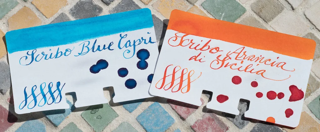
Today I'm reviewing two summery Scribo inks: Blue Capri and Arancio di Sicilia.

Blue Capri

Scribo Blue Capri Sample
Scribo Blue Capri Colodex

Blue Capri is a bright, turquoise-blue ink with good shading and a bit of magenta sheen.

On Rhodia Dot Grid paper the ink offers good saturation, some shading (especially in broader nibs), and a fast dry time. It is not waterproof.

Blue Capri Rhodia

Chromatography reveals slight variations in tone from light turquoise to medium turquoise.

Blue Capri Chromatography.jpg

I did a longer writing sample using the Fenestro EF fountain pen (reviewed here) on Tomoe River Paper. The ink flowed well and is bright and readable. Even with an EF nib, some shading is noticeable if you look closely.

Blue Capri Tomoe 2.jpg

On MD Cotton Paper with a ruling pen, the ink dazzles. It's nicely saturated, with shading, lovely pooling, and that magenta sheen.

Compared with my other turquoise inks, Blue Capri is closest to TWSBI Sky Blue, although Blue Capri is slightly more saturated. Iroshizuku Ama Iro is a cooler turquoise. Robert Oster Tranquility is greener and Fire & Ice is darker.

Blue Capri Comparison.jpg

Blue Capri is a beautiful turquoise ink, reminiscent of sparkling Italian waters.

Arancio di Sicilia

Scribo Arancio

Arancio di Sicilia is a vivid orange ink with excellent shading and some pink sheen.

The ink is saturated with deep reddish-orange tones and good shading (especially in flex nibs). The ink took some time to dry, but that's likely because I tested it with my flex nib. It is not waterproof.

Scribo Arancio Rhodia.jpg

The Chromatography displayed pale pink, peach, and deeper orange tones.

Arancio Chromatography

The Ruling Pen brought out the best of this ink on MD Cotton Paper. It is bright orange ranging from deep sunset tones to lighter pink-orange. The shading is excellent and pink sheen shows up where the ink pools.

Arancio Big 1.jpg

For my longer writing test, I used Cosmo Air Light paper. The pink tones of the ink are enhanced on this paper. Shading is also good. It's an orange that is deep enough to read easily, but complex enough that it doesn't jar your eyes.

Arancio Writing 2.jpg

Although I have several orange inks, none of them are as beautiful as Arancio di Sicilia, in my opinion. TWSBI Orange is closest in terms of hue, but it is more of a burnt orange whereas Arancio is brighter.

Arancio di Sicilia just became my favorite orange ink. It looks like how a fresh, juicy orange tastes. I'm definitely going to order a full bottle of this color.

You can purchase both inks from Vanness Pens. Blue Capri is $3.50 for a 4ml sample and $35.00 for a 90ml bottle. Arancio di Sicilia is priced the same.

(Vanness Pens provided this product at no charge to The Pen Addict for review purposes.)


Enjoy reading The Pen Addict? Then consider becoming a member to receive additional weekly content, giveaways, and discounts in The Pen Addict shop. Plus, you support me and the site directly, for which I am very grateful.

Membership starts at just $5/month, with a discounted annual option available. To find out more about membership click here and join us!
Scribo Ink
Posted on June 25, 2021 and filed under Scribo, Ink Reviews.

Pennonia Vattacukor Cotton Candy Fountain Pen Ink Review

Pennonia Vattacukor Cotton Candy

Pennonia is an ink brand born in Romania, and still based there, with the owner, founder, and ink maker - Máté Bikfalvi - currently residing in Hungary. Make sense? It doesn’t have to. What you need know is this: I really like the first bottle I’ve tried.

Pennonia Vattacukor Cotton Candy Fountain Pen Ink Review

I chose Vattacukor, which is Hungarian for cotton candy, and learned something interesting along the way. When growing up, Máté had only ever seen white cotton candy, only discovering the pink variety from watching the Cartoon Network as a kid. How cool is that for an ink name origin story?

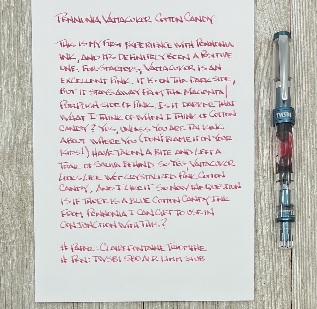
Vattacukor is on the darker side of standard pink shades, but doesn’t cross over into the Magenta/Hot/Purple shades that I am so fond of (see Akkerman #12 Mauritshuis Magenta.) This is a pink with a hint of red, but not enough to take it over. It’s a great writing color, which to me means it is easy to read.

Pennonia Vattacukor Cotton Candy Bottle

On top of that, there is some decent shading going on with Vattacukor. If you look at my writing with the TWSBI 1.1 mm stub, you can see a good top half/bottom half color differentiation in the letters. It looks fantastic, and would make a great letter writing ink - if I wrote letters.

Pennonia Vattacukor Cotton Candy Writing

Since this is my first Pennonia ink I can’t compare Cotton Candy to the rest of the lineup, but I will say this ink leans towards the dry side. It could be because red/orange/yellow inks tend to lean that way from the jump, or it is part of the formulation. Either way, if you have a preference for wet, lubricated inks, this wouldn’t be a great choice for you. Otherwise, that hint of dryness does lead to a quick dry time, and it is definitely wet enough to not cause any issues when writing.

Pennonia Vattacukor Cotton Candy Dry Time

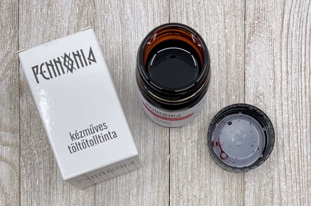
The ink bottle and packaging are simple but effective. Pennonia uses 50 ml amber glass pharmacy-type bottles, giving you good stability in the base, and a wide opening for filling any pen type you wish. The bottle also uses a label printed on a white Claiefontaine 60 gsm paper, making the the small swab on the front reasonably color accurate. These bottles are perfect across the board for me.

Pennonia Vattacukor Cotton Candy Story

And finally, the price. $13 for a $50 ml bottle is almost impossible to beat. Not only do you get a great ink, you also support a small maker with a dream. That combination is hard to beat in my book.

(Vanness Pens provided this product at no charge to The Pen Addict for review purposes.)


Enjoy reading The Pen Addict? Then consider becoming a member to receive additional weekly content, giveaways, and discounts in The Pen Addict shop. Plus, you support me and the site directly, for which I am very grateful.

Membership starts at just $5/month, with a discounted annual option available. To find out more about membership click here and join us!
Pennonia Vattacukor Cotton Candy Review
Posted on May 10, 2021 and filed under Pennonia, Ink Reviews.