Posts filed under Ink Reviews

Diamine Writer's Blood Ink Review

Diamine Writer's Blood Ink Review

(Sarah Read is an author, editor, yarn artist, and pen/paper/ink addict. You can find more about her at her website and on Twitter. And check out her latest book, Out of Water, now available where books are sold!)

With a name like Writer's Blood, of course I needed this ink. I had already decided to buy it when Brad was kind enough to send me a bottle, and it immediately landed at the top of my list of favorite red inks (which literally does exist). I use red ink a lot. Because editing. And this one ticks all the boxes.

Diamine Writer's Blood Ink

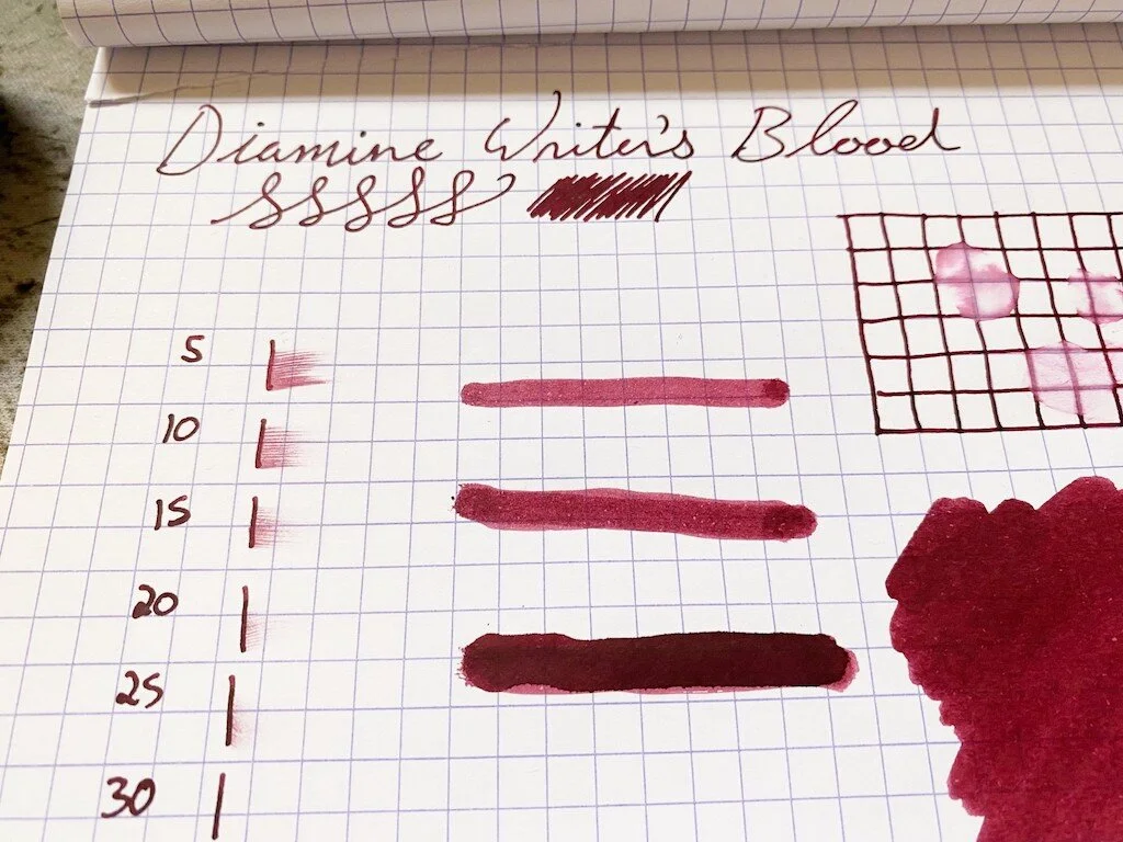
It's a perfect gothic cherry color--dark enough to not be glaring, but bright enough to be seen easily. It's extremely saturated, so it doesn't show much shading, and there's only a very faint sheen where the ink dried in a pool. Perhaps because of this saturation it has a little bit of water resistance. Even where the water sat for a while and was then wiped away, there are still traces of the lines visible. This is also a good thing for editors and writers. The last thing you want is for a teacup hiccup to erase your progress. Chromatography shows its deep rose and purple tones, like a vampire's smoking jacket. Yes, please.

Diamine Writer's Blood Ink Swab
Diamine Writer's Blood Ink Comparison

It is not vastly different from other wine/burgundy inks, and while I do not have any exact matches in my swab collection, there are several very similar ones. It's a good match for Organic Studios Edgar Allen Poe, which is arguably the perfect name for this ink's closest cousin.

It has an average dry time of about 25-30 seconds. It doesn't feel too wet or too dry when writing, though I do have it inked in a very wet writer at the moment. I've yet to meet a Diamine ink that wasn't very well behaved--they all write well and consistently, and this one is no different.

Diamine Writer's Blood Ink Dry Time

This shade comes in two different bottles. You can get a lovely blown glass 80ml bottle like the one shown here for about $16.50, which is an insanely good deal. Or you can get a plastic 30ml bottle for $7.50. I recommend either or both.

(JetPens provided this product at no charge to The Pen Addict for review purposes.)


Enjoy reading The Pen Addict? Then consider becoming a member to receive additional weekly content, giveaways, and discounts in The Pen Addict shop. Plus, you support me and the site directly, for which I am very grateful.

Membership starts at just $5/month, with a discounted annual option available. To find out more about membership click here and join us!

Diamine Writer's Blood Ink Water
Posted on October 14, 2021 and filed under Diamine, Ink Reviews.

Colorverse Eye on the Universe Season 7: eXtreme Deep Field and NGC 1850 Review

Colorverse Eye on the Universe Season 7: eXtreme Deep Field and NGC 1850 Review

(Jeff Abbott is a regular contributor at The Pen Addict. You can find more from Jeff online at Draft Evolution and Twitter.)

Colorverse is an ink company in South Korea that is well-known for their innovative inks that draw inspiration from space. I've always enjoyed seeing the collections they come up and reading about the source material from different space programs. The latest ink pairing I've had a chance to try out is from the seventh season of Eye on the Universe. These inks are inspired by findings from the Hubble Telescope, which is particularly interesting to me since I have family members that worked on the Hubble program at NASA. And, just like every other Colorverse ink I've tried, these don't disappoint!

Colorverse Eye on the Universe Season 7: eXtreme Deep Field and NGC 1850

This collection is made of two inks: eXtreme Deep Field and NGC 1850. The former is a deep teal with red sheen, and the latter is a dark teal with a silver shimmer material. As a pair, they look great together and seem to be based on the same deep teal color. I'm blown away by how many little surprises are tucked away in both inks.

With both inks, they are incredibly dark and somewhat boring when wet. I was a little disappointed by both until I gave the ink a few seconds to dry, and then I was blown away by what I saw. The eXtreme Deep Field has a dark red sheen that isn't shy at all as long as you find the right viewing angle. The NGC 1850 is even more stunning after it dries. The shimmering silver bits are hard to miss, but it's the stunning variation from dark teal to lighter teal and even some purple sheen that make this ink pop. When I made the first swatch with this ink, I accidentally created a piece of art that reminds me of a nebula photo. Such beautiful colors and shades! The shimmer on top looks like distant stars. Needless to say, I'm in love with this ink.

Colorverse Eye on the Universe Season 7: eXtreme Deep Field and NGC 1850 Swab

While both inks swab and swatch really well, they're a little less interesting when writing with them in normal nibs. I still enjoy using them, but you can't really see the full potential of these inks without using a large nib or just brushing this stuff all over the paper. It's just gorgeous and I'm a little bummed that it doesn't come out more easily in normal writing.

Gripes aside, both inks perform beautifully. They're incredibly wet and well-lubricated inks, making the writing experience really smooth. They dry fairly quickly at the 15-20 second mark, but I doubt they'll work well for left-handed writers.

Colorverse Eye on the Universe Season 7: eXtreme Deep Field and NGC 1850 Comparison

Both inks have a fair bit of shading, which comes out easily in larger nibs (anything medium and above). The red sheen of the eXtreme Deep Field comes out easily in areas where the ink pools, adding a good deal of visual interest to your writing. The NGC 1850 is a beautiful dark teal with plenty of silvery shimmers on top that instantly grab your attention. It's also worth noting that I didn't have to shake the NGC 1850 bottle prior to filling the pen to ensure I got plenty of shimmer materials. I filled a pen both unshaken and shaken and the writing results were identical.

Both inks take a little bit of work to clean out of your pen's feed assembly. It took a few flushes of clean water until the water coming out of the nib and feed ran clear. It wasn't the most difficult ink to clear out of a pen, but it definitely wasn't the easiest. This should bode well for the longevity of the ink once it's dried on paper!

Colorverse Eye on the Universe Season 7: eXtreme Deep Field and NGC 1850 Writing

The eXtreme Deep Field ink comes in a 65ml bottle and the NGC 1850 comes in an adorable 15ml bottle. I wish they were both the same size — maybe a 30ml bottle each? Either way, 15ml will still go a long way, and I'm sure I'll get plenty of enjoyment out of this shimmery beauty.

The set costs $36, but you can normally find these on sale for a few bucks less. If you're interested in space exploration, NASA, or just interesting ink combinations, I highly recommend this set. It's a dark and mysterious combo that makes me smile every time I use it.

(Goldspot provided this product at no charge to The Pen Addict for review purposes.)


Enjoy reading The Pen Addict? Then consider becoming a member to receive additional weekly content, giveaways, and discounts in The Pen Addict shop. Plus, you support me and the site directly, for which I am very grateful.

Membership starts at just $5/month, with a discounted annual option available. To find out more about membership click here and join us!

Colorverse eXtreme Deep Field and NGC 1850
Posted on October 13, 2021 and filed under Colorverse, Ink Reviews.

Van Dieman's The Wilderness Series Federation Peak Ink Review

Van Dieman's The Wilderness Series Federation Peak Ink

(Jeff Abbott is a regular contributor at The Pen Addict. You can find more from Jeff online at Draft Evolution and Twitter.)

With summer ending and fall already laying its stake where I live, I've reluctantly gotten out some darker inks that I haven't tried out yet. The cooler weather and different feeling in the air seems like a perfect time to try out some more moody and ominous ink colors, right?

I've really been enjoying a small handful of ink samples that I got from Van Dieman's recently. Each ink I've used so far has so much to offer in terms of performance and color. The Wilderness Series is a collection of ten inks that represent the Tasmanian wilds that make me really want to visit some day. The latest ink in this collection that I've had the pleasure of using is called Federation Peak, sharing its name with the mountain found in Tasmania. The marketing copy does a great job of explaining the name:

This ink is an ash dark grey based upon Federation Peak, a lone quartzite mountain possessing a menacing sharp spire on the Eastern most tip of the East Arthur ranges, overlooking Hanging Lake and 600m above Lake Geeves in the southwest wilderness of Tasmania.

But I also encourage you to do your own reading on the mountain!

Van Dieman's The Wilderness Series Federation Peak

Getting back to the ink, it's a dark gray that looks more like a black ink when writing. If you look closer, you can see the ash gray mentioned earlier, but this is certainly a dark and ominous color. I like that's not so dark that you mistake it for a black ink. It looks black at first glance, but there's just enough character to make you look twice and notice the details. It can certainly pass for a black ink if needed.

What really makes this ink interesting for me is the small amount of shading that you can tease out in the thinner strokes. There's a dark gray tone and sparkle that peak out from under the black, similar to tall mountain peaks glimpsing out behind thick fog. This character makes me keep coming back to this ink over other bright inks that I have on my table. It's not a plan black or dark gray ink — it's something in between that has a small amount of sparkle, despite not having any kind of sparkle or glimmer ingredient. It's subtle and magical.

Van Dieman's The Wilderness Series Federation Peak Swab

Like most (all?) Van Dieman's inks, this one is dye-based. It will resist water just fine but is gentler on your pens than a pigment-based ink. You sacrifice longevity, but it shouldn't be a problem for most people. If you need archival quality ink and paper, you definitely know what to look for.

In my use, the ink behaves really well. I haven't had any instances of ink getting stuck or not flowing smoothly. My experience with Van Dieman's as a whole has been nothing short of stellar. They make great inks that behave well in your pens, are dependable when writing, and feature interesting colors.

My ink collection is notably short on one thing at this point: true black inks. I just don't have space for them and have nearly zero interest in them. I know that there is plenty of nuance and character between different black inks, but it's not something that has interested me up to this point. With Federation Point and other dark gray inks, there's something about them that I am certainly drawn to. They're trying to show you something that is hidden beneath the surface, and I love watching that peek out in the shading on the page as you use the ink.

Federation Peak is available in a 30ml bottle for just under $13, or you can snag a small sample vial if you're not sure you want the whole bottle. These Van Dieman's inks are such a great value for what you get, and I encourage to check out all their other offerings!

(Vanness Pens provided this product at no charge to The Pen Addict for review purposes.)


Enjoy reading The Pen Addict? Then consider becoming a member to receive additional weekly content, giveaways, and discounts in The Pen Addict shop. Plus, you support me and the site directly, for which I am very grateful.

Membership starts at just $5/month, with a discounted annual option available. To find out more about membership click here and join us!

Van Dieman's The Wilderness Series Federation Peak Writing
Posted on September 29, 2021 and filed under Van Dieman's, Ink Reviews.