Posts filed under Ink Reviews

Birmingham Pen Co. Hydrangea Fountain Pen Ink Review

Birmingham Pen Co. is doing some interesting things in the ink space. Whether it is a wide range of wild colors, or ink properties to fit your specific needs, BPC has you covered. They have a certain prolific-ness, which I appreciate, even if it means I can’t keep up with all of their releases.

When I check out their ink lineup, I’m never disappointed in discovering something new and interesting. Hydrangea fit that bill on a recent order. This is a purple ink with character, which is what I’m looking for with this particular shade.

Purple ink colors land in that second tier of personal ink favorites - right behind blue black and bright blue, and alongside orange, pink, and green. I prefer moody purples over bright purples (think Imperial Purple,) with a strong lean towards the dusty/grey range of shades.

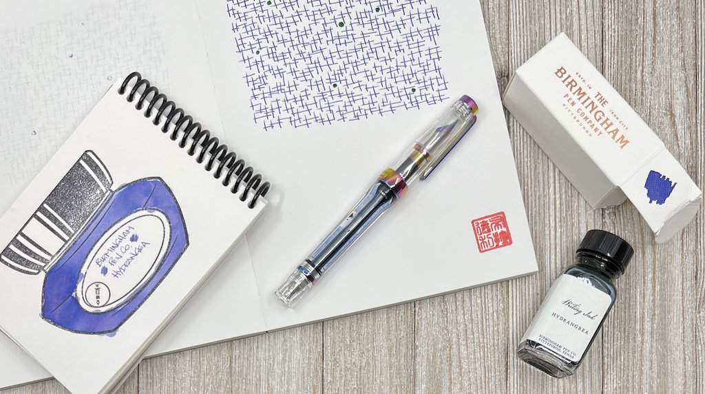
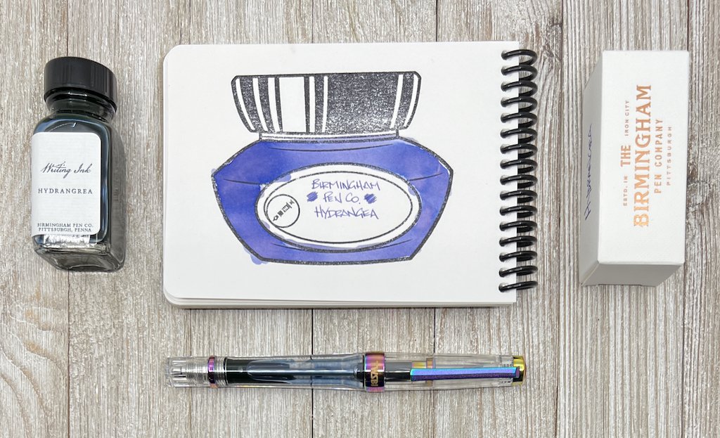
Hydrangea doesn’t fall into that category, but it has character that I appreciate on a page. It’s as if I inked a pen with grape juice and cut it with a couple of drops of water. It’s a great color, is legible, and has a small amount of shading. Right from the nib it shows a little blue, like the skin of a blueberry, but I wouldn’t call this ink a blurple when dry.

If a lot of ink goes down on the page - say from a swab, folded nib, or brush - you will get some pink undertones, which look great in those inky areas.

In my TWSBI VAC 700R Iris with a Fine Steel nib, it flows perfectly. It’s not too dry, nor is it overly lubricated. It’s just … nice. I think that is the goal of the Crisp ink formulation, of which Hydrangea is a part of. It works well in all writing situations.

I’ve had Hydrangea in use for weeks now, and there isn’t another purple I’m anxious to replace it with. That will happen eventually - it always does - but this bottle has found a home at the front of my ink shelf.

(Birmingham Ink Co. provided this product at no charge to The Pen Addict for review purposes.)


Enjoy reading The Pen Addict? Then consider becoming a member to receive additional weekly content, giveaways, and discounts in The Pen Addict shop. Plus, you support me and the site directly, for which I am very grateful.

Membership starts at just $5/month, with a discounted annual option available. To find out more about membership click here and join us!

Posted on November 1, 2021 and filed under Birmingham Pen Co, Ink Reviews.

Diamine Writer's Blood Ink Review

Diamine Writer's Blood Ink Review

(Sarah Read is an author, editor, yarn artist, and pen/paper/ink addict. You can find more about her at her website and on Twitter. And check out her latest book, Out of Water, now available where books are sold!)

With a name like Writer's Blood, of course I needed this ink. I had already decided to buy it when Brad was kind enough to send me a bottle, and it immediately landed at the top of my list of favorite red inks (which literally does exist). I use red ink a lot. Because editing. And this one ticks all the boxes.

Diamine Writer's Blood Ink

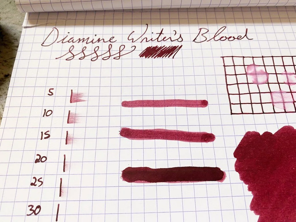
It's a perfect gothic cherry color--dark enough to not be glaring, but bright enough to be seen easily. It's extremely saturated, so it doesn't show much shading, and there's only a very faint sheen where the ink dried in a pool. Perhaps because of this saturation it has a little bit of water resistance. Even where the water sat for a while and was then wiped away, there are still traces of the lines visible. This is also a good thing for editors and writers. The last thing you want is for a teacup hiccup to erase your progress. Chromatography shows its deep rose and purple tones, like a vampire's smoking jacket. Yes, please.

Diamine Writer's Blood Ink Swab
Diamine Writer's Blood Ink Comparison

It is not vastly different from other wine/burgundy inks, and while I do not have any exact matches in my swab collection, there are several very similar ones. It's a good match for Organic Studios Edgar Allen Poe, which is arguably the perfect name for this ink's closest cousin.

It has an average dry time of about 25-30 seconds. It doesn't feel too wet or too dry when writing, though I do have it inked in a very wet writer at the moment. I've yet to meet a Diamine ink that wasn't very well behaved--they all write well and consistently, and this one is no different.

Diamine Writer's Blood Ink Dry Time

This shade comes in two different bottles. You can get a lovely blown glass 80ml bottle like the one shown here for about $16.50, which is an insanely good deal. Or you can get a plastic 30ml bottle for $7.50. I recommend either or both.

(JetPens provided this product at no charge to The Pen Addict for review purposes.)


Enjoy reading The Pen Addict? Then consider becoming a member to receive additional weekly content, giveaways, and discounts in The Pen Addict shop. Plus, you support me and the site directly, for which I am very grateful.

Membership starts at just $5/month, with a discounted annual option available. To find out more about membership click here and join us!
Diamine Writer's Blood Ink Water
Posted on October 14, 2021 and filed under Diamine, Ink Reviews.

Colorverse Eye on the Universe Season 7: eXtreme Deep Field and NGC 1850 Review

Colorverse Eye on the Universe Season 7: eXtreme Deep Field and NGC 1850 Review

(Jeff Abbott is a regular contributor at The Pen Addict. You can find more from Jeff online at Draft Evolution and Twitter.)

Colorverse is an ink company in South Korea that is well-known for their innovative inks that draw inspiration from space. I've always enjoyed seeing the collections they come up and reading about the source material from different space programs. The latest ink pairing I've had a chance to try out is from the seventh season of Eye on the Universe. These inks are inspired by findings from the Hubble Telescope, which is particularly interesting to me since I have family members that worked on the Hubble program at NASA. And, just like every other Colorverse ink I've tried, these don't disappoint!

Colorverse Eye on the Universe Season 7: eXtreme Deep Field and NGC 1850

This collection is made of two inks: eXtreme Deep Field and NGC 1850. The former is a deep teal with red sheen, and the latter is a dark teal with a silver shimmer material. As a pair, they look great together and seem to be based on the same deep teal color. I'm blown away by how many little surprises are tucked away in both inks.

With both inks, they are incredibly dark and somewhat boring when wet. I was a little disappointed by both until I gave the ink a few seconds to dry, and then I was blown away by what I saw. The eXtreme Deep Field has a dark red sheen that isn't shy at all as long as you find the right viewing angle. The NGC 1850 is even more stunning after it dries. The shimmering silver bits are hard to miss, but it's the stunning variation from dark teal to lighter teal and even some purple sheen that make this ink pop. When I made the first swatch with this ink, I accidentally created a piece of art that reminds me of a nebula photo. Such beautiful colors and shades! The shimmer on top looks like distant stars. Needless to say, I'm in love with this ink.

Colorverse Eye on the Universe Season 7: eXtreme Deep Field and NGC 1850 Swab

While both inks swab and swatch really well, they're a little less interesting when writing with them in normal nibs. I still enjoy using them, but you can't really see the full potential of these inks without using a large nib or just brushing this stuff all over the paper. It's just gorgeous and I'm a little bummed that it doesn't come out more easily in normal writing.

Gripes aside, both inks perform beautifully. They're incredibly wet and well-lubricated inks, making the writing experience really smooth. They dry fairly quickly at the 15-20 second mark, but I doubt they'll work well for left-handed writers.

Colorverse Eye on the Universe Season 7: eXtreme Deep Field and NGC 1850 Comparison

Both inks have a fair bit of shading, which comes out easily in larger nibs (anything medium and above). The red sheen of the eXtreme Deep Field comes out easily in areas where the ink pools, adding a good deal of visual interest to your writing. The NGC 1850 is a beautiful dark teal with plenty of silvery shimmers on top that instantly grab your attention. It's also worth noting that I didn't have to shake the NGC 1850 bottle prior to filling the pen to ensure I got plenty of shimmer materials. I filled a pen both unshaken and shaken and the writing results were identical.

Both inks take a little bit of work to clean out of your pen's feed assembly. It took a few flushes of clean water until the water coming out of the nib and feed ran clear. It wasn't the most difficult ink to clear out of a pen, but it definitely wasn't the easiest. This should bode well for the longevity of the ink once it's dried on paper!

Colorverse Eye on the Universe Season 7: eXtreme Deep Field and NGC 1850 Writing

The eXtreme Deep Field ink comes in a 65ml bottle and the NGC 1850 comes in an adorable 15ml bottle. I wish they were both the same size — maybe a 30ml bottle each? Either way, 15ml will still go a long way, and I'm sure I'll get plenty of enjoyment out of this shimmery beauty.

The set costs $36, but you can normally find these on sale for a few bucks less. If you're interested in space exploration, NASA, or just interesting ink combinations, I highly recommend this set. It's a dark and mysterious combo that makes me smile every time I use it.

(Goldspot provided this product at no charge to The Pen Addict for review purposes.)


Enjoy reading The Pen Addict? Then consider becoming a member to receive additional weekly content, giveaways, and discounts in The Pen Addict shop. Plus, you support me and the site directly, for which I am very grateful.

Membership starts at just $5/month, with a discounted annual option available. To find out more about membership click here and join us!

Colorverse eXtreme Deep Field and NGC 1850
Posted on October 13, 2021 and filed under Colorverse, Ink Reviews.