Posts filed under Ink Reviews

Private Reserve Ink Orange Crush Review

(Jeff Abbott is a regular contributor at The Pen Addict. You can find more from Jeff online at Draft Evolution and Twitter.)

Fall is officially here, and even though the temperatures in north Alabama are still arguing over that fact, I've already settled it in my mind by picking a nice fall colored ink to focus on for a while. I've only tried one or two other inks from Private Reserve, so I thought it was time to give them another try since they have such a large catalog. Orange Crush is the ink I chose for the new fall season, and I'm pretty happy with the color (not so much the name) and especially the performance.

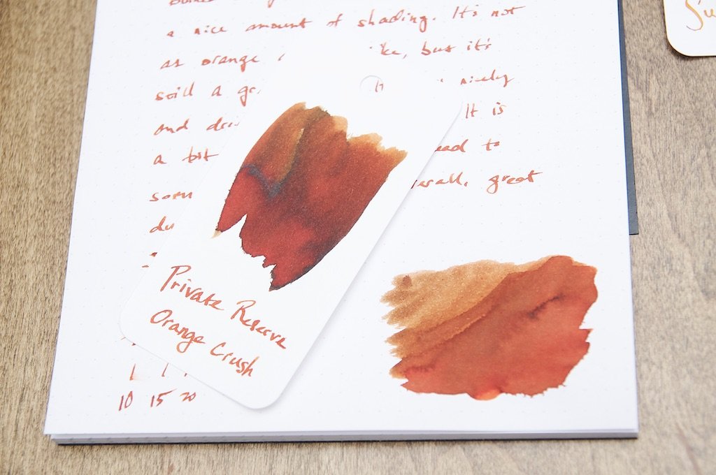
Orange Crush is a dusky orange/brown color with some hints of red in some areas. It's not orange enough for me based on the name alone, but it's still a pretty color in its own rite. To me, Orange Crush makes me think of the soft drink brand, which is a really bright and cheerful orange. There's nothing wrong with the color of this ink, but the name was misleading for me at least.

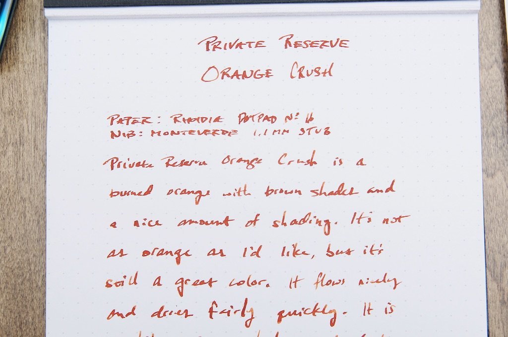
Being a dark orange ink, it shows up really well on paper. Some orange inks can be so light that they look more like a highlighter ink than something you'd write with. The dusty orange/red hues look fantastic, and there's even a bit of shading that happens with larger nibs that uncovers some additional red, orange, and brown hues.

The inks feels well-lubricated and writes smoothly. I haven't had any issues with ink getting stuck or dried up in the nib, and it starts off beautifully after being capped for a while.

One area that I've had a little trouble with different types of paper is feathering/bleed. This ink tends to feather and bleed a bit on certain papers ā€” even Rhodia. It also tends to bleed through to the other side of the page if you're using a really wet nib. It's not terrible, but definitely worth mentioning.

A different area where this ink excels is dry time. Using the 1.1mm stub nib for the writing sample, the ink was normally dry between 10 and 15 seconds, but it's even faster when using a smaller nib. I was surprised by how quickly it was dry to the touch!

Private Reserve Orange Crush comes in a stout 60ml bottle with an incredibly wide mouth. There's plenty of space for filling your pens, but that also means there's even more opportunity to make a giant orange mess. I like the extra wide bottle mouth, but I was definitely more careful when handling this open bottle!

At just under $16 for a 60ml bottle, it's a fantastic value. If you like the color and don't mind having a large amount on hand, it's a great deal. It's not my favorite orange ink, but it's certainly a solid dark, dusty orange if that's your thing. Aside from the feathering/bleed issues, it's also a great performer with quick dry times.

(JetPens provided this product at no charge to The Pen Addict for review purposes.)

Posted on November 17, 2021 and filed under Private Reserve, Ink Reviews.

Yoseka X Ink Istitute No. 1 Origin Ink Review

(Sarah Read is an author, editor, yarn artist, and pen/paper/ink addict. You can find more about her at her website and on Twitter. And check out her latest book, Out of Water, now available where books are sold!)

Yoseka Stationery in Brooklyn partnered with the Ink Institute in Taiwan to create Yoseka X Ink Institute - No. 01 ē”± Origin Ink that pays tribute to their shop's colors and founding.

This is a dye-based ink that comes in a 30ml bottle made of frosted glass. It's a really nice bottle--sturdy and easy to fill from. It costs $18, which is standard for a bottle of ink this size.

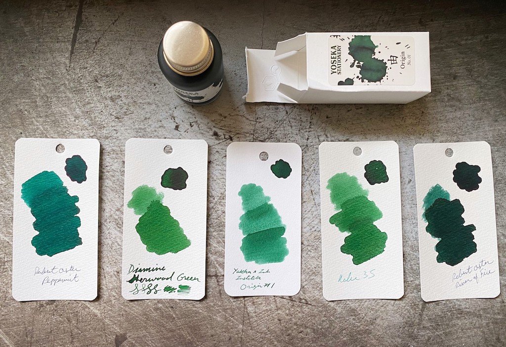
The color of this ink is fantastic. It's a deep, complex green that shows shades from pale pine, to emerald, to deep green, with a bit of red shading on the right paper. Chromatography shows a wild color split with some orange and gold, lime green, emerald, and bright cyan. Definitely in my top three most exciting chromatography tests. It shows a lot of shading, so your writing shows the full range of its complexity.

I don't have any duplicates for this color in my swab library, and it fits in nicely with my other greens, so it easily justifies its place in my ink collection.

While the ink is nicely lubricated and flows very well, it also dries quite quickly at 20 seconds. I didn't even have to use the 25-second spot I'd already written down, as there was no trace of smearing at 20. There is no sign of feathering on Rhodia paper, and the only place where the ink bled through was where I let a full-liquid drop sit until it dried. Even the ink swabs show very little show-through.

This ink has no water resistance. All traces of lines disappeared at the slightest hint of water, and where water was wiped away, the ink was completely erased.

This is, overall, a very balanced ink. It's a fun color, but calm enough to use at work. It's dark enough to read in low light, but bright enough to bring life to your writing. It has fantastic characteristics while still remaining practical. It's the first ink I've tried from the Ink Institute, but it won't be the last.

(Yoseka Stationery provided this product at no charge to The Pen Addict for review purposes.)


Enjoy reading The Pen Addict? Then consider becoming a member to receive additional weekly content, giveaways, and discounts in The Pen Addict shop. Plus, you support me and the site directly, for which I am very grateful.

Membership starts at just $5/month, with a discounted annual option available. To find out more about membership click here and join us!

Posted on November 11, 2021 and filed under Yoseka, Ink Institute, Ink Reviews.

Birmingham Pen Company Pennsylvania Slate Ink Review

(Jeff Abbott is a regular contributor at The Pen Addict. You can find more from Jeff online at Draft Evolution and Twitter.)

I've definitely been on an ink kick over the past few months, and my latest fascination has been Van Dieman's ink options. I've really enjoyed exploring what they have to offer and their unique perspective to ink colors that are tied to their local (Tasmania) geography and history. My most recent introduction, however, is a little closer to home: Pennsylvania.

The Birmingham Pen Company is a name I've heard over the last several months, but I haven't had an opportunity to try it out until now. New inks are one of my favorite things about pen shows, and I blame the pandemic and lack of pen shows for these Birmingham inks to hit my inbox. Iā€™m looking forward to a time when pen shows are back on my agenda so I can discover more beautiful inks in person!

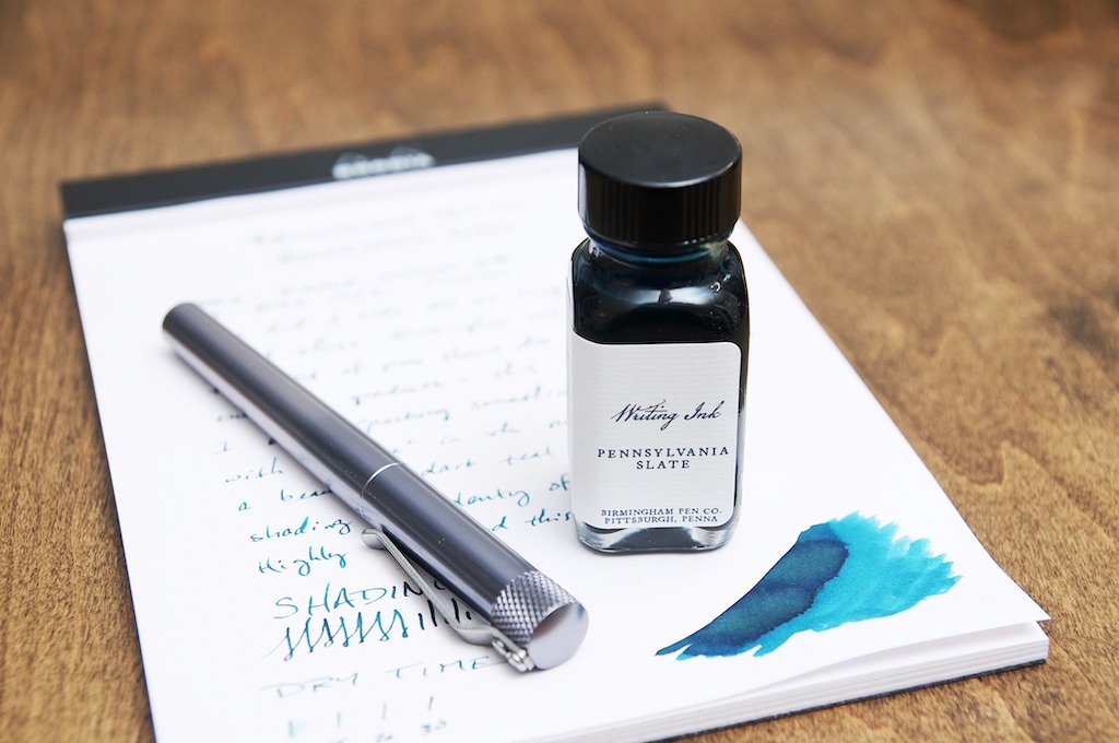
For the first ink to try, I went with Pennsylvania Slate because the name made me think of fall and cooler temperatures. But, just like they say you can't judge a book by its color, you also can't always assume an ink's color by its name. In my case, I assumed this ink would be dark and moody ā€” closer to a blue-black than a blue ink. I was very happily surprised when I did my first swatch with this ink. It's a gorgeous dark teal that has some wonderful shading and gobs of character. I have so many blue and blue-green inks in my collection, but Pennsylvania Slate still manages to be unique in a sea of similar shades.

The darker pools of ink take on a dark and mysterious tone, but the real magic happens in the lighter areas where the blue and green tones come out to play. It's incredibly obvious in a swatch that this ink has a wide range of shades, but it also comes out great when writing. For my sample, I used a medium cursive italic nib ā€” it's not a "big" nib by my standards, but does a good job at showing off any flare an ink has without being too wide and ostentatious for everyday writing (for me, anyway). I just love the subtle color changes that happen in each stroke. And it certainly doesn't hurt that my eyes just can't get enough of this blue and blue-green realm of ink colors.

Everything else about this ink is top notch. It flows well, it doesn't have any bleeding or feathering issues, and it actually dries pretty quickly. With normal writing with a medium cursive-italic nib, most lines are dry between 10 and 15 seconds. Not bad!

The ink does a good job of flowing after sitting for a while in a closed pen or even after a minute or so of being unused and uncapped. Likewise, it cleans out quickly and without any fuss.

Even better, this uses Birmingham's own "Crisp" ink formula that touts excellent performance on a range of different paper types and qualities.

I'm not one that normally cares a whole lot about packaging and presentation, but I will say that the Birmingham ink bottles are quite attractive. They apparently pour, seal, and label each bottle by hand. I just know it looks good sitting on my desk and ink shelf.

Pennsylvania Slate is available in 30ml, 60ml, and 120ml bottles for $13, $16, and $19 respectively. If you know you want a lot of one ink color, the large bottle is an incredible value! Regardless of size, you owe it to yourself to try out some of the inks that Birmingham Pen Company offer. I know I'll be adding several more to my list for the near future, and I look forward to seeing some more options in person at the next pen show I attend.

(Birmingham Pen Co. provided this product at no charge to The Pen Addict for review purposes.)

Enjoy reading The Pen Addict? Then consider becoming a member to receive additional weekly content, giveaways, and discounts in The Pen Addict shop. Plus, you support me and the site directly, for which I am very grateful.

Membership starts at just $5/month, with a discounted annual option available. To find out more about membership click here and join us!

Posted on November 3, 2021 and filed under Birmingham Pen Co, Ink Reviews.