Posts filed under Ink Reviews

Bungubox L'Amant Fountain Pen Ink Review

Bungubox L'Amant Fountain Pen Ink

(Jeff Abbott is a regular contributor at The Pen Addict. You can find more from Jeff online at Draft Evolution and Twitter.)

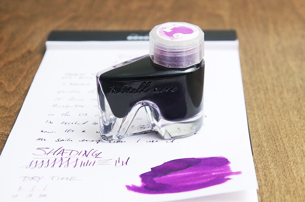
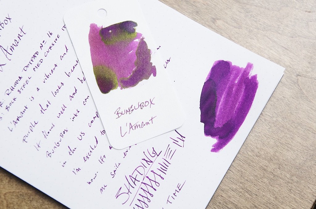
It's been quite a long time since I've tried a new Bungubox ink, so this is long overdue. L'Amant is a lovely purple ink with plenty of vibrant character and a few surprises. Since Bungubox can be a little difficult to find in the US, I don't have a large collection. But, I expect quite a bit from based on my past experience with it. Luckily, L'Amant doesn't disappoint.

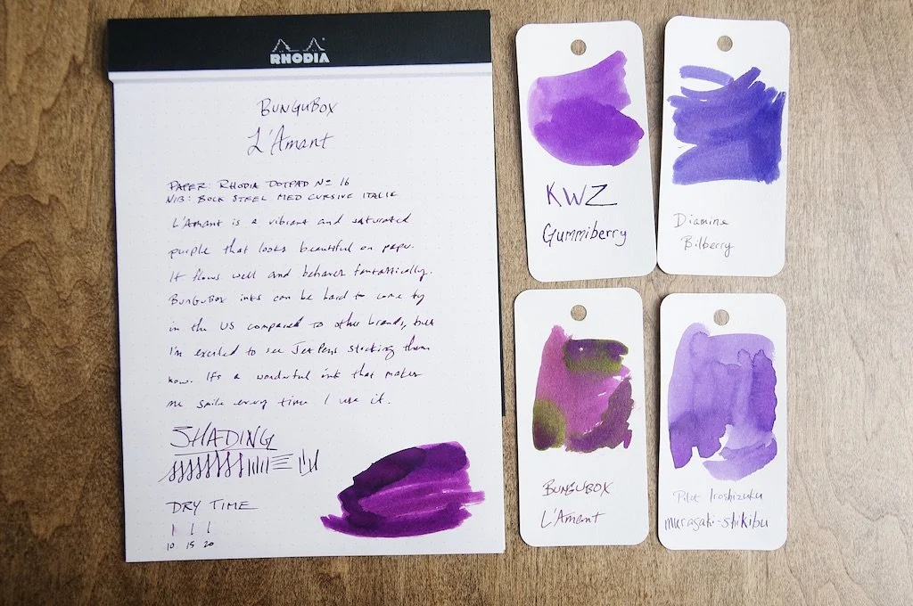
On the surface, L'Amant is a cheery purple ink with a good deal of shading between dark tones. It's dark enough to blend in with a professional setting, but bright enough to stick out. What surprised me is the gold/green sheen that appears in some spots. The edges of ink pools is where I see the most of this sheening behavior, and I can't get enough of it. It totally surprised me.

Bungubox L'Amant Fountain Pen Ink

L'Amant is a dye-based ink, and it dries extremely fast. In my testing in a medium cursive-italic nib, most of my writing was dry to the touch in 10 to 12 seconds. Wetter areas were dry by 15 seconds. Again, pretty impressive.

Performance is definitely on par with what I've seen with other Bungubox inks. There's zero feathering and bleed on good paper, it flows extremely well, and finds the perfect balance of lubrication and wetness.

The ability for this ink to deliver a consistently vibrant and calm purple on the page is stellar. The surprise green/gold sheen around larger pools of ink is simply delightful. Unfortunately, this sheen doesn't come out much in smaller nibs. You need to use a large nib to see this in action.

Bungubox L'Amant Fountain Pen Ink

The marketing for this ink makes a big deal out of the bottle shape and the box it comes in. The heel shape of the bottle is unique and easy to use, and I really appreciate the big ink swatch on top of the cap to show you what's inside. The box is designed in a way so that the top third flips open to act as a kick stand for the ink bottle. The idea is that you use the box to prop the ink bottle at a good angle for getting at the last few milliliters of ink in the bottom. This is nifty and certainly a well-thought-out design consideration, but I'd probably just use a syringe to get out the last bit of ink. Using this setup requires you keep the box around — which is fine in my case — but not everyone wants to keep the ink packaging around. Pro tip to those that toss out the ink boxes: ink is much easier to store and move when you keep them in their box. Boxes are easy to stack, whereas oddly shaped ink bottles are not!

At $44.50 for 30 ml, this ink definitely comes at a premium price. Bungubox has an excellent reputation and I can whole-heartedly recommend paying the premium price for any of their inks that tickle your fancy. If you haven't had the opportunity of trying out any Bungubox inks, definitely add them to your list.

(JetPens provided this product at no charge to The Pen Addict for review purposes.)


Enjoy reading The Pen Addict? Then consider becoming a member to receive additional weekly content, giveaways, and discounts in The Pen Addict shop. Plus, you support me and the site directly, for which I am very grateful.

Membership starts at just $5/month, with a discounted annual option available. To find out more about membership click here and join us!

Bungubox L'Amant Fountain Pen Ink
Posted on April 13, 2022 and filed under Bungubox, Ink Reviews.

Kakimori - A 2-for-1 Quick Look

(Kimberly (she/her) took the express train down the fountain pen/stationery rabbit hole and doesn't want to be rescued. She can be found on Instagram @allthehobbies because there really are many, many hobbies!.)

Sometimes I look down at the pile o’ goodness that the Bossman sends me and try to figure out what to play with that is both interesting to me and to you. Most of the time, it is difficult because I’m paralyzed with so many choices! Should I review an ink? Maybe a notebook? Or a new pen? Well, this time, it was a pretty easy choice because I found TWO things that I wanted to play with, so lucky you, you’re gonna get a 2-for-1 quick look today!

I have a bottle of Kakimori 08 Zabun, which is a pigmented ink, and Kakimori Letter Paper. Thank you to Vanness Pens for sending these for review.

Zabun is one of 10 pigmented inks in their classic line from Kakimori and comes in an adorable 35ml bottle. These ink bottles were designed by Makoto Koizumi, who wanted them to look like falling drops. It’s easier to show you than describe but imagine a big round drop of glass with a flat base, but rather than an opening right at the top, it’s off to the side, making it look a little tipsy or lopsided, but in a cute way. The nice wide opening is at an 8-degree angle from the top, making it perfect for dipping as well as inking up pens/converters.

Kakimori
Kakimori Ink

Unlike dye-based inks, pigmented inks are meant to be water, fade and smudge- resistant. It is not an iron gall ink, so it can be used safely in pens with steel as well as gold nibs. Also, because it is pigmented, you should always shake up the bottle prior to inking up a pen to evenly disperse the pigment. Lastly, pigmented inks are mixable, so if your inner alchemist/artist/colorist wants to try making other colors of pigmented ink, have at it - just be sure to use a separate clean vial/bottle for the mixing so you don’t contaminate the original colors.

Because it is meant to be water resistant, pigmented inks may be more difficult to clean out your pen if you leave it unused for a long time, or if it has dried out. Since I don’t always get a chance to rotate my pen usage as much as I’d like, I decided to ink this up in a converter (in case it permanently stains it).

Kakimori

I wrote a few lines on HP 28lb laser jet paper and let the ink dry before running water over it for 15 seconds.

Kakimori

This is what it looked like after I put the wet paper on the counter. Definitely water-resistant!

On Col-o-ring cards, you can see that it is a nice dark teal. I used a Woodshed Pen Company teal demonstrator with a Franklin-Christoph Medium nib for the writing sample. You can see that it is a nice dark teal - neither too green nor too blue. It has average flow, maybe even a teensy bit on the dry side, resulting in a little bit of shading on both the Col-o-ring cards and the Kakimori letter paper.

Kakimori Ink

I put the Col-o-ring cards on the Kakimori letter paper to show that the latter has a slight cream tinge to it.

Kakimori Ink

Similar inks include Ferris Wheel Press Bluegrass Velvet, Papier Plume Ink 13, Monteverde Iced Cookie, Montblanc Blue Hour, Diamine Smoke on the Water (minus the sheen), Straits Pens Sad Stormy Swedish Sea, Sailor 50 States California and KWZ IG Turquoise.

Zabun dries fairly quickly on the Exacompta index card as well as the Kakimori letter paper. It might take a touch longer on more slick papers like Tomoe River, but I didn’t really notice much of a difference for dry time.

Kakimori Ink

Dry time was about 30 seconds on this yellow index card (it’s not my bad lighting this time, lol)

On to the Kakimori letter paper! The paper is blank with teal colored lines and swirls on the top and a single line at the bottom with a small Kakimori logo in the lower right hand corner. The paper is B5-sized and has a laid texture, where there are fine “lines” running across the page both horizontally and vertically. These lines feel like little bumps and can help you write straight without a guide sheet, but it can also be distracting when writing with fine or extra fine nibs as you may feel each bump with up/down strokes. The “front” side of laid paper is the side with the texture. In addition, there is a watermark which will indicate which is the writing side - if you hold it up to the light, you can see the watermark of the word “conqueror” (its placement is random on each sheet). The reverse side is smooth by comparison, but not like Tomoe River or Cosmo Air Light.

Kakimori Paper

It’s a lot easier to see the laid texture as well as the watermark if you hold it up against the light.

It took me a bit to get used to the texture but it was nice not having to use a guide sheet or rely on preprinted lines/dots. The paper held up nicely to a variety of pens, nibs and inks. It handled dye-based inks (what we’d all just call “ink”), this Zabun pigmented ink, shimmer ink as well as a sheening ink, though the paper seems to have soaked up most of the sheen. Other than the bottom swatch where I released a drop of ink from the converter onto the page and smeared it onto the paper, there was really no bleed through, which is impressive. Even then, it barely bled through to the other side.

Kakimori Paper

I didn’t see any feathering with any of the writing samples.

Kakimori Paper
Kakimori Paper

All of the inks looked fine on the page, too.

Kakimori Paper

Barely any ghosting on the back even with the ink swatches.

The Kakimori letter paper comes either as 6 sheets to a pack for $5, or 3 sheets and an envelope in the letter set for $6. This can add up very quickly, especially if you have a lot of penpals or are long-winded like me. But if you wanted something a little more special, this would be a great option. And if you wanted a nice pigmented ink to address your envelopes for rainy season or perhaps use for art or just because you like the color, the Kakimori pigmented ink, at $30 for a 35ml bottle, is also an excellent but somewhat pricey option.

(Brad purchased this product at a discount from Vanness Pens for review purposes.)

Posted on March 25, 2022 and filed under Kakimori, Ink Reviews, Letter Writing.

Van Dieman's Tassie Seasons Black Truffle Review

Van Dieman's Tassie Seasons Black Truffle

As winter is coming to a close, I figured a gloomy black ink would be a fitting ink choice as I anticipate the warmer and brighter weather. Van Dieman's Tassie Seasons series is a beautiful collection of inks that take their inspiration from the natural beauty of Tasmania, and Black Truffle is a dark brown that looks black in most light. I'm hoping that by the time I write all of this ink through my pen, spring will be here!

While I usually favor bright and cheery inks, there's definitely plenty of space for dark inks. It doesn't matter if you're required to use a dark ink in some situations, if a dark ink just works better in others, or if you just enjoy using it in any scenario — they should still be pretty and interesting. Black Truffle doesn't disappoint. When you first write with this ink, it looks a couple shades darker as a fairly mediocre black. But as the ink dries (which happens really quickly, by the way), the dark overtones give way to a dark brown hue that pops out in the thinner areas of the ink. It provides a perfect amount of color and shade variation to make it visually interesting on the page. If you're looking for a solid, rich black ink, this isn't the one for you. This black ink vacillates between brown-black and black depending on the thickness of the nib stroke, and that's why I've really been enjoying it.

Van Dieman's Tassie Seasons Black Truffle

Along with the mild shading, there's also a shine or black sheen in certain areas where the ink pools. It's hard to catch on camera, but it adds a little depth to the finished product. It's not enough sheen to steal the show, but it catches my eye every now and then when I'm not expecting it.

The lubrication of the ink is fantastic. The pens I've used with this ink have no trouble gliding across the paper. It starts quickly and feeds perfectly. I've had zero issues with the behavior of this ink in my pens, and that's what I've come to expect from Van Dieman's.

I can't see any feathering or bleeding from the ink either, which makes this an excellent performer for an all-around ink pick. It's done great in any combination of paper and nib I've thrown at it.

Van Dieman's Tassie Seasons Black Truffle

One of the things that shocked me about this ink was actually the dry time. I thought I was doing something wrong or getting distracted when I was doing the timed tests because I couldn't make the ink smudge after 10 seconds. I thought I was surely losing track of time somehow, even though I was using a watch to time it. Well, there's nothing wrong with my watch or my smudging technique — this ink just dries ridiculously fast. In my tests on Rhodia paper with a medium cursive italic nib, the ink was smudge-proof by 8 seconds. In some cases, it was dry by 5 seconds. In my tests, I haven't been able to get a smudge when I wait until the 10 second mark. It's just incredible.

Van Dieman's Tassie Seasons Black Truffle

While the color isn't something that really excites me, this is still a superb ink. The color is dark and somewhat ordinary, but it's still interesting due to the background hues and shading effect. It behaves well in pens and writes marvelously. Throw the super quick dry time in there and you've got a killer ink on your hands.

If you're in the market for a dark brown-black ink with a little character and a fast dry time, check out Van Dieman's Black Truffle. A 30ml bottle will set you back $13.95, but you can also pick up a small sample to try first.

(Vanness Pens provided this product at no charge to The Pen Addict for review purposes.)


Enjoy reading The Pen Addict? Then consider becoming a member to receive additional weekly content, giveaways, and discounts in The Pen Addict shop. Plus, you support me and the site directly, for which I am very grateful.

Membership starts at just $5/month, with a discounted annual option available. To find out more about membership click here and join us!

Van Dieman's Tassie Seasons Black Truffle
Posted on March 9, 2022 and filed under Van Dieman's, Ink Reviews.