Posts filed under Ink Reviews

Sailor Yurameku Itezora Ink Review

Sailor Yurameku Itezora Ink Review

The most important question about Sailor Yurameku Itezora ink won’t be “Is it good?” It also won’t be “How does it perform,” “Is it waterproof,” or the impossible “Is it worth it?” The most important question about Sailor Itezora is “What color is it?”

The answer? I have no idea.

Sailor Itezora Ink Bottle

That’s a feature of the entirety of the Sailor Yurameku line, not specifically Itezora. From the product description at JetPens:

“Sailor Yurameku inks feature soft, mysterious colors that defy easy description. They can shift between two or three different hues as they dry, leaving behind a dreamlike ribbon of mercurial colors. The amount and color of this shading vary depending on the type of paper and pen used.”

I have to say the description is true. What I see as grey, green, purple, pink, blue you may see as something different. Or at least in a different priority. That’s by design. The nib and paper will make a big difference it what you see on the page.

Sailor Yurameku Itezora Ink

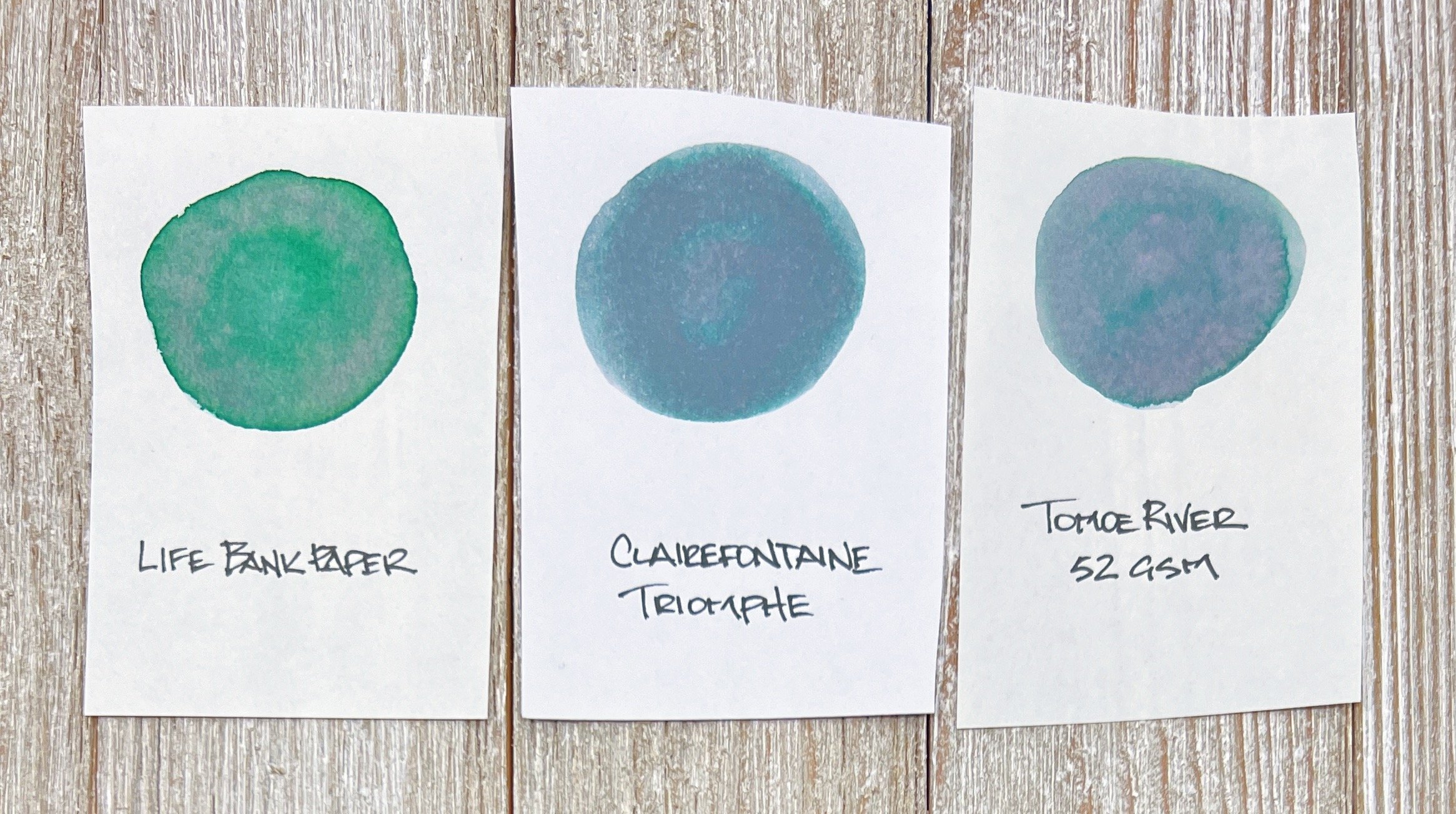
For example, I want to call this a grey ink. That’s the main color I see on a few standard paper types I initially tested. Then, I switched over to bank paper and all of a sudden the green came out. A switch to original Tomoe River 52 gsm paper brought out the purple on top of the grey and green, with a hint of pink sheen. It’s kind of great.

Sailor Itezora Ink Paper Mind

The Paper Mind Mitsubishi Bank Paper.

My biggest concern when choosing this ink was if it would be dark enough to read on the page with my finer nibs. I’m happy to report it has been a non-issue. It’s obviously not black, but it trounces the readability of an ink link Sailor 123. Now, I’m not rushing out to load this up in a Japanese Extra Fine nib, but this Bock EF? It’s been great.

Sailor Itezora Ink Yoseka

Yoseka Notebook Paper.

Speaking of the nib, it is in use with the Ensso Japanese Ebonite Pocket Fountain Pen. We got an early preview of both the regular size, which Jeff reviewed last week, and the pocket size, which I’ve been testing out myself. So far, my thoughts mimic Jeff’s in that it is great. The pocket size construction and feel is similar to the regular, with the obvious difference being the barrel length. The short barrel is just that, and is threaded on the back-end for posting, which makes the pen a full-length writer.

I eyedropper-filled the pen with Itezora a little over a week ago, and it has worked perfectly since.

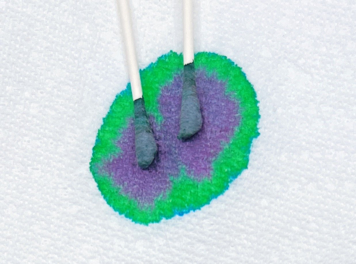
Sailor Itezora Ink Chromatography

Accidental chromatography.

Ok, back to the ink itself. I recommend it. Even at its $20 for 20 ml price tag. There are eight inks total, and looking at the palette, I can’t say I’m into the full series. That said, picking and choosing an ink or two from the Yurameku lineup is in the cards if you like to experiment with unique fountain pen inks.

(JetPens and Ensso provided these products at no charge to The Pen Addict for review purposes.)


Enjoy reading The Pen Addict? Then consider becoming a member to receive additional weekly content, giveaways, and discounts in The Pen Addict shop. Plus, you support me and the site directly, for which I am very grateful.

Membership starts at just $5/month, with a discounted annual option available. To find out more about membership click here and join us!

Sailor Itezora Ink Lines
Posted on June 13, 2022 and filed under Sailor, Ink Reviews.

Robert Oster Cities of America: Chicago Ink Review

Robert Oster Cities of America: Chicago Ink Review

(Jeff Abbott is a regular contributor at The Pen Addict. You can find more from Jeff online at Draft Evolution and Twitter.)

I've long been a fan of Robert Oster’s inks that take so much inspiration from Australia, so I was intrigued to learn about his Cities of America series. The first variant of the collection I've scored is the Chicago ink, which is a lovely denim blue color with hints of green and gray interspersed.

When confronted with the question of what color a certain city makes you think or feel, I'm not sure there's ever a correct answer. More than likely, you'll get as many unique answers responses. For me, Chicago is vibrant yet cold and hard. A steely gray with some character comes to mind. But, there's also color. Lake Michigan, the Cubs, the bustling downtown, all the rich history that makes Chicago what it is today. For Robert Oster, Chicago is a dusty denim with tones of green and gray. I like the color he chose for this city, but (more importantly) it's just a great color for an ink.

Robert Oster Chicago

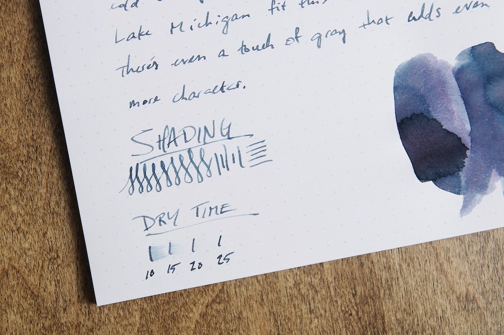
The shading that this ink exhibits makes it every more difficult for me to determine the exact colors. It has layers, and that's exactly what I've come to expect from Robert Oster inks. It's not simply one color. It has depth, and it can even shift between light and nibs.

So whether it's a dusty blue or a slightly green-gray blue, this ink will continue to surprise you — similar to how a big city will continue to surprise you over time.

Writing with this ink is fantastic. If you've used a Robert Oster ink before in the past, you'll know what to expect. The delivery is smooth and predictable, and it works nicely on virtually all combinations of nibs and paper types.

Robert Oster Chicago

Dry time is fairly good as well. In most cases, the ink was smudge-proof by 10 or 15 seconds if I was writing lightly. When writing slower and really letting the ink flow well and pool up in certain areas, the ink takes more like 20 to 25 seconds to fully dry. For most normal writing, it's a pretty quick dryer.

Feathering and bleeding are non-existant with this ink, as least in my testing on nice paper. You can expect some feathering on thinner paper or copy paper, but it's not bad considering.

At $18 for a 50ml bottle, it's a great deal. The bottle is a great shape and has a good opening for accommodating most pen section sizes. It might struggle a bit with large nibs, but there's always eyedroppers and aftermarket glass ink bottles for those situations.

Chicago belongs to the first series of the Cities of America collection, and there's been promise of a second series coming sometime this year.

Chicago is a lovely ink color that really finds a nice spot in between blue, gray, and green in a way that only Robert Oster can manage. The extra character found in the shading and other behaviors just make it more special.

If you haven't tried any of Robert Oster's inks, definitely give one a try soon!

(Pen Chalet provided this product at no charge to The Pen Addict for review purposes.)


Enjoy reading The Pen Addict? Then consider becoming a member to receive additional weekly content, giveaways, and discounts in The Pen Addict shop. Plus, you support me and the site directly, for which I am very grateful.

Membership starts at just $5/month, with a discounted annual option available. To find out more about membership click here and join us!

Robert Oster Chicago
Posted on May 25, 2022 and filed under Robert Oster, Ink Reviews.

Monarca Arena Blanca Ink Review

Monarca Ink

(Sarah Read is an author, editor, yarn artist, and pen/paper/ink addict. You can find more about her at her website and on Twitter. And check out her latest book, Out of Water, now available where books are sold!)

Monarca Stationery inks are so tempting. I love the names, the look of the bottles, and the wooden stand for the bottle with the pen rest (a limited offering, I believe). There's a lot to like about what they're up to, including an array of great colors.

Monarca Ink

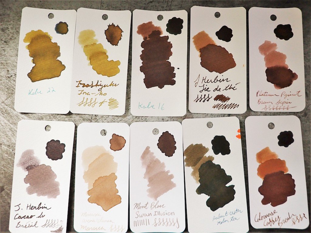
I love brown and sepia toned inks, so I was curious to try this pale sand color from them. Arena Blanca means White Sands, and that's a great name for this color. It's a very soft, warm brown and quite pale. It's one of those ink colors that won't work for folks who want bold, saturated colors. It's not an ink you could read easily in low light or use on kraft or brown-toned paper, but it has tons of character on regular paper.

Monarca Ink

This ink shades like crazy, and it looks so much like a watercolor painting of a shoreline. It's a very peaceful color and I dig it. Heavier application, or where the ink pools, creates a bolder brown. There is no sheen, but the shading is so intense a sheen would be too much.

The color is a complex one, and the chromatography was wild. There's a grey base, with shell pink, peach, and soft goldenrod, with a light skim of blue. The breakdown is as pretty as the ink itself.

Monarca Ink

There is no water resistance to this ink--it washes away quickly, just like its namesake. The dry time was quite slow, and I had to add a 30-second mark to see if it would stop smearing, and even that streaked a little. Dry time on this one is "eventually."

I do have two nitpicks with this ink, though. One, the stock picture sent to retailers looks absolutely nothing like the actual ink color. Look to reviews for a more accurate shade. And two, the opening of the bottle is far too narrow for easy filling. Even my narrower pens had trouble, and my Pilot 823 didn't fit at all.

Monarca Ink

This ink will be filed in my "lovely but impractical" category, which I use more often than you'd think. At $20 for a 30ml bottle, it's about mid-range on price. Not inexpensive, but not alarming. It's a fair price. Overall, I like it a lot, despite my nitpicks.

(Monarca Stationery provided this product at no charge to The Pen Addict for review purposes.)


Enjoy reading The Pen Addict? Then consider becoming a member to receive additional weekly content, giveaways, and discounts in The Pen Addict shop. Plus, you support me and the site directly, for which I am very grateful.

Membership starts at just $5/month, with a discounted annual option available. To find out more about membership click here and join us!
Monarca Arena Blanca Ink
Posted on May 19, 2022 and filed under Monarca, Ink Reviews.