Posts filed under Ink Reviews

Vanness Healing Stone Ink Review

Vanness Healing Stone Ink Review

(Jeff Abbott is a regular contributor at The Pen Addict. You can find more from Jeff online at Draft Evolution and Twitter.)

There are so many different inks to choose from today, and that's even after you discount any specialty or sub-par options. High quality ink options are abundant, and we are extremely blessed for that. But that doesn't mean we don't want more options to choose from!

One of the more exciting areas of stationery for me is the blossoming ink market. It seems like every time I turn around, there's a new boutique ink formulator that has beautiful inks for sale. The latest boutique ink to cross my desk is from a familiar name, though. Vanness Pens have experimented with custom inks before, but it's never been a full-on product line. Think of it more as special one-off runs. In this case, the ink is called Healing Stone, and it’s no longer for sale. That being said, it serves as a fantastic example for what the Vanness team are capable of when it comes to designing a fantastic fountain pen ink.

Vanness Healing Stone Ink

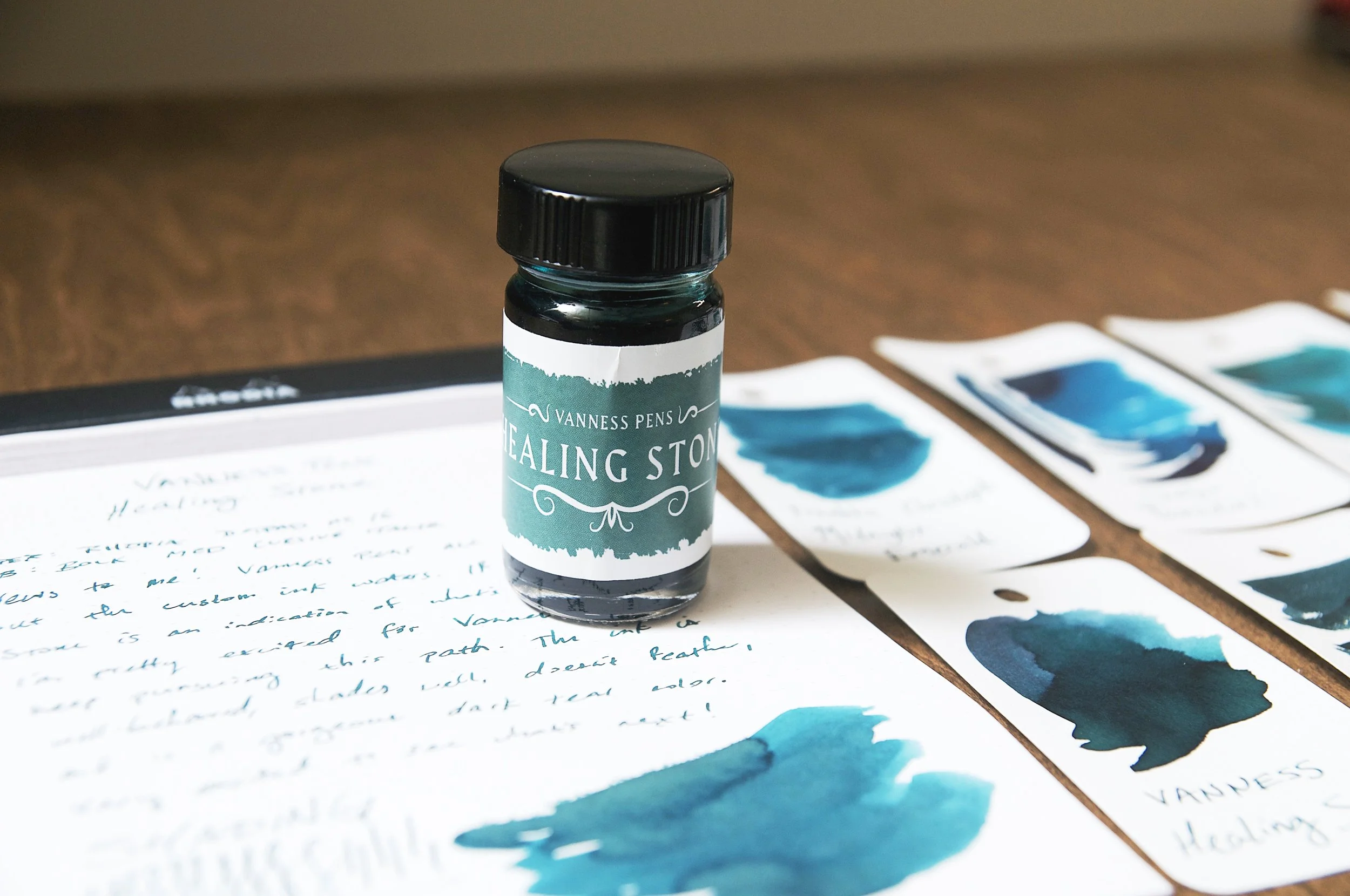
Healing Stone is a dark teal ink that reminds me of other inks that I own, but stands out on its own with plenty of unique merit. Comparing it to other swatches of my ink collection, I noticed that it fits a specific gap that doesn't easily compare. It either has more blue or more green than my other similar inks, but it's such a gorgeous color that I'm happy to add it to the collection.

The dark teal color is murky but distinct. It's not close to the black-teal territory at all. This is a solid teal color that exists somewhere on the edges of dark teal without any hint of black. It's a moody but calming color for me. It has plenty of depth, but without feeling cold or mysterious.

Vanness Pens Healing Stone

The shading of Healing Stone pairs perfectly with the color. There's enough shading to offer plenty of color variation from medium to dark teal, which adds that depth I mentioned. The shading is very apparent when using a wet medium cursive italic (used for the review photos), but it also comes through on finer nibs too. In areas where the ink pools, it still maintains the teal hue instead of taking on a black tone. For me, it has the perfect amount of shading for everyday writing.

What really blew me away about this ink was the dry time. I did the same test several times because I thought I was making mistakes while counting the time. In most cases, the ink was smudge-proof before the ten second mark. I couldn't believe it, hence the repeat tests. Even after five seconds, there isn't a tremendous amount of smudging or smearing. It's an incredible feat!

Vanness Pens Healing Stone

The ink is very well-behaved. It's well lubricated and glides easily across the page. At the same time, it isn't overly wet, which can cause feathering and bleeding. The only bleeding I've observed with this ink was when I used a watercolor brush to glop ink onto the Rhodia paper for a test. When writing, there have been zero issues. It doesn't even show through on the back of the page as much as I'd expect from a darker ink. Once again, incredible!

In all, I'm really impressed by Healing Stone. It's not my favorite color, but I've enjoyed using it due to the shading variation and crisp lines it achieves. Add in the quick dry time, and it's a complete winner.

I wish I could point you to a link to buy your own bottle of this fantastic ink, but it isn't current for sale. I don't have the details about when/if this in will be available for sale (or what other plans Vanness may have for the ink market), but I hope that this isn't the last we hear from Vanness in terms of interesting inks.

(Vanness Pens provided this product at no charge to The Pen Addict for review purposes.)


Enjoy reading The Pen Addict? Then consider becoming a member to receive additional weekly content, giveaways, and discounts in The Pen Addict shop. Plus, you support me and the site directly, for which I am very grateful.

Membership starts at just $5/month, with a discounted annual option available. To find out more about membership click here and join us!

Vanness Pens Healing Stone
Posted on August 3, 2022 and filed under Vanness Pens, Ink Reviews.

Inkebara Crimson Fountain Pen Ink Review

Inkebara Crimson Fountain Pen Ink Review

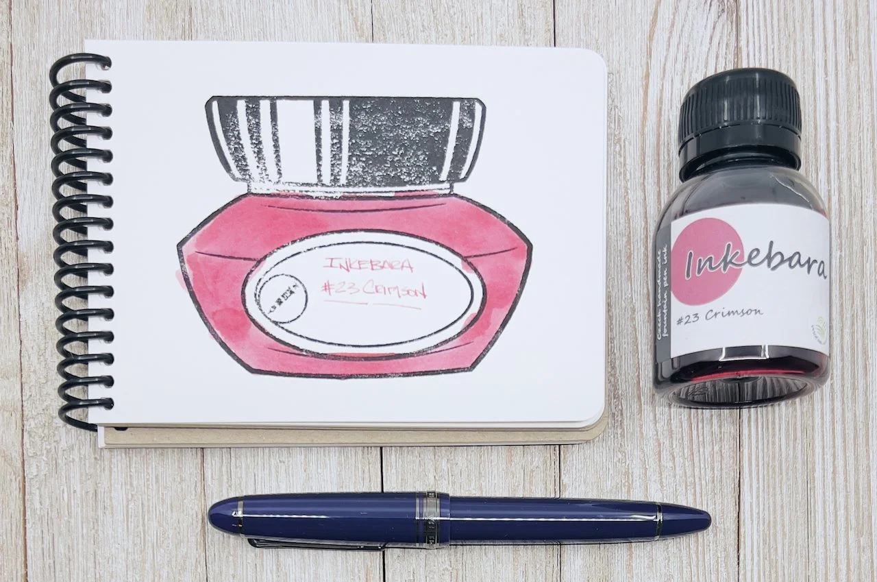
Based in the Czech Republic, Inkebara is a new-to-me fountain pen ink manufacturer. Founded in 2016 out of a desire for more local ink options for fountain pen fans, Inkebara has branched out around the world, and on to my desk for testing.

I picked up several colors recently, and chose Crimson for my first review. Why? Because I don’t use many red inks and wanted to experiment with one for something different.

Inkebara Crimson Fountain Pen Ink

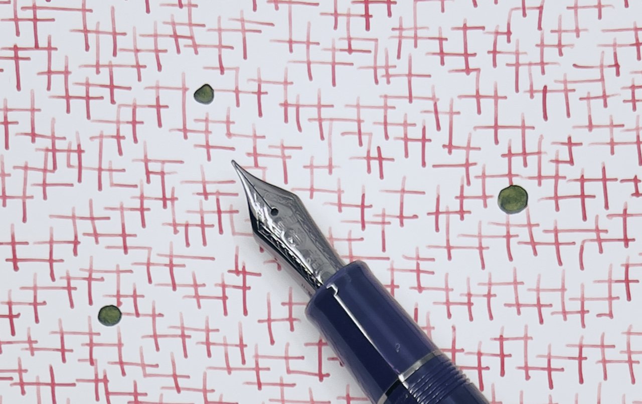
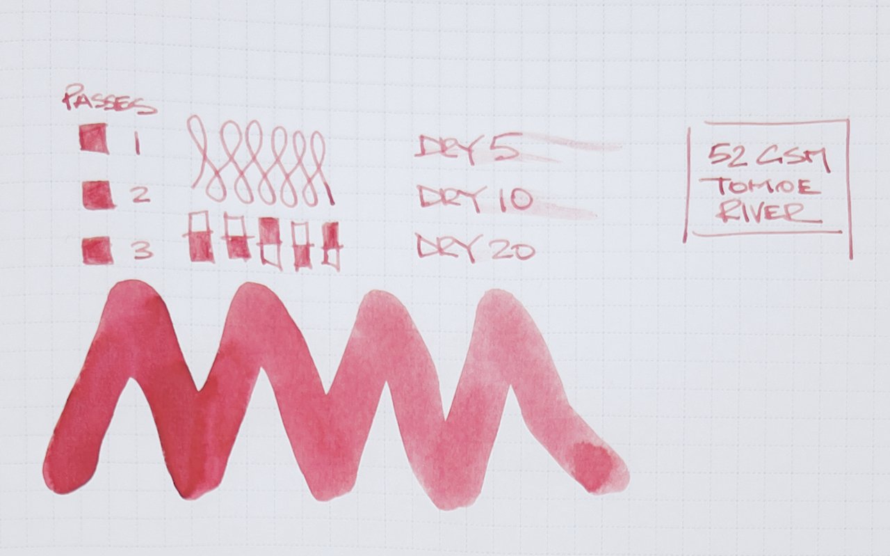
I’d hesitate to call Crimson a true red. It leans pink in all but the heaviest ink applications on the page, which do get into a redder range. That wasn’t my expectation when I cracked open this bottle, but I’m happy with the results.

Inkebara Ink

Performance-wise, it has worked well. It has good flow, good lubrication, and despite being a lighter shade, good color saturation. I chose one of my favorite writing nibs to test with, a 21K Medium Fine in the Sailor 1911L Wicked Witch, and it has been perfect. My lines are fine and legible with a small bit of shading, and the ink dries quickly even on Tomoe River paper.

Inkebara Ink

Reviewing a quality product in a simple, straightforward manner is difficult. It’s good-what else is there to say? I mean that in the most positive way. Even the price, $15 for 60 ml, is good. I wouldn’t hesitate to recommend it to any fountain pen user.

With over 40 inks already on the market, and the level on enjoyment I am getting from this one, you can bet there will be more Inkebara inks in my future.

(Vanness Pens provided this product at no charge to The Pen Addict for review purposes.)


Enjoy reading The Pen Addict? Then consider becoming a member to receive additional weekly content, giveaways, and discounts in The Pen Addict shop. Plus, you support me and the site directly, for which I am very grateful.

Membership starts at just $5/month, with a discounted annual option available. To find out more about membership click here and join us!

Inkebara Ink
Posted on July 25, 2022 and filed under Inkebara, Ink Reviews.

Ferris Wheel Press Ink Charger Set Review

Ferris Wheel Press

(Sarah Read is an author, editor, yarn artist, and pen/paper/ink addict. You can find more about her at her website and on Twitter. And check out her latest book, Out of Water, now available where books are sold!)

Ferris Wheel Press inks have been catching my eye a lot lately and I even bought a bottle at the Chicago Pen Show, despite my resolution to not buy more ink until the stash diminishes a little. It's even more tempting to cave in when the inks come in these adorable 5ml sample bottle sets.

Ferris Wheel Press
Ferris Wheel Press
Ferris Wheel Press

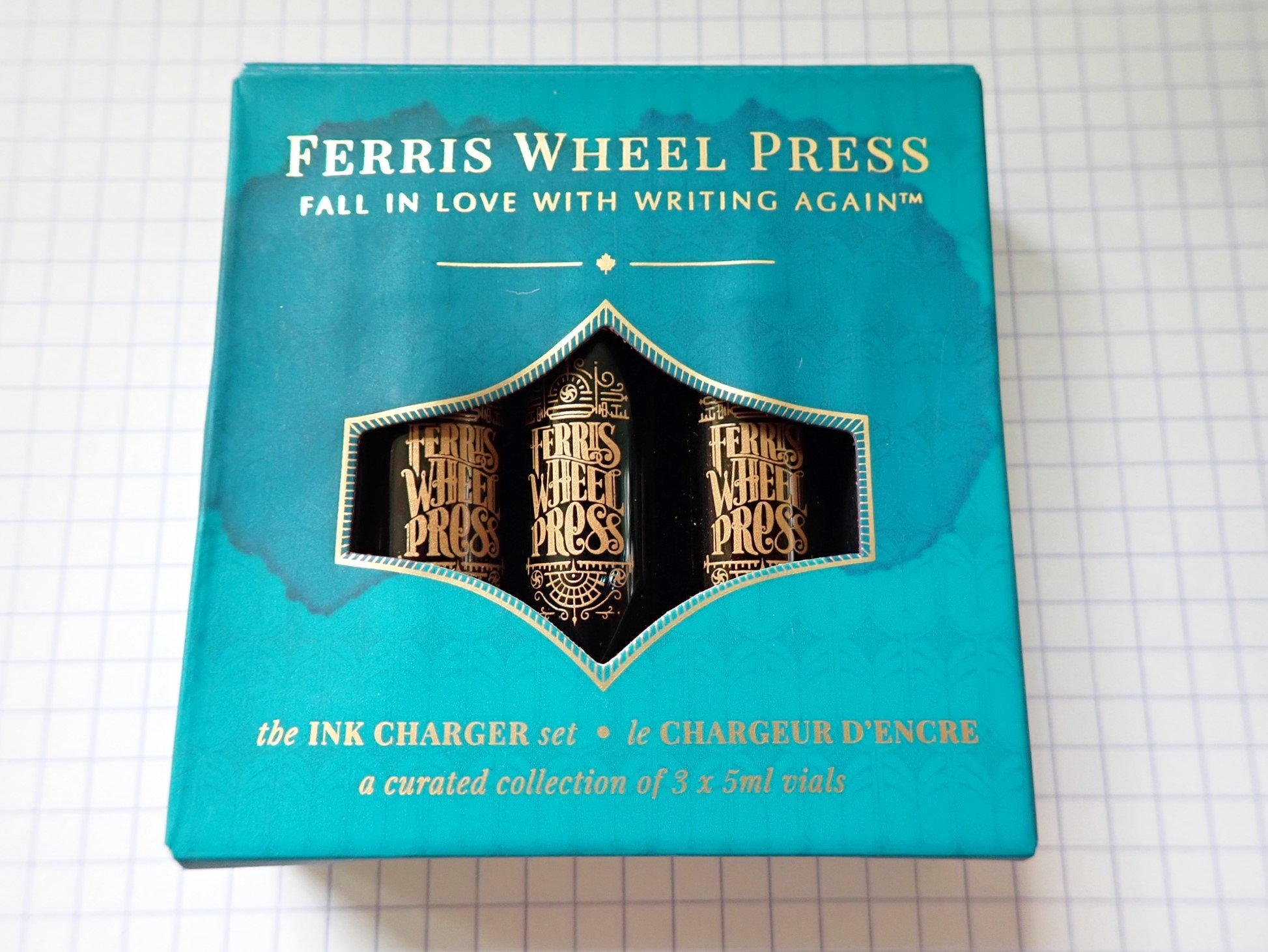
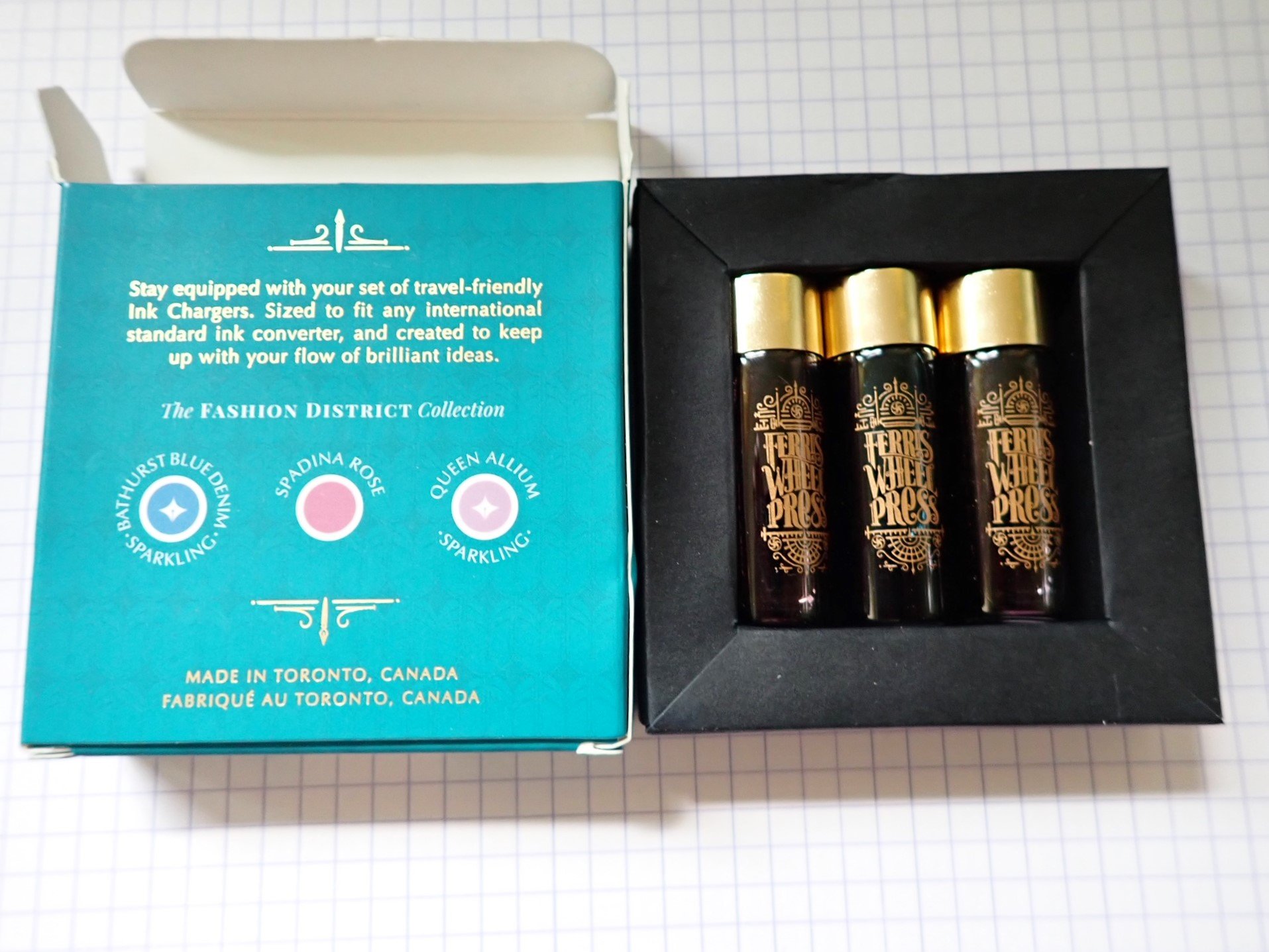
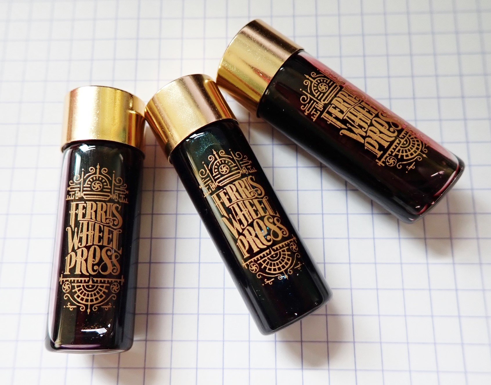
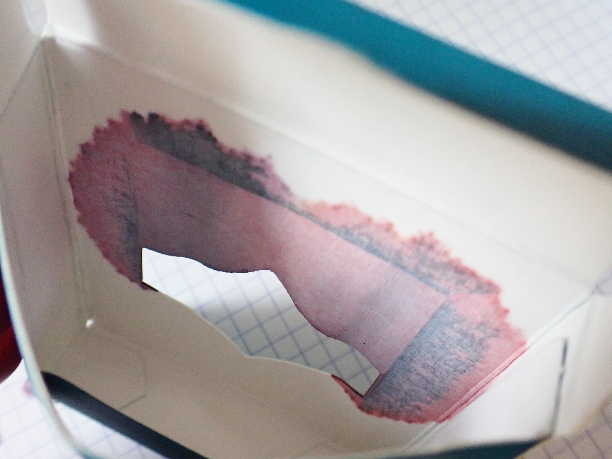
The Fashion District Ink Charger Set is just that--adorable and tempting. It includes three tiny bottles of FWP ink in themed color sets. This one has Bathurst Blue Denim, Spadina Rose, and Queen Allium. The bottles come packaged in a nest inside of a box, but heads-up that mine were leaky. You can see the ink stains on the inside and outside of the cardboard, and two of the bottles were about 1/3 empty. They continued to leak a bit as I worked with them, and now I have a rose-colored ring on my desk mat. The bottles are also very narrow--made to fit a converter, but not a pen nib. So they won't work with any pens that have internal fillers, like piston or vacuum-fill pens.

Ferris Wheel Press
Ferris Wheel Press
Ferris Wheel Press
Ferris Wheel Press

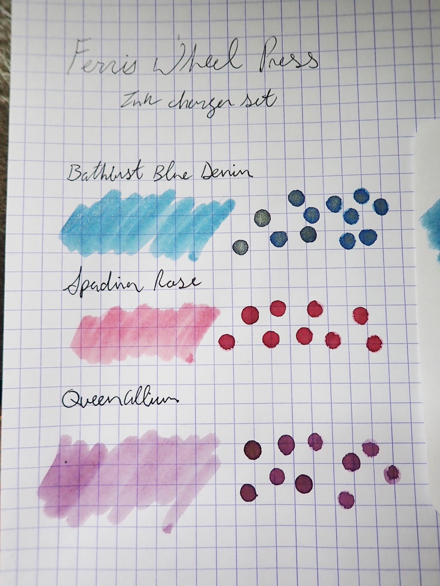
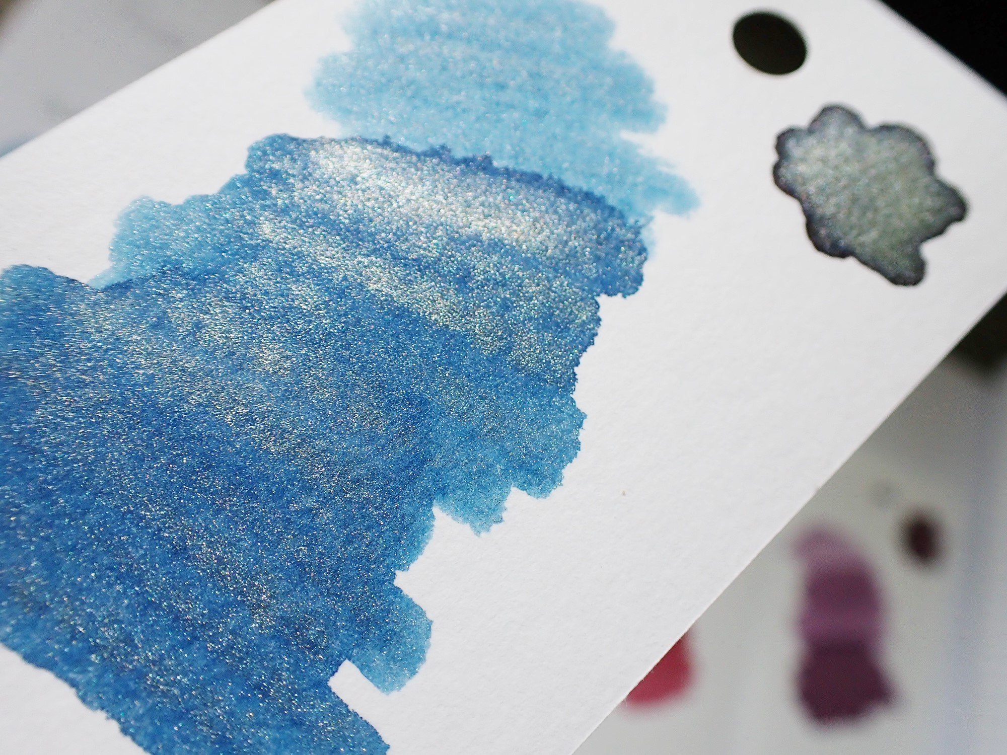
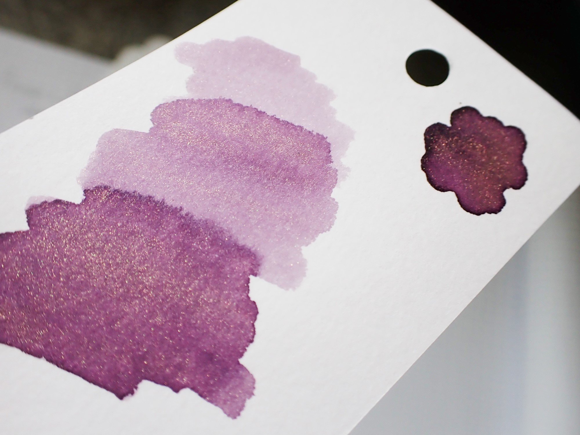
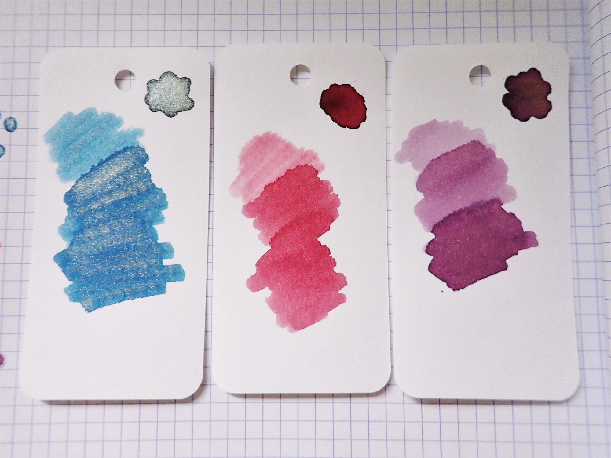
Inside the adorable-but-kind-of-annoying bottles are three lovely ink colors. The Bathurst Blue Denim is a very nice grey-blue with a fine gold shimmer. The shimmer really comes through, even in finer lines, and the blue tone is just different enough to be more fun than a standard blue. The Spadina Rose is a really lovely dusty pink color, no shimmer, that looks like the perfect shade for a Victorian tea party. It's on the pale side for writing with very fine nibs, but has excellent shading with broader writing. The Queen Allium is a pink-toned purple shade with gold shimmer. It is also a pale, soft color that might be difficult to see in a fine nib, but it is also very rich where the ink shades and pools. The shimmer is slightly less visible in the finer/paler areas, but looks excellent with heavier application.

Ferris Wheel Press

All three shades are beautiful and go really well together. The set costs $16 at Vanness Pens, which is just over a dollar per ml of ink, which is fairly standard for sample sizes. However, as I mentioned, I lost a few ml to a leak in the bottle's cap seals. In general, I'm a big fan of these inks. I like the softer colors, and I have had no issues with the full-sized FWP ink bottle I own. So while I'm not sure I'd recommend this wee set, I do recommend the inks themselves.

(Vanness Pens provided this product at no charge to The Pen Addict for review purposes.)


Enjoy reading The Pen Addict? Then consider becoming a member to receive additional weekly content, giveaways, and discounts in The Pen Addict shop. Plus, you support me and the site directly, for which I am very grateful.

Membership starts at just $5/month, with a discounted annual option available. To find out more about membership click here and join us!

Posted on July 7, 2022 and filed under Ferris Wheel Press, Ink Reviews.