Posts filed under Ink Reviews

Wearingeul The Mind Fountain Pen Ink Review

Wearingeul The Mind Fountain Pen Ink Review

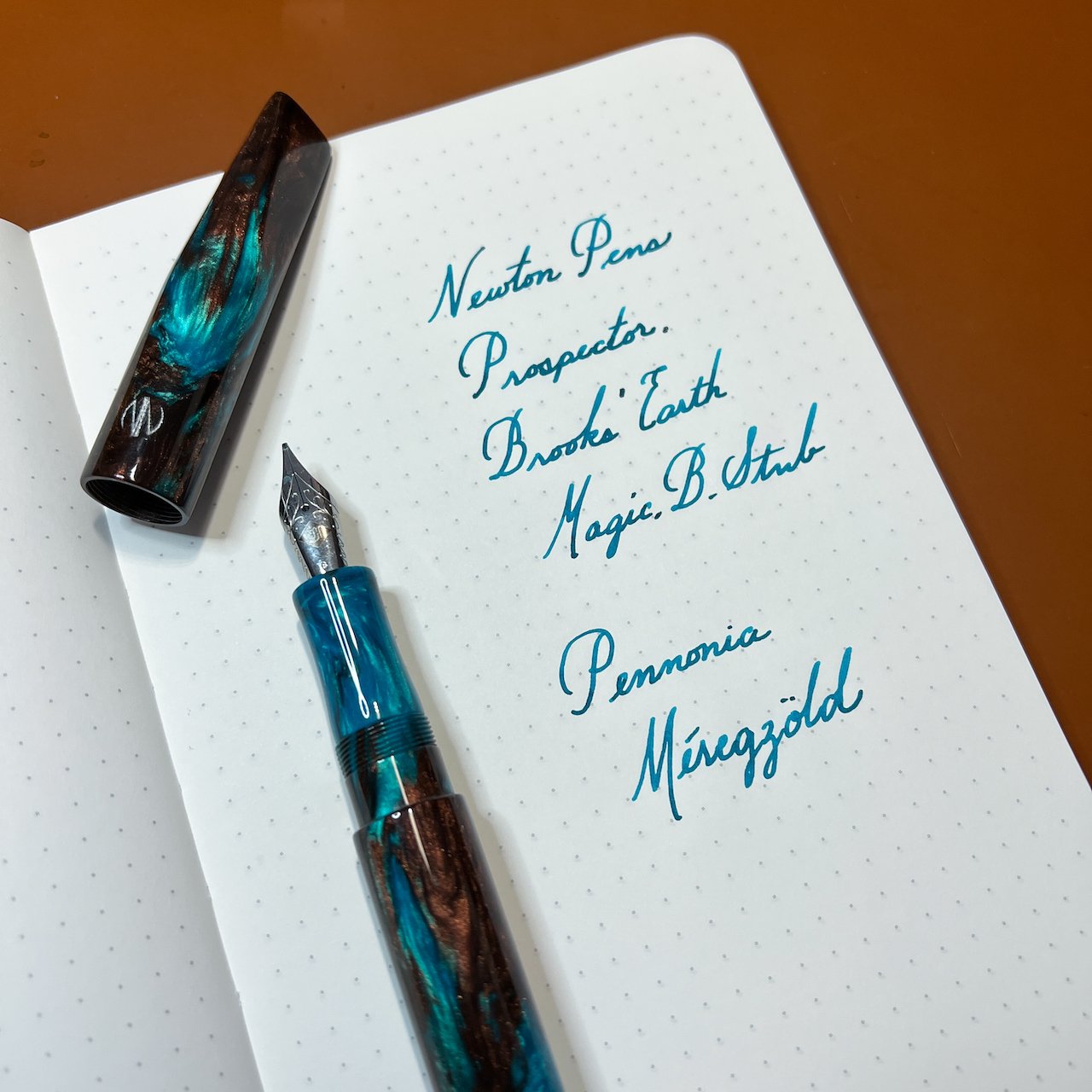
(Jeff Abbott is a regular contributor at The Pen Addict. You can find more from Jeff online at Draft Evolution and Twitter.)

At this point, I'm not surprised at all to have an in bottle in my hands from a company that I've never heard of before. In fact, it's pretty exciting because you can be pretty certain that whatever ink is inside will be both well-behaved and visually interesting. The fountain pen ink market is booming, and that's great news for us.

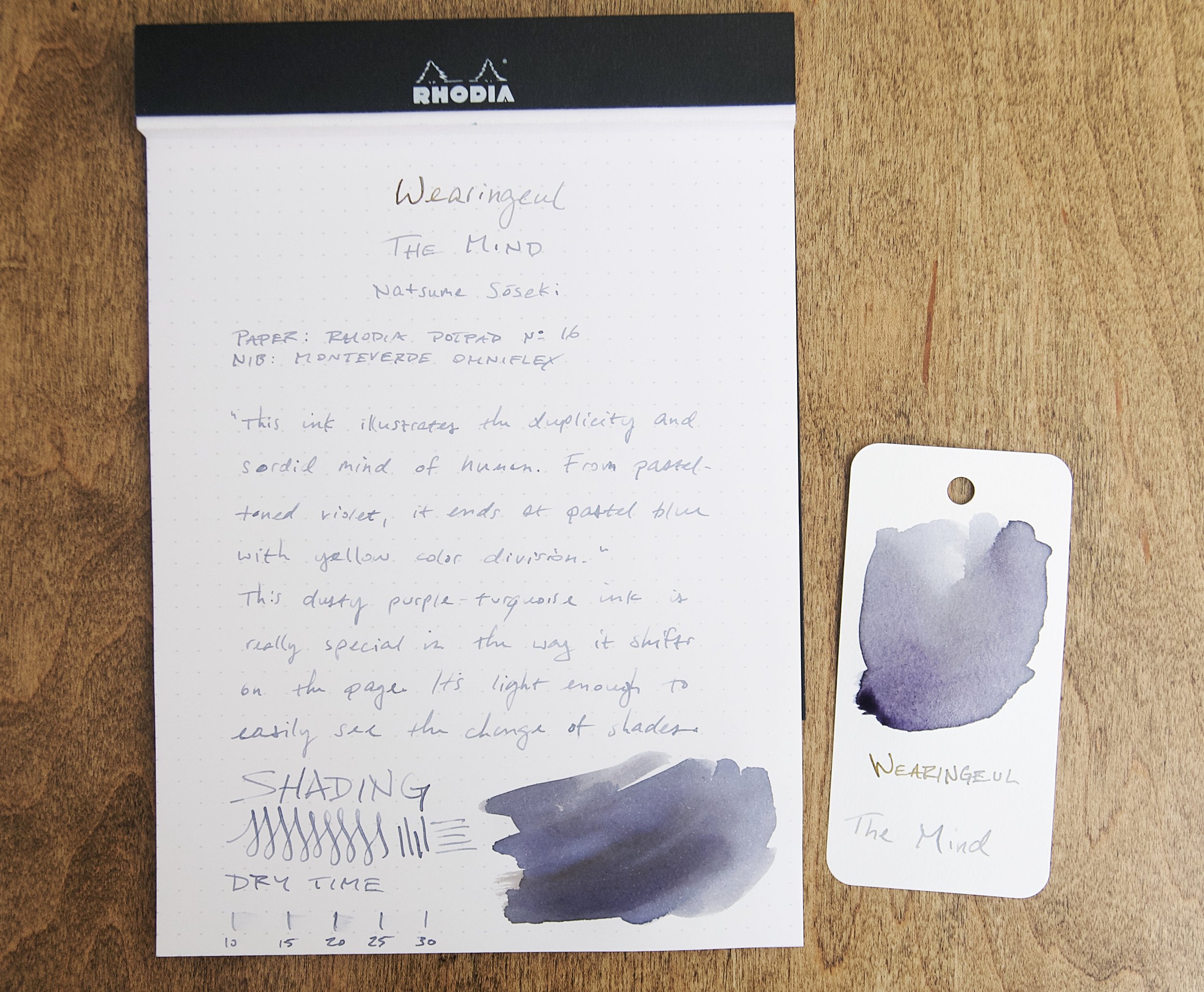
The latest ink to cross my desk is from a Korean company called Wearingeul. The Mind is part of an ink series that focuses on different literary figures. The Mind represents Natsume Sōseki, a Japanese author from the early 20th century. I haven't read any of his work, but this ink introduced me to his name, which means I now have several things in my reading queue. I'm a big fan of ink naming schemes that introduce you to other subjects.

Wearingeul The Mind Fountain Pen Ink

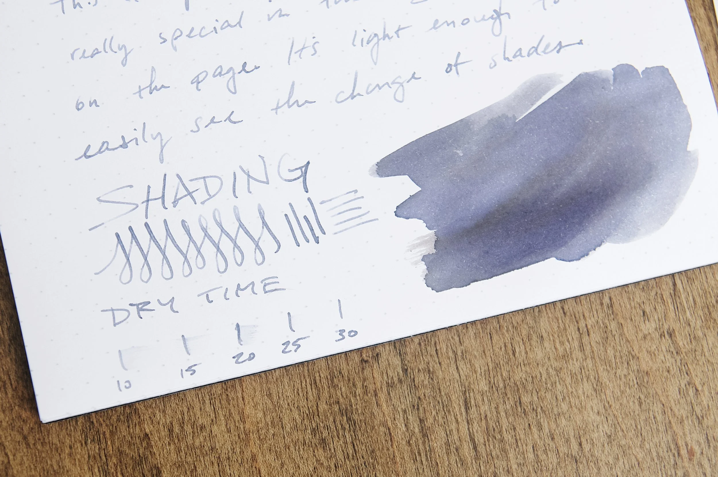
The Mind is a subdued purple ink with decent shading and a faint yellow sheen that looks great on paper. I'm not sure who did it first, but Wearingeul is another ink company that includes a Pantone code that corresponds to the ink hue. In this case, it's Pantone 5405 U. To my eye, this looks like a blue gray, which is really similar to the average color that I see from this ink on paper. There's a bit of shading and sheen that creates some hue variation, but it stays true to this main color.

This ink illustrates the duplicity and sordid mind of human. From pastel-toned violet, it ends in pastel blue with yellow color division.

It's a great color, but I struggle to see the violet. Maybe it's just my eyes, but it just looks blue gray to me. After holding some Pilot Iroshiku Fuyu-syogun next to this ink, I can't tell them apart! I might've just confused my brain, but whatever I did has had a permanent effect. Either way, it's still a fantastic color.

Wearingeul The Mind Fountain Pen Ink

The blue gray tones vary back and forth a bit with the ink shading, but the yellow sheen is what really interests me. It doesn't show up easily, and hardly ever at all in a normal nib. Swatching the ink is the best way to observe the sheen, but that's not really a normal way to use ink. If you use a large enough nib, you'll see a bit of shading, but not nearly as much as I'd like to see.

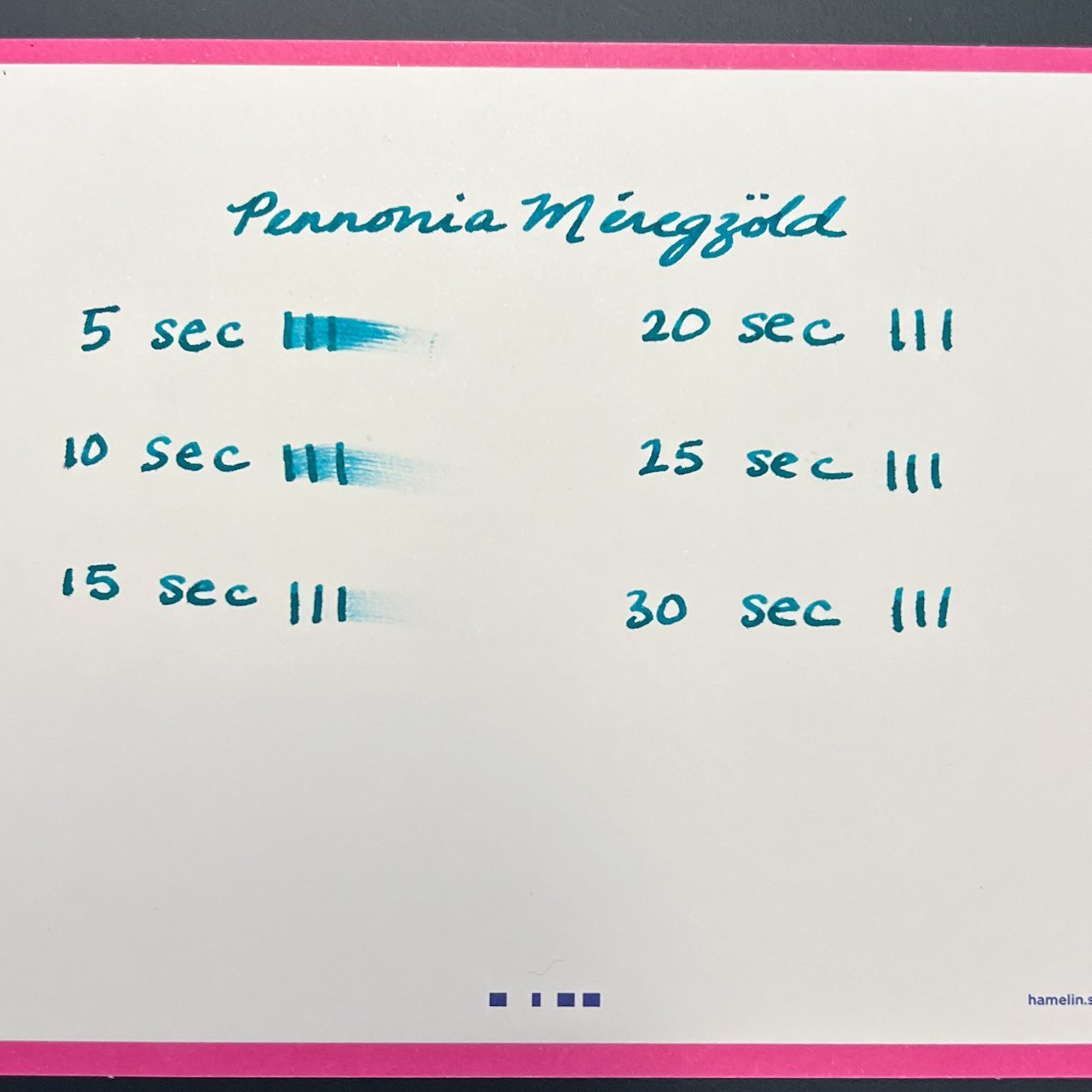
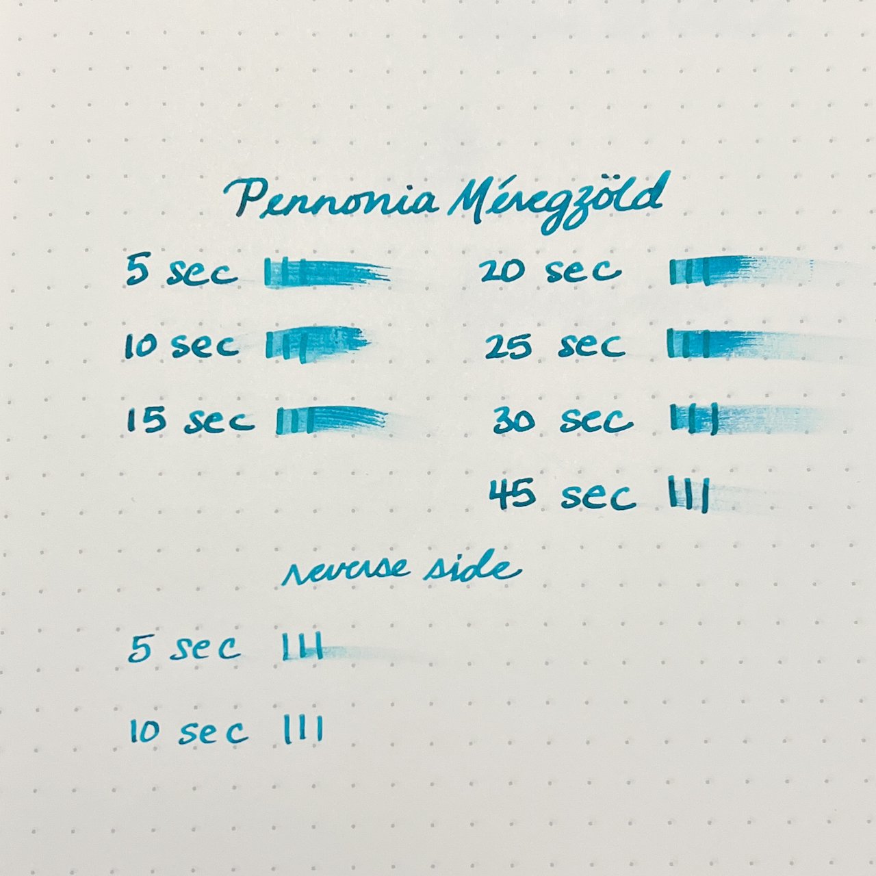
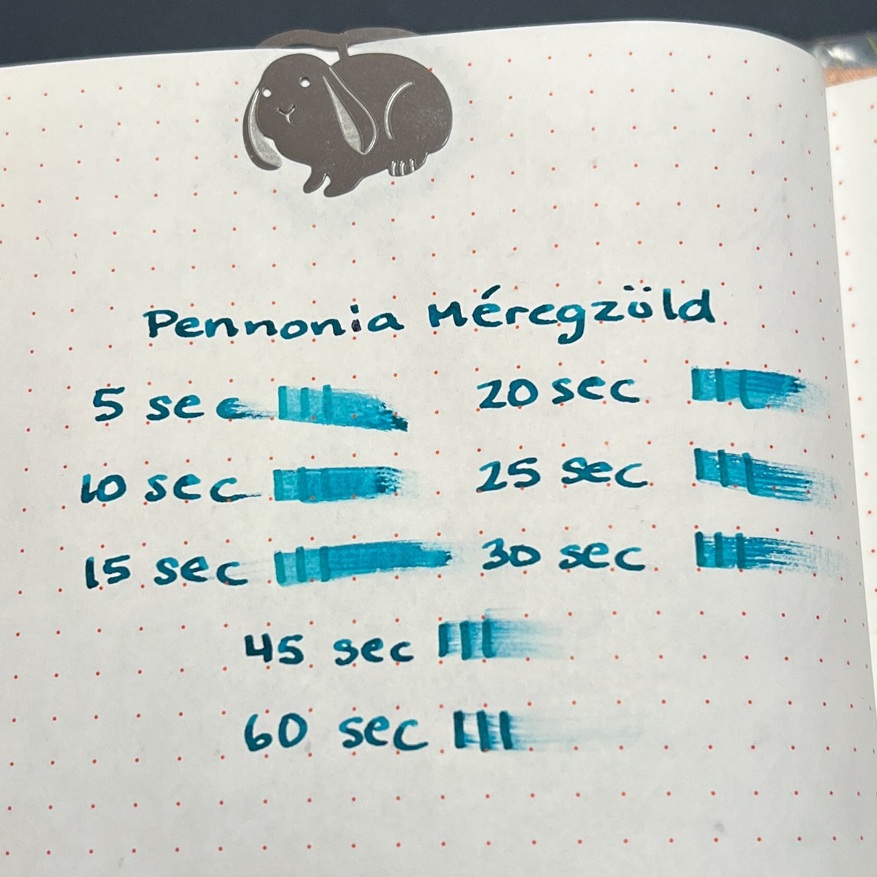
The Mind behaves really well in the pen. It starts smoothly, doesn't bleed or feather, and flows really well. It's pleasant to use and makes any good nib shine. The only area where this ink doesn't impress is dry time. This is a slow drying ink, coming in anywhere from 20 to 30 seconds. The Monteverde Omniflex nib I used for this test normally operates like a wet fine nib, so these times should be fairly comparable for a lot of different nib sizes. 20 to 30 seconds is a long time!

Wearingeul The Mind Fountain Pen Ink

Speaking of drying, that's where this ink lost some of its allure for me. The dry-on-the-page color is a dusty blue-gray like you see in the photos. When writing with this ink and while the ink is still wet, it does have more of a purple hue. I like the wet color a lot, and I wish it kept more of that after the ink dried.

The Mind comes in a 30ml bottle and runs for $20. If The Mind isn't to your liking, I suggest you look around at all the other colors they have to offer. There are some really beautiful inks in their collection that I'd love to try some day. I really look forward to what they come up with next.

(Goldspot provided this product at a discount to The Pen Addict for review purposes.)


Enjoy reading The Pen Addict? Then consider becoming a member to receive additional weekly content, giveaways, and discounts in The Pen Addict shop. Plus, you support me and the site directly, for which I am very grateful.

Membership starts at just $5/month, with a discounted annual option available. To find out more about membership click here and join us!

Posted on October 5, 2022 and filed under Ink Reviews, Wearingeul.

Yoseka Ceramics Ink Ming Kong Que Blue Ink Review

Yoseka Ceramics Ink Ming Kong Que Blue

As your resident orange, purple, and pink ink fan, I would be lying if I told you that bright blue fountain pen inks didn’t excite me more than any other color when inking them up for the first time. There is something about that bright color on the page that makes me smile, and want to show off.

Yoseka Ceramics Ink Ming Kong Que Blue is definitely one to show off.

Yoseka Ceramics Ink Ming Kong Que Blue

This series of inks was produced in collaboration with Taiwanese ink maker Ink Institute and ceramic artist Li Yan Xun. The 8 inks in the Ceramics Series were designed specifically to represent the colorful glazes found throughout the history of Chinese ceramics. Ming Kong Que Blue was formulated to represent the Peacock, or Turkish Blue, glaze found beginning in 12th century ceramic works.

Yoseka Ceramics Ink Ming Kong Que Blue

As a modern product, this fountain pen ink pops off the page. It is a bright sky blue, with a hint of red sheen around the edges in heavier applications. To test it out, I inked up the new Tesori Venezia pen I picked up at the Orlando Pen Show, and fitted it with a Nemosine 0.6 mm stub nib I picked up from Birmingham Pen Co. earlier this year. This is a perfect match all the way around.

Yoseka Ceramics Ink Ming Kong Que Blue

Ming Kong Que Blue works well with this setup. The ink has medium wetness and flow, with great dry time. There is some shading in the lines, and less sheen in my standard writing than I would expect from seeing the product pictures online. A wider, rounder nib that allows for more ink on the page will provide more sheen around the edge of the lines.

Yoseka Ceramics Ink Ming Kong Que Blue

The color is bright, and I won’t profess it to be unique. Browse enough bright blues in enough product lines, and they all begin to favor each other. I would like slightly more sheen, too. There is little to none from the nib-I only found it on the edges of some heavy ink splatters I spread around. The product pictures on the Yoseka page concur with this assessment if you look close enough.

That’s no knock on the ink itself. It’s very good. At $20 for 30 ml it is fairly priced for a limited run, and I would recommend it from a performance perspective. As an added bonus, a portion of the proceeds will go to support the Yanshan Art Museum to support the work of Li Yan Xun. That is something I am fully behind.

I’m behind the Ceramics Series as a whole, and look forward to reviewing a second bottle I picked up from Yoseka Stationery in the same order.

(I purchased this ink from Yoseka Stationery at full price for purposes of this review.)


Enjoy reading The Pen Addict? Then consider becoming a member to receive additional weekly content, giveaways, and discounts in The Pen Addict shop. Plus, you support me and the site directly, for which I am very grateful.

Membership starts at just $5/month, with a discounted annual option available. To find out more about membership click here and join us!

Yoseka Ceramics Ink Ming Kong Que Blue
Posted on October 3, 2022 and filed under Yoseka, Ink Institute, Ink Reviews.

Pennonia Méregzöld - Seafoam or Poison?

Pennonia Méregzöld Ink Review

(Kimberly (she/her) took the express train down the fountain pen/stationery rabbit hole and doesn't want to be rescued. She can be found on Instagram @allthehobbies because there really are many, many hobbies!.)

Pennonia is a company founded by Hungarian fountain pen enthusiast Máté Bikfalvi who decided to launch his own line of inks in early 2020. There are currently over 40 different inks, not including exclusives like Inkdependence’s Cheerio Waterbus. I will be reviewing Pennonia Méregzöld, which we received for review from Vanness Pens.

Back in the day, Máté’s family computer had a seafoam teal Windows 95 background. Máté’s mom thought it looked like méregzöld, which is Hungarian for “poison green”. So when this dark teal ink was created, the name was an obvious choice and Pennonia Méregzöld was born. Pro tip: if you want to learn how to pronounce the name of this and other Pennonia inks, head over to this helpful pronunciation page

Pennonia Méregzöld comes in a 50ml glass bottle which is packaged in a white box with a round color swatch on top which I find super helpful for locating colors in my ink drawers.

Unlike Mike’s Cheerio Waterbus which is a little more green, Méregzöld leans a bit more blue. It is a fairly saturated ink that has average to slightly wet flow in the Broad Stub.

Pennonia Méregzöld Ink Review

Similar inks include Diplomat Caribbean, Stilo e Stile Roman Bronze Oxidation, Sailor 2022 Pen Show Ink and Robert Oster Aqua.

Dry times were pretty fast on more porous paper like the Hamelin index card, but was upwards of 30 seconds on 68 gsm Tomoe River paper and more than 60 seconds to fully dry on 52 gsm. If you want faster dry times, consider a finer nib, dryer nib/feed and less coated paper or all of the above.

Pennonia Meregzold

Dries pretty quickly on this Hamelin index card.

Pennonia Meregzold

Dry times on 68 gsm Tomoe River. The Broad Stub is a bit of a wet writer but it definitely takes a while to dry, unless you write with the nib upside down which usually has a drier flow.

Pennonia Ink

Dry times on 52 gsm Tomoe River - not surprising that this takes even longer to dry.

I have had Pennonia Méregzöld inked up in a Newton Prospector with a Franklin-Christoph Nagahara Broad Stub nib for the past 3 months and it always starts up right away even if I haven’t written with the pen/ink in a few weeks. It is a lovely shade of teal that reminds me of the ocean. I picked it because it pairs beautifully with this Earth Magic material from Jonathon Brooks.

Pennonia Ink

Pennonia Méregzöld in a Newton Prospector in Earth Magic with a Broad Stub on 68 gsm Tomoe River.

Pennonia Ink

Brooks’ materials are stunning and this is no exception. I absolutely love it when I find a good ink to match.

Pennonia Méregzöld sells for $13 USD for a 50 ml bottle, which is a good price for a nice amount of ink. I don’t care what the name really means, because Méregzöld definitely is not poison green but a beautiful teal ink that I am really enjoying using.

(Vanness Pens provided this product at a discount to The Pen Addict for review purposes.)

Posted on September 23, 2022 and filed under Pennonia, Ink Reviews.