Posts filed under Ink Reviews

Sailor Yurameku 2nd Edition Date Gokoro Ink Review

Multi-shading inks are all of the rage these days, and Sailor is at the forefront with their Yurameku fountain pen ink lineup.

When they launched the 1st edition of these inks inks, I was excited, but my expectations were tempered due to the lightness of the colors. I reviewed one of the relatively darker shades in Itezora, and was pleasantly surprised. The color was dark enough for regular writing, and the color - wow - that’s what I signed up for. Is it blue? Green? Purple? How about yes to all of the above?

That is the idea of Yurameku in a nutshell. From Sailor’s website:

“The color changes depending on the length of time and the paper. A mysterious ink that shows glimpses of different colors in shades and streaks.”

Mysterious is the right word. And it’s nice to see Sailor point out, even subtly, that paper matters.

With the 2nd Edition Yurameku inks, Sailor brought in the darker shades, which are more up my alley for day to day use. I get why the light colors went first - they are much more visually appealing in pictures - but the dark colors are where it’s at for day to day writing.

Sailor includes converter stickers in some of their ink lineups.

I bought three bottles of the 2nd Edition at the Atlanta Pen Show, Date Gokoro, Suki Gokoro, and Zare Gokoro, and I’m reviewing the first in the list today. Looking at the packaging of Date Gokoro, I expected a purplish black ink, and I think that’s what we have here. Maybe.

Before even inking it up in a pen, I took my Kakimori dip nib out and laid some ink down on original 52 gsm Tomoe River, new Sanzen Tomoe River, Yamamoto Bank Paper, and Kokuyo Business Paper. I like to know how inks work on these papers. The first three are specialty papers that handle fountain pen inks well, albeit in different ways, and the last one is more of a stock, basic paper.

In general, the color is close on all paper types, but on closer inspection, different colors take prominence depending on the page.

The character of Date Gokoro shines on these fountain pen friendly papers. It’s a deep dark purple with hints of blue and black, a note of pink underneath, and a moderate red sheen after it dries. On the Kokuyo Business Paper, the color is much more flat. That makes sense since it is more absorbent. It’s good for fountain pens, but it dries fast. With these multi-shading inks, you want the ink to dry slower to get the full character of the ink to come out.

I inked up Date Gokoro in a new Mythic Pen Co. Aeschylus model, also bought at the Atlanta Pen Show, with a Medium steel Jowo nib. It flowed very well from this setup, with a deep, dark purple fresh from the nib, and lighter shades as it dried. This is the entire idea of the Yurameku ink lineup. Yes, many inks exhibit this exact behavior, but the multi-color appearance after it dries is what sets it apart. There is a lot going on with these lines on the page.

The color is all over the place depending on how much ink goes down on the page.

Dry time on Yamamoto Bank Paper was on the slow side, which, again, is the expectation here. I wouldn’t buy one of these inks if you worry about smearing the lines right after putting them down.

If you are interested in buying these inks, they are in the premium category. They are “only” $20 per bottle, but the bottle is 20 ml in size. I think we can all do that math, which, for ink, is expensive. I’m ok with it - maybe I’ll actually finish a bottle of ink for a change.

(I purchased this product at a discount from Dromgoole’s at the 2023 Atlanta Pen Show.)


Enjoy reading The Pen Addict? Then consider becoming a member to receive additional weekly content, giveaways, and discounts in The Pen Addict shop. Plus, you support me and the site directly, for which I am very grateful.

Membership starts at just $5/month, with a discounted annual option available. To find out more about membership click here and join us!

Random Kakimori streaks on Sanzen Tomoe River.

Posted on April 17, 2023 and filed under Sailor, Ink Reviews.

Colorverse Lucky Galaxy Ink Review & Chromatography How-To

(Kimberly (she/her) took the express train down the fountain pen/stationery rabbit hole and doesn't want to be rescued. She can be found on Instagram @allthehobbies because there really are many, many hobbies!.)

As soon as Lauren Elliott, AKA FlygirlElliott and Lucky Star Pens posted about the latest addition to the Lucky Star Colorverse lineup, I knew I had to buy one, which is exactly what I did at the recent Baltimore Pen Show. Colorverse Lucky Galaxy is the third exclusive release for Lucky Star Pens and was created to celebrate its 3rd anniversary. The prior two releases were Lucky Star and Lucky Star II. Like the other two before it, Lucky Galaxy is a shimmer ink, or what Colorverse calls “Glistening”. The ink comes in a 30ml glass bottle and sells for $20.

Colorverse Lucky Star Ink Series

The 3 Colorverse x Lucky Star Pens inks: Lucky Star, Lucky Star II and Lucky Galaxy.

Colorverse Lucky Galaxy

I inked up my trusty TWSBI Go with a Medium nib and used that for the writing samples on the Col-O-Ring cards. For the other writing samples, I used the Kakimori steel dip nib with 52 gsm and 68 gsm Tomoe River and Cosmo Air Light 75 gsm papers.

Colorverse Lucky Galaxy Ink Review

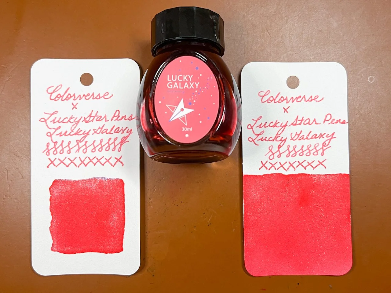
In large swatches, Lucky Galaxy leans more red than pink.

Colorverse Lucky Galaxy Ink Review

Writing sample on 52 gsm Tomoe River paper.

Colorverse Lucky Galaxy Ink Review

68 gsm TR.

Colorverse Lucky Galaxy Ink

Cosmo Air Light 75 gsm paper.

Colorverse Lucky Galaxy Ink

In the writing samples, the pink is more pronounced.

Colorverse Lucky Galaxy Ink

The shimmer is there but not in-your-face, which I like.

Colorverse Lucky Galaxy Ink

The turquoise/blue shimmer can make it look kind of blurple but what you see near the nib is the real ink color.

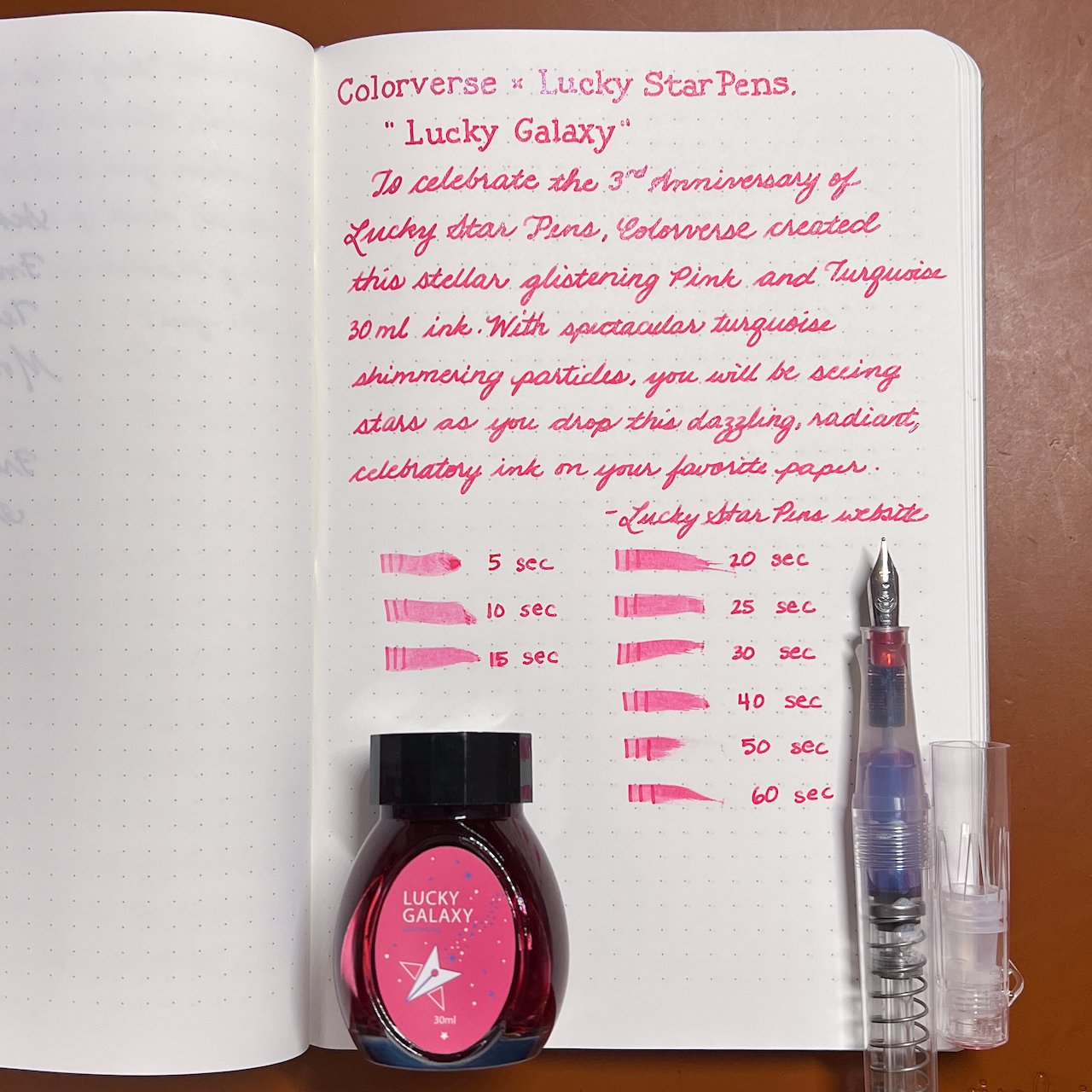
Lucky Star Galaxy had an average flow when writing but definitely took a while to dry on 68gsm TR. Dry times may be a bit slower on 52gsm TR or faster on papers like Rhodia, copy paper, Cosmo Air Light or with drier or finer nibs. The ink has blue/turquoise shimmer, minimal shading and no sheen.

Colorverse Lucky Galaxy Ink

Inks similar to Lucky Galaxy are Diamine Pink Glitz (gold shimmer), Diamine 2019 Inkvent (Blue Edition) Candy Cane (no shimmer), Sailor Ink Studio 731 (no shimmer but gold sheen), Colorverse #49 Felicette (no shimmer), and Diamine 2021 Inkvent (Red Edition) Pink Ice (silver shimmer.)

While I have similarly colored inks in my collection, it’s not often that non-gold or silver shimmer is used so I’m glad that Lucky Galaxy has a different shimmer. This ink sells for $20 per 30ml bottle on the Lucky Star Pens website, which is about the perfect amount for a bottle of ink.

BUT WAIT! There’s more!! Just when you thought this article was over, it’s not over!! I thought I’d share something new that I decided to do for ink reviews - chromatography! Basically, chromatography is a way to show the various components of a mixture (in this case, ink) as different parts get drawn up the strip via capillary action at different rates. As it relates to ink, this means chromatography allows you to see the colors that make up the ink.

What you need to do ink chromatography

  • Chromatography strips - You can find them on Amazon - the ones I have (which are out of stock) are about 6” x 0.75”. I have not tried these personally but I have heard that white coffee filters (cut into strips) or even paper towels, can be used in lieu of chromatography strips.
  • Cup - I use glass so there is no risk of staining if I accidentally get ink in there
  • Rod - A chopstick, slim pen/pencil, wooden dowel, or in this case, a paintbrush, will work
  • Clip - You will need a clip to secure the strip. I use binder clips because I can suspend the strip from the rod.
Chromatography

Wine glass (cuz I’m bougie that way), binder clip, chromatography strip, paintbrush.

How to do ink chromatography

  1. Put some water in your glass
  2. Depending on how tall your glass is and how much water you put in it, you may need to trim your strips or add/remove some water. You want the strip to touch the water a bit but you don’t want to submerge the ink.
Fountain Pen Ink Chromatography

Strip is on the outside of the glass so I can see if it will touch the water.

  1. Draw a line across the strip about ½” from the bottom (does not need to be exact.)
Fountain Pen Ink Chromatography

Testing this outside the glass so I can add/remove water as needed.

  1. Put the rod through the binder clip and rest it on the glass such that the strip touches the water, then you wait.
Fountain Pen Ink Chromatography

You can see the ink line is above the water line and is already beginning to “move up.”

Fountain Pen Ink Chromatography

Roughly 4 minutes in.

I waited until 5 minutes when the ink “stopped moving” before removing it from the glass. Duration of wait time will vary based on how quickly the ink is separating up the strip. If you wait too long, the colors may get too diluted and be harder to detect.

Fountain Pen Ink Chromatography

Letting the strip dry on a paper towel (no, those aren’t blood stains, just Lucky Galaxy!)

Fountain Pen Ink Chromatography

Closeup reveals a hint of shimmer at the base where I drew the line and basically pink ink throughout.

Fountain Pen Ink Chromatography

Contrast that with a multi-shading ink (or chromashader) like Sailor Manyo Fuji which shows shades of magenta/pink and blue, with a bit of yellow above the pink.

While chromatography isn’t necessary to enjoy inks, it is a fun way to see how similarly colored inks may have underlying differences that aren’t as noticeable in writing samples or ink swatches. I can’t wait to see my future ink chromatographies.

(Disclaimer: I purchased Lucky Galaxy ink at regular price from Lauren Elliott at the 2023 Baltimore Pen Show.)

Posted on March 24, 2023 and filed under Colorverse, Ink Reviews, Chromatography.

Diamine Claret Fountain Pen Ink Review

Diamine Claret Fountain Pen Ink Review

(Jeff Abbott is a regular contributor at The Pen Addict. You can find more from Jeff online at Draft Evolution and Twitter.)

Spring is in the air, and it's time for some bright and cheerful colors to get me out of the winter fog. I've recently been trying to step outside of my comfort zone in terms of ink colors. Diamine Claret is the first ink as part of this experiment. I normally go for blue, green, and purple inks that feature lots of saturation, shading, and bright character. On occasion, I also enjoy dark inks that are in the blue or blue-green shade. So, reds and pinks are really outside of my normal preference.

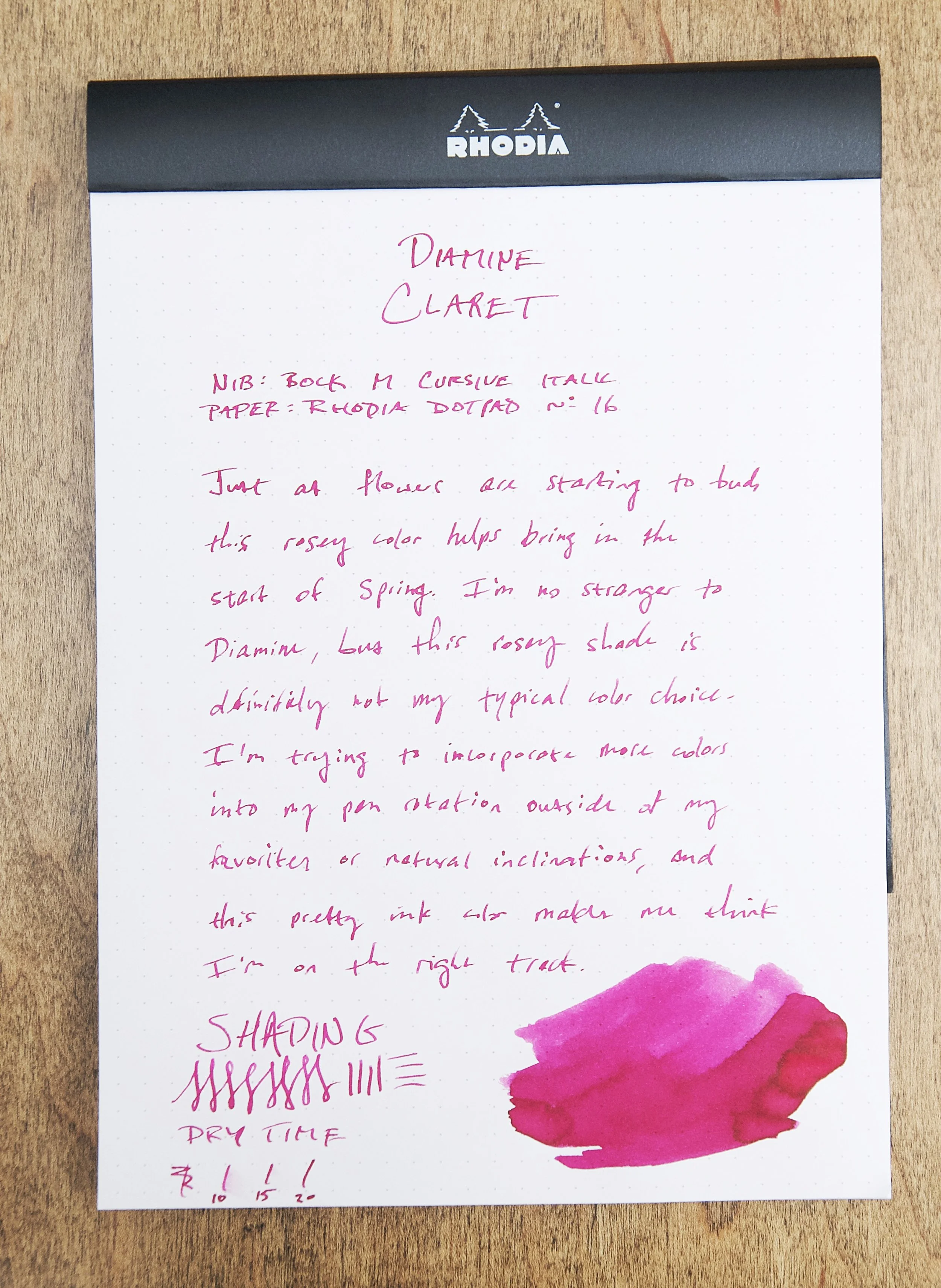
Magenta is always a tricky color for me to nail down. Is it pink, purple, or red? The answer is...yes. Depending on the color of the light in your environment, this ink can look more red or pink. In other cases where the ink has pooled, you can detect a hint of purple. It has a lot of character, and I've been surprised by how much it grew on me after writing a few lines. The color is red enough and dark enough to make it easy for me to use on a regular basis, and it has all the pop and saturation that I crave in my inks.

Diamine Claret Fountain Pen Ink

Diamine Claret is really well-behaved, which is something I've come to expect from any Diamine ink. It flows well, has plenty of lubrication while writing, and has a little bit of shading that pops out between the red and pink hues. On top of that, this ink dries really fast. In my tests, it was normally smudge-proof within 10 seconds. That time went up a few seconds for marks that had more ink pooled up, but it was always dry in 15 seconds. This isn't the fastest drying ink out there, but it's pretty respectable. Fast-drying inks isn't something that I look for, but I know that it's really important to many people and many different situations. This is a decent option if you want a magenta ink that dries quickly.

Diamine Claret Fountain Pen Ink

I chose think ink due to the bright color swatch on Goldspot's website. I figured that even if it wasn't a preferred color, it should still be loud and proud of what it is. Claret definitely delivers in this regard, but also provides some extra delight in the moderate shading that comes with it. I have some trouble identifying and/or naming specific colors in the pink and purple range, but I can easily tell that there is a nice amount of variation between different shades when writing with this ink. It's just enough to let you know that this isn't a wide gel pen — this is a nibbed pen that provides those beautiful little variances and pools of darker ink that collect in some strokes but not others. The more I've used this ink, the more I've come to appreciate and even love it. While it's not a preferred color by nature, it's quickly ascending the ranks of my favorite inks to use.

Diamine Claret Fountain Pen Ink

As the inaugural ink my experiment to push myself to use inks that are outside of my usual preferences, Diamine Claret is a strong and promising start. If you'd also like to try it out and add some spring-time colors to your life, you can pick it up in bottled or cartridge format. Bottles are available in 30ml or 80ml sizes, and the cartridges come in an 18-pack. I went with the 30ml bottle, and that came in at just $8. I'm pleasantly surprised by this cheery ink and look forward to trying more!

(Goldspot provided this product at a discount to The Pen Addict for review purposes.)


Enjoy reading The Pen Addict? Then consider becoming a member to receive additional weekly content, giveaways, and discounts in The Pen Addict shop. Plus, you support me and the site directly, for which I am very grateful.

Membership starts at just $5/month, with a discounted annual option available. To find out more about membership click here and join us!

Posted on March 22, 2023 and filed under Diamine, Ink Reviews.