Posts filed under Ink Reviews

Colorverse Long Trail Ink Review

(JetPens provided this product at no charge to The Pen Addict for review purposes.)

In most parts of North America, plants are blooming and there's plenty of rich green and other vibrant colors popping up everywhere (along with the not so desirable pollen). With the latest Colorverse ink that I'm trying out, its name pays tribute to a hiking trail in Vermont. Perfect forest green color to pair with a long hike in rural Vermont.

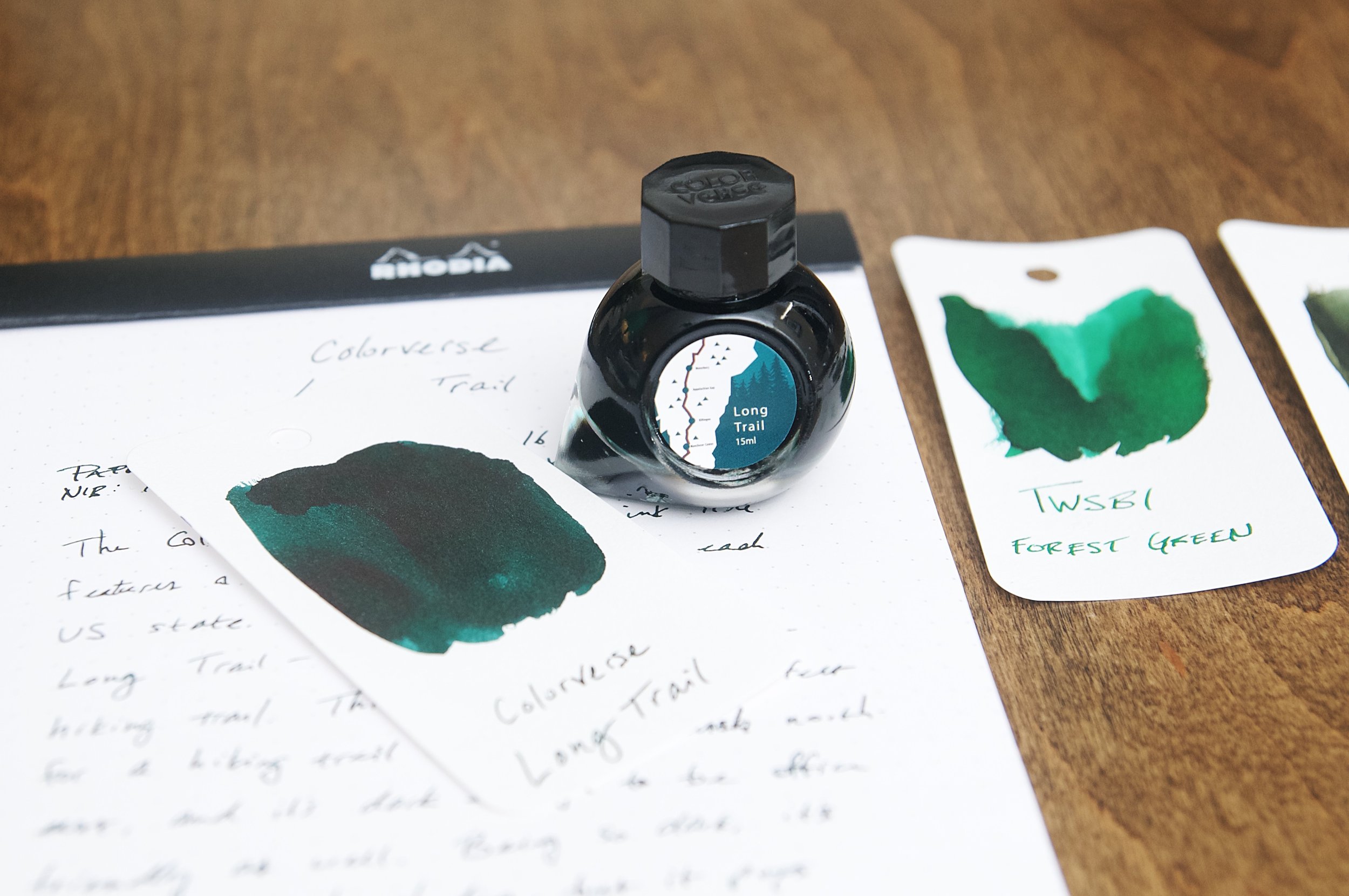
Colorverse Long Trail is named after the oldest long-distance hiking trail in the US. Located (and spanning) Vermont, this trail winds 273 miles through the longest part of the state. Tackling the trail in one go often takes weeks, and there are countless awe-inspiring vistas along the way. All that to say, this ink has quite a heritage to live up to in its namesake.

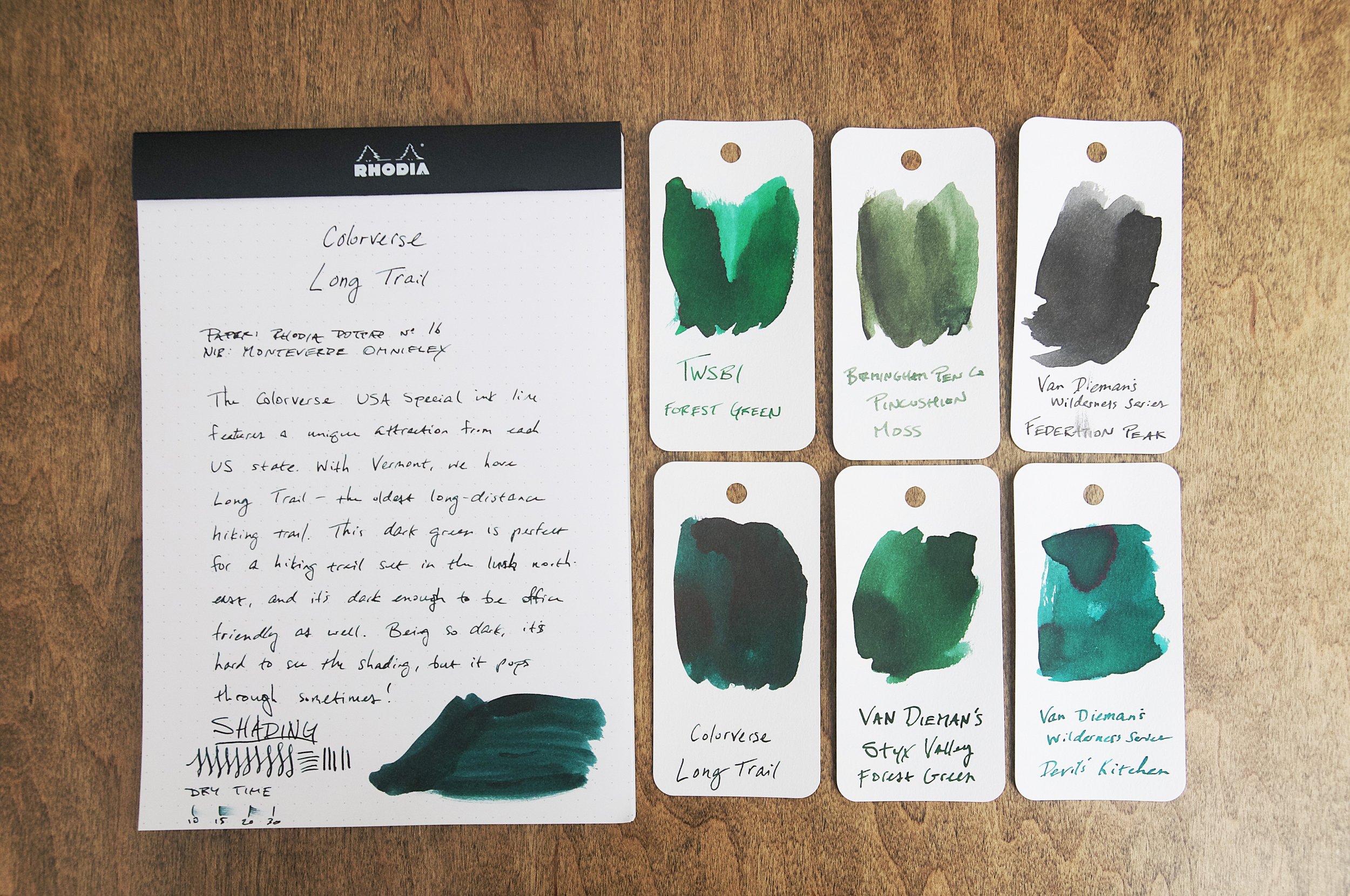
I have several Colorverse inks in my collection, and I've always had really good experiences with them. I love how specific and intentional their ink names are — I always learn something new when researching where the name came from. Long Trail is a deeply saturated forest green ink that fits the landscape of lush forest and dewy undergrowth perfectly. Upon first inking and trying this ink out, I was really happy with the deep green lines that came out of the pen.

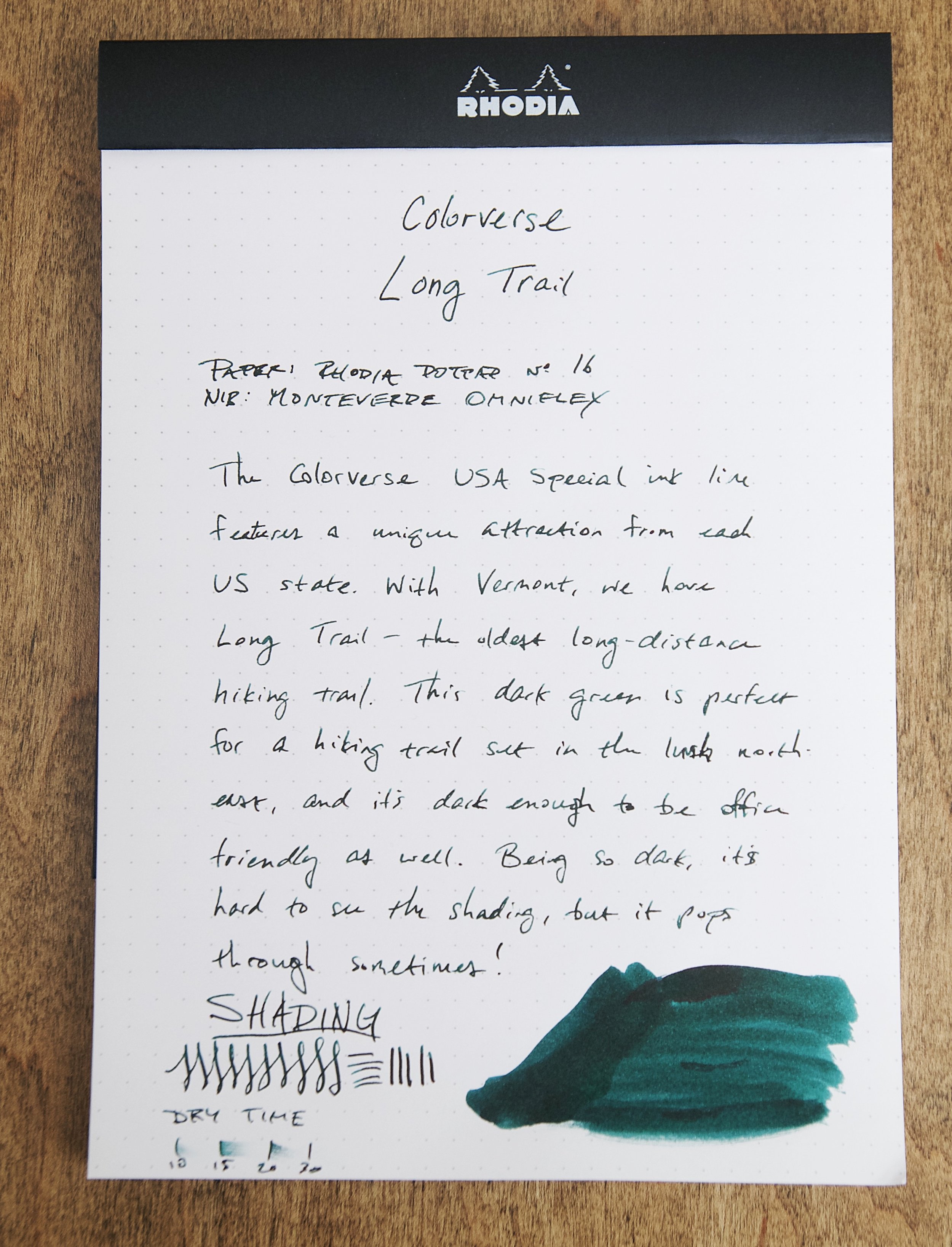
As far as forest green goes, this is a dark one. It's so dark that you could definitely use this in an office setting where they frown on bright or non-standard ink colors. There's just enough enough color in the depths to quickly let you know that this isn't a black ink. The rich color also gives way to some shading that adds a little character to the lines.

The ink also behaves well. It's well-lubricated and flows easily. With the Monteverde Omniflex nib I used in the photos, the ink has no trouble keeping up with the wet nib even when the tines are spread to the max. The lines are also crisp and sharp — no feathering or bleeding in sight. Dry time is a little slow — somewhere between 15 and 30 seconds in this wet medium-ish nib, but your results will vary between different nibs and paper types. Despite whatever pen and paper combinations you try, this likely won't be a good pick for lefties.

The saturation in this ink is so rich and deep — it's really beautiful (especially when using a paint brush to swatch the ink), but it can be a little annoying to clean out of pens. It washes out easily, but it takes several rounds of flushing to get it all. Definitely plan on taking the pen apart to really clear out the feed if you can. If you can't, it's really not a big deal — just means you'll spend an extra minute or two flushing it out. I have zero concerns with putting this ink in any pen I own.

Long Trail comes in a 15ml bottle for around $13.50, which is right on target for Colorverse inks. Their inks are high quality, so the price is great. And I love that the bottle is so small because I really have no need for large amounts of ink when I already have so many bottles.

I have a handful of dark green inks, and I enjoy using them from time to time. Out of all of them in my collection, I think Long Trail is my new favorite. It really is a beautiful forest green with lots of murky character.

(Goldspot provided this product at a discount to The Pen Addict for review purposes.)


Enjoy reading The Pen Addict? Then consider becoming a member to receive additional weekly content, giveaways, and discounts in The Pen Addict shop. Plus, you support me and the site directly, for which I am very grateful.

Membership starts at just $5/month, with a discounted annual option available. To find out more about membership click here and join us!

Posted on May 10, 2023 and filed under Colorverse, Ink Reviews.

Nahvalur x Galen Leather Rose Gold Demonstrator & Vinta Inks The Maiden/Lakambini - A Double Review

(Kimberly (she/her) took the express train down the fountain pen/stationery rabbit hole and doesn't want to be rescued. She can be found on Instagram @allthehobbies because there really are many, many hobbies!.)

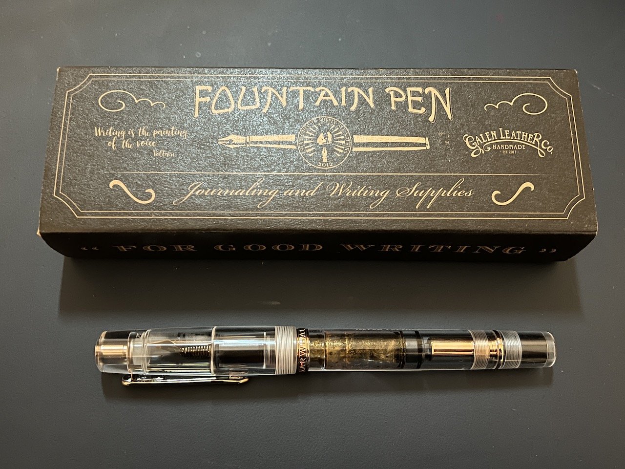
I usually don’t know what is going to show up in Brad’s boxes of goodness but I was excited to find a Galen Leather Co. pen box that contained a pen with rose gold accents! I don’t know when it happened but at some point in my adult life, I started loving rose gold, as much or even more than yellow or white gold. This happened even before my obsession with fountain pens. So whenever a fountain pen has rose gold trim, I’m in trouble!

Up for review is the Nahvalur x Galen Leather Demonstrator fountain pen with Rose Gold trim. Nahvalur, formerly Narwhal Pens, made a demonstrator version of their popular Nahvalur Original piston-filler fountain pen with rose gold trim and nib to celebrate Galen Leather’s 10th anniversary. This Demonstrator model is also very similar to their Schuylkill pen. Side bar: how long do we have to keep saying “Nahvalur, formerly Narwhal Pens? Seems like it’s been forever, but only since August 4, 2022, so I think I’m going to let it go until August 3rd, 2023, and after that, it’s Nahvalur and nothing else, lol!

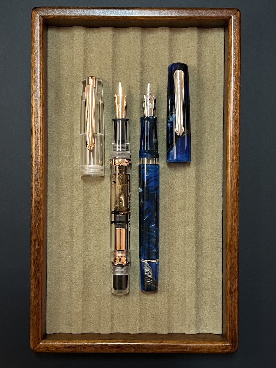
Similar in size and shape the Demonstrator has the added barrel band and of course, doesn’t have an ink window. It is also a little heavier than the Schuykill.

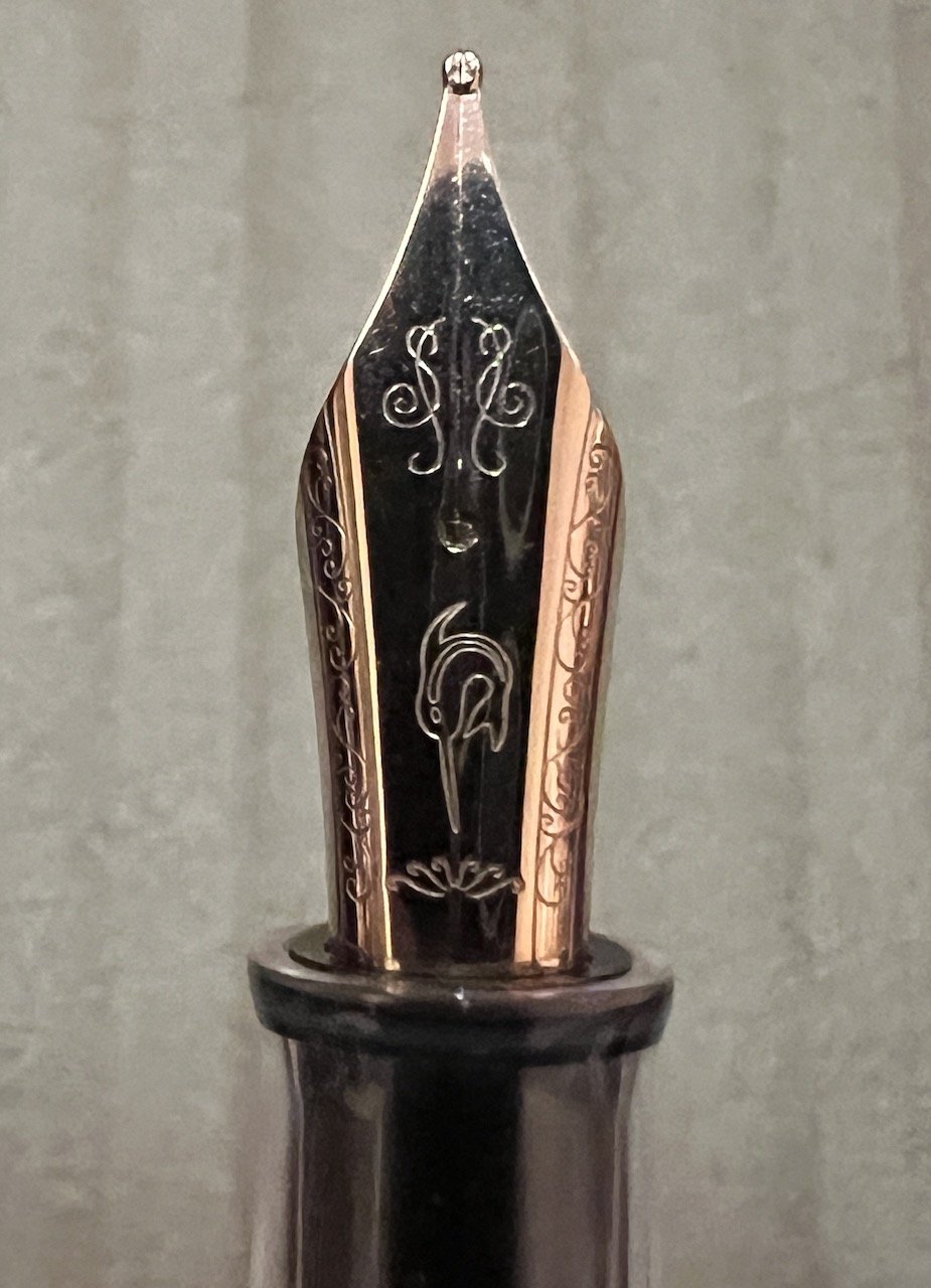
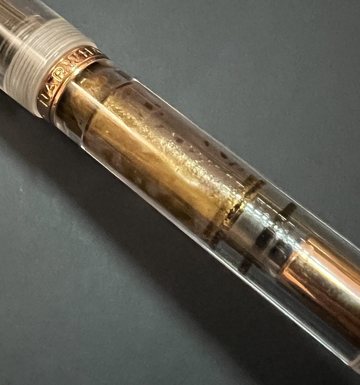
The pen comes with a rose gold-colored steel nib with the Nahvalur logo, in Fine, Medium, Broad, Double Broad and Stub (though it looks like only the Broad and Stub nib sizes are in stock right now). In addition to the nib, the rose gold accents include the clip, the piston, the piston ring, and the barrel band, which still reads “Narwhal”. The acrylic is polished well and is very clear and shiny.

Love the logo on the nib, though I wish it would indicate the nib size somewhere.

Since I was reviewing a new pen, I probably should have done the smart thing and inked it up with a “normal”, well-behaving ink, but the rose gold matchy match was calling my name, so I picked Vinta Inks’ The Maiden/Lakambini, from the Fairytale Collection. But it turns out there was no need to worry. The ink behaved just fine in the pen and wrote beautifully. It’s fun to look at the shimmer in the pen barrel and in the writing as well. As with all shimmer inks, to prevent clogging, periodically tilt the pen up and down so that the shimmer particles don’t all settle into the nib/feed. What I like to do with piston fillers, but also with converters, is to use the piston to push the ink up into the feed and then retract the piston to “suck out” the ink and any shimmer that may have accumulated on the feed. It helps ensure that you don’t end up with a pen that is clogged with shimmer or end up with no shimmer left because it’s all been written up earlier.

Writing sample on Clairefontaine Triomphe.

Almost too sparkly to read on the Clairefontaine.

Tomoe River 68 gsm Endless Recorder notebook.

Look at all this fun shimmer in the pen! And you can almost see the engraved “Galen Leather Co” on the barrel.

The Lakambini ink is pink with gold shimmer, which makes it look a bit brownish, especially with wet and broad nibs. The ink has average dry time, but still pretty good considering this is a medium nib which lays down a somewhat broad line. You can see in the chromatography above that it breaks down into pink (of course), along with some yellow and blue. I still don’t think I could figure out what an ink looks like if you just gave me a chromatography strip though!

The closest match would be Tono & Lims Burma Tourmaline. However Robert Oster’s Rose Gilt Tynte is also similar but with a silver shimmer instead of gold. Sailor Peche is a brighter pink without shimmer. I also included some other inks that are somewhat in the same range.

L to R, Top to Bottom: Robert Oster Rose Gilt Tynte, Vinta Lakambini, Tono & Lims Burma Tourmaline, Sailor Peche, Robert Oster Rose Gold Antiqua, Robert Oster Cherry Blossom, Robert Oster Australis Rose, Papier Plume Garden District Azalea.

I’ve had this pen inked up since Dec. 20, 2022, and have used it about 8-9 times in that time frame. I have deliberately left it untouched for a few weeks at a time, and whenever I did so, it might take a stroke or two for it to start writing but then it writes flawlessly after that. Hard to say whether this is due to the ink or the pen/cap, but I didn’t really see it as much of a problem.

Cleaning the pen is pretty easy: you can either use the piston to get water in/out of the barrel or you can unscrew the nib unit and syringe clean it. Just be careful not to blast it too hard or you may get water behind the piston. If that’s the case, you can also disassemble the pen, with a Nahvalur wrench (not included with this pen). I was unable to fit either of my TWSBI wrenches to fit the piston but I have heard that it can work.

L to R: Pelikan M605, Pilot Custom Heritage 912, Platinum 3776, Nahvalur, TWSBI 580 & Eco (you knew those two were coming.)

The pen sells for $59 USD on the Galen Leather website and also includes a free leather pen sleeve. This is a great price for a pen that looks great and performs well too. It is similar in price to a TWSBI 580 AL/ALR and I would say a fairly comparable pen. The Vinta Lakambini ink can be found at Vanness Pens starting at $4/sample or $16 for a 30 ml bottle. This was a great match for this pen and I plan on buying a bottle after I’ve used up this sample.

(Disclaimer: Thank you to Galen Leather for sending us this pen and to Vanness Pens for the Vinta Ink. All other items in this article are my own.)


Enjoy reading The Pen Addict? Then consider becoming a member to receive additional weekly content, giveaways, and discounts in The Pen Addict shop. Plus, you support me and the site directly, for which I am very grateful.

Membership starts at just $5/month, with a discounted annual option available. To find out more about membership click here and join us!

Posted on April 21, 2023 and filed under Nahvalur, Vinta, Fountain Pens, Ink Reviews, Pen Reviews.

Sailor Yurameku 2nd Edition Date Gokoro Ink Review

Multi-shading inks are all of the rage these days, and Sailor is at the forefront with their Yurameku fountain pen ink lineup.

When they launched the 1st edition of these inks inks, I was excited, but my expectations were tempered due to the lightness of the colors. I reviewed one of the relatively darker shades in Itezora, and was pleasantly surprised. The color was dark enough for regular writing, and the color - wow - that’s what I signed up for. Is it blue? Green? Purple? How about yes to all of the above?

That is the idea of Yurameku in a nutshell. From Sailor’s website:

“The color changes depending on the length of time and the paper. A mysterious ink that shows glimpses of different colors in shades and streaks.”

Mysterious is the right word. And it’s nice to see Sailor point out, even subtly, that paper matters.

With the 2nd Edition Yurameku inks, Sailor brought in the darker shades, which are more up my alley for day to day use. I get why the light colors went first - they are much more visually appealing in pictures - but the dark colors are where it’s at for day to day writing.

Sailor includes converter stickers in some of their ink lineups.

I bought three bottles of the 2nd Edition at the Atlanta Pen Show, Date Gokoro, Suki Gokoro, and Zare Gokoro, and I’m reviewing the first in the list today. Looking at the packaging of Date Gokoro, I expected a purplish black ink, and I think that’s what we have here. Maybe.

Before even inking it up in a pen, I took my Kakimori dip nib out and laid some ink down on original 52 gsm Tomoe River, new Sanzen Tomoe River, Yamamoto Bank Paper, and Kokuyo Business Paper. I like to know how inks work on these papers. The first three are specialty papers that handle fountain pen inks well, albeit in different ways, and the last one is more of a stock, basic paper.

In general, the color is close on all paper types, but on closer inspection, different colors take prominence depending on the page.

The character of Date Gokoro shines on these fountain pen friendly papers. It’s a deep dark purple with hints of blue and black, a note of pink underneath, and a moderate red sheen after it dries. On the Kokuyo Business Paper, the color is much more flat. That makes sense since it is more absorbent. It’s good for fountain pens, but it dries fast. With these multi-shading inks, you want the ink to dry slower to get the full character of the ink to come out.

I inked up Date Gokoro in a new Mythic Pen Co. Aeschylus model, also bought at the Atlanta Pen Show, with a Medium steel Jowo nib. It flowed very well from this setup, with a deep, dark purple fresh from the nib, and lighter shades as it dried. This is the entire idea of the Yurameku ink lineup. Yes, many inks exhibit this exact behavior, but the multi-color appearance after it dries is what sets it apart. There is a lot going on with these lines on the page.

The color is all over the place depending on how much ink goes down on the page.

Dry time on Yamamoto Bank Paper was on the slow side, which, again, is the expectation here. I wouldn’t buy one of these inks if you worry about smearing the lines right after putting them down.

If you are interested in buying these inks, they are in the premium category. They are “only” $20 per bottle, but the bottle is 20 ml in size. I think we can all do that math, which, for ink, is expensive. I’m ok with it - maybe I’ll actually finish a bottle of ink for a change.

(I purchased this product at a discount from Dromgoole’s at the 2023 Atlanta Pen Show.)


Enjoy reading The Pen Addict? Then consider becoming a member to receive additional weekly content, giveaways, and discounts in The Pen Addict shop. Plus, you support me and the site directly, for which I am very grateful.

Membership starts at just $5/month, with a discounted annual option available. To find out more about membership click here and join us!

Random Kakimori streaks on Sanzen Tomoe River.

Posted on April 17, 2023 and filed under Sailor, Ink Reviews.