Posts filed under Ink Reviews

Pairings Party: Waldmann Xetra Vienna, Amarillo Stationery Azul Frida

I did my first pairings party a few weeks back with the Onoto Scholar and Ferris Wheel Press Central Park Greens, and this week I’m back with another matchy-matchy combination that I’m loving in the Waldmann Xetra Vienna and Amarillo Stationery Azul Frida.

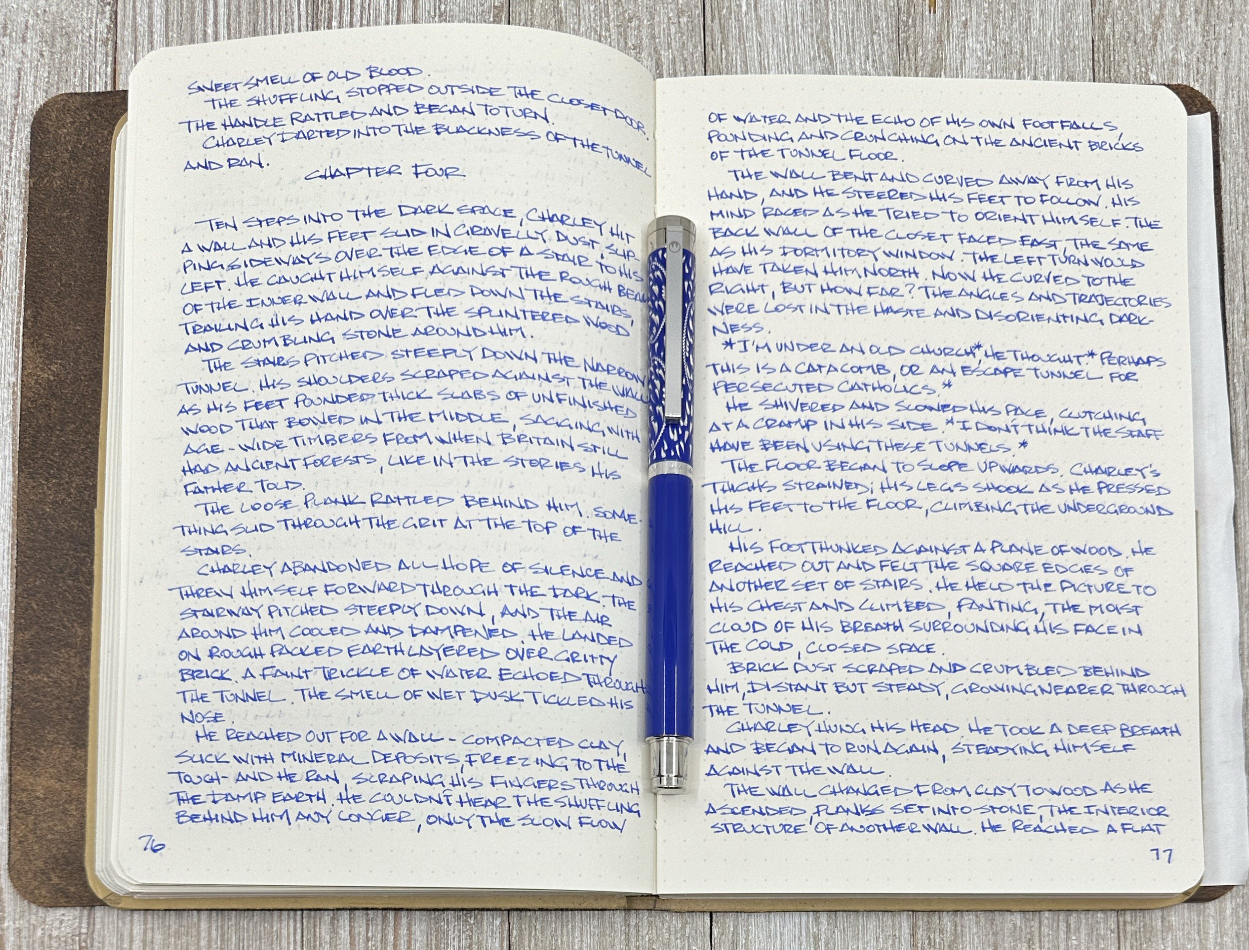
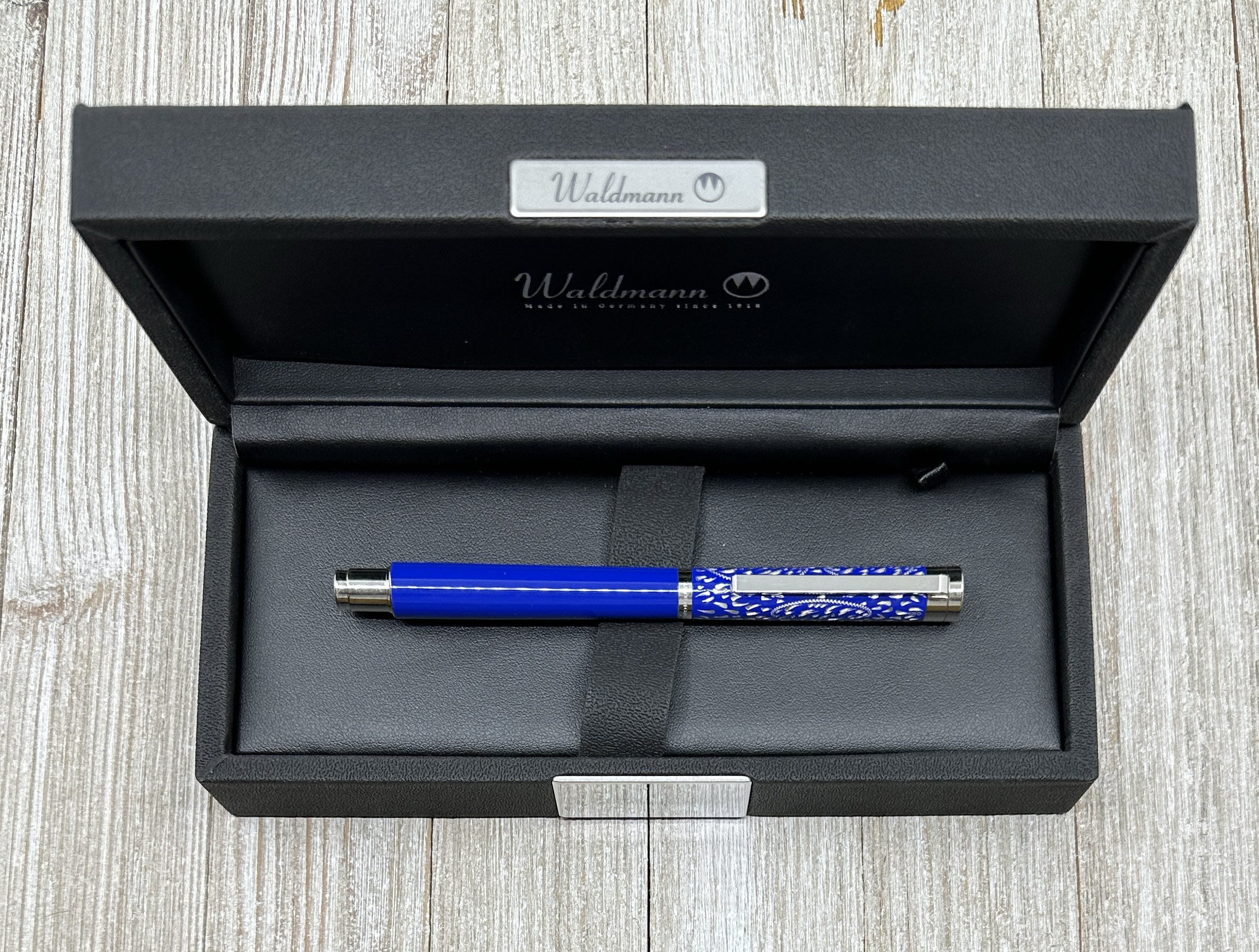
Beginning with the Waldmann, the Xetra Vienna puts the brand’s craftsmanship on full display. I knew this pen was a stunner with its polished blue lacquer and platinum plated parts, but I had no idea the cap pattern was hand-engraved. Not only does it look amazing, but it makes each pen in this series unique.

The Xetra Vienna is a standard length fountain pen, but with a narrow diameter. This shape leads to a requisitely narrow grip section, and #5-sized nib. My review model features an 18k Fine gold nib, but there is a stainless steel option as well.

This narrow barrel fits right into my preferences for writing. While I am comfortable using many pen shapes and sizes, I do prefer the narrow side of the ledger, so keep that in mind when I tell you how much I enjoy writing with this pen. Those who prefer bigger, wider pens may want to wait and see about the next Waldmann I will be reviewing.

I’ve had the Xetra Vienna in my writing rotation for a few weeks now, and it has been great. The added weight of the metal barrel balances out the narrowness, making for a comfortable writer. I mixed in a longer copy writing session for my long-running “The Bone Weaver’s Orchard” project, and the feel of the pen removed itself completely from the occasion. It morphed into my hand, the ink flow never stopped, and I had nothing to think about other than the text I was reading, and writing.

It was a great experience.

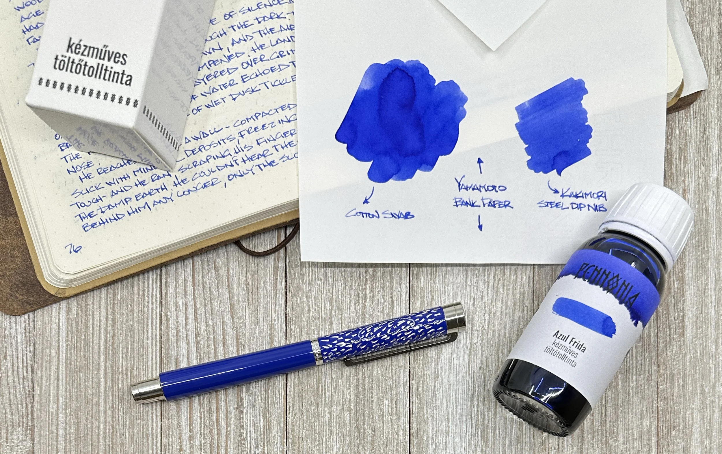
Adding to the writing experience was the perfect match of Pennonia Azul Frida, made for Amarillo Stationery. Inspired by Casa Azul, the long-time home of artist Frida Kahlo, this is a classic, bright blue that will feel right at home in any pen, especially one as perfect as the Xetra Vienna.

I’ve used a couple of Pennonia Inks, and the consistent performance of Azul Frida matches my experience with the rest. Great flow, excellent color saturation, and good dry time - all universally loved ink properties. As a bonus, what looks like a basic blue has hints of purple underneath, as seen in some of the ink swatches on different paper types - Yamamoto Bank Paper, for example.

I always want a classic blue on hand, and one with and added story and added character, like Azul Frida, is right up my alley.

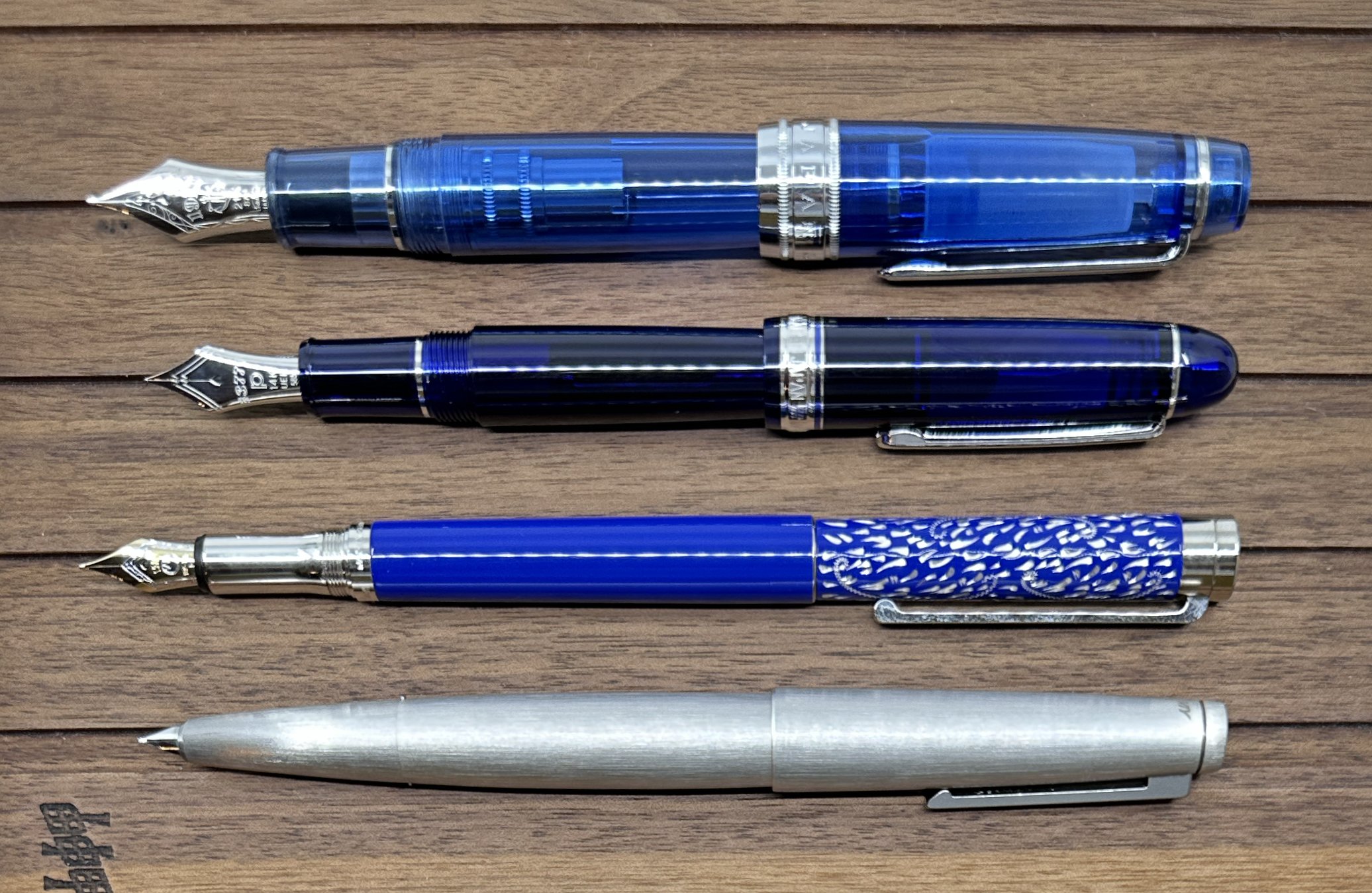
Top to bottom: Sailor King of Pen Sky, Platinum 3776 Chartres Blue, Waldmann Xetra Vienna, Lamy 2000 Stainless Steel.

My first experience with Waldmann was last year, when Kimberly let me test out one of hers. In general, the designs of this 100 year-old German brand aren’t a perfect style match for myself, but my goodness was the writing experience nice. That alone put them on my radar, especially as they continue to release interesting models.

The Xetra Vienna runs $319 with a steel nib, and $439 with an 18k gold nib, as seen in this review. The price feels right for the level of quality and craftsmanship. And Waldmann has well over a dozen different styles to choose from, ranging from $200 on up. While I don’t have one in my collection today, it won’t me long before one makes the cut and I add it to list.

(Luxury Brands of America loaned the Waldmann to The Pen Addict. Amarillo Stationery provided the ink at no charge.)


Enjoy reading The Pen Addict? Then consider becoming a member to receive additional weekly content, giveaways, and discounts in The Pen Addict shop. Plus, you support me and the site directly, for which I am very grateful.

Membership starts at just $5/month, with a discounted annual option available. To find out more about membership click here and join us!

Posted on May 22, 2023 and filed under Waldmann, Pennonia, Fountain Pens, Amarillo Stationery, Ink Reviews.

Colorverse Brunch Date - An Ink Review

(Kimberly (she/her) took the express train down the fountain pen/stationery rabbit hole and doesn't want to be rescued. She can be found on Instagram @allthehobbies because there really are many, many hobbies!.)

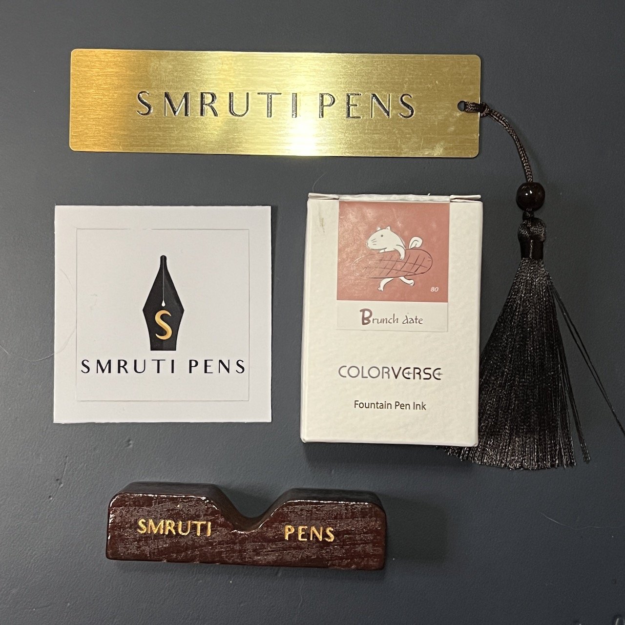
As I mentioned in the 2023 Atlanta Pen Show Recap, I had the pleasure of meeting Akhila Sheth who is the driving force behind Smruti Pens. Brad and I also got to meet her “assistant” (and husband) Nirmal and their two kids at the show, and they provided this Colorverse Brunch Date ink for us to review.

Colorverse Brunch Date is No. 80 in the Colorverse lineup and is part of their Season 6 - Earth Edition. It is part of the Joy in the Ordinary series along with No. 76 Under the Shade, No. 77 Walk the Dog, No. 78 Rainy Day, No. 79 Coffee Break, and No. 81 Delicious Sleep. I had heard that this could be a good match for some rose-gold trim pens so I was eager to test and review it.

Colorverse No. 80 Brunch Date.

A-ha! Now we know how the bread got stolen!!

Since my TWSBI Go pens were already inked up, I picked the TWSBI Swipe with a Medium nib and used that for the writing samples in the notebook. For the other writing samples, I used the Kakimori steel dip nib on the Col-O-Ring cards, as well as the 52 gsm, 68 gsm Tomoe River and Cosmo Air Light 75 gsm papers.

Writing sample and swatch on 68 gsm Tomoe River Paper.

52 gsm TR paper.

Cosmo Air Light 75 gsm paper.

Writing sample and dry times on 68 gsm Tomoe River Paper.

Chromatography showed a pink with hints of orange on the upper portion, which I didn’t expect.

Brunch Date had an average flow, though it felt wetter than I expected based on what a lovely shader it is. Shading inks are usually drier than their more saturated counterparts, so I was a little surprised that it took ~30 seconds to dry on 68gsm TR, which is neither too fast nor too slow given the wet TWSBI Medium nib. It would definitely dry faster like Rhodia, copy paper, Cosmo Air Light or with drier or finer nibs.

Inks similar to Brunch Date: Robert Oster Melbourne, Kobe #54 Goshikiyama Ocher, J Herbin Rouille D’Ancre, Sailor Ink Studio 273, Papier Plume Maroon, Ferris Wheel Press Lady Rose, PenBBS #178 Rose Quartz.

This category of inks is so hard to describe and match! It’s sort of pinkish, brownish and in some cases, almost orangish. It really depends on what other pens or inks are next to it and then you can see how it differs. It is definitely not as orange as the Robert Oster Melbourne, nor as pink as the FWP Lady Rose or PenBBS Rose Quartz, nor is it as brown as Sailor Ink Studio 273 or Papier Plume Maroon (which is much lighter than I expected a Maroon to be). The two that are the most similar to it are Kobe #54 Goshikiyama Ocher and J Herbin Rouille D’Ancre - both of which are my favorite inks to match with rose gold trimmed pens.

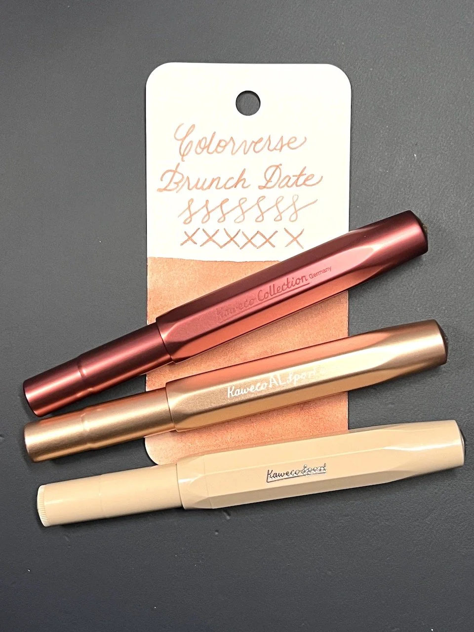
Just for funsies, here are some Kawecos (AL Sport Ruby, AL Sport Rose Gold, and Sport Macchiato) that could work with Colorverse Brunch Date.

Colorverse Brunch Date, along with the other Colorverse Joy in the Ordinary series inks, can be purchased for $14 for 30 ml at Smruti Pens. You can also purchase 3ml or 5ml samples from them for $3 and $5 respectively. I am glad I have now added another option for matching with my rose gold pens!

(Smruti Pens provided this product at no charge to The Pen Addict for review purposes.)


Enjoy reading The Pen Addict? Then consider becoming a member to receive additional weekly content, giveaways, and discounts in The Pen Addict shop. Plus, you support me and the site directly, for which I am very grateful.

Membership starts at just $5/month, with a discounted annual option available. To find out more about membership click here and join us!
Posted on May 19, 2023 and filed under Colorverse, Ink Reviews.

Robert Oster NYC Pen Show 2022 Ink Review

(Jeff Abbott is a regular contributor at The Pen Addict. You can find more from Jeff online at Draft Evolution and Twitter.)

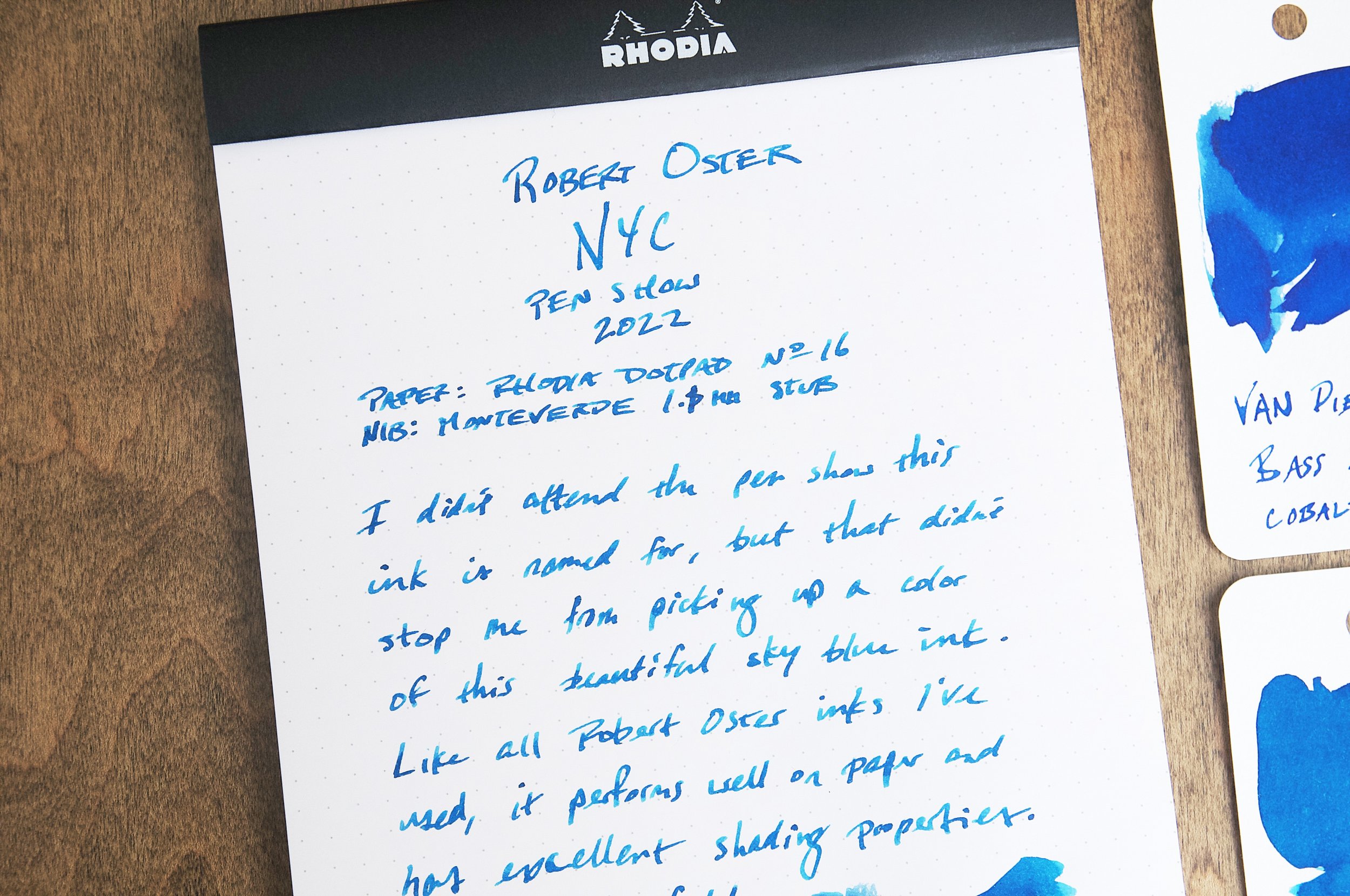
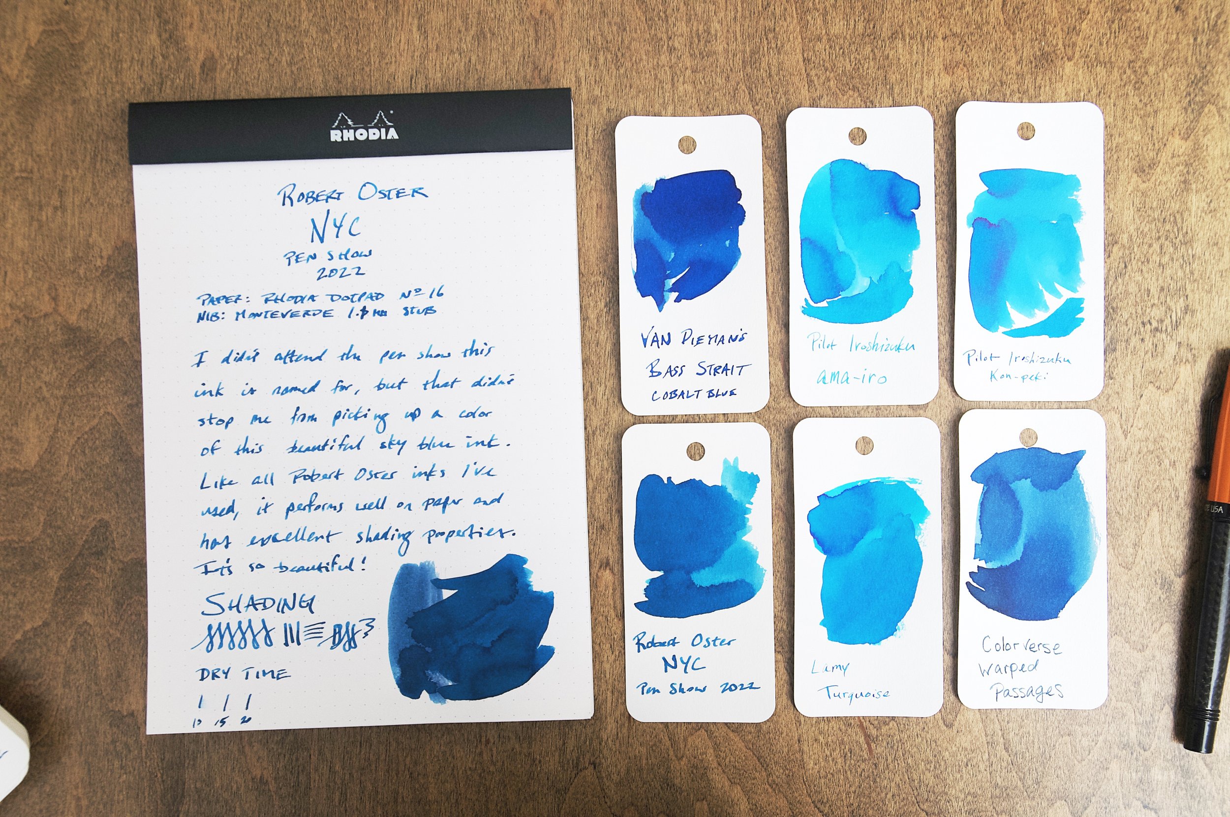
Combining three things that you love into one thing is quite a challenge, but that's what I have in the Robert Oster NYC Pen Show ink from 2022. This special edition ink from Robert Oster hits three positive notes for me out of the gate: Robert Oster inks, pen shows, and NYC. Even though I've never attended a pen show in New York, this ink caught my attention.

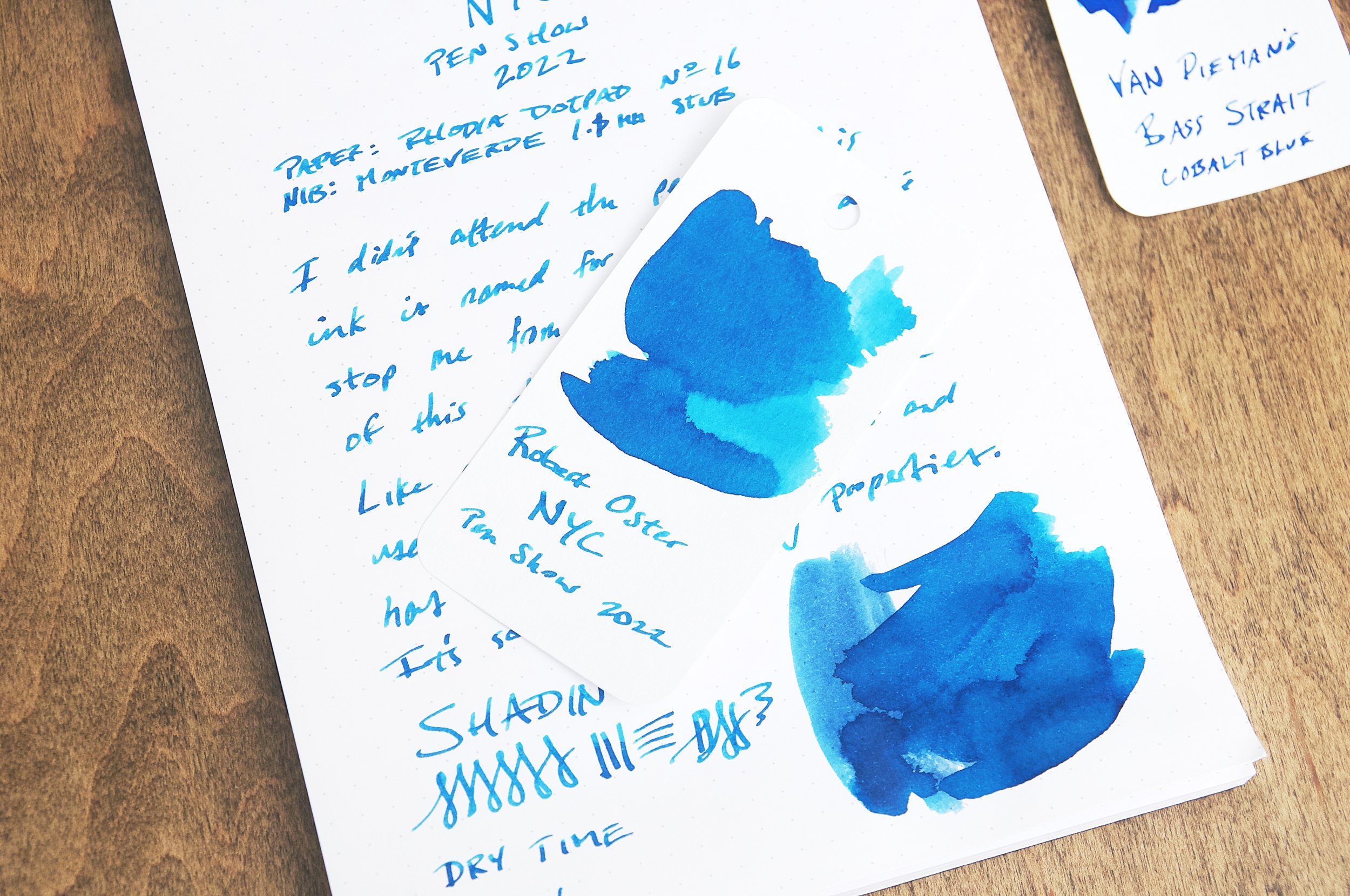
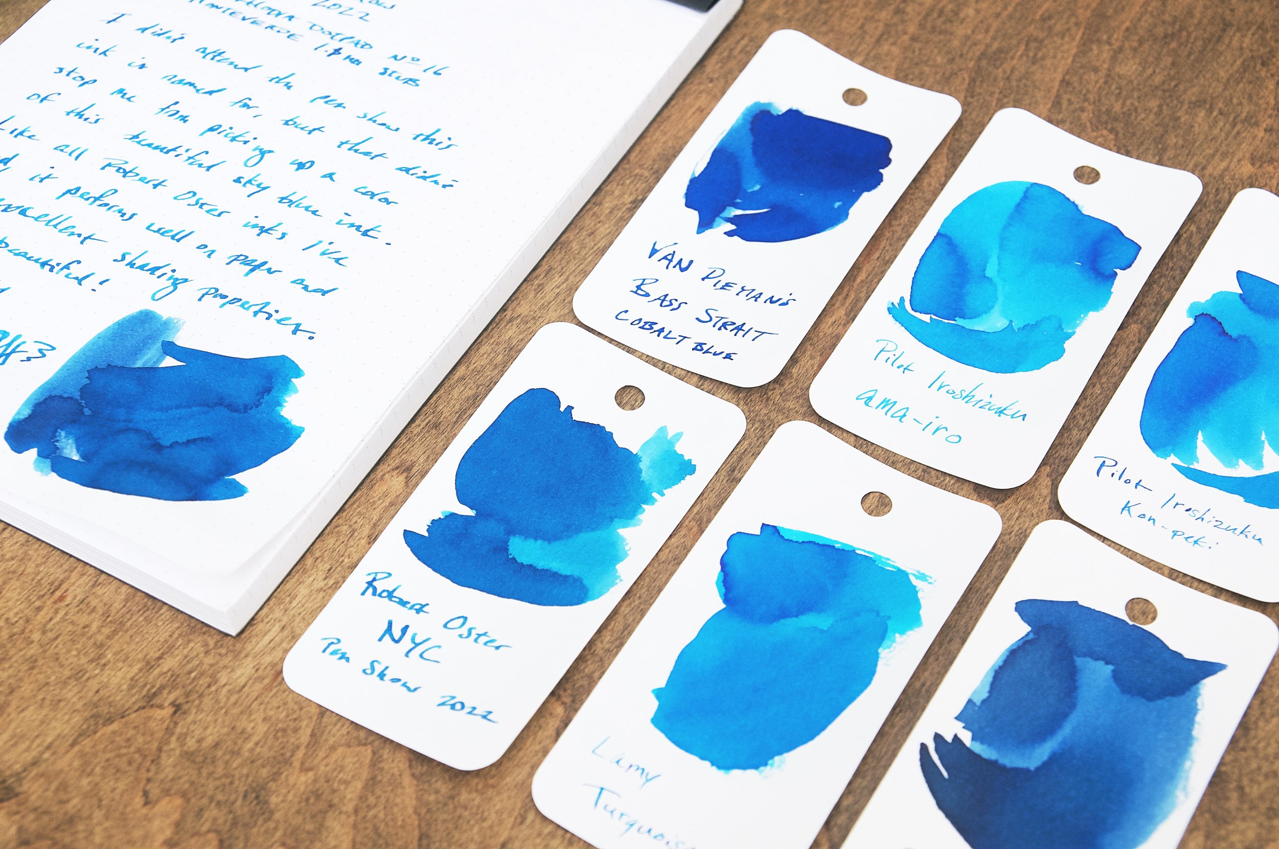
Robert Oster NYC Pen Show 2022 is a sky blue ink that leans toward the darker side of this particular hue. In a word, it's gorgeous. It's a lovely color with the shading goodness I've come to expect from Oster inks. And of course it's also well-behaved and easy to use and clean. The one thing I can find wrong with this ink is the simple fact that I already have so many similar inks in my collection. Sky blue or turquoise is something I'm drawn to by forces I can't explain, but despite that self-admitted problem, this ink still stands out as a unique shade of this lovely blue color. It's darker than some of my favorites — like Lamy Turquoise or Iroshizuku kon-peki — but still has enough brightness to scratch the itch I have for this color zone.

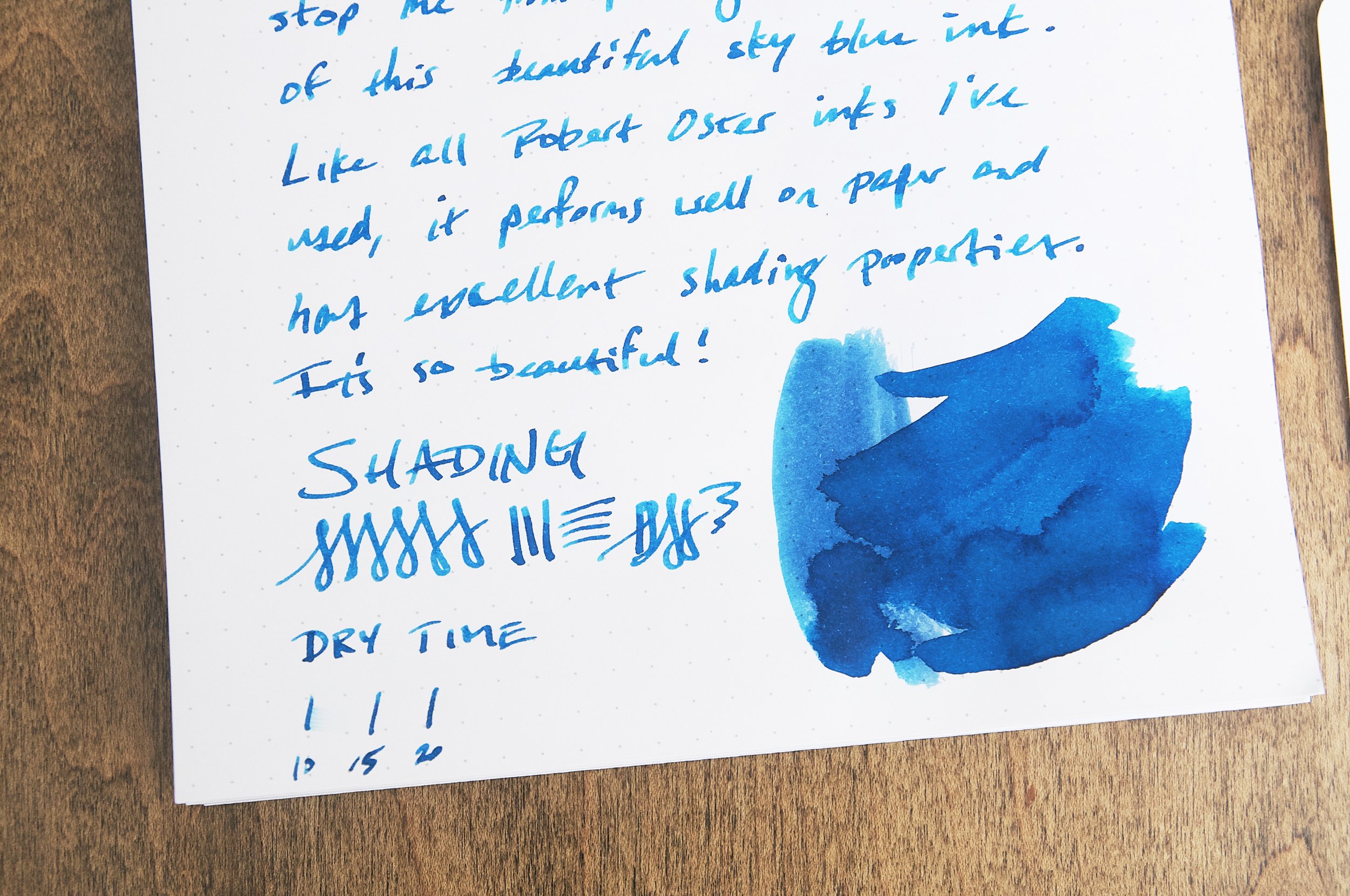
For me, an ink that only presents a single color on the page is kind of boring. Sometimes that's exactly what you want out of an ink, but I tend to lean toward inks that have noticeable shading effects. This ink shades nicely between a medium and light sky blue even with smaller nibs. It's just enough variation in color to attract the eye and drop plenty of hints about the type of pen being used to make the marks. It's elegant and happy, and that's why I like using it.

In terms of performance, it's top-notch. No feathering or bleeding, and minimal show-through on the back of the page when writing with a wet 1.1mm stub nib. This is exactly what I've come to expect from this ink brand and why I never hesitate to try out new colors that look interesting. I know they'll at least perform well even if I don't love the color!

Dry time isn't phenomenal, but it's respectable. It dries for me in under 15 or 20 seconds in most cases, and even faster with a finer nib (I used a 1.1mm stub in the photo writing sample). Still, this won't be a good option for writers that drag their hand across the left side of the page while writing.

I'm sure that you can find another ink (probably several) that match this ink in terms of hue and shading properties. There really are so many ink options in this spectrum (bordering on too many), and you'll likely know immediately if it's too similar to something you already have. For me, it looked a little darker than anything else I had in my collection, and I was lucky enough to have guessed right in this case.

Robert Oster NYC Pen Show 2022 is a special edition ink that I'm glad to have in my collection. It's a beautiful medium sky blue with lovely shading properties. If you can't snag this limited edition, I'm sure we can find something very similar or identical to this one. And I bet I'll have an inexplicable urge to buy that ink too! At $21 for 50ml, this ink is priced a few bucks higher than the standard inks, and I imagine this has something to do with the limited nature and smaller scale. The price and quantity is still reasonable for the beautiful color and excellent performance, so don't hesitate if you love the color and need another sky blue ink in your life.

(Goldspot provided this product at a discount to The Pen Addict for review purposes.)


Enjoy reading The Pen Addict? Then consider becoming a member to receive additional weekly content, giveaways, and discounts in The Pen Addict shop. Plus, you support me and the site directly, for which I am very grateful.

Membership starts at just $5/month, with a discounted annual option available. To find out more about membership click here and join us!

Posted on May 17, 2023 and filed under Robert Oster, Ink Reviews.