Posts filed under Ink Reviews

Diamine Sailor’s Warning Ink Review

Sailor's Warning was one of two ink formulations chosen by the /r/fountainpens community on Reddit earlier this year, continuing a wonderful trend by Diamine in working with many collaborators - big and small - to create inks. Given all of the recent changes with Reddit, will they continue this project? Who knows, but let me be the first to ask: Mastodon ink when?

If you are Mastodon curious, check out the wonderful community being built at Penfount, where you can find all the details you need. And if you are shimmer ink curious, well, Sailor’s Warning is one you will want to take a look at asap.

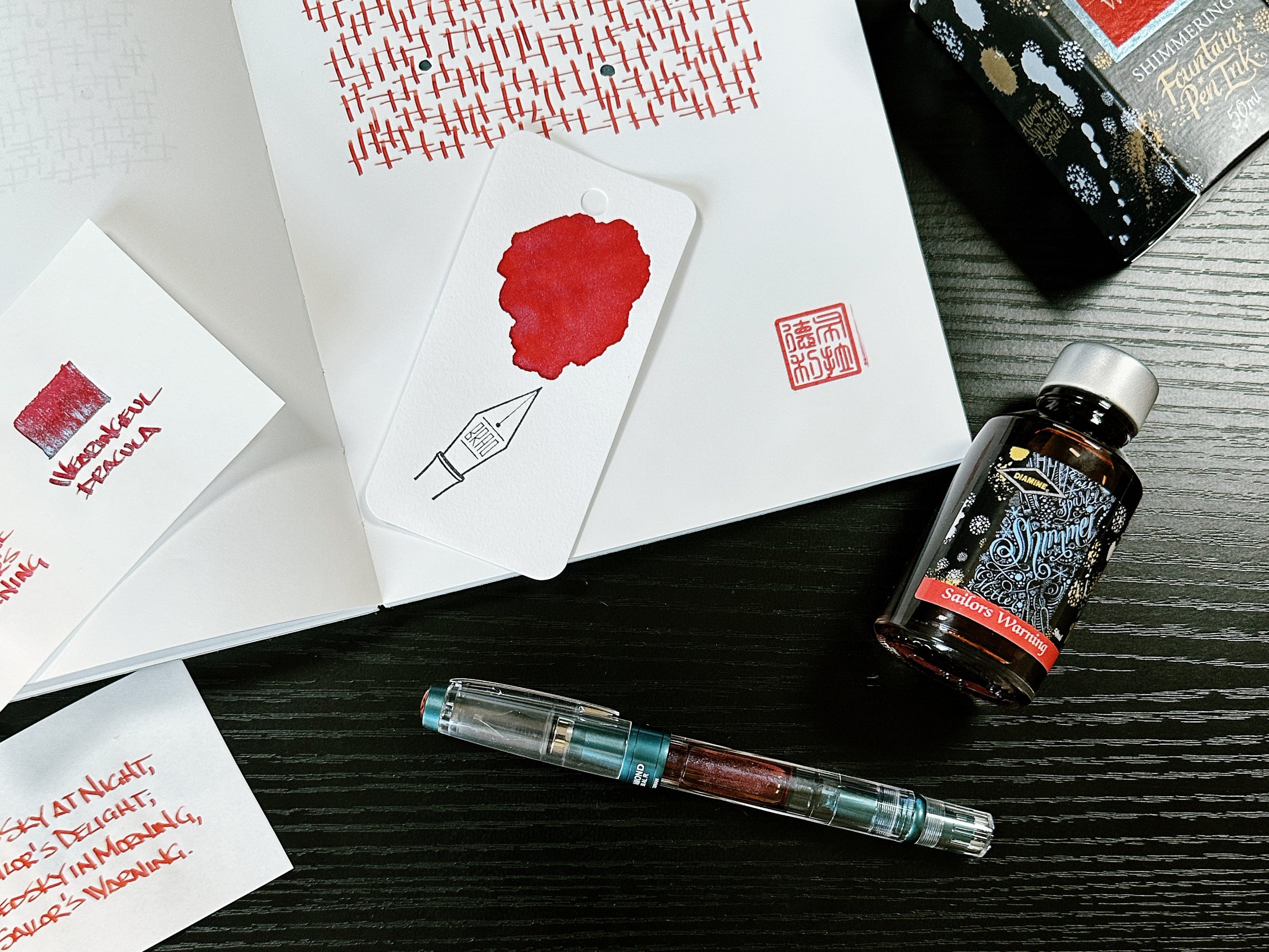
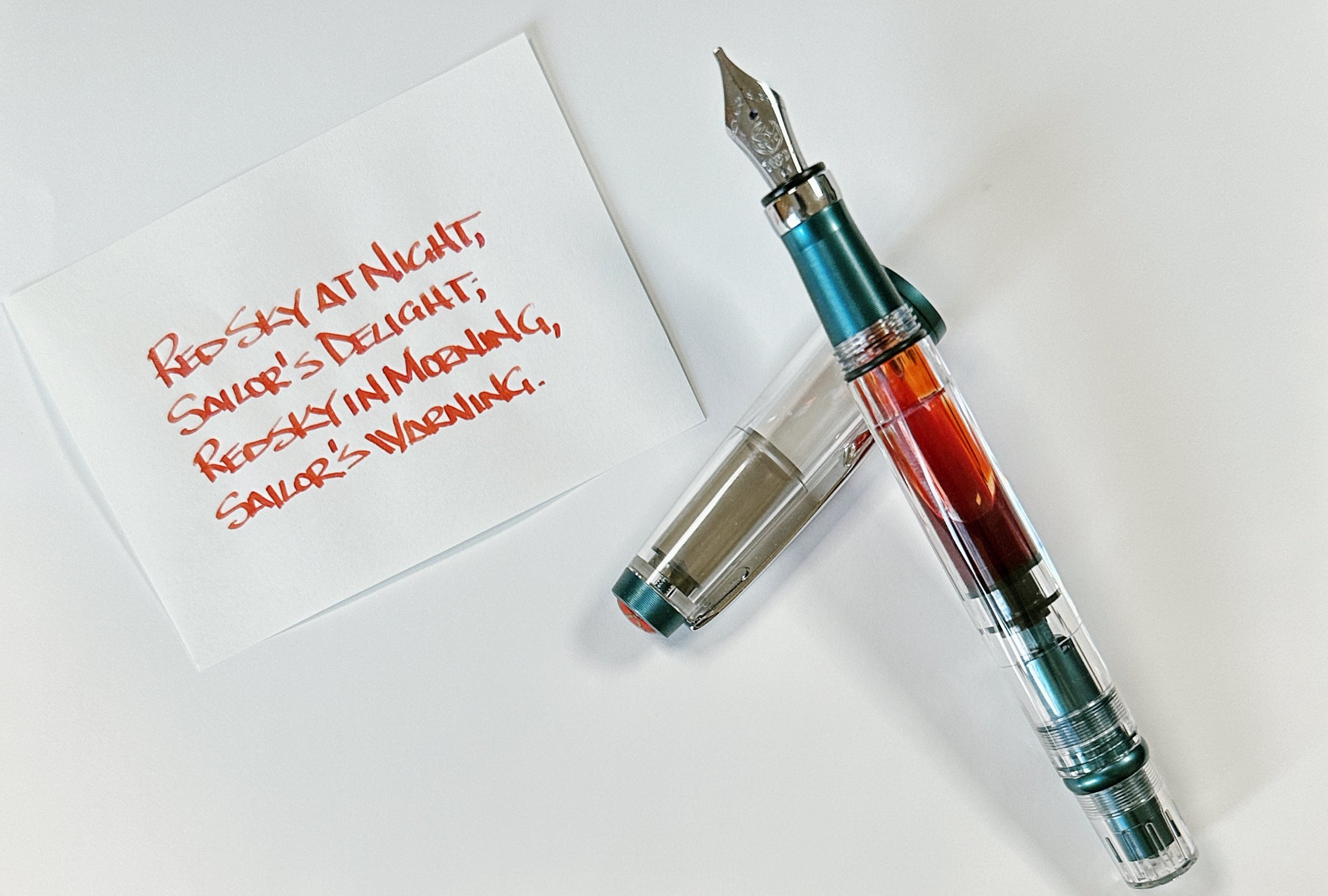
The most interesting thing I noticed out of the box with this ink is the underlying color. I thought it would be bright red, and there is plenty of that shade, but the base color underneath that red is peach. That took me by surprise, in a positive way. My 1.1 mm stub nib in the TWSBI 580ALR Prussian Blue pen I used for this review spreads the ink thin at the top of the line, with the ink pooling more towards the bottom of stroke. That’s how shading happens, and in this case, that’s how the peach shade pokes out from underneath the red.

But let’s be clear, you aren’t buying this ink for the peachy-red color - you are buying it for the peachy-red color with shimmer! Diamine says the shimmer is silver, but I see a faint light blue tone where the shimmer breaks through. I think that shade is a perfect match for this ink, giving the ink a purple tone in some areas.

When I bought Sailor’s Warning, I was interested in how it compared to another favorite shimmer ink of mine, Wearingeul Dracula. My guess was that they would be close enough to be interchangeable, but that couldn’t be further from the truth. Dracula is very red in comparison, with a brighter blue shimmer. In the end, these two inks are very different.

If there is any downside to Sailor’s Warning it is that it seems dry, even from this 1.1 mm nib. I expected more ink flow, which shimmer inks need to show off their primary property. I want to give it a try in another pen and a different nib to see if I feel the same way, but I’ve tested several shimmer inks in this pen and flow has never been an issue.

At $22 for a 50 ml bottle, Diamine Sailor’s Warning is priced well. I wouldn’t hesitate to recommend it, but I would make sure to use a wide, wet nib. That goes for all shimmer inks, so that should come as no surprise, but I find it to be especially true with this one.

That’s my Sailor’s Warning.


Enjoy reading The Pen Addict? Then consider becoming a member to receive additional weekly content, giveaways, and discounts in The Pen Addict shop. Plus, you support me and the site directly, for which I am very grateful.

Membership starts at just $5/month, with a discounted annual option available. To find out more about membership click here and join us!

Posted on July 3, 2023 and filed under Diamine, Ink Reviews.

Nahvalur Explorer Mango Sorbet Ink Review

(Jeff Abbott is a regular contributor at The Pen Addict. You can find more from Jeff online at Draft Evolution and Twitter.)

Summer is fast-approaching, so that means bright and colorful ink options abound. What could be better in the summer than a cold frozen dessert on a hot day? Sorbet can certainly do the trick, and that's what this ink from Nahvalur has me thinking about every time I pick it up.

Nahvalur Mango Sorbet is a dusty yellow-orange ink from their Explorer line of inks. This line of inks complements the Original Plus line of vacuum filler pens, and Mango Sorbet is a direct match to Gold Ocellatus. I don't have the pen, but I imagine the yellow-orange Mango Sorbet looks great swirling around the transparent reservoir with yellow swirls in the material.

Regardless of what pen you use this ink with, the color that comes out on the page is really fun. I've struggled to nail down the exact color of this ink due to the level of shading it exhibits, but it's a lovely yellow-orange that switches between more yellow and more orange with each nib stroke. The color saturation is a little subdued, which is exactly what I'd expect from an ink color that mimics the inside of a mango. Mango is a sweet and pleasant fruit, but both the color and taste are balanced and not too up-front. The ink does a great job of representing what my imagination comes up with when you say the words "mango sorbet."

Going back to the shading properties, this is my favorite thing about the ink. I loved using this ink in a wide, wet nib because it really shows off how much color variation this ink has to offer. Regardless of what nib you use, the shading manages to shine and offer lighter and darker versions of the ink color with each stroke.

In some light, I can detect a little bit of green, but it's rare and only when swatching the ink with a brush. I wouldn't expect any nib to get this out of the ink under normal circumstances. But, it was really intriguing to see this when making large pools with the ink.

Something this ink touts is a quick dry time, but I would call it average dry time. It's not a quick drying ink, but usually becomes smudge-proof after 15 seconds. The lighter areas are dry much sooner, but those areas where ink pools under certain letters are what take several more seconds to dry. This probably isn't a great choice for left-handed writers or anyone who drags their hand behind the nib.

Everything else about this ink is fantastic. I haven't tried an Nahvalur inks before this, and I'm impressed by how well it performs. In my mind, the fact that a renowned pen manufacturer is producing ink does not automatically mean the ink will be any good. For Nahvalur, they've at least done a great job with this specific ink, and I look forward to trying others. It's also exciting to see them pairing inks with pens! I'm not a stickler for matching pens and inks, but it is nice to find that perfect pairing.

Mango Sorbet is $12 for a small 20ml bottle. That's a good value for what you get when comparing to similarly-sized ink vendors. You can certainly find better value when buying a Diamine ink, but they have significant scale and connection since it's their main focus. If the color intrigues you, it's a great impulse purchase. And, if you happen to have one of the Original Plus Gold Ocellatus pens, you should feel compelled to pick up this ink to see how it pairs with the pen!

(Goldspot provided this product at a discount to The Pen Addict for review purposes.)


Enjoy reading The Pen Addict? Then consider becoming a member to receive additional weekly content, giveaways, and discounts in The Pen Addict shop. Plus, you support me and the site directly, for which I am very grateful.

Membership starts at just $5/month, with a discounted annual option available. To find out more about membership click here and join us!

Posted on May 31, 2023 and filed under Nahvalur, Ink Reviews.

Pairings Party: Waldmann Xetra Vienna, Amarillo Stationery Azul Frida

I did my first pairings party a few weeks back with the Onoto Scholar and Ferris Wheel Press Central Park Greens, and this week I’m back with another matchy-matchy combination that I’m loving in the Waldmann Xetra Vienna and Amarillo Stationery Azul Frida.

Beginning with the Waldmann, the Xetra Vienna puts the brand’s craftsmanship on full display. I knew this pen was a stunner with its polished blue lacquer and platinum plated parts, but I had no idea the cap pattern was hand-engraved. Not only does it look amazing, but it makes each pen in this series unique.

The Xetra Vienna is a standard length fountain pen, but with a narrow diameter. This shape leads to a requisitely narrow grip section, and #5-sized nib. My review model features an 18k Fine gold nib, but there is a stainless steel option as well.

This narrow barrel fits right into my preferences for writing. While I am comfortable using many pen shapes and sizes, I do prefer the narrow side of the ledger, so keep that in mind when I tell you how much I enjoy writing with this pen. Those who prefer bigger, wider pens may want to wait and see about the next Waldmann I will be reviewing.

I’ve had the Xetra Vienna in my writing rotation for a few weeks now, and it has been great. The added weight of the metal barrel balances out the narrowness, making for a comfortable writer. I mixed in a longer copy writing session for my long-running “The Bone Weaver’s Orchard” project, and the feel of the pen removed itself completely from the occasion. It morphed into my hand, the ink flow never stopped, and I had nothing to think about other than the text I was reading, and writing.

It was a great experience.

Adding to the writing experience was the perfect match of Pennonia Azul Frida, made for Amarillo Stationery. Inspired by Casa Azul, the long-time home of artist Frida Kahlo, this is a classic, bright blue that will feel right at home in any pen, especially one as perfect as the Xetra Vienna.

I’ve used a couple of Pennonia Inks, and the consistent performance of Azul Frida matches my experience with the rest. Great flow, excellent color saturation, and good dry time - all universally loved ink properties. As a bonus, what looks like a basic blue has hints of purple underneath, as seen in some of the ink swatches on different paper types - Yamamoto Bank Paper, for example.

I always want a classic blue on hand, and one with and added story and added character, like Azul Frida, is right up my alley.

Top to bottom: Sailor King of Pen Sky, Platinum 3776 Chartres Blue, Waldmann Xetra Vienna, Lamy 2000 Stainless Steel.

My first experience with Waldmann was last year, when Kimberly let me test out one of hers. In general, the designs of this 100 year-old German brand aren’t a perfect style match for myself, but my goodness was the writing experience nice. That alone put them on my radar, especially as they continue to release interesting models.

The Xetra Vienna runs $319 with a steel nib, and $439 with an 18k gold nib, as seen in this review. The price feels right for the level of quality and craftsmanship. And Waldmann has well over a dozen different styles to choose from, ranging from $200 on up. While I don’t have one in my collection today, it won’t me long before one makes the cut and I add it to list.

(Luxury Brands of America loaned the Waldmann to The Pen Addict. Amarillo Stationery provided the ink at no charge.)


Enjoy reading The Pen Addict? Then consider becoming a member to receive additional weekly content, giveaways, and discounts in The Pen Addict shop. Plus, you support me and the site directly, for which I am very grateful.

Membership starts at just $5/month, with a discounted annual option available. To find out more about membership click here and join us!

Posted on May 22, 2023 and filed under Waldmann, Pennonia, Fountain Pens, Amarillo Stationery, Ink Reviews.