Posts filed under Ink Reviews

Octopus Fluids Purpur Ink Review

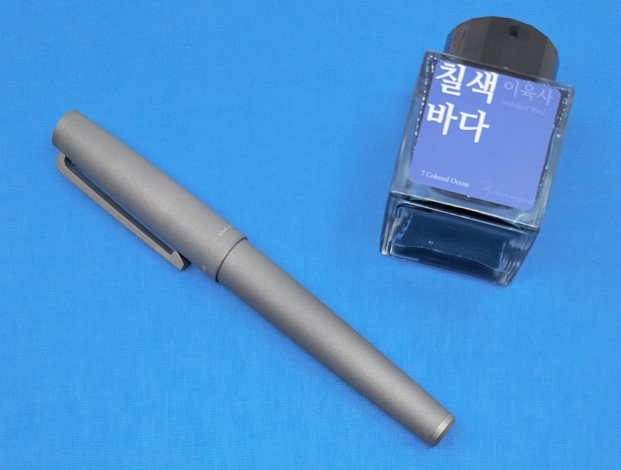
(Jeff Abbott is a regular contributor at The Pen Addict. You can find more from Jeff online at Draft Evolution and Twitter.)

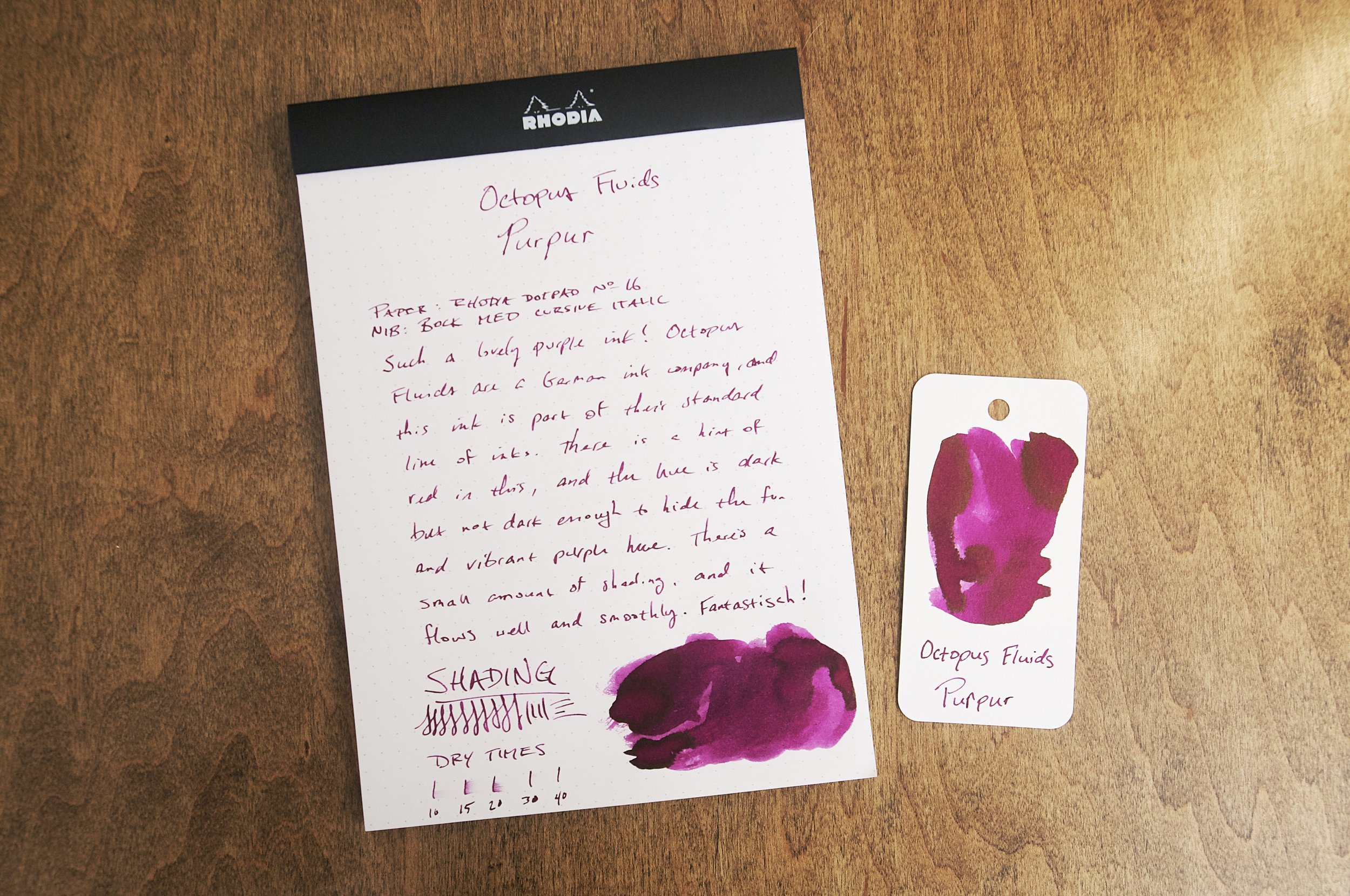
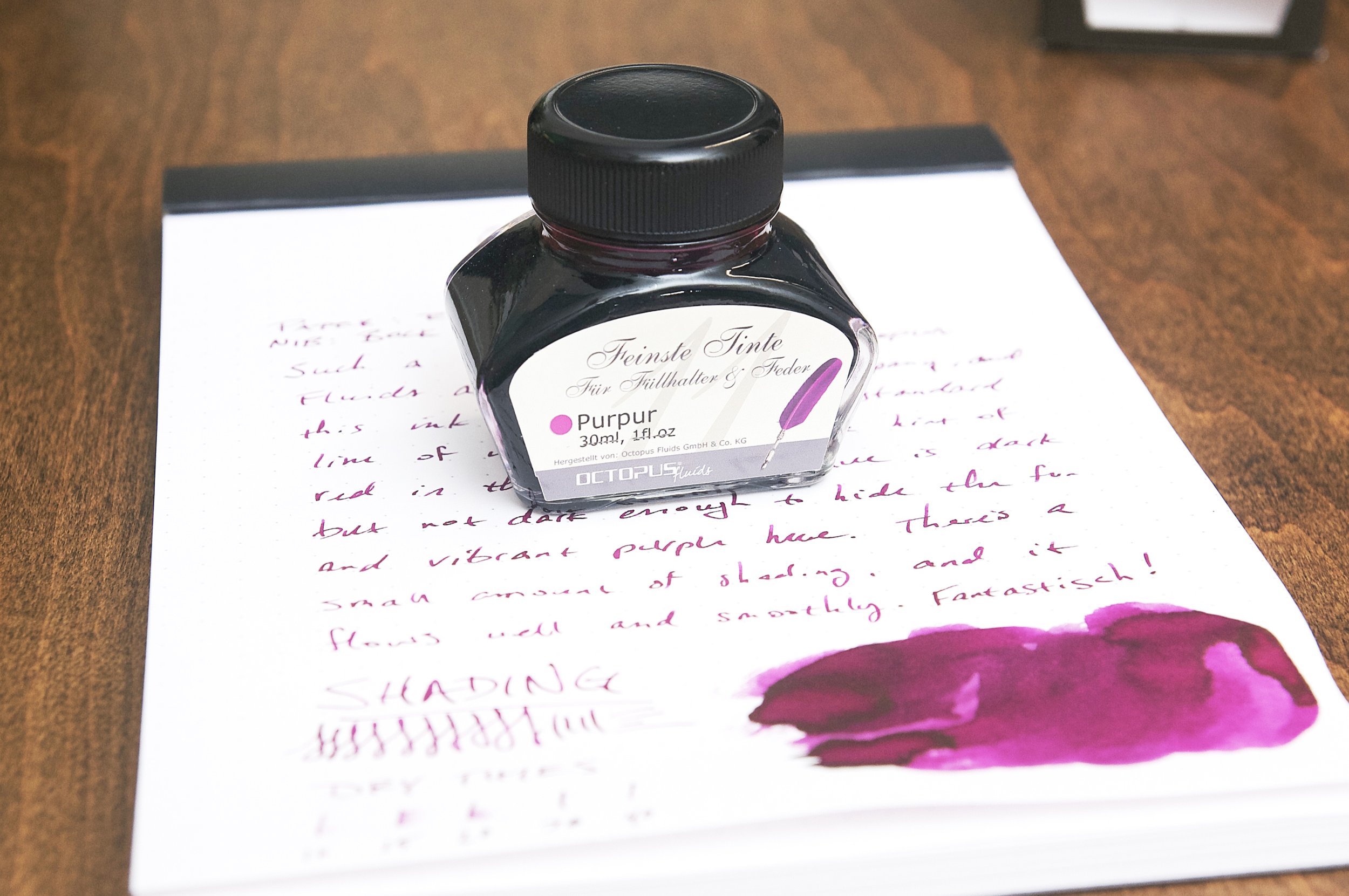
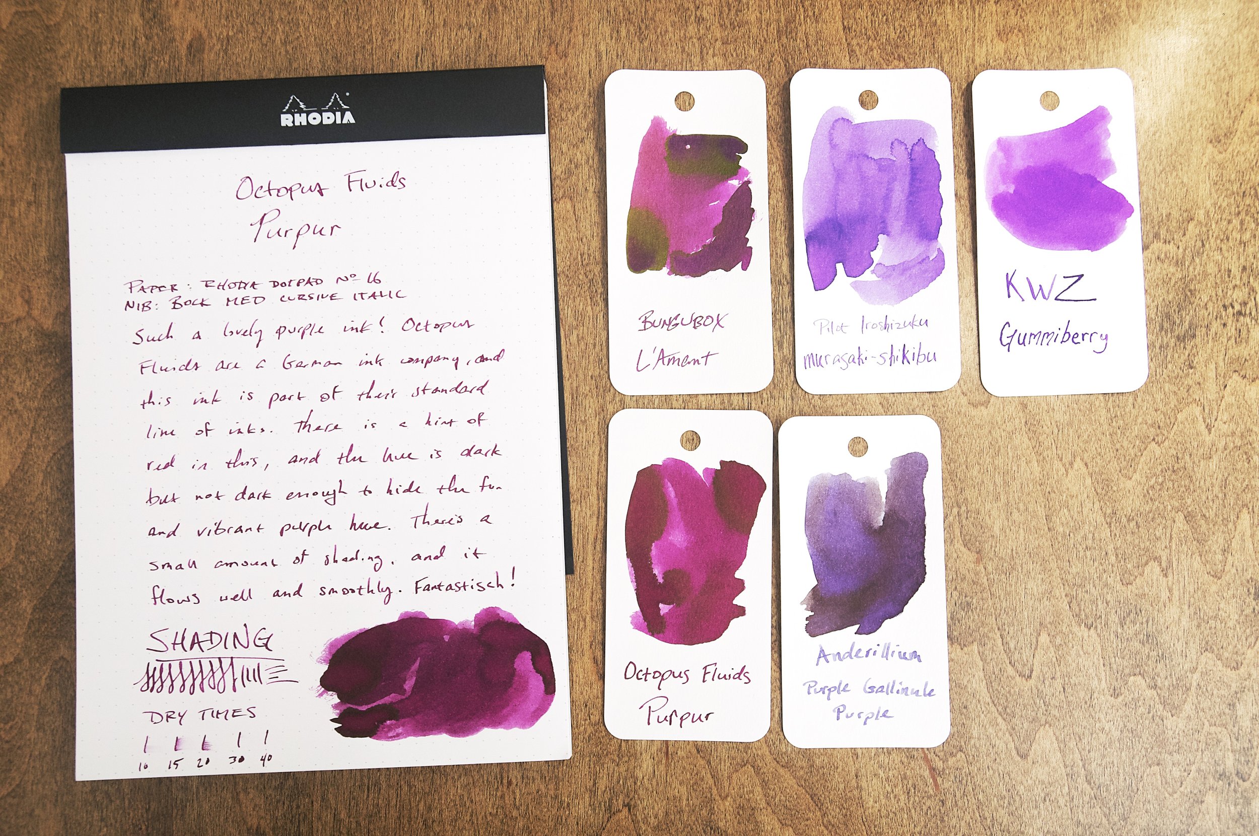
It's getting difficult to keep up with all the new ink makers that have popped up in the past couple of years, and I'm not complaining. The latest new ink to hit my desk comes from Octopus Fluids in Germany, and it's a gorgeous purple ink with a little bit of shading and lots of personality.

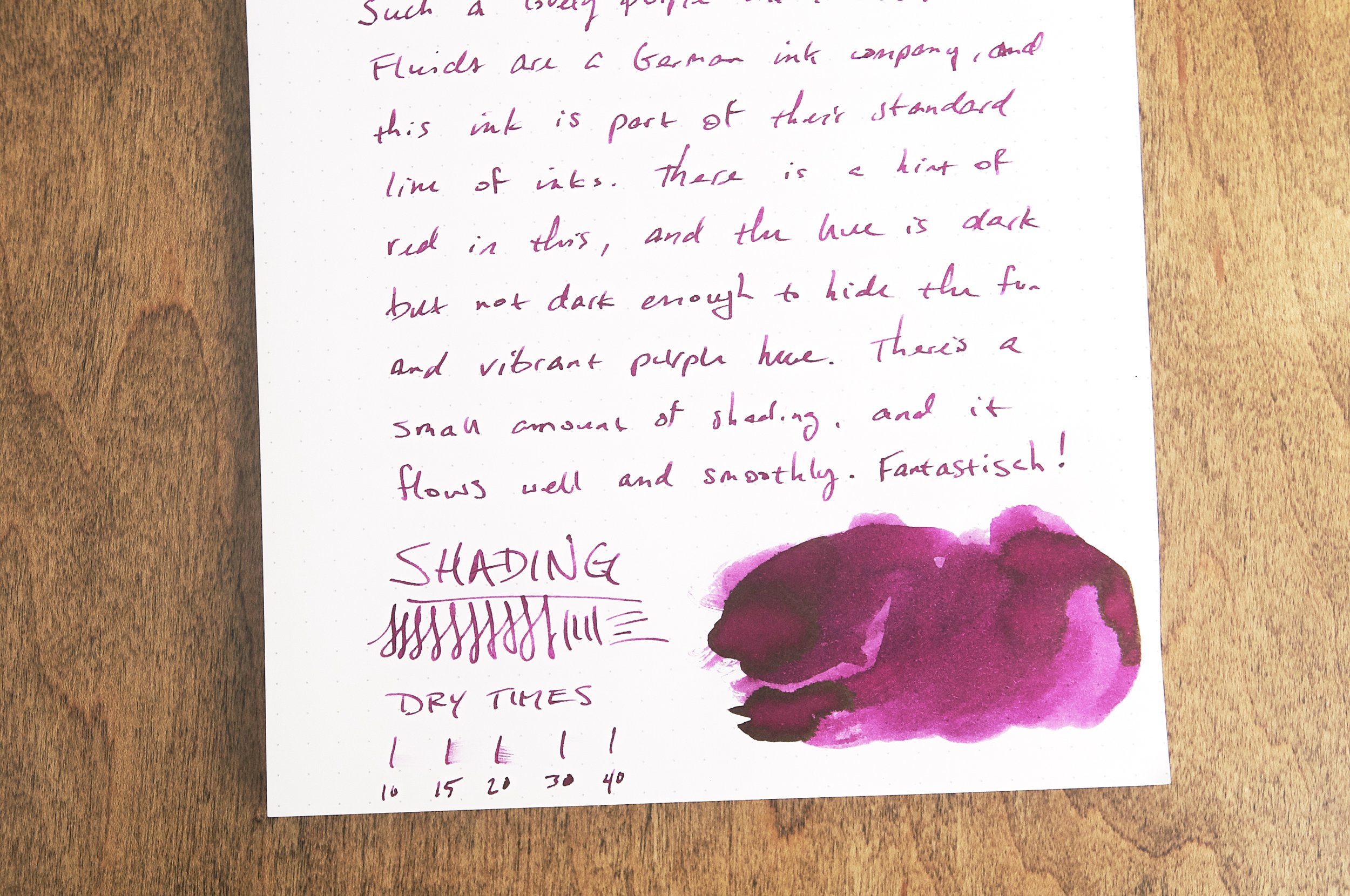
Octopus Fluids Purpur is a medium purple with a little hint of red that makes it a great choice for everyday writing and doodling. This color is part of the standard line of inks that Octopus Fluids offer, and I think it's a great standard representation of purple. It's not as vibrant as some, but it's also dark enough to make it easy to use in a professional setting.

Writing with this ink is a pleasant experience. It flows easily and smoothly, and works well with all the pens I've tried it with so far. The ink doesn't feather or bleed, and it cleans up easily as well. There's a bit of shading in this ink, but it isn't extreme. In the medium cursive italic nib I've been using recently, you can see slight color variation in each stroke, but it doesn't jump out at you. Still, it does add just a touch of variation that indicates that a fountain pen was used to make the marks.

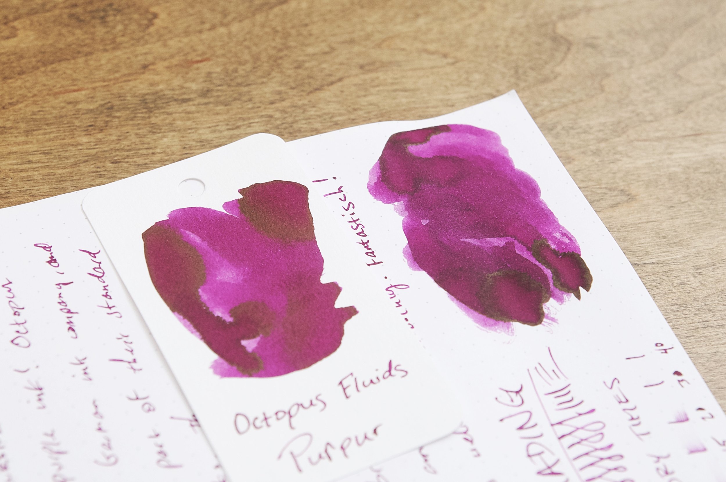
An interesting feature of this ink that I've only seen when doing swatches or making large pools of ink is that there's a reddish sheen that hangs on top of the dried ink. It looks great under the right light, but it's only easy to pick out in swatches or areas where ink has pooled significantly. Realistically, you won't see the sheen under normal writing circumstances.

Dry time for this ink does leave something to be desired, though. In my testing, the ink normally took between 20 and 40 seconds to dry to the point where it wasn't easy to smudge with light pressure. This isn't the slowest ink to dry in my testing, but it is pretty slow. Definitely something to consider if you're left handed or want to use this ink in a notebook where you plan on quickly jotting down notes and closing the book. There will be ink spots on your hands and/or opposite pages of your notebook.

Despite the dry time, I have zero complaints with this ink. I'm partial already to purple inks, and this color just makes me happy when I'm using it. It's not as bright as some of my other purple inks, but the medium hue is gorgeous and makes it easy to use in any setting while still being obviously purple.

I'm excited to explore more from Octopus Fluids because my initial exposure with this ink has been a great experience. The 30ml bottle of Purpur cost $14, so the price is fairly standard for other small-shop ink vendors. Vanness also offer a small 4ml sample vial if you want to try it out (and others while you're at it) to see if you want to commit to a larger bottle. Try out Octopus Fluids the next time you're able!

(Vanness Pens provided this product at no charge to The Pen Addict for review purposes.)


Enjoy reading The Pen Addict? Then consider becoming a member to receive additional weekly content, giveaways, and discounts in The Pen Addict shop. Plus, you support me and the site directly, for which I am very grateful.

Membership starts at just $5/month, with a discounted annual option available. To find out more about membership click here and join us!

Posted on July 12, 2023 and filed under Octopus Fluids, Ink Reviews.

Parings Party: Waldmann Titan Fountain Pen, Wearingeul 7 Colored Ocean

The tactile feel of the Waldmann Titan Fountain Pen is something to behold.

I didn’t know what to expect when requesting this pen from Luxury Brands to review, and that is exactly why I choose it. The Titan is not a pen I would have picked out blindly for myself, but after using it for the past month, I’ve come away impressed.

If you aren’t familiar with Waldmann, we have reviewed a couple of this German manufacturers pens previously, with very positive results. Given that, it should come as no surprise that I feel similarly about the Titan. What does surprise me is that Waldmann decided to make this pen in the first place.

I shouldn’t be surprised, as they are a metal pen manufacturer at their core, but the Titan is a visual outlier compared to the rest of their lineup. And, like the rest of their lineup, they nailed the execution.

Back to my first comment: I can’t get the feel of the Titan out of my head, or my hands. Metal barrel pens ride a fine line between showing off materials and manufacturing, and making a blunt force object far too heavy to write with comfortably.

Titanium is lighter than many other metals used in pen manufacturing, but the manufacturer still has control over the final weight. How thick are the barrel walls, for example? Too thick, and you throw off the balance. Too thin, and you compromise the structure. Waldmann landed on a nice balance and weight with the Titan, allowing for long writing sessions without fatigue, while making a sturdy pen that is built to last.

The sandblasted finish is an added bonus. I like a bit of texture on metal pens, especially in the grip area, and they did a great job with the overall feel. It is a tip-to-tail finish, too, as this pen is all titanium outside the nib, nib housing and feed, and converter.

The only question I have is the use of Bock’s #5 steel nib, instead of the larger #6 model. This is a full-sized pen, and could handle a #6 easily. Luckily, Bock’s #5 is sized like a 5-1/2, so visually it works fine. I simply have to ask the question of why not the bigger nib?

My review unit sports an Extra Fine (hooray Bock nib markings!) and writes perfectly for me. My usage has run the gamut from planning, journaling, scratching notes, and, inked with the brilliant Wearingeul 7 Colored Ocean, has worked flawlessly every time I uncapped the pen thanks to the internal plastic liner that seals it upon closure.

How did I decide on 7 Colored Ocean for this pen? Well, what color ink would you have chosen? Literally anything would have matched the titanium barrel, so when you can choose everything, how do you choose anything? I ended up going with this Blue Steel vibe, despite running bright green, hot pink, orange, and purple shades through my mind before settling on this one.

I think I made the perfect choice. 7 Colored Ocean isn’t breaking new ground on bright blues with darker shading and a hint of red sheen, but dang if it isn’t perfect for this pen. I lean towards this color a lot with my finer nibs, and the results usually pay off. This could be an all day, every day writing combination.

The Waldmann Titan is a limited edition of 200 worldwide, and is currently priced at $385 at site sponsor Pen Chalet. It’s expensive, but every part of this pen feels worth it to me. It’s hard to imagine a better built pen that what Waldmann has done here. Add in a $22 bottle of Wearingeul 7 Colored Ocean, and you too may end up with a pairing party of your own.

(Luxury Brands USA loaned the Waldmann Titan to The Pen Addict for review purposes. The Wearingeul Ink was purchased from Vanness Pens at a discount.)


Enjoy reading The Pen Addict? Then consider becoming a member to receive additional weekly content, giveaways, and discounts in The Pen Addict shop. Plus, you support me and the site directly, for which I am very grateful.

Membership starts at just $5/month, with a discounted annual option available. To find out more about membership click here and join us!

Posted on July 10, 2023 and filed under Waldmann, Fountain Pens, Ink Reviews, Pen Reviews, Wearingeul.

Wearingeul Macbeth & The Phantom of the Opera - A Review, Part 1

(Kimberly (she/her) took the express train down the fountain pen/stationery rabbit hole and doesn't want to be rescued. She can be found on Instagram @allthehobbies because there really are many, many hobbies!.)

I was very excited when the Bossman picked up Wearingeul Macbeth and The Phantom of the Opera at this year’s Atlanta pen show for me to review, but only getting to it now. Sorry! To make up for it (and also because it’s fun), I decided to make this review a two-parter. Don’t worry, I won’t leave anyone hanging about how these two inks performed, so without further ado…

Wearingeul Macbeth (left) and The Phantom of the Opera (right) I love that the mask is a sticker than you can peel off, if you so choose!

For Macbeth, I used the clear TWSBI Go with a Medium nib and a TWSBI Swipe with a Medium nib for Phantom for the writing samples in the notebook. For the other writing samples, I used the Kakimori steel dip nib on the Col-O-Ring cards, as well as the 52 gsm, 68 gsm Tomoe River and Cosmo Air Light 75 gsm papers.

Macbeth is a medium grey ink with light purple shimmer. The included “swatch” is much more purple than the actual swatches.

Writing sample and swatch on 68 gsm Tomoe River Paper.

52 gsm TR paper.

Cosmo Air Light 75 gsm paper.

Writing sample and dry times on 68 gsm Tomoe River Paper.

Love the shimmer from this ink!

Chromatography didn’t travel very far and was mostly light grey with a little bit of pink.

Macbeth had an average flow, which was surprising, since grey inks can sometimes feel a little dry. It was well-behaved in the TWSBI Go with decent shimmer in my writing sample and no clogging. I had expected it to dry pretty quickly but it took ~40-50 seconds to dry on 68gsm TR. It would definitely dry faster like Rhodia, copy paper, Cosmo Air Light or with drier or finer nibs.

I don’t have a lot of grey inks, let alone many that were very similar to Macbeth, so I picked some that might be more readily available: Wearingeul Me in the Mirror (grey with silver shimmer), Montblanc Oyster Grey (cooler tone, less blue), Diamine Snow Storm (probably the most similar in color and shimmer), Iroshizuku Fuyu-Syogun (a bit too blue and too light but kind of close), Kiri-same (too brown).

Phantom is a medium dark, slightly denim-leaning, blue ink with dark red sheen. It is not a super sheener but the wetness of the pen/swatch will influence how much red you get.

Writing sample and swatch on 68 gsm Tomoe River Paper.

52 gsm TR paper.

Cosmo Air Light 75 gsm paper.

Writing sample and dry times on 68 gsm Tomoe River Paper.

Closeup of the subtle red sheen around the edges.

Unlike Macbeth, Phantom’s chromatography traveled very far and probably could have kept going. It starts off as a purplish grey, transitioning to pink and then a bright blue/cyan.

The Phantom of the Opera had a much wetter flow, which you can tell by the broader line that the Swipe Medium nib laid down (the nibs are the same as the Go/Eco, but there can always be minor variations between nibs/feeds). I was expecting it to take much longer to dry, based on how much smearing there was at the 40-50 second mark but it was dry by 60 seconds. One of the annoyances of some sheening inks is that it could smear long after it has dried. But not so with Phantom. I smeared it with my (dry) finger several minutes after letting it dry, and again the next day (as I’m writing this) and there was no smearing!

Inks similar to The Phantom of the Opera:Pure Pens Westgate Hotel, Anderillium Flying Squid Blue, Fanyantan #24-B The Sea, Inkebara Midnight Blue (this and the remaining swatches are a bit lighter), KWZ Walk Over Vistula, Krishna Paakezah, Organics Studio Ralph Waldo Emerson Twilight Blue.

Wearingeul Macbeth and The Phantom of the Opera can be purchased for $20 and $21, respectively, for 30 ml at Dromgoole’s. Wearingeul keeps coming out with a lot of great inks, so I’m glad they are available in a reasonable 30 ml size.

That concludes this first part of my review of Wearingeul Macbeth and The Phantom of the Opera. Tune in again next time when we see what else is up my sleeve!

(Disclaimer: This ink was purchased from Dromgoole’s for a discount at the 2023 Atlanta Pen Show.)


Enjoy reading The Pen Addict? Then consider becoming a member to receive additional weekly content, giveaways, and discounts in The Pen Addict shop. Plus, you support me and the site directly, for which I am very grateful.

Membership starts at just $5/month, with a discounted annual option available. To find out more about membership click here and join us!

Posted on July 7, 2023 and filed under Ink Reviews, Wearingeul.