Posts filed under Ink Reviews

Troublemaker Inks Autumn Rain Gray Review

(Jeff Abbott is a regular contributor at The Pen Addict. You can find more from Jeff online at Draft Evolution and Twitter.)

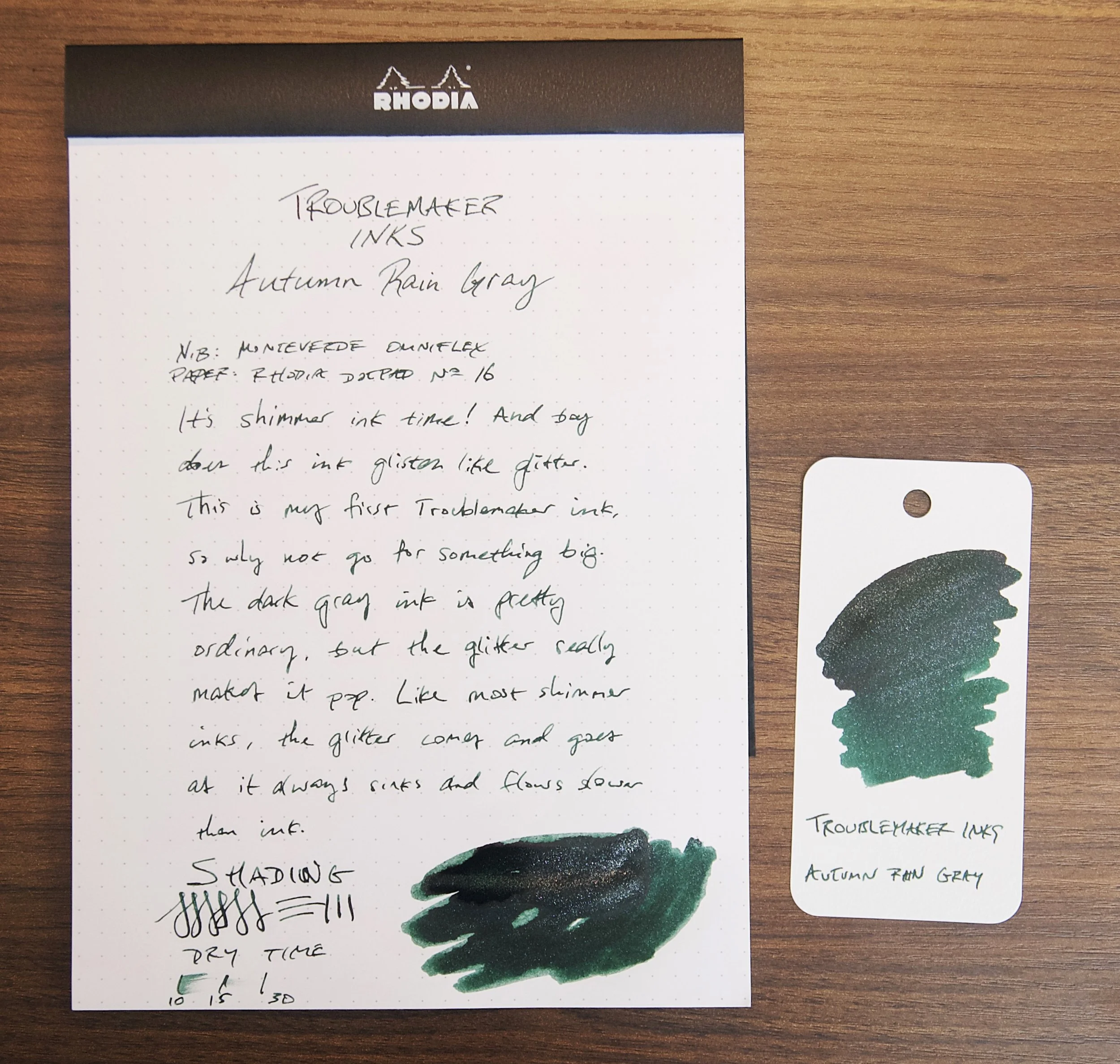
It's been quite a while since I've tried a new shimmer ink. For whatever reason, they just don't interest me as much as inks that shade beautifully or feature vibrant colors. In some cases, a little shimmer effect really makes an ink look like more than the sum of its parts. With Autumn Rain Gray from Troublemaker Inks, this is definitely the goal.

For the uninitiated, a shimmer ink is a fountain pen ink that features a reflective glitter material suspended in the ink. The glitter material is usually silver or gold colored, but can be other colors as well. When writing with a shimmer ink, little glitter particulates end up on the page while you write, and start to sparkle as the ink dries. It's a magical effect that took the fountain pen ink world by storm a few years ago.

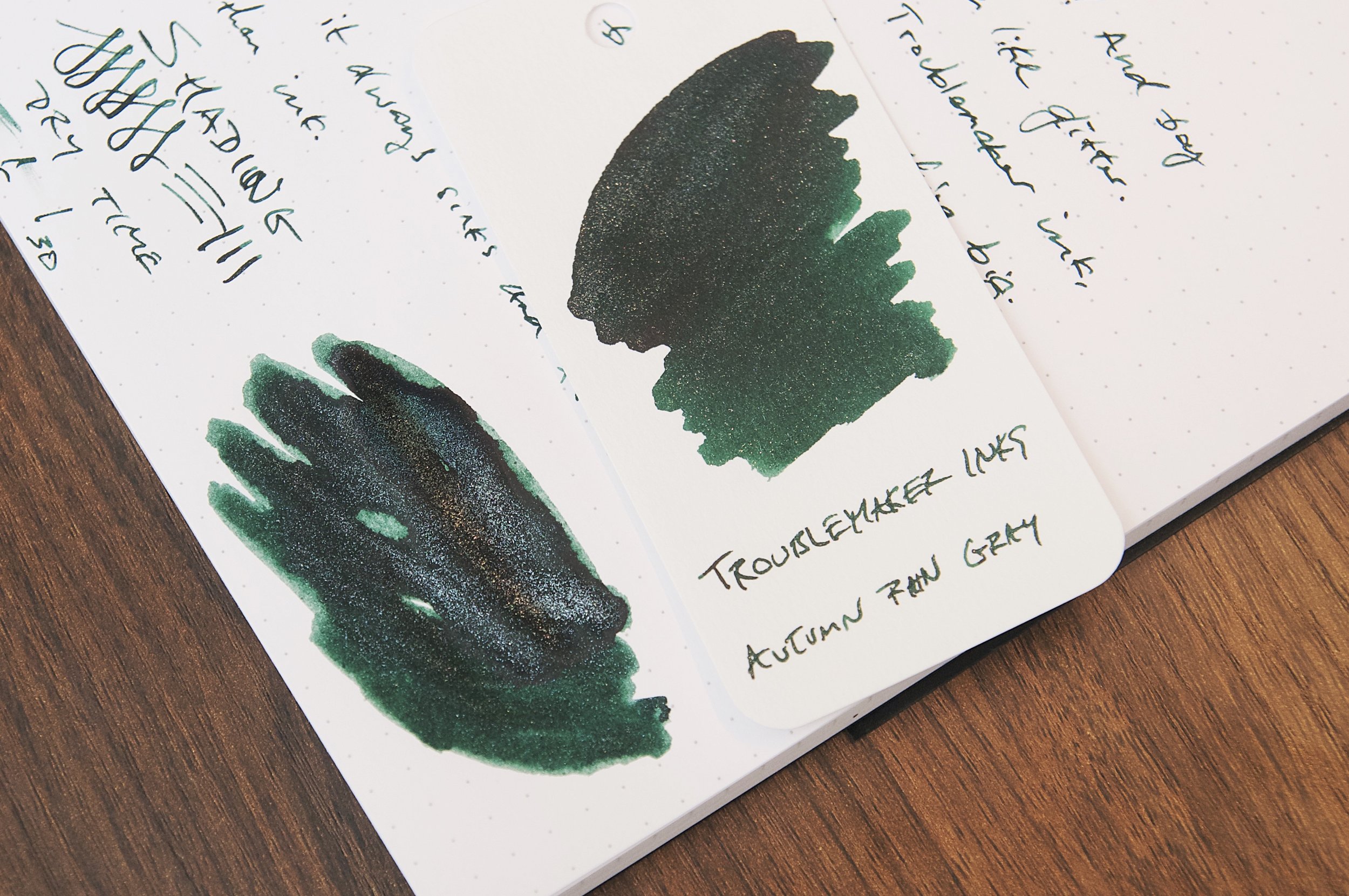
In the case of Autumn Rain, the base ink color is a dark green or green-black and the shimmer effect is achieved with a silver glitter material. There isn't much in the way of shading with this ink, but there is a ton of shimmer. After inking the pen, there was so much glitter on the grip section that I was worried that I hadn't shaken the bottle enough to evenly disperse all the glitter. Nope; in this case, there is more than enough shimmer to go around in the ink while also wasting some when filling a pen.

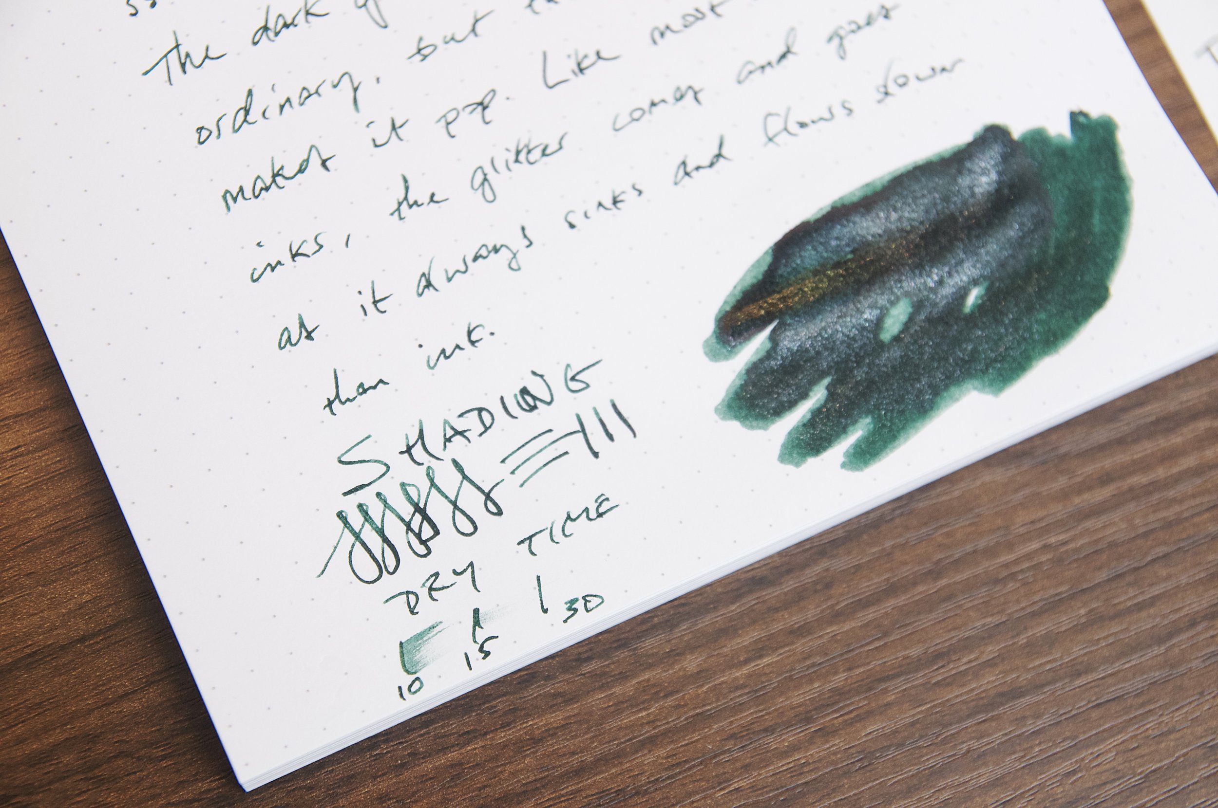
Based on the name of the ink, I was expecting a medium gray ink with some moderate shading to imitate a dreary autumn sky full of thick clouds and streaky rain. Instead, this is much, much darker to the point that I don't think the name fits at all. When looking at the swatches, it makes me think of a star-filled night — absolutely nothing to do with autumn or rain. When writing with this ink, it looks like a really dark gray or gray-black on the page. When swatching this ink, you can tell that the main color under all the darkness is actually a beautiful forest green. The green is so much more prominent than any gray that I once again find the name of this ink to be such a bad choice. The forest green color under the dark clouds is so pretty with silver glitter on top of it. I absolutely love the color I see on my swatches. I just wish I saw more of that when writing with this ink! If it were up to me, I might name this ink something like Dewey Forest or Deep Lagoon.

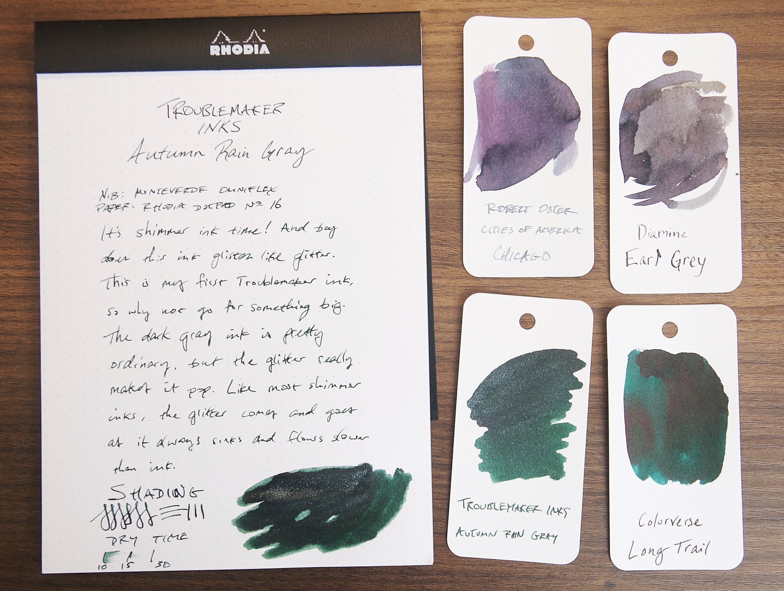
Name choices aside, I really enjoy this ink. The dark color and minor shading paired with the bright sparkle is a great combination. It's a smooth flowing ink and has no issues starting or bleeding. I tend not to worry or treat inks any differently whether they're shimmering or not, but I haven't noticed any downsides to using this ink with all the glitter material floating around in the pen. Aside from behaving well when writing, it also dries pretty quickly. In my tests, normal writing normally dries between 20 and 30 seconds to the point that it is smudge resistant. Not bad, but certainly not a fast drying ink.

Troublemaker is a new brand to me (based out of the Philippines), and I'm definitely interested in trying more of their inks. I think this ink is fun, pretty, and interesting, though the name is a complete miss. If you can get past the name (and also be aware that it's a misnomer for the actual ink color), I'd definitely recommend trying it. A large 60ml bottle is just $24, though Vanness also have a small 4ml sample vial if you're not ready to commit to such a large amount of shimmer ink.

(Vanness Pens provided this product at no charge to The Pen Addict for review purposes.)


Enjoy reading The Pen Addict? Then consider becoming a member to receive additional weekly content, giveaways, and discounts in The Pen Addict shop. Plus, you support me and the site directly, for which I am very grateful.

Membership starts at just $5/month, with a discounted annual option available. To find out more about membership click here and join us!

Posted on July 26, 2023 and filed under Troublemaker Inks, Ink Reviews.

Sailor Yurameku Zare Gokoro Ink Review

(Jeff Abbott is a regular contributor at The Pen Addict. You can find more from Jeff online at Draft Evolution and Twitter.)

The latest ink that I've been using in a couple of my pens is a dark brown ink from Sailor's Yurameku line called Zare Gokoro. This particular ink looks almost black when wet, but dries to a lighter shade that has some brown-black to dark brown hues that show through.

There are several Sailor inks in my collection, so I'm always excited to try something new from this Japanese brand. Zare Gokoro looks exciting due to the marketing copy that claims this "mysterious" ink changes color as it dries. How can you pass that up? I already have some inks in my collection that do this, but they're most iron gall inks. In this case, Zare Gokoro is a water-based dye ink. How does it stack up against the iron gall alternatives?

Like all Sailor inks I've used, this ink flows well, doesn't feather or bleed, and is incredibly consistent and easy to use. It's an incredibly slow ink to dry, though. In my tests, it takes at least 30 seconds to dry to the point where it doesn't easily smudge. For areas where more ink has pulled up in the valley of a direction change from the nib, it can take up to a minute to dry. This is a really slow drying ink.

I was really curious to see how the ink color changed as it dried, so that was the first thing I was focused on after inking up the pen. Sure enough, writing with the ink lays down a dark line that looks black to my eyes. I wouldn't even call it black-brown because I can't discern any brown while this ink is wet. Magically, the ink color lightens as the ink dries, revealing a dark brown with mild shading. In some areas, you can even detect some dark red or rust color. It's really fun to watch this transition happen as the ink slowly dries.

Since this is an ordinary water-based ink, it doesn't fare well when introduced to water. It doesn't wash away, but just a little bit of water rinses away the darkness of the ink and leaves behind a de-saturated blue color instead. You would be able to read what was on the page as long as the paper survived, but it might be difficult in some areas.

Overall, I was expecting more out of this ink. The color changing behavior was interesting since most inks get a little darker as the dry, not lighter. Iron gall inks also get a bit lighter as they dry, which is something I've always liked about them. It was one of their unique qualities aside from their water resistance. The super long dry time, lack of much shading, and the price all put me off this ink.

At $20 for a 20ml bottle, you're paying a premium for the Sailor name, and I don't think the price justifies the ink performance in this case. There are so many other interesting and well-performing inks on the market, so it's easy to point in almost any other direction here.

(JetPens provided this product at no charge to The Pen Addict for review purposes.)


Enjoy reading The Pen Addict? Then consider becoming a member to receive additional weekly content, giveaways, and discounts in The Pen Addict shop. Plus, you support me and the site directly, for which I am very grateful.

Membership starts at just $5/month, with a discounted annual option available. To find out more about membership click here and join us!

Posted on July 19, 2023 and filed under Sailor, Ink Reviews.

Wearingeul Macbeth & The Phantom of the Opera - A Review, Part 2

(Kimberly (she/her) took the express train down the fountain pen/stationery rabbit hole and doesn't want to be rescued. She can be found on Instagram @allthehobbies because there really are many, many hobbies!.)

Last time, I did a review of Wearingeul Macbeth & The Phantom of the Opera but you may recall that I wasn’t done! Sure, I finished the ink review portion but there was more that I wanted to share, so here we are!

In addition to the inks he picked up at the Atlanta show, Brad also got some other fun swatching items from Dromgoole’s. They include the Wearingeul Color Chart Cards, Instant Film Color Swatch cards, and Clear Chart book/binder.

Clockwise from upper left: Instant Film Color Swatch cards, Clear Chart Book, and Color Chart Cards.

100 Color Chart Cards cards come in a plastic card case and measure approximately 3.5” x 2” (90mm x 50 mm). They have a bottle printed on the front as well as two dots on the right, one on top of the other. I’m not sure what the dots are for, so I just wrote next to them. On the back of each card is the word ‘Jaquere’, which is Wearingeul’s sister stationery brand that “aims to provide a better writing experience through Quality Writing”. The Color Chart Cards are available in a Horizontal and Vertical orientation; this is the Horizontal version.

Color Chart Cards.

The Instant Film cards come in a pack of 50 and are approximately 3.75” x 2.25” (87mm x 53mm). They have this shiny, slightly textured border around the swatch (not the entire card) and feels similar to the edge of a Polaroid picture.

Shiny but unobtrusive border around the Instant Film cards.

I compared the swatches on the Color Chart Cards and Instant Film cards to swatches made on Col-O-Ring swatch cards using both the Wearingeul inks from the last review as well as non-Wearingeul inks - Jacques Herbin Violet Imperial (shimmer) and Robert Oster Napa (non-shimmer). The colors were true to the swatches I had made on the Col-O-Ring.

Comparison with Wearingeul Macbeth & The Phantom of the Opera.

Comparison with Jacques Herbin Violet Imperial and Robert Oster Napa.

Now that I had these swatches done, I wanted to see if they would fit in the binder! I’m calling it a binder even though the pages aren’t removable and it doesn’t have rings. It measures approximately 7.5”L x 4.5”W x 0.75”D (195mm x 110mm x 20mm) and has a pliable but firm plastic cover with a button closure. There are 40 sheets (80 pages) of sleeves, each containing 6 slots (3 on the front and 3 on the back), so you can put 240 swatch cards in here!.

The binder, also made by Jaquere, was designed to hold the horizontal or vertical Ink Color Chart Cards.

It can also fit the Instant Film swatch cards, but the Col-O-Rings are a bit too long. They do fit, but I think the ends would start to curl as you put more cards in the sleeves.

This is gonna get nice and thick once it’s filled!

These stickers are “DIY” (Do-It-Yourself) because they aren’t pre-cut. You can cut them to any shape/size you’d like and decorate your binder!

The Color Chart Cards are available for $6, the Instant Film Swatch cards for $5, and the Binder for $6. They can be found in the Wearingeul paper section on the Dromgoole’s website. I’m still going to stick with my tried-and-true Col-O-Rings for all my swatching, but I might use this for all of my Wearingeul swatches!

(Disclaimer: The Wearingeul products were purchased from Dromgoole’s for a discount at the 2023 Atlanta Pen Show. The Jacques Herbin and Robert Oster inks as well as the Col-O-Rings are my own purchases.)


Enjoy reading The Pen Addict? Then consider becoming a member to receive additional weekly content, giveaways, and discounts in The Pen Addict shop. Plus, you support me and the site directly, for which I am very grateful.

Membership starts at just $5/month, with a discounted annual option available. To find out more about membership click here and join us!

Posted on July 14, 2023 and filed under Ink Reviews, Wearingeul.