Posts filed under Ink Reviews

Pairings Party: Andhand Method Fountain Pen, Van Dieman’s Mandarin Duck Wing

You know a party is a success when you are pleasantly surprised throughout the event. That has been the case with the Andhand Method Fountain Pen, inked with Van Dieman’s Mandarin Duck Wing, over these past several weeks.

Andhand reached out to me earlier this year, offering up the Method for me to check out. I received the Brass model, with a #5 Medium Steel Schmidt nib, and I have to say that they made a metal barrel pen that fits my needs perfectly.

The key for me with brass pens is overall weight. They can’t be too heavy for me to write with comfortably for medium and long writing sessions. In conjunction with overall weight, the balance of that weight has to be managed correctly with the design of the pen. Many metal pen designs don’t consider the effect back-weighting has on the writing experience. The Method pen nails the balance - unposted, of course - making for a proper writing experience.

How did they accomplish this? This is a smaller barrel, closer to my favorite ystudio Brassing Fountain Pen than some of the bigger, bolder brass pens on the market. Big, heavy, brass pens certainly have their place, and their fans. My preferences lie in the smaller and lighter builds, and Andhand did a great job with that here.

Aside from being happy with the weight, balance, and overall feel of the Method, the cap design impressed me. The cut out facets add a nice visual touch to the design, but what I enjoyed even more was the snap cap. That’s right, no metal threads on the barrel to dig in to your fingers! The section is long enough to grip comfortably, with a slight taper down from the barrel seam to the nib.

Aside from Brass, the Method Fountain Pen comes in a ystudio-esque Black + Brass - both for £110 - and a Stainless Steel model for £130. The Stainless model checks in a few grams lighter, too: 48g vs 52g for the Brass.

Given the all-Brass design and color of my Method, I had the run of the rainbow for my ink choice, so why did I choose a more muted shade in Van Dieman’s Mandarin Duck Wing? Because I like to test ink colors outside of my normal usage zone.

Written on the Mitsubishi Bank Paper Notebook from The Paper Mind.

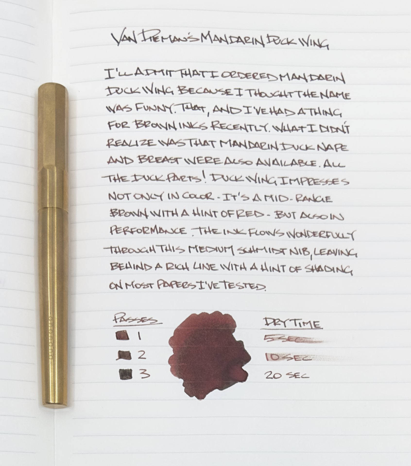
Reddish-browns rank far down my list of color choices, but I have been more than happy with Mandarin Duck Wing. Impressed, even. For starters, the color is a little more brown than red, which I prefer, and the performance is outstanding. Flow has been perfect, no matter if I have been using the pen several times throughout the day, or a week between uses. That is a compliment to the cap design of the metal barrel pen, too, sealing the nib off well from the elements.

It shows off a bit of shading on most pages I’ve tested it on (Midori, Mitsubishi Bank, PLOTTER,) and has a medium dry time. There is no sheen present, and the ink is not waterproof. It bears repeating just how consistent the flow is. I will definitely be trying this ink in finer nibs to see if the performance is similar.

If you like metal pens that are properly sized and weighted, then you should check out the Method Fountain Pen from Andhand. I like the Brass one that they sent me well enough to consider ordering the Stainless Steel model, which is a favorite material of mine. And which Mandarin Duck part should you ink it up with? I went with the brownish-red Wing, but feel free to check out the classic blue Mandarin Duck Breast, or the bright green/teal of Mandarin Duck Nape. All bottles are $14.95 for 30 ml. Any combination of the above would make a great Pairings Party.

(Andhand provided this pen at no charge, and Vanness Pens provided this ink at a discount to The Pen Addict for review purposes.)


Posted on July 31, 2023 and filed under Andhand, Van Dieman's, Ink Reviews, Pen Reviews.

Troublemaker Inks Autumn Rain Gray Review

(Jeff Abbott is a regular contributor at The Pen Addict. You can find more from Jeff online at Draft Evolution and Twitter.)

It's been quite a while since I've tried a new shimmer ink. For whatever reason, they just don't interest me as much as inks that shade beautifully or feature vibrant colors. In some cases, a little shimmer effect really makes an ink look like more than the sum of its parts. With Autumn Rain Gray from Troublemaker Inks, this is definitely the goal.

For the uninitiated, a shimmer ink is a fountain pen ink that features a reflective glitter material suspended in the ink. The glitter material is usually silver or gold colored, but can be other colors as well. When writing with a shimmer ink, little glitter particulates end up on the page while you write, and start to sparkle as the ink dries. It's a magical effect that took the fountain pen ink world by storm a few years ago.

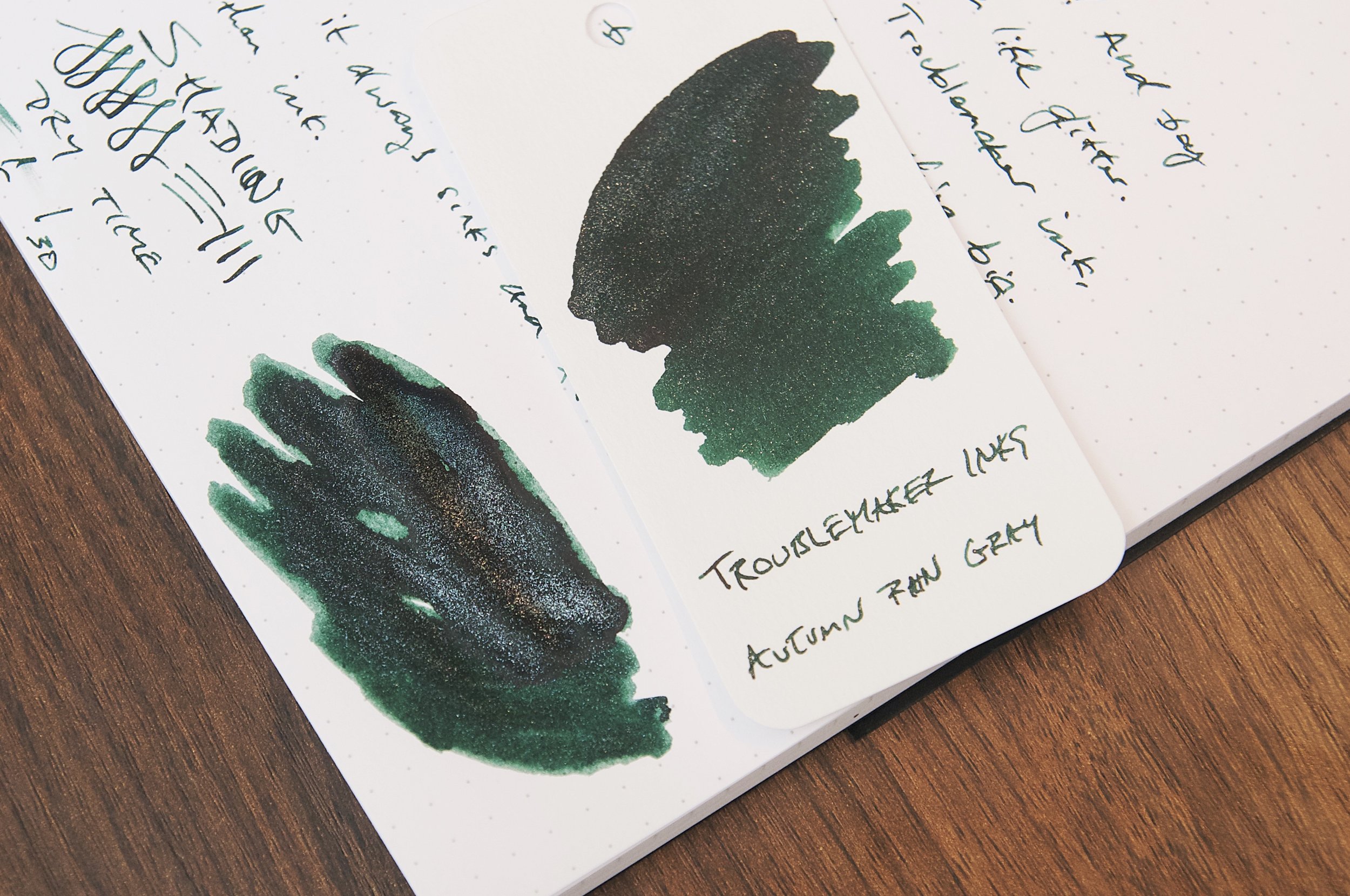
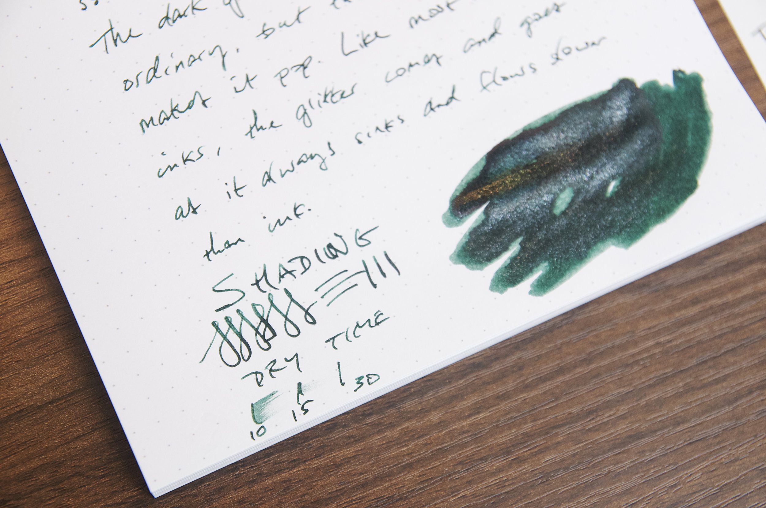
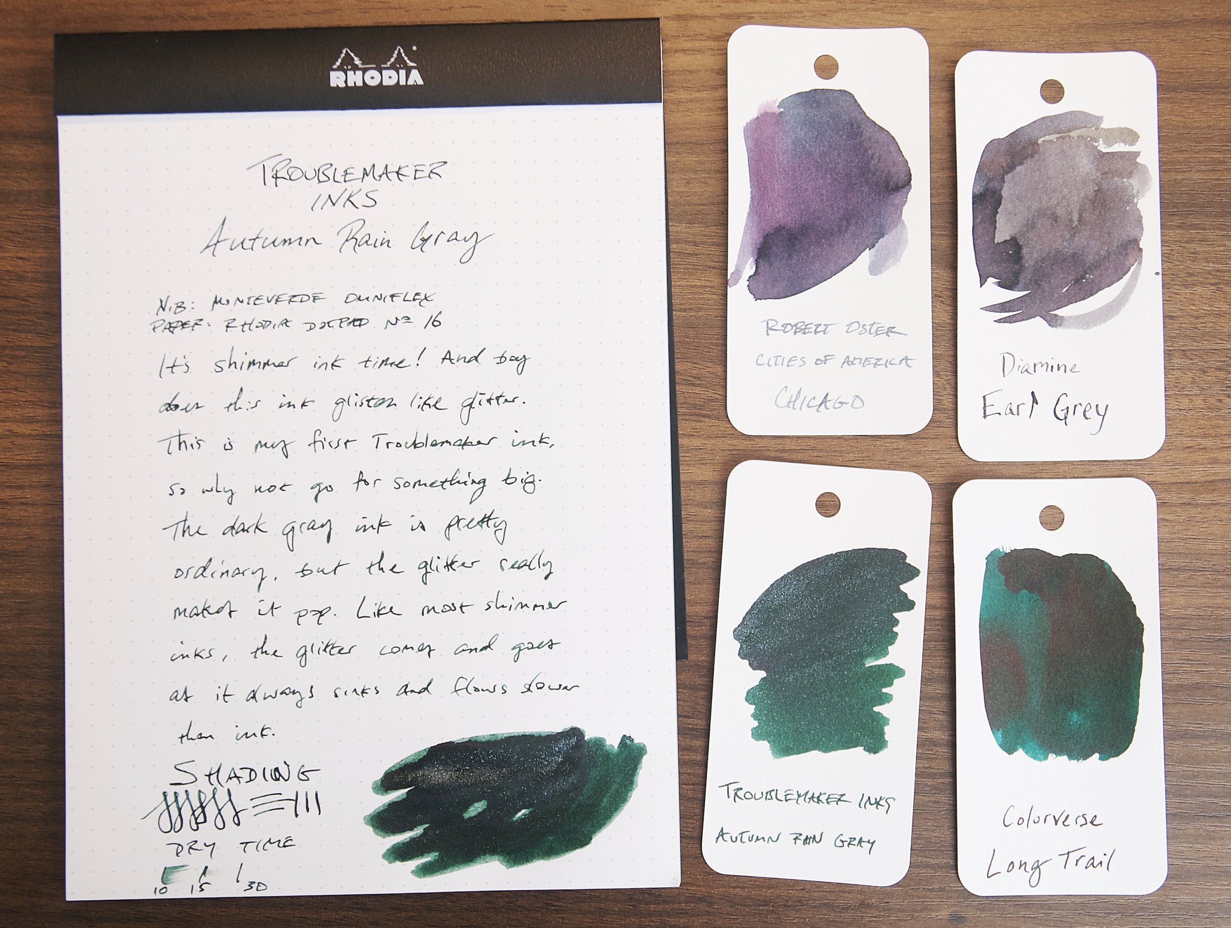
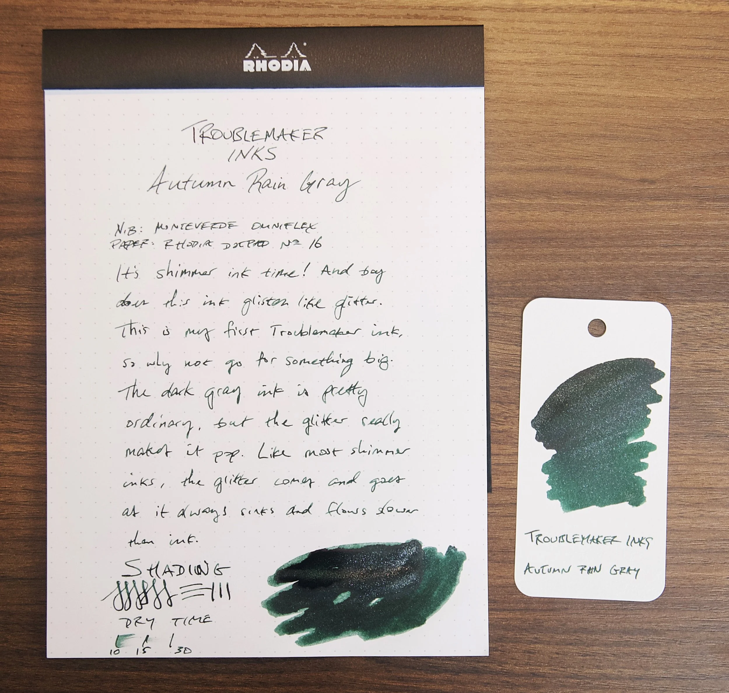
In the case of Autumn Rain, the base ink color is a dark green or green-black and the shimmer effect is achieved with a silver glitter material. There isn't much in the way of shading with this ink, but there is a ton of shimmer. After inking the pen, there was so much glitter on the grip section that I was worried that I hadn't shaken the bottle enough to evenly disperse all the glitter. Nope; in this case, there is more than enough shimmer to go around in the ink while also wasting some when filling a pen.

Based on the name of the ink, I was expecting a medium gray ink with some moderate shading to imitate a dreary autumn sky full of thick clouds and streaky rain. Instead, this is much, much darker to the point that I don't think the name fits at all. When looking at the swatches, it makes me think of a star-filled night — absolutely nothing to do with autumn or rain. When writing with this ink, it looks like a really dark gray or gray-black on the page. When swatching this ink, you can tell that the main color under all the darkness is actually a beautiful forest green. The green is so much more prominent than any gray that I once again find the name of this ink to be such a bad choice. The forest green color under the dark clouds is so pretty with silver glitter on top of it. I absolutely love the color I see on my swatches. I just wish I saw more of that when writing with this ink! If it were up to me, I might name this ink something like Dewey Forest or Deep Lagoon.

Name choices aside, I really enjoy this ink. The dark color and minor shading paired with the bright sparkle is a great combination. It's a smooth flowing ink and has no issues starting or bleeding. I tend not to worry or treat inks any differently whether they're shimmering or not, but I haven't noticed any downsides to using this ink with all the glitter material floating around in the pen. Aside from behaving well when writing, it also dries pretty quickly. In my tests, normal writing normally dries between 20 and 30 seconds to the point that it is smudge resistant. Not bad, but certainly not a fast drying ink.

Troublemaker is a new brand to me (based out of the Philippines), and I'm definitely interested in trying more of their inks. I think this ink is fun, pretty, and interesting, though the name is a complete miss. If you can get past the name (and also be aware that it's a misnomer for the actual ink color), I'd definitely recommend trying it. A large 60ml bottle is just $24, though Vanness also have a small 4ml sample vial if you're not ready to commit to such a large amount of shimmer ink.

(Vanness Pens provided this product at no charge to The Pen Addict for review purposes.)


Enjoy reading The Pen Addict? Then consider becoming a member to receive additional weekly content, giveaways, and discounts in The Pen Addict shop. Plus, you support me and the site directly, for which I am very grateful.

Membership starts at just $5/month, with a discounted annual option available. To find out more about membership click here and join us!

Posted on July 26, 2023 and filed under Troublemaker Inks, Ink Reviews.

Sailor Yurameku Zare Gokoro Ink Review

(Jeff Abbott is a regular contributor at The Pen Addict. You can find more from Jeff online at Draft Evolution and Twitter.)

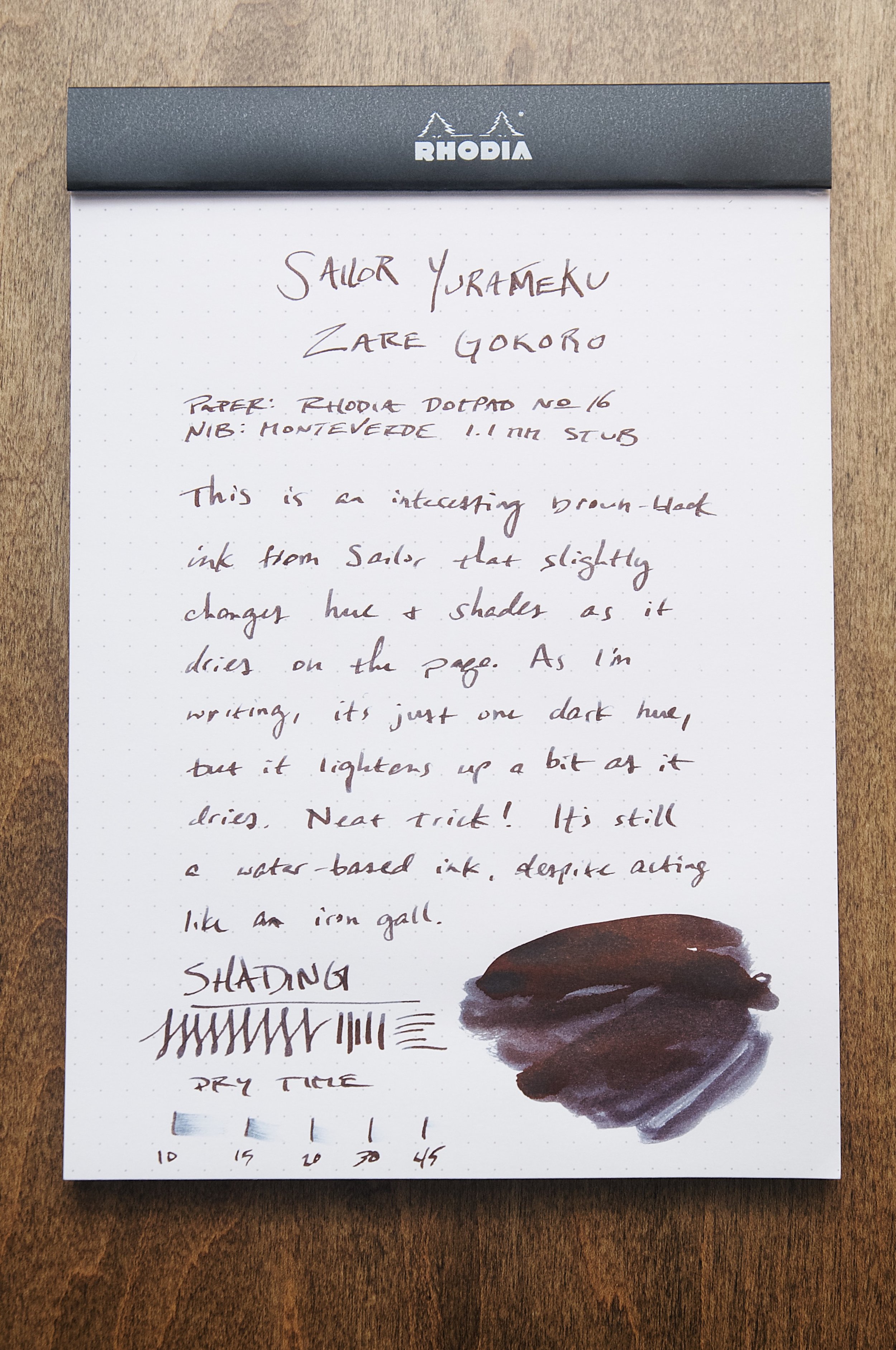
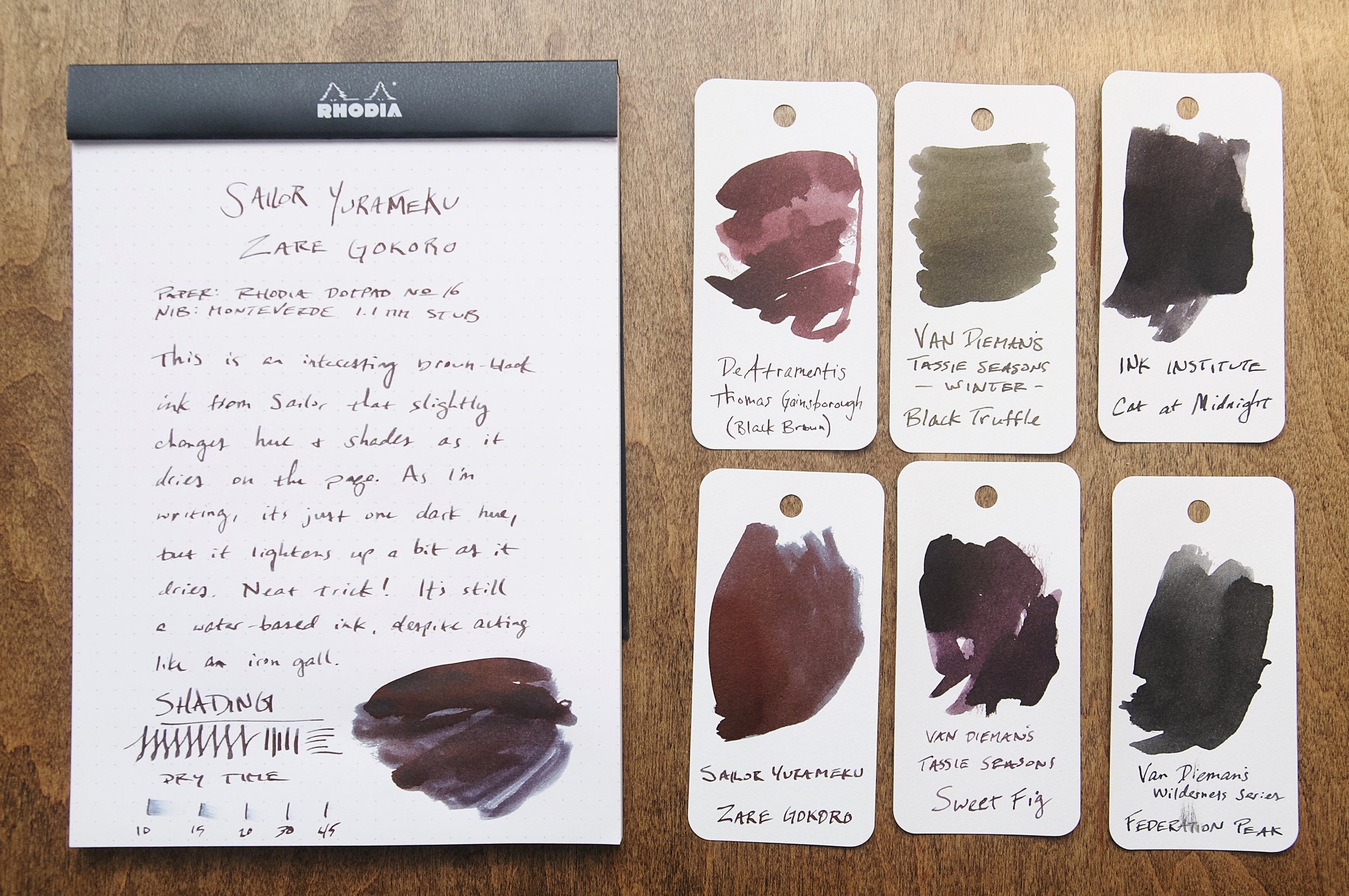
The latest ink that I've been using in a couple of my pens is a dark brown ink from Sailor's Yurameku line called Zare Gokoro. This particular ink looks almost black when wet, but dries to a lighter shade that has some brown-black to dark brown hues that show through.

There are several Sailor inks in my collection, so I'm always excited to try something new from this Japanese brand. Zare Gokoro looks exciting due to the marketing copy that claims this "mysterious" ink changes color as it dries. How can you pass that up? I already have some inks in my collection that do this, but they're most iron gall inks. In this case, Zare Gokoro is a water-based dye ink. How does it stack up against the iron gall alternatives?

Like all Sailor inks I've used, this ink flows well, doesn't feather or bleed, and is incredibly consistent and easy to use. It's an incredibly slow ink to dry, though. In my tests, it takes at least 30 seconds to dry to the point where it doesn't easily smudge. For areas where more ink has pulled up in the valley of a direction change from the nib, it can take up to a minute to dry. This is a really slow drying ink.

I was really curious to see how the ink color changed as it dried, so that was the first thing I was focused on after inking up the pen. Sure enough, writing with the ink lays down a dark line that looks black to my eyes. I wouldn't even call it black-brown because I can't discern any brown while this ink is wet. Magically, the ink color lightens as the ink dries, revealing a dark brown with mild shading. In some areas, you can even detect some dark red or rust color. It's really fun to watch this transition happen as the ink slowly dries.

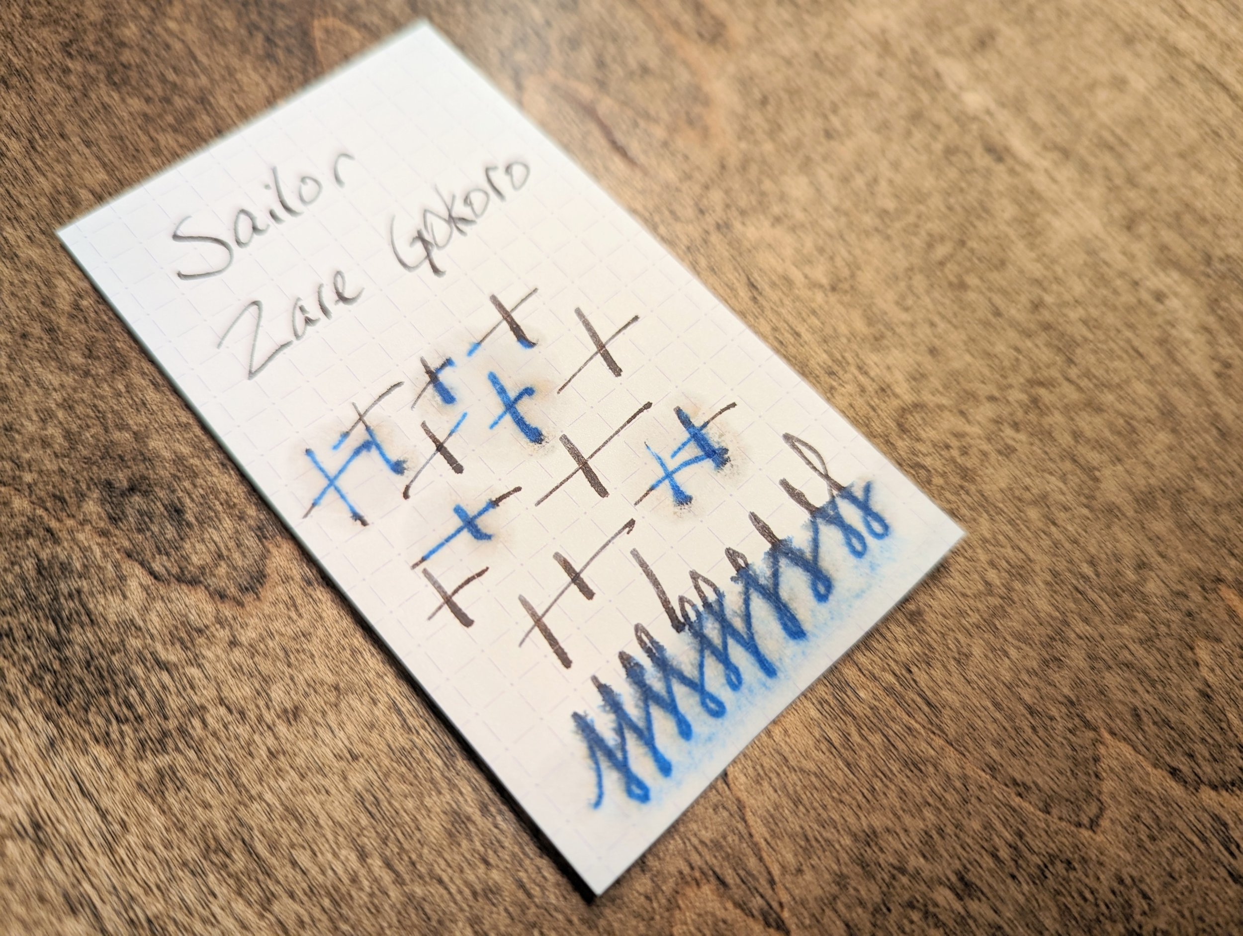
Since this is an ordinary water-based ink, it doesn't fare well when introduced to water. It doesn't wash away, but just a little bit of water rinses away the darkness of the ink and leaves behind a de-saturated blue color instead. You would be able to read what was on the page as long as the paper survived, but it might be difficult in some areas.

Overall, I was expecting more out of this ink. The color changing behavior was interesting since most inks get a little darker as the dry, not lighter. Iron gall inks also get a bit lighter as they dry, which is something I've always liked about them. It was one of their unique qualities aside from their water resistance. The super long dry time, lack of much shading, and the price all put me off this ink.

At $20 for a 20ml bottle, you're paying a premium for the Sailor name, and I don't think the price justifies the ink performance in this case. There are so many other interesting and well-performing inks on the market, so it's easy to point in almost any other direction here.

(JetPens provided this product at no charge to The Pen Addict for review purposes.)


Enjoy reading The Pen Addict? Then consider becoming a member to receive additional weekly content, giveaways, and discounts in The Pen Addict shop. Plus, you support me and the site directly, for which I am very grateful.

Membership starts at just $5/month, with a discounted annual option available. To find out more about membership click here and join us!

Posted on July 19, 2023 and filed under Sailor, Ink Reviews.