(Kimberly (she/her) took the express train down the fountain pen/stationery rabbit hole and doesn't want to be rescued. She can be found on Instagram @allthehobbies because there really are many, many hobbies!.)
Last year I went a little nuts and reviewed all of the Anderillium Cephalopod Inks and thought I’d do the same with the latest Lepidopteran series too! This third series of inks was released at the DC Pen Show back in August (the two others are Cephalopod and Avian). Lepidoptera is an order of insects that includes both moths and butterflies.
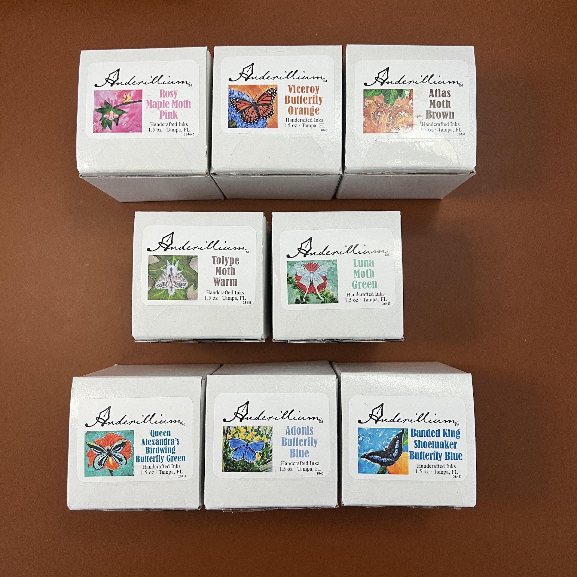
The 8 inks in the Lepidopteran series are as follows: Rosy Maple Moth Pink, Viceroy Butterfly Orange, Atlas Moth Brown, Tolype Moth Warm, Luna Moth Green, Queen Alexandra’s Birdwing Butterfly Green, Adonis Butterfly Blue and Banded King Shoemaker Butterfly Blue. The inks come in 1.5 ounce (approx. 44 ml) sealed glass jars that look like adorable little jam jars.


All swatches were done on Col-O-Ring cards using a Kakimori steel dip nib and the non-brush end of a paintbrush and writing samples were done primarily with a Lamy Vista with a steel Medium nib, and later also with a TWSBI Go with a Medium nib. The notebook used for writing samples is from Endless Recorder with 68 gsm Tomoe River paper. Dry times may be a bit slower on 52gsm TR or faster on papers like Rhodia, copy paper, Cosmo Air Light or with drier or finer nibs.

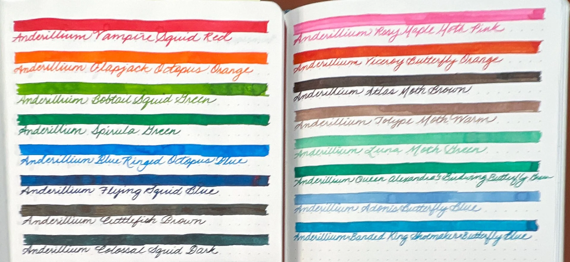
Comparison of the Cephalopod series (left) with the Lepidopteran series (right.)
Rosy Maple Moth is a bright pink that isn’t quite bright enough to be a “hot pink”. It doesn’t have as much coral to it as similarly colored inks. It was slightly dry in terms of wetness and pretty fast dry times. There is some shading and no sheen.


Inks similar to Rosy Maple Moth: Vinta Inks Glam Pink Rosas (shimmer), Iroshizuku Kosumosu, Akkerman Gourmet Pens Pink, Inkebara Fairy Tale Pink, Bungubox Sweet Love Pink, Diamine Hope Pink.
Viceroy Butterfly Orange is a nice copper/reddish orange with an average flow and pretty fast dry times. There is some shading and no sheen.

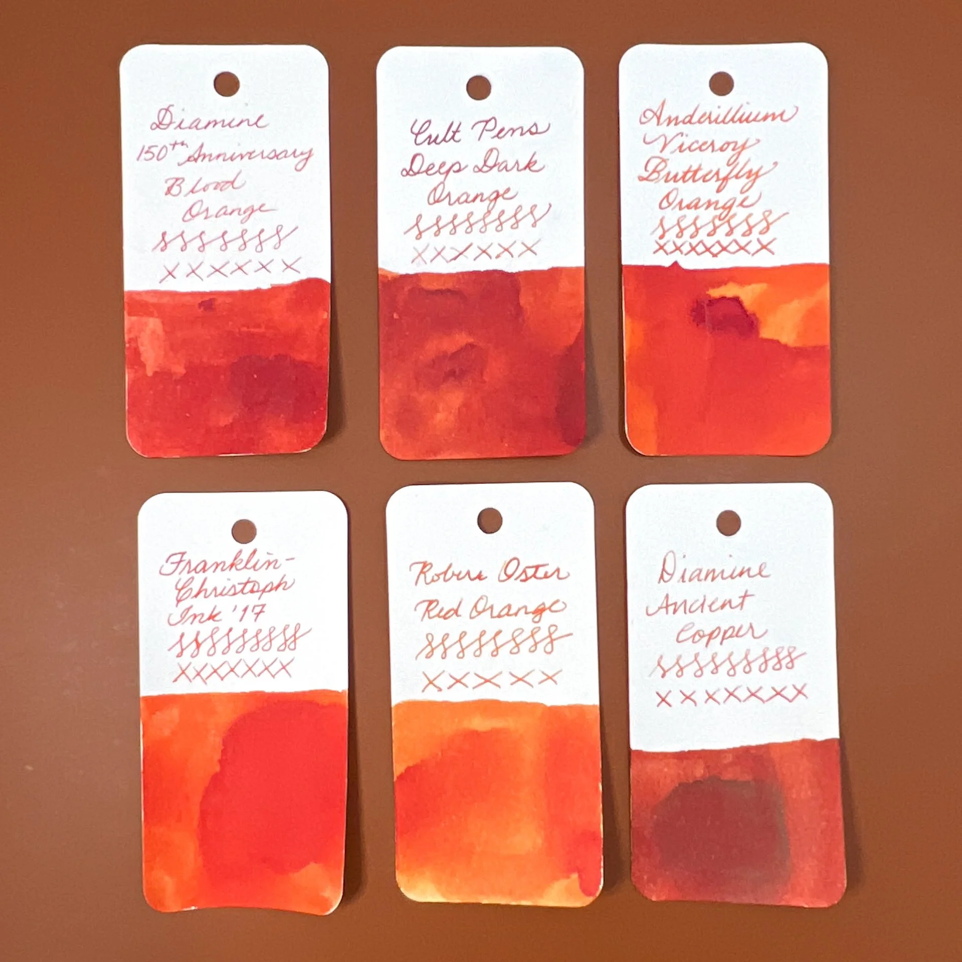
Inks similar to Viceroy Butterfly Orange are Diamine 150th Anniversary Blood Orange, Cult Pens Deep Dark Orange, Franklin-Christoph Ink ‘17, Robert Oster Red Orange (a bit too light and too orange) and Diamine Ancient Copper (too brown.)
Atlas Moth Brown is a dark chocolate brown ink that swatches much darker than the writing sample indicates. It had a slightly dry flow and pretty fast dry times. It has nice shading as well.
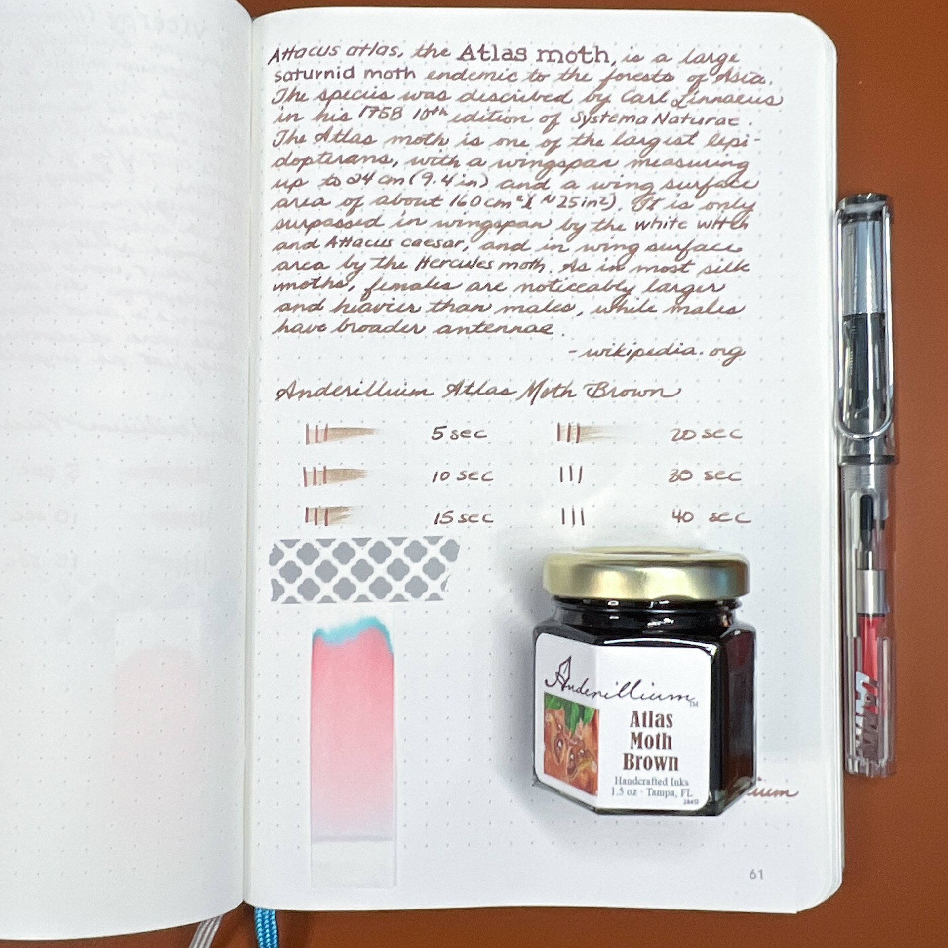
You can see a lot of red in the chromatography strip. I’m surprised at how much blue there is too. The writing is more of a milk chocolate brown.

Inks similar to Atlas Moth Brown include Robert Oster Smokescreen (undertones are slightly too red), Kakimori 09 Mukuri (a bit too yellow), Kobe #3 Kyu-kyoryuchi Sepia, Anderillium Cuttlefish Brown (it’s a little easier to see how this one is more yellow in tone than Atlas Moth Brown), KWZ Dark Brown.
Tolype Moth Warm is a light brown ink that borders on grey-brown. The flow felt a bit dry and had very fast dry times. It reminded me a lot of Montblanc’s Swan Illusion. There is some nice shading and no sheen.
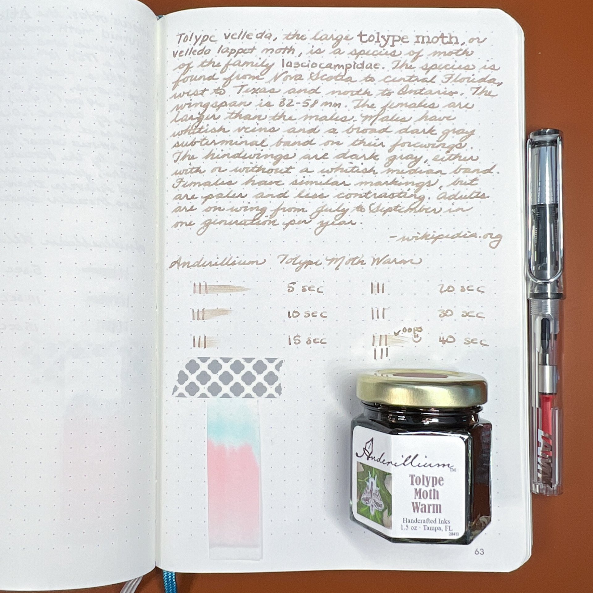
Similar to the above, Tolype’s chromatography shows light pink and blues.

Inks similar to Tolype Moth Warm: Sailor Ink Studio 273 (too yellow/peachy), Montblanc Swan Illusion (touch more yellow), Wearingeul Stonecutter’s Song and Robert Oster Chocolate Pudding were both more grey by comparison.
Luna Moth Green is a light green ink that I was surprised I didn’t have more matches for. Like the ones above it, the writing sample was so much lighter than I expected that I decided to ink up a second pen (the TWSBI Go). The flow was average and dry times were average for the Lamy Vista and a bit longer on the TWSBI Go since I was still able to smear it at the 60 second mark. There is a decent amount of shading with the Vista but not as much with the Go. There is no sheen.
The writing samples for this ink and the remaining ones were done with the Lamy Vista, except for the last sentence of the paragraph where I used the TWSBI Go. I don’t know why but I reversed that order with the dry times (first line is with the Go and the second line is with the Vista - marked “(v)”.


Inks similar to Luna Moth Green include Montblanc Homage to Victoria and Albert Green Mint (a touch too blue), Robert Oster Elf’s Cap (a touch too bright and yellow) and Sailor 2020 Pen Show ink (also too blue). Other similar greens either had too much yellow/olive, more blue or were darker.
Queen Alexandra’s Birdwing Butterfly Green is a “regular” green that is slightly darker than a medium green. It has an average flow with a little bit of shading with the drier Lamy Vista. There was only a hint of reddish sheen on the wet swatch. With the drier pen, the ink has a touch more blue than swatches or a wetter pen might show. Dry time is average.
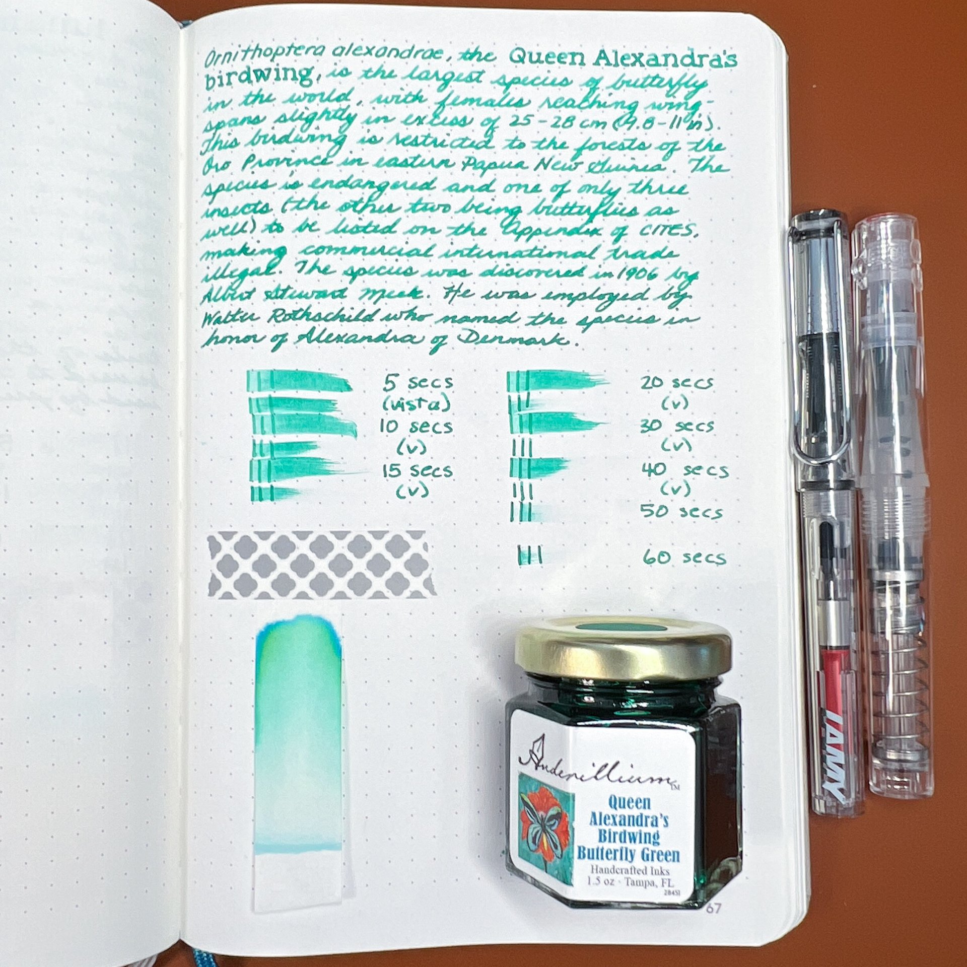

Inks similar to Queen Alexandra’s Birdwing Butterfly Green include Pilot 100th Anniversary Fuku-roku-ju (touch too blue), Robert Oster Green Diamond (the closest match), Sheaffer Very Verde (also very close), Iroshizuku Shin-ryoku, TWSBI Forest Green (too light), and Blackstone Daintree Green (too dark.)
Adonis Butterfly Blue is a really pretty dusty blue color. I did not love how light it was in the Lamy Vista but in the TWSBI Go, it is quite a nice color that had average flow and dry time. The difference in writing samples is especially obvious with this ink.

It’s not just the pen, but the chromatography is very light too.

Inks similar to Adonis Butterfly Blue include Sailor Ink Studio 140 (has a bit too much purple), Colorverse x Goldspot Blue Moon, and Taccia Hiroshige Asahanada (the best match.)
Banded King Shoemaker Butterfly Blue is a blue leaning teal that has average flow and average to slightly long dry times (especially with the Go). There is some shading but no sheen. I was surprised that I don’t really have a lot of inks that were very similar to this one aS they were either too green or too blue leaning.


Inks similar to Banded King Shoemaker Butterfly Blue include Robert Oster Aqua and Monteverde Sweet Life Iced Cookie (both too green), and Robert Oster Clearwater Rain (the closest match) and Fire & Ice (but both are slightly too blue.)
All in all, the inks behaved well, though some felt much drier in the Lamy Vista. This was a great reminder that the pen & ink (and paper) combination really makes a difference, not just in the color & saturation of the ink but also in the writing experience. This is more due to the Lamy Vista (and Safari/AL-Stars, etc) being a drier writer than the TWSBI Go (which is a spring-loaded piston filler). So, before you judge an ink too harshly for being too dry or too wet, etc, consider trying it in a different pen/nib and give it another chance!
If I had to pick favorites in the bunch, they would be Adonis Butterfly Blue because it’s such a lovely muted blue and Tolype Moth Warm because I am now obsessed with finding the perfect pen/nib for it (the Lamy Vista definitely was not it, lol). I think the colors are nice and they are worth the purchase if you don’t already have similarly colored inks. I do think the inks are fairly “straight forward”, compared to chromashading, shimmer or sheening inks and nothing jumped out as a particularly wild or different color (Tolype Moth Warm might be an exception). As I also said with the Cephalopod series, I would have liked to have seen a purple ink in this set.
Anderillium inks sell for $14.50 per 1.5 ounce bottle, or $50 for 0.5 ounce bottles of all 8 inks. They can be purchased directly from Anderillium Inks or from authorized resellers like Amarillo Stationery and The Gentleman Stationer.
(Disclaimer: Brad purchased this ink at regular price from Anderillium Ink at the 2023 DCPen Show.)
Enjoy reading The Pen Addict? Then consider becoming a member to receive additional weekly content, giveaways, and discounts in The Pen Addict shop. Plus, you support me and the site directly, for which I am very grateful.
Membership starts at just $5/month, with a discounted annual option available. To find out more about membership click here and join us!