Posts filed under Ink Reviews

Troublemaker Tablea Fountain Pen Ink Review

(Jeff Abbott is a regular contributor at The Pen Addict. You can find more from Jeff online at Draft Evolution and Twitter.)

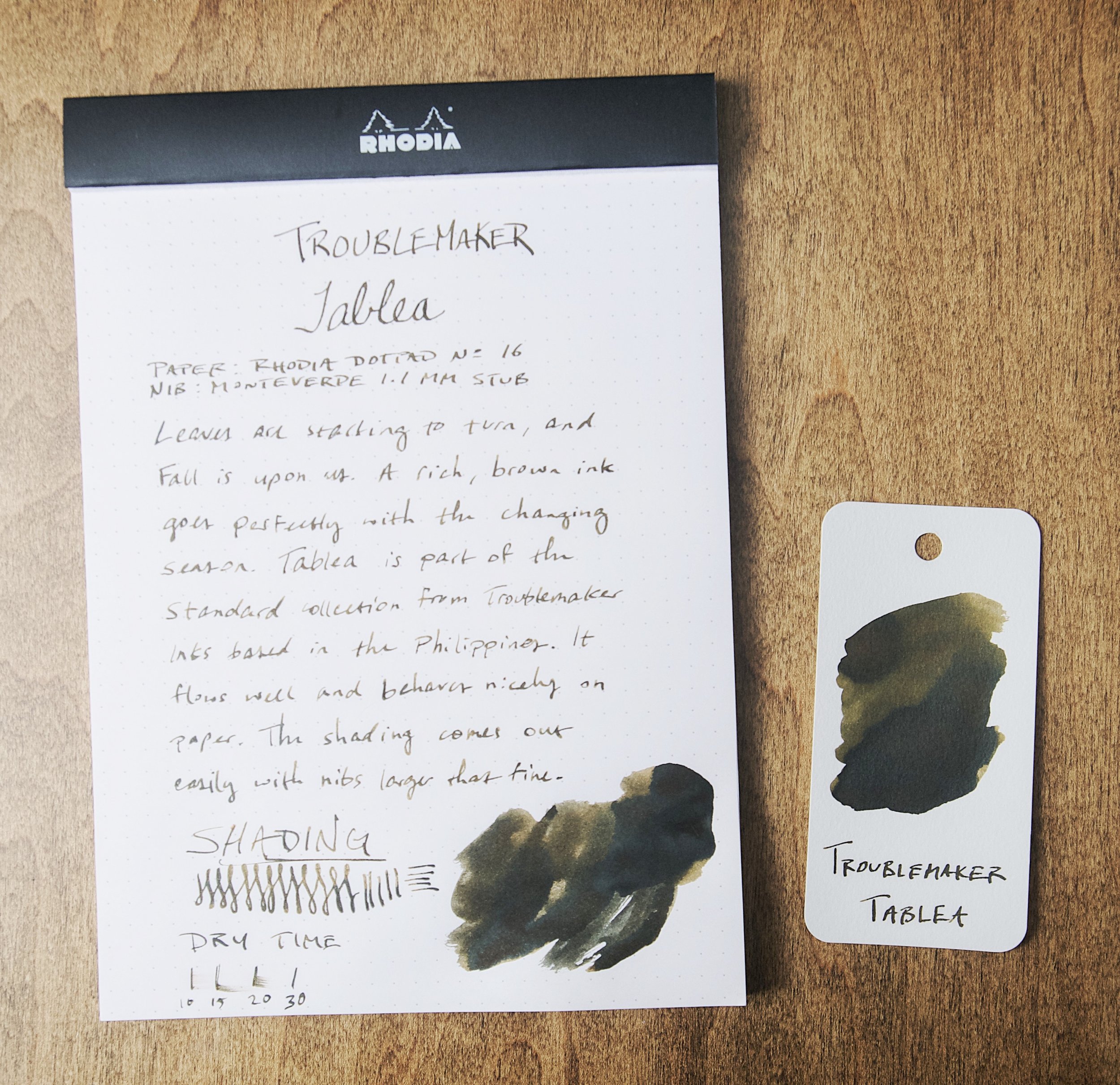
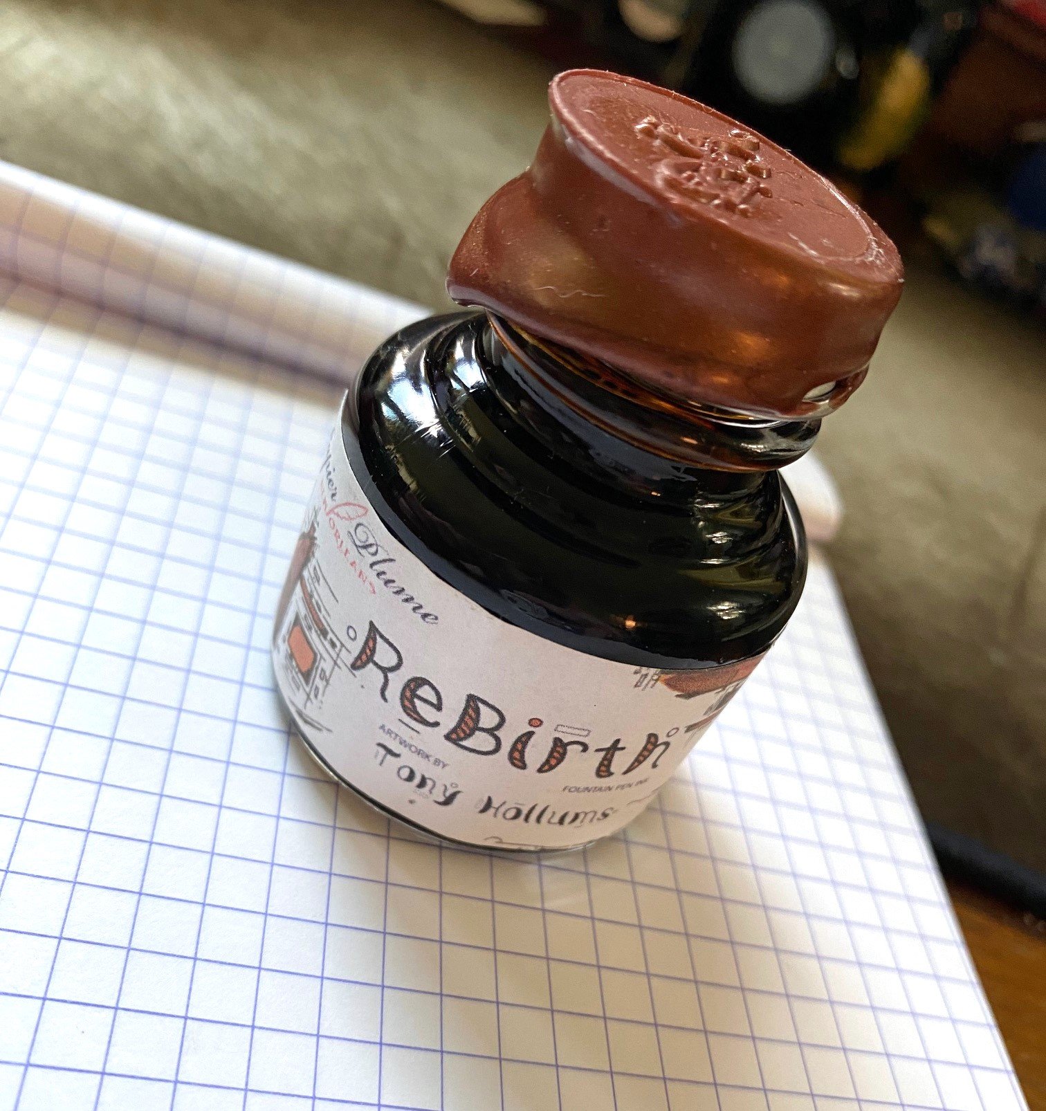
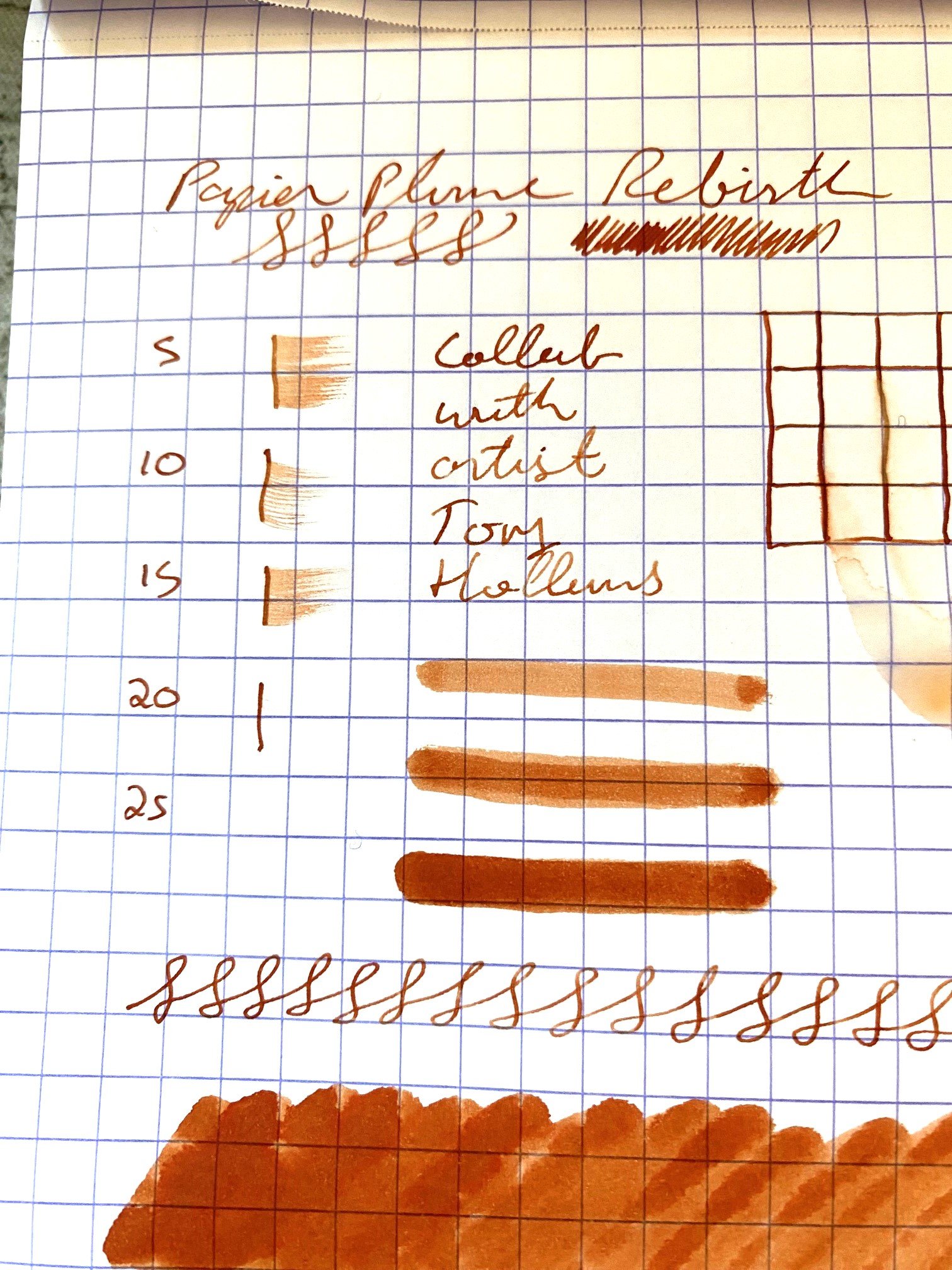
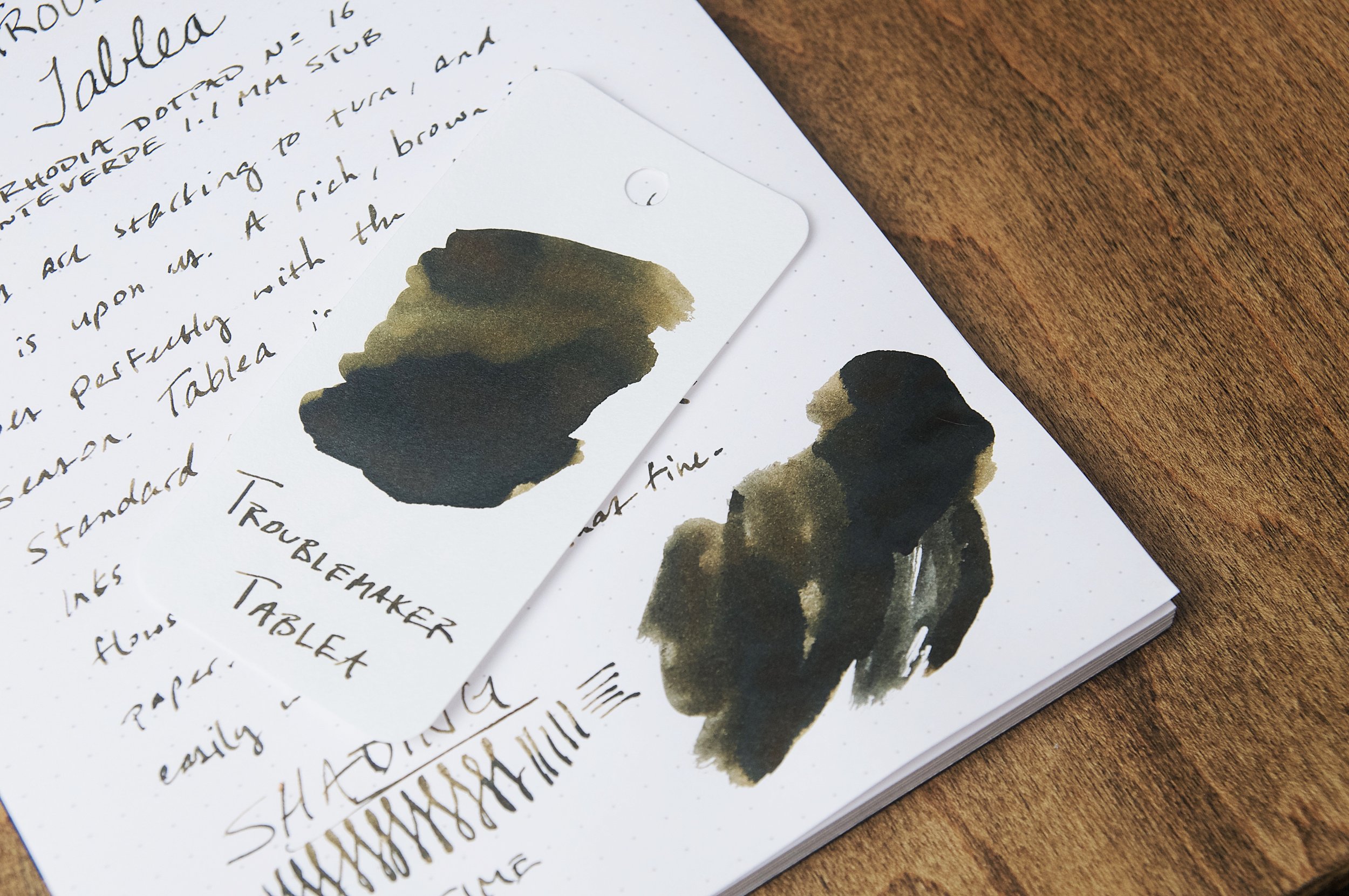
It was just a few months ago that I had the pleasure of using my first ink from Troublemaker Inks out of the Philippines. Autumn Rain Gray is a shimmering ink with dark character, but the latest ink I'm trying is part of their standard line of inks. Tablea is a deep brown ink with plenty of shading and zero shimmer.

Brown inks are never at the top of my list of things to try or rotate into my active pens. That said, I can definitely appreciate a nice brown ink if it has some character. In my mind, that character can be achieved with shading. With Tablea, there's plenty of shading to be had, and you don't even need a really large nib to coax it out.

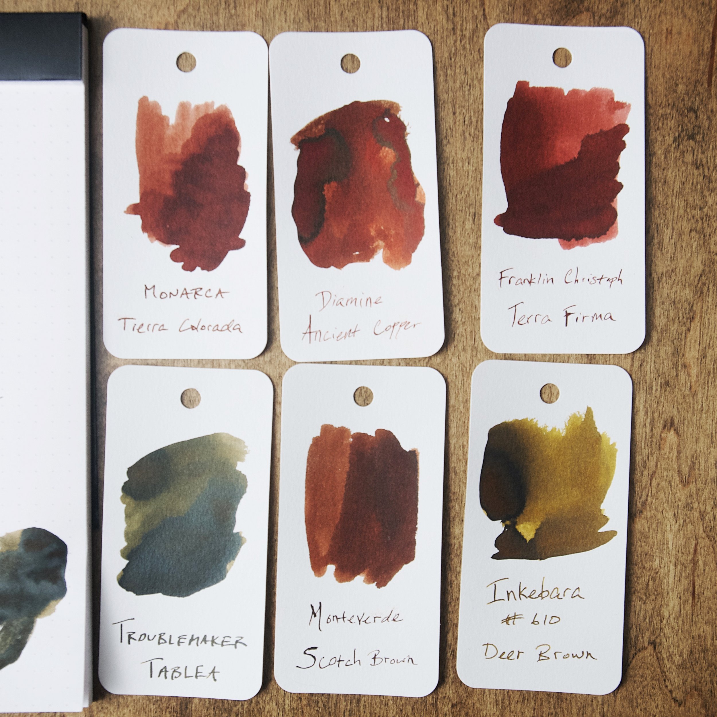
With a lot of dark inks, seeing the shading effects can be difficult with smaller nibs. Given the dark color of the ink, you have to spread it drastically to allow the shading to pop through. Tablea is just light enough to allow the lovely shading to come through with even a German fine nib. It comes out even easier with the 1.1mm stub I used for the photos of this review. Given the great shading effect of this ink, it's definitely a brown that I'll keep around and recommend.

Apart from the shading, this ink is pretty standard. The flow is good, but it feels a tad dry on the nib when writing. This isn't a flow issue at all — more of a lubrication item due to the unique formula of this particular ink. At any rate, it's not severe enough to be unpleasant. It only took a few seconds of writing to adjust to the feel.

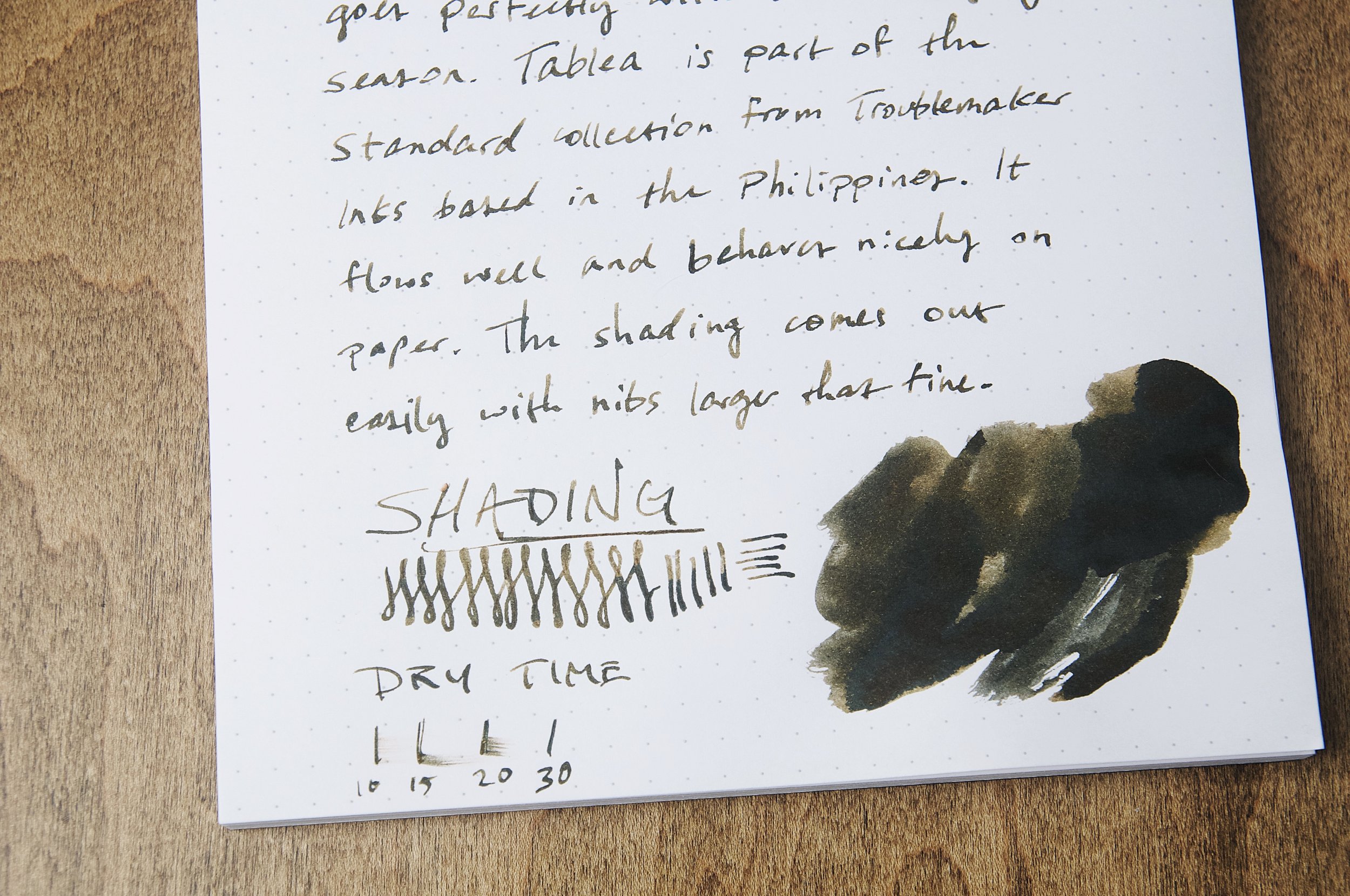
The ink does really well on paper. The lines are crisp and defined, and there aren't any bleeding or feathering issues that I've noticed on the different papers I've tried. Show through on the back of the page is on par with what I'd expect with a dark ink, but not overly noticeable. The back of the page is still usable.

The one area where this ink is a little disappointing is the dry time. In my unscientific testing, the ink took between 35 to 45 seconds to dry to a point where it didn't smudge when I ran a finger of it. Look out lefties — this probably won't work well for you unless you really like all your writing to be smudged and on your hand. Regardless of your writing style, you still have to be careful about handling the paper or notebook after writing to avoid smudging or transferring the ink before it's fully dried.

Tablea is a rich, beautiful medium brown ink that fits in well with this season of changing leaves and cooler weather. You can pick up a bottle for $16.50 or a 4ml sample for $4 from Vanness. I'm not often in the mood for a dark brown ink, but this is definitely on the top of my list for when that mood strikes. Give it a try if it looks interesting to you!

(Vanness Pens provided this product at a discount to The Pen Addict for review purposes.)

Enjoy reading The Pen Addict? Then consider becoming a member to receive additional weekly content, giveaways, and discounts in The Pen Addict shop. Plus, you support me and the site directly, for which I am very grateful.

Membership starts at just $5/month, with a discounted annual option available. To find out more about membership click here and join us!

Posted on October 18, 2023 and filed under Troublemaker Inks, Ink Reviews.

Van Dieman's Birds of a Feather — Mandarin Duck Nape Ink Review

(Jeff Abbott is a regular contributor at The Pen Addict. You can find more from Jeff online at Draft Evolution and Twitter.)

There's a reason that ink makers look to nature — and particular birds — for inspiration when mixing and naming their inks. The most recent ink that I've tried that borrows a name from the avian kingdom is Van Dieman's Mandarin Duck Nape, which is one of six in their Birds of a Feather collection. The Mandarin Duck is a colorful creature with lots of interesting characteristics, but the namesake of this ink focuses on the back of the duck's head (the nape), which is a vibrant teal.

I'm no stranger to Van Dieman's, so my expectations were higher than average due to my past experience. Mandarin Duck Nape is no exception here, which means it performs well and is gorgeous on paper. Based on pictures I've seen, the green-leaning teal of this ink matches the duck's feathers really well. It's a fairly dark ink, and it really works best in a wide and wet nib. Smaller nibs just don't show off the best characteristics of this ink, and it just looks like a dark green ink. In the flex nib I'm using right now, there's a small amount of shading from dark teal to a medium green-teal color. In some areas, you can even see some red sheen on top of the dried ink.

While the shading is a great feature of this ink, the dry time certainly isn't. In my tests, it takes more than 30 seconds for the ink to dry to the point that it won't smear from light to moderate pressure. In areas where the ink is a bit thicker, it can take anywhere from 40 to 60 seconds to fully dry. This is something you should definitely take into consideration if you're left-handed or if you want to use this ink in a notebook that will be closed shortly after jotting down some notes. Depending on your writing grip, smearing is a guarantee if your hand trails after the pen. And if you close a notebook within a minute after writing with this ink, there will be ink deposits on the opposite page. This is definitely a slow drying ink!

One of the features that I really love about this ink is the red sheen that you can see on top of the dried ink. Unfortunately, this is really hard to see in normal writing. It shows up easily in small pools of ink, swatches, or large areas of scribbles. If only the sheen was just a little less shy, this would be a fantastic perk!

To my eye, and according to pictures, this ink is really close in color and behavior to Robert Oster's River of Fire. River of Fire is more on the green side of the teal spectrum, but it also has a strong red sheen that you can see in large deposits of dried ink. Mandarin Duck Nape has more blue when you compare the two, but they're definitely both on the green side of the teal spectrum.

Writing with Mandarin Duck Nape has been a real pleasure. It works well in my pens, doesn't feather or bleed, and looks great. The slow drying time is a major caveat, so consider that before purchasing this ink. In the right situation, this beautiful ink is a great choice. You can pick up a 30ml bottle for $17 or a 4ml sample vial for just $4.25. If you go for the sample vial, be sure to add a few more samples that look interesting!

(Vanness Pens provided this product at a discount to The Pen Addict for review purposes.)


Enjoy reading The Pen Addict? Then consider becoming a member to receive additional weekly content, giveaways, and discounts in The Pen Addict shop. Plus, you support me and the site directly, for which I am very grateful.

Membership starts at just $5/month, with a discounted annual option available. To find out more about membership click here and join us!

Posted on October 11, 2023 and filed under Van Dieman's, Ink Reviews.

Papier Plume ReBirth Ink Review

(Sarah Read is an author, editor, yarn artist, and pen/paper/ink addict. You can find more about her at her website and on Twitter. And her latest book, Root Rot, is now available for pre-order!)

You know what's better than New Orleans? Artists in New Orleans. And what's even better than that? Artists in stationery shops in New Orleans. So this Tony Hollums inky collaboration with Papier Plume is obviously fabulous.

Brown inks with a vintage vibe are my favorites, so I was very excited to give ReBirth a try. This color tone skews more orange, giving it a very warm tone. It's giving copper or rusted iron, it's giving cinnamon, and where it shades, it's giving leather.

And it shades brilliantly. This can really be seen in Tony's artwork, which is used for the bottle's label, but it shows up even in writing with an extra fine nib. There is no sheen or shimmer to this ink. In fact, its dried state almost seems to have a matte finish to it, so it looks like terra cotta or dry clay.

The ink does feel a little bit dry when writing with it, and it dries quickly on the page, between 15 and 20 seconds.

Water drop tests show some water resistance. The coppery color washes away, but faint lines remain. This shows up in the chromatography, too, where a grey line stays put on the filter paper, while the orange tones travel up the sheet and split into a yellow and pink.

The ink comes in a blown glass bottle with Papier Plume's signature wax-sealed lid. Arguably my favorite ink bottle style available. The bottle holds 30ml of ink and it sells for $10. That's an "of course I want it" reasonable price. It is a limited edition, however, and bottles are becoming scarce.

This is a color I think I'll use often. The orangey-brown is perfect for autumn, while the whole effect sill makes me think of New Orleans, which is one of my favorite places on Earth.

(Brad purchased this ink from Papier Plume at the 2023 Washington D.C. Pen Show.)


Enjoy reading The Pen Addict? Then consider becoming a member to receive additional weekly content, giveaways, and discounts in The Pen Addict shop. Plus, you support me and the site directly, for which I am very grateful.

Membership starts at just $5/month, with a discounted annual option available. To find out more about membership click here and join us!

Posted on October 5, 2023 and filed under Papier Plume, Ink Reviews.