Posts filed under Ink Reviews

An Inky Survey - Please Fill Out!

Community member Dr. Nicole Sharp put together a survey to collect data around the perceptions of wetness and dryness as it relates to fountain pen inks. A note from Dr. Sharp in the Pen Addict Slack is below:

“As many of you know, I study the physics of fluids, and I've teamed up with a rheologist to look at the characteristics of different fountain pen inks. We'd like to correlate our scientific findings with how people perceive different inks, and, to that end, we've created this survey. We're asking you to rank the listed inks on a scale of 1 (extremely dry) to 10 (extremely wet) based on your own experience. If you've only used one of the inks, that's fine, just rank that one. Used a bunch of them? Awesome, rank them all!

The more FP users we can get info from, the better we can correlate our rheological results with the subjective ones, so please share the link and encourage your pen friends to participate.”

Please click here to go to the survey and add in any data you have. I look forward to the results!

Posted on October 31, 2023 and filed under Ink Reviews, Ink Test.

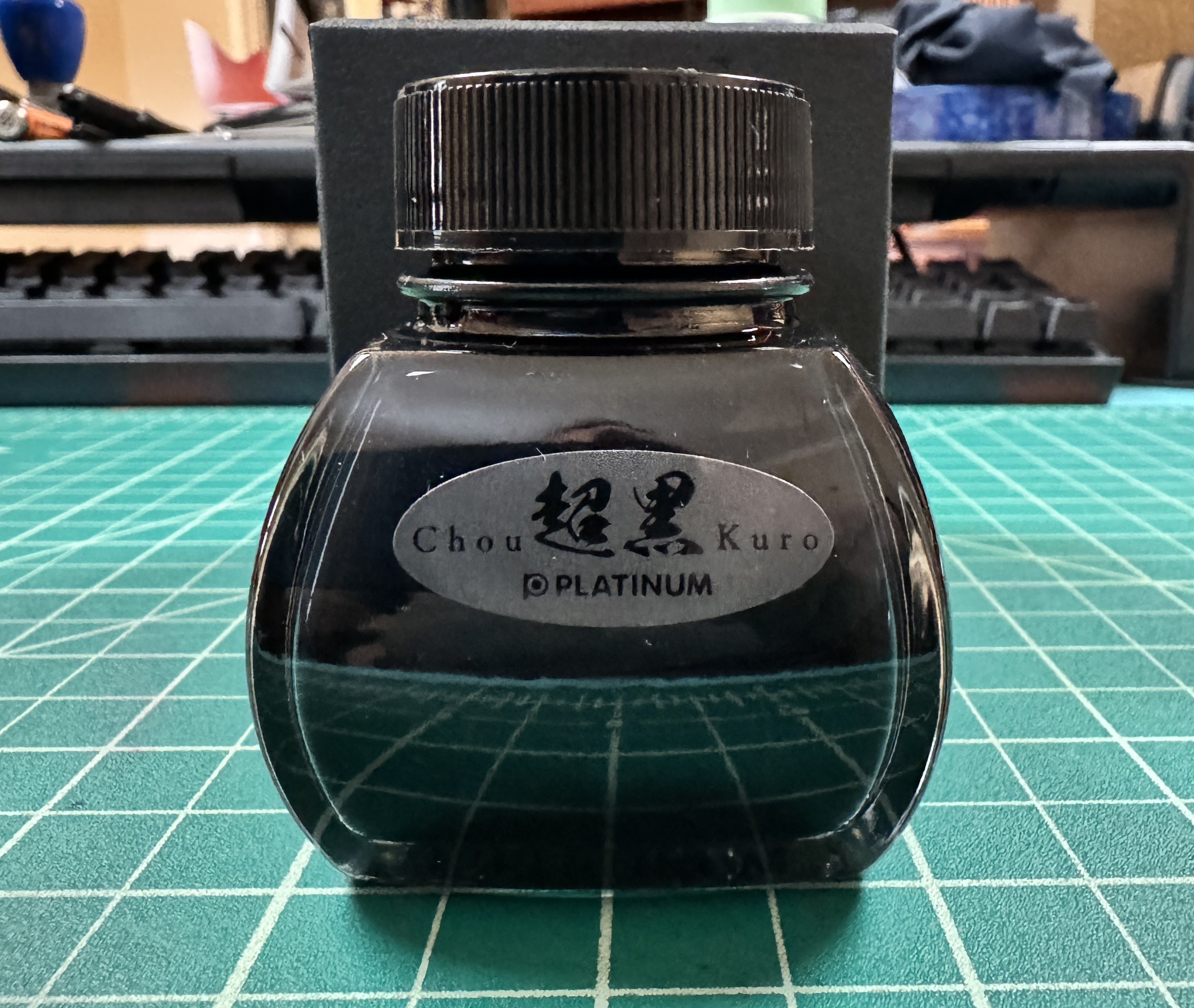
Platinum Chou Kuro Black Ink Review

How committed are you to fountain pen maintenance? That is the question Platinum needs you to answer before picking up a bottle of Chou Kuro, which, according to them, is the blackest black ink ever produced for use with fountain pens. With a catch.

“Careful maintenance is required to ensure that “Chou Kuro” ink stays intensely black. PLEASE USE PURIFIED WATER, DO NOT USE TAP WATER WHEN CLEANING "CHOU-KURO" INK.”

Emphasis theirs.

Many of us dedicated fountain pen users are used to added maintenance and cleaning routines for specialty inks. Shimmer, sheen, pigment, iron gall - any ink in those categories requires you to pay more attention to your usage and cleaning regimen. No inks, at least that I am aware of, suggest to use distilled water over standard tap water. How intense is Chou Kuro?

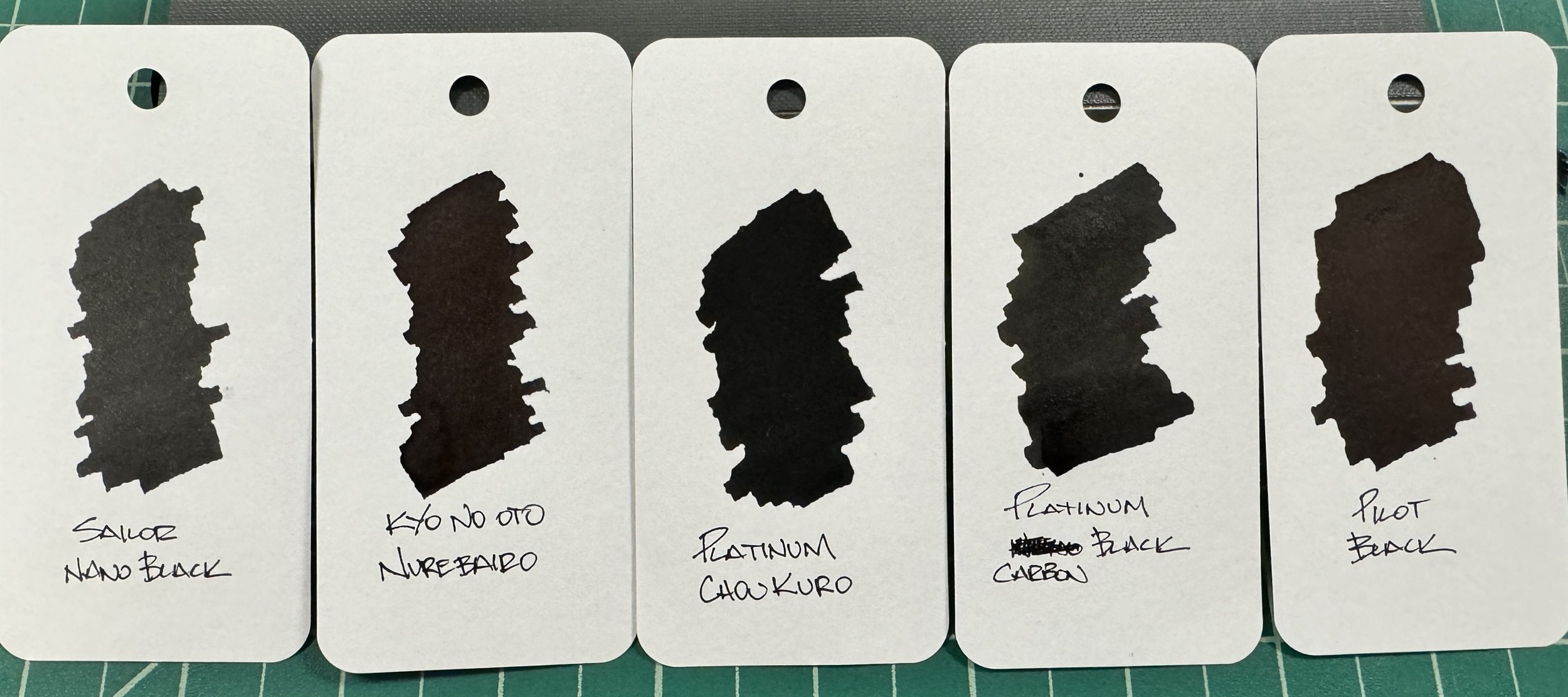
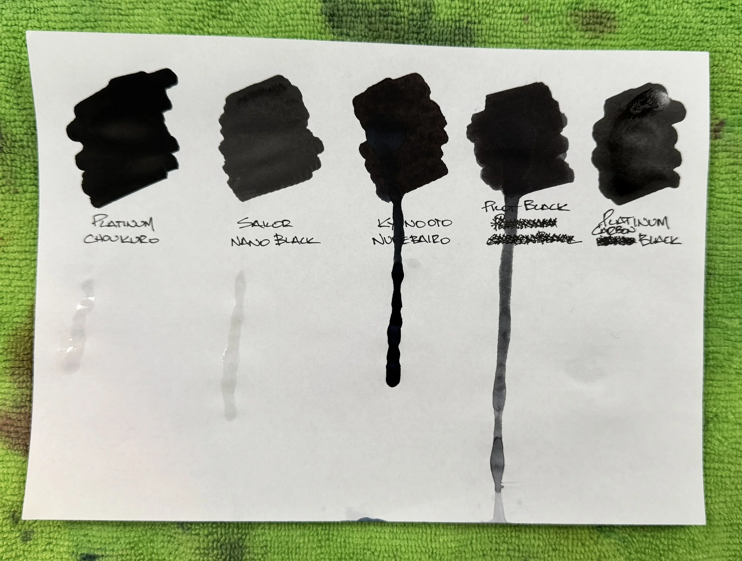
Ink swabs made with Kakimori Stainless Steel dip nib on Col-o-ring cards.

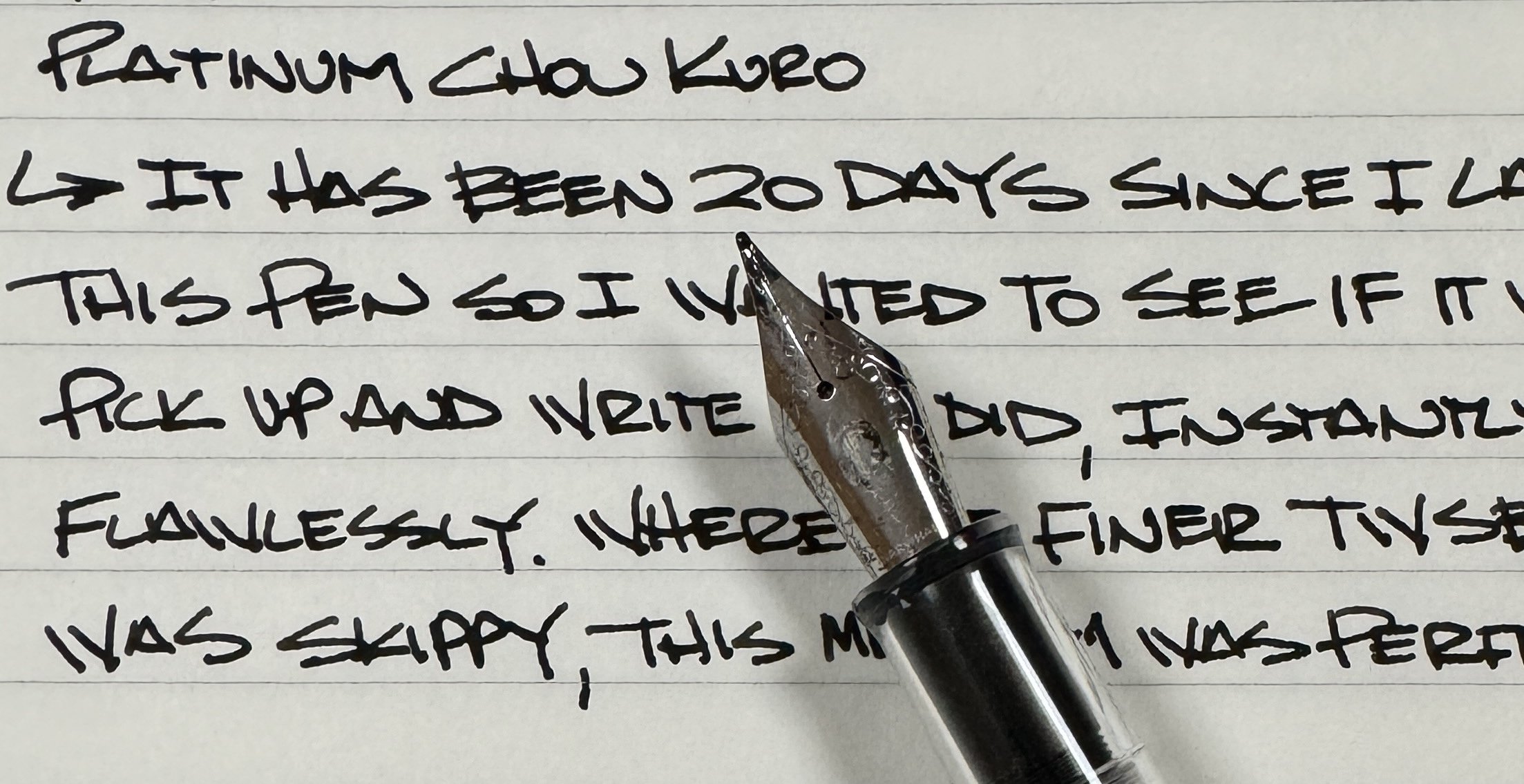
According to Platinum, it provides “intense blackness” on the page, and I can’t argue with that. I have shockingly few black inks on hand to compare to Chou Kuro, but one look at the pictures and I’m certain you could pick it out of the lineup if I removed the descriptions.

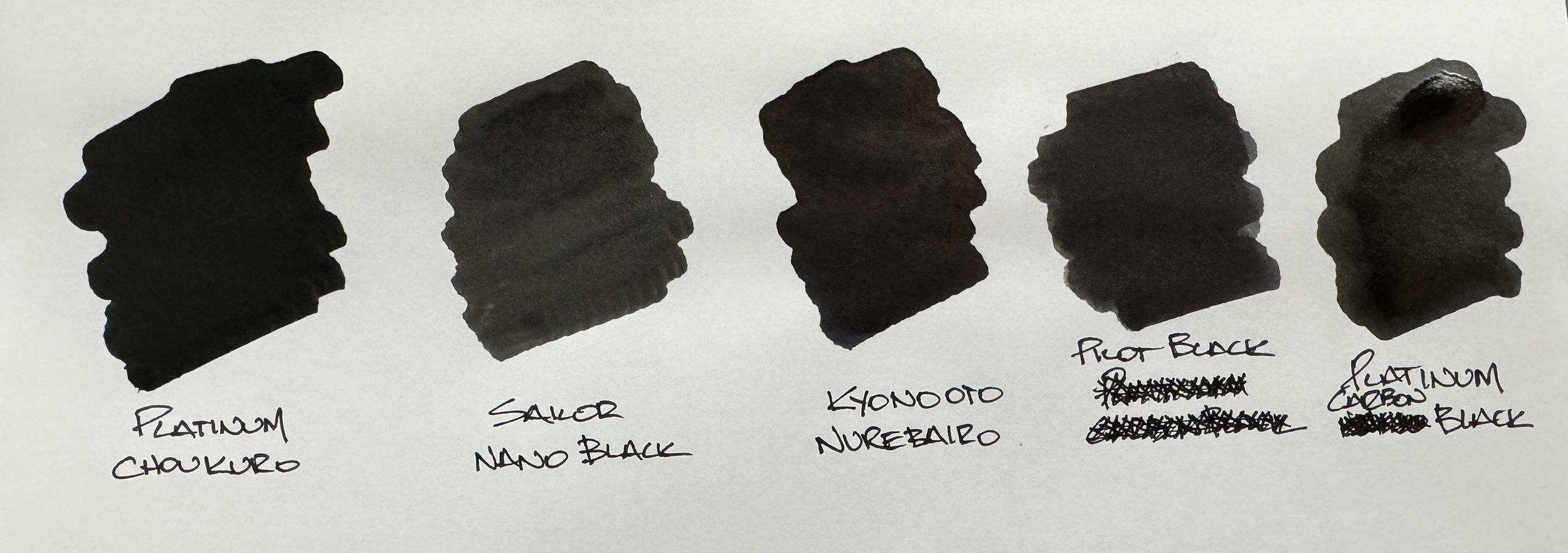
Of the inks I had on hand, Kyo No Oto Nurebairo is the next darkest, with Pilot Black possibly darker than Platinum Carbon Black? They are different types of inks - the Pilot a basic dye ink, and the Platinum a pigmented ink - and dry a bit differently, but are surprisingly close. Sailor Nano Black isn’t even under consideration with the rest of the group.

Cotton swabs on Kokuyo KB paper.

So yes, Chou Kuro is that black. And the flat, matte-like finish when it dries keeps it that way. There is no sheen to reflect light off the ink at any angle.

Ok, so it’s as dark as I have seen from a fountain pen ink, but how does it write from a nib?

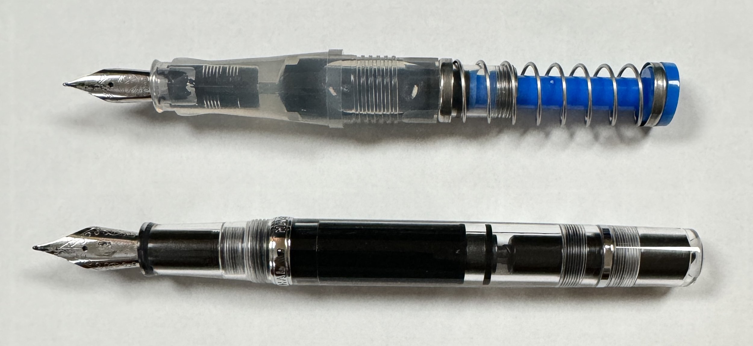
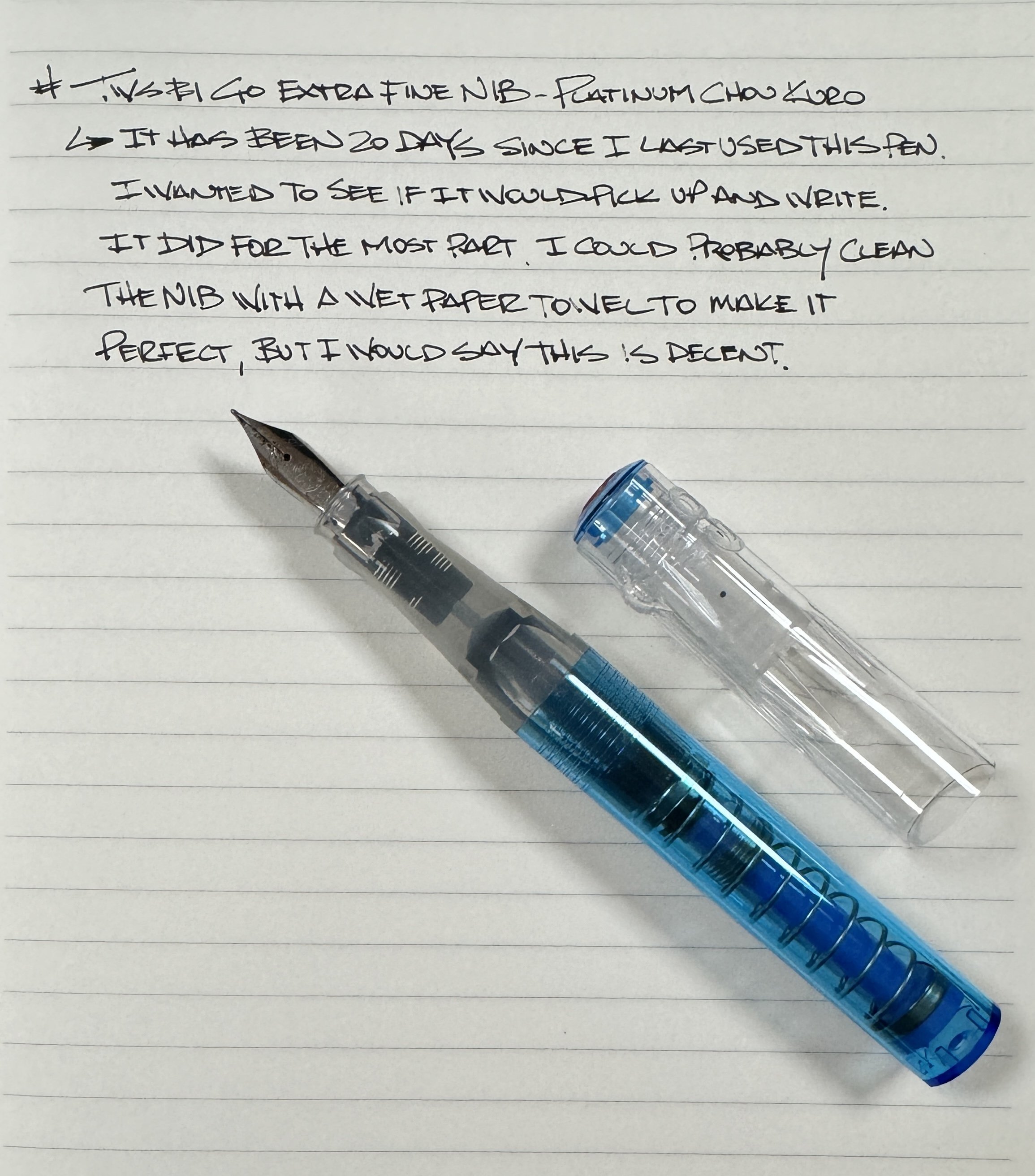
I filled two pens with Chou Kuro: a TWSBI GO with an Extra Fine steel nib, and a Nahvalur Original Plus with a Medium steel nib. I wanted to try a couple of different line widths with an ink like this, and the clear winner was the wider nib of the Nahvalur.

Consistently inconsistent with the TWSBI GO EF.

With the TWSBI GO EF, my lines were inconsistent. If I wanted to wipe down the nib more between uses, or really prime it before and during writing, the flow may have been better, but I wanted to keep it an “uncap and go” experience. When I uncapped the Nahvalur, the Medium nib flowed right from the start. There was no dryness, and no skipping, even after letting the pen sit for 20 days between uses.

I could make this Nahvalur pairing permanent.

The delay between uses was purposeful, and I found no difference in either pens performance no matter if I let the pen sit for an hour, or a week. That was a pleasant surprise.

Would cleaning the blackest black ink from these pens surprise me as well? Yes. Total time inked in both was close to 30 days, and they both cleaned flawlessly. I purposefully chose these two pens because of their clear barrels so I could see if there was any staining. Neither showed any inky remnants, and took no more time to clean than any standard ink cleaning. And yes, I used tap water from the sink. I’m probably on a watchlist somewhere now.

Spotless.

The only cleaning issue I saw was with my Kakimori Steel Dip Nib. I would dip it in the ink, write, wipe it off with a wet paper towel, and let it sit for a couple of hours before fully rinsing it. I could see the black ink sitting in the grooves, but I had no problem taking a brush to it to clean it out better. Next time I’ll keep a small cup of water next to me when I use the dip nib.

For an ink like Chou Kuro, waterproofness is an important feature. They didn’t put in all of this work to not have it be permanent. I swabbed each ink on Kokuyo KB Paper, let it dry, dropped a spot of water in the middle of each swatch, and lifted the paper to have the water run down. The three pigmented inks - Chou Kuro, Sailor Nano, Platinum Carbon - all behaved as expected, as did the two dye-based inks with their large runoff. More testing and time is needed to see the full permanence results, but as an initial look it works as expected.

The main expectation of Chou Kuro is that it is the blackest ink you can use in a fountain pen. I think they succeeded with that, but here are a few tips to keep in mind if you are considering it:

— Use Chou Kuro in a pen you can take apart to clean.

— Lean towards wider nibs for better ink flow.

— Ink it, and use it. Don’t let it sit.

— Clean it often. Commit to distilled water if you will be using it in your regular rotation.

In short, be particular with Chou Kuro. Have a usage and cleaning plan, and stick to it. That’s good practice for any fountain pen and ink combination, but especially this one.

Platinum Chou Kuro runs $60 for a 60 ml bottle, so that is another commitment you will need to make. $1/ml is a price point we have seen before, but not usually in this capacity. In comparison, Platinum Carbon Black is almost half the price. Yes, Chou Kuro is darker, but is it worth the added hassle? In a few cases, yes, I can see a recommendation being made. Otherwise, I’d chose Carbon Black and feel comfortable with that decision.

If you have read this far, be sure to check out more reading from Platinum, as they have broken down the science behind Chou Kuro) to support the claims they are making.

(JetPens provided this product at no charge to The Pen Addict for review purposes.)


Posted on October 30, 2023 and filed under Platinum, Ink Reviews.

Troublemaker x Flax Pen to Paper Exclusive Ink Review

(Kimberly (she/her) took the express train down the fountain pen/stationery rabbit hole and doesn't want to be rescued. She can be found on Instagram @allthehobbies because there really are many, many hobbies!.)

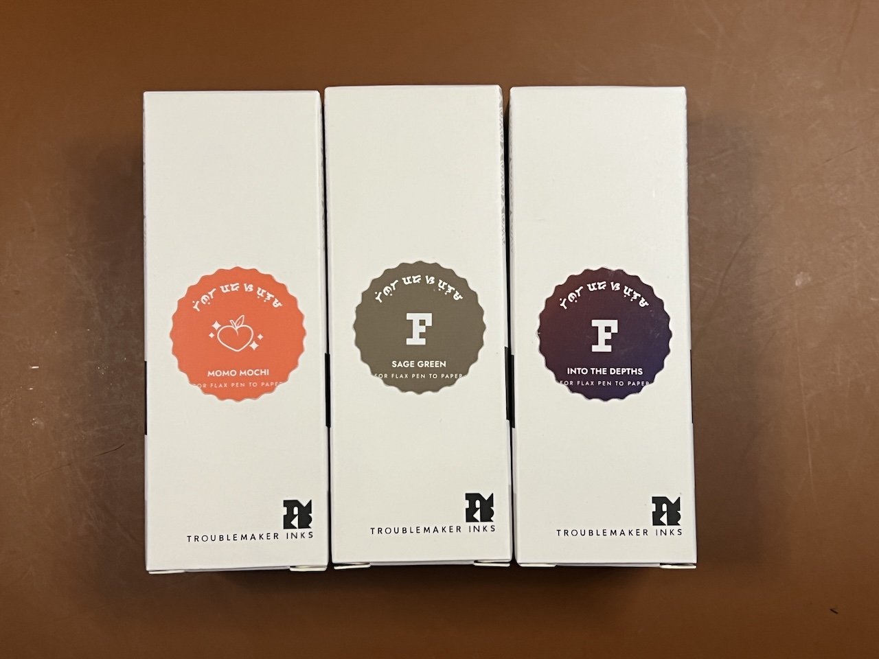
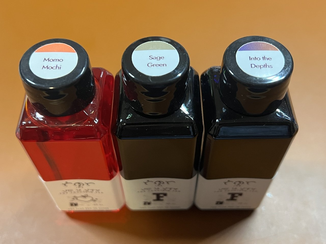
At this year’s SF Pen Show, I was excited to get the set of 3 exclusive inks made by Troublemaker Inks for Flax Pen to Paper, a stationery shop in Los Angeles, CA. The 3 inks are Momo Mochi, Sage Green, and Into the Depths.

I like that the labels on the front give you an idea of what the ink color is.

Ditto the labels on the tops of the bottles. I don’t know why the Momo Mochi bottle is transparent while the other two are opaque (and it’s not because the inks are dark.)

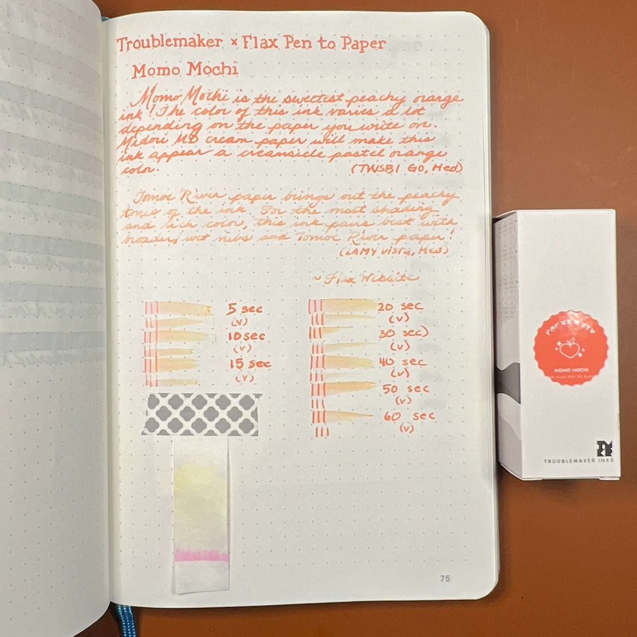
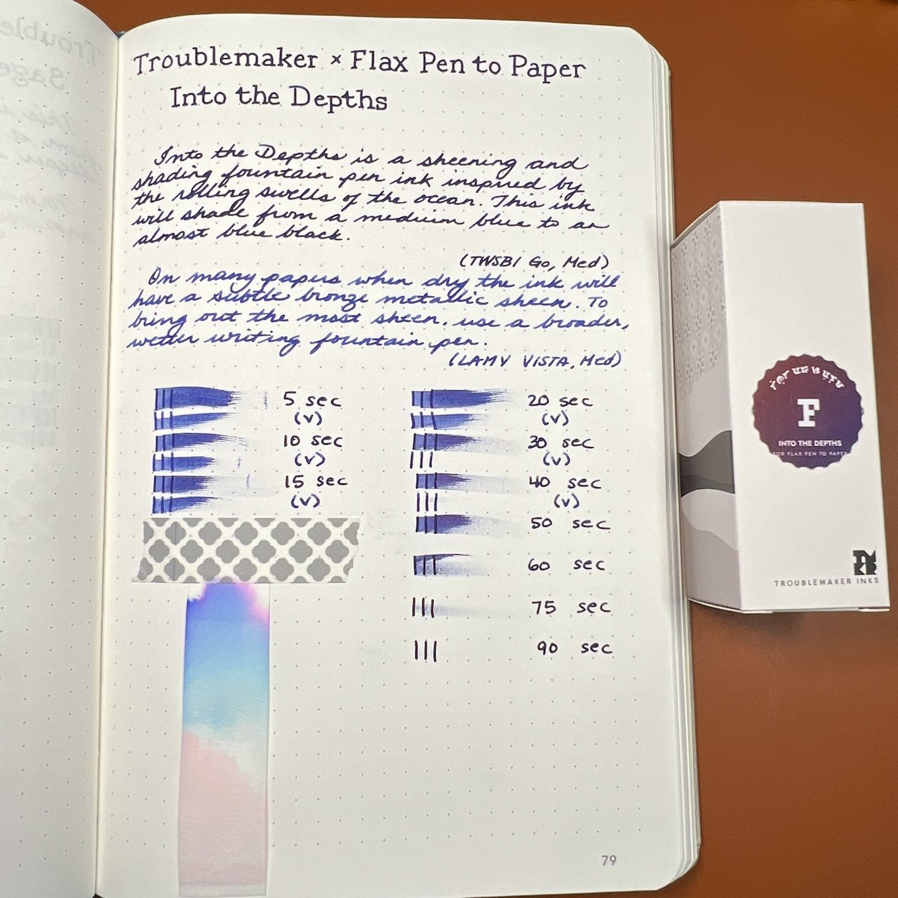
As in the past, all swatches were done on Col-O-Ring cards using a Kakimori steel dip nib and the non-brush end of a paintbrush, while writing samples were done with a TWSBI Go with a Medium nib and a Lamy Vista with a steel Medium nib. The TWSBI Go is a wetter writer and the Lamy is a drier writer, so these two give me a good idea of how an ink will look from different pens. The notebook used for writing samples is from Endless Recorder with 68 gsm Tomoe River paper. Dry times may be a bit slower on 52gsm TR or faster on papers like Rhodia, copy paper, Cosmo Air Light or with drier or finer nibs.

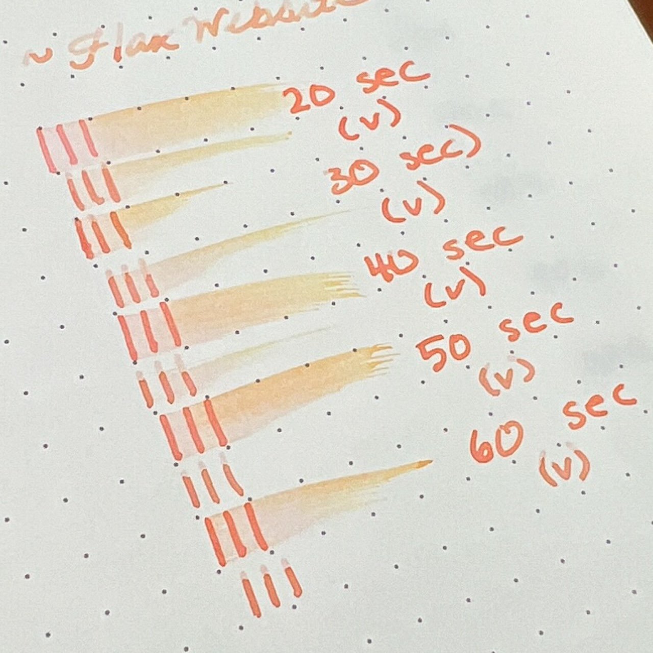
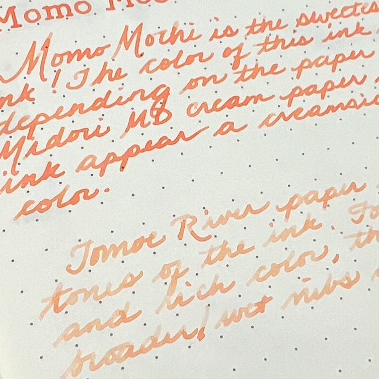
Momo Mochi is a bright peachy coral-y color that is in between orange, pink and other inks that have peach in the name. You can see its shades of orange, yellow and pink in a drier pen like the Vista, but it was almost too light for my personal preference. The wetter nib made it more readable but you don’t get as much shading. There are varying levels of shading depending on nib wetness and no sheen.

Chromatography of Momo Mochi shows light yellow and pink.

You can really see the orange and yellow shades in the smear.

What a difference a pen makes! Hard to believe these are the same ink!

Inks similar to Momo Mochi: Sailor 2023 Pen Show Ink (it is more vibrant irl), Sailor Manyo Sakura, Sailor Ink Studio 173, Laban Apollo Orange (which is the most similar in tone but lacks the chromashading), and Colorverse Space Needle. Neither the Robert Oster 2020 Dutch Peach or Diamine Peach Punch inks were a good match as they were too red.

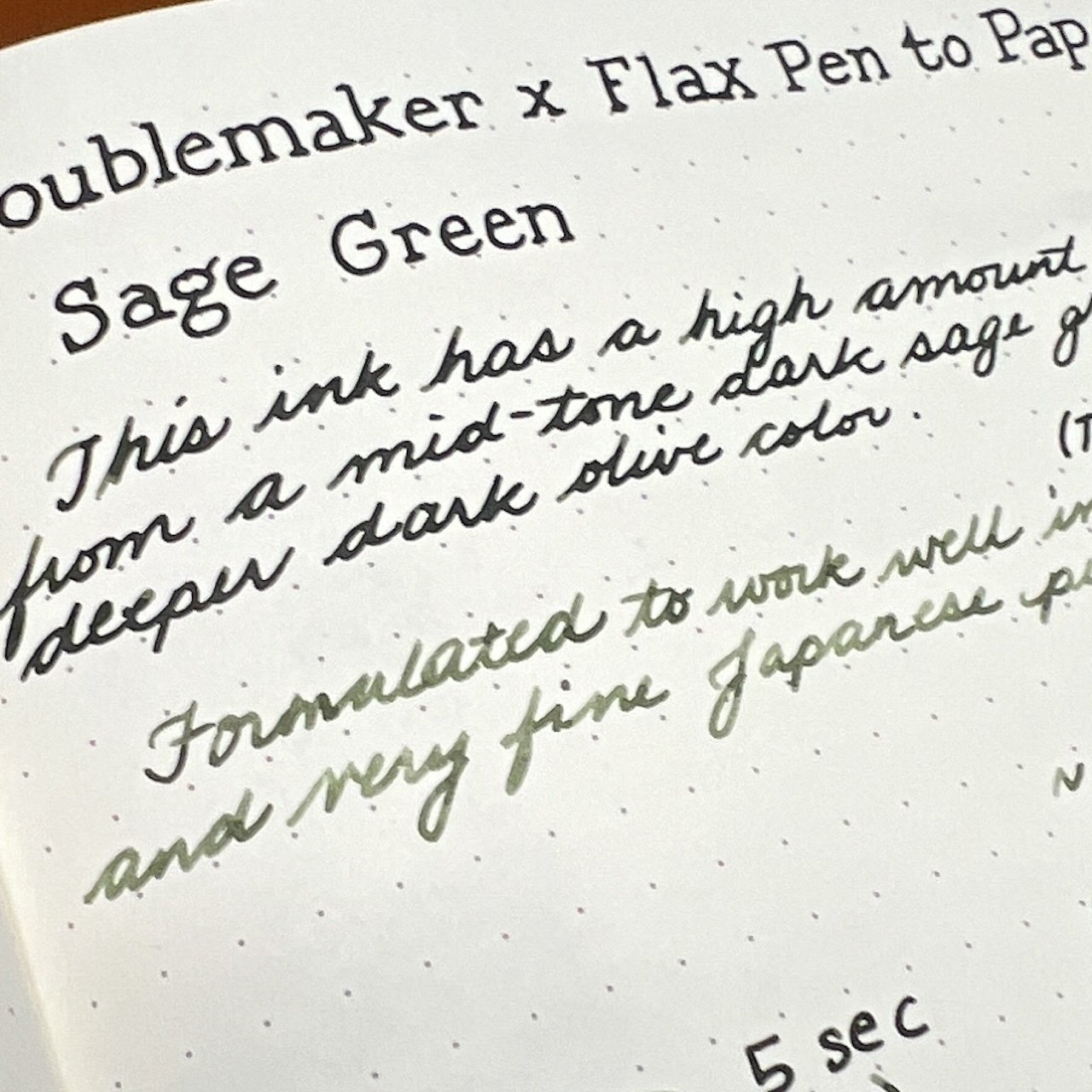
Sage Green is a nice olive green with hints of brown. It is a medium to medium-wet ink (depending on nib) and dry times ranged from 50-90 seconds depending on nib wetness. As with Momo Mochi, the level of shading will depend on the wetness of the nib; there is no sheen.

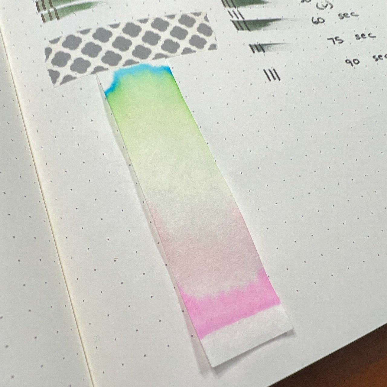
I wouldn’t have guessed that there would be so much bright pink from this ink!

The Lamy Vista really shows off the brown undertones here while the wet TWSBI produces a nicely saturated darker tone.

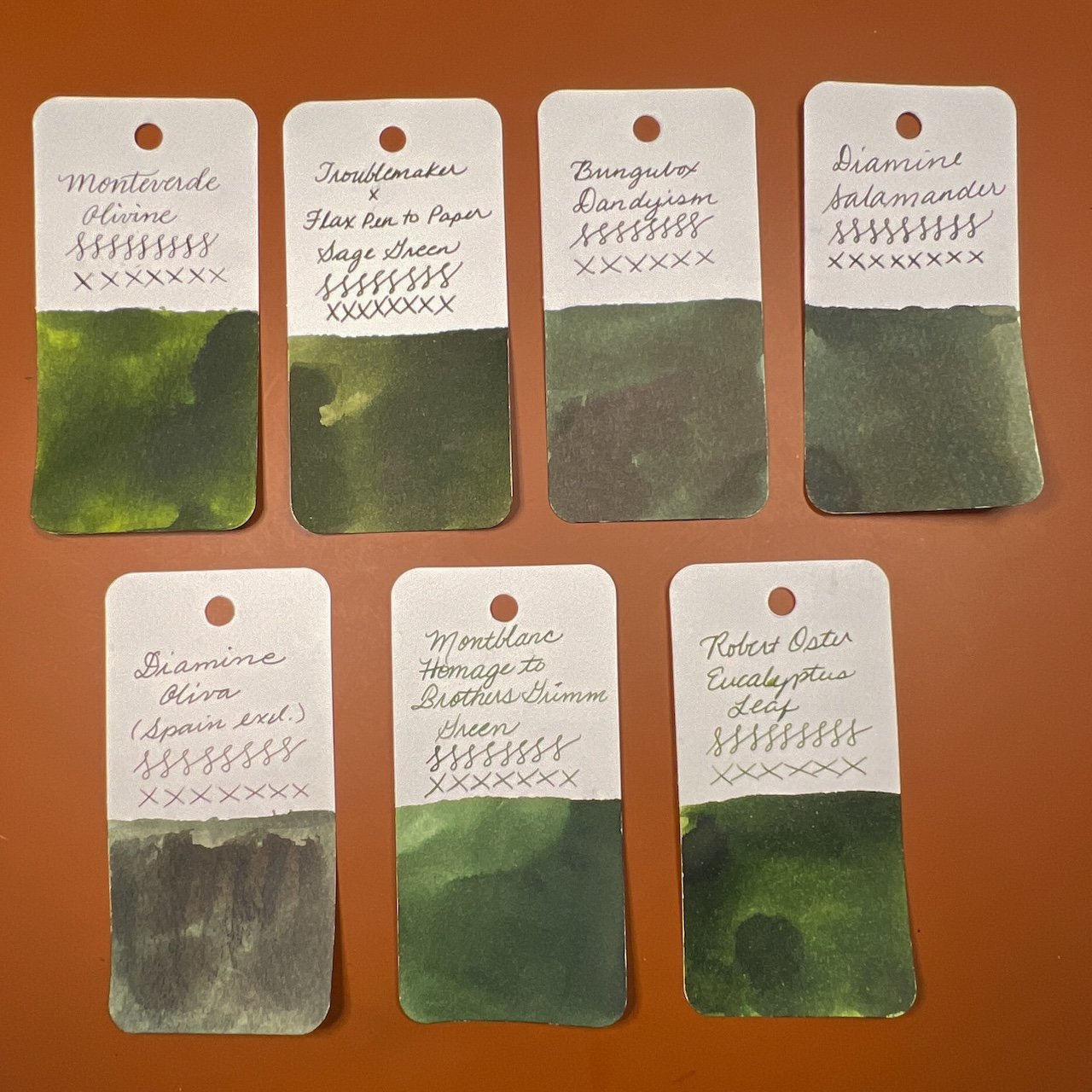
Inks similar to Sage Green are Monteverde Olivine (a bit too green), BUngubox Dandyism (not enough yellow), Diamine Salamander (ditto), Diamine Oliva (too dark), and both Montblanc Homage to Brothers Grimm and Robert Oster Eucalyptus Leaf didn’t have enough brown undertones.

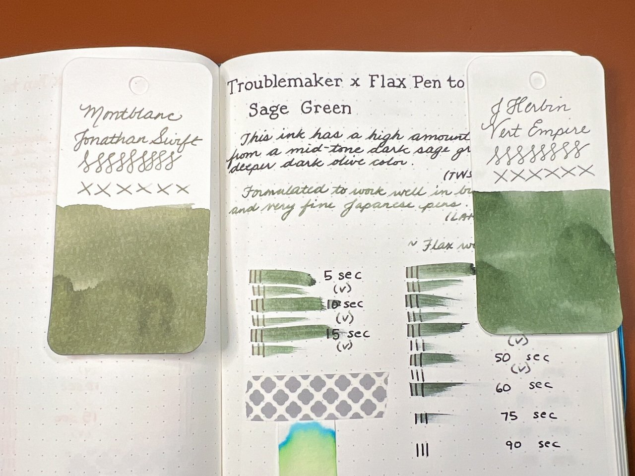
Since the color is so different from the drier nib, I decided to find similar inks to match. Montblanc Jonathan Swift is a better match irl than the photo suggests and J Herbin’s Vert Empire was a really good match too.

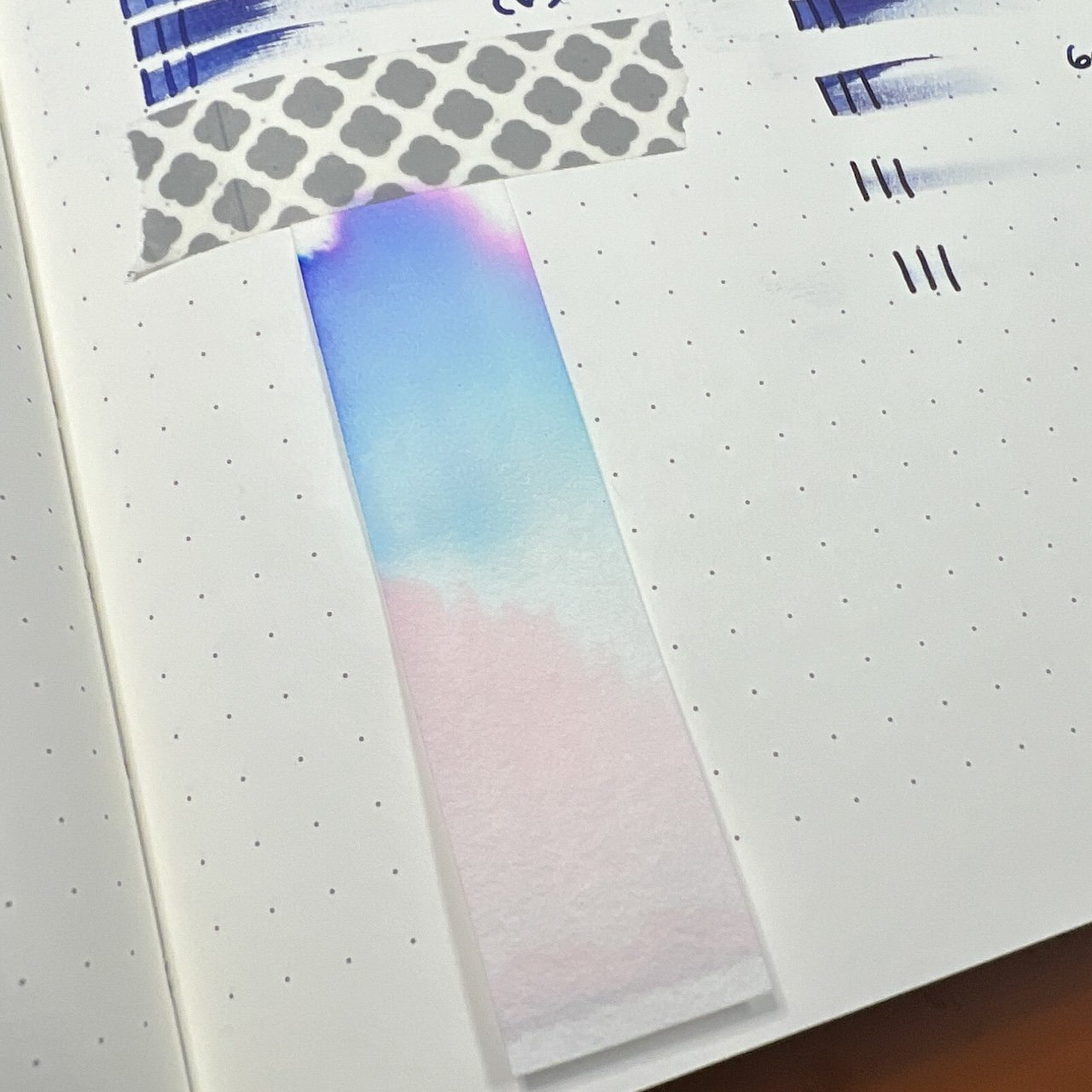
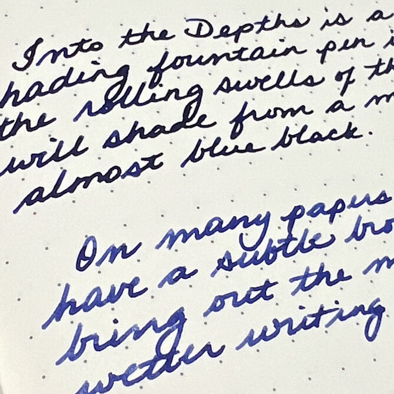
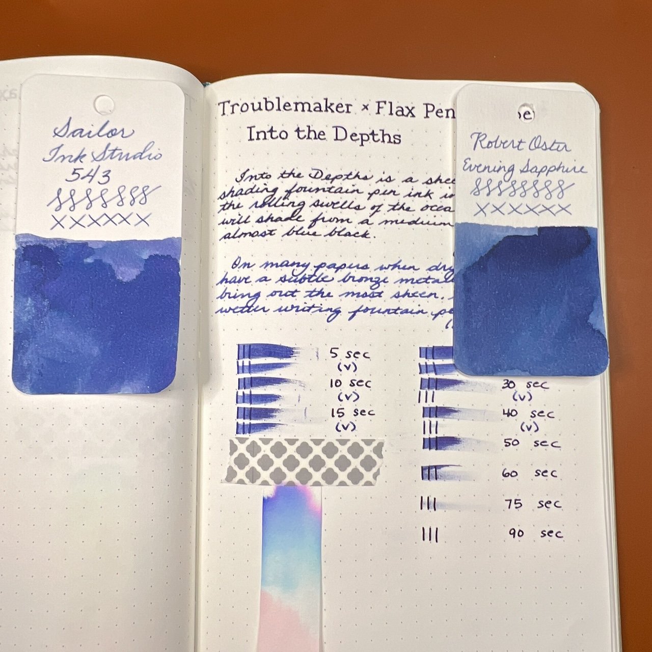
Into the Depths is a dark blue that borders on blurple, depending on nib wetness and paper. It is a medium to medium-wet ink (depending on nib) and dry times ranged from 40-80 seconds. The ink is either a very saturated and dark blue or a medium blue with some shading. The sheen was difficult to pick up in the writing samples but you can see it on the swatches.

Pinks, blues, some purple and then pink again??

The difference between the two writing samples is pretty drastic. I liked the tones and writing experiences with both pens.

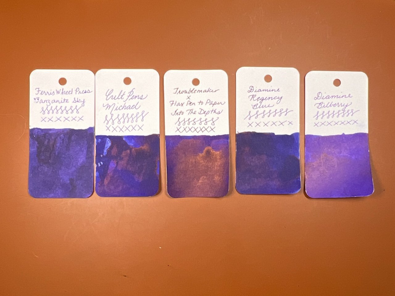
Inks similar to Into the Depths are Ferris Wheel Press Tanzanite Sky, Cult Pens Michael, Diamine Regency Blue, and Diamine Bilberry (a bit too purple.)

Here are two matches if you’re using Into the Depths with a drier nib: Sailor Ink Studio 543 and Robert Oster Evening Sapphire.

All in all, the inks behaved well, though Momo Mochi felt too dry for me in the Lamy Vista, but I liked it in the TWSBI. This was a great reminder that the pen & ink (and paper) combination really makes a difference, not just in the color & saturation of the ink but also in the writing experience. You may prefer the color or writing experience that a wetter or drier pen/nib will produce, and that preference might be different depending on the ink/pen combination too. I liked the wetter pen/nib for Momo Mochi but the drier one for Sage Green and I liked them both for Into the Depths. So, before you judge an ink too harshly for being too dry or too wet, etc, consider trying it in a different pen/nib and give it another chance!

These Troublemaker inks sell for $15.00 for a 60 ml bottle and are available exclusively at Flax Pen to Paper’s website or in-store at 1078 Gayley Avenue, Los Angeles.

(Flax Pen to Paper provided this product at no charge to The Pen Addict for review purposes.)

Posted on October 27, 2023 and filed under Troublemaker Inks, Ink Reviews.