Posts filed under Ink Reviews

Third House Inks Aqua Tofana Ink Review

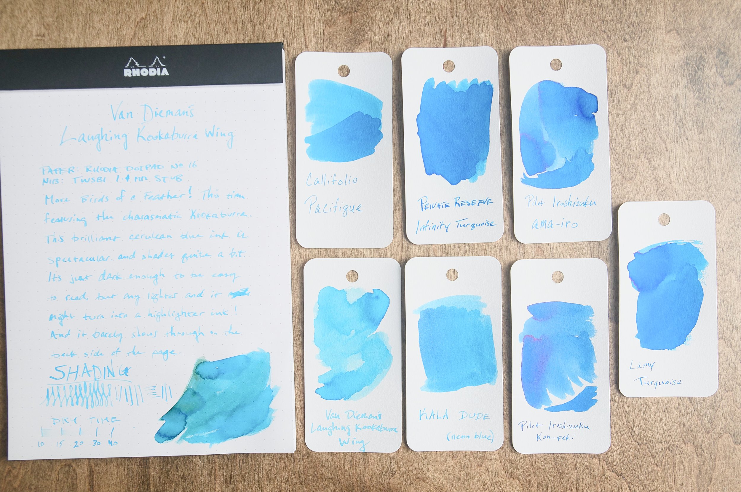
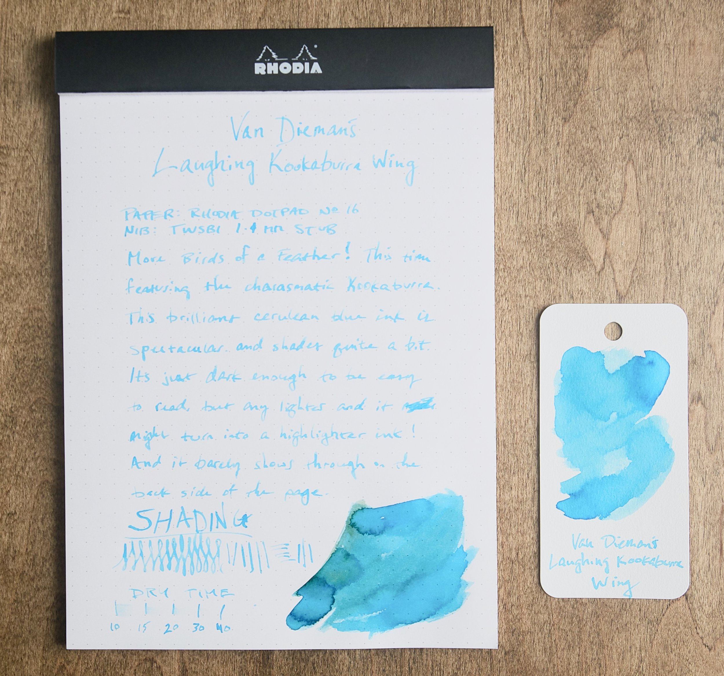
(Sarah Read is an author, editor, yarn artist, and pen/paper/ink addict. You can find more about her at her website and on Twitter. And her latest book, Root Rot, is now available for pre-order!)

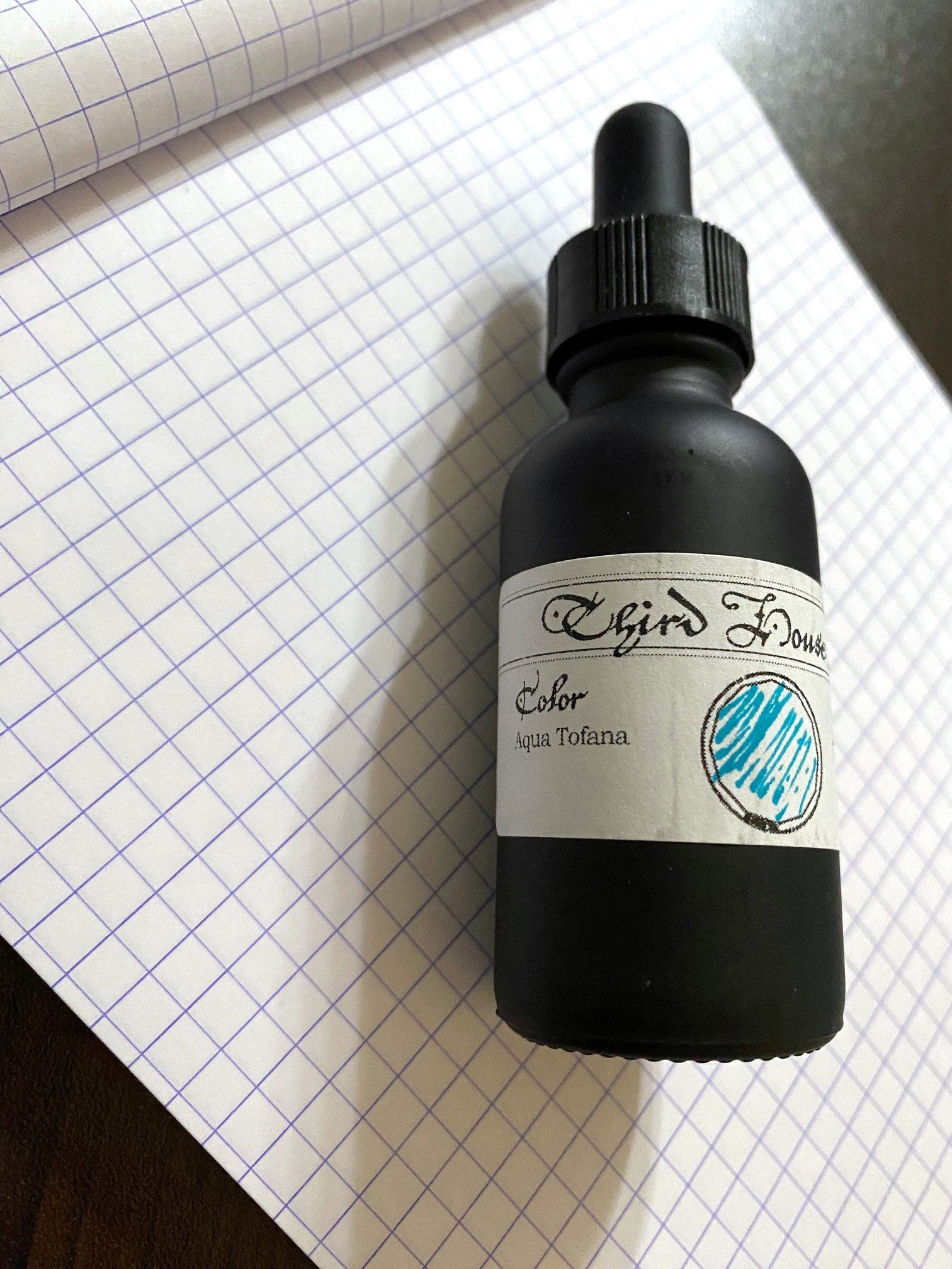
It starts out feeling just like a cold, then a stomach flu, and then you're dead. Just a few doses of Aqua Tofana, and that's it. Or, that was how it worked in Italy in 1630, when Giulia Tofana developed and sold the arsenic, lead, and belladonna concoction to women who wished to be widows.

But this particular bottle of Aqua Tofana looks pretty and smells nice, so I'm sure it's fine. Don't drink it, though.

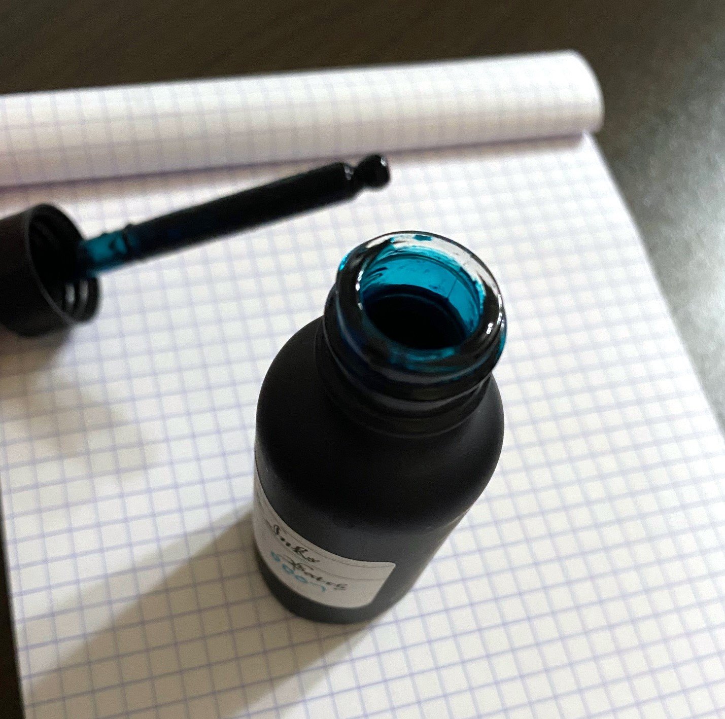
Third House Inks gives a new face to this name. Instead of a poison cosmetic, we have a charming ink. It comes in a 30ml matte black glass bottle with an eyedropper lid. The eyedropper is handy for filling pens that fit that style, but it's trickier for filling converters. And the bottle's neck is too narrow for many pens to fit into, so filling from it is also a bit tricky. But once the pen is filled, this is a very fun ink.

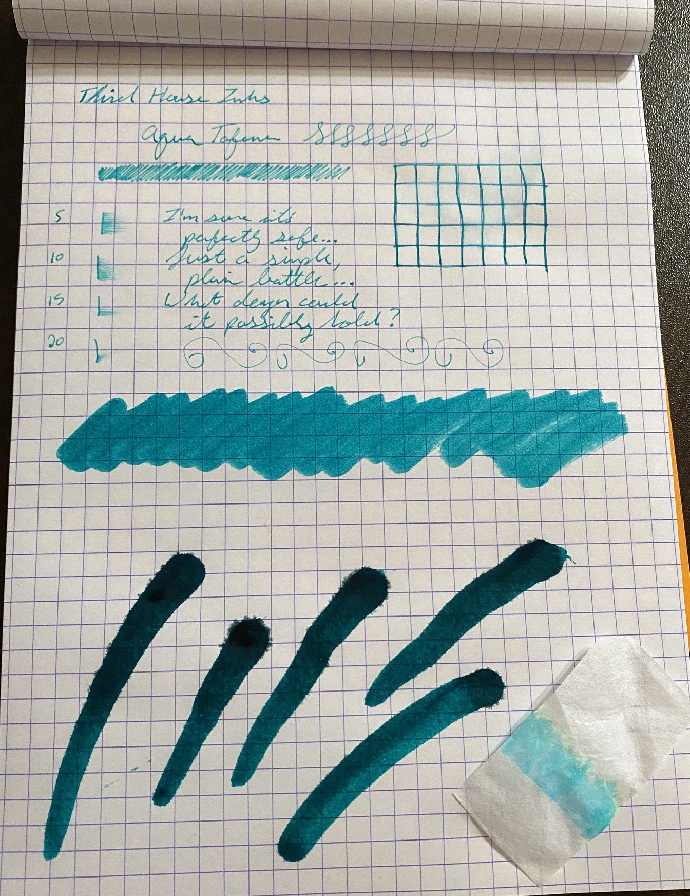
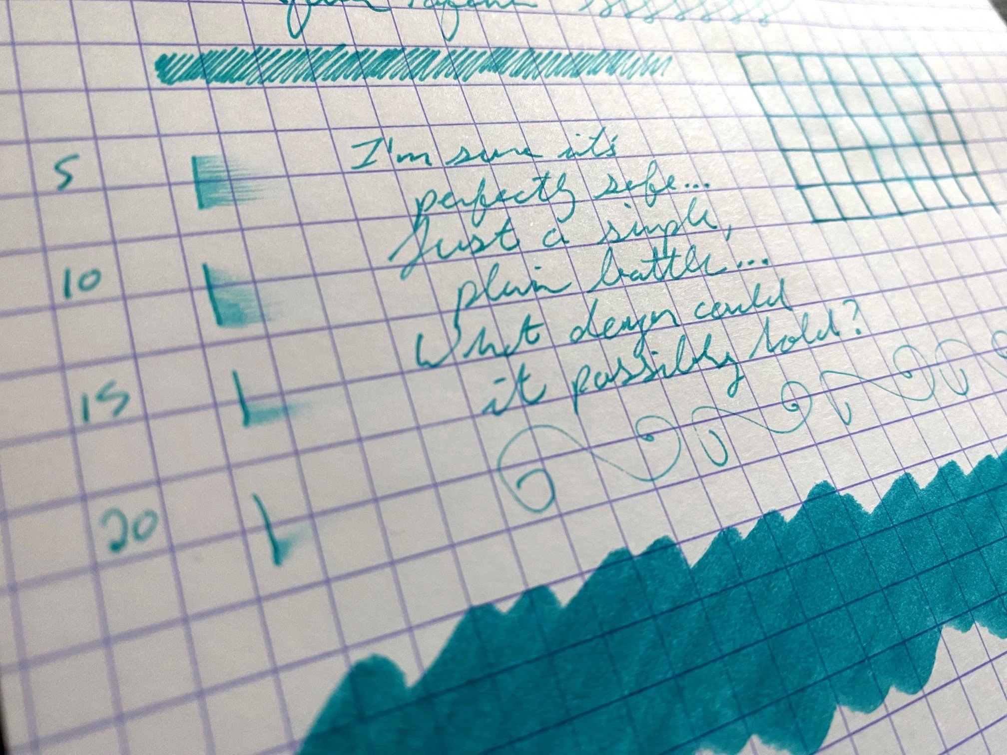
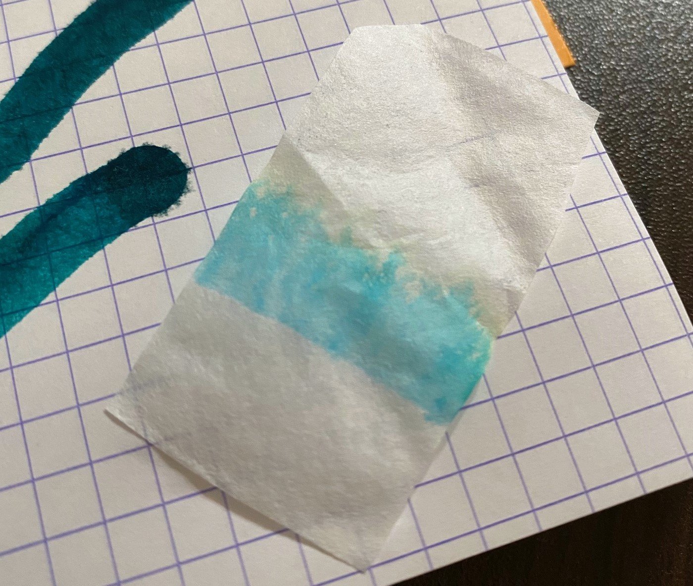
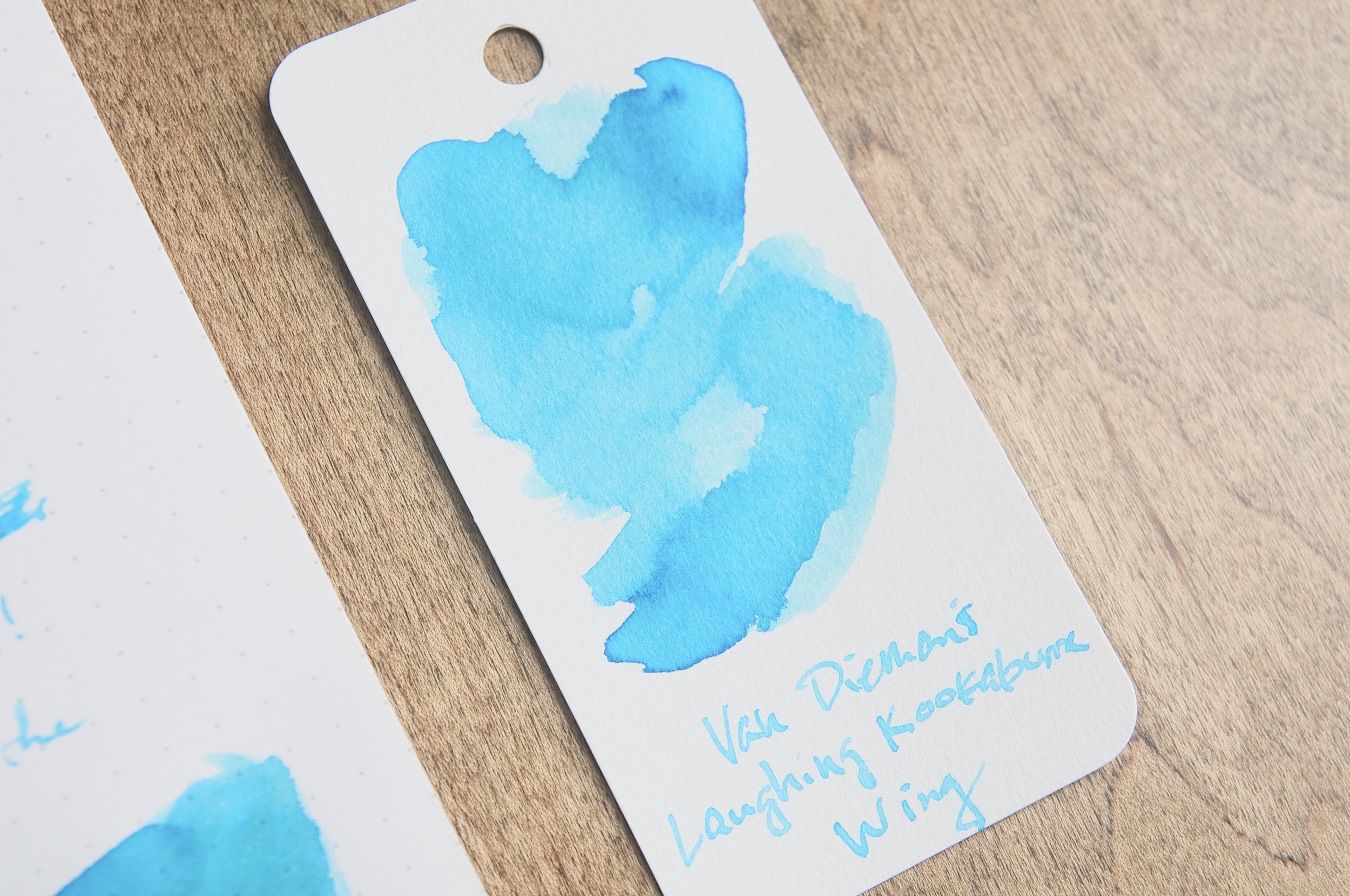
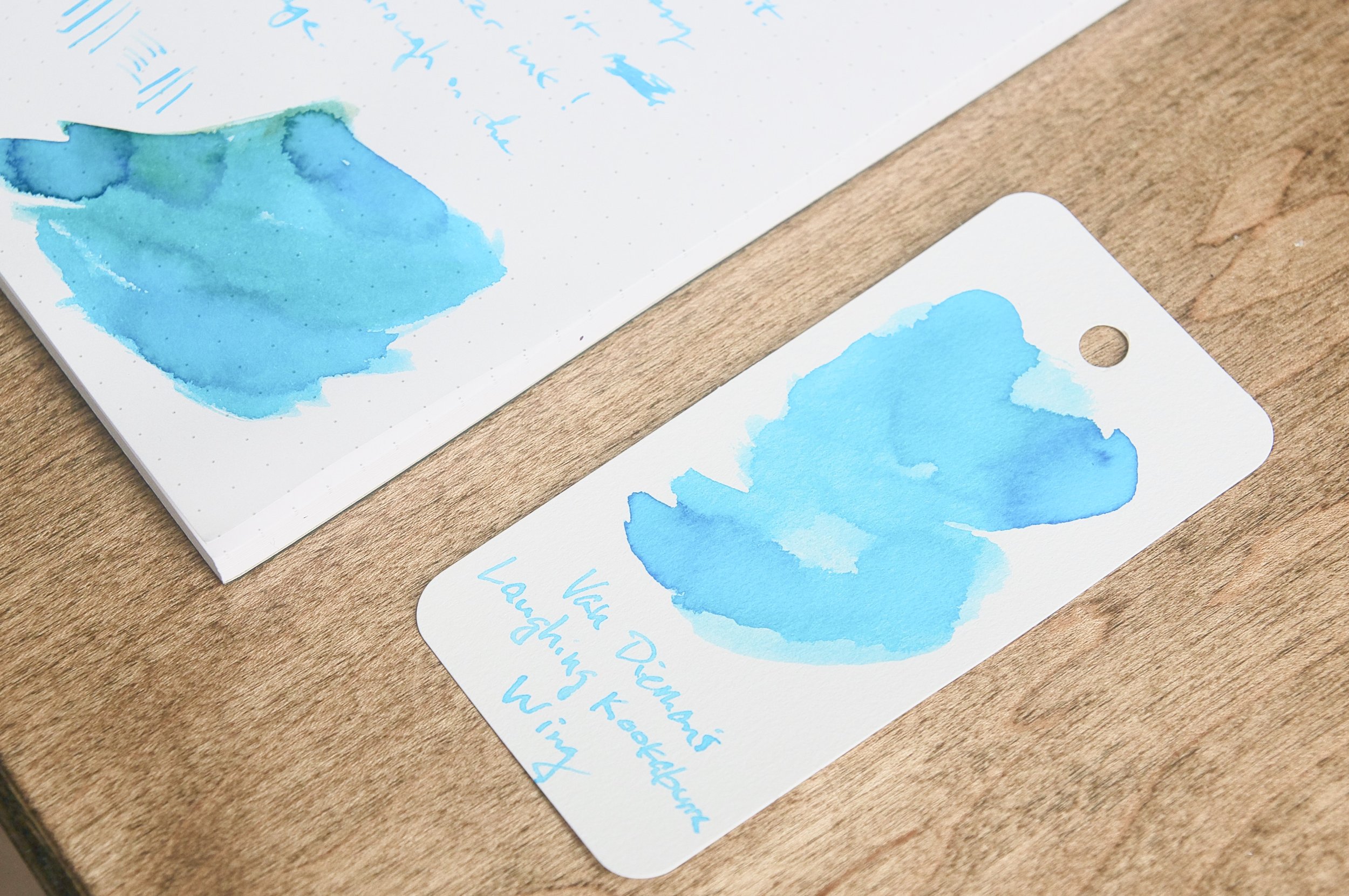
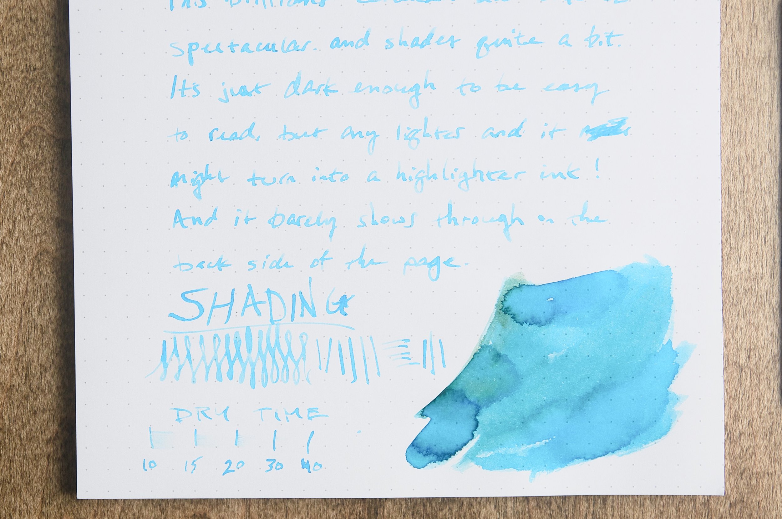
The color is a pure teal, with chromatography going from sky blue to a tint of yellow. Where it pools, it looks like dark spearmint green, then it fades to a bright emerald. It has a quick dry time, and it does feel a bit dry when writing. It has no sheen, and shows little shading in the writing, but it doesn't feather except where it has been pooled on the page on purpose. The ink shows excellent water resistance, and didn't fade or run at all when water was dripped on it or wiped across it.

Overall it behaves well, and, as I said above, it smells nice. It has clearly been perfumed, and the scent is apparent not just in the bottle, but on the page as well. It's not overpowering, just pleasant.

There are similar shades of teal out there, but the fast dry time and water resistance set this one apart. And while I don't love the bottle, I do like the ink, and it's certainly worth the $8 price tag. Heck, for that, I'd buy it just for the name. In fact, Third House Ink names are all pretty irresistible. So many poisons!

(No individuals were harmed in the writing of this review. Brad purchased this ink at the 2023 Orlando Pen Show at regular price.)


Enjoy reading The Pen Addict? Then consider becoming a member to receive additional weekly content, giveaways, and discounts in The Pen Addict shop. Plus, you support me and the site directly, for which I am very grateful.

Membership starts at just $5/month, with a discounted annual option available. To find out more about membership click here and join us!

Posted on December 21, 2023 and filed under Third House Inks, Ink Reviews.

Van Dieman's Laughing Kookaburra Wing Fountain Pen Ink Review

(Jeff Abbott is a regular contributor at The Pen Addict. You can find more from Jeff online at Draft Evolution and Twitter.)

It's another week, and I've got yet another Birds of a Feather ink from Van Dieman's. This time around, it's Laughing Kookaburra Wing, which is a lovely cerulean blue with loads of shading.

If you're new to Birds of a Feather, it's a series of inks from Van Dieman's (though they're not the only ones that have a series like this) that showcases the beautiful colors that can be found on the plumage of local avian species in and around Australia. At this point, this collection of inks is nearing 20 in total, and I would be lying if I said I didn't want all of them.

Laughing Kookaburra Wing is both fun to say and fun to spell, and it's fitting that the ink is also an incredibly fun color. The medium cerulean blue is gorgeous. It's so light and bright, but just dark enough to make it easy to read on the page. If it were any lighter, though, it might need to be classified as a highlighter ink.

Many of my favorite ink colors are in this same range. (Iroshizuku kon-peki or ama-iro, anyone?) But, Laughing Kookaburra Wing is lighter than anything else I currently have in my collection, so that makes it a valuable addition for me. I've never met a turquoise-ish ink I didn't like, and this one is no different.

Like every other Van Dieman's ink I've tried, this one performs flawlessly in whatever pen I use. For the review photos, I went with a wide 1.1mm stub nib from TWSBI because it really shows off this ink's best quality: shading.

The shading that this ink produces is effortless and pronounced. It reminds me of idyllic beaches with light, crisp shallow water that seems inviting even to someone like me who dislikes being in the ocean. The transitions between light, sky blue and medium cerulean and several shades in between are such a joy to see on the page as you write.

This ink flows well and has no problems with starting or skipping. It's not a super "wet" ink, but it's not dry either — it's right in the middle. Since the color is so light, it also doesn't show through on the back of the page for most types of paper. I haven't seen any feathering or bleeding either.

The ink can take between 30-40 seconds to dry to a point where smudging isn't an issue, so it's definitely not a quick drying ink. That said, I've noticed that this ink doesn't smudge a lot when using a normal-sized nib. It does a good job of resisting light pressure smudges just after 10 seconds or so. Still, not a great option for lefties or anyone who needs a fast-drying ink.

One of my favorite things about the Birds of a Feather series is that I inevitably learn about a new type of bird that I've never seen in person. I'd wager the Kookaburra is fairly well-known, but I still learned plenty of new facts when I looked it up to compare the ink color to the bird's namesake wing.

This is a fun ink that performs well! At $17 for a 30ml bottle, it's also a good value. Of course, if you don't want to commit to the full bottle, you can always go with a small sample vial too.

(Vanness Pens provided this product at a discount to The Pen Addict for review purposes.)


Enjoy reading The Pen Addict? Then consider becoming a member to receive additional weekly content, giveaways, and discounts in The Pen Addict shop. Plus, you support me and the site directly, for which I am very grateful.

Membership starts at just $5/month, with a discounted annual option available. To find out more about membership click here and join us!

Posted on December 6, 2023 and filed under Van Dieman's, Ink Reviews.

Van Dieman's European Honey Bee Eater Chin Ink Review

(Jeff Abbott is a regular contributor at The Pen Addict. You can find more from Jeff online at Draft Evolution and Twitter.)

I really admire the level of bird knowledge that Van Dieman's possess, and I really enjoy the result of all that knowledge when it comes to their ink naming process. I'm no stranger to the Birds of a Feather collection from Van Dieman's. Each ink represents not only a specific bird, but a specific color of that bird's plumage. It's incredibly specific and I always learn about a new bird species with each of these inks. The latest of this collection to cross my desk is European Honey Bee Eater Chin. While not my favorite name, it's a surprisingly interesting yellow ink.

When it comes to yellow inks, you already know that you'll likely need a specific use case in mind prior to purchasing. Since they're so light, they don't tend to work well on typical light colored papers. It's not much fun to use a beautiful ink on a paper that doesn't allow the ink to show its full personality, and that's exactly the problem I see with European Honey Bee Eater Chin (known simply as EHBEC from here on). The golden yellow color is absolutely delicious, but you have to use it with the right paper to see it.

It's probably safe to guess that most fountain pen inks are intended as daily writing colors for typical paper (white, off-white, ivory, cream, etc.). There are outliers, sure — some inks are meant specifically for highlighting over other inks. In this case, you need a light-colored hue with plenty of transparency, but you also want an ink formula that doesn't cause other inks to bleed, feather, or smudge when used on top. EHBEC is a typical writing ink (I don't believe it's intended to be a highlighting ink), but I think the best way to use this ink is for ink drawings instead of writing. For someone that uses fountain pens for drawing, this color is something I assume would be fun to use to bring some golden yellow brightness to a drawing or illustration.

While the color isn't great on white paper, it's still legible if there's plenty of light. But this ink really shines when contrasted by nearby dark colors. I've always marveled at how much a tiny smidge of white or a similarly light color can dramatically change a drawing that's already full of color. This yellow is a great accent color.

Writing with this ink is typical for Van Dieman's inks. It's well-behaved — it starts easily, flows smoothly, and doesn't feather or bleed. Due to the light hue, nothing at all shows through to the back of the page. The ink is a little dry in terms of how the nib feels when writing (meaning it feels like the ink lacks lubrication), but there's plenty of flow for quick jots or shading strokes.

There's a small amount of shading that comes out in broader strokes (or in swatches or shading) that hints at a mild orange color hidden beneath the intense yellow colors. I wouldn't say the ink shades a lot, but there is a small amount of consistent shading that adds just enough orange character to catch my eye and make me smile.

I'm not an artist by any means, so I'm not sharing any of my doodles here — but I'm really pleased by how this ink interacts with others. It complements whatever I put it next to. While it will never be a daily writing option for me due to the difficulty in reading what I've written, I'll still keep it around for making accents and creating contrast.

If you haven't already, take a minute to admire the namesake bird. The pop of color on the bird's chin/throat is exactly how this ink acts on paper. The chin is such a small part of this bird's plumage, and I see several other colors that would also make fantastic ink colors.

This is a fascinating ink color that really respects the original inspiration, and this is why I find the Birds of a Feather collection so interesting. If you'd like to try it out, you can pick up a 4ml sample for $4.25 or a 30ml bottle for $17 over at Vanness Pens.

(Vanness Pens provided this product at a discount to The Pen Addict for review purposes.)


Enjoy reading The Pen Addict? Then consider becoming a member to receive additional weekly content, giveaways, and discounts in The Pen Addict shop. Plus, you support me and the site directly, for which I am very grateful.

Membership starts at just $5/month, with a discounted annual option available. To find out more about membership click here and join us!

Posted on November 1, 2023 and filed under Van Dieman's, Ink Reviews.