Posts filed under Ink Reviews

Diamine Celadon Cat Ink Review

(Sarah Read is an author, editor, yarn artist, and pen/paper/ink addict. You can find more about her at her website and on Twitter. And her latest book, Root Rot, is now available for pre-order!)

I don't know how I can still be so delightfully surprised by ink colors when it feels like we've got to have run out of ink colors by now, but here I am, with a new favorite color from Diamine.

Celadon Cat was a collaboration between Diamine and a Reddit fountain pen community, and while I'm not on Reddit, I send them my thanks, because this ink is fantastic.

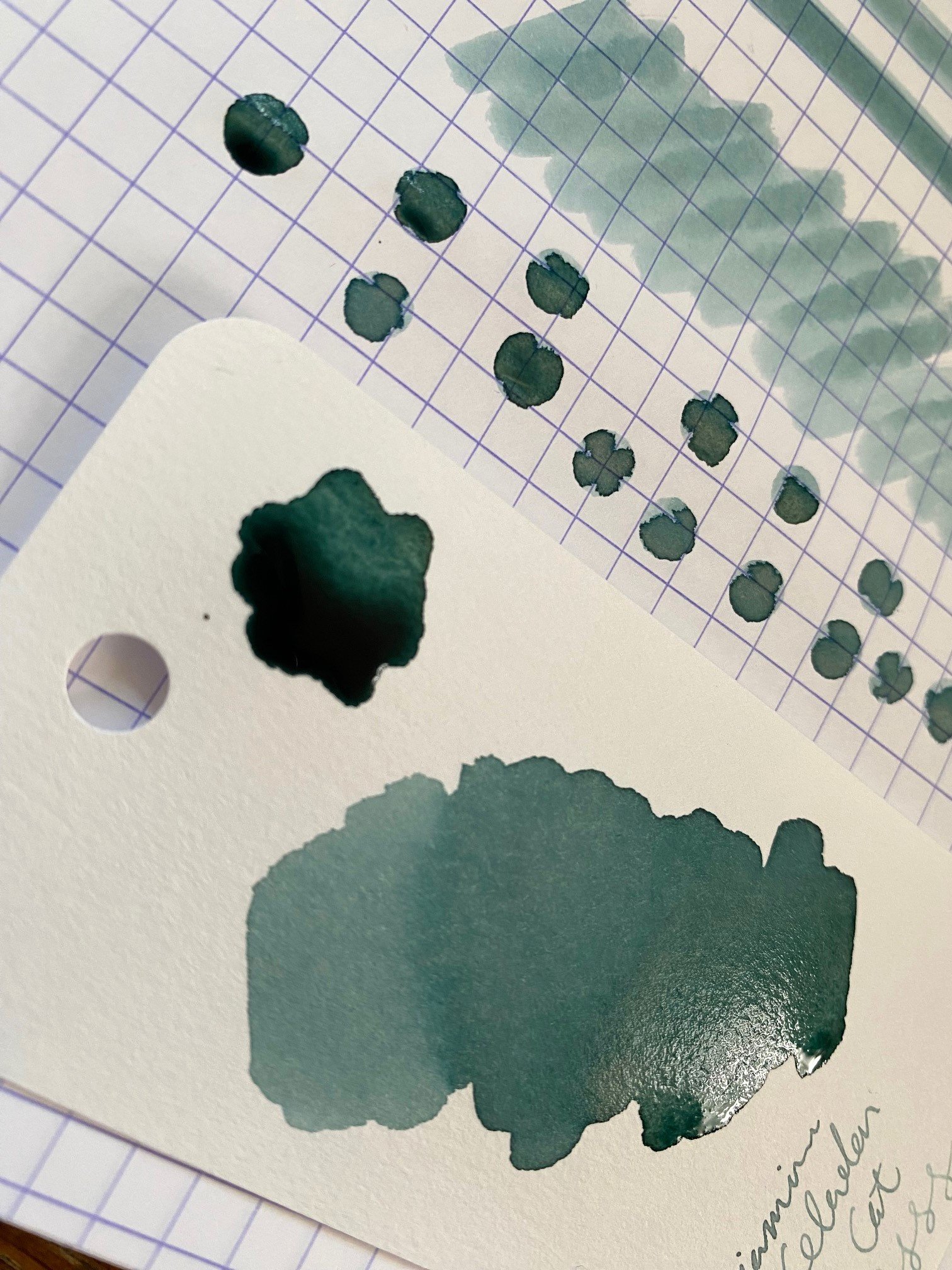
The color is a light blue-green-jade with a huge variety in its character depending on the paper saturation, nib, and even the light level in the room. It's impossible to really capture it in photographs. It's a little bit spring storm clouds, a little bit ocean water, a little bit frost on spruce needles in the blue light of morning. It's a very peaceful color. Chromatography shows an interesting blend of a dusty rose with moss green and cyan. Clearly this was made with some kind of alchemy.

It is on the pale side for writing, especially with a fine nib. It pools to a perfectly readable shade, and it shades like mad, so this would be exceptional with a wet nib. On the downside, that wet nib is going to lay down lines that will take ages to dry. Even a fine nib line took 35 seconds to stop smudging. It's okay for me, as I always use blotting paper, but left-handed writers might find this dry time to be frustratingly slow.

There is no water resistance to this ink, and it fully washed away where water was dripped. And despite its excellent shading, there is no trace of a sheen.

My ink came in the plastic 30ml bottle, which sells for a remarkably inexpensive $8 on JetPens. While that's a great deal on a wonderful ink, the bottle itself is almost impossible to fill from, as it has a very narrow opening. Fortunately, there is an 80ml glass bottle for $17, which is a good way to stock up on a color I'd be happy to use forever.

(JetPens provided this product at no charge to The Pen Addict for review purposes.)


Enjoy reading The Pen Addict? Then consider becoming a member to receive additional weekly content, giveaways, and discounts in The Pen Addict shop. Plus, you support me and the site directly, for which I am very grateful.

Membership starts at just $5/month, with a discounted annual option available. To find out more about membership click here and join us!

Posted on February 8, 2024 and filed under Diamine, Ink Reviews.

Dominant Industry Decade in the Desert Fountain Pen Ink Review

Pen Chalet has their collaboration game on point, including this recent release with South Korean ink maker Dominant Industry. And by recent, I mean Summer 2023, which means that Decade in the Desert, the two inks created to celebrate Pen Chalet’s 10th anniversary, are already sold out.

My apologies.

Even though they are no longer available, I wanted to discuss these two inks - Arizona Sky Citrus and Arizona Sky Crimson - because I’m not only enjoying them individually, but also in use together.

Dominant Industry is known around the hobby for their wild interpretation of inks, including many that are made for dip pens only, less they clog up the inner workings of a fountain pen. Take one look at their Alchemist Inks for Calligraphy and you’ll see exactly what I mean.

This commitment to ink making translates well to their standard ink lineup, too, and I have been impressed with every Dominant Industry ink I’ve tried - to the point where they have become a core choice for my writing.

Cotton swabs on Yamamoto Bank Paper (left) and Sanzen Tomoe River 52 gsm.

Heavier application with a Kakimori Dip Nib on Sanzen.

As the product names indicate, these two inks were created to represent the brilliant shades seen in the Arizona skies during sunset. Even if you’ve never been in Arizona to see the beauty in person, these inks do a great job of capturing the scene.

The orange-leaning Citrus is a knockout in my book - to the shock of no one - but Crimson is the real surprise here for me. Normally, burgundy shades are not my thing, but this one has two things going for it: hints of purple, and a perfect pairing with its counterpart.

Basic testing on Kokuyo Business paper.

Both inks exhibit slight amounts of shading, and no sheen. Dry times are moderate, if not quick - at least for a fountain pen ink. Both flow nicely from the nib, although Citrus could be a little drier. That is par for the course for yellow dye inks. Overall, these inks were a joy to write with.

Line art in the Yoseka Notebook.

Joy. That’s a common term I use with Dominant Industry inks. The bottles are a joy to look at, the inks are a joy to use in my pens and on the page, and the price - $9.60 for a 25 ml bottle for standard inks - is a joy to my bank account.

What’s not to love?

(Pen Chalet provided this product at a discount to The Pen Addict for review purposes.)


Enjoy reading The Pen Addict? Then consider becoming a member to receive additional weekly content, giveaways, and discounts in The Pen Addict shop. Plus, you support me and the site directly, for which I am very grateful.

Membership starts at just $5/month, with a discounted annual option available. To find out more about membership click here and join us!

Posted on January 29, 2024 and filed under Dominant Industry, Ink Reviews.

Franklin-Christoph Ink ‘24 Review

(Kimberly (she/her) took the express train down the fountain pen/stationery rabbit hole and doesn't want to be rescued. She can be found on Instagram @allthehobbies because there really are many, many hobbies!.)

I recently attended the Philly Pen Show, which is the first pen show of the year and kicks off the pen show season. Scott Franklin, of Franklin-Christoph, is co-owner of the Philly Pen Show and makes an exclusive ink for the show, along with matching pens and accessories. Some of the past years’ colors include Teal (2023), Magenta/Hot Pink (2022), and Red (2019) and this year’s color is Indigo. The 2024 PPS pens are in last week’s recap and here are the limited edition accessories. But let’s talk about the ink!

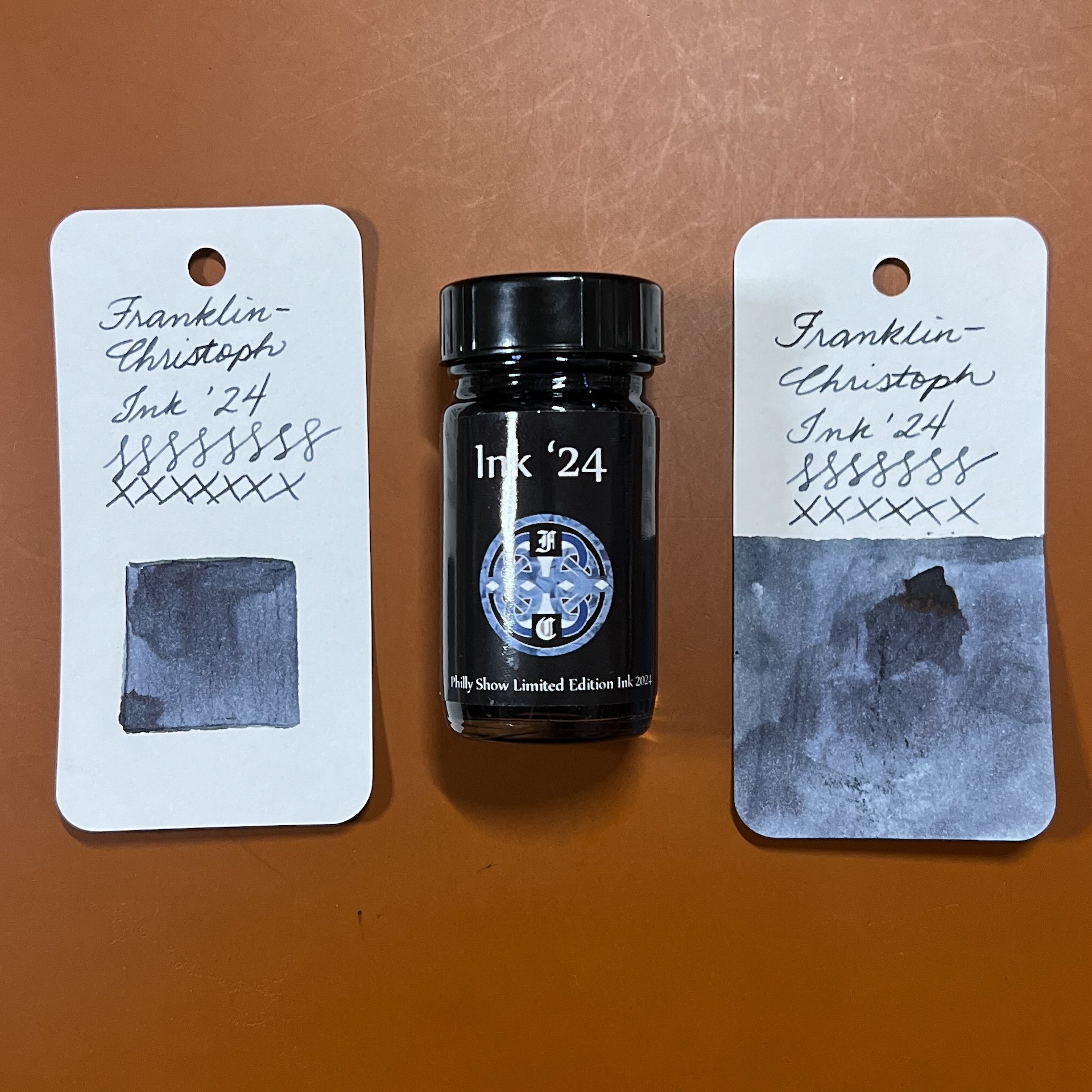
As in the past, all swatches were done on Col-O-Ring cards using a Kakimori steel dip nib and the non-brush end of a paintbrush, while writing samples were done with a TWSBI Go with a Medium nib and a Lamy Vista with a steel Medium nib. The TWSBI Go is a wetter writer and the Lamy is a drier writer, so these two give me a good idea of how an ink will look from different pens. This time around, I also included a writing sample with the Franklin-Christoph 45XL Indigo with a 1.4 nib. The notebook used for writing samples is from Endless Recorder with 68 gsm Tomoe River paper. Dry times may be a bit slower on 52gsm TR or faster on papers like Rhodia, copy paper, Cosmo Air Light or with drier or finer nibs.

Writing sample on 68 gsm Tomoe River Endless Notebook.

You can really see the shading from the Vista compared to the other two nibs.

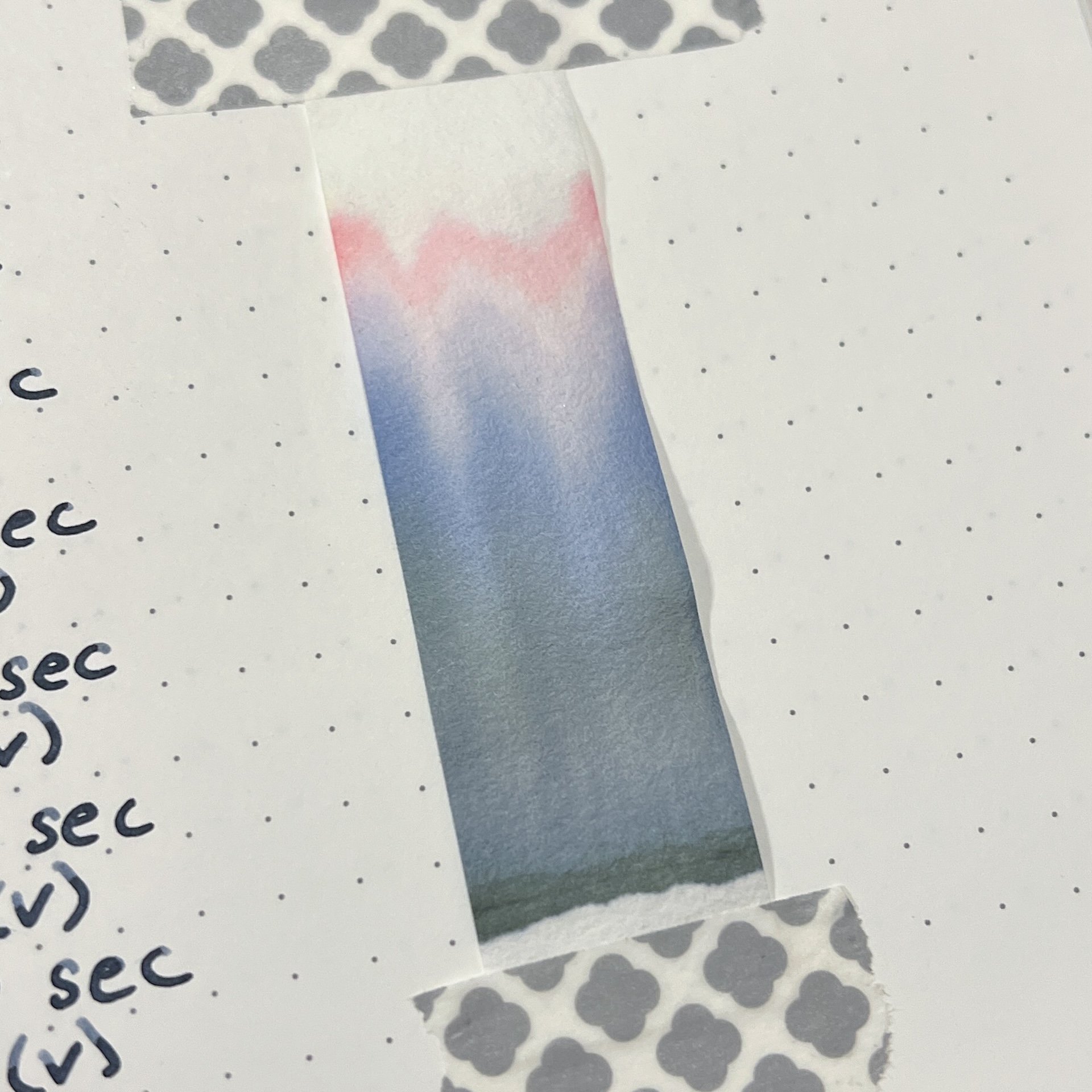
Ink ‘24 Indigo, is a dark blue black ink with a greyish undertone. The grey isn’t as noticeable with wet writers like the TWSBI Go or the 1.4 nib on the F-C, but it is much more visible in the drier Lamy Vista, as well as in the chromatography, swatches and “smears”. There isn’t as much shading unless you’re using a drier writer like the Vista, and there is no sheen in writing samples and only a hint of reddish sheen in wetter swatches.

Chromatography of Ink ‘24 shows the blue grey tones but also pink, which I didn’t expect.

Inks similar to Ink ‘24: Franklin-Christoph Noir et Bleu (not surprising that these would be similar but NeB has a greenish tinge vs Indigo’s grey), Maruzen Athena Blue Black, Taccia Hiroshige Ainezu, Sailor Blue Black, Pelikan Edelstein Tanzanite, Aurora Blue Black and Montblanc Midnight Blue. I think the Maruzen Athena Blue Black is probably the closest but it doesn’t have as much grey as Ink ‘24.

I was a little surprised that I didn’t have more blue black inks that were similar to Ink ‘24. I think it is the grey component that really makes this a moody BB, which I am enjoying. As with the regular line of Franklin-Christoph inks, this one behaved well and was pleasant to use in the three different pens/nibs. I liked the color the most in the Lamy Vista because the grey really comes through, and it didn’t feel super dry in that pen either. You may prefer the color or writing experience that a wetter or drier pen/nib will produce, and that preference might be different depending on the ink/pen combination too.

The ink, which sells for $8.25 for a 1 ounce bottle (~30 ml) sold out at the Philly Pen show but another batch of ink has been added to their website.

(Disclaimer: All inks and pens (and swatch cards/notebooks) were purchased by me.)

Posted on January 26, 2024 and filed under Franklin-Christoph, Ink Reviews.