Posts filed under Ink Reviews

Van Dieman's Tassie Seasons Spring - Macleay's Swallowtail Butterfly Ink Review

(Sarah Read is an author, editor, yarn artist, and pen/paper/ink addict. You can find more about her at her website and on Twitter. And her latest book, Root Rot, is now available for pre-order!)

If you look up photos of a Macleay's Swallowtail Butterfly, you'll see that this is the perfect match for it. A little touch of springtime jewel captured in a bottle.

Graphium macleayanus, the Macleay's swallowtail (via Wikipedia.)

The Van Dieman's Tassie Seasons series has lots of lovely colors. The Spring line dismisses the trend of pastels and instead boasts a number of bright, vibrant colors that I think properly encapsulate the excitement of winter's end.

This color is a vivid, bright green, paler than apple--almost a viper color, or the color of a brand new leaf. Chromatography shows a blend of lime and sea glass colors that can both be spotted when the ink shades, which it does do in a very pretty way. The downside, though, is that this is a very pale ink. It works better as a highlighter color than a writing ink. It definitely puts beauty over practicality, which isn't inherently bad, but it doesn't work super well for me.

Apart from the difficulty in reading the pale color, it behaves well as an ink. As mentioned, the shading is top tier. It also has a reasonable dry time--not fast, but not super slow--at around 25 seconds. It did not feather or bleed, even when the ink was pooled. There was no water resistance--drips erased the lines completely. There is no sheen on this ink, but the layering of the shading is enough of a special effect that sheen isn't missed.

The ink comes in a glass jar with a sturdy base and an opening wide enough to accommodate most pens. The bottle holds 30 ml of ink and sells for around $11, which is a great value for any ink.

I think this ink would be perfect for journal washes or highlighting. And it certainly can be used for writing--you'll just need a good light source when you're reading it later. It's a lovely addition to the Spring lineup and it's making me eager for our own Spring season to bless us with new leaves and bright butterflies.

(Vanness Pens provided this product at a discount to The Pen Addict for review purposes.)


Enjoy reading The Pen Addict? Then consider becoming a member to receive additional weekly content, giveaways, and discounts in The Pen Addict shop. Plus, you support me and the site directly, for which I am very grateful.

Membership starts at just $5/month, with a discounted annual option available. To find out more about membership click here and join us!

Posted on February 15, 2024 and filed under Van Dieman's, Ink Reviews.

Robert Oster Polar Vortex Fountain Pen Ink Review

(Jeff Abbott is a regular contributor at The Pen Addict. You can find more from Jeff online at Draft Evolution and Twitter.)

There are many Robert Oster inks that pay homage to a city or location, but Atlas Stationers have an exclusive ink that is named after a cold weather event in early 2019 that set a lot of temperature records in the area. The cold wave, which originated from the polar vortex further north, caused temperatures in the Chicago area to dip to −23 °F (−31 °C), with a windchill of −52 °F (−47 °C). There's nothing like crazy weather that bands together a community!

Dubbed Polar Vortex, this gray ink with blue and purple tones is offered exclusively by Atlas Stationers and made by Robert Oster. As Atlas describe on the product page, the ink color matches the winter sky. I'm just glad I'm enjoying it from the comfort of my heated home instead of the frigid conditions that it borrows its name from.

Polar Vortex is definitely a gray ink, but there's a delightful amount of purple and blue hues that come through in different light and depending on the amount of ink on the page. Heavy/thick strokes are undeniably dark gray, but there's plenty of medium-gray and gray-purple in the shaded areas. One of the things I enjoy most about Robert Oster inks is the amount of shading, and this one is no slouch. The cold gray tone is definitely a perfect fit for these short winter months.

Despite being a dark ink, there isn't any significant show-through on the back side of Rhodia paper with a wet medium cursive italic nib. On thinner paper, this might be a bit of an issue, but (for my tastes at least) still totally possible to use both sides of the page. The ink also lays down a crisp, sharp line. I haven't noticed any feathering or bleeding. In terms of performance, it behaves just as I expect a Robert Oster ink to behave (meaning, it behaves very well).

Dry time leaves a little to be desired, but it's not terrible. The ink dries in as little as 20 seconds and up to 45 seconds depending on the speed of the stroke and how wide or wet the nib is. I wouldn't recommend this ink for any left-handed writers.

At $18 for a 50ml bottle, the price is similar to what you'll find for any bottle of Robert Oster ink. It's great ink, and the price fits the quality. It's a beautiful gray ink with subtle purple and blue tones, and also a reminder of a rare weather event for the upper mid-west! If it looks interesting to you, you won't be disappointed in how this ink works in your pen or in how it looks on the page.

(Brad bought this ink at a discount from Atlas Stationers during the 2023 Fountain Pen Day event.)


Enjoy reading The Pen Addict? Then consider becoming a member to receive additional weekly content, giveaways, and discounts in The Pen Addict shop. Plus, you support me and the site directly, for which I am very grateful.

Membership starts at just $5/month, with a discounted annual option available. To find out more about membership click here and join us!

Posted on February 14, 2024 and filed under Robert Oster, Ink Reviews.

Ink Showdown: Dominant Industry Goryeo Celadon & Wearingeul Dewy Starlight

(Kimberly (she/her) took the express train down the fountain pen/stationery rabbit hole and doesn't want to be rescued. She can be found on Instagram @allthehobbies because there really are many, many hobbies!.)

When I was at the Atlas Stationer’s Fountain Pen Day event last November, I spent time flipping through their ink swatch binders and saw two inks that I couldn’t decide on: Dominant Industry Goryeo Celadon & Wearingeul Dewy Starlight (I will refer to them as Celadon & Starlight). Normally, I would have had to flip a coin but since the Bossman let me pick some inks for review, I thought, why not both?

Dominant Industry Goryeo Celadon (left) & Wearingeul Dewy Starlight.

Celadon (left) & Starlight bottles.

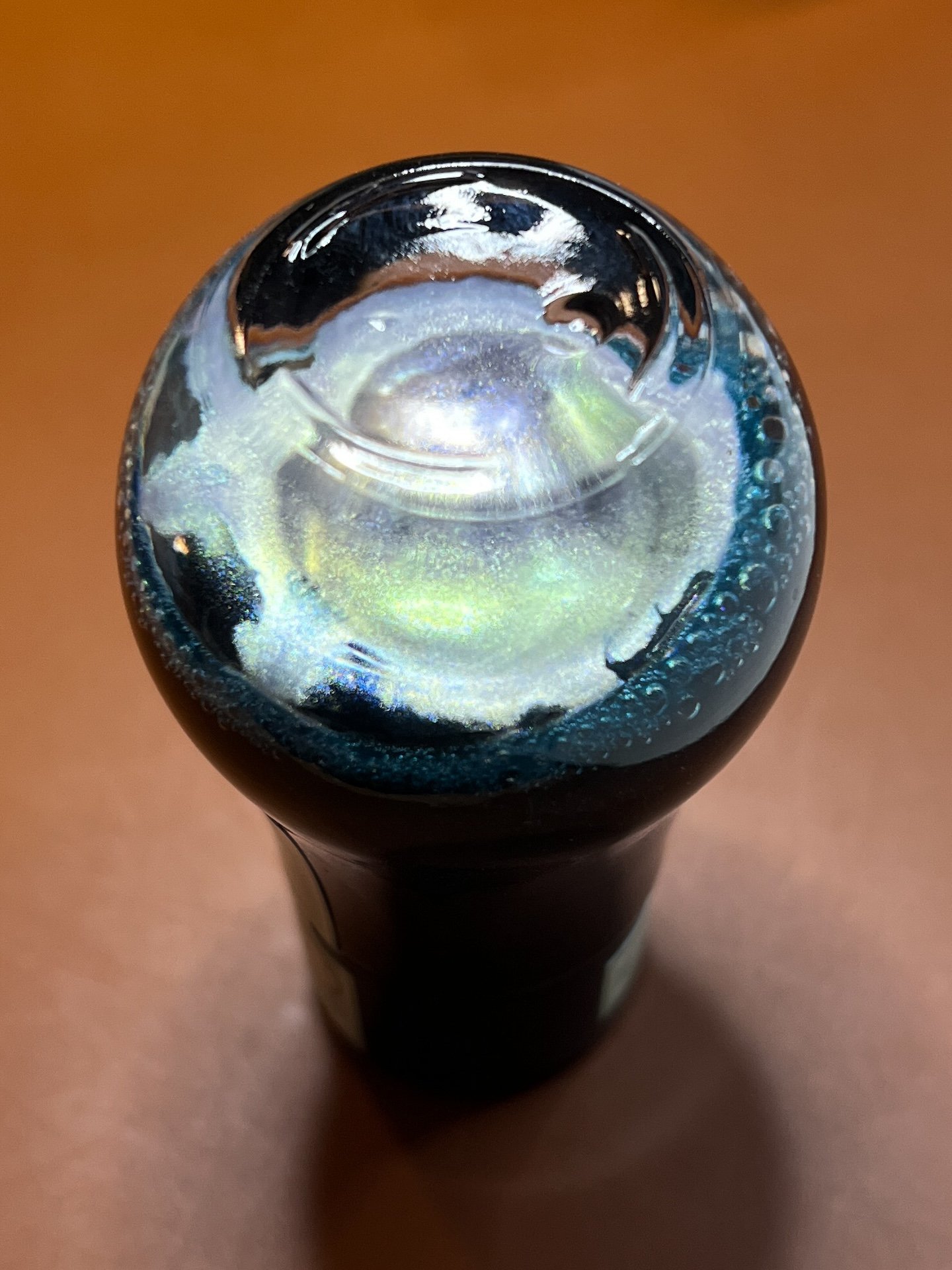
Celadon has an opalescent/silver shimmer.

Starlight’s shimmer is gold.

You’re going to think I am colorblind because the colors on the two boxes aren’t the same. Celadon has minty green packaging and Starlight is dusty blue.

As in the past, all swatches were done on Col-O-Ring cards using a Kakimori steel dip nib and the non-brush end of a paintbrush, while writing samples were done with a TWSBI Go with a Medium nib and a Lamy Vista with a steel Medium nib. The TWSBI Go is a wetter writer and the Lamy is a drier writer, so these two give me a good idea of how an ink will look from different pens. The notebook used for writing samples is from Endless Recorder with 68 gsm Tomoe River paper. Dry times may be a bit slower on 52gsm TR or with wetter nibs or faster on papers like Rhodia, copy paper, Cosmo Air Light or with drier or finer nibs.

Swatches of Celadon (left) and Starlight and now the difference isn’t as obvious as the packaging. Still, you can see that Celadon is a bit lighter and leans a little more green while Starlight is a bit more saturated (albeit barely) and a little more blue.

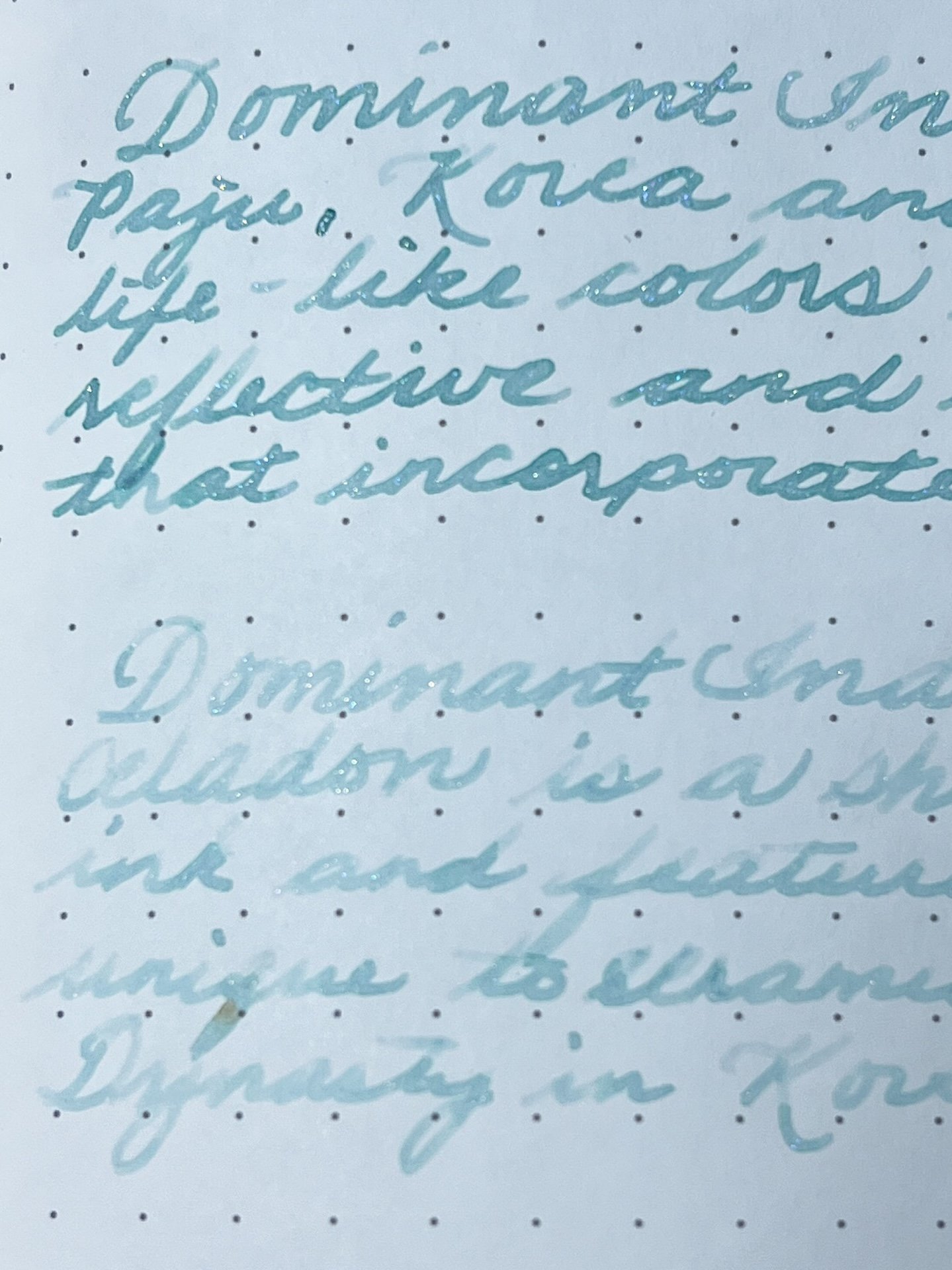
Celadon writing sample on 68 gsm Tomoe River Endless Notebook.

You can really see the difference between the Go and the Vista.

Celadon chromatography shows a bit of yellow near the line and faint blue shading above it, but that’s about it.

Celadon is a nice minty, muted pale green with opalescent silver shimmer in a wet writer like the TWSBI Go, but in the Lamy Vista, it is almost unreadable and there is barely any shimmer (I shake the bottle before filling each pen). The shimmer makes this ink look bluer than it really is.

Starlight writing sample on 68 gsm Tomoe River Endless Notebook.

Much like Celadon, Starlight is almost unreadable with the Vista.

The golden shimmer of Starlight makes this slightly bluer ink look greener than it really is. This is the opposite of Celadon which looks bluer because of the shimmer! This is probably why the two inks look much more similar when swatched than from the packaging. Like Celadon, Starlight is almost unreadably light in the Vista and hardly has any shimmer. The shimmer is much more pronounced in Starlight with the Go. Both inks had an average dry time of 30-40 seconds. The chromatography is subtle, with undertones of pink near the line and spreading out to light blue as expected.

Similar inks include Pennonia Zuzmo Lichen , Celadon, Sailor Ink Studio 162 , Starlight, Vinta Inks Perya, Pennonia Patina, Visconti Self Portrait, Wearingeul Wuthering Heights, Kobe 68 Nishimaiko Pearl Blue and Sailor Manyo Haha.

I don’t usually gravitate towards lighter inks so I don’t have any inks that are dupes but there are some similar ones like Pennonia Patina for Celadon and Vinta Perya for Starlight, though neither of them are shimmer inks.

And a little bonus - I decided to start using the Wearingeul swatch cards for my Wearingeul inks, so I decided to swatch Starlight on the Wearingeul Puppy Swatch Cards which I had ordered from Atlas.

Used the TWSBI Go to write the name of the Starlight ink.

I used the paintbrush to spread the ink over the design. Puppy looks like it should be named “Spot.” 🙂

After the swatch was dry, I wiped the puppy’s face and now we have a happy dog!

The cost of the two inks are comparable - you can get a 25ml of Dominant Industry Goryeo Celadon for $20 or 30ml of Wearingeul Dewy Starlight for $22.

Now that I’ve swatched and written with both inks, if I had to pick just one, I’d go with Wearingeul Dewy Starlight over the Dominant Industry Goryeo Celadon. The Starlight is slightly wetter (noticeable during swatching as well as writing), is a bit darker and therefore, easier to read, and it also has more shimmer. Both inks need a wetter pen/nib to really shine and the Lamy Vista showed that it definitely isn’t the right pen for either of these inks.

(Disclaimer: Both inks were purchased at a discount from Atlas Stationers during their Fountain Pen Day event and the swatch cards were ordered on my own, also from Atlas.)

Posted on February 9, 2024 and filed under Dominant Industry, Wearingul, Ink Reviews.