Posts filed under Ink Reviews

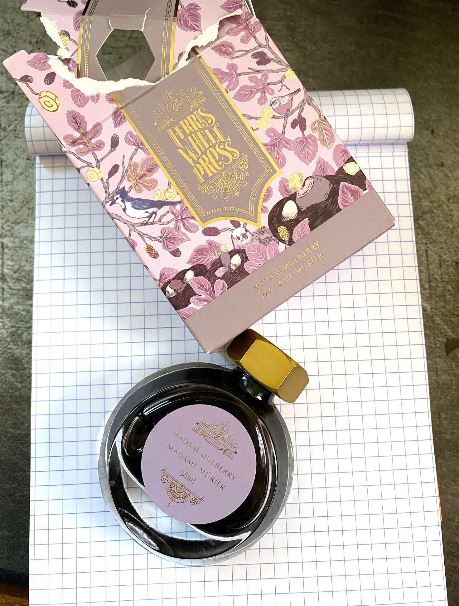
Ferris Wheel Press Madam Mulberry Ink Review

(Sarah Read is an author, editor, yarn artist, and pen/paper/ink addict. You can find more about her at her website and on Twitter. And her latest book, Root Rot, is now available for pre-order!)

I don't often buy ink anymore because I likely have enough ink that I'll never use it all before I die, even if I live to be 150. But every now and then, a color calls to me, and, well. That's what happened here with Madam Mulberry. I got too close to the Atlas Stationers booth at the Chicago Pen Show. It happens.

Ferris Wheel Press has made quite a splash with their ink offerings the past few years. They have fun, creative colors, elegantly designed packaging, and reasonable prices.

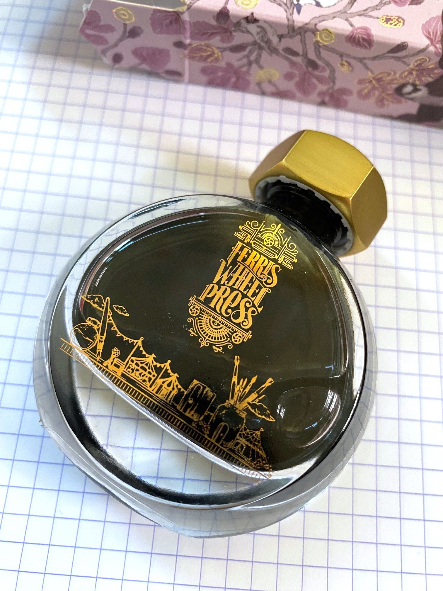
To get my only criticism out of the way up front, that elegant packaging drove me bananas. The cardboard box was like a puzzle box that I ended up just hulking open. The beautiful bottle is too narrow to be sturdy, with an opening too small for nearly any pen, and the lid doesn't seal as well as I'd like, which led to some leaking. This bottle is the high heels of ink bottles--lovely, but hardly functional.

But once you get past the box and the bottle, you get to the beautiful ink, and that's the whole point.

If you could bottle Victorian Gothic, it would be this. It's a soft, smokey purple-rose color that looks like antique dried flowers. Chromatography shows a lilac base with pink, gold, and sky blue all making color magic together. The overall tone has a lot of character that looks different depending on the angle, lighting, pen, and paper you use.

In addition to lots of subtle color shifts, the ink shades beautifully. The dark spots show an almost grey color with a hint of lilac, and the pale spots are a light amethyst. It can be a bit faint for reading in low light when used with a fine nib, but unless you're a nocturnal creature writing by candlelight, you should be fine. I was fine just adding an extra candle.

The ink does have a bit of a dry feel to it when writing, and it has a quick dry time of just over 15 seconds. It's not unpleasantly dry, though. It had some resilience when faced with water spills, as well. It washed out a bit, but some faint lines were still visible.

Overall, it's a great writing experience, and this is one of my favorite ink colors. I purchased it for $22, which is a fair price for 38ml of lovely ink. It's not inexpensive, but it's not the most expensive, either. I would definitely try other FWP inks based on this experience, though I'll likely decant them into a different container for use. In any case, I'm looking forward to getting too close to the Atlas table again this year, and hopefully coming home with another ink to try.

(I purchased this ink at regular price from Atlas Stationers at the 2023 Chicago Pen Show.)


Enjoy reading The Pen Addict? Then consider becoming a member to receive additional weekly content, giveaways, and discounts in The Pen Addict shop. Plus, you support me and the site directly, for which I am very grateful.

Membership starts at just $5/month, with a discounted annual option available. To find out more about membership click here and join us!

Posted on February 22, 2024 and filed under Ferris Wheel Press, Ink Reviews.

Van Dieman's Tassie Seasons Spring - Macleay's Swallowtail Butterfly Ink Review

(Sarah Read is an author, editor, yarn artist, and pen/paper/ink addict. You can find more about her at her website and on Twitter. And her latest book, Root Rot, is now available for pre-order!)

If you look up photos of a Macleay's Swallowtail Butterfly, you'll see that this is the perfect match for it. A little touch of springtime jewel captured in a bottle.

Graphium macleayanus, the Macleay's swallowtail (via Wikipedia.)

The Van Dieman's Tassie Seasons series has lots of lovely colors. The Spring line dismisses the trend of pastels and instead boasts a number of bright, vibrant colors that I think properly encapsulate the excitement of winter's end.

This color is a vivid, bright green, paler than apple--almost a viper color, or the color of a brand new leaf. Chromatography shows a blend of lime and sea glass colors that can both be spotted when the ink shades, which it does do in a very pretty way. The downside, though, is that this is a very pale ink. It works better as a highlighter color than a writing ink. It definitely puts beauty over practicality, which isn't inherently bad, but it doesn't work super well for me.

Apart from the difficulty in reading the pale color, it behaves well as an ink. As mentioned, the shading is top tier. It also has a reasonable dry time--not fast, but not super slow--at around 25 seconds. It did not feather or bleed, even when the ink was pooled. There was no water resistance--drips erased the lines completely. There is no sheen on this ink, but the layering of the shading is enough of a special effect that sheen isn't missed.

The ink comes in a glass jar with a sturdy base and an opening wide enough to accommodate most pens. The bottle holds 30 ml of ink and sells for around $11, which is a great value for any ink.

I think this ink would be perfect for journal washes or highlighting. And it certainly can be used for writing--you'll just need a good light source when you're reading it later. It's a lovely addition to the Spring lineup and it's making me eager for our own Spring season to bless us with new leaves and bright butterflies.

(Vanness Pens provided this product at a discount to The Pen Addict for review purposes.)


Enjoy reading The Pen Addict? Then consider becoming a member to receive additional weekly content, giveaways, and discounts in The Pen Addict shop. Plus, you support me and the site directly, for which I am very grateful.

Membership starts at just $5/month, with a discounted annual option available. To find out more about membership click here and join us!
Posted on February 15, 2024 and filed under Van Dieman's, Ink Reviews.

Robert Oster Polar Vortex Fountain Pen Ink Review

(Jeff Abbott is a regular contributor at The Pen Addict. You can find more from Jeff online at Draft Evolution and Twitter.)

There are many Robert Oster inks that pay homage to a city or location, but Atlas Stationers have an exclusive ink that is named after a cold weather event in early 2019 that set a lot of temperature records in the area. The cold wave, which originated from the polar vortex further north, caused temperatures in the Chicago area to dip to −23 °F (−31 °C), with a windchill of −52 °F (−47 °C). There's nothing like crazy weather that bands together a community!

Dubbed Polar Vortex, this gray ink with blue and purple tones is offered exclusively by Atlas Stationers and made by Robert Oster. As Atlas describe on the product page, the ink color matches the winter sky. I'm just glad I'm enjoying it from the comfort of my heated home instead of the frigid conditions that it borrows its name from.

Polar Vortex is definitely a gray ink, but there's a delightful amount of purple and blue hues that come through in different light and depending on the amount of ink on the page. Heavy/thick strokes are undeniably dark gray, but there's plenty of medium-gray and gray-purple in the shaded areas. One of the things I enjoy most about Robert Oster inks is the amount of shading, and this one is no slouch. The cold gray tone is definitely a perfect fit for these short winter months.

Despite being a dark ink, there isn't any significant show-through on the back side of Rhodia paper with a wet medium cursive italic nib. On thinner paper, this might be a bit of an issue, but (for my tastes at least) still totally possible to use both sides of the page. The ink also lays down a crisp, sharp line. I haven't noticed any feathering or bleeding. In terms of performance, it behaves just as I expect a Robert Oster ink to behave (meaning, it behaves very well).

Dry time leaves a little to be desired, but it's not terrible. The ink dries in as little as 20 seconds and up to 45 seconds depending on the speed of the stroke and how wide or wet the nib is. I wouldn't recommend this ink for any left-handed writers.

At $18 for a 50ml bottle, the price is similar to what you'll find for any bottle of Robert Oster ink. It's great ink, and the price fits the quality. It's a beautiful gray ink with subtle purple and blue tones, and also a reminder of a rare weather event for the upper mid-west! If it looks interesting to you, you won't be disappointed in how this ink works in your pen or in how it looks on the page.

(Brad bought this ink at a discount from Atlas Stationers during the 2023 Fountain Pen Day event.)


Enjoy reading The Pen Addict? Then consider becoming a member to receive additional weekly content, giveaways, and discounts in The Pen Addict shop. Plus, you support me and the site directly, for which I am very grateful.

Membership starts at just $5/month, with a discounted annual option available. To find out more about membership click here and join us!

Posted on February 14, 2024 and filed under Robert Oster, Ink Reviews.