Posts filed under Ink Reviews

Troublemaker Ink Mango Review

(Sarah Read is an author, editor, yarn artist, and pen/paper/ink addict. You can find more about her at her website and on Twitter. And her latest book, Root Rot, is now available for pre-order!)

I had to chisel my car out of ice this morning, so let's #KillWinterWithOrange. And this is a glorious orange.

Mango is the first ink I've tried from Troublemaker, so I was excited to dive in. The ink comes in a tall, rectangular plastic bottle with a narrow top. It may be a bit narrow for very wide pens, but it fit a standard width pen. The plastic bottle is lighter than glass ones, so it is a wee bit easier to knock over, which I almost did once, when filling. The bottle's shape is very convenient for storage, though. One could line up a lot of bottles in less shelf space than with thicker glass bottles with low profiles. The bottle looks small, but contains a whopping 60ml of ink. So while it's not my favorite bottle, it is one of the most practical for ink hoarding purposes.

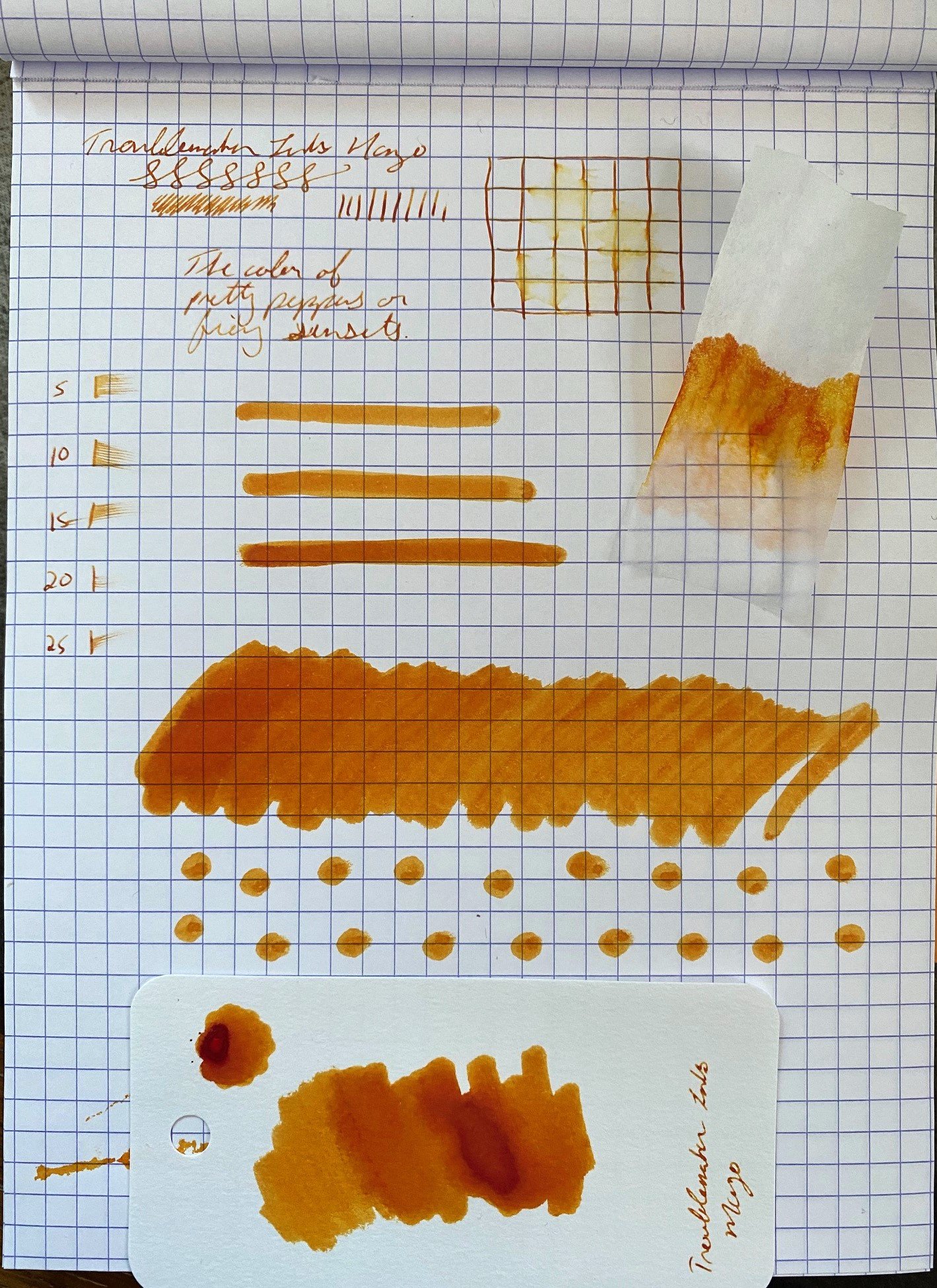
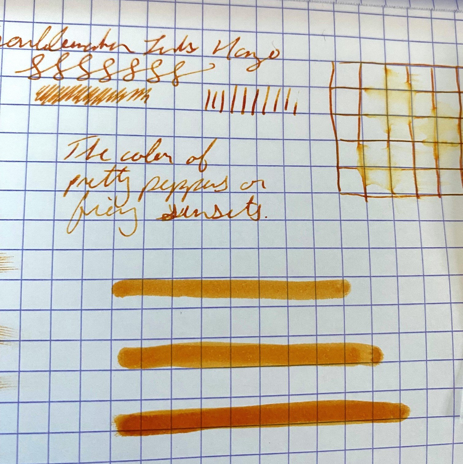
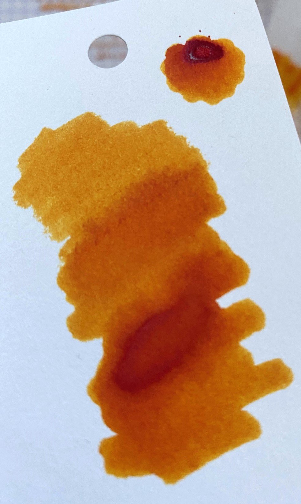
Of course, it's what's inside the bottle that really counts. This ink is one for the stunningly shading, fiery, peppery, sunset family of oranges. The ones everyone goes bananas for, and for good reason. Where the ink is shallow, it's a pale mango color, but where it pools, it's a rich red-orange, and where it really pools, it's blaze red. Even where it's pale, it's very readable, and the shading makes for a visually fun effect. There is no shimmer, but that would be too much, given how much character the ink already has.

Chromatography showed what looked like an actual sunset--some soft peach hues with golds and orange.

The ink has very good flow, on the wetter side. It moves with less viscosity than some inks I've used, with drops of ink behaving more like water than many inks. Despite this, it didn't seem any more prone to feathering or bleeding.

Dry time was a bit long, close to 30 seconds. With dry times that long, I tend to reach for blotting paper more, but blotting this ink takes away some of that fabulous shading, so it's one of those times it's worth exercising a little ink-patience.

There was no water resistance, with the lines totally wiped out by a drop of water. Keep your cuppa tea away from these pages.

The 60ml bottle sells for $16.50 at Vanness Pens, which is a very good price. I will definitely be trying more Troublemaker inks. In fact--I inked up another today that looks just as promising. At this rate, I might just have to see how many of those bottles I can fit on a shelf.

(Vanness Pens provided this product at a discount to The Pen Addict for review purposes.)


Enjoy reading The Pen Addict? Then consider becoming a member to receive additional weekly content, giveaways, and discounts in The Pen Addict shop. Plus, you support me and the site directly, for which I am very grateful.

Membership starts at just $5/month, with a discounted annual option available. To find out more about membership click here and join us!

Posted on February 29, 2024 and filed under Troublemaker Inks, Ink Reviews.

Dominant Industry Soleil Couchant à Etretat Ink Review

(Jeff Abbott is a regular contributor at The Pen Addict. You can find more from Jeff online at Draft Evolution and Twitter.)

Named after a Monet painting, Dominant Industry's Soleil Couchant à Etretat ink is a lovely shimmer ink with a dark blue-green color that looks fantastic.

I love when an ink is named after something else that it draws inspiration from. Whether it be colors found in nature on animals, in landscapes, or from famous works of art, I really like see what colors and other properties an ink maker focuses on when matching a name to an ink. In this case, the Monet painting of a famous French coast landmark is a beautiful starting point to draw inspiration for an ink color. To me, the color and subdued shimmer quality echo the peaceful water in the painting.

The blue-green ink color presents like any other ink — meaning the shimmer effect isn't immediately noticeable. The medium green-blue hue looks great on paper. Since it isn't a dark color, it's easy to see the greens and blues when writing with a normal nib. But you get more shading between medium to dark greens and blues when using a larger nib. The shading isn't dramatic, but there's enough of it there to mimic the characteristics of moving water.

This ink is part of Dominant Industry's Pearl Series, which is a line of shimmering inks. I'm not a huge fan of shimmering inks, but they're fun in small doses. With the shimmering inks I've tried in the past, there's no way you can miss the shimmering quality when using the ink — regardless of how small the nib is. With Soleil Couchant à Etretat, the shimmer is minimal. You have to search for it under a good light to find it in normal writing. But, it somehow still manages to catch just enough light to make one of two spots twinkle as your perspective changes in relation to the piece of paper. This intangible "is it shimmering or not" effect is really cool. Since this is the first ink I've experienced with such a dialed-back sparkle factor, I'm second-guessing my original stance on shimmering inks. The effect is subdued and only pops out every once in a while. Again, this really echoes the source material in my mind.

Writing with the ink is also a great experience. It's a touch on the dry side in terms of flow, but it can keep up with fast-paced writing. It just doesn't feel as slick or lubricated as most inks. In terms of performance, I can't point to any degradation — just the sense of the nib dragging just a hair.

In what seems like forever, this is an ink that actually dries fairly quickly. In most cases, the ink is dry to the touch and smudge-proof in a 20-second window. Some spots may need 30 seconds to fully dry, but it's mostly dry in 20 seconds or less, making this a good choice for quick notes in a notebook that you plan on closing shortly after writing something down. It's not quick enough to really qualify as a good ink for left-handed writers, but it's worth consideration if the color and shimmer qualities speak to you.

Soleil Couchant à Etretat comes in a 25ml bottle for $17, and there are several other inks in the Pearl Series as well. I'm really curious if the other inks in this series are also minimally shimmery or if it's just this one. Either way, this is such a lovely color that shades well and dries quickly — it's worth picking up just for those properties alone.

(Goldspot provided this product at a discount to The Pen Addict for review purposes.)


Enjoy reading The Pen Addict? Then consider becoming a member to receive additional weekly content, giveaways, and discounts in The Pen Addict shop. Plus, you support me and the site directly, for which I am very grateful.

Membership starts at just $5/month, with a discounted annual option available. To find out more about membership click here and join us!

Posted on February 28, 2024 and filed under Dominant Industry, Ink Reviews.

Ferris Wheel Press Madam Mulberry Ink Review

(Sarah Read is an author, editor, yarn artist, and pen/paper/ink addict. You can find more about her at her website and on Twitter. And her latest book, Root Rot, is now available for pre-order!)

I don't often buy ink anymore because I likely have enough ink that I'll never use it all before I die, even if I live to be 150. But every now and then, a color calls to me, and, well. That's what happened here with Madam Mulberry. I got too close to the Atlas Stationers booth at the Chicago Pen Show. It happens.

Ferris Wheel Press has made quite a splash with their ink offerings the past few years. They have fun, creative colors, elegantly designed packaging, and reasonable prices.

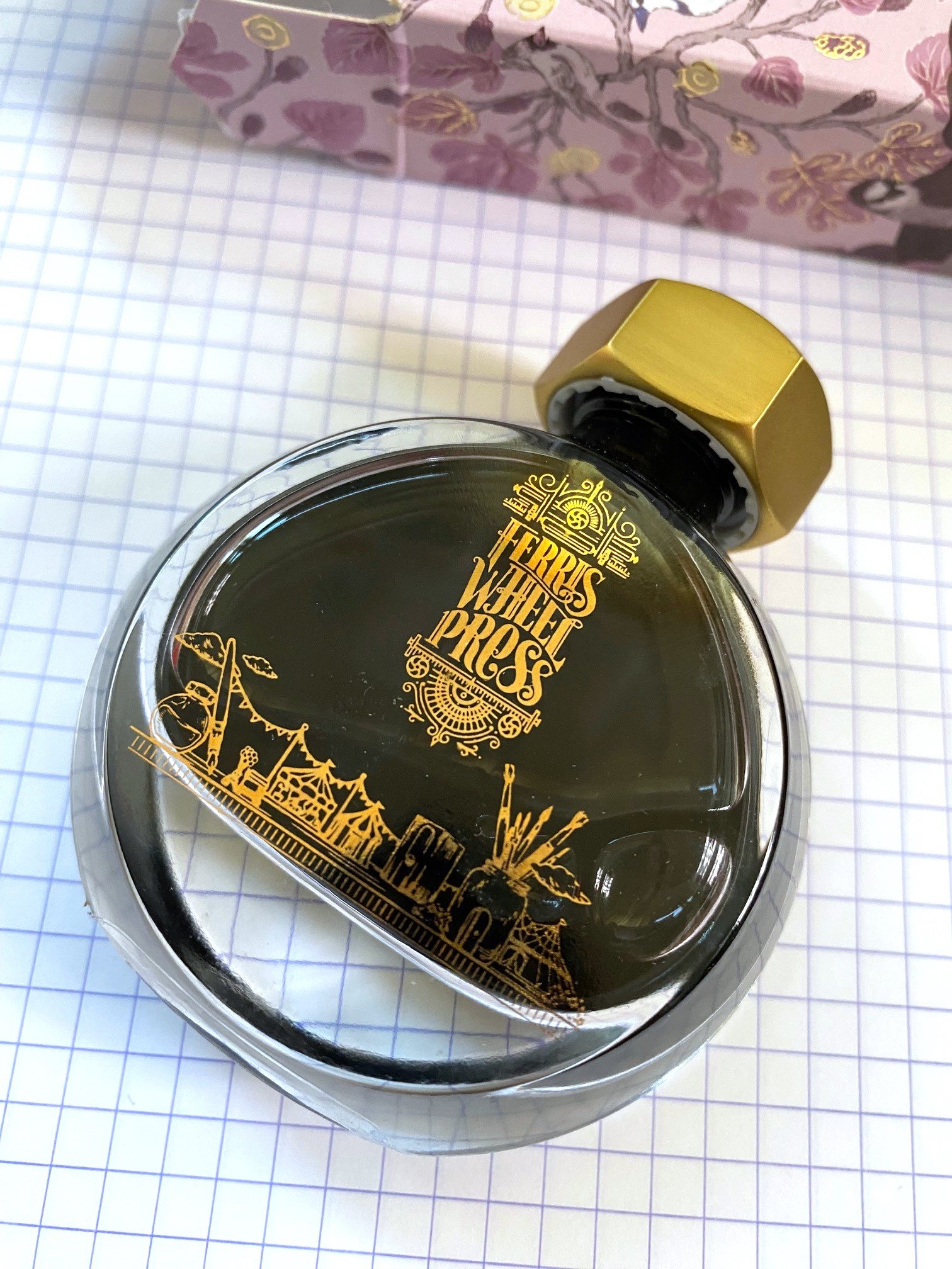
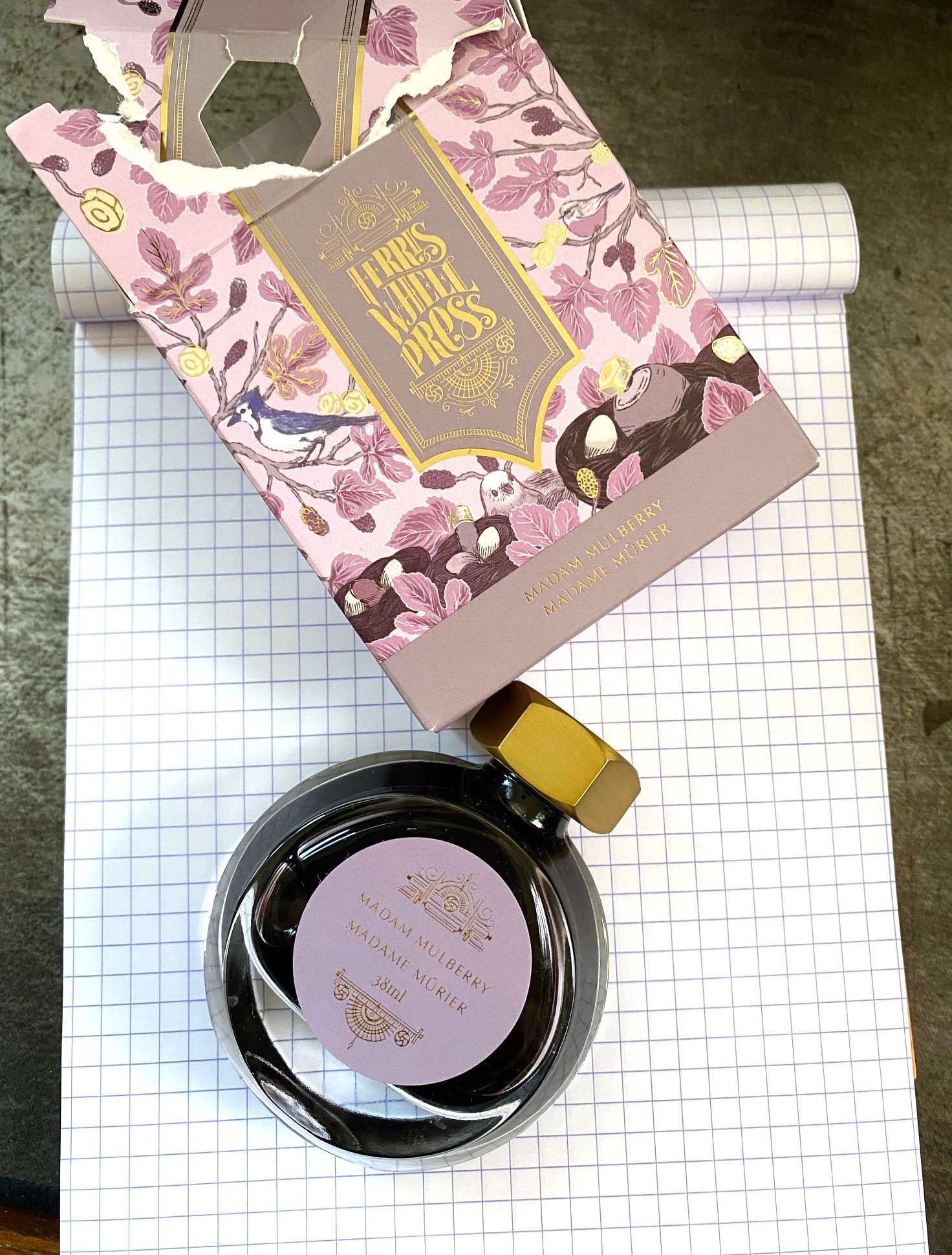
To get my only criticism out of the way up front, that elegant packaging drove me bananas. The cardboard box was like a puzzle box that I ended up just hulking open. The beautiful bottle is too narrow to be sturdy, with an opening too small for nearly any pen, and the lid doesn't seal as well as I'd like, which led to some leaking. This bottle is the high heels of ink bottles--lovely, but hardly functional.

But once you get past the box and the bottle, you get to the beautiful ink, and that's the whole point.

If you could bottle Victorian Gothic, it would be this. It's a soft, smokey purple-rose color that looks like antique dried flowers. Chromatography shows a lilac base with pink, gold, and sky blue all making color magic together. The overall tone has a lot of character that looks different depending on the angle, lighting, pen, and paper you use.

In addition to lots of subtle color shifts, the ink shades beautifully. The dark spots show an almost grey color with a hint of lilac, and the pale spots are a light amethyst. It can be a bit faint for reading in low light when used with a fine nib, but unless you're a nocturnal creature writing by candlelight, you should be fine. I was fine just adding an extra candle.

The ink does have a bit of a dry feel to it when writing, and it has a quick dry time of just over 15 seconds. It's not unpleasantly dry, though. It had some resilience when faced with water spills, as well. It washed out a bit, but some faint lines were still visible.

Overall, it's a great writing experience, and this is one of my favorite ink colors. I purchased it for $22, which is a fair price for 38ml of lovely ink. It's not inexpensive, but it's not the most expensive, either. I would definitely try other FWP inks based on this experience, though I'll likely decant them into a different container for use. In any case, I'm looking forward to getting too close to the Atlas table again this year, and hopefully coming home with another ink to try.

(I purchased this ink at regular price from Atlas Stationers at the 2023 Chicago Pen Show.)


Enjoy reading The Pen Addict? Then consider becoming a member to receive additional weekly content, giveaways, and discounts in The Pen Addict shop. Plus, you support me and the site directly, for which I am very grateful.

Membership starts at just $5/month, with a discounted annual option available. To find out more about membership click here and join us!
Posted on February 22, 2024 and filed under Ferris Wheel Press, Ink Reviews.