Posts filed under Ink Reviews

Octopus Fluids Unicorn Fountain Pen Ink Review

(Jeff Abbott is a regular contributor at The Pen Addict. You can find more from Jeff online at Draft Evolution and Twitter.)

It's not often that you see the word "Unicorn" in a product name, but experience has taught me to get excited if I do see it — especially in stationery products. Unicorns are magical creatures, so the bar is high if you want to use the name in a product.

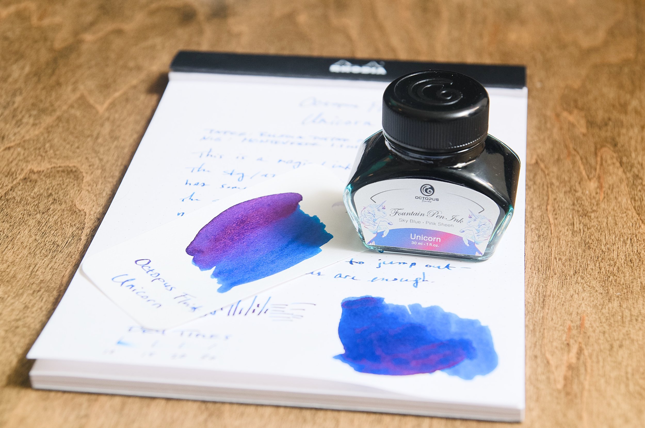
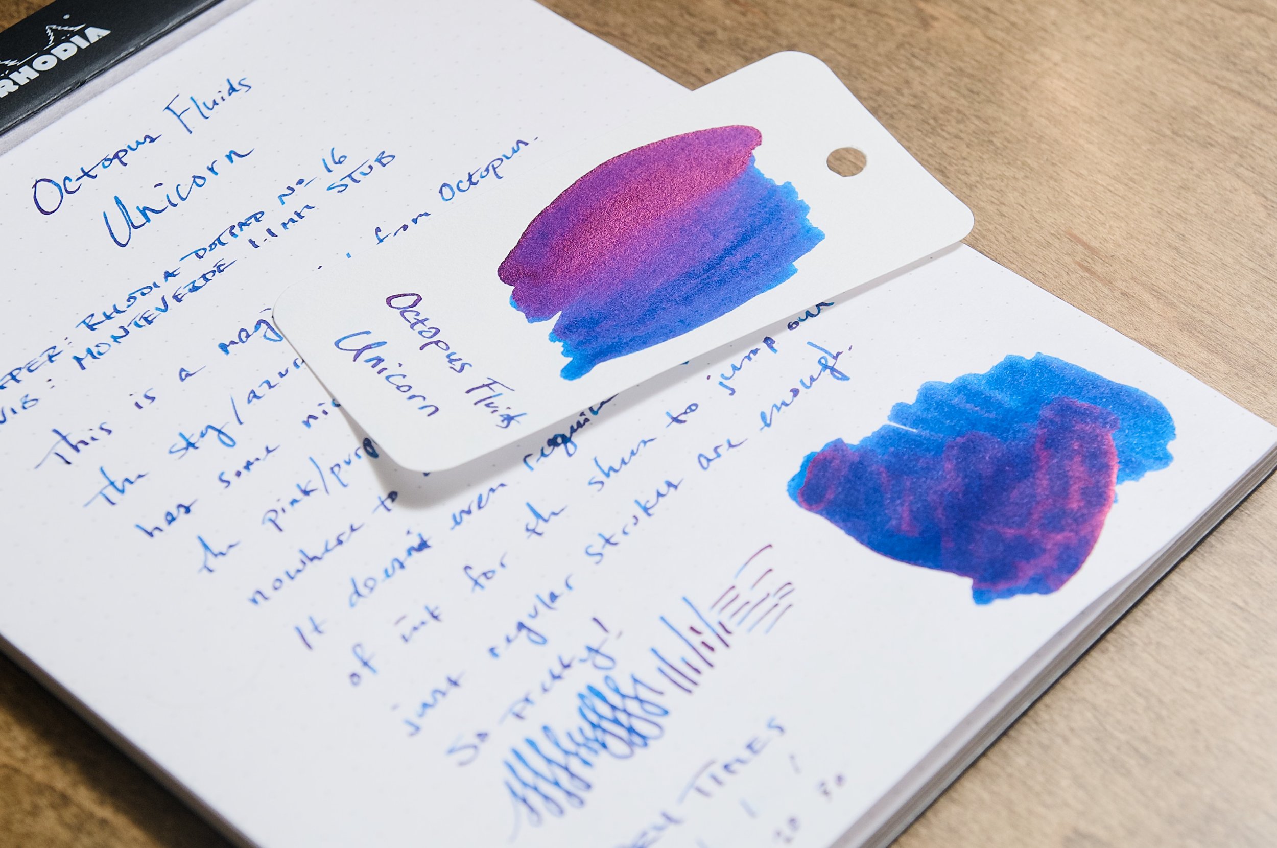
Unicorn blue from Octopus Fluids is a gorgeous medium blue ink with loads of shading, but it also has a secret magical feature that blew me away. There's gobs of pink/purple sheen that you can easily see once this ink has dried. With lots of inks that have high sheen, you need to use a large, wet nib to really get the benefit of the sheening effect. That's not the case with Unicorn. The pink/purple sheen comes through with ease in normal writing — not just large ink swatches.

I've only used a couple of inks from Octopus in the past, but my experience so far has been great. Unicorn is no exception when it comes to the basic ink behaviors. The flow is fantastic and even a bit on the wet side. The ink is nicely lubricated and glides across the page with ease. I haven't seen any feathering or bleeding, and the ink doesn't show through on the back side of the page very much either. Shockingly, even the dry time is shorter than I expected. In most cases, the ink is most dry by the 20-second mark, but certainly by 30 seconds.

As a blue ink, it's a winner. It's a deeply saturated blue that looks great on its own. The shading and sheen only add to the fantastic baseline color. I'd describe the color as a dark cobalt. There's a lovely level of shading that adds character and depth to the rich blues, and it looks great when writing with a wide or stub nib.

Once the ink dries, the pink/purple sheen starts to pop off of the page. With all sheening inks, one of the easiest ways to accentuate their effect is to move the source of light around the page so you can see all the different ways the ink and light interact. You can't see the sheen in dim light or soft indirect light, but it really comes to life when the ambient light is bright or if there is direct light hitting it. As you move around, it's easy to notice how the colors shift in the characters on the page. It really is magical, and I can't get enough of it. This effect beats out shimmer inks any day of the week (in my humble opinion).

It seems like there are so many ink makers that are worth being excited about at this point in time. It's honestly overwhelming, but that's such a good thing. Unicorn is another ink in my list of favorite inks, and I look forward to using it for my own pleasure, but also to see the responses from other people when they see the ink dance in front of their eyes like some magical creature that only exists in our collective imagination.

Octopus Unicorn is $20 for a 30ml bottle, but you can also snag a sample vial to try out first. I try to be objective and understand that not everyone likes the same things or has the same needs from their stationery and tools. That still applies here, but I'm finding it very difficult to refrain from making a universal, absolute recommendation on this ink. It's a great ink, and you should buy it if you find it in stock.

(Vanness Pens provided this product at a discount to The Pen Addict for review purposes.)


Enjoy reading The Pen Addict? Then consider becoming a member to receive additional weekly content, giveaways, and discounts in The Pen Addict shop. Plus, you support me and the site directly, for which I am very grateful.

Membership starts at just $5/month, with a discounted annual option available. To find out more about membership click here and join us!

Posted on March 20, 2024 and filed under Octopus Fluids, Ink Reviews.

Lamy Dark Lilac 2024 vs The Original Lamy Dark Lilac 2016

(Kimberly (she/her) took the express train down the fountain pen/stationery rabbit hole and doesn't want to be rescued. She can be found on Instagram @allthehobbies because there really are many, many hobbies!.)

Since its release in 2016, Lamy Dark Lilac has been a beloved and highly sought-after ink. Aside from it being a beautiful shade of dark purple, it also had a bit of a slight gold sheen, which was quite uncommon at the time. Since it sold out pretty quickly, inkophiles have been begging, hoping, wishing, and praying for a re-release of the Lamy Dark Lilac ink and were shocked when they found it listed for sale on the German Lamy website. There had been no announcements made about the re-release of this ink, so people speculated that maybe it was a typo or maybe a tease of things to come?!? It also coincided with their annual release of limited edition Safaris, so maybe it was just being confused for Violet Blackberry? Turns out, it was a re-release of Lamy Dark Lilac, so everyone (including me) was excited to find out if it was the same formulation as the original 2016. TLDR/Spoiler Alert: it’s not the same because one of the ink components is no longer allowed .

There’ve been an abundance of posts and articles written about all of this, to the point that it made it to the New York Times (you need to be a NYT subscriber to read the full article.) Talk about mainstream news! If you’re interested in finding out more about this check out Aidan Bernal’s video as well as the series of #lamygate posts from FountainPenMemes starting with this one.

As a hoarder, I mean, owner of several bottles and cartridge packs of the original Lamy Dark Lilac (which I will refer to as OG or 2016), I was really curious to see how the two inks compared, so let’s dive right in!

One of the ways you can tell if you have the 2016 (left) vs 2024 versions of Lamy Dark Lilac is from the box. Limited Edition inks always have solid colored side (and bottom) panels. The colored circle on top (see below) as well as the bottle on the front are also slightly different shades of purple.

Let’s have some more fun into the guessing game by throwing in one of this year’s LE inks, Violet Blackberry (top), which has yet another shade of purple on top/sides.

I’m surprised that the price tag on the OG is still there! The underside colors match the rest of the boxes, whether it be LDL, silver or Violet Blackberry.

The tops of the bottles have no major distinguishing features, so you can’t tell from the top which are the LE ones. The bottle caps of 2016 and 2024 did appear to be identical so I kept them apart at all times and boxed each one immediately after use because I definitely didn’t want to get those mixed up.

I had originally swatched LDL 2016 around 2017/2018 when I had gotten the ink and decided to swatch it again, just to see if the color had changed (it hadn’t). I also swatched Violet Blackberry to see if it was close to either the old or new LDL. This review won’t include that ink.

Original Lamy Dark Lilac 2016 swatch from ~2017/18 (left), same bottle swatched again (middle) and the new 2024 LDL (right). The gold sheen of 2016 is visible primarily in swatches and is more subtle than 2024’s more dominant green sheen.

Same as above but with Violet Blackberry, which is a darker purple with gold/bronze sheen vs LDL 2024’s green sheen.

All swatches were done on Col-O-Ring cards using a Kakimori steel dip nib and the non-brush end of a paintbrush, while writing samples were done with two TWSBI Go with Medium nibs and different Lamy’s with steel Medium nib. Both TWSBI Go pens are wetter than the Lamy’s, and the Lamy Dark Lilac Safari Medium nib writes drier than the Al-Star Lilac, I suspect that the black plated nib on the Safari is the reason why. Usually I just use the Endless Recorder with 68 gsm Tomoe River paper, but this time I included 52 gsm Tomoe River Paper (old) as well as 75 gsm Cosmo Air Light and 80 gsm Rhodia DotPad. Dry times may be a bit slower on 52gsm TR or with wetter nibs or faster on papers like Rhodia, copy paper, Cosmo Air Light or with drier or finer nibs.

Lamy Dark Lilac 2016 writing sample and dry times on TR 68. I just had to put this ink in the Lamy Safari Dark Lilac LE pen from 2016! I also chose the clear TWSBI Go as usual.

A light pink to purple chromatography with some magenta near the top.

You can really see the difference in the 2016 ink color with the drier Safari nib vs the wetter Go nib. The dry times were pretty fast with the Safari nib. Other than on the larger swatches, I was unable to get much, if any, gold sheen in my writing samples.

The biggest difference with the 2024 LDL is the presence of the green sheen. It dried a touch faster than the OG. I picked the aptly named Lamy AL-Star Violet for 2024 LDL along with the blue TWSBI Go, both with Medium nibs.

Even after smearing with my finger, you can see the sheen left behind. I also smeared the times on the right after all the dry tests were done and nothing smeared, which is awesome.

A brighter pink dominates the 2024’s chromatography.

Side by side, the 2016’s pink is a little pastel, with a tinge of coral, while 2024’s hot pink is hard to ignore. Up top, the shades of purple are similar but not quite the same - 2024 has a touch more blue compared to 2016.

Writing sample on 80gsm Rhodia DotPad: the two Lamy’s (top 2) and two TWSBI Go’s (bottom 2). In both cases, the 2024 LDL is a bit darker than the OG.

Writing samples on 75 gsm Cosmo Air Light (top) and 52 gsm TR. CAL eats a bit of OG’s gold sheen, but you can see it on the 52 gsm TR. 2024’s green sheen is present on both.

Writing samples on 68 gsm TR: Top line swatch is 2016, bottom line is 2024. I alternated lines in the writing sample and it’s fairly obvious which one is which, due to the green sheen of 2024.

Some inks that are similar to LDL include: DeAtramentis Alexander Hamilton (aka Aubergine, Puccini, etc.), Diamine Purple Dream (which has gold shimmer), Diamine Pansy, Sailor Ink Studio 935 (Pansy and 935 are the most frequently mentioned as OG LDL stand-ins), and Kiwi Ink A Witch’s Potion is similar to LDL 2024 but turns up the green sheen to 11.

After all is said and done, is Lamy Dark Lilac 2024 better, worse, the same or as good as 2016? They aren’t the same but they are pretty close. I do like the pop of green sheen in 2024 which is a lot more visible than 2016’s gold sheen, but it’s almost (but not quite) too much sheen. Sheen aside, the base color (if you can get to it) is similar enough that I don’t think one needs to chase the OG version (unless you want to). Both inks behaved similarly with average flow and nice rich purple color so you can’t go wrong. The 2024 version did take a couple extra flushes with the syringe to get the Kakimori nib clean, so it might be a stainer, or at least take a little more time to clean out. Lamy’s inks are a bargain at $12 for a 50ml bottle and this new Dark Lilac is no exception. Like others, I think that Lamy should have renamed this to something else, or at least called it Dark Lilac 2.0, to avoid confusion. They seemed to have taken this all in stride, including poking fun at themselves in this recent IG post.

(Disclaimer: The original bottle of LDL from 2016, as well as the Lamy Safari, Dark Lilac, were purchased by me back in 2017. The 2024 LDL, the Violet Blackberry and the Lamy Al-Star Violet were all purchased from Vanness Pens; the pen was purchased at a discount at the Atlanta 2022 pen show.)

Posted on March 15, 2024 and filed under Lamy, Ink Reviews.

Troublemaker Ink Butterfly Dream Review

(Sarah Read is an author, editor, yarn artist, and pen/paper/ink addict. You can find more about her at her website and on Twitter. And her latest book, Root Rot, is now available for pre-order!)

What do butterflies dream of? Enchanted gardens, probably. Milkweed and big blossoms. Bottle that, and you have Troublemaker Ink Butterfly Dream, which has some enchantment of its own.

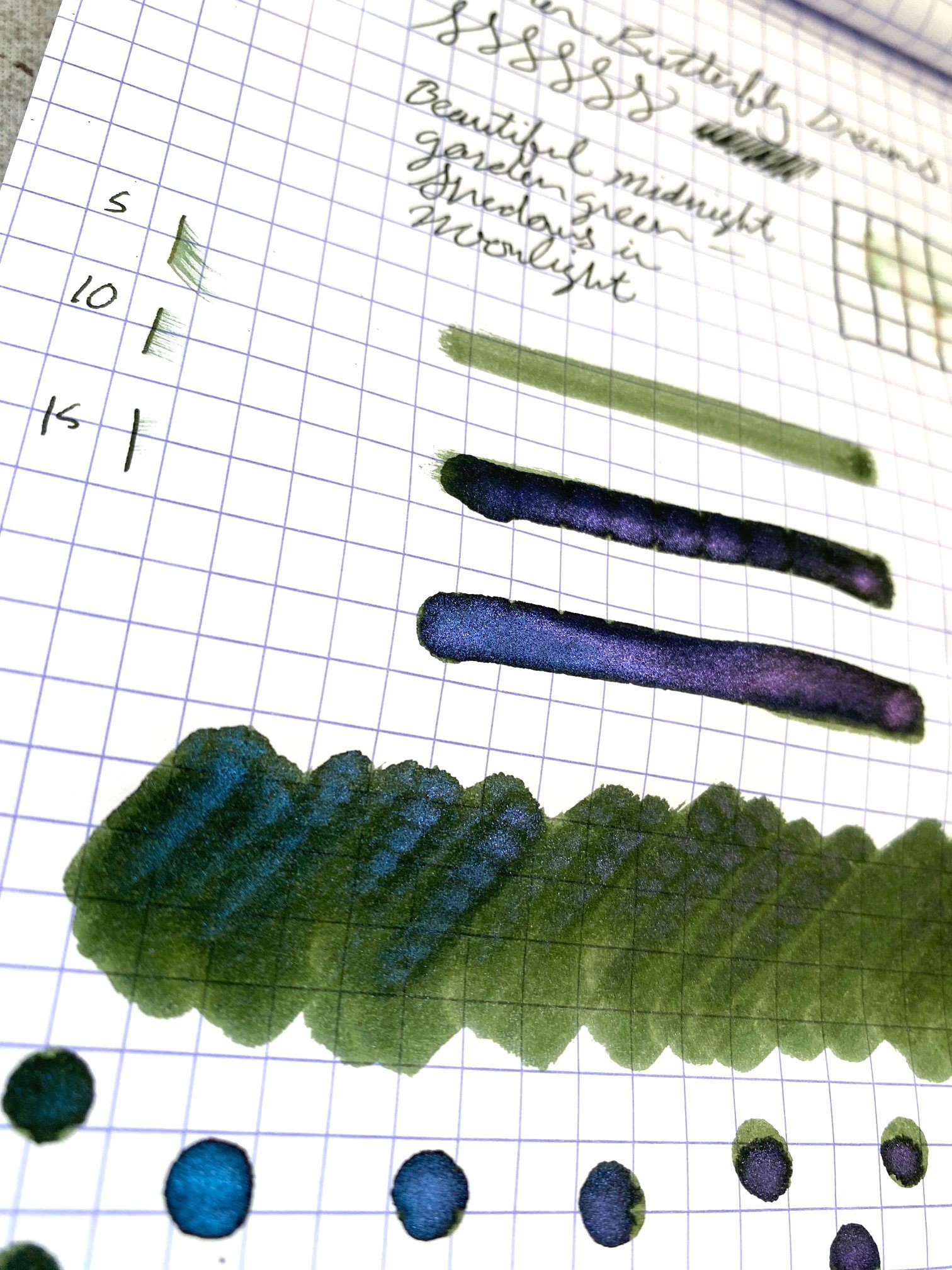
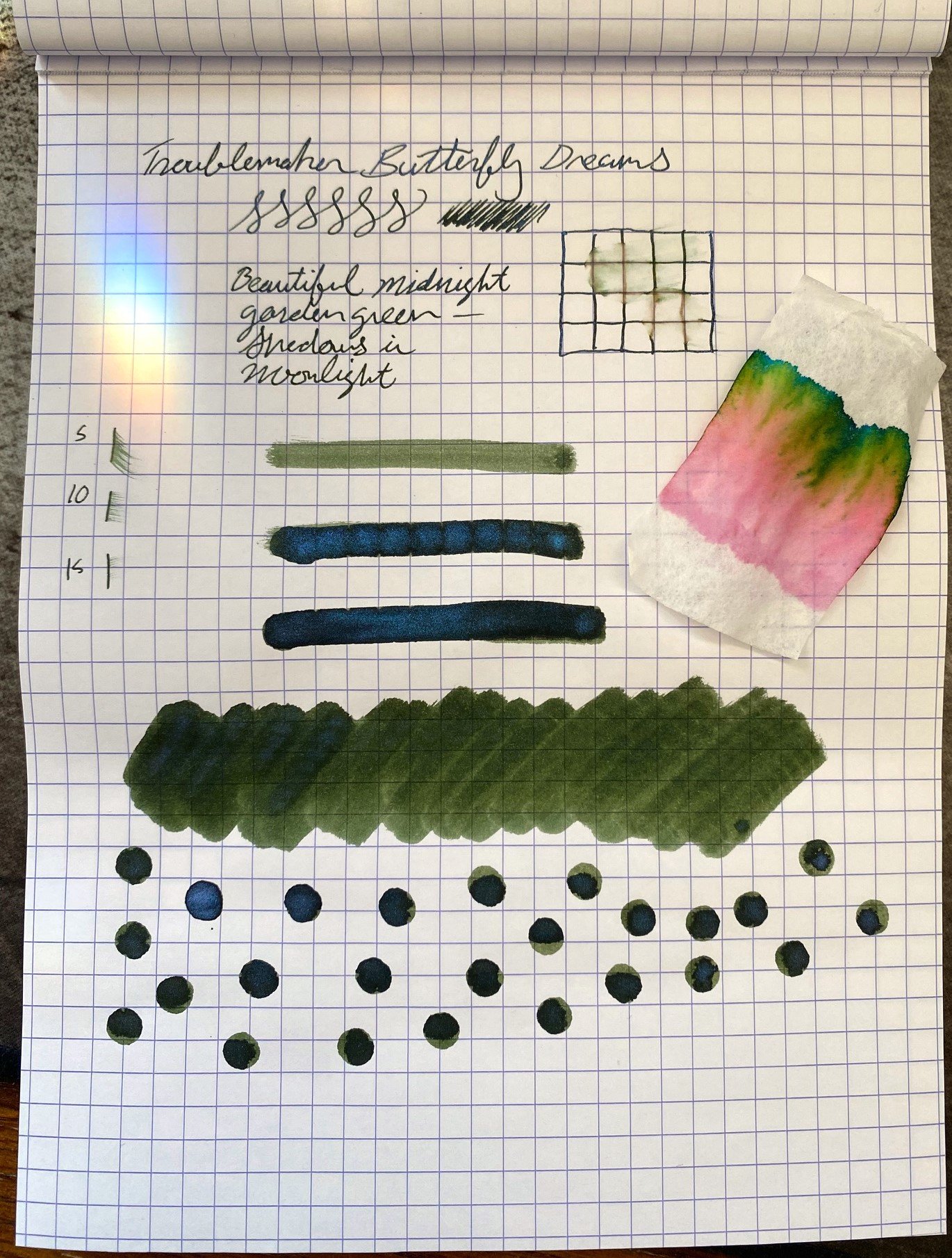
At first glance, it's a lovely dark green. Mossy, shady, dark enough to look nearly black, but with enough character to be interesting. In its lighter shades, it's a gem tone, like tourmaline or moldavite, an elegant green with an art nouveau attitude. And then you see the pop of blue shimmer, and look at the chromatography and fall even more in love. Rose pink, gold, lime green, and emerald all hide in this subtle tone. It drives home that tourmaline impression--like watermelon tourmaline. This is a complex color with a lot of subtlety in plain writing, but wildness when you turn it loose. It makes me want to fill pages.

The ink is on the dry side, with a bit of a dry feel and a super-fast drying time on the page. By 15 seconds, it was almost smudge-free, which would make it a great option for lefties. It was not unpleasantly dry to write with, though, and it flowed well, looking fabulous in any nib size.

There is a fair bit of shading to this ink, from that light bottle green to an almost black tone where it pools, and in the pools there's a deep blue shimmer that looks like magic.

When sprinkled with water, the green tones wash away, but the rose-colored undertones remain, so a tea spill may not eradicate all trace of writing, which is always good insurance.

The ink comes in a 60 ml plastic bottle. The rectangular shape makes it great for storage, but it can be a little tippy when filling, and the opening is on the narrower side. The bottle costs $24, which is an excellent deal.

This is the perfect blend of playful complexity in an ink that can be used in practical applications at work or for fun. It has merit for writers and artists alike. No wonder the butterflies like it so much.

(Vanness Pens provided this product at a discount to The Pen Addict for review purposes.)


Enjoy reading The Pen Addict? Then consider becoming a member to receive additional weekly content, giveaways, and discounts in The Pen Addict shop. Plus, you support me and the site directly, for which I am very grateful.

Membership starts at just $5/month, with a discounted annual option available. To find out more about membership click here and join us!
Posted on March 7, 2024 and filed under Troublemaker Inks, Ink Reviews.