Posts filed under Ink Reviews

Colorverse Korea Special Ink, Part 1

(Kimberly (she/her) took the express train down the fountain pen/stationery rabbit hole and doesn't want to be rescued. She can be found on Instagram @allthehobbies because there really are many, many hobbies!.)

I’ve been on a bit of an ink swatching spree, and at the bottom of one of the bins was this set of 10 inks from the Colorverse Korea Special Inks, part 1, which I got some time in December. They have since released part 2, so I knew I had to swatch these before getting tempted by the second series! I am following the same speed swatching methodology from my recent swatch-a-palooza, so without further ado, here we go!

Colorverse Korea Special Ink, Part 1.

I am swatching these in the order that Colorverse lists them in one of their IG posts, which is also how they are listed numerically from 044 - 053.

  • 독 도 Dokdo - is a nice, mid-toned teal with slight red sheen on the edges of wet swabs.
  • 한 빛 Han Bit (Glistening) - The only glistening (aka shimmer) ink in this series, Han Bit is a very light dual shading blue/lavender ink with light blue shimmer. I am very interested in seeing how this looks in a wet writer.

You can see more of Han Bit’s chromashading as well as the shimmer if you view it at an angle.

  • 이응다리 Eung Bridge - At first glance, it looks like a “regular blue”, but it’s actually a little more complex. It is a bit of a chromashader, with purple and bright blue popping out against the more muted periwinkle shade of blue.

I wonder how similar this one will be to Sailor Manyo’s Nadeshiko.

  • 거북선 Korea Turtle Ship - I hesitate to call this a black ink because it’s more like a black-ish, or grey, ink. It reminds me of pencil lead.
  • 단오제 Danoje Festival - This ink is a mint colored ink, with hints of yellow as well as turquoise sheen around the edges of wetter swabs.
  • 왕의 길 King’s Road - I don’t know if “light, dusty, sage green” are the right words to describe King’s Road but that’s the vibe I’m getting. It is very slightly dual shading, so I’m curious how it will look from a wetter pen on Tomoe River or Cosmo Air Light.

Some yellow and darker greens showing up on the wetter parts of the swatch.

  • 녹 차 Green Tea - There are many shades of green tea inks and this one leans brighter and more yellow. It is borderline too light for my personal tastes, but again, maybe in the right, juicy pen/nib, it could be quite lovely.

Hard to see in this picture, but there is some bright lime as well as dusty pink popping up.

  • 하회탈 Hahoe Mask - A slightly pinkish-leaning lighter brown ink, Hahoe Mask gives off dusty, warm clay mask vibes, though Hahoe Masks are often made from wood, not clay.
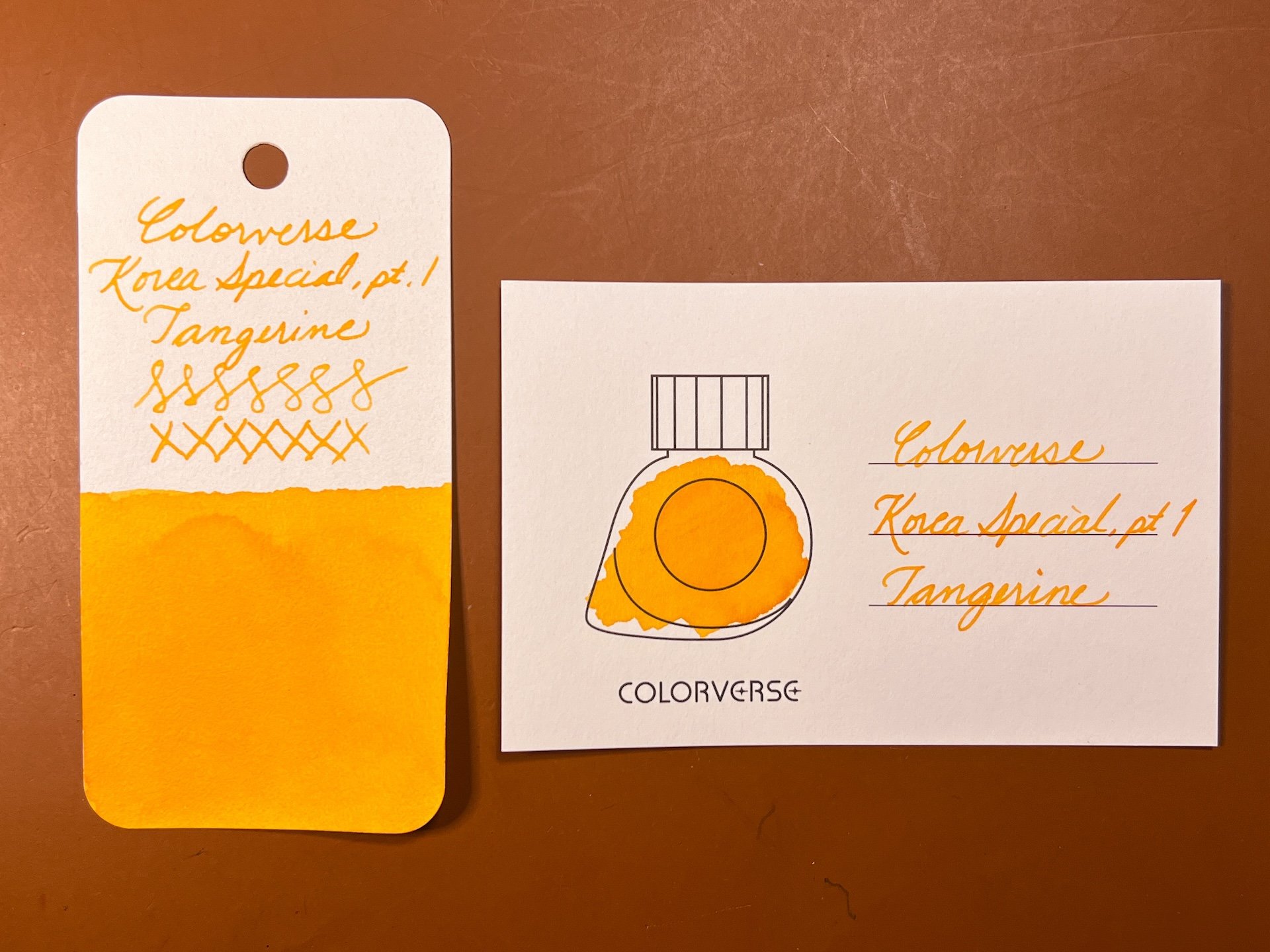
  • 감 귤 Tangerine - This is a nice, light, but not in-your-face bright, orange inks. Despite it’s brighter color, it is a bit softer in tone.

Tangerine - this looks brighter in the photo than it does in real life.

  • 소래 안개 Sorae Fog - This peachy pink ink felt a bit on the dry side, but is a lovely color that ranges from light pink to a medium-light coral.

In addition to using the Col-O-Rings, I also decided to swatch the series on PLOTTER DP Cream and Tomoe River 68 gsm papers.

I love seeing all the colors on a page like this!

Look at that purple popping from Eung Bridge! Also, ignore the bloop on the latter part of Danoje Festival because that’s from user error, I mean, the Kakimori dip nib, and not the ink’s fault.

Green Tea’s bright, lime green edges as well as the barely perceptible peach shade looks really interesting!

Line swatches on Tomoe River 68 gsm - I was a little surprised that these swatched lines weren’t as “interesting” as the swatches on PLOTTER paper, especially since both were made from the same Kakimori dip nib! Just goes to show how differently inks can behave on different paper!

I’ve decided to ink up these two:

I picked a Pelikan M605 with a medium nib (the swatches get harder to photograph once you put a pen on it.)

I know that Sailor Pro Gear Slims aren’t the wettest pens out there, but I’m keeping my fingers crossed that the Medium nib on this PGS Fuki pen will put down enough ink to make it legible.

A few thoughts that popped up while doing these swatches:

  • The one word I would use to describe almost all of the inks (except Dokdo) is “soft”, as in slightly muted, not very saturated, not very bright. This is neither good nor bad, just a vibe that I get when I look at the inks.
  • Most of the inks (except for Dokdo) felt a bit dry when swatching. I look at how easily ink moves around when i’m swatching, as well as how it feels from the dip nib, to help me gauge an ink’s wetness or dryness. Obviously, this isn’t foolproof, but if I have to do a lot of dipping and swabbing to get ink onto paper, it’s something I notice.
  • We know that pen/nib is important in how an ink looks and feels, but paper is particularly important for the chromashaders like Eung Bridge, King’s Road, and Green Tea.
  • I love that Colorverse made these in 15ml bottles. I wish they’d stop making the gigantic 65ml bottles of ink. The 15 and 30ml bottles are perfect.

Swatch cards

  • The swatch cards took ink nicely and were easy to use and did not warp when swatched. I don’t like having only 3 lines for the ink names. I think I would prefer that it was blank.
  • They are an interesting size, around 4” x 2.5” or 100 x 65mm, or “Size B”. Larger than a Col-o-Ring and much larger than a business card (which is about what Wearingeul’s cards are), but also quite a bit smaller than an index card. I’m not sure how I will store these cards now that they are swatched.

==swatch card== The swatch cards come in packs of 50 and are made from 200 gsm Nebula Premium paper.

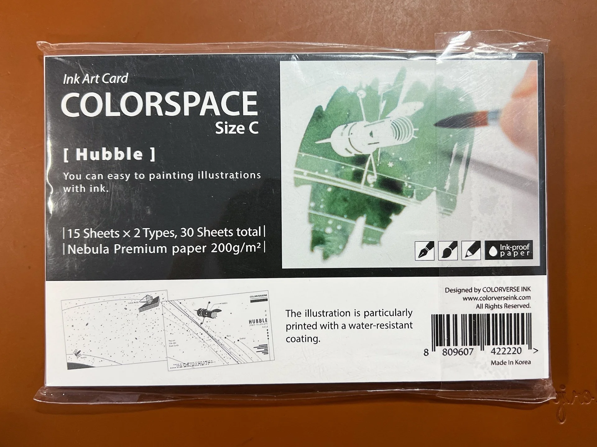
  • Just for fun, I decided to try the Hubble Ink Art Card in “Size C”, 5.75 x 3.75” or 145 x 95 mm. I started the swatch with the Kakimori and quickly realized I needed a lot more ink (and more frequent dipping would only increase the chances of me knocking over the bottle), so I switched to a paintbrush. Next time I think I might try syringing some drops onto the card instead.

There are 15 sheets each of two designs (total of 30 sheets) and are made from the same paper as the swatch cards.

You can see the few places where I went over it more than once, and it’s cool to see more of Eung Bridge’s chromashading.

Colorverse Ink, including the Korea Special inks series can be found at site sponsors JetPens, Goldspot, Pen Chalet, and Vanness Pens for around $15/bottle retail. The ink bottle swatch cards retail for $6 for a pack of 50 cards, while the Hubble cards retail for $12 for a pack of 30 (15 each, of 2 designs).

(Disclaimer: The swatch cards and ink art cards were provided by Luxury Brands of America at no charge for review. I purchased the inks on my own.)

Posted on June 7, 2024 and filed under Colorverse, Ink Reviews.

Robert Oster Whiskey Fountain Pen Ink Review

(Jeff Abbott is a regular contributor at The Pen Addict. You can find more from Jeff online at Draft Evolution and Twitter.)

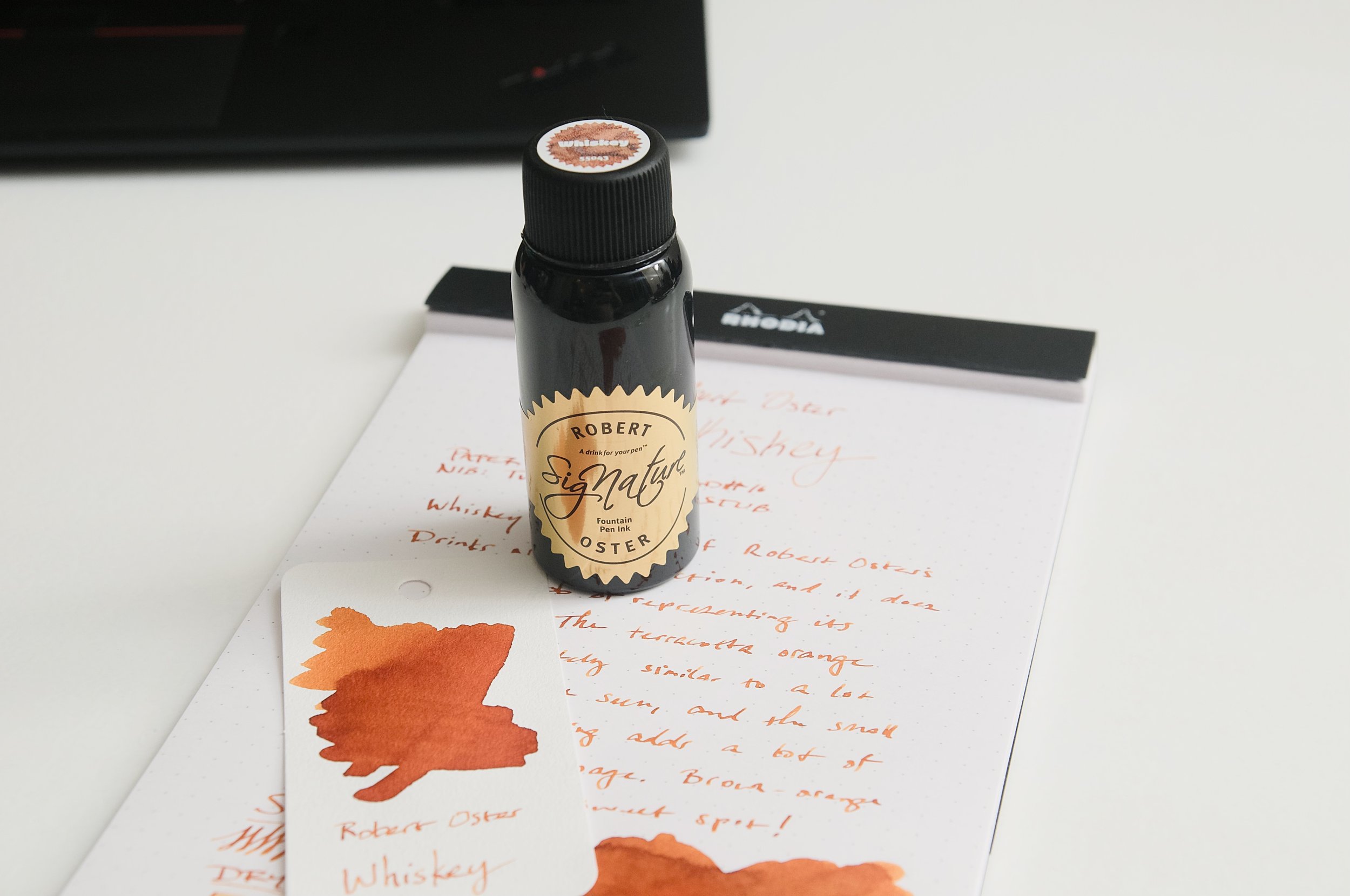
Ever since I saw Robert Oster's Whiskey fountain pen ink, I've wanted to try it out. For one reason or another, I either forgot to add it to an order or didn't have luck with it being in stock. But, I finally have it and have been using this brown-orange for the last couple weeks.

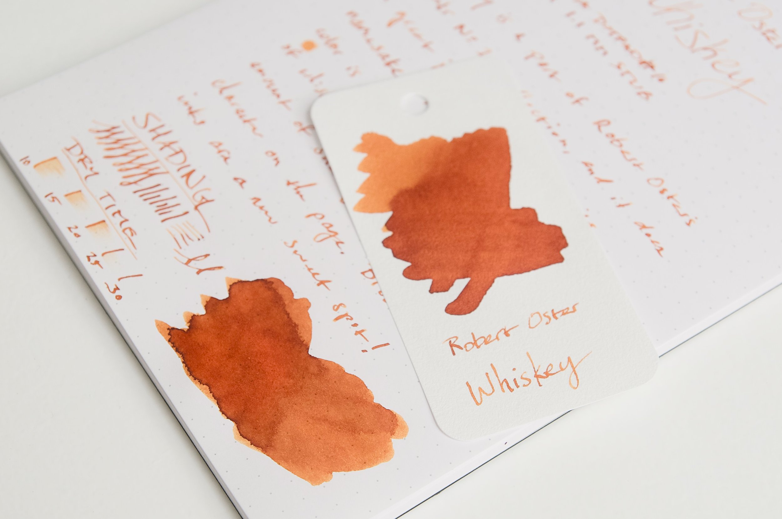
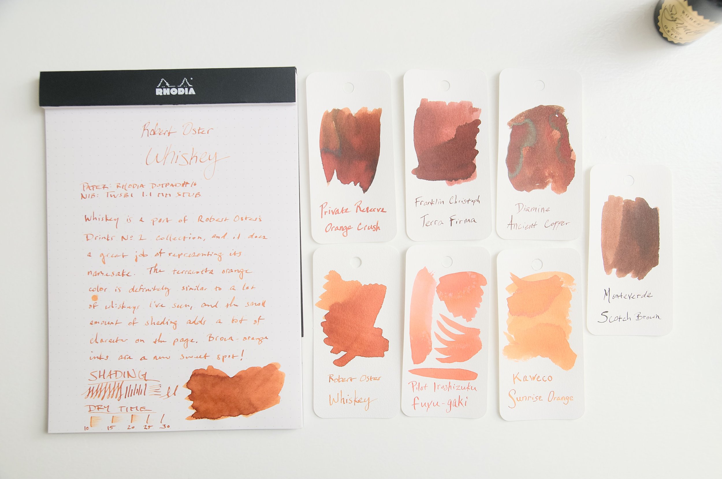
Whiskey is part of a collection of ink called Drinks that represents different drink colors. The caramel color of this particular ink does a fantastic job of emulating the smooth amber/brown liquid it's named after. Described as a "terracotta orange," this is an earthy ink with a little bit of shading to add some great character.

While whiskeys vary a lot in color, I think the hue that Robert Oster captured in this ink is a fantastic representation of the general spirit. As someone who has almost no other inks that fall into this brown-orange territory, I'm afraid I might have stumbled into a new favorite color category. It reminds me a little of Diamine's Ancient Copper, but with a lighter hue and more orange. In all, it's a fantastic color that suits everyday writing while adding a bit of flare that's easy to see on the page.

Aside from the warm, caramel color of this ink, it acts like every other Robert Oster ink I've ever tried. When it comes to the writing experience and my expectations, Robert Oster inks have gotten a little boring — meaning they always behave well in the pen and provide an excellent writing experience. With Robert Oster inks, you really only have to focus on the colors you like as well as other characteristics like shading and sheen. Regardless of what you pick, the baseline performance and behavior is stellar.

There's no feathering or bleeding to speak of (I'm not counting a little bit of feathering in one of my swatch samples because that's not what I consider a normal use). Show-through is minimal given the overall light/medium shade.

My favorite attribute of this ink apart from the color is the light level of shading you get with it. Like the spirit, there isn't any variation in the base color, but the fact that it's a liquid means it can look lighter or darker depending on how much of it is in a vessel, how much light is traveling through it, etc. This small bit of shading that the ink exhibits is a perfect nod to the fact that it's emulating a liquid. The little bits of darker brown/orange around the edges of letters where the ink pools up is so satisfying. If there wasn't any shading with this ink, the overall color might be a little drab. The shading gives it that little touch of character that elevates it to another level in terms of visual interest.

There is some bad news, though. This is not a fast-drying ink. It takes roughly 25 to 35 seconds to dry to a point where it doesn't smudge. For me, the sweet spot for ink dry times is around 20 seconds. Anything less than that is gravy. At 30 seconds or more, it means I have to take that into consideration when choosing whether to use that specific pen. This will be even more of a consideration for left-handed writers or for anyone that grips then pen in a way that means your hand or arm trails the pen's writing direction. There will be smudges!

Despite the slower dry time, this ink instantly shot to the top of my current list of favorite inks. Back when I first saw it and liked the color on screen, I should have just picked it up. Like I said, with Robert Oster inks, you know you'll get a great ink, so it's all a matter of listening to what colors speak to you.

Robert Oster Whiskey is available in a 50ml bottle for just $18. This is on par for other Oster inks, and a great value for what you get. If you dig this color, then you won't be let down by how it performs and looks on the page!

(Pen Chalet provided this product at a discount to The Pen Addict for review purposes.)


Enjoy reading The Pen Addict? Then consider becoming a member to receive additional weekly content, giveaways, and discounts in The Pen Addict shop. Plus, you support me and the site directly, for which I am very grateful.

Membership starts at just $5/month, with a discounted annual option available. To find out more about membership click here and join us!

Posted on June 5, 2024 and filed under Robert Oster, Ink Reviews.

Montegrappa Saffron Fountain Pen Ink Review

(Jeff Abbott is a regular contributor at The Pen Addict. You can find more from Jeff online at Draft Evolution and Twitter.)

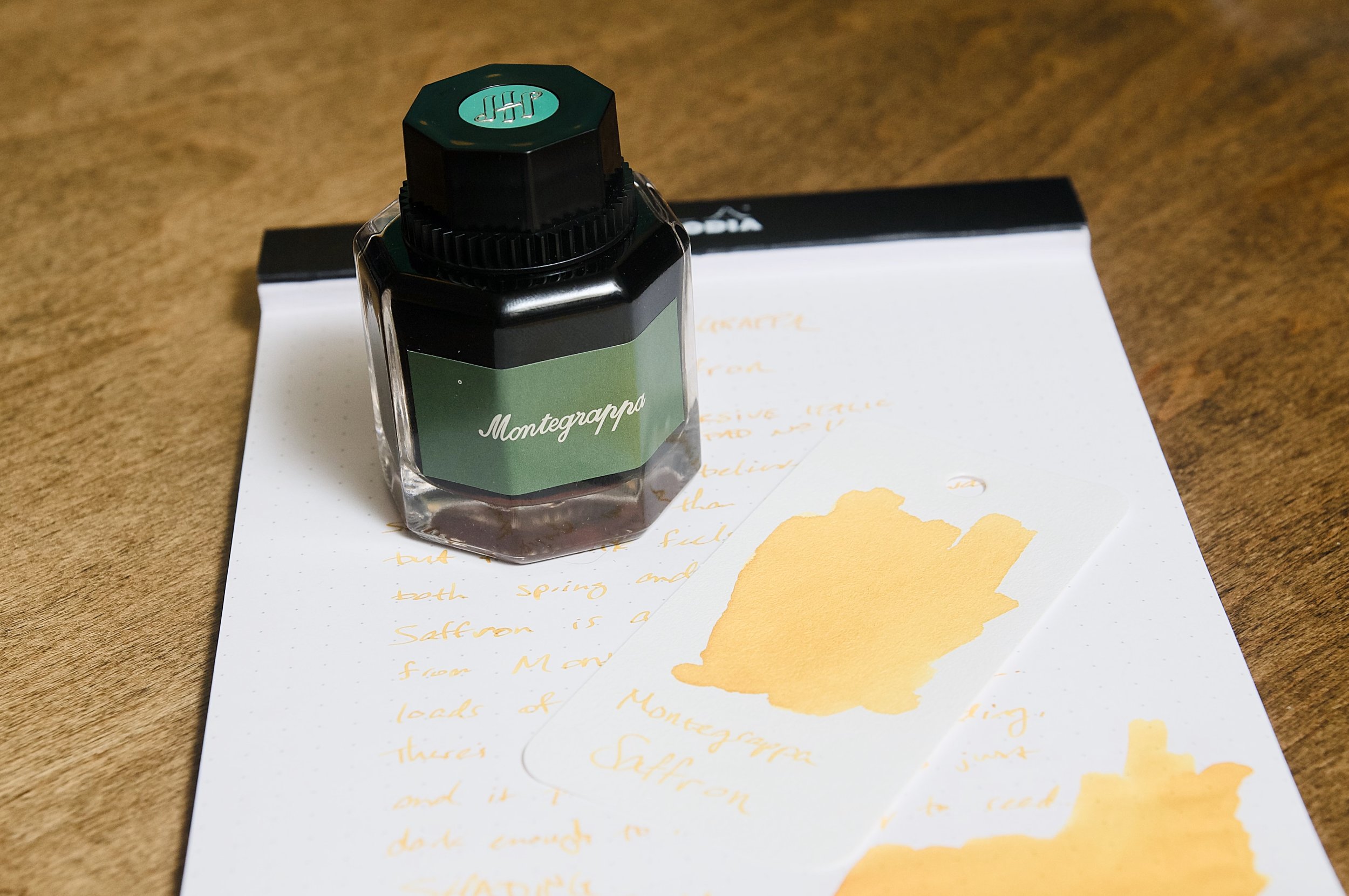
Montegrappa Saffron is a lovely yellow ink from the Italian luxury brand that is more known for their unique and bold writing instrument designs. While the name would have you believe this is a dark red or maroon ink like the spice it shares a name with, it's actually a golden yellow color.

Despite the misnomer, this ink is a beautiful color that behaves well. This is the first ink I've ever tried from Montegrappa, and I haven't heard a lot in the past about their ink offerings, so I really didn't have any expectations. Luckily, I've had a really great experience with Saffron. The ink flows well, resists bleeding and feathering, and dies relatively quickly. While it flows well and keeps up with fast writing, it does feel a little dry when writing. I doubt this is something that you'll experience in every case as each nib/feed accounts for a lot of the writing feel.

Along with the crisp lines that this ink produces, it also has some mild shading effects. The ink is just a tad more golden yellow in areas where the ink pools when drying. Most of the ink strokes are a medium yellow, but the darker areas make it look more interesting as well as making text easier to read. This ink has just enough saturation and depth to stay bright and vivid, but still easy to read on white paper.

Writing with this type of color isn't something I do regularly, but I definitely prefer that the yellow color be dark enough that it's easy to read while also still looking cheery and yellow instead of light red or brown. It's a tough line to walk, but Montegrappa have done a good job here.

Another positive thing regarding this ink is the dry time. In my testing, it was smudge-proof by about 15 seconds. Not bad! It might not be fast enough for some cases, but it's pretty quick when comparing it to the majority of fountain pen inks.

Just shy of $19 for a 50ml bottle, this is a fairly average ink price. There are plenty that average lower and higher, but this price feels fair for the performance and amount you get. By all means, if the color speaks to you, you won't regret picking up a bottle of Saffron. It's a great performer and adds joy and brightness to any page!

(Pen Chalet provided this product at a discount to The Pen Addict for review purposes.)


Enjoy reading The Pen Addict? Then consider becoming a member to receive additional weekly content, giveaways, and discounts in The Pen Addict shop. Plus, you support me and the site directly, for which I am very grateful.

Membership starts at just $5/month, with a discounted annual option available. To find out more about membership click here and join us!

Posted on May 30, 2024 and filed under Montegrappa, Ink Reviews.